


Apartment and commercial buildings aren’t inherently limited to neutral tones, and yet there seems to be a prevailing tendency to stick to more trendy black-and-white palettes. Personally, I advocate for embracing more colourful options.
Let’s take a closer look.
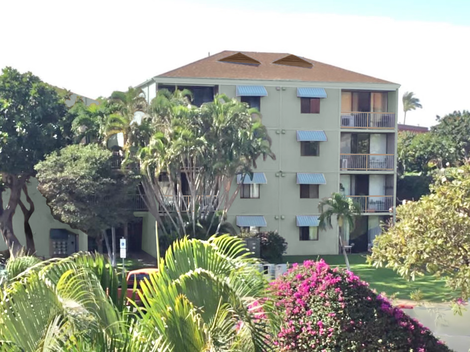
Last week while I was vacationing in Maui, a follower sent me this photo. She told me she was on the design committee to choose the paint colours. And of course everyone else wants to paint the building trendy black and white.
Consider the setting
Would you say the existing colour scheme is working for the tropical setting?
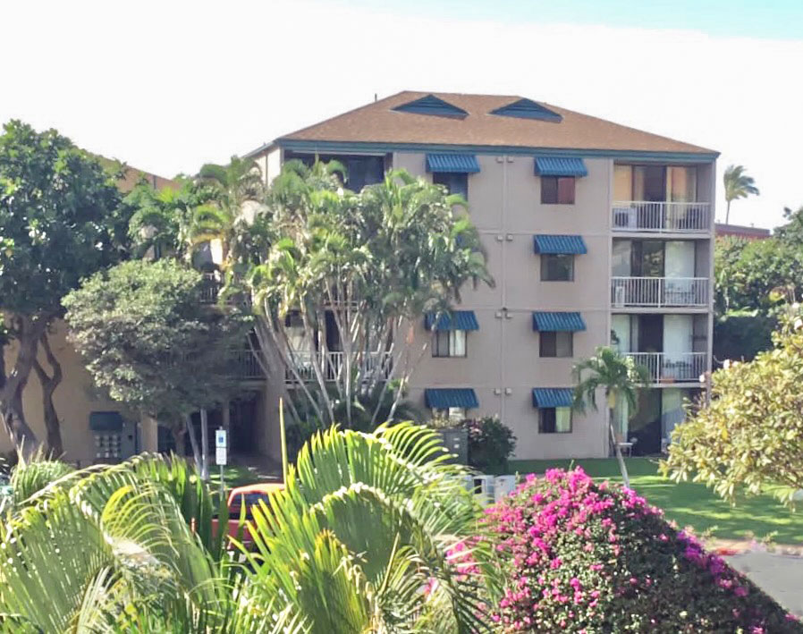
The pink taupe stucco colour is the “play it safe” neutral from the grey trend so it’s looking dated but it’s also not a colour I would consider to be a tropical neutral either. Kudos for choosing a COLOUR for the awnings, but again, it’s a safe, corporate blue.
My exterior Masterclass is relaunching soon and one of the lessons you’ll learn is to consider exterior colours that work in the area you’re in. There is only one place in the world where it’s totally fine that every single house is white. You’ll learn that too.
In the meantime, if you’re in a tropical place, black and white is far from being the right exterior colour. Period.
Colour by committee is often boring and defaults to the trendy neutral of the moment but COLOUR is much more timeless for an exterior.
Avoid going all in at the end of a trend cycle
And did I mention we’re about 7 years into this trend? That means it is starting to look tired.
When I saw the first commercial building in the town I live in go white with sleek black signage I also thought it looked fresh and new.
So if you are not in the colour industry like I am, you might STILL be thinking it’s the best answer for every exterior colour dilemma but I’m here to tell you, the moment the trend warms up (it’s happening already!), you will re-think your black and white house.
Because that’s what happens when we follow the trends, we fall out of love with the last trend and wish we could incorporate the next trend in our house immediately.
Let’s see what it would look like in black and white shall we?
Doesn’t it remind you of something? *bats eyes*
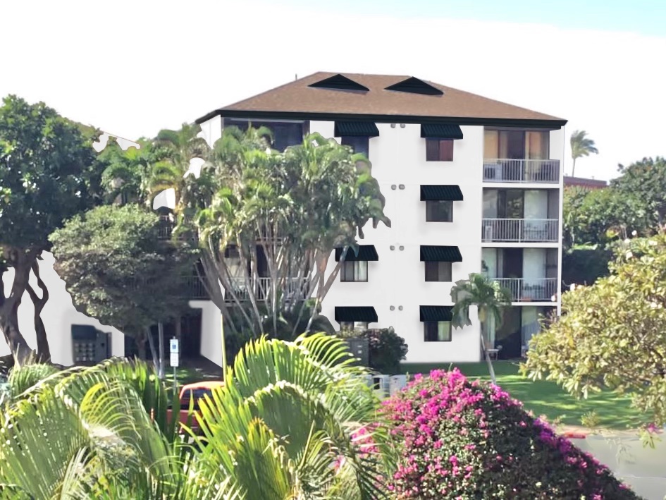
The first thing you see is heavy black eyelashes on each window.

Black and white is not as simple as it seems
These days no one wants to think outside of the black and white box. But, as I said, the look is tired. And while choosing black and white seems simple – it doesn’t get more basic – it’s SO stark in contrast that PLACEMENT becomes really tricky to get right.
Case in point? The multitudes of exteriors where the black windows are all different random shapes and sizes. The harsh contrast only draws attention to that design flaw.
In Maui though? It’s simply too harsh and severe for the lushness of its tropical surroundings. Paint this building black and white and you’re just pulling on the boring uniform of conformity, following a soon-to-be-dated trend. And, again, placement: muppet eyelashes is not the best look is it?
So what are some better options?
Colour is more timeless than the trendy neutral of the moment
The tropics are a landscape of abundance. They are the perfect setting for COLOUR. Look at the vibrant pink of the bougainvillea in the foreground of the picture.
And colour is more timeless than most neutrals. Why? Because each major 10 year trend cycle is defined by its dominant neutrals. Right now, we are turning away from black and white into softer, warmer neutrals again. Hello beige!
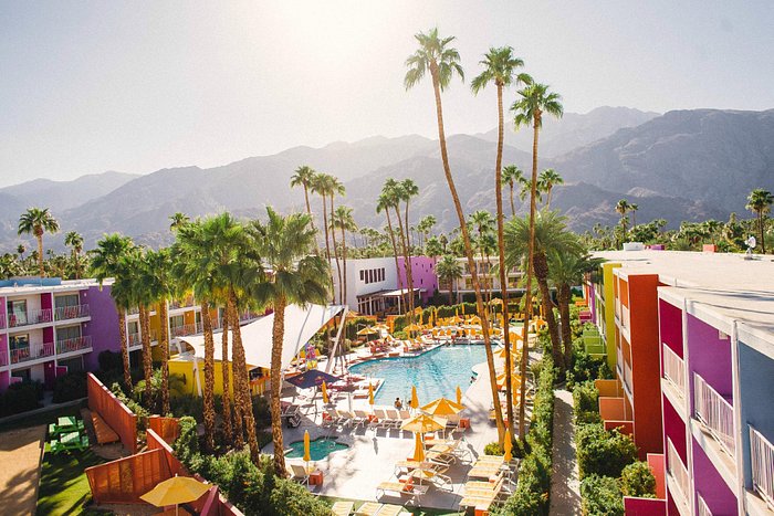
On the other hand, some of the most famous Instagram-able buildings have lively, vibrant colour schemes. And they never look dated because they are simply happy.
Here is the famous Saguaro hotel in Palm Springs. A highly sought after booking (and one of the most Instagrammed hotels). Imagine if they had painted this hotel grey or black and white?
Or Hotel Zed in Tofino, also the most distinctive spot where everyone wants to stay.
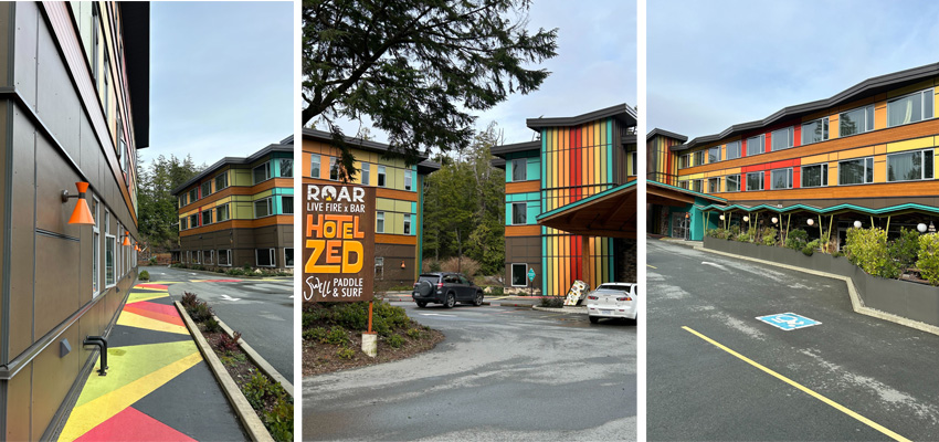
Photos by our lovely copywriter Lisa Pike
So fun right?
Go with colour instead
Now this being a residential building, I wouldn’t expect the committee to go for a full rainbow scheme. However, this building should have a fresh and timeless look with colour.
First up, let’s tweak the blue to a fresher sky blue and paint the stucco a pretty blue green.
This is a soft look that integrates beautifully with the landscape.
I would paint the fascia the body colour for better balance, and the railings bronze to match the windows.
We could also paint the stucco a warm complex cream and simply put a fresh accent colour on the awnings. Like a green to relate to the landscape.
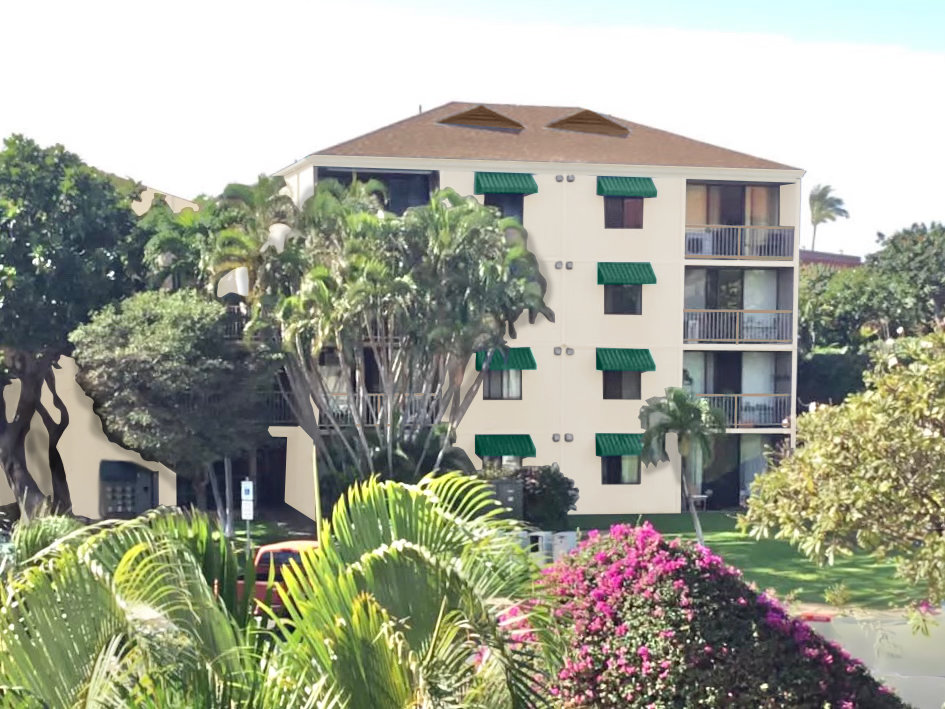
Or even bright pink to relate to the pretty bougainvillea.
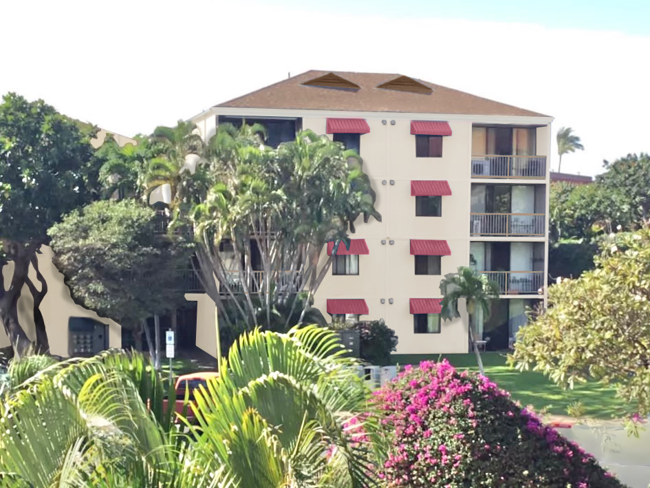
With any of these happy colour schemes, no on is going to be in a hurry to repaint this building until it’s faded and peeling.
Which scheme would you choose?
If you’d like help creating a timeless exterior for your exterior painting project this Spring, I would love to help, see my packages here.
Psst! Now’s the time to sign up for my May True Colour Expert Training in Chicago. Seats are selling out fast! If you’re a homeowner, don’t work on any new projects until you attend my Create your Dream Home training in April.
What people are saying:

PS. someone in the comments said it could also look similar to the Royal Hawaiian Resort in Honolulu so I looked it up:
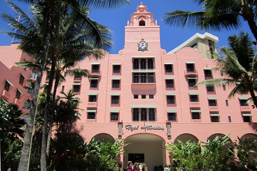
Now we’re talking. This is what a hotel in the tropics should look like!
Related Posts
How eDesign Saved This Exterior from Black Windows; Before & After
Why a Colourful Sofa is as Timeless as Subway Tile
Timeless Exterior Colour: Stand Out Without Being Trendy

very true
(they do the same white/black thing in Europe as far as I could see. Why? It so often doesn’t belong in the first place. I tell myself it’ll probably get dustier though soon, and less harsh and more forgiving-that’s the only hope)
I’d choose a green color with blue awnings. Green and blue are perfect for Maui, I remember I took a picture of a wall of teal blue house once, in Hawaii, just to never forget how it looked like it belonged and was so, so happy to belong.
So pretty, I’m glad I don’t have to choose between your renderings. I love them all. But what a difference it makes. Hope they take your advice. Will they let you know? I’d love to see what they do.
Love all your choices! My favorite is the warm cream with green awnings. Looks timeless and fresh at the same time.
Same!
The dark green awnings almost look like lashes to me. Love the other two options though.
I love the green awnings and soft white walls — it’s perfect for the setting (and for anywhere else that green plants grow).
I like them all lol. I’m kind of smitten with the pink truth be told.
Hoping they choose one of your pairings. The “bat lash” descriptor had me grinning.
The new examples look fresh and happy. And who doesn’t want to feel like that?
the way you talk about color is music to my ears 🥰
I would use a cream on the body and a coral or peach on the awnings. A color that will blend with The roof. Do they really need the awnings?
I would use a cream on the body and a coral or peach on the awnings. A color that will blend with The roof. Do they really need the awnings?
You nailed it, Maria, with the soft green and soft blue awnings! Perfection!
In the first updated photo, the body doesn’t look blue green, but the original color. Is it my phone, or an error in uploading?
Love the other two options. I think I like the green awnings the best!
Same I was struggling to see it. Looked yellow on my phone.
I like awnings that start high on the exterior wall and slightly cover only the top of the actual window to give the illusion of larger windows—a more modern approach and awning than exists now. And how about a striped awning? More color! I see soft yellow walls and royal blue/yellow striped awnings as an option.
Yes! This is what I was thinking. I would love to see the pale blue just a little bit darker to provide more contrast on a blue and white striped awning!
Copy the Royal Hawaiian Hotel in Honolulu. Salmon pink with white awnings. I think a darker body color with lighter awnings looks prettier. When the awnings are darker, they stand out too much.
The pictures of the awnings I’m seeing on the Royal Hawaiian look pale blue/green to me. Either way, I like them with that salmon pink 🙂
To me, neither the sage nor the cream augment the typical color of the lush landscaping. I would go with a soft yellow (like B Henderson suggests) with blue awnings – both would blend with all the surrounding greenery and show off the colorful bougainvillea. Or, choose a cleaner green that is a compatible backdrop for all the greenery with blue awnings like they already have or even a brighter blue awning. The blue sky is beautiful there and the blue awnings are a nice compliment. Match the trim color to the paint color.
Of the options you suggested, I like the cream with green awnings. The sage body looks too washed out to me. I do think I’d like the cream body with the awnings a little bolder shade of turquoise than what is shown with the green body. I also like the idea of a yellow body. I do hope we’ll get to see the final project. And I’m so glad your follower is on the design committee, so this building will not end up black and white!
Give me the last one please- because c’mon the awnings are pink and I’m a sucker for pink!
I’d say paint the building a pale turquoise with awnings painted a stripe of pink and salmon! Bold I guess but I think it needs more color than what has been pictured. I love the rainbow colored buildings in the photo but on this particular one it just needs more than 2 colors. Please let us know what they end up with! Exciting!
I like your suggestion!
Think “Bermuda” for colors that look great in tropical settings. They use saturated colors in pink, blue, yellow, etc …
What fun choices they’ll be making! I like the third pic best. The beige with the pink awnings. It would be nice to see, depending on the amount of buildings they have to paint, if each building had it’s own individual color, ie… Light pink on building, Coral on the awnings; Sage green with botanical green awnings; light sky blue with sea blue awnings etc. But I’d definitely play with the all beautiful colors of the flowers throughout the grounds. Nature’s colors are timeless in any season.
The white painted with heavy/thick painted black window frames & shutters seems to be cropping up more often than I would like to see in my 1968 neighborhood here in Virginia where the home style leans more colonial. 🫣
My favorite tropical looking hotel that I have seen in person is the pink palace of St Pete…the Don Cesar Hotel 💖
Yes, I was going to suggest the beautiful pink Don Cesar!
I live in Germany and we are behind. Still building white cubes and selling black kitchens. I feel so sorry for the people, who have to live in it and the women, who have to clean it. It is better to make a mistake with a colour, than live without colours.
I feel like you went too neutral there for the area. Definitely green on the awnings, and the base needs to be a pink shade. The original shade with fresh green awnings are better than a boring cream. Just my opinion of course 😆