Discover how the Understanding Undertones neutral colour wheel can simplify your search for the perfect neutral by helping you quickly identify and match undertones in any space. And, learn why choosing the neutral that belongs makes your room feel amazing!
If you haven’t purchased my Understanding Undertones neutral colour wheel yet, let me just say you’re missing out! It’s time to treat yourself to the handiest tool for choosing the right neutral!
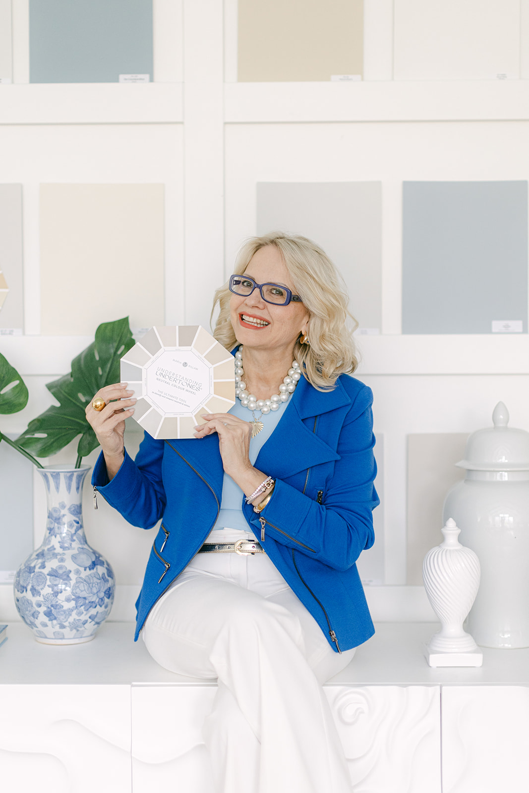
What is a neutral colour wheel?
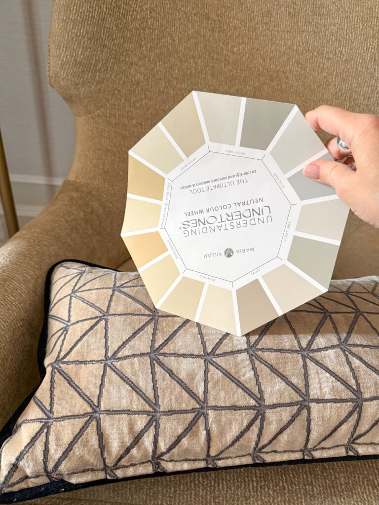
My Understanding Undertones neutral colour wheel displays the range of useful neutral undertones and whites. Its portable design makes it easy to compare and quickly identify the neutral undertone of any item, helping you narrow down your choices with confidence. That means you’ll get it RIGHT!
How to use the neutral wheel when decorating an existing room
This way, you can tell which neutral decor item, whether it’s a pillow, rug or drapes might be worth hauling home to try in your room.
If you’re adding to or refreshing an existing room, the most useful way to use the wheel is to identify the neutral undertone that exists in your finishes or furnishing so you can go find more of the same to match.
How NOT to use the Wheel
A common misconception about the wheel is that it’s about which neutral undertones coordinate with which. And while it’s true that some neutral undertones can co-exist in harmony, that’s not really the point.
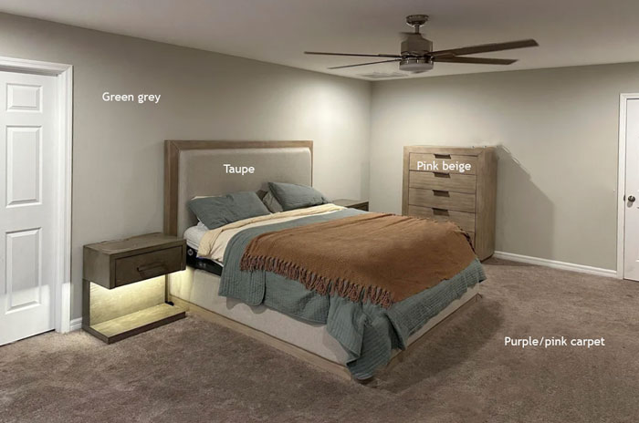
For example, while none of the neutral undertones in this room clash individually, the combination of too many neutrals that do not match, simply looks bad.
Because the way to create a cohesive space is to LIMIT the neutral undertones to just ONE or a maximum of TWO and MATCH and REPEAT the neutral you’re working with.
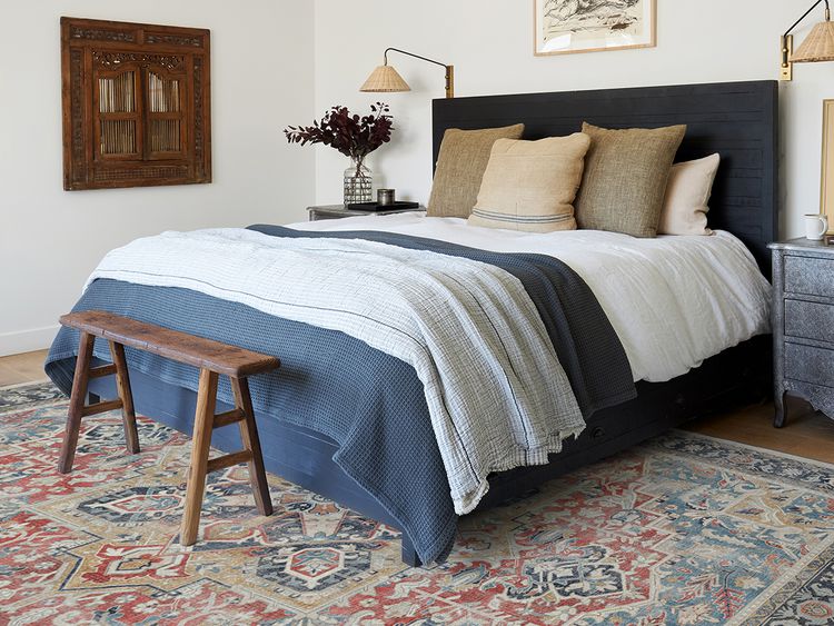
In this bedroom (below), the decorative pair of green beige pillows repeat the green beige in the area rug. However the pillow in the middle is pink beige and doesn’t relate to anything in this room. A red lumbar pillow to repeat the red in the area rug would have been better here.
Also because the lampshades are orange beige, and all three are solids and in close proximity, they all start to feel like a clash because the orange is technically not repeated in this room either.
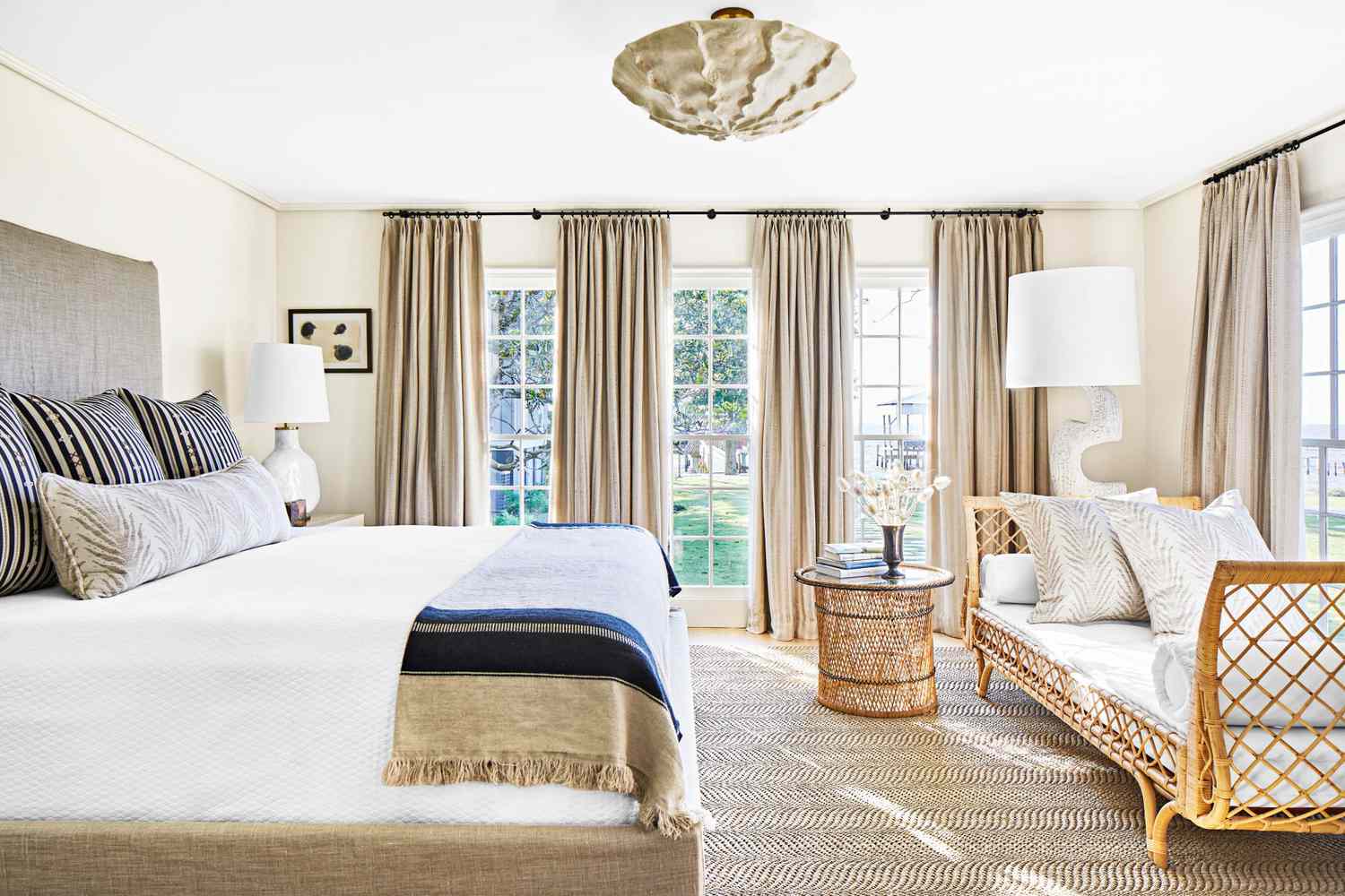
Then in this image below we have a green grey headboard and pillows, with taupe drapes. They don’t clash but they do look like we tried to match them and we failed.
Had the headboard been navy it would have looked better but when we try so hard to choose everything ‘neutral so we won’t get bored’ we end up creating a boring room and at the last minute adding striped navy euro shams and throw.
How to decorate with neutrals
So the word, when it comes to choosing neutrals, is not COORDINATE. Because coordinating suggests that the colours can be complementary but different.
MATCH and REPEAT. That is what there is to do when working with neutrals.
Here is the difference:
Neutrals that don’t match the other neutrals in the room just look off.
What do you when you make a mistake? How do you approach a kitchen or bathroom where the neutral undertones don’t match? That’s what I teach through many exercises in my workshops.
When working with neutrals, less is more
So the a core idea of my colour system is create harmony by MATCHING and LIMITING the neutrals. It’s NOT about COORDINATING multiple neutrals.
There’s a consistent pattern you’ll notice when helping people make color and design choices: everyone tends to put off making a definitive color decision. That’s one reason why so many homes end up with layer upon layer of often mismatched neutrals.
And that’s also why some people hold onto my neutral colour wheel, hoping it will magically reveal the perfect paint colours. After all, it often feels like everything starts with paint, doesn’t it? Which neutral undertone is best?
The best neutral for your room is the one that best matches the neutral undertone of the neutral finishes and furnishings in the room. That’s what makes it look like it belongs.
It makes your room feel amazing!
Skip straight to the perfect paint colours for your home with an eDesign consultation.
Here’s what clients are saying about my eDesign colour consultations:
⭐️⭐️⭐️⭐️⭐️
“Hello! I just wanted to say thank you, thank you, thank you!!! We went with all of your colour suggestions for our open concept kitchen and family room and couldn’t be happier! It came out just beautifully. Thank you so much for your suggestion to replace the backsplash, and tips on how to make it work with our original earthy granite. Again, it works perfectly. It is fun seeing it all come together though.
Related Posts
What Everyone Should Know About Warm Neutrals



Oh no I don’t think the rooms mentioned in the wording match the pics included…