


 Photos by Maria Killam
The first time this couple hired me to help them with their house (around 4-5 years ago), it was to choose a colour for the kitchen cabinets. Their house had been completely re-done (a lot of it without their approval) while they were out of town and their designer back then had chosen a colour that looked a lot like battleship gray (HC-101 below). She said it looked far worse in person than in this photo.
 Before
The only colour (after they tried a total of six) that did not fight with the many finishes, including the Birdseye maple, mahogany and the pink, black and green granite (above) was black in the end, so there were many black walls in this house, in addition to the greeny gray colour which remained in the kitchen which was BM 2137-40.
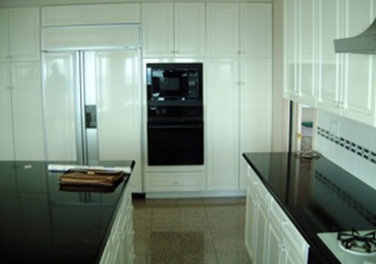
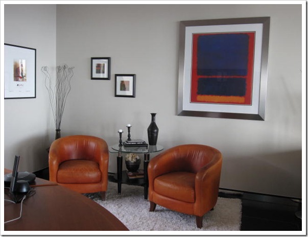
This was the white kitchen, and in this house it stuck out like a big white elephant because all the colours were so dark and dramatic. The colour I chose to coordinate with the existing wall colour was 2141-50. If you pull out your fandeck and look at these colours, you’ll notice I didn’t just go down a couple shades from 2137-40 because the colour needed to be warmer. The lighter shade of the one you have isn’t always the best way to go.
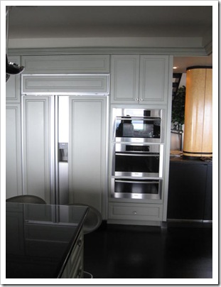
After
This summer, they had some real estate agents and stagers through the house. It was established that something needed to be done with the colour but the stagers thought more black was in order and that was when my client called me. She was convinced that the house needed to drop all the heavy black and she was absolutely right!
 Before
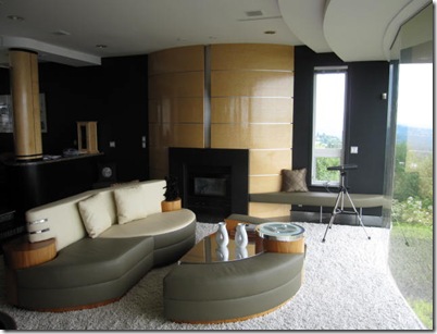
The big discussion during our consultation was which colour once again would not fight with all the different colours already in the room. I decided a light green gray was the way to go. We chose 3 different shades to try [BM 2143-50 Old Prarie, OC-47, Ashwood and OC-15 Baby Fawn] and and I recommended that they paint the entire wall to the right of the fireplace. The colour was going to be such an extreme departure from the black that it would be impossible to test it any other way. Here is the one we ended up with [OC-15] below:
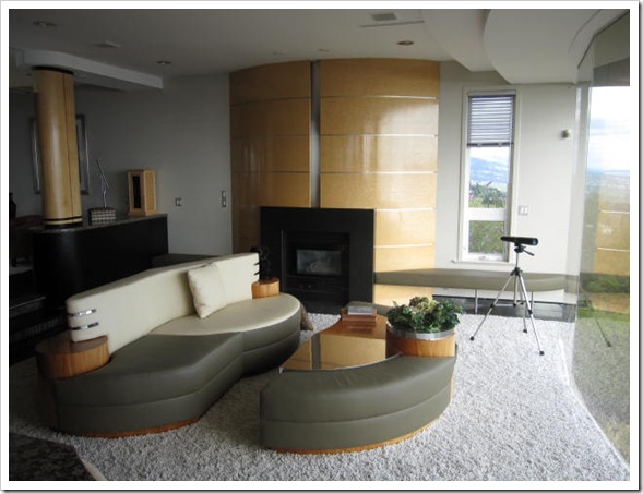
After
I know with this much light it almost looks like white in the photos but if you look at the ceiling you can see the difference. The colour also nicely relates to the inlaid stainless in the fireplace wall.

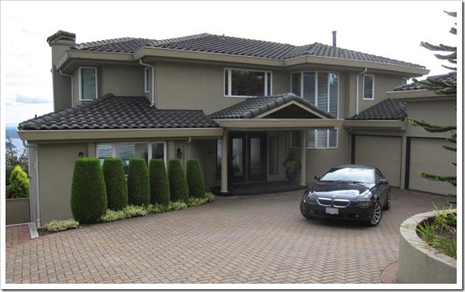
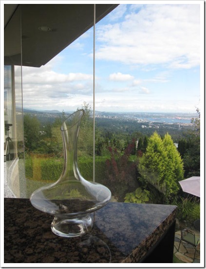
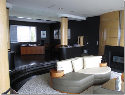
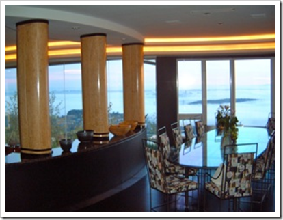
This is the view from the living room (well every room actually), it’s up in the British Properties.
 Before
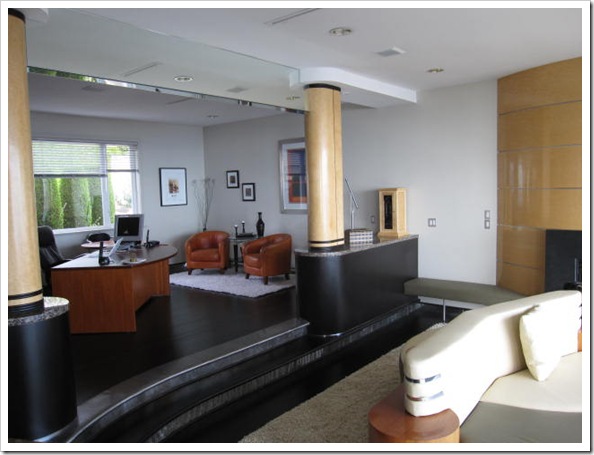
After
What a difference the addition of the light shag rug, moving art around and the new light colour has made!
My client said she had been reading my “How to Create a Tablescape” post, which is why the vignette on the end table looked so great, I didn’t have to move a thing for the photo!
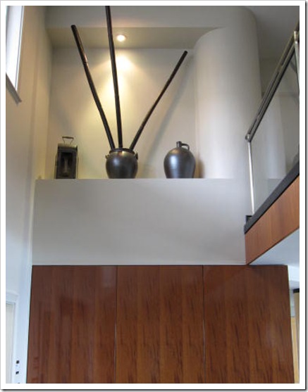
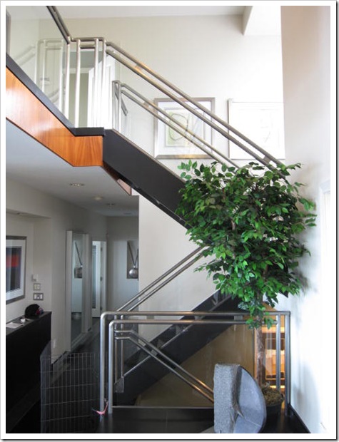
 Entry looking up to the second floor (before)
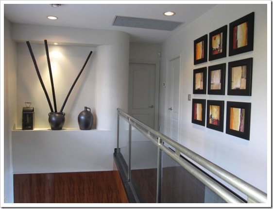 After
After
She also said the Mahogany just screamed with the black and that now it’s gone to sleep with the new light gray and I agree!
 Before
After
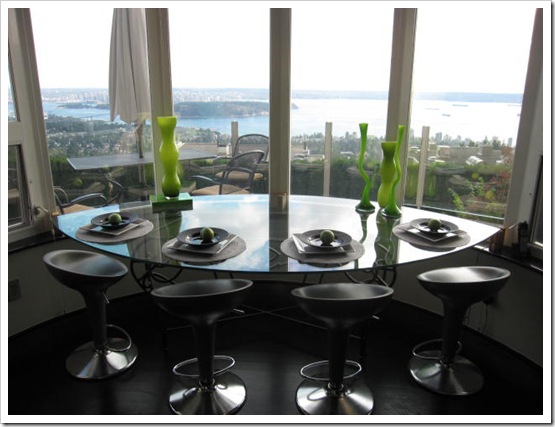
My clients were having a dinner party so she staged the kitchen for me because she knew I’d be taking photos when I came over. Love the apple green vases!
 Before
The dining chairs were custom made years ago (if you look closely you can see the fabric has bottles of wine on it. As this room is the first thing you see (besides the view of course) when you walk into the house, and because it’s such a big focal point I suggested we update the chairs with a look that was softer and more current. Here is what they are now.
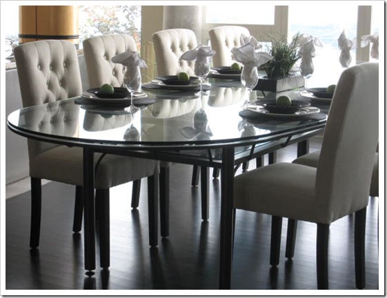 After
After
She also turned a room formerly used as a dressing room into a guest room. I like the way she mixed the fresh yellow green with the existing greeny gray shade on the walls.
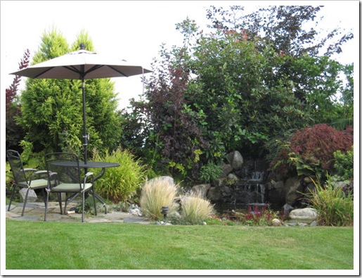 This is their private garden in the backyard.
Just like a light colour will never come to life in a dark room, a house with this much light needed a pale colour! My client said she only wished they had done this sooner! Hope you enjoyed the tour.
If you would like your home to fill you with happiness every time you walk in, contact me for on-line or in-person decorating and colour.
Related posts:
How to get the most out of a Colour Consultation
The Colour of Wood vs. Wall Colour. How Important is it really?
New to this Blog? Click here ; Subscribe to my Monthly Newsletter; Become a True Colour Expert
While you’re here, subscribe to this feed so you don’t miss out!

What a transformation – from gloomy to grand. Very impressive. I can see why she wishes she had done it ages ago. It is a pet peeve of mine to fix up the house just before we sell it. I want to make the changes now so I can enjoy it. That's why I painted our kitchen this summer so I get to enjoy it before we move on.
Lovely home turned stunning.
Nice advice, Maria! I bet y'all are proud of this one!
-Ann
What an incredible difference! Good work! smiles.
Wow….what an amazing transformation!! You are such an inspiration!!
Maria, as always, you helped breathe new life into a beautiful home to make it really come alive. Love the new paint color and the new dining chairs. What a difference the right color makes!
Those cabinets are definitely not my cup of tea, but the lighter colors really make it work. Great results.
Wow, what a great transformation! I'll bet she wishes she called you five years ago. Nice work!
What a difference the light gray makes!! I have no idea why any was thinking to add more black?!?! It looks so airy and fresh now, and really speaks better to the beautiful view outside.
I love those touches of yellow green too!
Nancy
I am always amazed by how color can truly transform a space. The warmer color in the kitchen is so much nicer. What a view..
Can't imagine living with all that black – maybe your stunning turnaround of this house will make them want to stay in it! You're awfully good at what you do, Maria, and I have really enjoyed your blog these last months.
Wow, great jon Maria. That's really great your client called you for help because I see you were needed. The house was so dark….dark walls, dark floors. Awesome job.
I love the kitchen cabinets, what a triumph! Really interesting project, I enjoyed all the 'before and after' shots, thank you.
I have so much admiration for your talent. Really well done. 🙂
No doubt they will get a far better offer on their house with your changes. I would love to see it in person, because no matter how great these pictures look, it must be incredible when you're in it seeing the true color. You really are a master at pulling existing tones together.
What a beautiful home. I wish it was mine! Love the changes. My dream is to have a home with a view like this.
Hi Maria,
Beautiful work!!
Love the cool shag rug 🙂
xoxo Laura
This post is proof in the puddin' that people NEED to hire a professional when picking colour… The style and scale of the rooms would be so intimidating for me… wonderful job Maria! You are a true colour expert!
Have a Great Week!
Hi Maria,
What a huge change you made. The colors look amazing. And updating the chairs makes everything look more contemporary.
I was wondering…do you think the items in the niche (looking up to the second floor) should be larger?
It's such a tall space that the existing items look dwarfed. That's just my opinion.
HI Mary,
I think the bamboo sticks fill up the space nicely. And it's like art, which is personal, so I think it works!
Thanks for your comment!
Maria
I like the idea of black walls. I think I'd like to do a bathroom or powder room in all black. But after seeing your colour choices, it's amazing to see how much more light and airy, and larger the space feels. Great job!
Maria,
Well done.Huge improvement.
Love the new colors!!
Thanks for sharing !!
Shay
Maria, Wow what a difference. Sometimes I don't think people realize just how important color is in their lives. I always say when it is in your home it wraps its arms around you so you had better love it!!! Great job and I think you helped your client in selling her home much faster,Happy Monday, Maria,
KATHYSUE
So much better! You really opened up the space and let it feel as light and pretty as the view.
Quite a transformation! Job well done especially getting rid of those dining room chairs and replacing them with the tufted parsons chairs. Brilliant! Love that view…we ski Whistler and it reminds me of the bus trip up to the mountain where every house, no matter how big or small, seems to have a view.
Maria,
For the love of light gray. Even when a project appears to be an elephant "the elephant" can only be handled one bite at a time!
Visuals are the only way to show how much or how little needs to be done to help a space breathe again.
Great post!
Bette
This post could be called "What a difference a Colour Expert makes"!
Wonderful job Maria.
I'm so excited to see you at High Point! I can't believe we haven't met in person already.
xo
Brooke
Do you have a magic wand? I love how you sprinkle goodness everywhere you go and leave behind such sparkling "after" affects.
Bravo~
pve
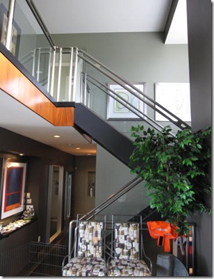
Wow, Maria! You 'lifted' the ceiling of that room a few feet at least! What a difference!
Sounds like that stager could benefit from my new e-course Sassy Decorating Secrets!
What an amazing update. One can now see the walls.
I liked it all except the two small pieces of art above the chairs in the study area. I seldom like pictures hung uneven – old school from a decorator friend – and I find them too small for the area.
I too think the sticks look too big for the pot in the niche and something in a larger pot would be a better solution. The proportions seem wrong.
what a fun house to work on. i love the results!
Great transformation. The lightness you brought lifted the mood of the space and probably the homeowners too. Like the garden. Looks like an intimate space.
nice job, real nice
Can we all just have a moment of silence to pay respect for that KILLER piece of real estate?!?! 1…2…3…4…5… There's nothing I desire more than a hillside view of the coast. Lovely, lovely, lovely.
Now, on to your masterful work and thorough post. I love what you've done with the place, and I'm sure they are very happy! The before & afters were a wonderful treat.
What is it with some designers and somber colors? My neighbor invited me in yesterday afternoon for my opinion on his paint color. To my horror, he had just painted his otherwise cheery kitchen a dark chalkboard gray. Let me establish that this is not a sunlit kitchen – and not so dark that you just have to "roll with it" and go for the glam. He has light maple cabinets (the color of your client's columns/woodwork), light floors and a sunny disposition to match. Here's this young Sicilian fellow with a warm and welcoming home (and color palette) who trusted his little sister (turned interior designer) that this was "the" color.
I know paint is temporary, but he'll need a lot of primer to hide this color.
The funny part? The paint chip he showed to me was called "Volcanic Ash"…my lovely Italian neighbor just had to put it on the walls once he saw the name.
What a riot.
OMG, what an amazing home!! Does the fact that real estate agents and stagers came in mean that your clients are planning to sell?? I don't think I'd be able to move if I lived in that house!!
The light colour you selected really works well — although I have to say, I do like the darker colour as well.
The new dining chairs are perfect for the space.
Kelly
Wow!!! What a great space! I love what you did to it and I absolutely LOVE the dining chairs. Could you tell me where I can find them? Thanks!
Hi Kim,
The chairs were $99 from London Drugs! Such a bargain!
Maria
I LOVE the changes, Maria. It looks amazing. I can't believe the dining chairs were so inexpensive. Huge bang for the buck!!
Wow Maria! You did a FANTASTIC job! I'm speechless. Those are gorgeous photos and you really transformed their home. That's saying a lot considering that the home is really strikingly beautiful and perfectly decorated–if such a thing can be done. What a treat to see all these pictures and what a testimony to your ability to help a client. You certainly do know what you are doing!
Thanks for sharing these photos with us!
xo
Donna