 via Flickr
I have found myself repeating this statement a lot lately so I thought I’d write a post about it. So, repeat after me; Anytime that you find yourself comparing a clean colour to a dirty one, the clean colour always looks better. Does this mean the dirty colour is wrong?
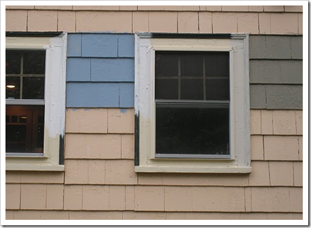
For example, the colour on the house currently being tested is a pale butterscotch colour.
The blue on the left is BM HC-146 and the one on the right is HC-104.
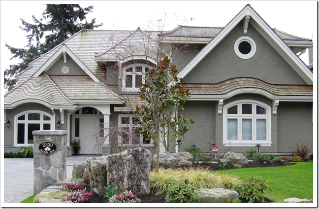
Right now, the colour on the right looks dirty and muddy because not only is the butterscotch a cleaner colour but so is the blue. While both are good options for the exterior of this house, it’s hard to see that the greeny gray on the right is even remotely an option because it just looks ugly. Here it is on an exterior:
 Photo by Maria Killam
A Dirty Answer to a Clean Question
How to pick Exterior Colours without a Designer
New to this Blog? Click here ; Subscribe to my Monthly Newsletter; Become a True Colour Expert


It looks beautiful on that full house shot, Maria! {Nice looking house, too}. I have to get moving on painting my front door. First it was too hot and humid, but you're right, the cold will be here soon enough so I better take advantage of this small window.
Maria,
Great paint session. I agree with temperatures changing and the sunlight is changing days are getting shorter. As far as outside maintenance is concerned it is the best month to clean up exterior painting and landscaping projects.
Bette
I'm looking forward to some cooler weather so I CAN paint my house. Consistent temps in the mid to upper 90s (plus HIGH humidity)with daily downpours is not the best weather for painting. (Would you believe January is the best month for this?)I'll be renewing the "shell coral" color. It's so warm and welcoming…so "Florida"!
Jane (artfully graced)
I am struggling with our exterior colors for our next home right now. Why is it I can pick colors for a client in 5 minutes but for myself I am on day 4?? Since the windows have to ordered first that is where I am starting, burgundy, brown, charcoal…too many options. I know I will either toss a coin or go with what we have on our current home since it just works. Time will tell.
Great post yet again!
Maybe it's my living in dusty deserts, but the "dirty" usually looks better to me for exteriors.
From a practical POV, paints fade and chalk to "dirty", so if you start out that way they look better for longer.
Yes, it's amazing the difference when seen on a larger scale but it's hard to imagine to the untrained eye,(me! lol.) Love it…… and completely off subject: that house is very cool! I love how it curves over the windows: so interesting. 🙂
Maria great advice as always. I love your practical advice that the homeowner can easily understand and apply to their own experience. KATHYSUE
PS I forgot to tell you I just did a post on the color ORANGE and how I discovered I did not like Orange!!!
Hi Maria,
To my eye I would have to say the HC- 104 is the way to go, bar none! The blue seems to have too much chroma for such a large area.
EB
Love the dirty color on teh fully painted home.
Teresa
H Maria,
Great visual to explain the difference. I love your examples of subject matter. I agree with Melissa that I can always pick a color for a client but for my own home it takes forever to make a decision.
I think the house will look super in HC-104!! The exterior photo you showed is gorgeous.
Dirty = ugly. Got it! (In what contexts would we ever want to choose such a thing!?)
Hi Lauren,
Muted, designer colours usually are dirty, it's when they are compared to a cleaner colour that they look ugly, so what I was trying to say (but maybe didn't quite do it) is that it doesn't mean that the dirty colour is wrong, it just means it must be tested where you are not comparing clean vs. dirty because the clean colour will always win if you are just judging it based on cuteness and not for relevance.
Hope this clears things up!
Maria
Muddy colors can be beautiful in the right context. I like your examples. You're a very good teacher, Maria!
The funny thing about comparing these colors on our house is that the "dirty" color looked better to us the more time we spent with it. Although we still weren't sure about the blue color, our initial reaction was to cross the HC-104 off our list. It came back into consideration, both because we moved away from the blues but also because we realized how rich it was on its own. We're still not decided on the final color, but it's going to be in the general vicinity of the HC-104…definitely a good lesson.
Amazing! Thanks so much for showing us this. I would never have guessed that using the wrong background for a comparison would pre-dispose us to make a wrong color choice.
I can confirm that you need to see exterior colors BIG. My friend, Laurie, had a real battle trying to choose the right brick color for their new home and the main problem was it always looked so different on an actual house. Being the smart girl she is, she started driving through the neighborhoods to match her brick. She avoided some costly mistakes!
Clean colours can look too bright on a really big area, like the exterior of a house, become too advancing in their properties, whilst muted colours are more receeding and easier to look at on a large area.
Hey Maria
To take the guesswork out of choosing an exterior color, I found a house nearby that was a color and trim that I thought would work for my house. I asked the owners if they knew the name and brand of the color. They did not so I matched it to a Sherwin Williams color from the company’s fan deck (10 dollars) and viola! The biggest color swatch of all is an entirely finished exterior, with no competing previous color in the background to confuse me! My house looks fabulous and just as I pictured it.
Your blog is my guiltiest pleasure. Thank you!!!
So why does a dirty color look good with the clean white trim on this lovely home? I thought they never went together.
It’s not a bright white, that’s why. Check out the colour on your fan deck. Anyway a bright white would not necessarily look dirty with an earthy, more muted house like this, it would just look wrong.
Maria
I like the greenish gray best because it obscures the black lines between the shakes and therefore looks better.