Today’s guest post is by Tricia Firmaniuk, my eDesign Director.
Tricia and I were talking about a thread on a forum where a designer was very concerned over a paint colour she had just specified for one of her clients when she started searching online and reading what others were saying about the same colour.
Let me be very clear. There is no such thing as the perfect colour. Every colour in the world is ugly in the wrong context. A clean colour will look bad with a more muted or dirty colour, a dirty colour will make a clean colour look bad, if your trim is too dark and your wall colour is too light, your trim will look dirty, but that same trim with a dark colour will be perfect, the list goes on.
So I asked Tricia to put together this post so that we could clear this up perhaps more profoundly than I have in previous posts:
_____________________________________________________________
Paint companies are smart. They know that if a celebrity designer comes out with a list of their favourite shades of white or grey or fill-in-the-blank-here-paint-colours, that people will grasp onto those brochures and lists like a life raft, and then bottom line, gallons of paint will be sold, which is the whole point right?
People constantly poll each other online about their thoughts on this colour or that. They look to their favorite designers, bloggers, Pinterest and Houzz for help with finding that elusive perfect paint colour.
And I wouldn’t be surprised to learn that the feature at the beginning of every House Beautiful issue where they list designers favourite paint colours along with the description is their most popular.
We’ve all seen those seductive articles that create mystique around this paint colour or that, like this below:
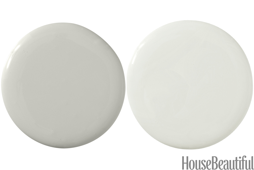
Sensible Hue SW 6198 and Aloof Gray SW 6197
“These grays are just the calmest thing in the world, and the green in them means they go with everything. I like painting a wall in two shades. The darker colour grounds the room, and then the lighter runs right up to the ceiling and makes it feel higher. It creates this serene atmosphere.” Laura Bohn, paint by Sherwin Williams
Whoa! Doesn’t that just make you nod your head and want to head directly to the paint store like some kind of decorating zombie?
I want some serene atmosphere.
And who doesn’t want high ceilings from a colour that “goes with everything”?
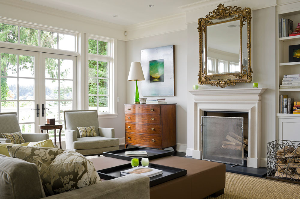
However, Joanna Gaines or Laura Bohn (below) have not been to your house. And the room that you are admiring has a look and a feel. Something you will still need to add to your room once it’s painted.
A lovely room by Laura Bohn
So, eventually, after spending days upon hours online researching paint colours, you take the plunge and paint your room the-colour-somebody-on-the-internet declares absolutely foolproof (and we know there’s no such thing right?).
Now you’re staring at four empty, freshly painted walls, squinting and tilting your head, and turning the lights on and off. You’re trying to discern the relative virtues and flaws of this hue you’ve just committed to.
Do you see a hint of pea soup? A whiff of smog? Weird fleshiness? Is it too dark? Too pasty? Does it fill you with serenity and a sense of well being? Probably not, because how can you be sure it’s right?
What’s missing when you’re looking up paint colours online is the same thing that’s missing when you’re staring at a paint chip or a freshly painted but empty room:
Context.
Context is everything. A paint colour will never be magical without relating well to your furniture, finishes, and décor, no matter what people on Houzz have to say about it.
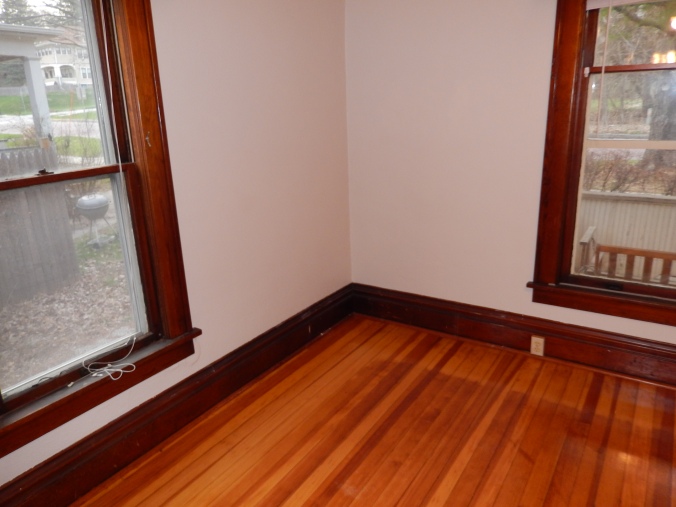
Here is BM Pale Oak, a pale greige with a taupe undertone, which is a very popular neutral right now.
It’s looking a bit pasty and well, pink, with the cherry trim in this empty, freshly painted room (below). There is a significant amount of reflection from the very red wood floor going on here and often wood trim requires a deeper colour depending on what colour it is.
And here is a lovely decorated room painted Pale Oak (below) with the colour repeated in the artwork and decor. (Ok, and pretty painted trim).
However, if you had painted the room above based on this image (below) you would definitely not be happy at this moment.
This is also the same reason why the paint colour that is simply ethereal in your neighbour’s home might be just dreadful in yours.
If you’ve been hanging around this blog for a while, you know that it’s a completely random draw if you don’t ground your paint colour choice in what you need it to relate to and what you need it to do for your room.
Even so, it can still be tempting to look online for inspiration and validation, which, most of the time, just confuses the issue. If you’ve wisely narrowed down your options based on what looks good with your furniture and finishes, don’t go online to research the colour that your eyes tell you is right.
You are likely to find someone who’s had a bad experience with the colour (because it doesn’t relate well to their room) to cast doubt on it for you. And you’re also going to get distracted by other colours that someone out there loves. Now what? You go in circles because the internet is not your room.
BM Nantucket Gray (above) looks drab and dated in this room, but on this shutter, it’s a good example of why you can’t judge a colour based on the chip without context
Recently, based on some online inspiration, a friend of mine decided he would paint his house a fresh pale gray. His wife called me in a panic, she just knew the colour was wrong, but she didn’t know why. She was sure it should be more “beige”. And she was right. Based on their furniture, carpet and tile, the right colour was BM Manchester Tan, a versatile green beige, and with my large boards, it was immediately clear that it was perfect and a marital crisis was averted.
And if green beige is the colour that works, your room will look much better painted green beige than the Sherwin-Williams-colour-of-the-year, or Joanna Gaines’ current go-to gray.
And about cream and beige, the popular neutrals have been hanging out on the cool end of the spectrum for quite a few years now, from taupe to gray to white, and people have become reactive about anything creamy, warm and especially yellow (most beige has quite a bit of yellow along with it’s dominant undertone). I’ve defended beige and cream before, and I’ll say it again, if you have earthy finishes, your room will look much fresher if you work with what’s there instead of trying to drag it blindly into the white and gray trend.
So while in a room with cool white finishes a beige or cream might look dingy and dated, in a room with creamy or earthy tile and furniture, the same colour might look absolutely fresh and beautiful which is why if someone online is dissing cream as dirty, don’t be persuaded, they are not standing in your room, the context is completely different.
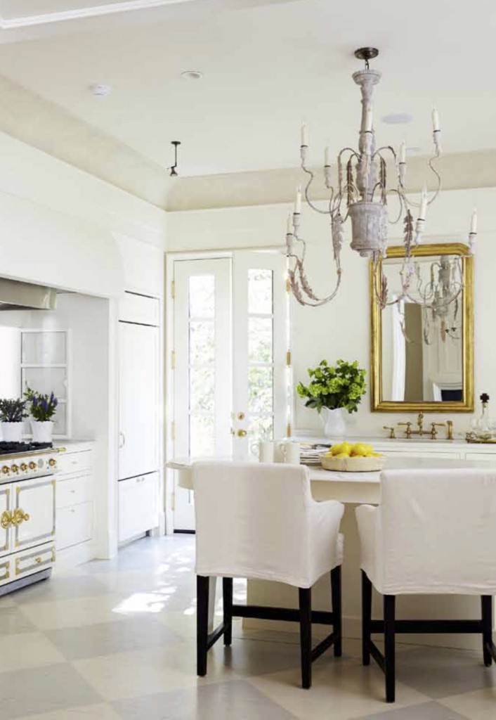
Look at how pretty and fresh BM Spanish White, a deep yellow cream, looks in this gorgeous kitchen with a beautiful cream La Cornue range (below).
Cream colours that border on beige get a bad rap as “apartment beige” (said with a wrinkled nose) because we tend to imagine something like this below.
It has some charm, sure, but it feels a bit stodgy. This room below is painted the same colour, BM Navajo White, a complex cream which, looks completely current.
If this room was painted a whiter white based on current trend pressure, it wouldn’t look as good. It’s perfect with the Spanish style of this house. It’s the styling that tells us it’s current with black and white photography and a textured black rug. Styling and context are what make the colour look right.
Pink beige is too often used in the wrong context as a default “warm neutral”, but that doesn’t mean it can’t be pretty in the right setting.
Here’s BM Natural Linen which does appear to match the pink beige bedding, but both the bedding and the paint look like they were chosen as a “safe” neutral below.
By the way, you may have noticed that the world is now full of gray versions of this bedroom.
Looking at this room (above), you might file Natural Linen in your “never” pile, even if it does match your fabric perfectly. Which would be a shame because Natural Linen can be a perfectly pretty paint colour in a well decorated room (below).
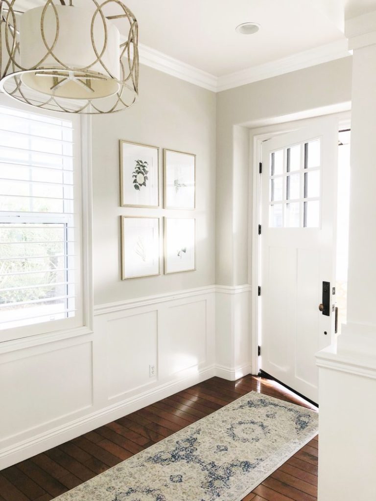
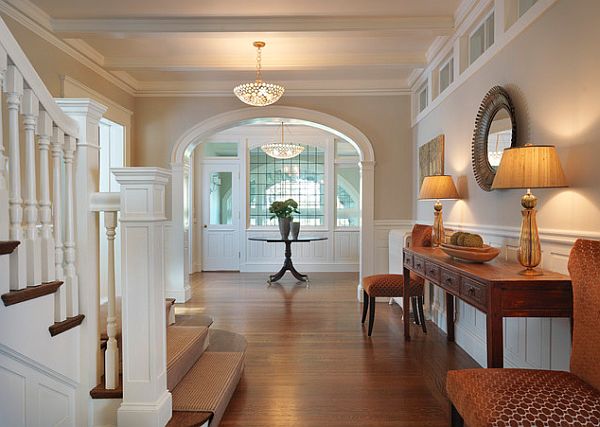
BM Grant Beige is a shade deeper than any green beige we’ve been specifying for interiors lately, but it’s still a perfectly good colour in the right context. Here it is looking less than awesome trying to hang out with pink and purple undertones (below). It’s easy to see how based on this room. someone might pronounce Grant Beige to be “dirty” and “way too green”.
But here it is looking classy and lovely in a pretty foyer (below).
When Maria and I receive feedback on our eDesign colours, whenever someone has been less than thrilled in the past, we ask for photos and the explanation rarely has anything to do with the wrong paint colour being specified, it’s just that the room isn’t finished yet. And for heaven’s sake, take the green tape off the floor before you start to judge.
Paint cannot do all the heavy lifting, it just can’t. And I think I’ve shown you that in this post. And, we have now added a slide that explains that in our eDesign presentations.
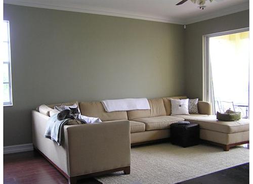
Here’s another perfect example of popular and versatile BM Edgecomb Gray looking a bit drab and uninspired (below). In this case, the chair and ottoman look like they are slipcovered in a natural linen fabric so they are looking slightly pink beige in comparison to the green grey wall colour.
And you might come to this conclusion, “I’ve just painted my room, but it just feels blah”, and go back online looking for paint colour magic, possibly even putting a negative spin on Edgecomb gray for someone else based on your experience. But we know better right? It needs decorating, not a repaint.
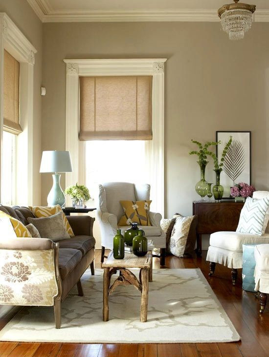
Here is Edgecomb Gray looking perfectly lovely in a well-decorated room (above).
The right paint colour is only one part of your decorating puzzle. It’s an impactful one for sure, covering lots of square footage, but be careful not to overestimate what paint will do for your room.
The right colour depends on the fixed elements, furnishings and decor in your room, and has nothing at all to do with what’s trending on Pinterest, or top designers’ current favourites. It will only come alive when it relates well and you decorate and style your room, so don’t panic if it doesn’t sweep you off your feet the minute it goes up.
Always use large samples and trust what your eyes tell you about what looks good in your room over what any trendy article, hot designer or the hive mind recommends. Step away from your computer and design your room.
If you would like help narrowing down your options, diagnosing your undertones and figuring out what colour to test, check out our convenient and effective eDesign consultations here.
If you would like to own the best colour tool for choosing colour, check out Maria’s curated collections of large paint colour samples here.
Thanks, Tricia for another thoughtful and well-written post!
Related posts:
How Much Heavy Lifting can a Paint Colour Handle?
Are you Waiting for your Paint Colour to Propose?
Why Your Paint Colour is Kinda Boring







What a lovely post. And the photos told the story!
I might just add that there’s the paint color and the furnishings and art and other elements – and one more part of the mix that can change everything. That’s light, both artificial and natural. Luckily artificial light can be changed: more light, whiter (higher Kelvin), warmer (lower Kelvin), better quality bulbs (higher CRI). But color in a north facing house with big windows isn’t going to look the same as a south facing house with those same windows. And a house in Maine isn’t going to have the same light as in Florida. Since color is light, the effect of light matters.
Of course with big color boards and context you get there. It’s just always interesting to me that it’s the last thing that past clients of mine ever think of. And when brought up, it’s like “light?” And when it’s explained a lightbulb goes off, haha.
Bravo Beth!
Yes, well stated. I had a male client get new LED bulbs that were bluish in a warm yellow kitchen and he came to me freaking out after all the money he’d invested, but with a change in the light bulbs, the floor, cabinets, bathrooms, laundry and the rest of his choices went back to beautiful in his beach house we had designed for him. He’d wanted to be energy efficient, but better chosen bulbs made all the difference.
Fantastic post! Thank you so much for your insight!
Fan.tas.tic article! Courage but evidence, hopefully more will listen, hire a colour consultant, and do the right job the first time. And most of all, be happy!
Btw, I have Grant beige in two areas in my home, one I love, and one is being changed before Christmas. Keep trying!
Absolutely brilliant article. Context IS everything.
I am reminded of Karl Lagerfeld’s quote, “Trendy is the last stage before Tacky.”
This does not mean that one should never follow trends. But is does mean that following color trends in order to cover up one’s lack of color knowledge is a bad idea.
Better to call you or one of your competent color experts and get it right – in context.
And no, Maria did not pay me to write this. LOL
Wonderful explanation of why paint colors work – or not! Paint colors need to be chosen within the proper ‘context’! Exactly! Thank you!!
Agreed… on all fronts. But can we just see your bathroom remodels already?! You’re killing us with suspense. Lol
Hi Renee, I’m waiting for wall sconces that are back-ordered! It’s killing me to look at holes in the wall every day, haha. Maria
Great explanation of what makes a color work! Yes context is everything. Sometimes it is so difficult to make a perspective client understand this because he/she has watched a zillion episodes of HGTV or has scanned Pintrest as you mentioned for the most popular colors. Now it seems like everyone wants gray not realizing that gray may look horrible in their situation. Love this article! You drive it right home!
Yes they make it look easy on TV with maybe a manufactured crisis to keep the tension of the TV show but actual problems do come up when you open the walls.
In my own home, I chose from big color samples and tested the way I learned from Maria, but when the ceiling reflected the red tile roof in a weird spot that I would see every time I came in, I found another color that worked and wouldn’t drive me nuts with that one patch that looked out of context. It cost me a little extra to repaint but on the high ceiling, it looked like a baby pink color which made no sense in that spot.
Great title — I’m binge watching Fixer Upper for the first time right now while working on a renovation so it made me laugh. I have very warm, creamy coloring myself (reddish hair, pale golden skin) and am drawn to colors I look good, therefore feel good, in. So while I love the current white and airy spaces in decorating, I’ve translated the whole gray trend into my own warmer toned palette.
Our new space is going to have off-white SW Snowbound on the walls, cabinets, AND trim (thanks for your old blog post for that idea), with a couple rooms getting SW White Duck, a rather creamy greige. Mid brown wood floors that aren’t red or orange, green-beige tile for the kitchen in a modern shape (I swear the only such green beige tile in our price range, it is hard to find that color right now). Maria, her blog, and her e-books have had a strong hand shaping this plan!
Too many people do not take their own coloring into account when choosing colors. Look at Maria, and the colors she loves and decorates with make perfect sense. When a designer talks about apricot colored walls being flattering to “everyone,” I wonder if she has ever run across the huge percentage of people with sallow skin. Apricot walls would make me look yellow.
Such good examples of why any paint color is not a one-size-fits-all answer to specific rooms!!
What a well written and insightful post, Tricia! The photos added great support to your words. I was thrilled to see the photo of Kim’s kitchen illustrating BM’s Spanish White, such inspiration!
I often think while watching fixer upper that the light in Texas is very different than where I live or where other people may live and while the colors she has chosen may look good in Texas light, they might be a little dingy and dusty for the light where I live. The paint colors she chooses might look good with other aspects of the Texas environment as well, the stone, the ground, the vegetation seen out the windows, etc.
Tricia, you captured Maria’s color system visually and succinctly. Context is everything.
Such an excellent post. I’m amazed at the difference decorating makes to a space and just astounded at how different the same paint colour can look in different contexts. Brilliant advice, thanks.
I like to think I’m pretty good with color, but I can’t see how natural linen is a pink beige.
Hi Heidi, if you compare it to a green beige like Grant Beige, you should be able to see the pink 🙂
Ditto to all comments above! Kudos
I just wanted to say thank you for this wonderful column. I just painted the tiny bathroom in my studio apartment. I have read your posts for a few years now and I used your advice and worked with what I had. Avocado faux marble countertops and harvest gold printed tiles in the tub surround. Awful right? But working with them, and taking your advice, I love the results.
Bonita–
What an accomplishment–making AVOCADO and HARVEST GOLD fresh and new! I think you just gave a whole lotta people a whole lotta hope! Thanks much–and congratulations on a refreshed bathroom that you like.
Love how you put colors into context in this post. Very educational! Great visual examples of the styling aspect that can make or break a color. Many thanks for this helpful research.
Thank you. Great as always.
Fantastic post Tricia! Your great photos really help to tell the story. It drives me crazy when people talk about “good” and “bad” colours. As you say…it’s all about CONTEXT!!
Thank you for a very informative post. I loved this.
When I see a well-decorated room, I don’t even notice the paint color. It just belends into the background. So I guess that proves that the paint color doesn’t do the heavy lifting.
BRILLIANT, and so well written! Thank you!
Best post ever on this site, brilliant!
Love the guest post and that title made me laugh! It’s the kind of catchy, funny title Maria would write!
Tricia, you are an amazing writer. You explained this issue so perfectly clear.
I cannot tell you the number of times I have heard, “I want X color because my (fill-in-the-blank) has it in her house.” Or because “I saw it on Houzz.” Or “I saw it in House Beautiful.” This post articulates perfectly what the rest of us have been telling our clients for years. THANK YOU!
A very informative post and as in the midst of upgrading eighteen spaces in my home can validate what Tricia has stated. One has to look at the entire picture and consider context! That said and briefly; as a self confessed wallpaper junkie I am opting for neutrals and whites as a backdrop this time around and am discovering they can be far more complex and a challenge to work with than any colour palette that I have used in the past. To assist; I purchased Maria’s Core Collection of Neutrals & Whites which are proving to be an extremely valuable tool in the choices that I am making and can vouch that the sample boards are well worth the money spent. Also, please note that I am definitely not on Maria’s payroll and only wish to share my current experience. Thanks Maria for saving my sanity …. °Û°. (Six spaces down and counting.) -Brenda-
Yep! That’s the best reply to this post! (But tell that to all your friends who suddenly found grays–just now yes!–and can’t be talked out of it.) By the way, I’m so glad you mentioned House Beautiful. I love the magazine but have learned not to be fooled by that part of it. It isn’t even their fault, but once you fall for the color and the description, the actual color NEVER looks like the magazine pictures. Grrr….:)
CONTEXT.
exactly!
Really great post???? Thanks so much!
Maria and Tricia,
This article/post was so well written and perfectly describes issues people have with the “popular color” of the day options. Once again, I am in awe of your ability to inform and educate!! Thank you for the visual examples that so many of us need.
Thank you, thank you, thank you! I will be sharing this post over and over!
L.O.V.E. this post! I can really relate to the grey/beige debate. We have lived in our home 38 years (we built it) and I have gone through both trends several times. The house started out warm with jewel tones and saturated colors – my personal preference and also what was being promoted at the time After a number of years, I needed to redecorate and the design trend was grey/white/pale colors. I made a huge mistake in trying to go with this trend instead of what I really liked and what coordinated with my permanent fixtures. It took me years to get correct those mistakes and I at times I struggle to even find fabrics, accessories, etc. the past few years which did not include ethereal grey. I did incorporate a deep, warm, charcoal grey on my fireplace and tied it into the attached kitchen design with a range hood and built in seating in the eating nook in the same Ben. Moore Satin Impervo. grey. That way, I am acknowledging the trend with easy-to-change paint….NOT flooring and furniture!
This was a great post, and have bookmarked it ….Both my DH and I don’t like grey, don’t look good in grey, and the color grey depresses me. I avoid grey (and stainless) like it’s radioactive and will until I have no other choice. I’ve stuck to my convictions about the colors in my home and as a result, have a home that is comfy, warm, inviting and “us”. Oh, and pretty up to date, except NO GREY anything.
Great article. What color would you choose as a better alternative to Pale Oak in the second photo? The cherry trim and floor in the photo definitely makes it look pink.
Hi Allison, Ideally you would have something more to go on other than just the wood trim. There are lots of options with wood trim, so some furnishings or decor would be where I would start. I think the pink in this image is quite a bit of reflection from the floor.
YES! Context matters! So true. BTW, the first photo for Edgecomb that apparently has a chair and ottoman will not show up for me. I’ve refreshed, I’ve exited and come back in. All the other photos are there..
Alleluia, and Amen! Someone besides me understands that there is only your perfect color, not a perfect color. Very well written… I will just show this to my clients instead of spending half the consultation explaining why the paint color the neighbor has on her wall that is so beautiful won’t be the same in your home.
This is one of the best blog posts in the history of blog posts!!
Very on point! Thank you Tricia!
Thank you for posting these photos and commentary! This post clearly shows that every room and every project is unique. A brilliant post with great visuals and spot on but brief explainations. Will be bookmarking this for sure!
Does this apply to new home builds as well? What if you are starting from scratch and need to make decisions quick?!
I’ve been in an apartment for several years thinking, “When I do get a house, I don’t want to paint it gray!” Now we’re about to get that house (this week!). Edgecomb Gray was on my short list, but I like the look of linen furniture and would like to have more of it. What kind of color would you have suggested in that first Edgecomb Gray photo with the linen chair? Thanks!
Hi Charlotte, You can have Edgecomb grey (green grey) paint with pink beige (natural) linen, the example room is simply not finished which is why we notice the undertones and how they don’t match.
If you did have a room filled with natural linen slipcovers and you wanted to coordinate the wall colour, you could try SW Patience. Hope that helps, Maria
It does, thanks so much!
I think most people are intimidated by choosing colors so they just want someone to tell them what will work. But as you say, it all depends on context and you have to work with what you have. The examples you provided really prove this point! Also, I’m a beige girl so thanks for defending it!
I just attended the course in Vancouver and this post reinforces what I learned especially as it relates to my own color dilemmas. As it turns out my wall color, Natural Linen is not necessarily the problem and I understand now why it looks good in some of my rooms and not so much in others and that my furnishings and styling are part of the reason. I still may change the paint color in some rooms but I might also change my flooring. Anyway, I’m feeling more confident about making those decisions now.
I LOVE this post. I tried dipping my toe in the greige world with a warm greige for my bathroom. It worked. Then I took the color strip (not sure of the precise name) and bought the lighter color for my kitchen. It was wrong, wrong, wrong. I had a sinking feeling as I was painting, but hoped that the cool undertones were merely because of green frog tape. As soon as I removed the tape, I knew for sure it was the wrong choice for my warm-undertoned counters (similar to New Venetian Gold granite) and cabinets (creamy white with Toasted Almond glaze). So, I repainted a couple days later. The lesson for me is that following the color strips can be misleading. I knew Maria recommended a large color sample size, but I thought I could “trust” the color strip. Lesson learned.
Great post!
Great post. After reading your blog and e-books, when I look for paint suggestions now it’s only where they specify something about it Like for example, whether a certain white reads slightly gray or slightly yellow. That helps me narrow down selections to try.
This wonderfully written post soooo describes my path of growth in my 20’s!
As my house gets more fixed up, i’m doing more things true to me, no pink, beige & hardly any grey. i fell in love with a dutch boy color called “vanilla sparkle” in 2006 and after years of following design recommendations, i have “vanilla sparkle” all over now. It just works with my decor taste/habits & the name just sounds happy.
Life is short, i’m sticking to what i like so it feels good coming home & yes, great point that the decor makes the room, not the paint. A poorly chosen or placed item can just up-end the balance.
Brilliant post! I have tried to explain the importance of proper paint color choices for years to people and get a headache every time they ignore my advice and choose something that is the “in color” or a color made popular by an HGTV designer that turns out to look hideous in their home, especially with the decor they own. You are an expert indeed!
I just read this post again. It is spot ON!! Thank you for the refresher, Tricia.
Your blog posts have been extremely helpful in choosing paint for our open floor plan home. I was wanting to brighten up the house and bring in a more current color palette. I translated that to using the current gray and greige colors. Everyone including my painter further encouraged me down this path. After sampling a half dozen beautiful colors it became apparent that I wasn’t going to be able to choose one because they were wrong wrong wrong. In desperation I took to the internet and found your blog that explained why I was having trouble. It had everything to do with undertones and wrong colors for my earthy floors and furniture (which I happen to love, btw). I choose a nice beige with the right undertones and it feels so right and comfortable. I feel like doing a happy dance! Thanks for the advice!
How wonderful, thanks so much for posting this comment! x Maria
I have the fabric in your “stodgy” photo. I guess zi should go with BM Navaho White 😉
What a great article, Tricia! And very well said. Context is EVERYTHING when it comes to paint colors.
I’ve been struggling with paint color in my house. I’ve recently painted my bedroom in SW Natural Linen. I first painted my window sills with the color and it looked great. After my white blinds were installed, I finished painting the entire bedroom. The color looks pink. My bedroom window is facing Northwest. My carpet is beige. Is there anything I can do to neutralize the pink aside from repainting the room?
Yes that’s because SW natural linen is a taupe which will appear pink if you have other neutrals in there that pull it out. This post will help explain what is happening: https://mariakillam.com/paint-colour-changes-light/
You’ll need to find some bedding in taupe or something to repeat your wall colour so that it looks right. Hope that helps, Maria
Thank you for your article. May you tell me what you think of Natural Linen w light gold, peach and sage? Cherry wood floor and furniture? Is it too grey! Currently the walls are sage/khaki color and fabrics are gold and peachy/salmon. Looking to neutralize/update the whole house. I hv Mexicana in dining room yikes!
PS the Natural Linen Im interested is Benjamin Moore not Sherwin Williams