


Recently, I received this email from one of my on-line clients:
Thank you for your consultation about half a year ago.
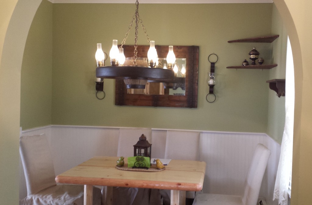
We finally had a chance to re-paint the dining room.
This color looked fabulous in the hallway, however there is something wrong how it feels with this color in the dining room.
Something just doesn’t feel right and I can’t understand exactly what. Is there anything you could recommend to fix it?
Maybe re-paint the paneling into cream or yellow?
Hi Irina,
I think it looks great so I’m not sure what you’re seeing (and I’m NOT saying that because I picked it). When the colour doesn’t relate to anything in the room, that’s when people criticize it the most. In other words, everything in there is white and there is no pattern with green (for example) that you can see relates to the walls, if you like the way it looks in the hallway that most likely doesn’t get much natural light maybe that means you should go darker in the dining room because you have natural light in there.
Let me know what you think. Maria
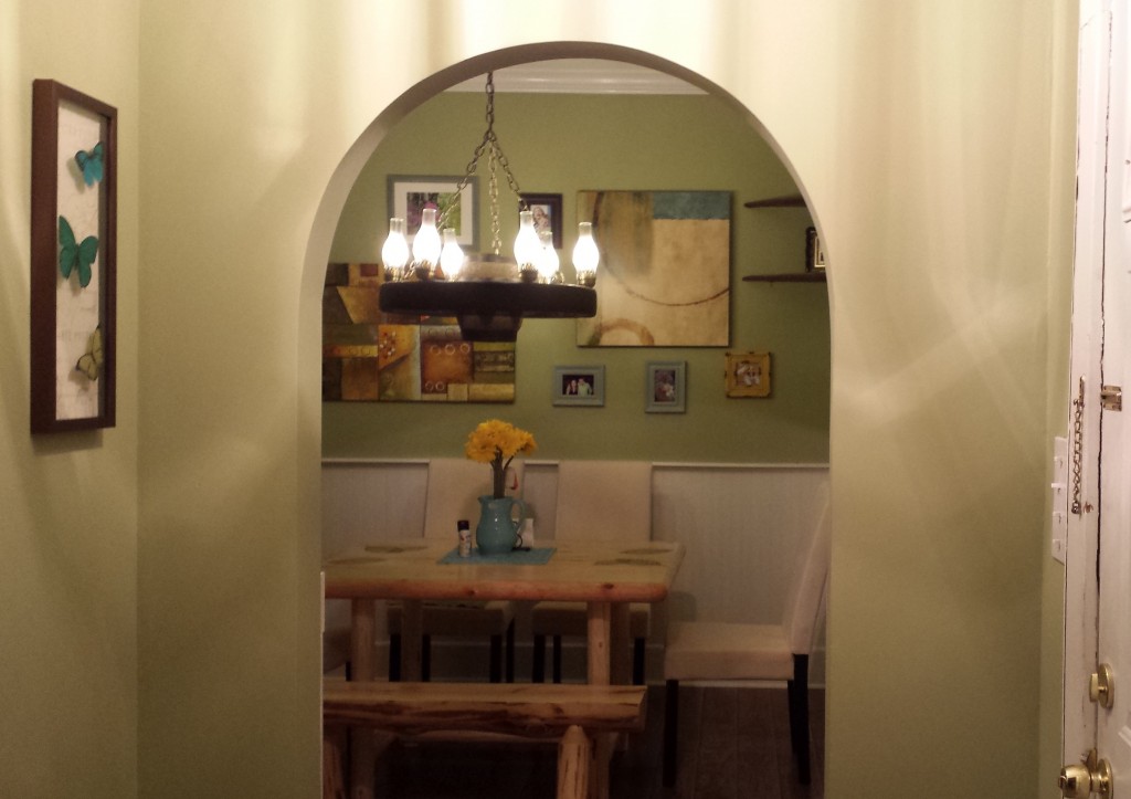
A few days later I received another email after she found some artwork in another room:
Maria,
Just wanted to share how it came out.
I think it looks nice now 🙂
Beautiful job Irina! Such a difference between the before without any colour and the after!
Is it important for you to know which green she used?
No.
Why?
Because unless it relates to something, it won’t look good in your space either.
Do you have a boring room in your house?
Related posts:
Are your Colours Married?
Are you Waiting for your Paint Colour to Propose?
The Best Colour for an Undecorated Room
If you would like your home to fill you with happiness every time you walk up to the front door, become a client. On-line or In-person.
Download my eBook, How to Choose Paint Colours – It’s All in the Undertones to get my complete step-by-step system on how to get colour to do what you want.
To make sure the undertones in your home are right, get some large samples!
If you would like to learn how to choose colour with confidence, become a True Colour Expert.

I think a cream in the hallway would have looked stunning. It’s a great green – just seems to be a lot of it. Cute house!
It looks very serene, and the artwork is displayed nicely. I am wondering how the color was specified when there were no other relating items in the room. Just curious why it was the choice.
Because she liked green. If all I did was specify beige or grey because my clients didn’t have any colour (which many don’t) to begin with, it would be a very boring world indeed. And, obviously in a perfect world, all fabrics, accessories, should be chosen first, paint last. Much easier to find a $50 gallon paint colour to go with a $3000 sofa then the other way around. Maria
Hi Maria, Hope you’re having fun in NC—you’re only down the road from me—well 5 hours down the road!
These last 2 blogs were an eye opener to me about repeating the wall color in the room–even if it’s white–which I repainted my LR in. NOW I know which (color) direction to go when I’m ready to purchase my couch—ivory-ish white, since the walls are Linen White. Have fun @ the roundtable!
xo,Paula.
PS: That little dining room of hers would be PERFECT for banquette seating in cream or a green/cream pattern…..
You WILL have FUN, too! Teach, Learn, Laugh! franki
Welcome to NC! Be sure to check the weather forecast because it’s been an unusually cool and wet summer for us….which might be normal for you! You should arrive to 90* but later in the week we will barely get into the 80’s a couple of days.
BTW in the above dining room, it seems to me that her change in accessories made the real difference in the look of the room. In my eyes they made it come alive, she did a great job on the wall hangings!
Hope you enjoy your time here!
That’s exactly the point of this post. Hmmmm. . . was that not clear? Maria
I think the point of confusion was if she also painted it a little darker
I agree with Paula twice. The posts on repeating and relating colors in a room and throughout your house, particularly if it’s an open floor plan have been very, very instructive. That’s why I’m doing a little angst-ing and a lot of analyzing before I do any deciding.
I think your original suggestion for adding something with a green pattern and Paula’s idea for a banquette in a green & white print would look great in Irina’s dining room; even dining room chair covers would work and be easy to change out later. In that case, the artwork would have to change but she’s already been creative with that.
Have fun at the conference!
Im wondering if the lighting from the CFL bulbs in the chandelier is throwing it all off? They are CFLs right? Otherwise..I never said anything.
Sometimes a new colour on the walls can be enough to make you happy and sometimes it’s not.
The point of THIS post was simply to notice that when the room was accessorized it looked so much happier than without.
Also pictures taken at night are never as good as during the day. So the lighting is not an issue here.
We can all continue to decorate and critique any room until the end of time, however time and budgets need to be taken into consideration.
Maria
ESPECIALLY BUDGETS!!!
Your suggestion to possibly paint the room darker was what I did with my guest bathroom.
My house is a open floor plan. But the guest bath had no windows. So I painted it 1 shade darker than the rest of the house. It looks perfect.
And nobody has asked if it’s a different color. It just looks a bit richer. The lighter color may have looked dingy.
I can’t wait to see you in NC! My fashion show was yesterday as my daughter struggled to feign interest…but now that I see your photo my outfits are not nearly fun or colorful enough! Hmmm….shopping?
This is a perfect example of where the accessories can really “make” the room and pull together colors one might not have thought worked together before. Pretty room; pretty paint colors!
Maybe its not important, but I still wonder what was the green she used???
You look good in anything you put on…don’t fret.
xo
I am driving through NC today, it’s. 94 degrees with showers off and on. I am headed for a week in the Hilton Head/Savannah/Beaufort area. Maria, I definitely will be contacting you for a color consult in the fall. I have my color boards and they really help, but I want to get your professional opinion. Enjoy your trip! Deb
I love green and this color is in my kitchen with coral/orange accents. To me the big dark chandelier is the first thing I see. I would love to see a clear glass pendant type light, then cover the chairs in a related fabric. I love the nook.
I would paint the yellow-toned pine table. It doesn’t related well to the color aroubd it, imo.
I was thinking it was all the dark wood only above the wainscotting that was making it look imbalanced. If there was a dark wood table that would have solved it too. it definitly looked better with the other colorful art and the dark framed mirror deleted.
Just painted a bathroom. I wanted to compliment the colors in a picture that In like. I thought teal would do it from the color chips I brought home….it is terrible, went back to the paint store and bought a lighter chip in the same color family…..hate it also. Now I am giving up the the picture and going with a light gray. I have no eye for detecting the undertones in a paint chip or a sample. Have lost sleep over this and I am a bit cranky! My painter is coming back to paint it gray. The woodwork is oak the flooring is white ceramic tile though not a solid white. Counter top is white and and white stool, tub and shower.