Choosing a new exterior paint colour
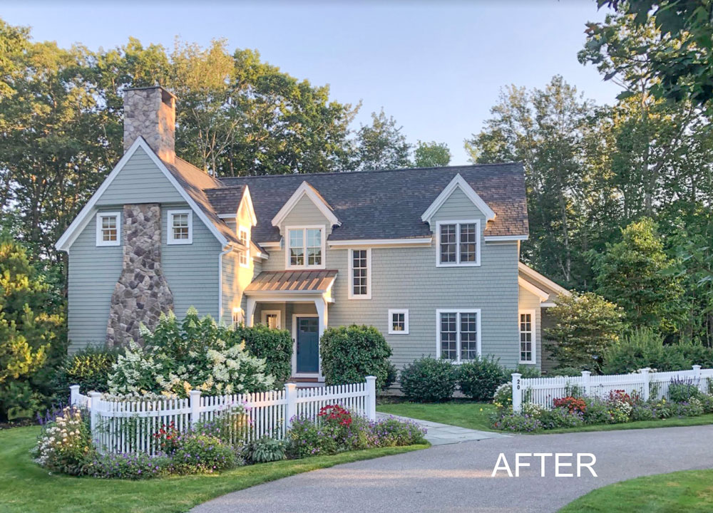
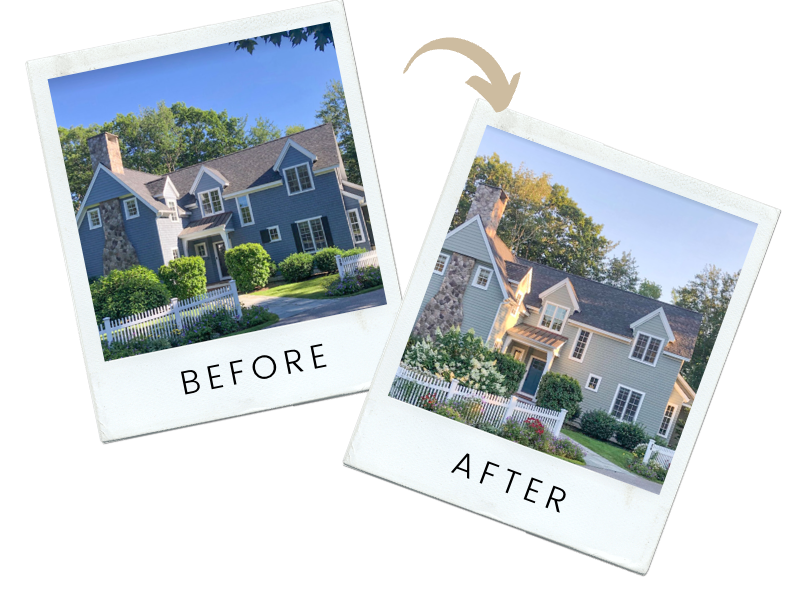
Last week we received the most beautiful before and after eDesign project photos taken with such gorgeous landscaping. I love the curved white fence, so pretty!
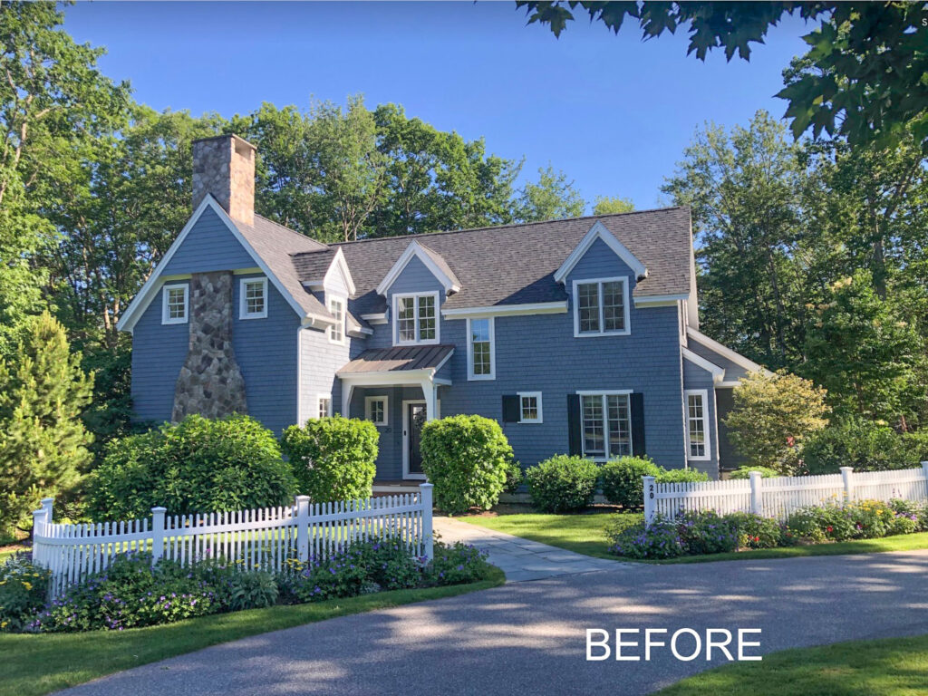
This is a very happy eDesign client who hired us to choose a new paint colour for her house.
She wanted a change because her house was looking very similar to all the neighbour’s.
Notice how lovely her landscaping is. Don’t just stop at choosing a paint colour for your exterior. Landscaping is like styling for the outside of your home. Click here for my most pinned exterior posts.
Painting the house green
In order to give her a neutral paint colour option, we needed to look at the overall read of the stone first.
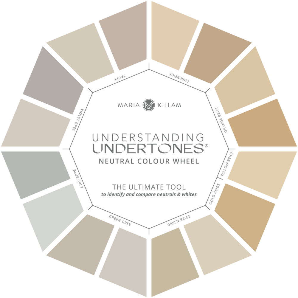
The stone chimney seems to have equal parts of taupe and green grey so we gave her a rich green grey that has a touch of violet in it to connect to both the taupe and green grey in the chimney stone
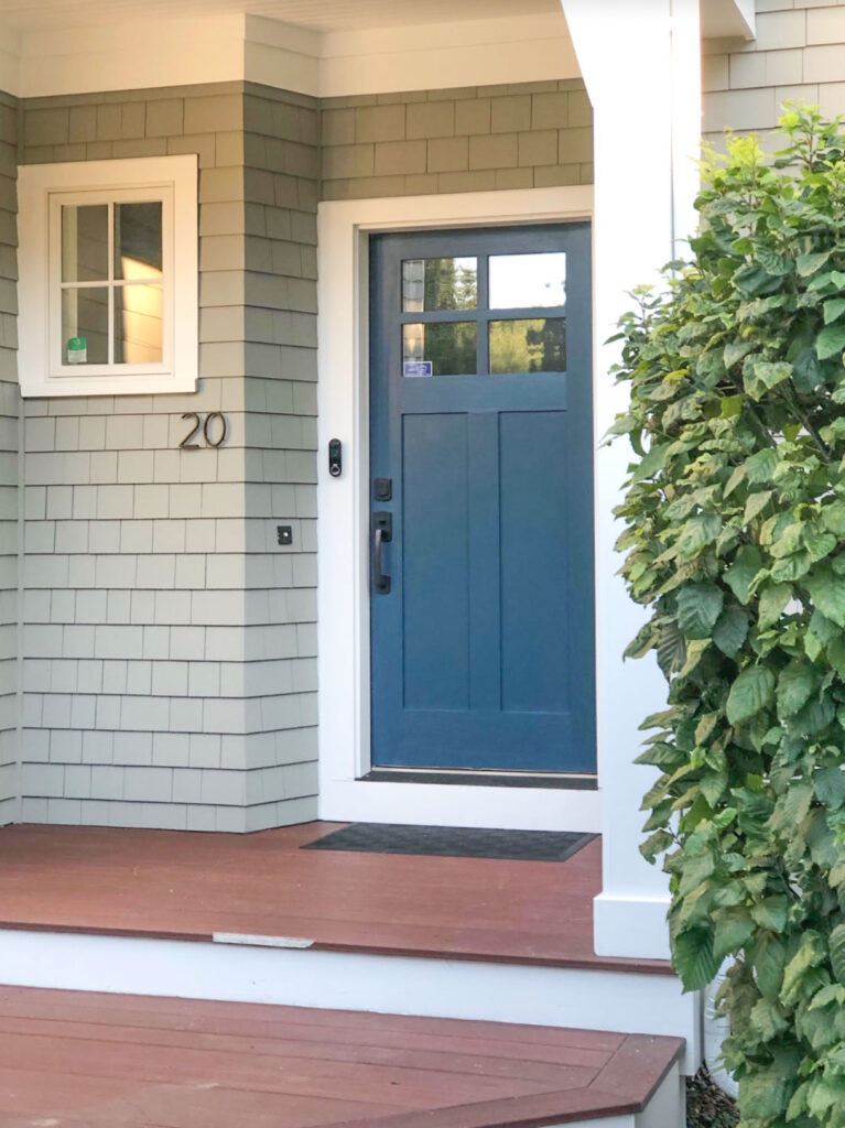
However, her neighbour across the street has a similar neutral painted house so she opted for the lovely green option instead with a navy blue front door!
Here’s how to find the undertone of your stone – this is something you’ll want to know BEFORE other exterior decisions are made. We can help!
Notice anything else different about this exterior?
Did you notice the shutters were removed in the after photo?
We also recommended that she remove her shutters because they didn’t quite fit the windows anyway. Doesn’t it look so much better?
Should you remove the shutters on your house? It’s a tiny detail that can make a huge difference in the overall appearance of your home. My Exterior Masterclass will walk you through what to do, you can buy it here.
If you want your home to fill you with JOY and impress your neighbors, see our eDesign packages here.
Create Your Dream Home
And, if you’d like to know:
- How to choose the best paint colour
- Whether you’re choosing dated finishes
- Where you can add creativity in your home
- How not to sabotage your expensive new build or renovation project
Then, the Create Your Dream Home two-day workshop is for YOU! Connect with other homeowners for a fun-filled training that will leave you with a clear vision, a better plan and more confidence to make the best decisions for your dream home! Bring your spouse/partner for free! Sign up here.
Related posts:
What would Maria do with This Exterior
How eDesign saved this Exterior from Black Windows: Before & After
eDesign Exteriors: Finding the Perfect Colour, Before & After










So glad she didn’t opt for white -seems everyone is painting their home white. What color is this?
Hard to tell from the picture but possible Revere Pewter?
What a wedding.
Yes it would be such a lovely yard for a wedding!
Yes annoying Maria doesn’t share the colors!
It’s so pretty! And now the landscaping pops too! It creates a soothing and restful arrival instead of austere and heavy. I feel the burden of the day lifting with the new color instead of being bogged down. Footsteps and breath would arrive a little lighter.
I prefer the original color, but understand wanting a change. The new color is attractive and allows the architectural features to really stand out. But, IMO, the #1 improvement is getting rid of the pointless shutters!
Both colors look good but the green really popped to me. I think the blue house could needed a brighter front door. I’m seeing a pinkish salmon color.
I love it! One month ago we painted our rancher this same green grey BM colour with white trim and we absolutely love ours too! Our roof is a warm brown grey and the driveway and walkway is grey stone concrete, so the colour was perfect for us. Glad to see it with the blue front door as I am still undecided about my front door colour. Our house came with a very deep pink front door to match the deep pink Hybiscus planted beside the entrance, and surprisingly it look’s quite nice with this colour while I decide. A black door is also nice.
Oh, that deep pink door sounds lovely on your home!
What BM color did you use?
Thank you to the homeowner for sharing this before and after. I love the final result! The home is charming, fresh, and the landscaping is gorgeous! Kudos to your team, Maria, for the inspiration and to the client for the execution 🙂
I loved the blue but the green is great, too! I’d just fill in that slightly empty area left behind by the missing shutters with a little taller landscaping. This is so pretty.
I love that the stone was your guide. I have been looking at a house with a similar stone chimney and entrance – and the exterior color is just bland. It is so neutral that nothing seems interesting. I love this color green – it feels rich and classic.
So main color – Quietude/Sea Spray/Niebla Azul? Door color – Azure Tide/Endless Sea?
Are these correct? How are we supposed to learn from this without specifics?