
For a few years now, Terreeia has been talking about renting a place in Palm Springs for the month of January. We live out in the country to be close to my family. Approximately one hour East of downtown Vancouver. We’re also here because we could buy a house. That’s very hard to do with the housing market in the city.
Because we live so close to my Sisters and my Mom, being in the country in the winter is not as hard on me as it is on Terreeia, she always says there is no reason to be here from January to March!
Anyway, when we tried to get here last January, we looked at Air B&B’s and other similar sites and found nothing but houses basically decorated with black leather furniture for $10,000 a month. I was depressed looking at them so we gave up on the idea.
Then last Spring, Terreeia had some friends that were down here so and they gave us the name of an agent. And that’s how we found this place.
We arrived on Christmas day and are here until the end of January. My Mom is with us. Here’s the tour along with the colour lesson:
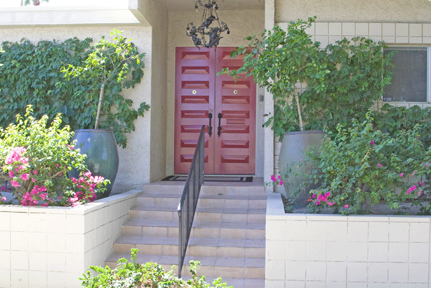
Here’s the entrance.
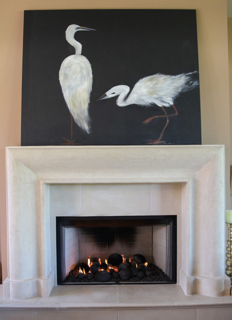
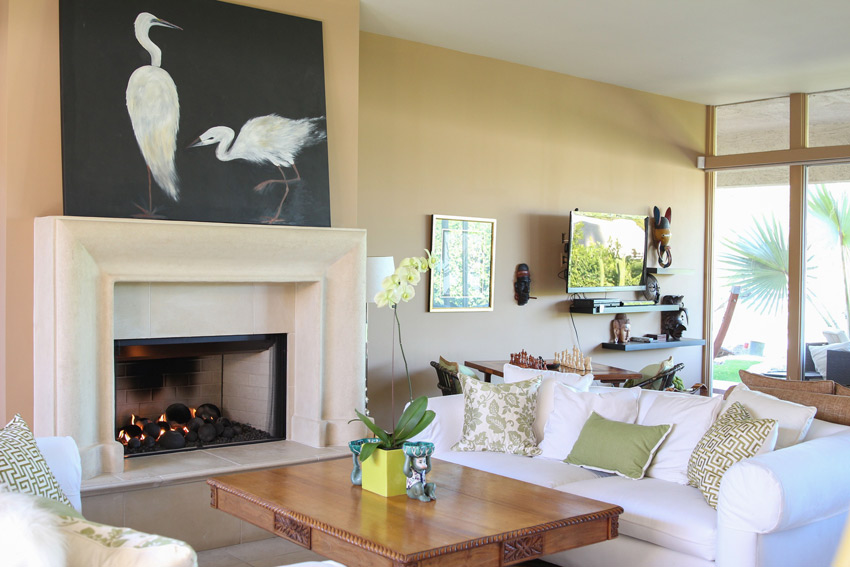
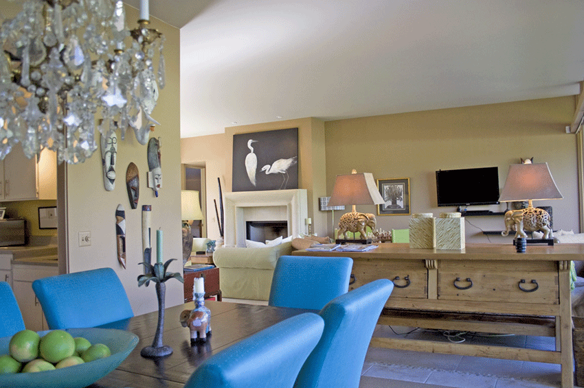
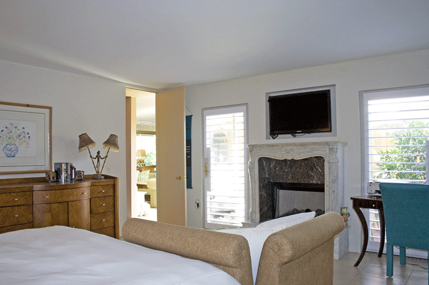
Here’s the living room with the adjoining sitting area for watching television. I loved the simple, classic fireplace surround. And the bird art, which makes this entire room. There is no signature so I’m wondering if the owner is an artist, we found a drawer full of paint and sketchbooks.
My sister Elizabeth and my two sweet nephews William (left) and Markus (right) arrived on New Years Day for a week and during that time Terreeia taught them how to play chess! They loved it and were into strategy right away! They also loved the pool (of course) they keep it really warm so that was fun since the days are short and the desert cools down quite a bit at night. I wish I had brought my Uggs and a puffer jacket. In fact I bought one immediately after I arrived.
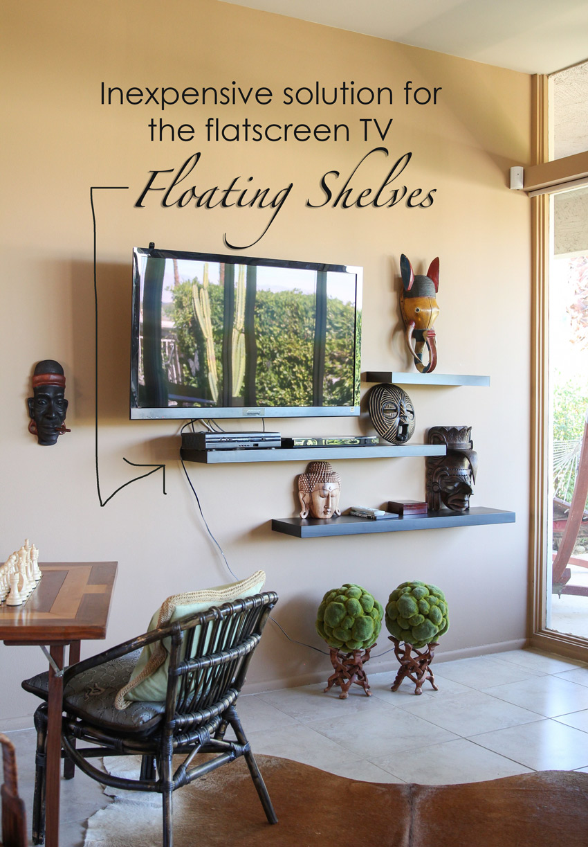
When I saw the way the television was displayed, I couldn’t wait to show you!
Such a creative and inexpensive way to have a flat screen floating on the wall and also take care of the components. Floating shelves installed close to the TV, give it the appearance of being wireless. Then you could run the plug along one of the shelves and hide it with the art similar to what the owner did here.
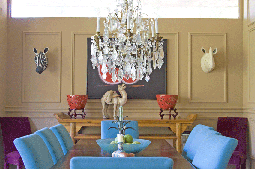
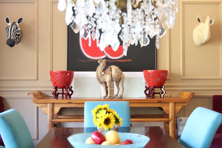
This is the dining room. What I want you to notice is how GOLD or actually PINK BEIGE the walls are.
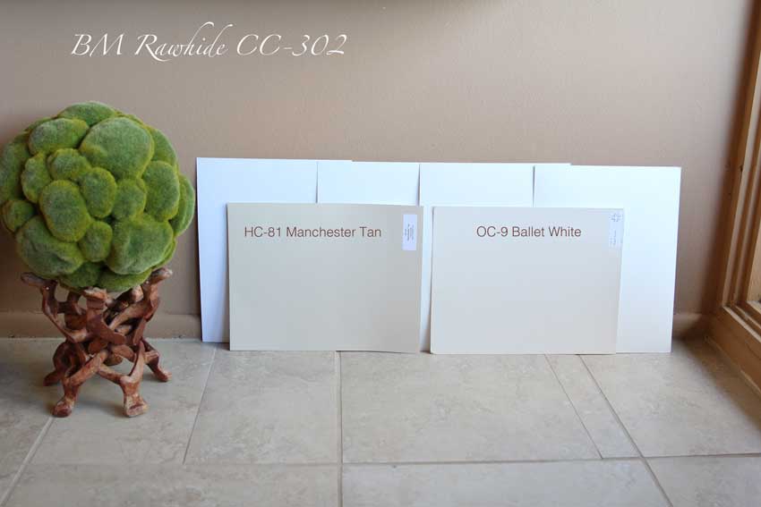
The wall colour in the main living and dining room is BM CC-302 Rawhide. It definitely has a strong pink undertone. But when you take a mid-tone gold beige and compare it to a mid-tone pink beige, they are soooo close that they don’t actually look terrible together.
If you’re new to my blog, I talk a lot about how yellow beige and pink beige don’t work together.
In the Tuscan trend there was lots of gold and pink beige combined in interiors everywhere. I was happy to see the colours in this house because they were a perfect example of the combination of both.
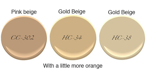
If you compare HC-34 Wilmington Tan and HC-38 Decatur Buff you’ll see that HC-34 is a little more orange than HC-38. CC-302 is even darker than both these gold beige colours but if you compare the gold beige colours in my system to the coordinating pink beige tones, they are very close.
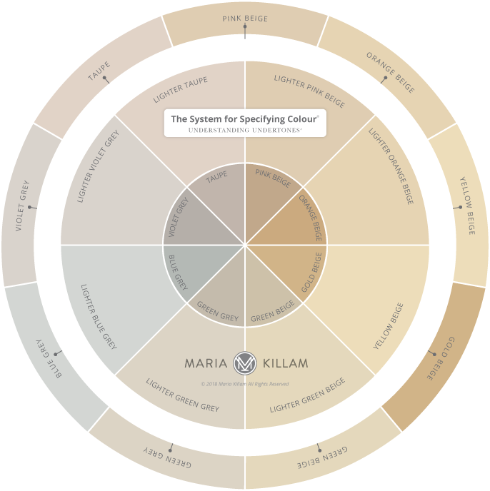
And if you look at my neutral colour wheel (below), you’ll see that gold beige (which is all by itself on the darker row) and pink beige visually are not that far apart.
Understanding Undertones – The System for Specifying Colour
We had our first retreat with our team here this past week and Tricia (my Director of eDesign) and I were talking about how the reason the combination of pink and gold beige works here, is because the decorating is so layered. Also, both those shades are also very close to colours of wood, and cognac leather which is also a neutral.
All these colours are also found in animal print fabrics and rugs which also look really neutral in a lot of interiors.
In this post, I showed you the best way to freshen up earth tones and she’s done that in this house with the white sofas.
Kelly, Maria & Tricia
Here we were out for dinner on Tuesday night. Hey the background is gold beige too!
Terrence Murtagh, our Chief Tech Officer, drove down from Arizona and here he was giving us an overview of Google suites and SEO. There is so much more I should have been doing over the years with my website, it makes me cringe when I think about it.
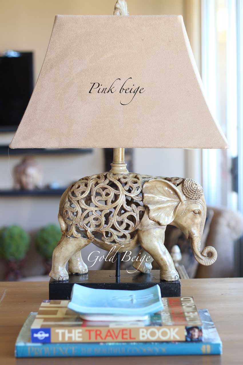
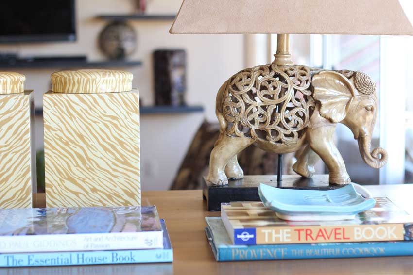
See the pink beige lampshade on the elephant lamps? If you look at the photo above you can see half of another lampshade in the living room (on the left) it’s yellow beige.
This is a perfect example of why I think all lampshades should be off-white. The combination is not amazing.
You can see that the urns below are cream and gold beige, the elephant is even more greeny gold and the lampshade is pink beige. But there’s so much to look at, the interesting masks in both rooms, the cowhide in varying shades of pink beige and gold, it just works.
Okay, so lets choose a new colour shall we? Here are the three steps to choosing a fresh colour:
Use LARGE painted samples and move them around.
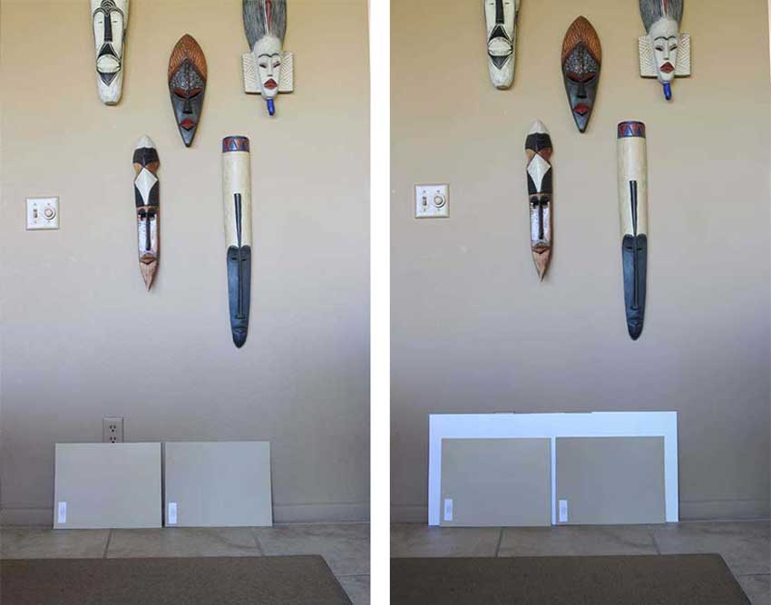
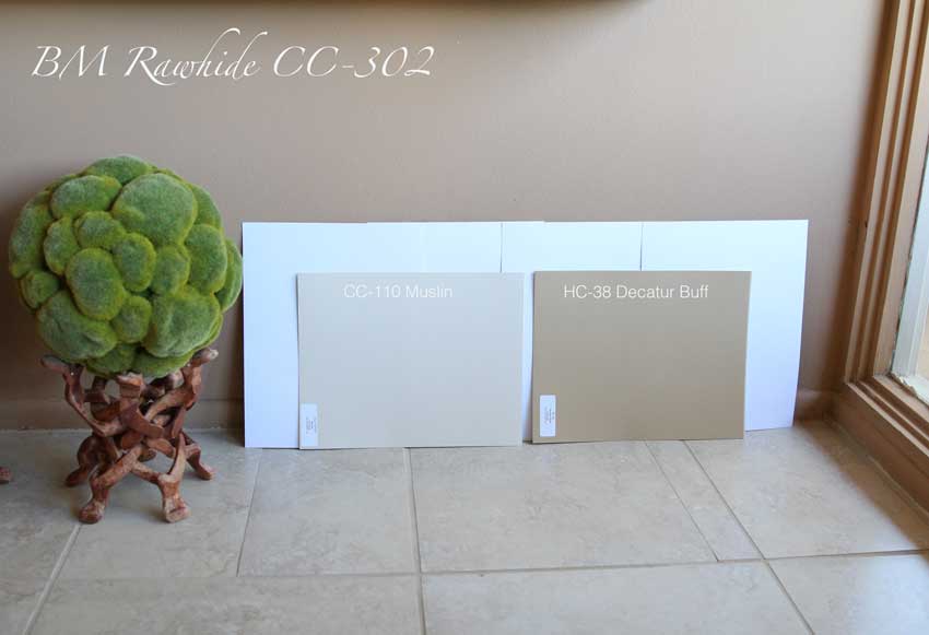
Okay so here we have the two gold beige undertones from my system. On the left is Wilmington tan and on the right is Decatur Buff.
I’m showing them to you without white paper, and with white paper behind them.
Comparing to white is how I can choose colour on-line for my clients. The light was not great on this side of the dining room so I moved to another area in the living room. What you can see, is that the walls are more pink than the tile and the two paint samples.
Also, when the wall colour is much darker than your tile, the paler undertone of the tile becomes less obvious. That’s when it starts looking more neutral.
Never compare your new colour to the existing one without a white board behind it
I was at High Point in the Fall and I struck up a conversation with a designer who said she was having a really hard time choosing colour for one of her clients.
She said had paint samples up but one day she’d arrive at her client’s home and along with her client, decide they loved the colour, but the next day she would come back and it looked wrong again.
I asked what the existing colour was? She replied “It’s an unfortunate shade of peach”.
Then I asked if she was painting the colour directly on the old colour. And she said ‘yes’.
“That’s why you can’t see anything.” I said.
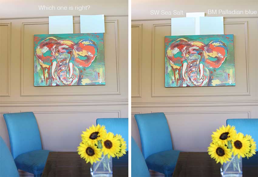
If you look at these two blues below propped up against the old colour (below), it’s hard to tell if they are even different.
Adding white, changes everything.
And of course, using large paint samples (painted with real paint).
Here, I’ve moved them into the dining room which is what I would do if I was choosing a new colour. I just turn some of my other colour samples around which gives me an instant white background.
Related post: How I Discovered my System for Understanding Undertones
Since this is an open plan living area, I would probably not paint the walls blue in here. I’m just showing you where I would plunk the colours down when I’m standing back with a client, looking to see which one is the right colour.
Identify the neutral undertone (see my colour wheel above)
When you want to get a neutral just right, you would be amazed at the number of times you’ll say ‘meh’, vs. ‘That’s perfect’. But you can only achieve close-to-perfect with a large sample.
Without large samples, you are guessing or using your spidey senses.
Overall the tile reads neutral and creamy in this house because the walls are so dark. As soon as you start looking for a fresher, lighter colour, the undertone of your tile will start to reveal itself.
In the tuscan brown trend, the colour could have also been gold beige because it relates better to the tile and the furnishings.
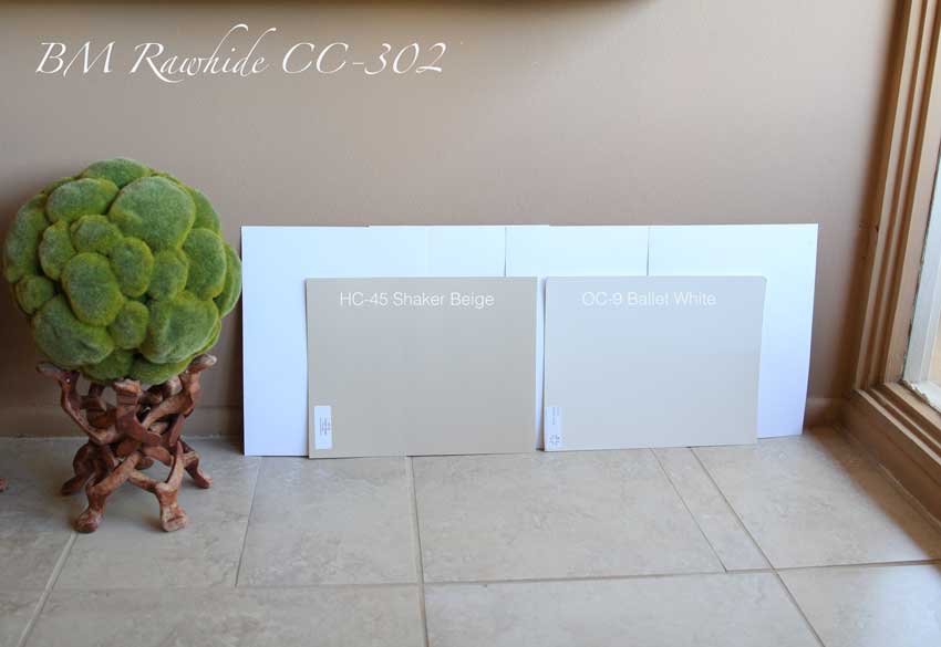
Here I’m showing Shaker Beige and Ballet White.
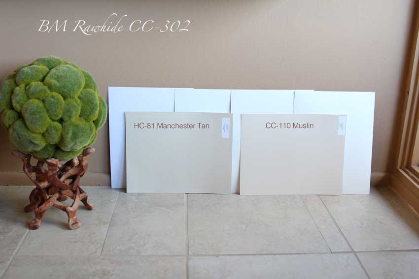
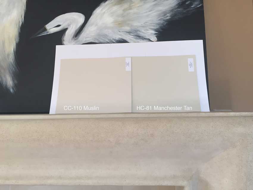
Here, Manchester Tan and Muslin.
Here it’s Manchester Tan and Ballet White
Which one would you choose? Which would be your first choice and then second choice? Post your answer below and I’ll post mine in a few days.
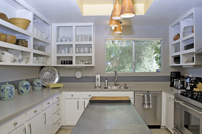
I thought I’d also show you the kitchen too because here the doors were removed in this old 60s kitchen which opens up the space. And the styling is good too, white dishes and natural elements. . . . it wouldn’t look as amazing if we were looking at an open spice cupboard, for example. The food is in the cabinets on the other side of the kitchen (below).
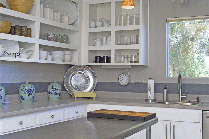
The same tile from the living room is in here. The countertops and walls are all painted a green grey with a blue grey stripe.
I like the row of turquoise and blue ginger jars.
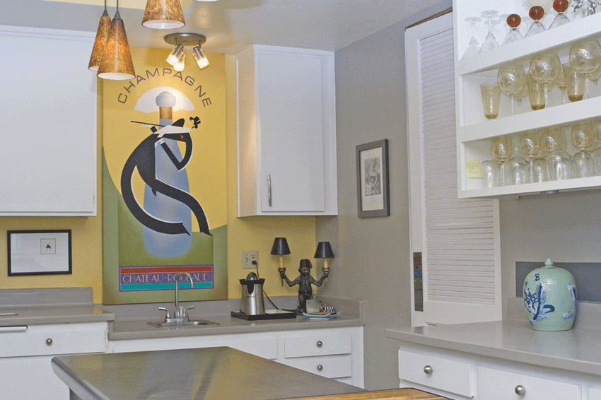
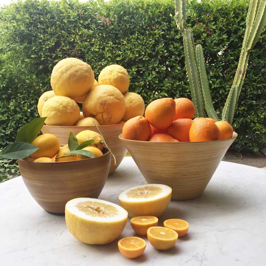
This is our juicing station (above). The trees outside are dripping with oranges, lemons and grapefruit so we’ve been drinking grapefruit juice every day.
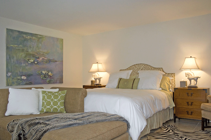
Here’s a glimpse of the master bedroom. Loved the monet inspired art!
More gold beige but paired with the white, cream, fresh green and animal prints it still looks current! I like how the art picks up the green pillows.
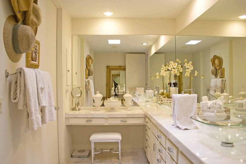
Here’s a picture of the ensuite bathroom (below) All three bathrooms in this house have vessel sinks. The owner left a note saying “Please don’t fill them with water or lean on them, the seal will break, NOT my best design choice”.
And, the glass ones look dirty instantly! Keep this look in a powder room if you’re in love with the idea of a vessel sink. Plus in this case they are way too high, the cabinet has to be that much lower if you’re going to have one. I have started sporting the Alicia Keys no-makeup look here this month because it’s too hard to wash my face in the sink at night.
Here the old cabinets remain with a white marble tiled countertop and floor.
And here’s my sweet Mom picking grapefruits in the front yard! We were thrilled to find the grapefruit picker in one of the closets!
Photos by Maria Killam
We only have a few days left here before we go home!
Don’t forget to post which colour you’d choose in the comments below!
Have a great weekend my lovelies!
If you’d like your home to fill you with happiness when you walk in the door use our eDesign services.
If you’d like to get your colours right, get my large colour samples.
Related posts:
What Everyone Should Know About Beige
How to Inject Fresh Into Your Earth-Toned House
Never pick a Neutral without Large Colour Boards (Pssst! They do it for you!)
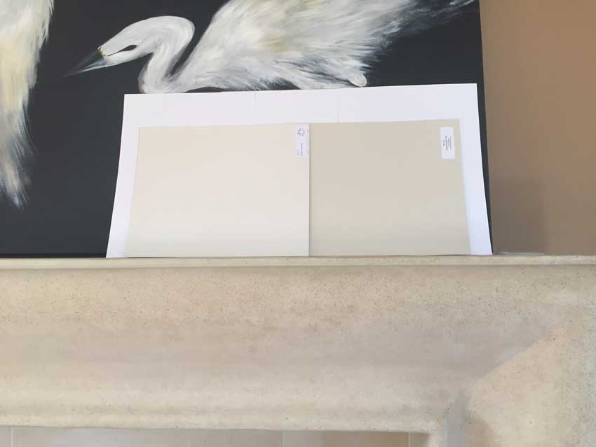
PS. Here’s Muslin & Manchester Tan on the fireplace!
I agree that Manchester Tan is the first choice and Ballet White the second. And someone said “It doesn’t look like Tan” Ignore the names. they often aren’t accurate. And what one person thinks is ‘tan’ is different for someone else. Insert ‘Tan’ in Pinterest and you’ll get every single undertone that is in my system!
It’s amazing how many times Manchester Tan wins. Unbelievable actually.
Ballet White (left) Manchester Tan (right)








I am thinking Manchester Tan first choice, 2nd Muslin???
1 manchester tan 2 muslin
I would choose HC-81 Manchester Tan or HC-45 Shaker Beige
I agree with Manchester Tan as 1st choice and Shaker Beige as 2nd.
One other question in regard to photos. Loved the kitchen with painted countertop with same color walls. Any posts on painted countertops?
Manchester tan. (In pic 1, I thought muslin. But in pic 3 it looked too pink. So I was confused.)
first choice: Manchester Tan
second choice: Shaker Beige
Man-tan
I would choose decatur buff or shaker beige
Manchester Tan.
However, my favorite beige is “Kilam Beige” from SW. I think it would have been great. Just a little lighter than Manchester
I also would vote for the Manchester Tan based on how things look on my monitor; however, I think the colors on my lap top monitor are off a bit. (I do like that Palladian Blue, too, but realize it might be a bit much for the whole living space!)
I would pick muslin and manchester tan– kind of hard to tell for sure. That was such a great post Maria, really enjoyed it. The place looks awesome and how fun for you to enjoy the nice ‘snow free’ weather.
My first choice would be the Manchester Tan/ Ballet White combo.
Second choice the Shaker Beige / Ballet White combo.
Muslin looks too pink with the tile to my eye.
Glad you two had a “warm” January in CA!
Manchester Tan
I would choose Manchester tan. The Muslin was looking a little too pink with the floors, and I think the walls are a few shades too dark to be current right now. Manchester Tan seems like it would completely update the house the rest of the way, and would look beautiful with her pretty blues in the dining room.
I personally don’t like beige/tan walls/paint no matter what the undertone is, and would never use them. So without seeing the rest of the house , and only looking at the floor undertone, I would only use Ballet White. (Unless Ballet White has a yellow undertone that doesn’t show in the pic).
Manchester tan. Shaker beige.
If I got this one right, I’m wondering if wearing blue contact lens is usually why I can’t see the undertones… or if I just got lucky this time.
Manchester Tan numero uno! and then shaker beige!
looks like Manchester Tan is the winner, it can have a little green appearance in certain light, but for a neutral it looks good. no one I talk with even wants tan colors, it’s still grey, grey, grey! I’ve also brought in C2, PPC, and Anne Hall paints. they are only sold at one BM store (not mine) and I’m excited to be introduced to new colors. Ten years looking at BM and I need a change. the full spectrum colors are the way to go forward in this business. people will pay $75. a gallon for paint if it looks damn fabulous. I know your clients can afford it, why not spec the full spectrum colors (hey I rhymed) I just had a consultation (thank god it’s about time) and used CSP, C2 and Anne Hall colors.
Your place in the desert looks wonderful, enjoy, I know you work hard!
1st choice: HC-81 Manchester Tan
2nd choice: OC-9 Ballet White
I like Manchester Tan, then muslin. I like the pictures of your mom even more!
Looks like you found a great place to stay, although I’m sure you could have found a color lesson anywhere. I appreciate that and love reading your blog.
As much as I try to embrace gray, I love a good gold or green beige, at least when it’s done right.
Enjoy the rest of your time in Palm Springs.
Susie
Manchester Tan popped out to me as a winner!
Manchester Tan.
1manchester tan 2 muslin.
Shaker beige
Shaker Beige and Manchester Tan. Either one would work, although Shaker Beige definitely brings out the pink tone in the tile.
If you know me at all, you know I can’t do beige. I would find a shade of blue.
I have always thought vessel sinks were impractical. You just confirmed it.
I think Alicia Keyes is onto something. If I didn’t have to wear makeup, I would get out the door in the morning so much faster.
It so nice that your family can join you on your vacation. Having them around must make everything more fun. Does Terreeia’s family ever come for a visit?
Manchester Tan- 1st Choice
Ballet White- 2nd Choice
Manchester Tan seems like it matches the flooring best, but I don’t know if it would give it the freshest look. Interested to hear your thoughts!
I like Manchester Tan with the tile.
I see a lot of pink in the tile, so my first choice is Shaker Beige and Ballet white which both have pink undertones. Manchester tan is a green beige, so I will stick with Shaker Beige.
I am sorry that you didn’t have more warmth and sunny days in PS. Our weather has certainly been unusual for California. We desperately need the rain so no one is complaining but I am now ready for warmer days! So glad that you had all of the citrus trees and to see your mom out there with a picker was so cute! After looking at the house that you rented I wonder if they knew who you were and put your favorite yellow and green in it. Nice house and how fun to have your family visit! Have a nice trip home.
I think Muslin is the way to go. All of the other colors are too pink or too green.
Manchester Tan would be my first choice. Decatur Buff would be my second choice.
My first choice is Shaker Beige and my second choice is Manchester Tan.
I chose Manchester Tan because the paler undertone of the tile becomes less obvious.
Although Man Tan looks nice on the computer I think it won’t be optimal in the actual space, it will only enhance the pink undertones of the tile. That green/red complementary thing is very real. I think Muslin or Ballet White for sure however that decision can only be made by placing sample against the fireplace surround and you haven’t showed us that visual yet 🙂
I’m with the Manchester Tan, though the Shaker Beige is a close second (I am tossed between whether the tile is pink or gold — or swirls of both!).
Thanks for such a fun quiz! Your eye is unmatched and am always amazed at how you see the world around you.
If the furniture stays as is, I would use Shelburne Buff.
If I had to choose only from the colours you lined up, and if the idea is to be more on trend toward grey, I would go with Manchester Tan.
Nice assignment. 🙂
Manchester Tan | Ballet White
My fist choice is also Manchester Tan and second choice is Shaker Beige or, possibly, Ballet White.
I like Ballet White because it provides some value contrast (wall is light/ floor is darker). I believe the undertone of Ballet White to be greige (but I could be wrong).
#1 Manchester Tan, #2 Ballet White.
Unless the tile has a pink undertone I eliminate Shaker Beige and Muslin, so my choice would be Manchester Tan and Ballet White both of which I believe have green UTs. Also, I would take into consideration the flow of the home where the the kitchen features gray-green walls and the visible foliage of the landscape from the living room, not to mention the splashes of fresh green used in the Master Bedroom. All said; as I personally am not a big fan of pink I admit I am being a tad prejudice plus as I’ve learned the hard way that one does not rely on computer generated images when choosing a colour, it wouldn’t be the first time I was wrong …. ☺. Excellent post Maria!
-Brenda-
P.S.: Regarding vessel sinks; to each their own but I honestly fail to see how they are all that functional and much prefer an under-mounted one myself.
Still in the learning phase so I won’t venture a guess but I would like to know if your colour choice has to work with the existing stand-out fireplace or if you would paint that as well. And I know you say that wood floors are a considered a neutral but if I’m seeing wood trim around the windows (real or just my computer?) how do you treat that? Looking forward to your answer.
Glad you are enjoying being south for the winter. Your getaway spot looks like heaven. Enjoy ’til the end!
Right away I chose the Manchester tan (1st) and Muslin (2nd). The longer I looked at all the colors, the more unsure I became! Help, I am overthinking and confusing myself! Maybe I like the ballet white after all…
I would use either the Manchester Tan or the Shaker Beige.
Manchester Tan
Ballet White
My vote goes to Manchester Tan. I recently chose Balet White over Manchester Tan for our bathroom. It proved to be the wrong choice. The BW actually brings out the pink/beige undertones in the tile, which is not what I was hoping for. Like all paint boo boo’s. I’ve been working to overcome the mistake with color in the rug/art work/accessories. I have a feeling we’ll be dragging home a can of Manchester Tan very soon!!
Ballet white first choice, I like the fresher look. Second Manchester tan.
What a challenge! My first thought is go white/cream. I lean toward ballet but the fireplace makes me pause with any white/ cream. Manchester has a green undertone and of the offerings would be my pick. Green is in the pillows, accessories. They get tons of sun there and grass growing on the golf courses in the desert. I feel we could pull off a green color overall. They could pull it from the lumbar pillow in the fireplace seating arrangement. Maria maybe visit cuba next winter?
Oops! Hit reply too quick. Though we have the requisite white subway backsplash in our kitchen I am intrigued with theirs. Here is a countertop 4″ lip and no decorative splash but I think that blue gray stripe really helps. Why does someone have to commit to a a fixed finish backsplash when we have washable paints and paintable caulk? Paint is cheap and easier to change!
I’m not a designer. Just a stay at home mom who loves color and enjoys the challenges you present with color choices! I tend to lean towards lighter airier colors so my choices would be 1) Ballet White, 2) Muslin.
So excited you are coming to Austin! Trying to organize myself so I can attend!
I think the place looks good as is. So why change it? The current color scheme enhances the red and blues in the current furnishings. By using the more washed out colors you would lose the depth, warmth and richness of the other colors in the room.
That being said, I would choose the Manchester Tan if i was going to repaint. Shaker Beige would be my second choice but may have too much pink if there is lots of light in the room. I would only change the paint if I was going to sell the place.
Yes it fits in the desert for sure. . . this was just a good teaching moment 🙂
Manchester tan. I agree with the person who thought Muslin looked good in the first pic but too pink in the other pic. And if there is a lighter color than Manchester Tan with exactly the same tone and undertone, I would pick that.
Oh, and I wanted to comment on that glass vessel sink. Clear glass is absolutely the worst for anything water touches. I shudder when I see pics of all those beautiful bathrooms with clear glass shower enclosures–once used, they will look awful. The labor involved in keeping them clean is more than I would ever want to face. Keeping the vessel sink looking nice would be a piece of cake in comparison.
Manchester Tan
Manchester tan or a shade lighter perhaps! 2nd choice Muslin.
I’d choose Muslin because it has a drop of pink. The pink in the floor will get pink-er if there is no pink in the wall. Maria keeps saying – It’s much harder to see the undertone if there’s no other undertone to compare it to. I also think it might work best with the limestone fireplace surround. Man Tan is a fine choice if we’re ok noticing the pink in the floor. It’s a decent tile as far as tile from that look goes.
The kitchen needs painting too though. I’m a firm believer in a united color story throughout the public spaces in a home! And, Muslin’s not the answer in there… :]
Thanks for the great lessons, Maria!!
It looks like Manchester tan to me.
I love the grey stripe above the counter in the kitchen. An interesting house with lots of personality and character for sure.
Thanks for the lesson. mia
What a fun house!!!! Love love love the fireplace!!! Great post!!. There’s so much going on in
that house I wouldnt be able to pick a color but if I had to I’d say Manchester tan or muslin
to go with the floor.
PS…..really like the TV with the shelves too. Thankyou for showing us this great idea!
1) ballet white, 2) muslin and then switch out the couch pillows to have a blue and or purple combination that flow with the dining room colors. (And a red orchid pot). If it were my own house, I would do SW Sea Salt or Filmy Green because I love color. They did a great job on the kitchen, but it would look so much better without the blue grey stripe on the wall. And if they painted the counter tops, they did a good job because it looks like they imitated the look of silestone in kensho gray. As far as the blue grey stripe, maybe they were trying to repeat the blue grey of the steel island, but I think it is not necessary because the steel is more of a neutral.
Agreed! Good points you made! Maria
Maria,
When you answered “agreed” to Mary’s post above, did you accidently let it slip that Ballet White is your first choice and Muslin the second choice, or were you just agreeing to the other comments? ( I came back today to see if you had posted your choice, LOL. BTW–I love how you have your picture by your replies to comments–it makes it so easy to find your comments, especially if we don’t have time to reread through all the comments again (or the first time.) I don’t remember if you did this on the old website, but it really stands out here! Great idea!
Thanks.
There is a setting for a website where EVERYone’s pictures (who have a profile setup in certain browsers) will appear besides their name. You might want to look into that, Maria.
So, after reading all the posts, I’m a little confused by Ballet White. Does it have a pink undertone or a green undertone?
Hi Pam, Ballet White is a greige, pale colours change the most in the light. Sometimes it could look pink or purple, sometimes it’ll look green, sometime’s it’ll look beige, sometime’s it’ll look like a neutral grey. What greige IS NOT is blue. It leans towards green.
Hope that helps,
Maria
Manchester tan
Manchester tan and Muslin.
Maria, I have a question off topic but am dying to know your opinion. What do you think about the wood look tile that is popular right now? In medium brown of course! 🙂
Manchester tan. Not loving any of the second choices so I won’t choose one!
ps. Fab new website, Maria. Gorgeous.
Manchester tan. It works with both the floor & the wood trim, as well as the green plant.
I like the Shaker Beige first then the Manchester Tan. It will be fun to see the final tally and Maria’s pick 🙂
The time posted on my comment must be GMT, as I’m in central time and it is 10:41am
Thanks for that! I will fix it! Maria
Ballet white then Muslin.
Shaker Beige and then Muslin, as the dominant fixed features (tile floor and fireplace) have more of a pinkish cast – at least to my untrained eye. The kitchen wall color looked downright drab to me. Is it the same tile floor? Looked more golden.
I agree with Mary about not liking the stripe around the kitchen countertop. Definitely Manchester Tan and I think I would use it throughout the house. I am curious about 2 things not mentioned:
1- The grout color in the tile, is it a pinkish, tan or gray, can’t tell in the pics. and would that influence your wall color?
2- Would you consider painting the wood trim (don’t know the amount of wood vs painted trim in the house) to match the rest of the painted trim and ceiling?
Thanks for this “exercise” 🙂
Susan A
I agree with grout question. And, I love these exercises so well guided and demonstrated with photos. thanks.
I like Manchester Tan first and then Ballet White second.
Of all those colors, I’m leaning toward 1) Ballet White, and 2) Manchester Tan
I like the Shaker tan 🙂
First choice – muslin
Second choice – shaker beige.
I am a ballet white fan so this was tough for me.
Creative idea for the flatscreen!
I struggled with the colors in the kitchen, overall… I liked the vessels but the pendants and yellow recessed ceiling and walls with the stripe just seemed messy; mixing dirty and clean everywhere I looked from walls to ginger jars to champagne art and pendants.
I loved the idea of fresh grapefruit juice daily!! Yum!
First choice: Manchester Tan and second is Muslin. I almost went with Muslin first, but changed my mind. 🙂
Just a comment about:
1. vessel sinks–don’t
2. glass sinks- don’t
I don’t know how accurate my computer is but I thought Manchester Tan, because it doesn’t look “tan.”
Manchester tan.
Thanks everyone for your comments! I’ve posted two more photos with the fireplace at the bottom of the post with the colours I would choose!
Maria: Does the tile have both pink and green undertones in the tile? I thought muslin was the answer until I saw Manchester Tan, and then I was confused.
Yes it does seem to have both. I thought the pink beige would be the one before I propped up the colour samples. . but the green beige looks better in the end. Maria
I’m thrilled to see that Manchester Tan keeps winning! Still on trend. Your vaca looks amazing, Maria. So happy to see that you are living and loving life! xo, Amanda
Hello!
I’m still learning so this was tough for me! Could you explain why Ballet White, Shaker Beige and Muslin are NOT best choices?
So very appreciative!!!
Jenn
Thank you for this post, Maria. My bathroom tiles are almost the same as in that house and as you know, I have had a hard time making them look good. Right now the walls are ivory white, an absolutely beautiful colour. The bathroom is beautiful and the paint matches the accent tile, but the main tile looks as ugly as ever.
I think I am going to try Manchester Tan. By the way, it is the colour of the kitchen cabinets in Bee Cottage.
what is a good white paint for trim that goes with manchester tan.