Yesterday I posted my Styled Interiors board from Pinterest on my Facebook Fan Page and one of my readers commented that it was her favourite board and wondered if I would post more images on tablescapes for coffee tables and end tables.
So I clicked over to Ralph Lauren Home because I adore the styling in all his images.
There’s always a beautiful video to watch when he introduces a new collection.
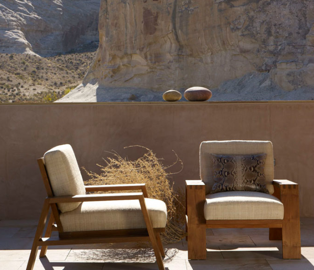
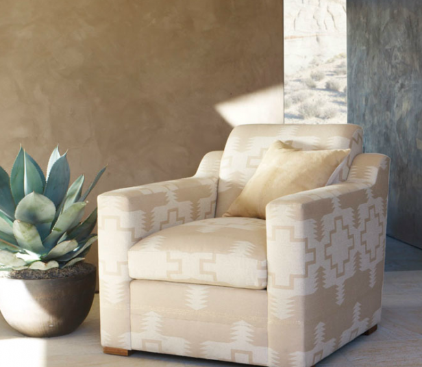
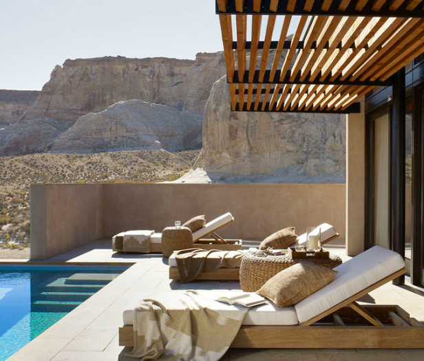
I noticed that the Desert Modern collection was strictly a combination of two undertones. Pink and Yellow beige. The two I say should pretty much never be seen together unless it’s travertine.
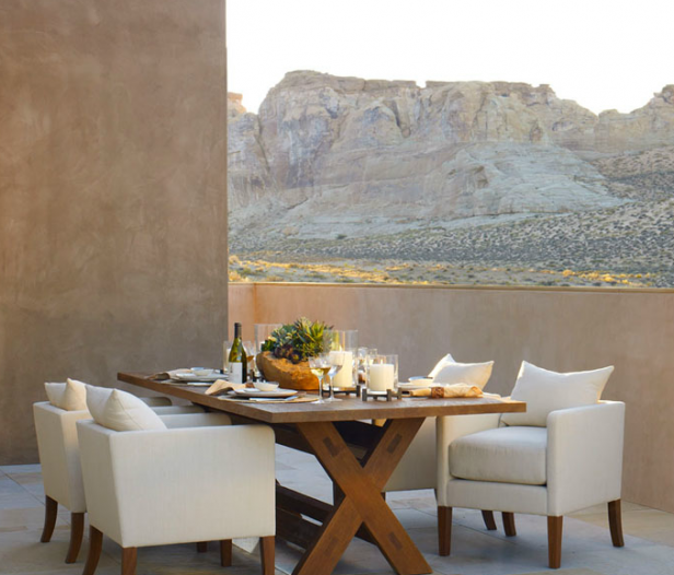
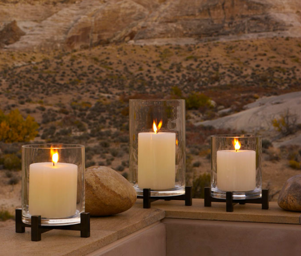
The thing to notice here though is that all the fauxed walls–which are entirely pink beige–actually ties right into the landscape.
My mantra for months now has been “I can’t remember the last time someone said ‘Maria, I looooove earth tones’.”
All my clients are looking for whites, grays and a clean look with pops of colour.
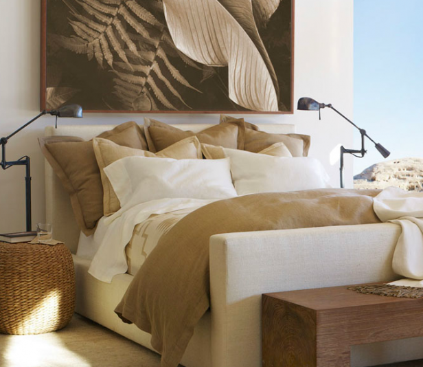
If your house is still all of these tones from the tuscan brown trend though, the lesson to take from these images is to introduce lots of off-whites and creams to keep it feeling fresh.
Really, the easiest way to do this is to get rid of all the rusty orange, sage greens, dull reds and gold accessories and buy off-white or cream accents instead. IKEA has inexpensive but nice looking off-white pillows.
So if your sofa is already sage green or gold, then eliminate the earthy accents. Leave in the artwork because that might be expensive to change out but think about getting a new area rug.
Finally, bring in a vessel with fresh green balls, a white orchid (many fake ones look real) and a green plant. Anything green that looks alive like leaves or moss never clashes.
That is the fastest way to get a fresh look even if your furniture is still brown or earth toned.
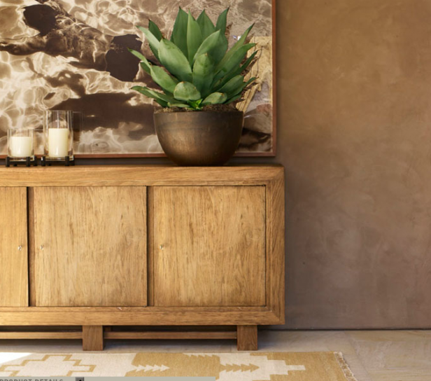
I love the style (not necessarily the colour) of this sideboard. It reminds me of the colour of Restoration Hardware’s furniture.
Notice the barely there glass (I think) knobs, gold and cream carpet and pink beige walls. Do they look dirty in comparison? Oh yes, but since this entire house is ONLY these two beige tones, in the desert setting, it’s lovely.
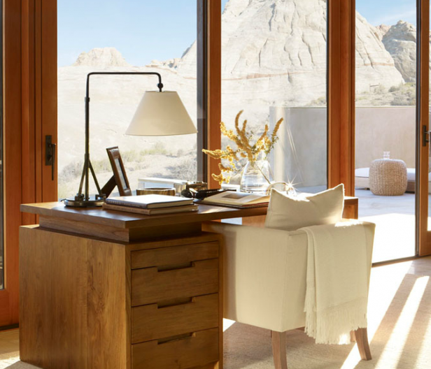
Pretty styled desk.
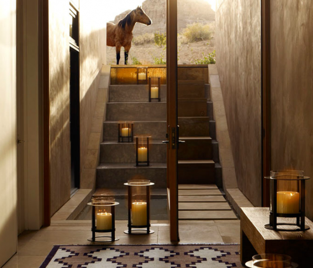
When in doubt, add a kid or a dog if you are styling a space for a photo shoot. Here it’s a horse but that works too!
Lots of creams and off-whites here. If you have kids and pets though, I would invest in lots of dirt-repellant fabrics.
All images from Ralph Lauren Home
Sage greens work with pink beige but the look feels dated. If I walk into someone’s house and they have a sage green sofa, I know it was purchased before the brown trend arrived about 10 years ago.
Nothing WRONG with that by the way, as long as you like those colours. It’s decorating your entire house in the current trendy neutral that dates really fast and will make you regret your choices much faster than buying your favourite colour.
Is it time to inject a little fresh in your home?
Related posts:
What Colour Sofa should you Buy?
How you Know you’ve Fallen for a Trend
Would you like to make sure you buy the correct neutral sofa? Download my eBook, How to Choose Paint Colours: It’s All in the Undertones.
If you would like your home to fill you with happiness every time you walk in, contact me.
To make sure the undertones in your home are right, get some large samples!
If you would like to learn to how choose the right colours for your home or for your clients, become a True Colour Expert.



Thanks Maria for articulating this lesson so clearly. You’ve always said it depends on the context. Great ideas of updating with creams and off-whites.
Had someone pick up the ikea white pillows based on your recommendation. Trouble is she keeps forgetting to give them to me!
I’ve recently been working with a client to refresh her living room and kitchen which are open to one another. The two things that we had to keep were the dark brown sofa and the beige carpeting. I was extremely frustrated until I started doing exactly what you suggested – using lots of creams and whites to make the earth tones feel fresher. I also incorporated fabrics that had brown as an accent color and then pops of clear hued jewel tones on a natural background.
Great advice, Maria. As someone who LOVES earth tones, it’s good to know that by softening them with creams and whites, I can still have a fresh look. It’s funny because I did just that in my dark coffee toned tv room on the bookcases to lighten them up. It does look fresh.
How can I do this with black sofas …. need to keep!
Hi Christine, I wrote a post about that a while back here: https://mariakillam.com/2011/04/10-ways-to-get-a-fresh-look-with-a-black-sofa.html Maria
Love this post, Maria – lots of good advice when you are dealing with existing elements/styles and you want a little update!
Wonderful pics and thoughts. I have clients all the time who say they love warm colors or earth tones. Maybe part of it is geographical, or can it also be that people who want you as their color guru and designer know you from your blog, and so partly – and logically – choose you for your preferred colors/taste? In other words, the calls we get aren’t always entirely random?
Great to know there’s a solution to freshen up earth tones! Thank you for sharing that color wisdom! 🙂 Those photos really prove the point.
I certainly didn’t realize how well earth tones are complimented by simple touches of nature or other decorative elements derivative of objects and ideas found in nature. Genius.
Neat post, Maria. The Ralph Lauren Home pics are so appropriate since I live in the desert of Arizona. I especially love the unabashedly gold sideboard with the unabashedly pink wall that works so well because of that beautiful green plant.
Nature obviously likes the combo herself. If you look at the landscape, there are pinks and whites and golds and even bluish greys in the rocks and it can look quite barren, but almost always you’ll find the pops of green or yellow green that bring life to the scene.
Gives me great hope that when I move to my new place and end up with new but probably pinky beige walls and carpet, I’ll be able to tie in the fresh green that’s revealed itself as my soul color and the the touches of white and cream and create a happy home.
Thanks Maria-
I’m struggling with a client who wants the tans and earthy greens in her room right now. I waffle between giving her what she wants, and not giving her something that already looks dated.
New Plan! I’ll introduce more creams and whites, AND give her what she’s asking for….!
So, was I wrong about navy being a color you could inject into such a scheme???
I also adore the Ralph Loren aesthetic. Always have, probably always will. My own home is has been “asking” me for quite sometime to change out to fresh colors. I’m ready, but we are in a remote area, 90 miles away from the nearest mall or furniture store!
That will not be stopping me (soon)….. Only my champagne taste and (not) that kind of budget will hold me back!!
haha.
Gorgeous images. I love this eye candy on a regular basis. Thanks Maria!
My clients in Kansas City still prefer earth tones, I’ve only had one who wanted gray. You could say we’re out of it in the Midwest, or you could say that it works well here, and is warm and cozy. Why should everyone in North America have the same colors anyway?
What’s tiring is seeing everyone jump on a color bandwagon of any sort — be it gray or the white kitchen. I had a sage sofa for years because it was a beautiful, clean color that always felt calm and I loved it and not because someone told me earth colors were “in.”
In New England, people are still loving and asking for earth tones. Not everyone, of course, but it’s still probably 50/50 for me. The suggestion of just adding creams and whites is really a great one (and of course I’ll use it) :] Hope you are enjoying your summer.
I always enjoy your posts. I am so sorry that you do not give the Benjamin Moore colors.
Hi Maria,
I stayed up late last night and a few other nights before, reading your wonderful blog and I”m not complaining haha, because I enjoyed your posts so much and I see that I can earn so much.
I am painter but being very honest I will like to be a decorator or interior designer and some day a true color expert 🙂
For some reasons I did not study interior design but I always enjoy beautiful rooms and love just looking at houses and see what people choses and how they live.
I found you through Lauren Liess blog, I love her blog too and I noticed reading your posts that you also like Sarah Richardson whom I admire and enjoy her shows and designs too.
Well, I’ll be following you as well as I will be following Lauren.
Thanks for sharing so much information and making it interesting and enjoyable.
Food for thought! Agree that these colors absolutely work in their context, being from the Southwest. Plus, Ralph Lauren can do no wrong. What you say about the trendy color — I’m already feeling like the grays are going to start feeling dated in about ten more years…it’s just everywhere…
Hi Maria
A great post for those who looove the earth-tone palette – like myself 😉 That is what I have a lot of in my house – creamy off-whites and some green plants.
But I think it’s still possible to go with the current trend of fresh colours like pink, turquoise, blue, yellow etc. and make it work in an earth-toned house. You just have to choose those pieces which are a little on the muted/dirty side (not dark though) instead of the very bright and punchy ones. Putting those colours into an earth-tone setting, they will read fresh, and will freshen up your space, almost as much as the bright ones do – without looking off. It will take a little more effort/time to find them though, as bright and poppy is the norm a.t.m. What do you think Maria?
Love them all!
Fresh is important, I have a Family room with the lower walls real tung and grove redwood at a 45 degree angle. it is beautiful natural, my upper walls are stucco. Would you ever paint over the redwood to freshen the look?