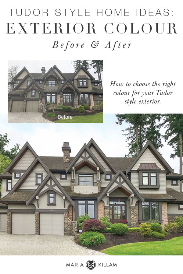
Looking for Tudor style home ideas? I can show you how to update your Tudor style home exterior colour with this before and after design consultation. Tudor style homes have a lot of exterior design elements that you’ll need to consider in order to achieve a cohesive exterior design.
If you have a Tudor style home, you should also check out this post: Historic Tudor Gets an Elegant Exterior Makeover; Before and After
My client Laura and I go way back. I decorated the interior of this house over 7 years ago. Their house is in Morgan Creek (in Surrey, BC) and their backyard overlooks the golf course (below).
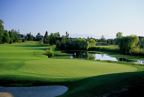
She has twin boys who will be heading to University next year and Laura and her husband will be downsizing. They have bought a fabulous, brand new condo in downtown Vancouver to experience city life and they will be moving in next year, after it’s built.
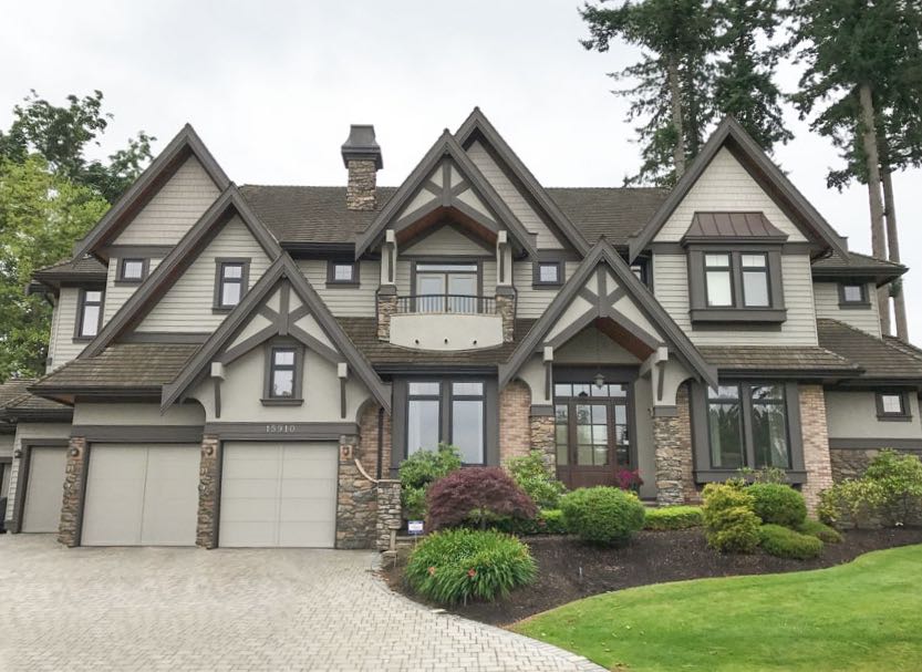
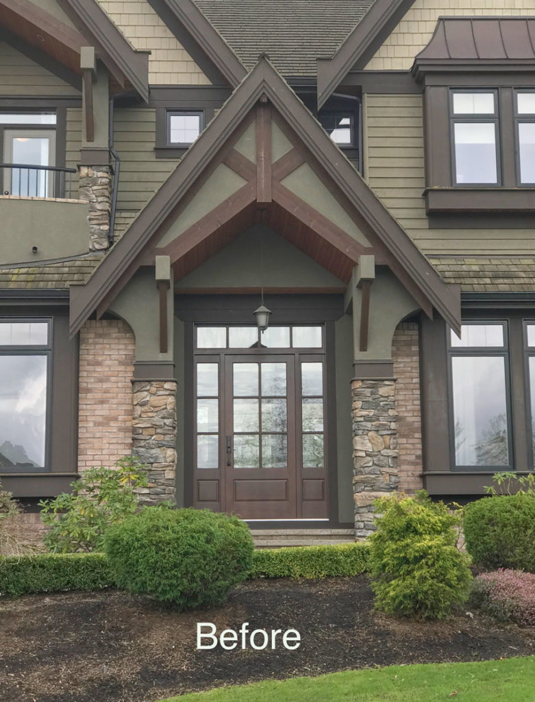
This Tudor style house will be sold (below) and Laura wanted to freshen up the dated exterior colour scheme:
How to choose the right colour for your Tudor style exterior:
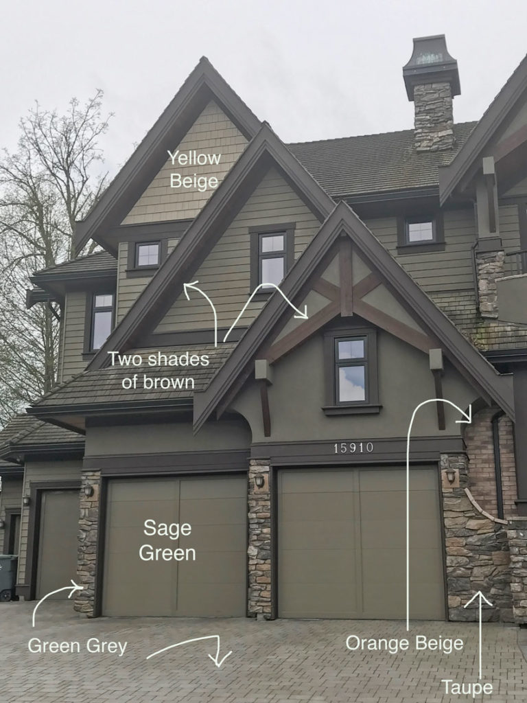
Given all the fixed elements of the stone and brick, the only colour that was close to being right on this house was the trim and fascia. The reddish brown, wood stained, tudor style trim didn’t relate to anything. And the sage green colour made the house feel too dark.
There was no green at all in the orange-beige brick and stone to relate to this colour.
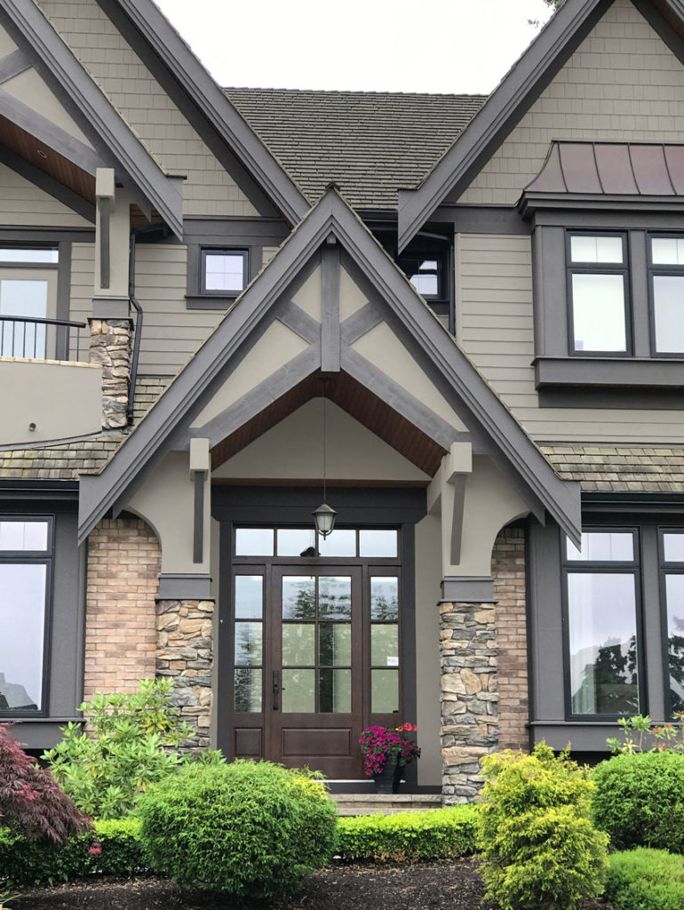
I chose a neutral green grey to create more contrast with the stone and brick and a new trim colour in a slightly lighter shade with a purple undertone for ALL THE TRIM – giving the entire Tudor style exterior a fresh update .
Tudor Exterior After in a Green Grey Neutral Colour
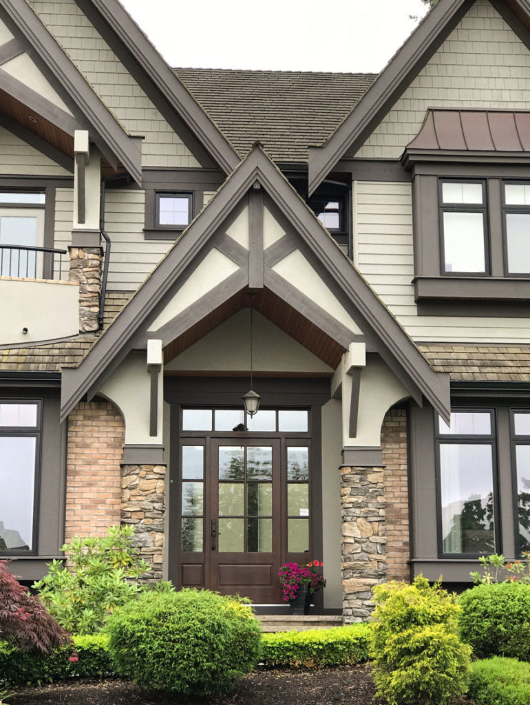
I also used photoshop to show the house painted in a shade of taupe so you could see it both ways, since there’s taupe in the fixed elements as well (below). Tricia and I have talked about this a few times when we are working on exterior eDesigns with stone or brick. The decision is often which colour to pull out of the stone – either green grey or taupe.
Do we decide to go cooler to make it seem more current as it looks above? Or, do we embrace the taupe in the stone and brick instead, which will result in a more earthy look that is slightly less current and modern.
As you can see in this example, you can go either way.
After in a Colour with Taupe Undertones
After in a Colour with Green Grey Undertones
This medium-toned green grey colour is often found in mortar and natural stone or concrete. You can see that it relates nicely to the green grey cobblestone driveway here.
After (in taupe)
You can see that the existing windows are black so the trim could not go lighter. And, there is no white or cream in the stone so painting all the trim a paler colour than the house would not have worked either.
Here’s the before again:
You can see that it is unnecessary to paint the gables a different colour. This house already has a lot going on because of the MANY gables and heavy trim and fascia (not to mention the combination of both brick and stone).
When I was a new colour consultant, I was under the misconception that if you had shingles, stucco or siding on your house, each element should be a different colour.
That opinion changed very quickly.
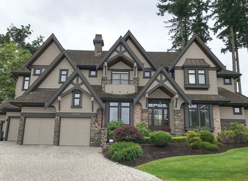
And here is the Tudor style exterior after the colour makeover:
After in Green Grey
Which neutral undertone do you prefer for this Tudor home, Green Grey or Taupe?
You can see that Understanding Undertones® is critical to choosing the right exterior colour. To become a True Colour Expert in one of my live workshops around North America, click here.
To get the exact colours in this combination, they are available in my Masterclass for Exterior Colour Selection here:
If you’d like help choosing colours for your exterior this season, check out our eDesign packages here.
AND, if any of my clients has an AFTER PHOTO to share from one of your exterior eDesign consultations, please email us at admin (at) mariakillam (dot) com. We would love to post it on the blog and would be so grateful to have one!
Related posts:
10 Steps to Transform Your Exterior
Navy Blue Exterior: Before & After




I am totally a taupe lover. But I’ve got to say the gray green looks a smudge better with the trim and plants.
I agree that the house benefits having its exterior updated with lighter colours. I like the new lighter brown on the trim. I am not in favour of either choices for the main exterior. To me the green grey relates nicely to the driveway but looks off in relation to the brick. The taupe doesn’t relate to the brick either and it’s a little dark. I think a light beige that catches the undertones of both the brick and some of the stones would look best. Now the brick is being ignored and there is just to much of it, IMO, to do that.
If it Had to be grey, I would choose a grey that has less green pigment in it – to catch the undertones of the mortar in the brick and some of the rocks. I love that you can try on different colours on exterior like that before committing to a colour. Really helpful – and cheap, too! 😀
I agree, Claudia. The brick and stone would be better with a light beige.
But which light beige? Yellow beige, pink beige, green beige or orange beige? Lighter would be creamier. . . and there is no cream on this house, lighter would mean that you’d have to add orange and NO ONE wants to paint their house orange beige right now. It’s amazing that on this house the stone and brick actually relate, there are countless homes in this neighbourhood where the stone in no way relates to the brick. There is no magical beige that will relate better to the stone and brick which was most definitely the limiting factor here. Maria
I like the green grey. There is a lot of green grey it relates to in the driveway – much more surface than the orange brick. Since they are selling it is the best option available IMO.
Between these two, I much prefer the green grey. The house felt so heavy before, and the taupe still leaves it feeling a bit too heavy, imho. It’s unfortunate that someone somewhere thought that this brick and stone actually would look good together. 🙁
The green-grey looks so much better. I’m sure your clients will have you back to help with their new condo.
Prefer the taupe with the brick. The lighter color makes the brick pop out more and it is the least desirable element of the exterior.
SO. Much. Better.
Honestly, it is a gorgeous house- I don’t think I would bother changing it-it didn’t look that different for what the great expense would be changing it- (of course, the lighter looked better, but the overall effect is, it is, what it is) I would have her do your magic on the inside of the house-you can stage a house better than anyone.
It is a nice house. I wouldn’t bother painting it either. This paint job will cost probably more than 20K, and if trim is done a lot more, here in Seattle and I wonder if it is worth it. Also it depends on if it’s a sellers market or not. Here it is a sellers market with houses flying off the shelf. As fun as it would be to see the difference, save your money and just sell.
But, the green gray is a good choice. Also, if it were mine, I might seriously paint the stone somehow. Maybe with just a color wash on the stone.
Oops ….I meant to write color wash the brick, not the stone.
If it were me, I’d paint or slurry the brick. We slurried our orange brick house – what an improvement!
Coloring the brick was my thought, too.
I don’t think the average buyer would notice the difference between green grey and taupe in the final effect, unless the comparison were right in front of them. I like lighter, and the green grey takes it a little lighter, so that’s what I’d choose. But I don’t think it really matters. There is way too much disparate stuff going on with this exterior to make any choice an entirely happy one, but lots of people will think the house is beautiful anyway. I do agree that it’s important to address the outside, both to reduce the number of clashing elements and to give it a more current feel.
Fanastic post Maria! I prefer the taupe but both are a great solution. I’m not sure I would have chosen those colors so it’s great to hear how you got to where you did. Thanks!
The update is so much better; however, the orange brick still competes with everything else. Was painting the brick the same green gray ever a consideration? To me it would enhance the stonework & everything else about this house.
Yes it does. . . but no one wants to paint their house orange beige these days. And as I said, they are selling so that’s why we didn’t go so far as to paint the brick. Maria
There is isn’t that much brick to paint. I really think they should go for it unless the cost is astronomical. Could they do that part themselves?
Did the clients consider painting the brick? That may yield an even “cleaner” result especially if they go with the green-grey. Can you photoshop it as if the brick were painted?
Since they are selling, they just wanted to give the house a fresh coat of paint, if they were staying, they may have considered painting the brick. Maria
As many have said, the new colors are such an improvement! …but now the orange brick really stands out. I understand the owners are moving so they don’t want to make an even larger investment, but it would be great to see a photoshopped version with the brick painted!
Actually I like both however IF were it were my home I would probably want ‘to play it safe’ °Û° and lean towards the taupe. To explain; as I live in a snow belt region (lots of snow and long winter seasons) I think I would much prefer that the colour related to the fixed elements on the home itself, rather than that of the laneway and/or landscape that changes during the winter months. In conclusion; to save my sanity it is the reason why Maria when I plan to do my own home I will be seeking your services and expertise. -Brenda-
P.S.: Will there be a change in the colour of its front door?
The front door is stained wood and I suggested it stay given the options to paint the door were more brown or orange in this case. Maria
Awesome post! Coincidentally, our home has taupe / green-grey brick so this was timely! Both colors work but the green-grey lifts and feels more current, which will be appealing to buyers.
I would not have chosen green gray with the red brick, but I do prefer it to the taupe. It looks great with the driveway and looks fresher. As for the beige, I think that may have not worked well with the driveway. This house is lovely regardless….
I prefer the green gray. I would make another change, paint the apron of the second floor balcony the trim color. I never noticed it in the Before picture but it stands out in a bad way once painted the lighter color of the house. Kept darker it blends with the roof color and the three drain holes are less obvious.
Beautiful house, but I’d also change the lantern above the front door, the existing is too small. Same for the lights flanking the garage doors.
WOW! What a transformation! Both are fantastic!!
I have to agree with the readers that would have preferred an orange beige. The front of my house is all orange and brown brick and I painted the trim SW Outerbanks. It is a medium color so it looks rich and not washed out, works with the brick and is the same tone as the grout. My shutters and gutters are a rich brown that compliments the brown tones in the brick. Wouldn’t it be better to go with a color that relates to the fixed elements rather than going with the current trend? Regardless, the green gray still looks better to me than the original colors which were mismatched and too dark and it definitely looks good with the driveway. However, personally I wouldn’t have spent the money to repaint unless the original paint was in bad shape because I don’t think it would have kept buyers away.
Beautiful home. I would paint the brick to match the siding. The brick doesn’t relate to anything else on the facade. Please paint the brick.
My personal preference would be influenced by the prevailing clouds/sun – not just how it makes the color look, but how the weather makes me feel. Couds/rain make me drawn to houses that look warm & cosy. But, if painting for resale it’s important to realize that most potential buyers are flipping through listings online and the way your colors look on most screens has to grab them enough that they even bother to come see the house in person.
Maria
It was so dark and heavy before .
It defiantly looks better now.
The orange brick hard one to work with .
When your selling a home money wise you have to pick your battles .
At least now it looks fresh
In a perfect world everything would coordinate but sometimes it just isn’t the reality of life .
With all the fixed elements that are on the house you worked your magic and it looks so much better .
Thanks for sharing how you cane up with those colors .
Nancy
Gray green! It’s better for the house (lighten the look and feel of the home) but not the driveway…sure you will be helping them with the condo, can’t wait to see/read about that post.
Both are a HUGE improvement over the existing colors. At first I was leaning towards the green grey because it freshened things up considerably, but after seeing the close up of the front door I’m kind of liking the second option better.
A question for you: I noticed the cedar shakes are aged somewhat…which is natural. Would your color choice be impacted if they were cleaned up? Obviously since they are moving it doesn’t matter to them. I was just curious what you thought. 🙂
I vote Green Grey. It gives the house a fresh look. Great post as always!
I prefer the GREY GREEN by a long shot!!!!!!!!!!
It was so dreary before and this freshness will really help the house to sell. I would have been tempted to paint the brick in grey green too.
You are so talented! It looks so much more crisp and current.
Maria,
The house looks fabulous now – I think you made great choices with the colors here! As far as some of the comments about everything relating (or not relating) to the existing elements, why does the gray green have to relate to the stone? Green complements orange, and I like that it looks a bit greenish and not simply a neutral. Not all exteriors need to be “neutral.”
You did a great job with this one!
Kristie
Kristie
I prefer the green grey. I feel that it suits the surroundings better as well as warms up the home. The taupe seems too purple and kind of dreary to me. Which color scheme did you end up going with? I love the way you teach, Maria, even though your posts. I find myself really thinking though the scenario and carefully going over each element. I can’t wait to attend one of your courses!
The green-grey looks so much better with the garden.
I really love the simplicity of fewer paint colors! My preference is the green-grey.
The green grey makes a huge difference! Fresh and updated.
Love the green grey. I spelled grey with an “e”.
Green Gray! The brick begs to be painted too.
OMG, it looks so much better with either neutral, because the whole house looks so much lighter. Having the darker colors on the fascia dragged the house down. The new green grey made the driveway look like a natural extension of the house and minimized the orange brick and didn’t make it stick out as it did before. BTW, do you ever advise painting brick (say with the taupe of the stone?) . there are a lot of painted brick homes in the Atlanta area which look very lovely. Maria, this house looks so much better, you are a genius!
I prefer the taupe! I think the green gray is too light … slightly too cottage-y for a home this large with it’s serious tudor styling. Also, there appears to be one other “fixed color” — the natural wood in the above the porch and the balcony — and I prefer the taupe with that. But as always — gorgeous options!!
Both color schemes are nice, but I prefer the green grey. It looks so fresh and pretty!
Marie. You did a Fabulous job. What a big transformation. Before the house looked dark and drab. Now with the new color which by the way I do love, It stands out. And in today’s market homes need to stand out. This home say’s COME IN. GREAT JOB.
My preference is also the green grey. It looks fresh.
I love the value contrast that the Green Beige provides. Nice job!
I prefer the green gray. To me this compliments the foliage better as well the other colors on the house. There is so little brick, it makes me wonder why it’s there in the first place. The new color scheme does help to make stand out less.
Green grey all the way! The exterior of the house is way, way, way too much – as so often, even builders of very upscale houses seem to feel that they need to add one or more of everything. Kristie’s comment about green complementing orange and the grey/green color not having to relate to the stone was right on. Reminds me of my late husband’s daughter & son-in-laws home in Bend, Oregon, custom built after years of touring Street of Dream homes in the area and designing their own dream. No bits of this and that – they went with gorgeous Montana stone outside and inside in a most stunning fireplace (my husband and I got a chance to watch the stone mason actually creating the pattern on a portion of the exterior), a lighter but warmer wood trim and a green grey color that, even in the depths of winter with rain and snow everywhere, still looks fresh and welcoming after all these years. I hope Laura chooses the green grey.
Green Grey – the house is busy and to me the Green-Grey looks happy and alive.
I love the green-grey! But….I would like to see the brick painted in the green-grey as well. The stonework is beautiful and current, but they brick color is distracting and dating the house. I feel like the stone, and the brick is fighting each other. Does anyone else see this?
Yes Christine, we all see this. . . and this is exactly why I advise my clients to proceed with caution if they must choose BRICK AND STONE for their exterior. AND, this is not the perfect world of exteriors that I’m showing. . . it’s real life “Let’s paint to sell the house” that you’re seeing.
NO I will not be photoshopping the brick for this post (in response to someone else’s comment) which is already done and dusted.
Thanks for your comment, Maria
I rather like the low-contrast original scheme, and prefer a somewhat darker taupe option if I had to pick, or go with a darker grey-green for at least part of the siding, like the shingles. Although I like the lighter colors in close-up, when seeing the house as a whole, the lighter colors really emphasize the array of dormers and other embellishments and make it look a bit disjointed in my opinion.
But if you do go lighter, those light colored tops of the angle braces really pop out like polka dots, and it makes more sense to paint the entire bracket the same color as the trim. That alone could help unify the facade, and make the brackets appear stronger, like they actually do help hold the roof up. Try it out and see what that alone does.
I also think the apron under the center balcony could be painted the trim color to help merge it with the roof. Or something matching the metal roof on the bay window. It seems a bit lighter than the other siding because it is stucco(?) not lap siding, and the higher contrast scheme and light color really makes it jump out to me. Perhaps it is just the program you are using, but the shingles look a bit darker than the other parts of the house, and that color could be used on that portion, or the difference could be more pronounced. as in the original.
I also wonder if a darker color or a bit more detailing on the garage doors would help demphasize them.
So much better with the green grey, although the taupe would work fine too. I know they are selling, but there is such a small amount of brick on the front, it would look better if the brick were removed and replaced with siding. Painted to match of course.
I love the green-gray. My impression of the house in the BEFORE photo was that it was heavy, dark and gloomy, almost depressing. In the AFTER photo I see a large expansive house with lots of room where a family could live happily. Wow, what a difference a change in colour in the right undertones can make ! Maria, you are truly amazing.
Prefer the taupe. Most importantly the garage doors should be painted a deeper color in either scheme.
Well.. does look better. I am not a taupe fan so the green gray it would be of the two. If this place was mine and we were to stay I would do a color.. maybe a blue
I really like the green gray. Prefer it over the taupe. Lighter and more appealing to this girl. The taupe obviously works but feels so much heavier. There are so many variables to this one and you came up with not just one option but offered the power of choice. Nice job.
green gray
Maria.. you’re right, and I agree about ‘ideally’ wanting to paint the brick, but were unable to do so because of selling the house. The ‘before’ shots had my eyes jumping around catching all of the differences. The ‘after’ was immediately more calming, as it brought continuity.
Which green grey (specific paint color/brand) did you choose Maria? We have similar brick and black windows and are looking to change/update trim color.
Personally, would love to also paint the brick, but that is not an option with the husband.
Many thanks!
I like the green-grey that you chose. The transformation of this home reminds me of the way you transformed my home a few months ago. While my home has Acadian architecture with a New Orleans influence, I had a similar orange brick as this Tudor home. The previous owners had painted the siding a hideous olive/moss green, with all the trim and facia in black. Very dark and heavy. When I purchased your exterior package, you and Tricia really lightened up the house with the perfect shade of green-beige and the trim in a cream with a green undertone. And the front door is a knockout in a rich eggplant color. I will send pix at a later time because we are currently in the middle of a huge landscape project. Just know that thanks to you, my house is now among the prettiest in southwest Louisiana! The neighbors can’t complementing us on the new look.
I meant neighbors can’t STOP complimenting us
What a difference a color(s) make! I prefer the green gray, but I am a bit confused: is the green gray image also a photoshop, as you mentioned the taupe choice was, or did the homeowners actually already paint the home green gray? Do you offer the photoshop service often with you exterior consults?
The photoshopped image of the taupe (and the green gray is that is also photoshopped) looks convincingly real. I have tried the Benjamin Moore, Sherwin Williams and the Behr versions of “photoshop” that they offer so you can try out their paint colors on your own photo, but find that they are seriously lacking in realism; the lighter colors actually seem to take on an eerie glow! They won’t be replacing a good color consultation with a real human anytime soon, LOL! Thanks for sharing. I love these before and afters!
Hi Phyllis, yes the green grey is the official ‘after’ picture, I just posted the taupe so that we could compare just for fun! I would NOT recommend photoshopping on a regular basis because photoshop still does not account for the fact that the colour washes out 4 times once it’s officially painted. I think it works only in this kind of situation. We do however, show our clients what the exterior colour looks like once it’s up on other exteriors. Thanks for your comment! Maria
The trim color looks fabulous, too; I also meant to ask why you choose a color with specifically a purple undertone, if you don’t mind sharing? (Just trying to educate myself on the “why”. )
Thanks again.
Because the stone had a slight purple undertone 🙂 Maria
what a beautiful combination. Green and grey this is the best color combination.. I really liked that.
Green grey! ??
Few people come up with new combinations of colors but not all of them look great, I loved the combination of green and grey and would surely try this combination 🙂
I never thought green and grey would go so well together, thanks for the new taste in colors. I will try this for sure 🙂
Hi, Maria. Just fell upon your site as I was researching paint combinations. I’ve noticed that in some of your other posts, you mention the names of the colours used. Would you be willing to share the specific colours used in your green/ grey undertone combination? This combo would work perfectly for my home which I plan to paint this summer. Thank you.
The colours can be found in my Masterclass for Exterior Colour Selection here: https://mariakillam.com/exterior-colour-masterclass/
Maria