


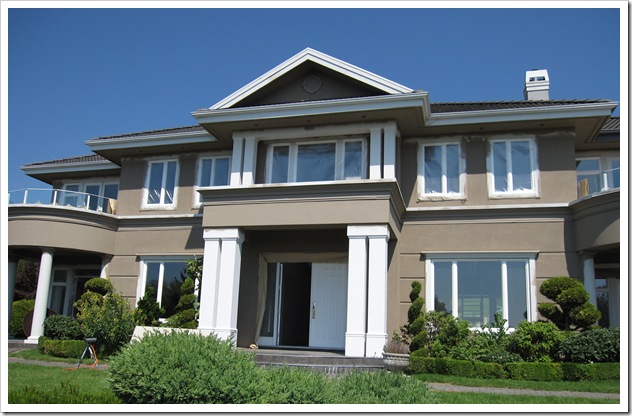
This exterior [was] in the process of being painted. It was previously an unfortunate shade of pink and is now in the middle of the transformation!

During
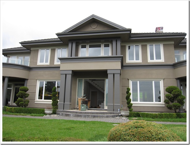
After
Much better don’t you think? Normally pillars look the best white [or cream] but in this case, this huge house without a lot of great artchitectural detail really works with the accents and pillars painted in a charcoal.
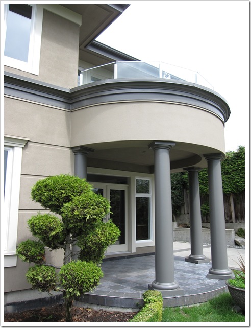
One of the reasons why the charcoal and brown works in this colour scheme is because they relate so well to the existing slate steps and patio areas. Always consider your fixed elements first before you choose a colour scheme.
Related posts:
Hiring a Designer; Luxury or Necessity
The 3 Most Important Words in a Colour Consultation
5 Steps to choosing the Right Exterior Colours
While you’re here, subscribe to this feed so you don’t miss out on any expert colour advice!

I agree, what works for one house may not for another.
Beautiful result! Love the charcoal.
xo,
cristin
I get so upset when clients tell me that they've had enquiries on the colour I have chosen for their house. Why do people think what works for one would work for all? Light, size, shape, aspect, surroundings all need to be considered when choosing an external house colour. You don't race off and buy an outfit you saw Nicole Kidman wearing for you, just because it looks good on her? (Mind you I'm sure she would make a paper bag look sensational!) Love your selection, very smart.
Maria,
This is amazing! The charcoal works indeed very well with the (I think bluestone) floor.
I am going to file these pictures because this is a good example showing people what a good transformation this is and to convince them by searching the right colour!
Thank you Maria,
Greet
ah yes, def great colours taupe and grey – my fav at the mom!
ahhh, very handsome. I wish you had a before pic. I passed on an award for your blog. Check out my page for details !
Have already forwarded your post to a client.
A front rail is white & should be……..
In addition to reducing the visual of the rail, emphasizing the home instead, it will push the home further back from the street.
Their white rail is making the home/lot appear small.
Garden & Be Well, XO Tara
Very nice, Maria! Well done. Can't help but wonder what you might think of the exterior colors of my house. I just might have to send you a photograph! 😉
It is just beautiful! Great job.
Most lay people don't realzie the importance of context when it comes to color. That is why there will always be income for professionals. One of the worst client color choices I ever saw was when clients painted the foyer and double height living room in an open layout mediterranean style home a really dark, drab sage/olive green because it looked so good at a friend's house, but they had been disappointed. When I asked what kind of space they had seen the color in, it was a small room with lots of traditional style molding painted a creamy white, hardwood floors, and lots of windows. I looked around at the huge molding-less room with very dark stained concrete floors and one source of natural light (a row of heavily curtained french doors), and thought I think I know your problem. After we painted the walls out in a much lighter, creamy, ochre they loved it.
Nicely done, Maria. This is my kind of painted exterior! Love the way the colors are working together with the other elements of the home. Very smart look.
A popular exterior color tip is to "drive around and look at other houses to find a color scheme you like". Sometimes it goes so far to suggest you go knock on the door and ask about the colors. That's not good advice. But many people follow it.
It's a problem so much so that I dedicated some precious word-real-estate to it on my new website in an effort to re-frame what that outdated color advice really means: "The place that you call home and provides shelter for you and your family deserves better than a hand-me-down color scheme".
Aside from positioning one of your biggest investments as favorably for the market as you possibly can, it just feels good. It feels good when the right pitch of color harmony is struck for people and structure.
Nice job, M.K.
Perfect picks. Perfect pitch.
This looks great – I have been staring at the outside of my house trying to figure out the colour direction for the longest time. Earth tones can be really difficult to pair. Our home doesn't have the most flattering shade of brick.. and I am trying to flatter it with Trim..;-)
I am going to have to learn to stop being so generous with my design advice..:-) love the designer's response..
i had that very same thing happen with a building i did recently! someone called me, wanting to know the exact colors I used so that they could duplicate them on a hotel they were painting. i explained that my clients had paid for a 'custom palette' and i wasn't at liberty to disclose that information. But if they wanted something similar, we could see if the same types of hues worked on their building. they quickly ended the phone call.
the next week, i heard from the painters that they returned to the job site, and were discovered sneaking around, trying to read the paint labels on the buckets…
* Mahhhhvelous, Maria~~~ It looks sooooo sharp… so stunning… strong… tres chic. Speaks volumes without shouting…
KUDOS n' thanks,!!!
Linda in AZ *
Love the charcoal – it's stunning!
I've never seen charcoal pillars and now I know they don't always have to be some version of white.
Love it!
Were the front doors painted charcoal too? Were the windows left white because they're vinyl?
WOW! What a difference…It never ceases to amaze me that people feel we do things for free!! But, happily nine times out of ten…our clients are the best. I have a rule, ht has served me well for many years. When working for a friend I never charge.
And,I only give advice.
Well I think it looks fabulous! I don't know that I would have picked charcoal, but it looks great!
Love the remark from your designer friend. Reminds me of the remark Don Draper made on this past episode of mad men. He told connie hilton that he didn't make it to the penthouse giving it away for free!
You are a genious!
I LOVE the charcoal pillars and accents on this house.
Sometimes I really wish our house exterior wasn't all white brick!!
Kelly
Maria – this looks so great – i would have never thought to do that – that's why you make the big bucks!!! it's so perfect!!! and what a difference. amazing.
Joni
I always love seeing your "Before" and "After" posts. The transformations are always beautiful. This one is no exception. You have such a gift!
xo
Brooke
The charcoal! Yum. And, that woman. She just drove away? Yikes.
beautiful!!!!! too funny about the woman stopping & asking the colors!
Actually, I thought the designer's response was kinda bitchy. I would feel slapped in the face and rebuked by that response. And yes, I'm a professional. And I give away a certain amount of advice for free – it's a chance to educate and get more business rather than alienate people.
Bitchy? Ehhh, maybe, maybe not. But it is savvy. I never would have thought of it. I would have been all excited that someone liked it enough to stop and get out of their car to come talk to me. Then I would talk a mile a minute, probably give her paint chips to go and stop just short of giving her my ATM PIN#.
Reading blogs makes you think about this stuff. Really, why should a designer give away that kind of info? A conscious choice to share freely or not is something each designer should decide for themselves.
After reading this, I'm going to rethink how I've handled it in the past. I'm not sure what I think about it now. Color me undecided on this one.
What a great look!
Suddenly modern instead of the same old same old…
I love the unexpected and you managed wonderfully!
Have a great weekend!
Victoria