Hi, everyone! Claire Jefford here of Creating Contrast Designs. I’m a True Colour Expert and certified interior decorator from Burlington, Ontario. I love mixing decorating styles and integrating both new and old items into my design plans.
What’s your favourite colour?
My absolute favourite colour is purple. Being born in February, I have the amethyst as my birthstone, so this is likely an underlying influence for my love of this colour. I prefer a deep, plum tone and feel that, overall, purple is sexy, regal, and inviting. I love it so much that I painted our bedroom Poetry Plum by Sherwin Williams, which complemented the drapery fabric and wallpapered accent wall.


What was your biggest colour/design mistake?
Obviously, this was prior to becoming a True Colour Expert, and thankfully, it was in my own home!
I designed built-ins for our basement living area, and I wanted to paint them a dark, rich brown tone. This was 10 years ago now, but if you follow Maria’s blog, you already knew the approximate timeline on that one!
The original colour I selected had a slight pink undertone that I didn’t notice when choosing the colour. As the surrounding walls were painted Hampshire Gray, which has a green undertone, this made the pink tones in the brown scream so loudly once the colours were side by side. It was just horrible.
My husband, although slightly annoyed at having to repaint, knew that, in the long run, this would be best for the future of our marriage. Ha ha! I reselected Willow by Benjamin Moore, and I am so much happier with the result.

How I would love to change my couch & carpet, but otherwise, it’s a pretty cosy place for our family
What is the most important colour lesson you’ve learned?
Compare, compare, and compare. To truly get a good sense of a colour, you must compare colours to one another. Now that I have over 250 large paint samples in my arsenal, choosing colour is so much simpler! For example, my clients can see instantly how a colour they thought was blue gray (like Gray Cashmere, for example) is actually more of a green gray when you compare it to a real blue gray, like Gray Owl. Sound confusing? Only if you’re still using small paint chips!

Grey Cashmere on walls and ceiling
When it comes to colour, what’s hot?
The colour blue has been popular in home decor for a very long time, and my prediction is that it will continue to be going forward. It’s fresh, soothing and sophisticated in so many ways. I’ve used blue in different design styles and various ways and am always pleased with the final result.
I took inspiration for a client’s living room design initially from the soft blue and green tones in the drapery fabric (below). I chose a slightly deeper and more vibrant blue for their occasional chairs and a few other accents in the room to tie it all together.

Pinch pleated drapery, pewter hardware with crackled glass finials

For another client’s family room, we repeated the blue found in their traditional area rug by applying it to their custom valances, and then again to accent cushions and accessories (below).

Benjamin Moore’s Flint is a dark blue-gray and can been found twice in my house. I used it in my living room, for a bold and eclectic look:
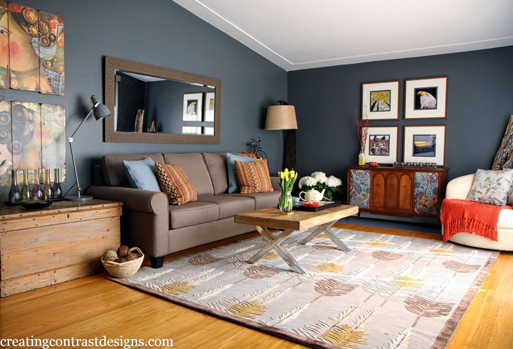
Eclectic Living Room
And I used the same colour in my son’s bedroom, where we applied it not only to the walls, but also to the ceiling and all the trim. He loves it with the pops of red and green, so we are both happy!

Boys bedroom in Flint, Benjamin Moore
What colour do you think is timeless?
White is definitely timeless. Although some may argue that it can make a space look sterile, I believe that if a design has been thoughtfully put together, the result can be stunning. Maria asked me to write a guest blog about a white bathroom design I did for clients a couple of years ago, and I still believe the look is classic and beautiful.

Claire Jefford, Creating Contrast Designs

Wood look tile grounds the space and adds warmth
Which colour trend would you like to see disappear?
Design and colour preferences are so personal to each individual, so I don’t necessarily believe that one colour trend alone should be banished. My role as a design professional is to work with clients to create spaces that are special to them and reflective of their tastes. I concentrate on scale and balance, as well as creating a cohesive colour palette that will flow with the entire home.
For example, I have never specified red in a consultation for a wall colour; however, clients who hired me to assist them with their living room layout and decorating requested that I work with the red accent wall that also housed their fireplace. I was happy to do so as I felt it went well with other elements of their main floor. We de-cluttered the room and brought in custom accent cushions and drapery that complemented the red wall. The room may not necessarily be my style, but it works and my clients love it, so that’s what matters to me.

Traditional living room with red accent wall and accents

I love these custom accent pillows with the rope trim, totally worth the splurge!
What do you think is one of the biggest mistakes homeowners make with colour?
Many times, homeowners are looking for a quick fix, thinking that just repainting their room will instantly transform the overall space and make them love it again. I try to explain that I do not simply choose a colour because it looks pretty, but that there is a process design professionals follow that requires thoughtful consideration. I carefully select finishes and accessories that pull everything together, and the paint colour is one of the last elements I choose.

Taupey tones in the granite in my clients kitchen go well with Benjamin Moore’s popular Pashmina
Do you find yourself drawn to designs where you ‘Create Contrast’ for clients, as your business name suggests?
When I chose the name for my business, for some reason it never occurred to me that people might interpret my company name to be a reflection of my design style. It never fails to surprise me how, during conversations, clients often use the phrase “creating contrast” when explaining the look they want.
Contrast isn’t necessarily just about colour, either. It can mean mixing different styles, textures, and finishes as well.
Sometimes, drawing attention to something is your only saving grace, and I find this to be especially true in modern decor. For a 3500-square-foot basement layout I designed, the number of bulkheads were ridiculous, but necessary. I get it! In the main living space, there was a five-foot-wide bulkhead that spanned the entire room, so no matter what we did, there was no ignoring this bad boy.
The bulkhead continued into an open-walled poker room that we wallpapered in a black and iridescent blue pattern. I wanted to keep the ceiling in this poker room dark and dramatic, but the massive bulkhead posed a problem in knowing where to start and stop the colour. My suggestion was to paint one side and underneath in Symphony Blue by BM. This would tie in with the backsplash at the bar and the wallpaper in the open poker area.
In this situation, contrasting the colour of the bulkhead was a great solution that worked really well and made it more of a feature, rather than something we were trying to conceal or ignore.

What did the True Colour Expert training do for your business?
Not only did Maria’s course provide me with the confidence to help choose colours, but it also gave me a better understanding of undertones and how to identify them when looking at countertops, backsplashes, flooring, fabrics, and more.
Meeting other like-minded professionals in my field who were interested in improving their skills and knowledge was a great (and totally fun!) experience and networking opportunity. The TCE Facebook page is an especially helpful resource to have when seeking advice and support from people who share similar experiences.
Without a doubt, investing in this course and buying Maria’s large colour boards has taken me from being anxious during colour consultations to now seeing it as one of my favourite parts of the job!
Thank you, Maria, for the opportunity to write this guest blog post. You have taught me so much when it comes to colour!
Photo credits go to Stephani Buchman of Stephani Buchman Photography and Leah Kirin from Forever Moments Photography.
Now it’s your turn: What do you do with awkward structural elements? When do you hide them, and when do you make them stand out? Let me know in the comments, and come check out my blog. Today, I have a special post up for Colour Me Happy readers about the ONE thing you must make sure your interior designer has.
—
Thanks, Claire! See more of Claire’s work here.
If you’d like to become the next True Colour Expert™ in your area register here.


What a great posting – I just love how you used all your own photos to explain the answers to the questions. Everything looks fabulous!
Thanks Jil! Yes, I was pleased that my photos reflected the explanations in my answers too!
Claire, I love your son’s room with Flint wrapped floor to ceiling. It looks so cozy. And, what lucky clients to have you to design their gorgeous white master bath. That huge shower with both a waterfall and hand sprayer is fabulous!
Thanks Ellen! My sons rooms really is proof that painting a small room a dark colour does not make it cold or closed in. The shower of my clients also has 4 jets on the wall that you can’t see – photographs cleaner without showing them! 🙂
Thank you. What a great post Claire!
Cheers Robin!
Beautiful Claire! I love purple too and I love your bedroom color choice. Your home is beautiful. Great job explaining how you choose colors for each room!
Hi Kelly and thank you for your comments. Isn’t purple fantastic?! It’s my kids favourite colour too!
Great post! Love your design photos.
Thanks so much Jo, glad you enjoyed the post and photos!
Great post Claire, as usual! I really enjoyed reading that and seeing some of your work!
Great post Claire!
Thanks Sheri!
Great post, Claire!
Cheers Alison!
Great job! Love seeing every point illustrated with your own work. Bam!!!
Ha ha, thanks Susan!
Enjoyed reading your post!! Beautiful work. You have learned Maria’s lessons well!
Thanks Margaret, I appreciate your kind words. Meeting Maria, following her blog, buying her book, colour boards and attending her course have totally changed the way I approach colour and I’m so thankful for it. xo
You nailed it Claire! Beautiful and informative post.
Cheers Diane!
Claire, What a wonderful lesson in contrast! You did a marvelous job creating each room. There is so much to learn in this business. I love being a designer and still learning from other experts. Maria is such a good teacher and she has helped us all.
Thank you for this post.
Hi Lucy and thanks for your comment. Yes, we are always learning in this business which definitely keeps us on our toes, that’s for sure! With great mentors such as Maria and helpful networking group – like the True Colour Experts on fb – we all learn invaluable skills from one another. 🙂
Hi Claire, I am a fellow decorator located in Milton, Ontario. I really enjoyed your post and your use of color. I share your opinion that the client’s taste is what is to be considered over our personal taste and strive to cater to that within every project. On a personal note… I wonder if you might share the company name/details of the white tile in the the shower image. I have been searching for a larger white tile with a mixed glazed/matte finish and this seems to have that. I can’t tell you how many tiles I have searched through at our local tile store! Thanks 🙂
Hi Carolyn, thank you for your comments! I believe this is the link to that tile – link http://www.ceratec.com/SKU.aspx?Language=En&CollectionId=1&ProdId=BINTESS10200000WHIT2
I got it from Eden Tile It in Burlington. Lisa is my contact there and if you were to call or go there and let her know that you are interested in that tile, she should be able to help you. Let me know if you find it and if you use it in your design!
Great post Claire. I loved what you did for your clients with the builtins next to the fireplace. Great job! Also, all your photos are beautiful.
Aawww, thanks Linda! I impressed myself with that built in unit too! 🙂
Enjoyed your post, Claire. Like your attitude regarding working with what the clients likes and respecting their wishes …that is so important to being successful in my opinion..often people have negative experiences with designers because they feel the designer wasn’t really hearing what they were saying. Like myself I did not want a white kitchen and white subway tile and got comments like its timeless…everyone wants white etc etc…
Great post Claire…love all your paint choices, especially the dark blue grey in your living room!!!
Great post Claire…love all your paint choices, especially the dark blue grey in your living room.
Thanks Patti, I love the deep blue grey in my living room too!