


I see this over and over in kitchens everywhere. And I think I’m especially noticing it now that the strongest colour on the planet is trending.
With so many black kitchens and islands everywhere, the biggest mistake I’m noticing is that there is zero contrast between the chairs and the island.
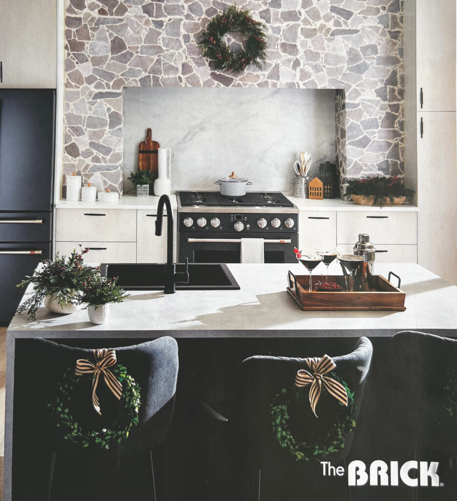
Case in point, I received this flyer in the mail and I thought the styling was really pretty, except that you can’t see that there are counter stools at all because they blend right into the black island. The wreaths are the only way we can see them.
In my Expert Colour & Design Training workshops the conversation about contrast is a BIG one because it’s such an important design principle. I wrote a post about it here.
You can’t see (or unsee) black counter stools
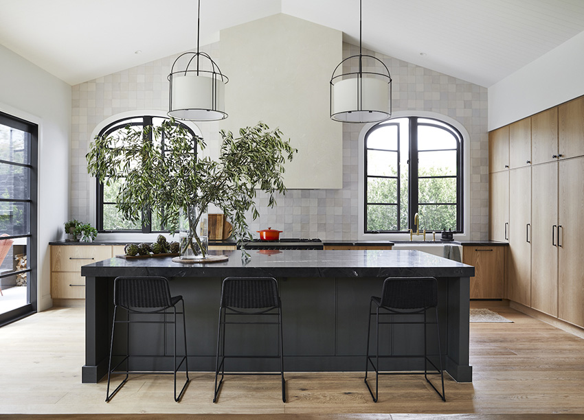
After you read this post, you won’t be able to unsee this everywhere you look. Even in otherwise pretty high-end designer kitchens like this one below.
What to do instead
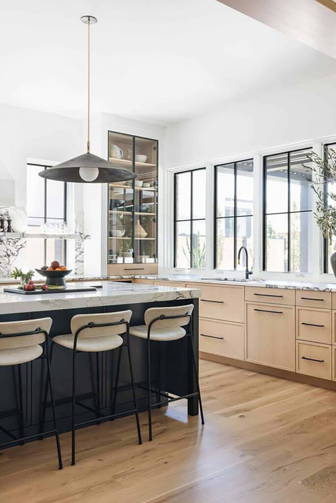
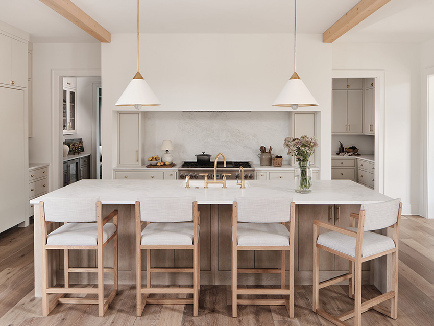
So here’s what to do instead. If you have a black island, look for a lighter colour to repeat to create contrast with your island stools.
These rattan stools pick up the light wood floors and accents and perfectly break up the otherwise heavy looking island.
This also applies to wood stained islands. Or any deep island colour. Which I thought I would mention because the novelty of black kitchen islands will soon wear off.
More design advice about contrast
One word of caution though. When choosing contrasting stools, be careful that they don’t create too busy a look against a dark island.
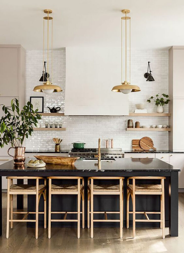
An upholstered stool works well because the legs can blend so that only the upholstery contrasts. This way you don’t end up with too leggy and busy a look. As they’ve done with these stools below.
And here the same idea with a softer wood stained island.
How to choose the right kitchen counter stools
In the end, choosing a very dark, especially black, accent for your island invites issues with creating balance with contrast. And getting contrast right is key to a successful design.
So instead, skip the trendy black island and opt for something softer like a pale wood tone, matching your island to your perimeter cabinets, or pulling a pretty colour out of your decor.
If you’re not sure which counter stools are best for your kitchen, or what the perfect island colour would be in the first place, and your kitchen just all around needs a bit of a glow up, check out my new Kitchen Refresh eDesign package here!
Related Posts:
Contrasting Kitchen Island: Get YOUR Colour Right
Kitchen eDesign Project: Before & After
The Colour Psychology Behind the Black & White Trend

In some cases, one does not want the counter stools to stand out but rather recede, because there might be other elements in the kitchen that are more important to highlight. I love the kitchen and the choice of dark stools under dark counters as in KWD because they create a “unit” with the island and my eye goes right away to the arched windows and then takes in other details.
I suppose this is subjective which is why there are so many lovely and different approaches to designing a kitchen. But to my sensibilities, setting priorities of importance is a good place to start.
I agree, contrast is so very important and essential to good design, because sometimes you want it and sometimes you don’t! As you said, are there other focal points more interesting that the eye needs to move to first? It really depends on what else is happening in the space. I think there are times for both, but to eliminate one option would be remiss.
I totally agree.
It should’ve read I agree with Amanda. Sometimes the barstools should blend in as they can be too distracting.
I don’t mind the barstools but the off-center sink in the island would drive me nuts.
I hear you about the sink and in most cases I would agree. But here, centering it would make it right in front of the range which would make it visually and functionally awkward.
Our sink is centered with our range, which makes it not centered on the island and was done intentionally. I believe it is off-center here to accommodate the dishwasher being in the island as well.
I think the problem with the sink is that it is black, so being off-center really stands out.
Some people put an island sink off-center to preserve a continuous prep space, but the sink needs to blend in. It should have been a white sink with a nickle faucet.
That stone wall is the big “no” in this kitchen for me. Particularly combined with the marble backsplash.
I thought that would have been the problem, not the stools. I cannot take my eyes off of that stone wall, it’s SO jarring and brings the whole kitchen down. In addition, contrasting stools would have added insult to injury. IMHO.
Absolutely agree! And there’s barely any prep space by the stove since the brick takes up a lot of counter space. Bigger issues in this kitchen than the bar stools.
I’m just focused on how my legs would hurt having to sit on stools since my feet wouldn’t reach the foot rests. My toes might. And how I’m so clumsy getting on a high stool I just wouldn’t.
But the first what-to-do-instead kitchen feels too busy. The stools catch my eye more than some of the more important and pretty elements.
I’m all about function. In my opinion, most of these stools look uncomfortable, unstable, and definitely unbalanced (in terms of design and function). Where do one’s legs go when sitting on these stools? Or your elbows? Or ouch, your lower back? Can four people (last photos) really sit side by side on these stools? I don’t think so. Thus, the stools are purely decorative and, in my opinion, clutter.
The things that stood out to me about the first photo were how busy the stone looks with the marble backsplash and the off center black sink in a white counter. The black makes the off centeredness stand out. I kind of think if the stools were a contrasting color it would just add to the chaos. Your eyes would just be darting from the stone to the marble to the sink to the stools and back. Also, that photo looks super blown out, so I wonder if the stools even really blend in that much.
I didn’t mind the stone with the marble actually, I think in this case the exception to mixing patterns works. Plus the examples I’m using here are still designer kitchens, there are countless examples online of stools and chairs that blend in which is the point of this post 🙂 Regardless, you cannot unsee it now. Thanks for your comment, Maria
You’re so right Maria. I didn’t even see there were any stools, they’re so well hidden. But I also really hate (though that’s a strong word) that rustic purpley stone against the blue grey marble backsplash.
ditto to all the comments about the marble with the stone. Yikes it is awful to me. I can’t stand a sink or a stove top on the island. Just messy. Wow this was super negative. My apologies!
My eyes went right to the hideous fake stone wall – especially with marble next to it. Yikes. New chairs is a much easier fix!
Haha I would say the BIGGEST mistake ppl make is getting non-counter-height stools! Can’t tell you how many homes and kitchen showrooms I’ve been to with breakfast bar height stools placed at a counter height island. Maddening.
That is true I have seen that many times as well. Maria
What is the right height for the different types of stools? I have noticed when visiting that sometimes I’m leaning WAY over to reach down to the counter. Or, perhaps I have it wrong, and that’s how it’ supposed to be?
I think this might be one of those “matter of taste” things. I think barstools look cluttery, a visual mess. If I had a kitchen with a counter that needed barstools I’d do my best to hide them. The first kitchen with the stone – the hidden barstools are a must. There are so many things wrong with that kitchen, more contrasting barstools would cause even more distraction. The second one with the tree branches – I think that one is perfect with the hidden stools.
Hi Maria! Thanks for creating so much wonderful content! My husband and I are building a new home and our kitchen will have light mushroom colored cabinets with a dark wood island. Our wood floor will be a light oak. Because there are two different wood tones already, should I go with a metal base for my stools? Or try to match the floor?
Thanks, again! Your color wheel and ebooks have been a lifesaver as we make a million choices for our forever home! ♥️
The mistake I also spotted is the application of “stone” at the range surround. As an architect, I wince when I see ‘lick-em-stick-em” stone veneer installed without the essential detail of a stone or timber header. Missing this detail exploits the faux nature of the veneer.
Stone should appear to be stacked and structural when applied on a vertical surface. Random stone belongs on horizontal surfaces.
I’m with most of the commenters, seeing this as an issue where not everything has to yell “look at me, look at me!” and 99% of the time, I’d want the stools to blend in and not be the boss of the room. But…..I’m definitely not a designer, so what do I know haha
I have a mostly white kitchen. There are green walls, not much wall shows but they are a pale green. I have found brownish-black counter-height stools. I hope they are going to look good and be a contrast. The granite counters were already there and they are white with black splotches! ( I would have wanted white quartz with a hardly-seen veining. I think it is called Miami Vena. Do you think I picked the wrong stools? The eat-in kitchen is right near them and the table and chairs are a lighter maple color. I am not sure about having a rug under the kitchen table.
Not a fan of the disappearing stools. just a clue that there’s somewhere to sit would be nice. Too much black everywhere these days!
I really enjoy fresh ideas, and learn something I didn’t know