I recently received this question from a reader who sent me a photo of her kitchen:
Hi Maria, I SO want to make my little basement apartment a haven that I love to call home. I want it to be as light and bright as possible since there is so little natural light… and I LOVE lots of light.
Everything is being painted… the cabinets, all the walls, etc. So I am working with the floor and the countertops when I am trying to determine the undertones I already have. The refrigerator and stove are an almond color, not my fav but will probably need to stay for now. Thank you again.
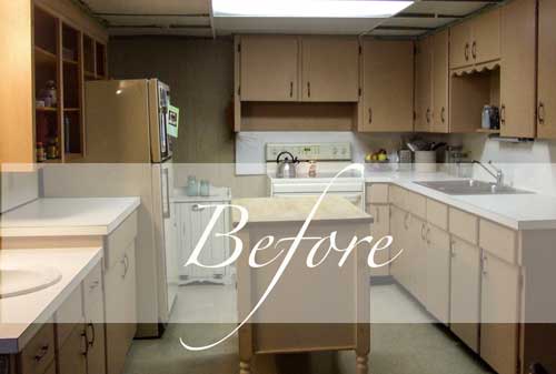
Here is her before photo (above). There is no natural light in this basement apartment kitchen. The light you see above the sink on the left is not a window.
The cabinets are pink beige, and the floor appears to be a yellow beige. The fridge looks more pink beige than almond (which I interpret to be green beige), but that could be because photos taken without natural light are not 100% accurate.
This kitchen presents a strong argument for colour!
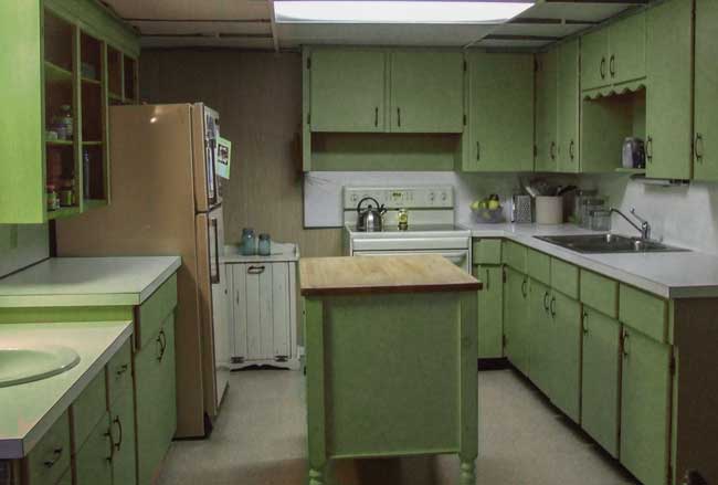
Have a room without natural light? This is when using colour over a neutral is an absolute necessity. I photoshopped this kitchen so you could see what the possibilities are.
First, the existing white countertops and backsplash are a bonus because they look the best with fresh colour over a muted neutral.
As you can see by looking at the before picture above, white simply makes the cabinets look even more dirty.
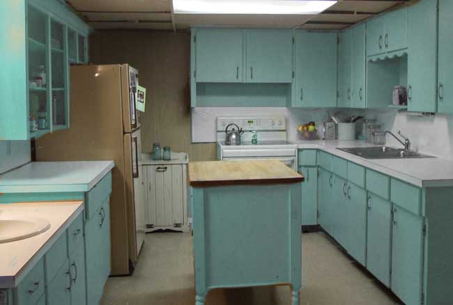
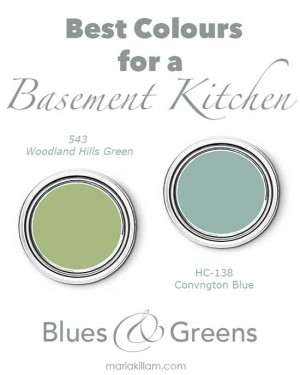
I prefer the turquoise because I think it looks better with the pink beige fridge. I would paint that back wall white to match the backsplash, or leave it as is to blend in with the fridge.
Or if you have a refrigerator that will always look bad with a fresh, new colour scheme, paint it!
Black chalkboard paint would turn it into this:
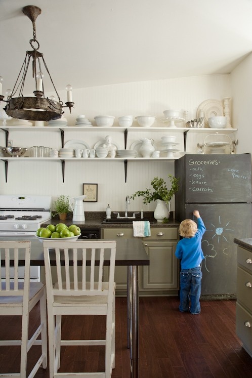
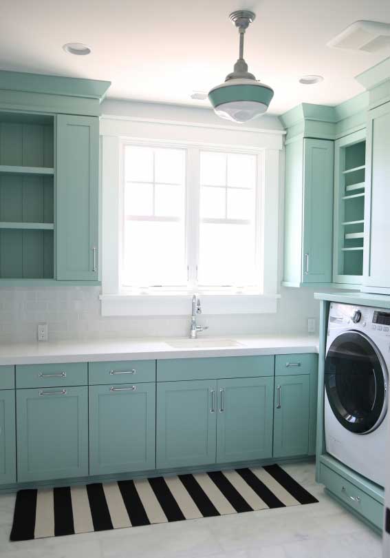
And then it would coordinate with two black-and-white runners on both sides of the island, which would help hide the beige floor and look similar to this photo below:
Via Sunny Side Up
Make sure you get an outdoor black-and-white runner; otherwise, the white stripes won’t stay white for long.
Here’s the kitchen photoshopped in a yellow beige (above).
Now, if this kitchen had flooring or countertops that were patterned instead of a solid, you’d have no choice but to paint the cabinets whatever colour looks best with your existing fixed elements.
via Pinterest
Here, the gold and green granite countertops relate to the green painted cabinets (above).
 via Pinterest
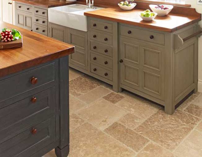
Here, we have pink beige travertine combined with blue and green (above). Neither shade actually looks bad with the tile floor, but IS a lot of colours.
Over to you, my lovelies. Which colour would you choose? Love to hear your opinion!
Related posts:
When Should you Rip out Brand New Tile?
5 Steps to Selecting the Right Colour for your Kitchen
5 Steps to a Kitchen You will Love
If you are stuck on choosing finishes for your kitchen, get the help you need right here.


At first, I couldn’t see the fridge on my phone.
To me that fridge looks like harvest gold, because it blended into the cabinets, and not almond… plus the stove looks bisque next to the white counters, also not almond.
I do like the blue and green suggestions for the paint. The blues you photo shopped in is very nice, but that fridge looks like it would be better chalkboard painted in black with the runners. Very cute that way!
I like the blue cabinets with the chalkboard paint as well. Why not have fun with color in a basement kitchen?
Love the turquoise/aqua and paint the frig. They can also apply removable chalkboard paint contact paper…no damage if they move. The most offensive thing in the room for me is the hideous florescent light fixture smack dab in the middle. A little too shop class/work room for me. Can they switch it out for an LED altar light…same shape, better ambience. Maybe some peel and stick vinyl hardwood look planks for the floor. The more expensive ones look nice…see them being used in many restaurants and one supermarket where I live. Or maybe paint the floor too if possible. Would like to see what she eventually picks. Very interesting post.
I’m with Elizabeth. The fluorescent light should be replaced or the result will be uninviting and lack ambiance. Maybe small lamps to fit under cabinets too (west elm). Also agree with a vinyl hardwood look plank floor. I think once the floor and lighting are corrected any color that works with white is an option. Even grays. Best if the refrigerator can be painted too.
What about painting the island black along with the refrigerator?
I also love the turquoise:)
I prefer the turquoise for the cabinets, black chalkboard paint for the refrigerator AND that back wall. Plus black and white runner for the floor. I’d also really love to see the finished kitchen once your client completes the project!
Why not paint the fridge white? Green or turquoise cabinetry brings a ‘happier’ feel to the space. To me, a big black fridge would look stark among the white counter tops and back splash, although I can see that a b&w runner and maybe a few black accessories would tie it together. But I’d prefer light, white and bright!
You could consider adding under-cabinet lights with either ‘daylight’ or ‘soft white’ LEDs. I think someone even makes a ceiling light that is supposed to resemble a skylight, with the look of clouds/sky.
I like your idea. A white fridge along with the other white elements & turquoise cabinets seem happy to me.
And fluorescent lighting never did anyone any favors. Get rid of it.
I agree with both of these ladies. Though the black chalk paint is an idea I’ll tuck away for a young mom.
Florescent lights are harmful to the brain–away with that culprit. AWAY!!
Whatever lights she chooses, get “daylight corrected”
bulbs. We all thrive on daylight.
Base of island painted also…how about a soft charcoal to diminish it’s size?
This post spoke to me for another reason…
I live in an area in a mountain/resort community in which most places are dark–surrounded by dense forest. I’m always seeking a solution to bringing life to these spaces.
Thanks , Maria, good one!
Love, Paula
PS: YES, by all means, paint the back wall white.
Always bugs me when the upper or adjacent walls
on the same plane are different from the back
splash. It looks WRONG every time!
Sorry, I’m a little picky that way.
I’m actually not a fan of either option. The green color immediately made me think of the 1960s avocado green, especially with the pink-beige wall color. The blue is better, but again, the wall color needs to be changed also in order for it to work.
I would do the blue color, but do the island in the yellow, paint the walls white, and add some great artwork on the wall beyond the refrigerator that incorporates all the colors.
Agree LoriBeth. Fabulous idea!
I like your idea, it could trend very French & cheery. There was a blogger who bead boarded her fridge, I think it was on Cottage8, maybe that would look better than black if a lighter look is better?
Here’s the link:
http://theoldpaintedcottage.com/pages/mycottage.htm
I love the turquoise. I agree– paint the island black (or white) to break it up a bit and paint the frig. I’ve also seen people wallpaper their frig with removable vinyl wallpaper.. with the right pattern it looks super cute!
I love the blue
Sorry- None of the above.
I agree. Go with the yellow-beige with warm red accents, like the island.
And the open shelving next to the fridge.
May I suggest that you remove the scallop above the sink? That so dates the kitchen. It’s amazing what little things such as this does to help update kitchens.
I think I like the blue in this instance, even though green is my go to color for most things. 🙂
Agree!
I say move. It’s an apartment. Nothing will ever look like natural light except natural light: windows, sunshine, clouds, grass, trees, sky.
To me the only colour for the cabinets is white…to quote you: “Your cabinets are like furniture and I would put white furniture anywhere regardless of how dark or light the room was.”….then maybe paint the wall turquoise and the fridge with chalkboard paint…
This is interesting too–can you photo shop that option, Maria?
To me, this is a different situation. Usually Maria is talking about new kitchen cabinets that can cost $15-$30,000. When you are making a decision about buying cabinets that you will more than likely have for decades, white makes sense. These cabinets are probably from the 50s and 60s and aren’t precious. A fun color perks them up. They can just be painted again if the owner gets sick of the color.
I really like the yellow beige. Maybe it’s just the Photoshop, but the yellow beige really brightens up the space compared to the other two colors. And that almond fridge looks right at home instead of sticking out like a sore thumb.
I agree 100%, Kristal.
It’s a small, dark kitchen with lots of cabinets on all 3 sides plus an island, so anything other than a light neutral really absorbs any avialable light and overpowers the space, or anything introduced to that space (to use Maria’s words, “It’s bossy!”). I think anyone would get tired of so much green or blue really fast! And it actually looks more dated to me.
The last option is a nice neutral that works well with the existing almond appliances and white countertops, and allows color and pattern, if desired, to be introduced and coordinated in other places — on the walls with paint, wallpaper or art, with accessories like towels, dishes and decorative objects, and even a small rug on the floor.
Plus it saves the reader from having to paint her appliances 😉
What Denise said: “It’s a small, dark kitchen with lots of cabinets on all 3 sides plus an island, so anything other than a light neutral really absorbs any available light and overpowers the space, or anything introduced to that space (to use Maria’s words, “It’s bossy!”). I think anyone would get tired of so much green or blue really fast! And it actually looks more dated to me.”
But I would paint the kitchen a light neutral grey; a pretty accent colour of choice for the walls; white fridge; and bring in some colours to complement the walls and a couple of other coordinating colours in accessories and rug. Much more versatile. Good lighting is a must, also under cupboards. 🙂
What Denise said. But I would paint the kitchen a VERY light neutral grey (leaning a little towards beige – not green); island could be the same colour only darker, or a not too stark turquoise/blue; a pretty, coordinating colour (not too stark) for the walls; white fridge; and bring in some colours to complement and coordinate with the wall/island in accessories and rug. Much more versatile. Good lighting is a must, also under cupboards. 🙂
My daughter currently lives in our basement apartment. It was filled with a lot of wood panelling & wooden kitchen cupboards. We painted the walls a lovely grey and then painted every single piece of wood in the apartment a pretty white. The space looks lovely. I love colour on the walls, but it just wouldn’t have worked in this space. Now it looks sophisticated & fresh.
Ummm, this sounds possible too1
Hard choices.
Wish I knew how to photo shop—
Ok, it’s on my list.
I like the blue — the green makes the space look murky.
What about making the island the bling in the room by adding colurful artwork to the side or painting it with a colourful pattern. Use the island like a toss cushion to incorporate all the colours and bring more life to the room.
Sorry but I couldn’t live with either of these colors. It’s difficult to know what color the fridge really is from my iPad, but I think painting the cabinets even lighter than the beige and walls a shade darker would be nice. I love the idea of painting the fridge. Finding a colorful picture and bright cookware would be my choice to bring color into the kitchen.
I have to say I do not find the colour choices attractive. I could not live with them especially in a basement where there is a lack of natural light.
What about a half tint of the Covington Blue, white on the wall in the back and add to that wall three shelves (incorporating the scallop) to display plates/platters or small pictures (all with an organic feel, it would look great and bring the outdoors in), with the bottom one the same height as the cupboard. Change the ceiling light if possible and add under cabinet lighting (perhaps the pucks). I like the idea of painting the fridge and the island in a chalkboard paint (BM’s can be tinted to any colour, perhaps Chelsea Gray HC168). I would also center the stove.
I also like the idea of the black and white striped runners.
I think both the green and blue cabinet colors are lovely although I prefer a green with more yellow. Once your reader decides, I’d tackle the fridge. I’d check with the landlord – might be an old fridge still in good condition with no plans to replace now but since your reader is planning to stay, the landlord might say “have at it” as far as “decorating” it, in which case your reader could have a ball. There are some many ideas out there and there are also neat magnetic covers available. And maybe a very simple and clean trompe l’oeil “window” or a large picture of one on the back wall (with proper lighting) could give an illusion of light and openness (simple so it doesn’t interfere with the fridge). Of course the fluorescent would be better changed, but that might not be possible so I wouldn’t label the kitchen negatively because of it. I hope your reader will share the after with you and us.
With fridge biscuit and stove almond/off white w/paint cabinets the blue and paint entire rear wall and cabinets white to match counter tops or stove. Small cabinet hiding behind fridge move next to stove – paint white, also. Paint fridge white if landlord approves – if not check temporary sugg. above. Hang fun poster on rear wall, remove scallop trim on right and change fluorescent light. Paint Island blue. A few black accessories/towels with black/white outdoor area rug – to clean better. Have fun!
Adding to painting entire rear wall and upper cabinets white: – would also paint right side upper cabinets white.
Con’t… Possibly all rear and right upper cabinets off-white rather than white of counter tops – will work more naturally with floor and help pull entire room together. With counter tops whiter – m/b fresh, subtle accent – m/test t/b sure.
I love the turqyoie color for cabinets.. Definately woyld chalk paint fridge front black and maybe reat of fridge the turquoise color?? The vlack and white striped rug so great. Matbe paint the one section of wall by oven giant horizontal vlack and white stripes.. Awesome…
I would do white/off white upper cabinets..a white with similar undertones to counter and stove. Lowers in a teal. Cover, paint or ignore refrigerator. A few black accents. I have a variation of this in my kitchen. BM Knoxville Gray bases, linen white on uppers and bisque appliances. Light quartz counter and soft white subway tile. I love my kitchen but would use a more saturated teal on bottoms in a basement.
In a perfect world we’d all replace the refrigerator but budgets and wants don’t always align. Therefore, I’d consider investing in a couple of sheets of cabinet grade birch plywood and enclose the refrigerator. The concept would be executed similar to the washer?/dryer? shown in the turquoise laundry room picture. I’d probably keep the side panels at counter depth. Then paint it to match the rest of the cabinetry. Only the front and a small sliver of the side of the refrigerator would be visible. As others have suggested vinyl appliques or contact type papers could be used to cover what is still exposed. Based on the photo, it looks like there would be enough room to accommodate the 3/4″ thickness of the plywood.
As for cabinet colors, I’ll leave that for others to debate. 🙂
Depending on how much money she has to spend on the remodel, there are several alternatives. First if there is enough space above the fluorescent light, she could put in pot lights. If not, there are ways to change the fluorescent to a more natural light. She could even put in a chandelier. Under cabinet lights would help immensely. The cabinets could be painted a cream and the island turquoise. If where the fluorescent was and that space is still raised I would also paint it turquoise.
The refrigerator could be taken out and repainted white or cream to go with the white/cream combination.
Accents of turquoise and cream could pull the whole kitchen together.
From the photo, it looks like the kitchen has what is known as drop or suspended ceiling which is a ceiling comprised of individual panels suspended in a metal grid. It also looks like both the grid and the panels are in rough shape. New ceiling panels could be installed in the existing grid but that can start to get rather pricey. Plus, if the grid is warped and misaligned, it’s basically lipstick on a pig.
Regardless, lighting changes in these types of ceilings can get very expensive. Let’s put it this way . . . it would probably be cheaper to buy a new, basic refrigerator than to upgrade/change the ceiling lighting (assuming the reader would have to hire a professional).
I’m not sure painting a refrigerator white would make it look better, I’ve never seen one. Chalkboard paint would give it some interest and function without trying to pretend it’s a new fridge.
I really didnt like either one. I preferred the orginal color over the blue or green. My choice would be in a cream/beige or grey tone for the cabinets.
Contact paper is always an easy, removable option to apply to any permanent fixtures in pesky, less-than-desireable colors. One would need to be extra careful with the application on rounded corners of appliances, for instance, but it would be an easy application on countertops. That simple color change might make all the difference! You could also experiment with artisan tape from craft stores to create a custom accent on your back splashes or the doors of your fridge.
Another trick might be to use a colored led rope or tape light installed beneath the cabinets. That would change the hue of the counter tops beneath them and create depth to your kitchen’s design. It also provides additional light in a dim room. (I did this in my kitchen and my roommates and I love it!)
Updating the hardware could also go a long way into making this kitchen feel a little more bright and friendly. I’m imagining stainless steel handles, very similar to the first two Pinterest photos Maria posted. If you DIY install them, and save the old handles, you can always replace them before you move and take your investment with you!
Accessorizing in the color schemes Maria suggested would be super fun and easy! I noticed that they are also somewhat interchangeable. – In the original photo, there are blue mason jars and green apples (very kitchen-appropriate). Both fit nicely with the turquoise and muted green paint swatches Maria suggests.
I too prefer the turquoise version. I think it blends nicely with both the white counters and natural wood butchers block counter. It also works better with modern black and white accessorizing.
I would love to see a beautiful bright red counter-top mixer in the turquoise kitchen! 😉
Another thing you can do with the fridge is fix a cute Etsy-esque chalkboard hanging onto the exposed side. This will minimize some of that color in the room and create a shabby-chic little place to display that week’s menu! Or it could become a fun, easy way to keep track of your weekly shopping list. <3
-Lizz
Oh! I have another decorating idea for you to consider! Have you ever seen those mirrors that are fashioned to look like windows? I think those are great because they mimic the feel of a window and light tends to bounce off of them and multiply a little!
A nice place for a window-mirror might be above the stainless steel sink, where there is currently some kind of shelf. I like feeling like there’s a window in front of my sink when I’m doing dishes (luckily, my current rental has a real one).
Keep buying fresh flowers for the island and keep the space clean and fresh. Maybe the rest is not worth the investment?
Maria,
While your style occasionally doesn’t quite sync with mine, I usually see where you’re coming from and agree with the internal logic of your choices. This is that rare time when I just don’t get it. At all.
I like both colors, possibly as accents, but I don’t see your design sensibility anywhere in the photoshop options.
What a great post. Loved that this situation was posted. The color solution in a less than perfect scenario made a sad kitchen inviting. I really like the Turquoise. It’s such a malleable color and I’m not sure why.
The turquoise is my favorite, and the refrigerator should get the black chalkboard paint.
What is the adjacent room like? Is it visible from the kitchen? -Brenda-
Brenda, this is my apartment 🙂 and yes, the adjacent room is visible from the kitchen… the basement is one big open room. So, if you can picture an area for a small table and chairs and a living-room – that’s what the rest of it looks like. Wish I could attach a picture.
I have to vote for the yellow beige. I think it makes the date scalloped cabinets less dated (1980s country). Save up for a new refrigerator!
I love the turquoise. My teenage daughter painted her bedroom this exact colour a few years ago to match an ‘antique’ map on the wall and it looks fabulous.
I am enjoying all the feedback and suggestions (yes, this is my apartment) – thank you for taking time to comment. Personally, I’m not digging the green or turquoise options for the cabinets. I would prefer a neutral, so the yellow beige photo option seems the best of the three to me. To those of you who mentioned going with a light neutral leaning toward gray – I’d love to get some gray going on in there. Not sure if I can do that with the yellow beige floor though?
Not a fan of either. Turquoise would be better. The green does date the kitchen. Why not paint refrigerator white and bottom of island white along with the wall. The idea for the stick tiles is great and change lighting. Island definitely different color to much turquoise. Good luck should be pretty when finished.
The lighting needs to be improved first. I’m not a fan of the colours if the lighting stays as is.
For someone who preaches white kitchens, this surprise me. Based on the photo, surely white/off white be a better choice than color in this space. (Perhaps only the island with color?)
Two suggestions: 1. paint the wall left of the stove to match the white cabinets. 2. box in the ‘fridge with cabinet grade plywood and paint it to match the cabinets. This would eliminate any visual break in the small space and make is look more cohesive.
First, the island does not look like a piece of furniture and it’s small. I’m not a fan of painted little islands like that which is why I did not recommend it. If she wants to paint it, she certainly could, there are lots of great recommendations here.
And, this kitchen is PHOTOSHOPPED. It’s not painted. My intention was simply to show colour vs. white, and I think if you have an old basement kitchen with zero natural light, this is when COLOUR should be introduced, not white, cream or grey. This kitchen should be HAPPY, and colour creates that more than anything else.
Maria
Yellow beige for sure. Do not like the blue or green and was surprised they were suggested.
As a guide line i always use Marie’s saying .
White doesnt come to life wirh out light.
She is so right on.
At first my thoughts were i need light color in dark spaces.
It turns out do blah and just dirty looking.
But color will come to life in a space with not much natural light.
Its been a lesson i have learned the hard way.
By just listening to Maria i have saved a lot of money .
Some times i have thought OMGosh what?
But then I do what she says and its just right !!!