Thank you to the Washington Post for including this post in your blog watch, March 26, 2009!
One of my clients generously allowed me to photograph her kitchen [last week] so that I could walk through [with you] the new colour we chose and why?
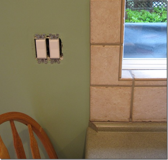
This is the countertop and backsplash tile. You can see that the backsplash has a pink undertone and that the existing wall colour does not relate to the countertop (it’s bluer and fresher than the gray/green of the counter).
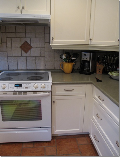
And she has a terra-cotta tiled floor (below). This is the process of choosing a new paint colour:
1. Is there a relationship between the backsplash, flooring, counter or cabinet colour?
In the example I’m showing today, the answer is no. This rules out the possibility of adding yet a 5th colour that does not relate to ONE of the existing finishes.
2. What colour would look best with the floor?
In this case a straw/yellow colour would have been my first choice with the terra cotta floor, but any shade of yellow would have looked terrible with the pinky-beige backsplash. And we ruled out orange (too strong), or any shade of peach (too dated) as neither colour would work with the backsplash.
3. Can we pick the colour based on the backsplash tile?
Here my client was not interested in repeating more of the pinky beige and it would not have been great with the floor either.
4. Can we work with the existing green shade in the countertop?
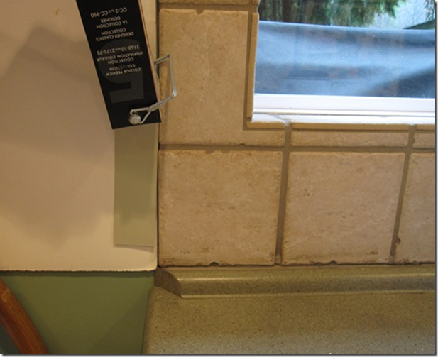
Yes, picking the Correct shade of green was our only option based on everything we had already considered . We selected cc-606 Beachglass:
There’s some shadow in the photo but you can see that when we held up the new colour (with a white board behind it) the Beach Glass is a perfect match to the counter.
5. Does this new colour flow with the rest of the house?
In this case she did have perfect flow as her sofa and loveseat were a darker shade of the gray/green we chose for her living room (which was a lovely coincidence as this was the kitchen in the home when they moved in).
Asking these questions will help eliminate a pile of colours already, making it easy to choose the final colour. And if this is not easy for you? Consider hiring an expert. Then you will love your space, every time you walk into it because you will know the colour is right.
Related Posts:
Insider Secrets to Testing & Selecting Paint Colours
What Everyone should know about Beige
The Right way to Create Flow using Colour
New to this Blog? Click here ; Subscribe to my Monthly Newsletter; Become a True Colour Expert


Great job Maria, I am glad that darker green is gone and a new more subtle one has come.
Accent colours choices, if needed, will be several, against a harmonious background.
Hope you’ll post pictures when the kitchen is done.
Thanks for the tips here! I love coming over to your blog to learn!
I am/have been in a major blogger’s block!! just so hectic at work… anyway.. love coming over here and seeing what’s colourful!
Whoa, that is alot to take in. shoot, i’m just going to have a mirror back splash and do whatever i want with the counter tops. although i am in love with that black countertops that science classroom tables have. mainly bc its easy to clean and upkeep, and its durable.
Loving your blog!
Thank you for walking us through this! I think this is the kind of thing you have to do in person, don’t you? Trying to do it by photographs would be too difficult, as the quality of the photo, computer monitor, light in the room – would all have too many possible variations. Color selection requires such precision! I honestly don’t see the undertones and such that you see immediately.
What type of paint is cc? I love some of the names they come up with. Beach glass conjures up such nice images.
Maria, very nice!! I have been seeing so many beautiful white kitchens but know it would stick out in our home since all the other colors are not so white. I hope to follow your guidelines as I pick a color for our kitchen and greatroom/dining room. Thank you! Have a golden day! xoxo
Dear Things that Inspire,
The US equivalent to Beach glass is 1516 Moon Shadow. And here’s a good way that you can start to train your eye on undertones of beige; ask yourself, is it green? Is it Yellow? Is it pink? The above example is more obvious than some beige tones will be, hopefully this will help.
And you are right about lighting, it’s everything and I would at the very least need samples to be closer in accuracy.
Hi! Good Choices Maria! Joyce…Love Benjamin Moore’s Lancaster White if your whites are yellow undertoned–Navajo White at Sherwin is great for
pink undertones–this might help for your cabinets–also consider a glaze coat over the top to tone them on the spot! So that they pick-up the warmth of the rest of the house and still have that crisp feeling of white. Done a lot with this…just thought I would hop in…thanks Maria for a great post.
Thanks Kelee Katillac! I missed that Joyce asked that question in my follow up comment!
Great suggestions you made and I agree with your point. You can certainly paint your cabinets a creamier colour if white is too stark. Natural Wicker OC-1 is one of my favourites that doesn’t read too yellow.
The reason I favour white cabinets is I think they are more timeless. I can walk into any home and guess (within 5 years) when their kitchen was installed when it’s a wood tone.
Thanks for sharing your thought process with us. I learned so much!
I am sure your client was thrilled with her new kitchen color!
You always make it so easy!! Time to write a book!!
xoxo
Great color choice, when I do color consults I’m much more random, but it all comes out great when I am done! Your approach is so well written and I agree with the blogger above, you should write a book…
Hope your having a lovely start to your Spring,
Donna Lynn
Amen, sistah!
Neutrals on a big wall space let the tile or the other good stuff shine. You don’t have to have the walls talk bold color…they mess with the peepers!
I love how you explain why colours don’t work together and how to find colours that do work together. I always overwhelm myself with colour chips when I decide to repaint a room — now by following your advice, I should at least be able to narrow down my choices!!
Thanks Maria 🙂
Kelly
Thanks girls for the wealth of information!! I’m getting the bug to paint!!
Thank you, Maria for another great post.
I agree with Things That Inspire. It is difficult for me to see undertones. Your advice to her shed a lot of light on the subject.
xo
Brooke
As always great insight ! I have used Beach Glass in the past and something I like about that colour is how it changes during the day.
love this – it makes perfect sense to match the countertop – but we needed you to tell us that!!!!
Hi Maria, Just checking out your website this morning, WOW, really great! I could spend hours poking around here… I do have a request, could you please add a picture of the finished picture?? I love seeing the before and afters. Love, Barbara
Love your blog! Just arrived and have been locked in my chair!
unfortunately, i hate that backsplash with that kitchen :P. I don’t think the cabinets go with either of the tiles- they are nice, modern, white, but I’d have gone with a soapstone countertop and perhaps a subway tile backsplash with those- i think the green and beige will become dated too quickly. Maybe had she wanted to use a terra cotta, a hexacon reclaimed version would’ve clicked better?
but i do love the blog!!!
Hi Kat,
This post (in case you may not have noticed) was a COLOUR consultation. This was the kitchen my client inherited when she moved into the house.
Maria
we are remodeling are kitchen and are ceiling is dark log wood i really want a off white old style kitchen but i cannot picture how it will turn out? my husband wants a dark kitchen but i am afraid it will be to dark plus we have dark wood flors? can you give any sugestions?
Just wondering if I could put a white/grey marble or granite counter together with white cupboards. I am thinking of having the entire kitchen in different shades of white, grey, If so, what color should the floor be
What about white cabinets in a log home with wood floors and wood on the ceiling??
Yes as that’s enough wood, you just need to keep it distressed looking so it works with everything else like this image http://pinterest.com/pin/185069865907616894/
Hope this helps,
Maria
Awesome blog Maria
28 years ago I had our dark mahogany cupboards painted white. 16 years ago when we moved into a new build I chose white cupboards. After all these years I am still happy with my white cupboards. This us very unusual because I get bored of de or quickly.