Photos by Maria Killam
Recently, I had a consultation with a client who needed help creating a colour palette for her new home.
She didn’t want to make the same mistakes she had made in the past and was looking for a plan. She sent me this inspiration photo for her house:
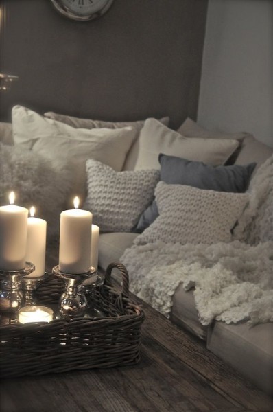
I spent a few minutes asking more questions to make sure this was the direction she really wanted to go since most people consult with me because they are looking for the confidence to inject colour into their home. She confirmed that she wanted to stay neutral.
First I had to re-group. Neutral over colour? ; ) ; )
Then I suggested adding a cognac colour to her decor to warm up the taupe and charcoal that was already in her hardwood floors and kitchen.
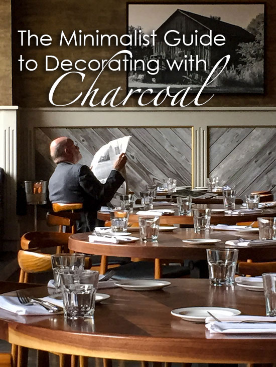
When we walked into this restaurant in Chicago on Tuesday afternoon, I snapped some photos so I could show you exactly how to add warmth to a grey-on-grey palette.
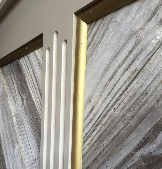
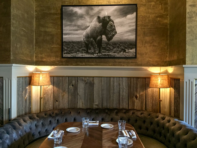
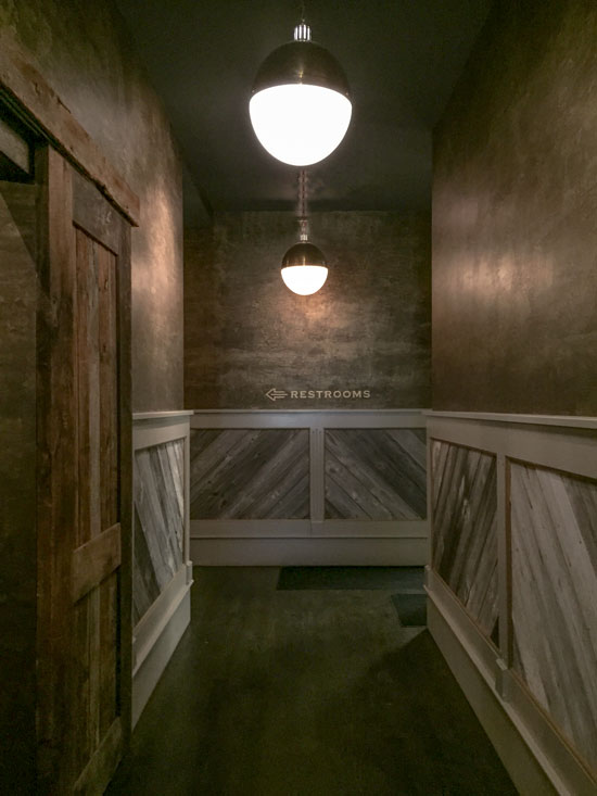
The wainscotting was weathered wood, with the trim painted in a green grey shade. The walls above were a faux painted gold and green grey combination (would not have been my choice but in the context of this restaurant it looked good).
Black and white artwork above to repeat the grey scheme below.
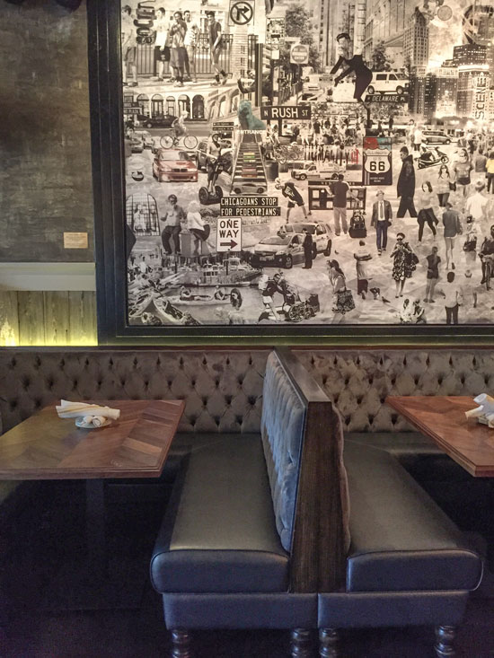
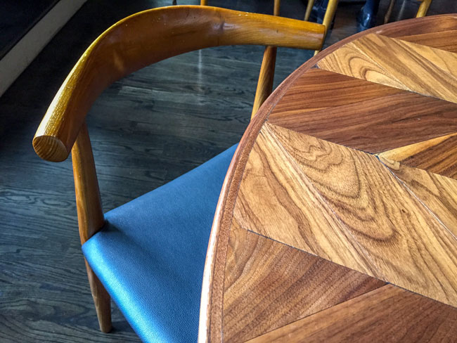
And here’s a close up of the warm wood tables with the table tops arranged in a chevron pattern:
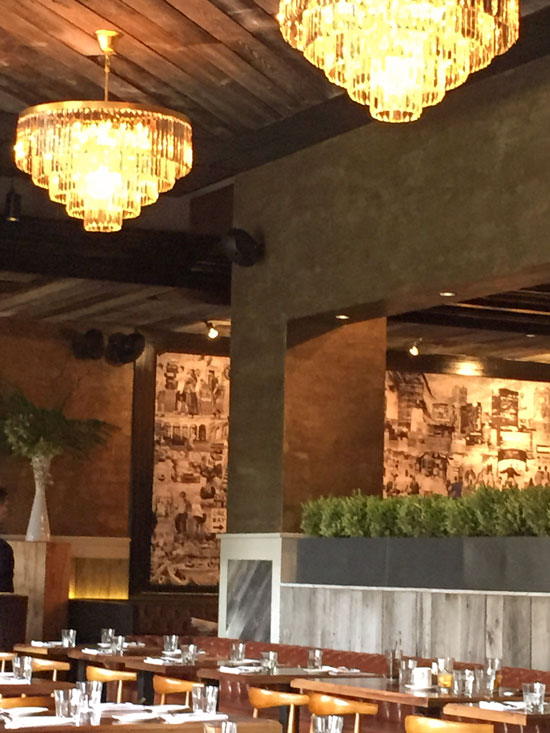
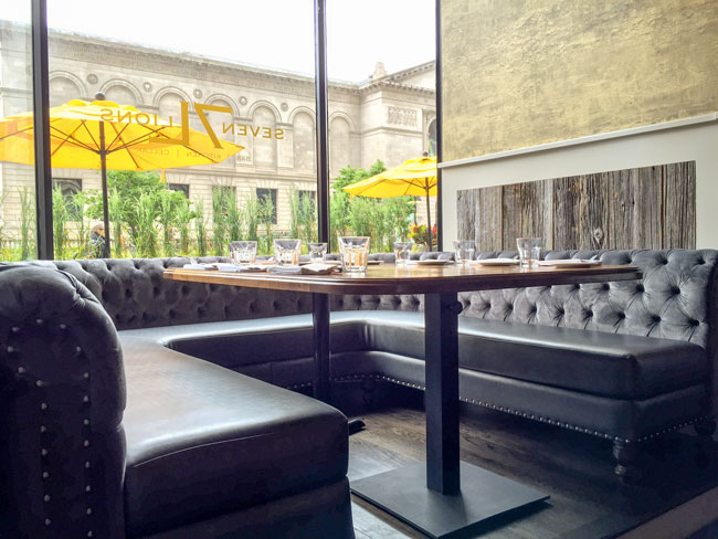
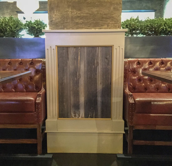
Another view of cognac leather furniture to warm up all the grey:
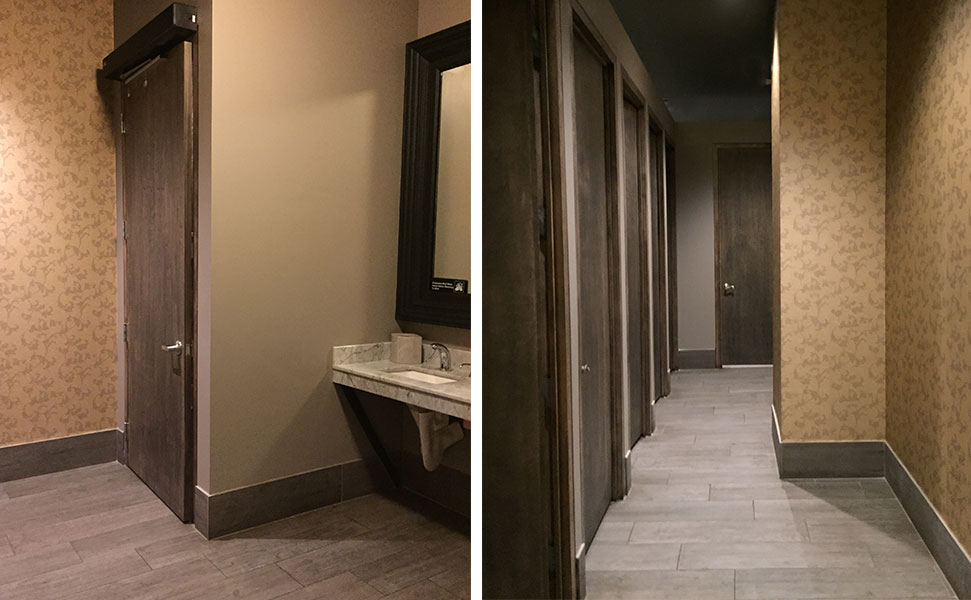
Here’s the restroom!
Are you following my 25 days of undertone series on Facebook? I’ve extended it indefinitely since we are past 25 days, but you can play the game right here with this bathroom.
What are the undertones that you see here (above)? Post your guess below!
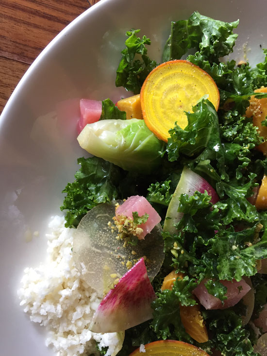
This was the most colour found in this restaurant! A pic of my salad! The food was so good.
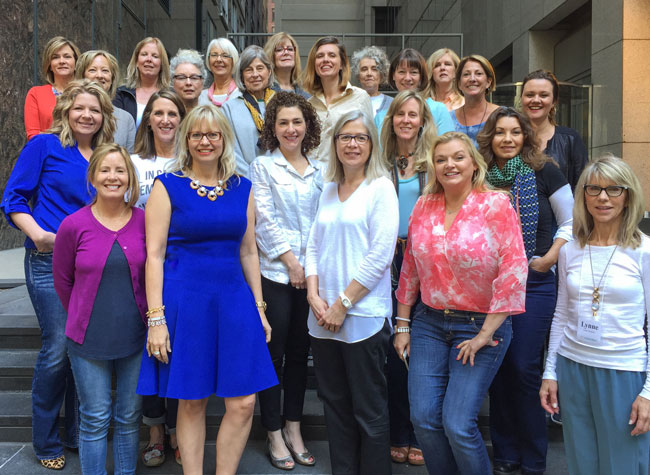
I’ve had such a great time this week with my biggest group ever here in Chicago! We had 22 fabulous women in our course, and two of the graduates were here with us as volunteers!
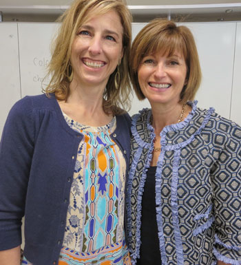
Here’s Susan Lecas of Gander Design & Consulting, who did my course in Toronto last fall, and Diane Golin of Colour Harmony Consulting. (Both live in the Chicago area).
“It was such an honor to assist during the Chicago TCE training! Hearing Maria’s system again proved to be a great refresher course and also validated my knowledge and confirmed that the training I took 3 years ago was a tremendous investment in my business. Thank you for giving me the opportunity to volunteer and give back to you for your continued support and color wisdom!” Diane Golin, Colour Harmony Consulting
What a pleasure and honor to spend time with you, Terreeia and all of the women attending the course. Maria – again, thank you for sharing all that you have learned.
I feel that everyone who attends this course leaves feeling so appreciative for several reasons. One being that Maria shares information about real life experiences (the good and the bad) that many of us will encounter within our own work experiences. Being able to have any information on the unknown lurking ahead helps to remove fear and replaces it with confidence and the knowledge of how to prepare in advance for many situations that may present themselves in the future.
Another bonus to attending the course is to meet the many talented people who attend. The people who have made the effort to attend the True Color Expert course want to be there and want to learn. So many attendees are open to sharing about how the course applies to their niche and also share their experiences.
After attending the course as a student and a volunteer, I have left the training both times with new skills, new knowledge and new peers within my industry. Thank you Maria and Terreeia for bringing it all together. Sue Lecas, Gander Design & Consulting
(Top from left to right) Paula Stewart, Susan Schneider, Cindy Sakos, Marie Glynn, Julie Kay, Sondra Singhurse, Cynthia Ruh, Cristina Hopper, Rosemary Lopiano, Hillary Kruse, Carolyn Soltesz, Baba Barnett, Jennifer Clayton.
(bottom from left to right) Cathrine Haley, Linda Sewell, Barb Lytle, Maria Killam, Pamela Tiberia, Jane Strom, Kari McCormick, Kristin Oblon, CeciliaTassy, Lynn Trinklein.
Julie Kay & Maria Killam
This morning, I received this email from Julie Kay from Julie Kay Design (above)
“Maria, I will be forever grateful for the opportunity to learn from you. I have been deliberating over choosing carpet and siding for our own home for months. I have had multiple samples and have never felt comfortable selecting the correct one.Well, today I took them around and within less than 1/2 hr, I selected both the siding and carpet color. I couldn’t stop saying, “AMAZING” the whole time I was walking around holding them up with tears in my eyes!THANK YOU! THANK YOU! THANK YOU!PS. I just can’t resist telling you one more thing! Just finished opening up all the color boards and laying them out. As I was doing so it brought back the feelings of being an excited child at Christmas opening my gifts. Overjoyed!”
If you would like to transform the way you see colour, become a True Colour Expert .




To anyone who is reading this and thinking they might be interested in learning more about color, I cannot encourage you enough to immediately sign up for Maria’s course. What you learn in just a few short days makes is incredible! I not only learned a ton about color, but I also met some absolutely wonderful women in the process. Maria, thank you for a wonderful class!!!
Hello Maria,
Please let us know when you can manage an EAST coast colour seminar! I’d be happy to help arrange it.
I would definitely attend an east coast seminar! I was hoping for Toronto in huge fall, sad to hear it won’t be going ahead. 🙁
Wish I could have been there. It would have been great to meet you.
I hope you had a chance to see more of my town.
I would love to know what the wall treatment above the rail was. It looks like plaster but hard to tell. Good looking restaurant
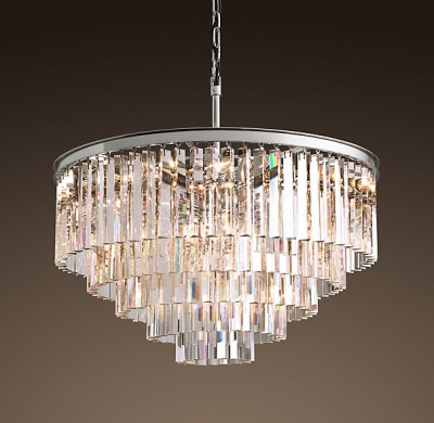
love it. my colors. just in case anybody cares, the chandeliers from restoration hardware are knock-offs from baccarat. i personally try not using copies or knock-offs. they take away from the original creators and to me NO price is worth stealing originality from others.
Thanks for putting that out Richard!
Fun. Fabulous. Fun Fabulous. Repeat.
What a good crew, too!!!!
I just discovered adding ‘cognac’ and ‘mahagony’ to a grey room, it transformed everything. A very little bit goes a very long way. I could not believe the difference.
waking up on a dark Sunday morning to this article brought color and undertones to the forefront of my mind! I’m very interested in any classes offered in the SF Bay Area. Minimalism lives on!!
Congratulations to all the graduates!
That table is gorgeous with the grain. Like it’s a piece of art itself.
i just forwarded this to my daughter who lives in chicago and is somewhat stuck in the all-charcoal/white mode and needs color (says i) to rev it up a bit. i think the yellow umbrellas and logo just make it all work. it’s hard to open a restaurant, most fail and the investment in materials needs to be cost effective. having said that, i wish that more “real” materials had been used. there are amazing antique warehouses in chicago with real moulding and real scars and heft from old growth wood. i would like to see heavier lamp, accessories and chandeliers — the real vintage. and i agree that the colors are a bit…off. undertones!!! anyway, it’s a lovely place, the wall art is amazing and who needs a monday morning quarteback anyway!!!!
Cobalt is definitely your color. You look stunning! Not loving the green and gold combo of the hotel and the chandeliers seem a bit over the top fancy for the rest of the decor.
Does this mean you’re rethinking the Colour of the Year? This looks really similar….I like it.
Maybe it’s watching episodes of “Mad Men” lately but seeing all the vivid colours both in clothing and decor made me wonder if the decorating trends of the last decade are reflective of our less-than-optimistic view of the world. The old “glass is half-empty” take on things.
Clearly this is not true for Maria but the rest of us seem to like living in a beige/grey world. Why is that? Kids could teach us a lot to when it comes to light and colour. Just saying…….
Maria this is so inspiring! I love the mix of modern black and white (and grey) with rustic and gold tones. I tried to share this on my facebook page but it hasn’t appeared yet. I’ll keep trying! <3
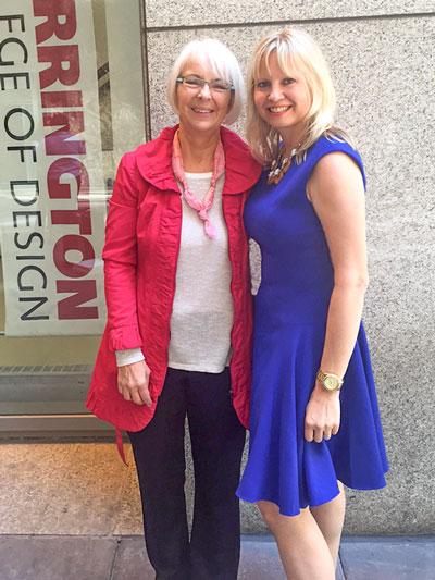
Stunning in the cute blue dress Maria!
I do love the lady’s inspiration photo. I love your color examples Maria (and your home!) BUT I think it depends on each person how much colour to use. To someone who lives a chaotic busy and stressful life, a neutral, soothing tone-on-tone environment may be what they need to allow their mind to stop and refresh. I still personally thrive on neutral backgrounds and inject color with changeable pillows and art.
This brought back fun memories from attending your course in Toronto some years ago. Your course Maria, changed the way I see colour… it brought me so much confidence. I see colour now, and I am not afraid of it. 🙂
Yes! Yes! Yes! I love the way you capture and put into words things the rest of us do or see but without even noticing. You have described how I try to work with my clients who have hung on to their teak furniture from the 60’s. Most want to pair it with more of the same warm tones everywhere. When I can convince them to use grays for flooring, walls etc. the cognac of the teak is toned right down and glows as a beautiful accent, warming up the dull grays. Thanks for “seeing” this, Maria!
Ditto for me on East Coast seminar! Boston or Phil. If NYC too expensive! I am just not a fan of all this charcoal! Pale watery grays are pretty w lots white and color
Great post. Great pictures. Love how it all warms it up. Oh and love your blue dress Maria!