


When we walked into our room at the Fairmont Vancouver Airport last May, I declared, “This room was decorated BEFORE the brown trend!” It’s a game I like to play with anyone who will listen everywhere I go.
What’s the dead giveaway? The colour of the wood-stained furniture: it was all orange and yellow with no espresso brown in sight. This hotel was built in 1999, so that means this colour scheme is 16 years old.
Kitchens from the 90s were also commonly a honey or orange maple.

Renovations in hotels are obviously expensive, and this is the ONLY hotel attached to the airport in Vancouver, so I’m guessing budgets have been allocated somewhere else.
Fun fact: my first career was as a sales manager in the hotel industry.
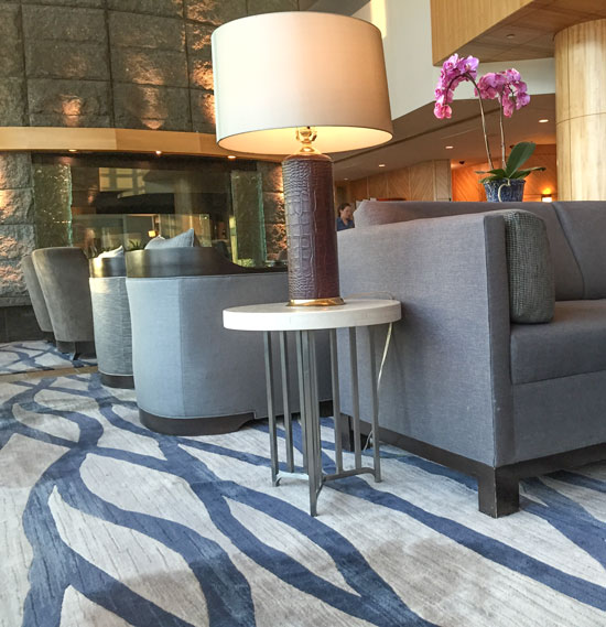
Here’s a little vanity area in the entrance of our room:
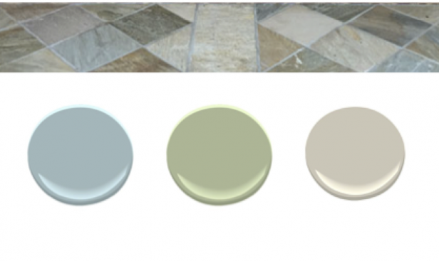
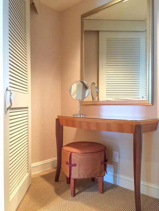 The carpet was gold and the walls appeared to be some shade of pink beige.
This slate, below, works with a West Coast contemporary scheme. See the marsala here? This is why I don’t think that Colour of the Year is coming back anytime soon in residential or commercial decor:
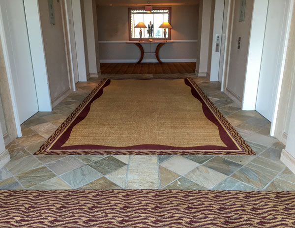
What do you notice about the trim colour chosen here (below)?
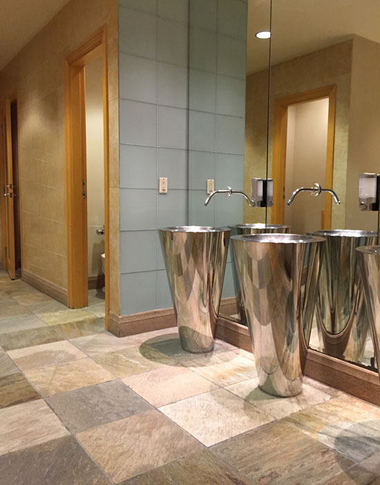
The public washroom downstairs still looked funky and Westcoast Contemporary. Not dated at all:
However, the public areas in the lobby, lounge, and restaurant had just been renovated two years ago, according to our server.
Here’s what I want you to notice about the new decor that was chosen: the chairs are a grey green, and if you look, you can find that colour in the tile. The carpet, on the other hand, looks pink:
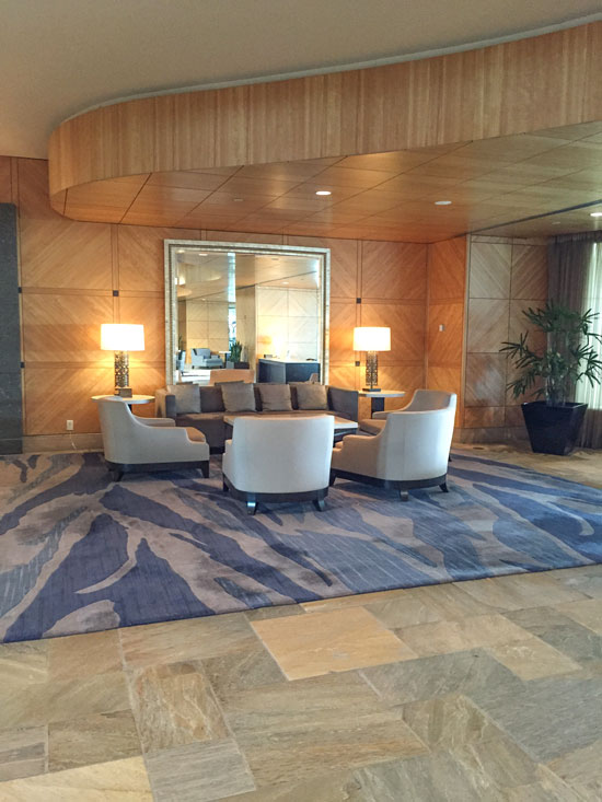
HOWEVER, depending on the light and which way I was looking at the carpet, sometimes it was exactly the colour it should have been: a green grey to relate to the upholstery and the green grey found in the slate tile. Look:
Below, it looks more taupe:
Overall of course, there was a high-end look to this installation; however, I have a theory about why the carpet looks wrong:
The small carpet sample was, most likely, exactly the right colour, but on a large scale, it changes dramatically in the light.
So here’s the lesson of the day:
Do not make colour decisions on large, important items like this without ordering the largest size sample you can get.
Here’s what the decorator did to coordinate with the extremely varied and colourful slate tile:
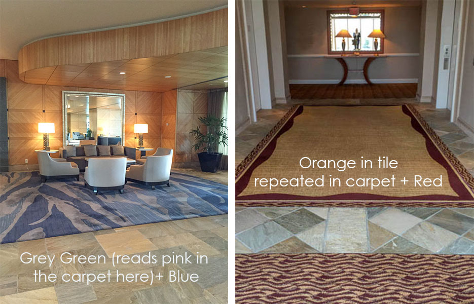
You can see that the old colour scheme (on the right) picked up the orange in the tile with one additional, unrelated colour.
How do you bring current colours into a dated colour scheme? You choose the more current colour (in this case, the grey green from the tile), which gives you permission to choose a second unrelated colour (in this case, the blue from the image on the left).
In the second colour scheme, would the hallways and decor that included the slate look even more amazing if ALL the colours had been chosen from the tile (given there’s 5 or 6 colours in it)?
Technically, yes. However, that’s not the choice this design team made.
Hope this gives you some freedom over your own bossy tile if you have some you need to decorate around!
If you’d like to transform the way you see colour, Register here.
Related posts:
What it Looks like to be in a Private Forum (Once you’re a True Colour Expert)
We’ve Come a Long Way Baby (Since I first started this course)

The colors you selected from the tile would have looked fabulous. Too bad they didn’t consult you!
I can see the downside of being a color expert is “seeing” all the bad color choices that are made in public spaces 😉
The thing I noticed about the trim is that it looks so “clean” compared to the “dirty” walls and floor.
Love the tip about picking colors from bossy tile. Thanks to your e-books, I finally found the right color to go with my bossy tile in the kitchen. I always used to feel so pained walking into they kitchen knowing something was wrong, but not knowing how to fix it. Now I’m completely satisfied and relaxed when I enter. Thank you!
Great post. I play these color games with my husband all the time, he’s a trooper. Sorry about your weather here today, NOT normally this cold! And if you like rich desserts, I HIGHLY HIGHLY recommend the renowned butter cake from the delicious steakhouse Mastros 🙂
I hope you brought a coat with you. Today is not going to be like yesterday.
I love the colors you selected to go with the tile. And yes, it’s hard to pick a rug from just a sample. If it has a nap, you’re dealing with 2 different looks. My new bedroom rug look looks light from one direction & dark from the other. Fortunately, both looks work in the space.
Now… what was I suppose to notice about the trim?
HaHa! I do this everywhere I go. Restrooms are the most fun (and usually clash undertones the most)! Have a great time in Chicago, my birthplace :), and tell those future TCEs they’re about to engage in an extraordinary experience! Have fun!!
I agree with ALL your comments, after all you are the color expert! 🙂 another observation is in the 7th photo above with the lobby pic, the walls and floor read to me as the same tone, which I think is boring. I think it’s more interesting when the the wall is much lighter than the floor or vice versa. Your thoughts ? Thanks!
I go lighter usually because that’s my aesthetic but it doesn’t mean both walls and floor can’t be the same colour. Good decorating can transform and distract the eye from mistakes all day and all night.
I think what you’re reacting to in that image is the new colour scheme basically doesn’t relate to the existing fixed elements.
Thanks for your comment Elizabeth!
Oh Yay, Chicago is such a fun town!! I love the beautiful flowers and landscaping on Michigan Ave and surrounding streets. We’ve never stayed at the Palmer. Can you take pictures to show us – pretty please!!!
Darlene
http://www.BundleMeBaby.etsy.com
Love the paint colors you chose; what are they?
Wonderful post (as always) good luck with your course.
Welcome!
The trim in the hall looks to clean as Allison said. Should be at the creamy end of off white or cream. Is that right?
Such good lessons of the day! I love that we can be set free from bossy tile! xo Leslie
You’re at the Palmer House! I love it – can’t wait to see your photos and hear what you have to say about that fabulous lobby.
Maria, As usual this is a great post! Are the area rugs in the above pictures the same? The first one looks like it has more design. I always tell my clients to look at a rug from two directions. One side will be darker and sometimes will throw the color off a little.
Would love to be ìn Chicago with you. I grew up in a little town on the Rock River 100 miles W. of Chicago.
Have a wonderful time and may the good weather be with you!
Excellent advice Maria. That said, re the lobby I agree with you that its installation has a high-end look however the carpet which I am sure is beautiful on its own IMHO also falls short in pattern when comparing it to the movement found in the beautiful slate floors. In other words, I wonder if a different design in pattern would have enabled the gray green to read better. -Brenda-
“See the marsala there? This is why I don’t think the “Color of the Year”….is coming back soon…”
I find this kind of statement extremely confusing because you do not state WHY you don’t think it is coming back. You tell us to look at it and we then are expected to intuit what you are thinking, without being given a correct prompt anywhere in the paragraph. I mean, I personally hate the color marsala but that is because I lived through its decorative heyday 25 years ago. When trying to educate, please explain WHY as explicitly as possible as close to the original question as possible. It gives the reader immediate feedback as to her guess, or in my case, a possible answer to what seems like an opinion question. Thank you.
Since I took your course, I now study tile, carpet and paint colors everywhere I go — hotels, department stores, restaurants, airports and friends’ homes. This hotel should have hired you! Hope you have fun in Chicago!
Oh I wish I had known you were in Chicago…I’m just now catching up on past blog entries & emails. Here’s a starter question: I am on a committee which is overseeing the renovations of our 100+ yr old church (Highland Park Presbyterian, 20 mins north of Chicago). It was last redecorated in 1980’s. It has lots of original dark stained oak trim mixed with newer (ugly) grey washed oak. A suggestion has been made to paint the trim, crown, wainscoting, etc to make it more light & welcoming. While I’m ok with painted trim in my house I’m hesitant about painting a historic, public use (fingerprints) building. Also, where do we stop painting the trim…the sanctuary is dark stained and that cannot be painted. If there’s a door frame where does the line between paint & stain meet as some of these doors will be opened all the time. Also, one member is concerned about picking a color/pattern that will look “dated” a year later.
Do you have plans to come back to Chicago?
Debbie
That’s a hard question to answer without seeing pictures. I won’t be back in the Fall, perhaps next year. Maria
Regarding the church, almost for sure was NOT stained dark, but, was originally coated in shellac. Shellac sponges up dirt.iver the years and turns dark.
Could consider stripping and varnishing with clear coat.
Many consultants and experts out there on this topic. 🙂 🙂 best if luck, and what a fun project to tackle!!