“Can I alternate this colour chip with that one?”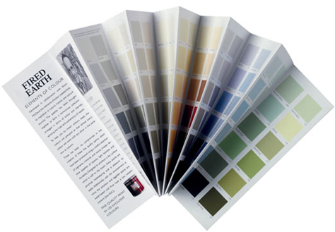
And the answer was usually, YES.
Colour combinations on interior and exterior brochures in paint stores are always suggested however what they don’t ask you to consider is “What are the fixed elements on my house [for exterior, stone, roof] already?” or for interior; What are the fixed elements inside my house? For example, countertops in the kitchen, or the drapes in my living room or the broadloom in my hallways.
All of the above is not obvious to the consumer who has run to the paint store (sometimes at the very last minute) because the painter is coming this week, eeeeeek!
And many years ago when my (ex) husband and I had just moved into our new house we simply opened up the brochure and picked a colour we liked from the Heritage collection. We were convinced that because it was a ‘heritage’ colour that it was somehow better than the rest (not true).

10 years ago when I first opened up my business I was called to pick a colour for the Krishna Temple in Vancouver (below). I was very scared of exterior (this was probably my first one) at the time and I arrived armed with my ‘Exterior colour combination’ brochures from the local paint store. I did not have a clue which colour was right but I was absolutely convinced that whatever colour we ended up with be from the inside of that brochure!

This temple is currently bright pink which I did not choose but at the time I did recommend that some pink be added (still wrong) since the awning at the time was pink (above).
Sigh.
Now, I would have said, “We’ll ignore the awning because it should be replaced.” Certainly not suggest what I did back then, that more hot pink should be added to the exterior.
Lessons learned from my earlier days when I was Vanna. Do you like this shade? How about that one? As I said in this post; If you don’t get the ‘Because’ during a consultation with anyone [in any business], you are talking to a novice. And in all fairness we have all been new at some point.
So here’s the lesson of the day. Take that brochure and use it to distinguish a clean/dirty mix of colours. That’s where [some] designers and homeowners make the most mistakes and usually it’s a good guide for avoiding those combinations anyway.
If you would like your home to fill you with happiness every time you walk in, contact me for on-line or in-person decorating and colour.
Related posts:
Why you Can’t Afford NOT to hire a Colour Expert
3 Steps to Finding a mentor in the Design Industry
Eeeek. . . it’s Mint Green!
New to this Blog? Click here ; Subscribe to my free Monthly Newsletter; Become a True Colour Expert (new dates)


I love the Vanna image! You are too funny. Thank you for the great information, Maria. (I know the blue wall doesn't relate in the first pic, but I think that pink sofa is sexy!)
I love your honesty about yourself (being new years ago). It's what makes you real, likeable, and trustworthy. Oh, and funny 🙂
Wow, Maria, I would certainly have done just that if not for the wonderful opportunity to consult with you. I would have 'stuck like glue' to the printed brochure.
Thanks for warning those of us who don't know what we are doing when it comes to paint color.
I love the post you wrote about being Vanna. The idea of how expertise is developed is important. For instance, I feel so comfortable slicing into expensive fabric, telling a friend exactly how many yards to buy to make drapes or snipping here and there to alter someone's brand new clothes so they fit just right…because I've done it for years. I rarely make mistakes now…but I used to!
Your quote on the Vanna post was perfect. You become an expert by making just about every possible mistake first. Pretty soon there are very few 'unknowns'.
I didn't feel any hesitation at all about buying eight gallons of paint this summer…because I knew you were the 'expert' and I would be happy with the results in the end.
I bought a new bedspread and a new couch knowing it will all look right. I just needed to know that the right person had made a good 'plan' that I could trust.
Thanks for sharing how you weren't always an expert. It shows even more WHY you are now an expert…education and experience.
xo
Donna @ Comin' Home
I am really coming into my own with my color consulting. Knowing what works and what doesn't and being the because girl. You help with that.
Maria,
Often if you remind yourself, that no one knows what you know, relax, you'll be amazed how much you absorb and how quickly you learn as things change.
We get better as we repeat the process. When we know better we do better, even with colors.
Bette
I hardly ever pay attention to those brochures, but I see tons of average consumers with a fist full of them. You brought up an excellent point that I would've ordinarily overlooked.
Vanna, I'd like to buy a 1950s pinky-beige for $200, please. 🙂
Those brochures drive me NUTS! The colors may work well with each other, but they are a clique and often don't play well with others in the neighborhood.
Hmmm, I wondered about this. We may be downsizing to a condo that has the usually beige-tan (whatever you call it) wall to wall carpeting. I was wondering if this would affect color choices on the walls.
I love picking up the paint brochures just to see what the pros recommend but I agree that they should come with a disclaimer. I've had to talk a lot of clients out of a pre-selected color palette because, while it looks pretty on the card, it looks horrible in their home.
~Andrea
Pink…oh my….smiles.
Just out of curiousity, what color would you have specified NOW for the temple? 😉
Thanks for your blog – I have learned so much from it! 😉
i love your authenticity. Wonderful post, Maria!
What great advice, Maria. I love the idea of using the brochures to work on distinguishing clean/dirty!
Hi Sarah,
Since it's basically white I would have ignored the pink awning (in terms of repeating it on the church). And I would have asked more questions about what Krisha temples are typically painted. Since I did not ask those questions I don't know what the answer to that question is now.
Maria
Yikes. . . we used one of those brochures to pick colours for Aarons' office. We were starting from scratch so, the colours worked but never again now that I've read this post.
great post! oh yes, boy my first few exterior jobs were disasters. Sometimes I think there should be a label on all things salmon that says "warning: this is PINK" but that's how you learn, and then you can say with authority to a client "look, I KNOW this won't work because…"
I just got in the mail the new 2011 "trend" type color collections from one manufacturer. I don't ever see these as usable palettes in an of themselves, but they are good reference for "what's going to match the commercially available fabrics this year" kind of thing.
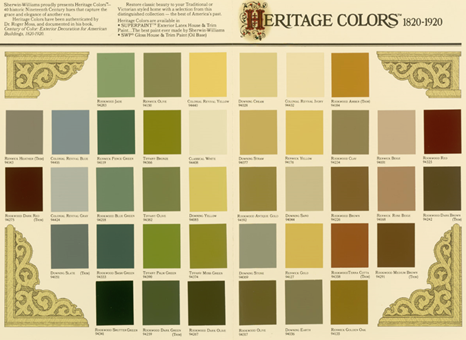
As for the Sherwin William Heritage chart, well that's an amazing tool for those of use restoring Victorians. They are exactly matched for original paints used on specific period buildings. I have also done entire entire jobs with the Benjamin Moore Historic Color Collection and they were fabulous. It can be done but placement is a big part of that. Again another reason to hire an experienced consultant!
Merry Christmas and Happy New Year, may all your wishes come true!
Beautiful post, great ))
I have a bag of paint brochures – all different companies. I don’t like any of the combos. I ended up painting my north facing living room in BM Edgecomb Gray – it’s okay – still looking too beige and bland but at least it’s lighter and cleaner than the old beige and somewhat less khaki.
… Not to mention 90% (or more!) of all color cards are printed either directly onto the page or made with color chips that use printers’ inks, NOT real paint. Sigh… Ink and paint are two very different vehicles for accurately representing color.