So I’m on a wood kitchen kick this week! In particular, kitchens with older rich warm, REDDISH wood stains that aren’t the current ashy oak look.
When I say cherry I mean red
I’ve been called out over the last couple of posts for calling species of wood other than actual cherry CHERRY. And that’s because by cherry, I mean anything that is a deeper, warmer wood tone leaning into RED or ORANGE visually. I don’t pretend to know what species of wood I am looking at in any given photo of a wood kitchen.
What I DO know is that deep warm wood tones are just not what we’ve BEEN doing in current new kitchens.
Although, warmer wood tones are poised to make a comeback.
It’s fine to keep your cherry cabinets
And to clarify another thing, I don’t believe that an older wood stained kitchen should ALWAYS be painted. Here’s one below from an eDesign client where she was clear, she wasn’t interested in painting her pretty wood cabinets. But she did want to refresh the backsplash.
And I wholeheartedly agreed.
When she updated her very dark backsplash, she was so pleased with the result that she shared some pretty before and afters along with this note:
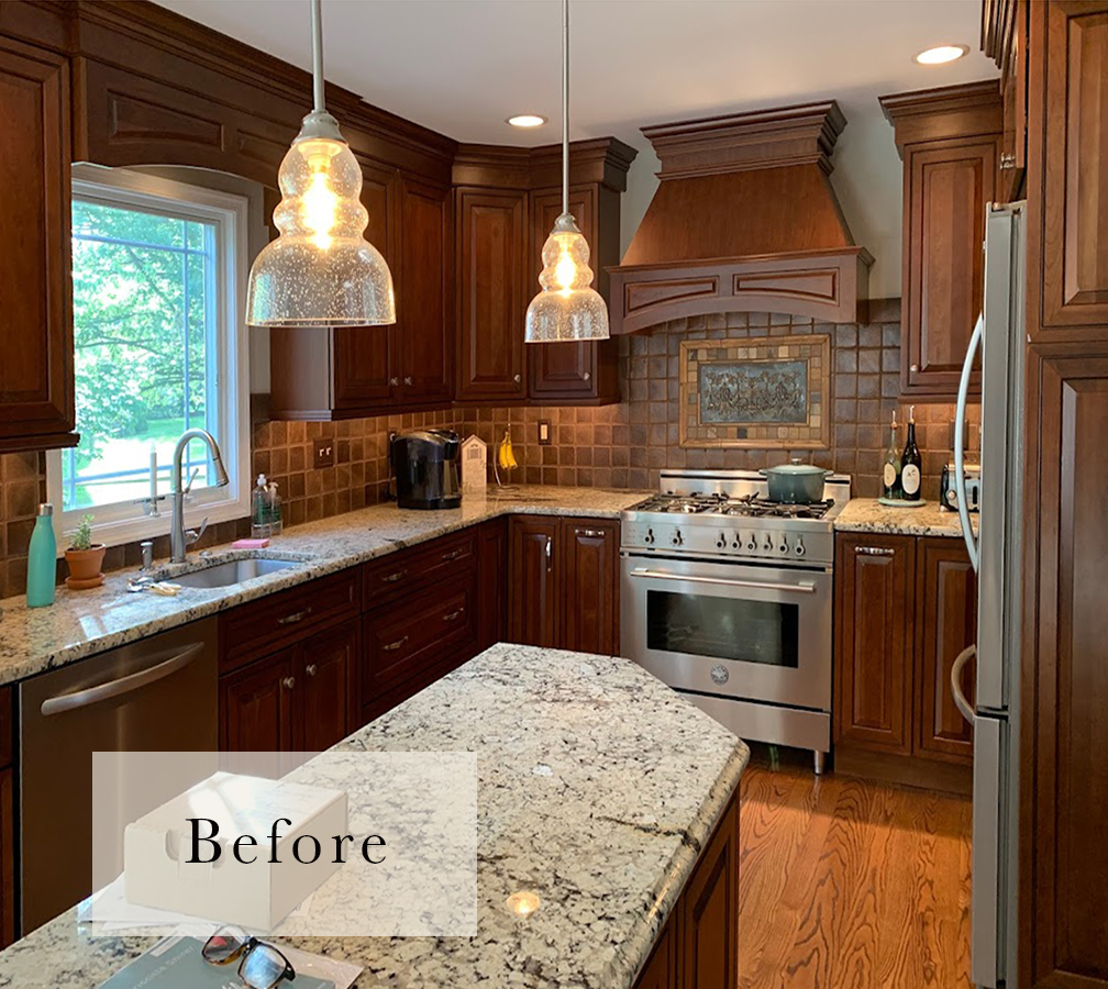
By the way, funny thing was the original backsplash was the last thing I picked in the reno back in 2011 and I was just tired of making decisions at that point and let the women who owned the tile store push me into the dark tiles. They were lovely handmade tiles, but very dark. When I decided to redo it I went back to her shop and she all but refused to help me if I wanted to take them out. At that point I knew what I needed to do.
If not for your edesign service I’m not sure I would have been able to make the decision. But I went to another tile store and [after gaining confidence from the consultation], went with what you had suggested. I’m so glad I did.
I was able to get my original contractor to come back because I wanted it to be done the right way. He had used a lot of moldings that had to be re-cut due to the difference in the depth of the tiles. I waited almost a year for him to be available for a small job but it was worth it. Even he was amazed at the result. Thanks! Barbara
Change out the backsplash instead
Here’s what her kitchen looked like before with the expensive hand cut tile that was too dark and provided zero contrast with her already deep “cherry” cabinets.
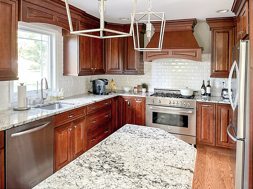
Her granite is nice and light so she was able to keep it and simply replace the backsplash them with a much less expensive bevelled soft off white subway tile, and the transformation is dramatic (below).
Because it’s never about how bespoke your tiles are if they are simply the wrong colour. Here’s a cherry kitchen I can get behind, beautiful job!
If you have to choose, update the hard finishes
I have had many students in my Specify Colour with Confidence workshops over the years ask me about their cherry stained kitchen cabinets with bad countertops and backsplash and often my advice has simply been, “If I have to choose whether to paint the cabinets and leave the dated and clashing countertop and backsplash, or change those out? I would leave the cherry and update the countertop and backsplash”.
In this case, the countertop was white enough that it could stay, but the new backsplash definitely achieved the fresh look we are all craving right now!
Again, it’s in the details
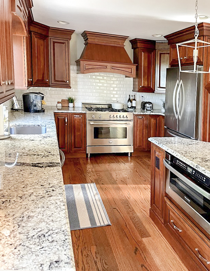
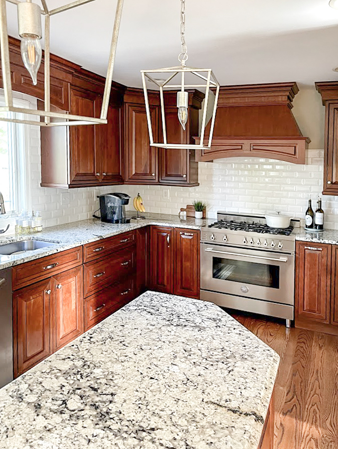
It’s great that her cabinets are already boxed in and finished right to the ceiling creating a polished high end look. And her matching hood fan is perfect.
The new simple white backsplash reflects so much more light. The cabinets actually look warmer and richer by comparison. I don’t know about you, but I would be much more motivated to cook and entertain in this kitchen now!
Great job Barbara, thanks so much for sharing!
If you would like help deciding what the most impactful updates you can invest in to make your kitchen look its best are, you can find my Create a Classic Kitchen package here.
To become a True Colour Expert, there are still spaces left in my last two workshops this year. Register here.
Related posts:
Before & After; Are Cherry Cabinets Back? Yay or Nay
Before & After: A Quick Fix for Updating 90s Wood Stained Cabinets












Hi Maria,
I am a huge fan and think you are doing really important work that is very environmentally conscious. Your suggestions often keep people from ripping out more than they need and choosing finishes they will be happy with for a long time rather than replacing every time a trend changes. I am a big believer in your “choose boring” theory for hard, unchangeable finishes.
This leads me to my question: what details do you suggest to try to make hard finishes last as long as possible? For example, the Chris & Julia reeded cabinets are a far cry from the cherry cabinets builders used to put in tract homes. What can we, as consumers, choose to try to achieve a timeless look? As you note, everything comes around again but it doesn’t look the same as last time.
Thanks for your good thoughts!
The “after” is an amazing transformation, but I think she could take it one step further by updating the cabinet pulls and knobs with something more contemporary. Perhaps black? What do you think, Maria?
I prefer the sparkle of the chrome, or polished nickel hardware (not sure what it is) against the darker cherry cabinets. Maria
And I would have tiles all the way up behind the hood vs showing drywall at the horizontal line.
Breaking that plane would have been more dramatic and made it seem more custom IMO
And used black hardware to bring out the black in the granite
I absolutely agree.
Vicki, I agree with you on the tile up to the ceiling100%, but agree with Maria that the brushed chrome pulls are perhaps a better contrast than black would against those cabinets.
Totally agree with the tile going all the way to the ceiling. Not sure why it didn’t, especially since it surrounds the window in full.
Homeowner here – I would’ve loved to take the tile to the ceiling around the range hood and that was my preference. However cutting around the side of the hood with the curves in the hood would’ve been very difficult and I had a very skilled contractor. If you notice I did have him take the tile all the way around the window 🙂
Now THIS is the way to brighten up a kitchen! Fantastic transformation! I also love the new light fixtures. “When I decided to redo it I went back to her shop and she all but refused to help me if I wanted to take them out.” Wow, that is some really horrible customer service. With that kind of attitude, the shop owner is alienating customers. Kudos to the homeowner for sticking to her guns and getting exactly what she wanted!
While My personal taste will always be a painted cabinet or light wood, my goodness what a difference!
As soon as I saw the photo in your email, I thought what a lovely kitchen but the back splash is too dark.
What she could have done is to paint it. Yes, you can paint tile with great results. She wouldn’t have had to wait a year that way, although I do agree with waiting to have something done the best way.
I agree. I adore subway tile, have it in two bathrooms and kitchen. But the kitchen in the picture simply does not lend itself to subway, imo. Perhaps a different layout or sizing, maybe even square like the original dark tile or a herringbone pattern. I also wish there was a (same color) design/pattern behind oven. Lot of space there that is crying for some detail.
Jo, Maria edits the replies here and takes out certain things, as you can see.
I think I will unsubscribe.
Hi Barbara, Guilty, I do remove comments that are not kind to generous readers who let me post a project that we can all learn from. Take shots at me, I’m fair game, but this is when I draw the line. Maria
Ah, a kitchen you can breathe in! Great job!
Really makes the kitchen lighter and brighter! I did the same, but had darker countertops, so changed them to a cream quartz in a matte finish, looks like limestone. I did the backsplash grout in a color that matched the cabinet stain, for more interest. Tile installer tried to talk me out of it, but loved it when finished. very happy with results!
This looks great. I would also update the handles on the cabinets, which is not expensive. So nice to keep the wood cabinets! I love wood; I love painted cabinets, too, but in a kitchen, it’s so easy to use a stain stick to fix a nick in the wood. I would prefer a lighter wood, but really, I wouldn’t rip those out or paint them either. They look expensive! It’s funny how some people think that changing a backsplash is harder than painting cabinets. If she had painted the cabinets lighter, that backsplash would still be glaring at us with its darkness like a Halloween pumpkin!
I agree about the subway and a herringbone or square would have worked better and taken up to the ceiling in the stove area. I also agree about changing the door /drawer hardware. And the reader who suggested painting the existing tile is a great idea and taking it a step further, then stenciling the tile in a simple pattern could also work. The trade off in that could have been to allow for a change from granite to quartz budget wise?
Sharon, I was the one making that comment, because I did paint my backsplash tile. It was a brand new house and changing it out wouldn’t have been easy because of under cabinet lighting and mouldings.
And I did stencil it as well! I didn’t think it would work, so didn’t spend time on the paint colour, just used something I already had. But it has held up beautifully, so I may re-do it with a different paint.
Hi Maria,
Side note…can you do a post on your thoughts on bathroom tubs? Do you think the freestanding ones that are out now will stand the test of time? We currently have a huge jetted tub from the Tuscan era and want to replace with something classic.
Thanks you!
Yes, think about an old bathroom with a claw foot tub. Timeless. it’s just hard to get those now so a free standing more modern looking tub will have to suffice. Maria
That was my very first guess at the solution…to change out the backsplash! I’m proud of myself! The cabinets really stand out as beauties now. And I’m not trying to brag but I also said to myself change out the lights above the island. It might have been costly but I did think to change the counter tops too but all of that can get expensive. It all looks really pretty now.
I guess the CLJ cabinets and the ones in this post look like a medium brown without strong red undertones to me, not cherry but walnut. I am not seeing the mahogany/burgundy tones that are “cherry”-ish.
So this kitchen, in actual fact IS a cherry kitchen, how I know this, is she was an edesign client. Thanks for your comment. Maria
I am confused with this post. In other posts you have mentioned that updating one thing in a dated kitchen makes it look…like you updated just one thing in a dated kitchen, ie, when many people installed busy granite countertops with their cathedral dome 80’s oak cabinetry. I agree that the original tile was so dark that it made the kitchen feel like a dungeon, but will people now see this kitchen and think “Oh! They must have just done the subway tile.”
I am no designer and have a hard time with many design concepts. I am just trying to understand what the rules/guidelines are and when to follow them. (I had our 1940’s kitchen cabinets painted white 25 years ago and will never go back.) Everyone thought it quite unique then. Give me light and bright every time.
Great question. It’s taken me many years of seeing a lot of homes for me to be able to give the right advice that helps my client make choices that don’t leave their kitchen with the ‘new backsplash, old kitchen’ kind of look but it doesn’t look like that in this case.
Had she installed encaustic tile for example, it would have screamed ‘new backsplash, old kitchen’, subway tile could have been installed when this kitchen was also installed, which is why it was the perfect choice to update this kitchen.
After all, it also depends on how much money you have to spend. I could live with this kitchen as is if that gave me more money to decorate my home, lamps, art, area rugs, accessories, not everyone can do everything all at once! Hope this helps, Maria
What a beautiful transformation! The homeowner has such a warm, bright, and inviting kitchen. I’m so glad she kept the granite, as it ties the cabinets, floor, and backsplash together so nicely and adds so much interest to the room. I hope she enjoys this space for many years!
It’s amazing the difference the white subway tile and updated lighting make this kitchen look! Even the granite looks light and fresh! I think the knobs/pull relate well to the stainless appliances.
That is what a beautifully updated cherry kitchen looks like! Gorgeous and it’s wood stained AND Granite!
You know what I have a hard time discerning the terms of? Brass hardware! Jeez, there are so many different finishes I have no idea which is the most updated popular “brass” hardware! I actually saw cabinet handles that are still being sold in the Amerock heritage section that I had on my cabinets 23 years ago and in the same finish. Blew my mind and it looks like brass with the black overlay. No thanks to that, but I’m loving the soft gold, or “champagne Gold”. I went through all this searching only for my husband to look at the champagne gold cup pulls and tell me he will just leave my shiny brass door knobs on my bedroom and bathroom doors then, and not change them out if I like “gold” so much. I argued that it’s not the same gold of 30 years ago. Haha! I guess it’s chrome then, Funny how you never hear complaints about chrome and it seems to be an all around winner.
I’m way past caring about being trendy…
I’m leaving that to my kids. I have all the solid brass knobs from the 90’s reno of my former home…40 were in the kitchen alone. I’ve used them all over the townhome I’ve lived in for the past 20 years.
I love the warmth of brass. Chrome faucets w brass cabinet knobs don’t bother me a bit. “Gold” is simply the “new” brass.
Give me the real thing..and a Coke.
Those are such beautiful cabinets! I’m so glad she didn’t paint them!
I have tried so hard to learn to like white cabinets in a kitchen but they just leave me cold. This transformation is lovely! Long live beautiful wood cabinetry.
Maria, In line with keeping wood cabinets and updating hard finishes, I’m wondering if you have ever recommended this idea:
We installed Hickory wood shaker cabinets with clear finish (to the ceiling in our kitchen over 30 years ago. At that time, I chose a plain white (looks handmade) 4×4 tile (also to the ceiling) with grout the color of the cabinets, black countertops, light granite island top similar to the cherry kitchen above. I plan to change the countertops to white quartz, but the tile is perfectly good, and I wondered how it would look if I painted the tan grout white, eliminating the business of the grout lines, instead of changing it to subway tile. Would love your thoughts on this!
It sounds like a good idea! Maria
These cabinets are beautiful and high end looking, not builder grade boring. The fact that, with the moldings, they go all the way to the ceiling is a huge plus. No need to update by adding a top row of cabinets. And the light countertops work too. The new backsplash and lighting really brighten it up, and I like the chrome/nickel hardware against the dark wood. As was mentioned it would be nice to have taken the new tile up to the ceiling behind the hood. And for me, I would probably have removed the apron above the window. But a really beautiful transformation.
The white made the beautiful, expensive oven pop! I didn’t even notice the oven at all before and had to go back to see if it was new!
I have this same kitchen – dark cherry cabinets (of good quality), white tile backsplash, but I have dark silestone counters. The dark counters actually look okay. I didn’t pick anything in my kitchen out – it was a 2006 spec house. I’m glad to see wood stained cabinets making a comeback because I don’t want to have to paint my cabinets white if I can help it. Honestly if I was building a new house today, I would be torn between going with white or going with stained wood. I would definitely never again pick out dark countertops though – they show every spec of crumb and dust and water smear!
The new white backsplash actually makes me think the cabinets need painting now. I think it is the sharp contrast in color.
I’d love to see before and after photos presented with similar photoshopped values (light/dark). As a graphic designer, I can see someone adjusted all the after photos to maximize the brightness. Look at the unchanged cabinets and how much brighter they look in the after photos. It leaves readers with unrealistic expectations of what a backsplash change can do. Maybe it was done to make sure readers could see a change on their small devices with crummy color rendition? Going from a dark to light backsplash (and possibly matte to shinier) is going to increase the general light reflected around in a kitchen, but it won’t be as much as it appears in the pictures unless substantial lighting wattage or extra windows are also added. Maria’s suggestions in other posts to add small table lights in corners and good lights in general would help, and may be a less expensive stopgap to try first. Anyway, I wish the before picture had been equally adjusted to make a more accurate comparison for readers. I do like the updates though! Kudos to Maria and the owner of that kitchen.