Before we get started on today’s post we have a job posting for a WordPress designer/developer, see the full job description here.
There is definitely some joy that comes with a well-designed workspace – even when it’s located inside your home. Here’s a look at my new studio office makeover.

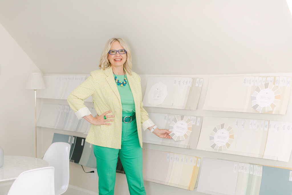
The dresser behind me was bought refurbished on Marketplace. I like that the hardware feels like jewelry.
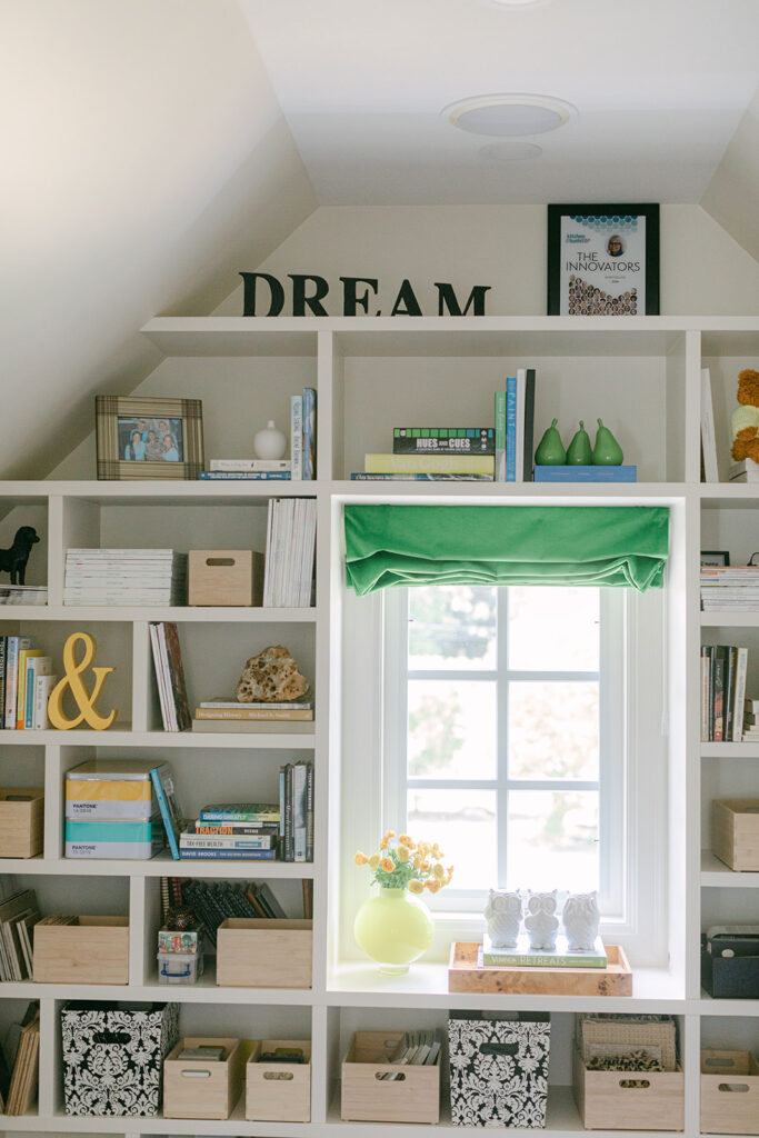
Design details from my studio office makeover
The difference between my new office and the studio in my last home is now my offices are inside the house, just above the attic. And it’s nice actually. No more running back and forth in the cold and rain.
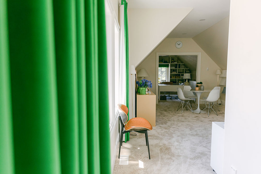
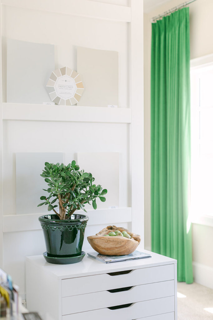
SW Neutral Ground–one of 6 green beige complex creams in my SW Foundation Collection of 50 curated by undertone
My favourite decor item in this room are my green velvet drapes. They are such a fabulous colour and they truly make the space feel cozy! This is a south facing window so the light here is wonderful, the second office where my assistant sits definitely needs lights during the day.
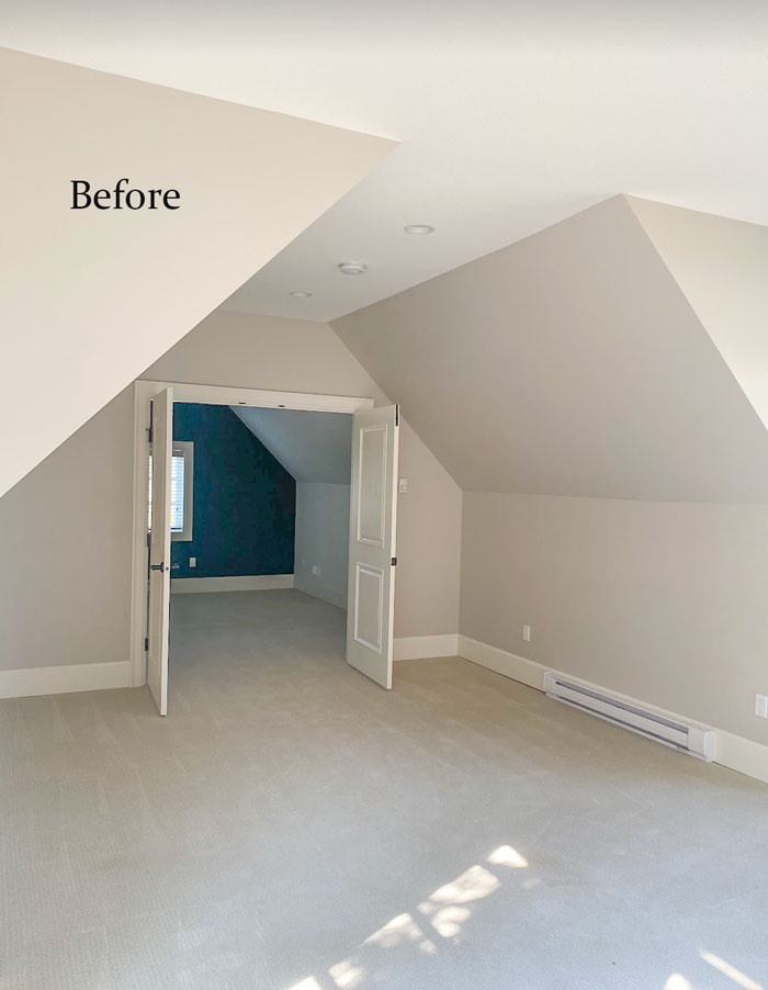
Here’s the before (Taupe walls with green beige carpets)
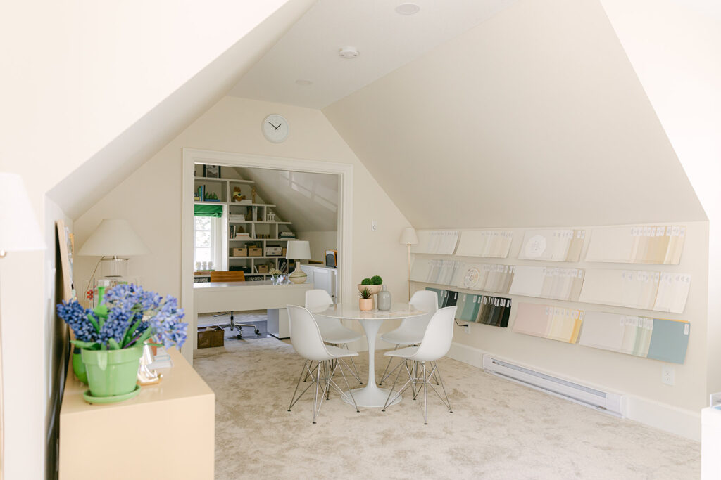
Large Painted Colour Board Storage
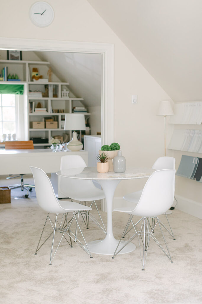
Now, take a look at the after below.
My entire collection of large paint samples are displayed here as well, makes it easy for me to pull them when necessary. Each colour board is painted on high quality poster board making it easy to move around to make sure the colour works with all your soft and hard finishes plus two coats of real paint and 100% colour accuracy.
Each paint sample also has the undertone printed directly on the front making them quick and easy to find.
Your clients need choice and you need to give them the ability to eliminate the paint colours that are not working. A curated collection helps you do just that.
When you can quickly narrow down the hundreds of available paint colours to 2 or 3 in the correct undertone (or the right colour) choosing paint colours becomes a lot faster and easier.
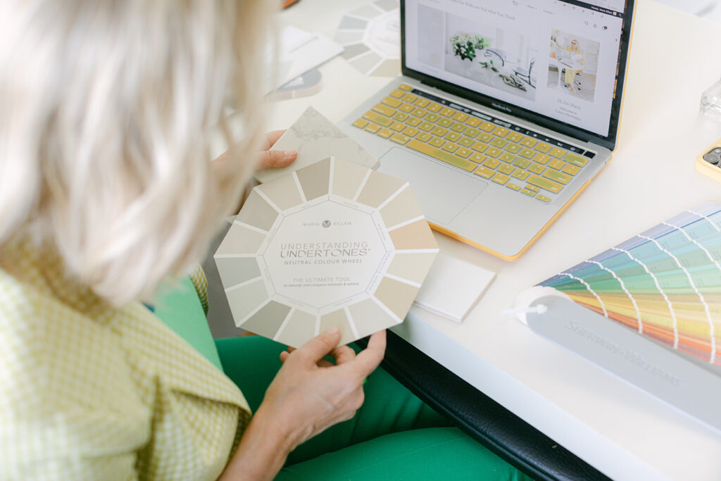
Each collection of large samples comes with a free neutral colour wheel.
See all four collections here.
If you’re a designer, having these displayed your office where you can pull them when you’re assembling colour palettes is a total game changer!
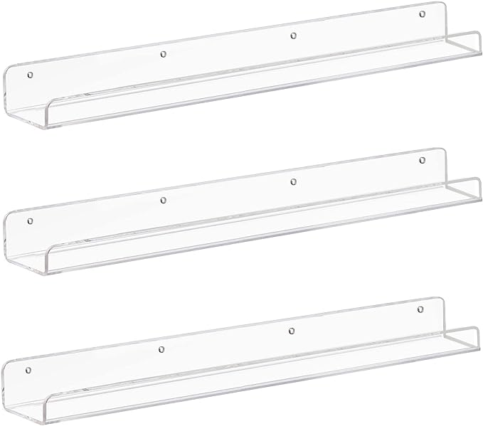
You can buy the plexiglass shelves here
Get your own updated colour wheel here.
Leopard rug from Stanton
Eiffel Chairs | Pedestal Table
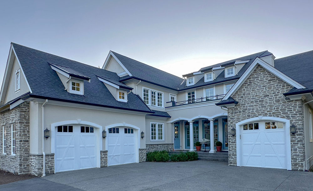
There’s my studio on the left side of the house on the second floor (below):
My freshly painted house sure is fabulous! See that post here.
Here’s the before:
If you need help choosing the perfect colour for your exterior this season, see my packages here. Or if you have a pretty straightforward scheme and just need a selection of the most timeless paint colours, get my Masterclass here.
Related posts:
My French Country Exterior + Expert Advice around Stone
The One Thing you Must do Before Choosing Exterior Colours
Which Colours are Trending on Commercial Exteriors





Hi , I love your blog ever since I found it. I am impressed how open and freely you give advice and share your knowledge. And although I live in Germany I can see that most of your insights apply for Germany too. Today apart from thanking you for sharing so freely and for many hours of fun (and insight) reading your blog I want to ask where to get your fabulous green velvet curtains in your office. I love the colour and have been lokking for exactly this colour since month.
kind regards
Sil
I whole hearted agree with you.
I, too, would like to know where the green velvet curtains come from. I was immediately struck by the gorgeous colour as I scrolled up.
Maria, your studio is lovely! Here’s wishing you many happy hours up there.
They were custom made. Maria
Love your office! Green is my favorite color!
Love everything about this space especially the velvet green drapes! Every morning I open my computer to see “what did Maria do while I was sleeping”? (I’m on the east coast of the lower 49 so you have time to play after I am in bed!) You are the highlight of my day in the interwebs.
Love the new office color. Just goes to show even before adding some bright colors the right neutral on the walls can make a room pop and feel so much “better”. The inside and outside paint made your home go from drab (but still amazing) to fab.
The exterior stone looks lighter and more upscale with the over-grouting!
I would love to work in your office space. That garret feel is inviting. I have a question. In you assistant’s office and in your office, did you consider painting the ceiling the color of the walls? I think I would have liked that. In my home, my ceilings are the same color or a slightly lighter value of the wall color, except for the really fun ceiling that is MB 696 Pleasant Valley. Could you explain how you decide the ceiling color when there is a knee wall with slanted walls above?
Hi Maria. I’ve only recently stumbled upon your blog, IG and Design service. Wish I had found you when we decided to open kitchen to living area. No regrets there but the whole transition from one room to another is challenging now with the stone I picked and the cabinet paint I picked. One pretty thing leads you down a path of, ‘my gosh.. look at all of the fuglies I now have to work on’. Nonetheless, I wanted to ask about your trim. I have searched your blog and noticed you painted your entryway and office Neutral ground, but I could not find your trim color. Can you nudge me in the right direction? My office is revere pewter. I still love the color but am ready for a brighter change. It gets morning light so hoping neutral ground or feather down will be an option as I, too, have green velvet curtains in the hopper. Thanks in advance for you time in reading this long winded question about trim color.
What an inspiring journey! How to pick one?! From the white sheet of printer paper I carry around with me to following my joy of color. Oh gosh and to being timeless but also saving to go on a trip! I am so glad I found and started following you a year ago.