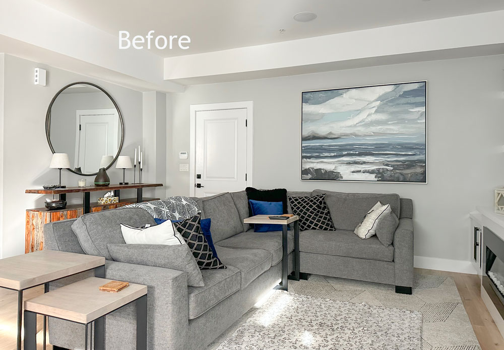
If you’re tired of looking at your black, white and grey living room and wondering how you can decorate with colour, this colour rescue is for YOU!
This week’s Colour Rescue over on YouTube is a one day makeover for Pete & Brittany! Brittany sent in her photos and said they wanted to add COLOUR to their black, white and gray living room.
This was a new build, just two years old and Brittany had made many timeless choices for their modern home before she found me about a year ago on Instagram.
Her LVP flooring was perfectly timeless, she installed a white kitchen (below) as well has installed lovely white and grey porcelain tiles and white countertops in their bathrooms (not shown).
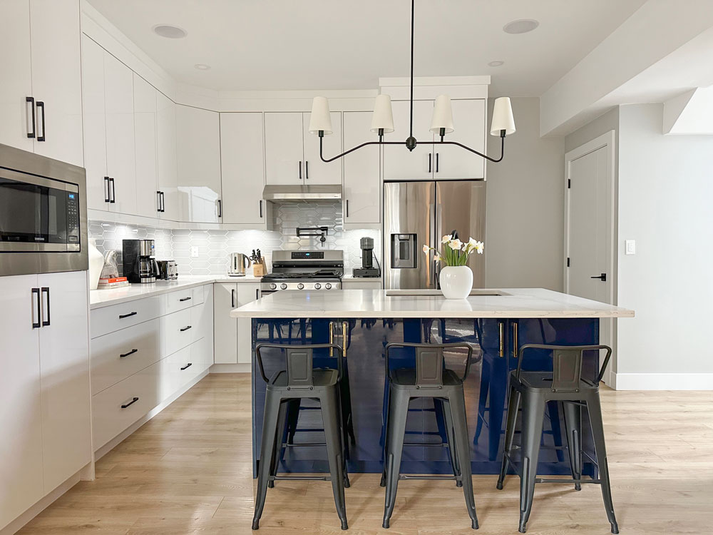
Where she added colour was in the navy island and then she repeated the blue in the living room but it was still missing warmth.
The first thing I did was move the art to their bedroom as we really wouldn’t consider navy to be a ‘pop’ of colour in an all grey black and white space.
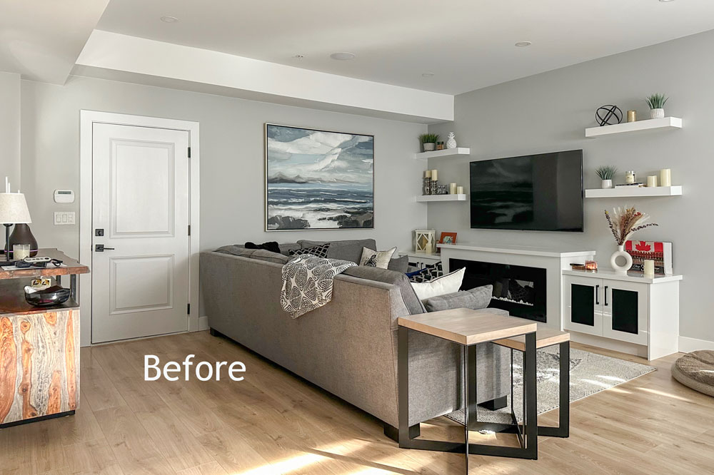
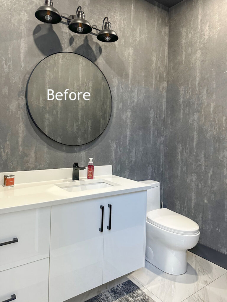
Instead I added blue to the powder room which also needed accessories and artwork. I couldn’t resist including this room in our decorating plans since it was so easy for me to do.
Brittany and Pete were thrilled with the changes because after they added the wallpaper to this room it felt flat and well, a little boring.
Please be kind if you have a critique, remember the homeowners are reading the comment!
How to decorate your black, white and grey living room
Check out this week’s episode along with all the befores and afters here:
And if you live in the lower mainland I would LOVE to help you add a look and a feel to a room in your home. You do need to have the basics just like in this colour rescue so that it can be a one day makeover! You can apply right here.
An update on kitchen trends
Have you heard? The white kitchen is out?
No matter what you’ve heard, something timeless can also be trending. So just because the white kitchen has officially been replaced by the English Countryside kitchen, it doesn’t mean that the all-white kitchen won’t stand the test of time! Just sayin’
To get up to date on all the trends and create a new vision for your home, there’s never been a better time to enroll in one of my workshops. Homeowners this is your course, It’s virtual (do it with your spouse). Design professionals can join me live in person.
PS. Every time I post a youtube episode, someone asks if I can go back to my old format of photos and blog copy. And believe me, I just want you to know I WOULD LOVE TO DO THAT. But I can’t, because video is better for learning. It just is. That’s why YouTube is the #1 search engine for how-tos. I can share and show you so much more in video.
But I hear ya. And I’m tired… I’ve never worked so hard since I’ve started doing these long form videos. And I had to keep going, keep making cringy videos until I got better. There’s no way around it.
It has taken me years just to learn where to place one light so that I don’t look 20 years older than I am, haha. In addition to special lighting, there’s also technology related to great audio, good editing and fun animations. I’ve even had to hire more people!
I would love nothing more than to go back to writing strictly a blog with my hair sticking up in my pyjamas. But that wouldn’t be serving you in the BEST WAY possible. So don’t be shy.
Head over to youtube where you’ll get a lot more content from me talking and showing than you ever will in a blog post. I promise! 💛
Related posts:
Watch all 7 Colour Rescue Makeovers from last season here
Colour Rescue: 3 Simple Kitchen Fixes, when you Can’t Renovate
Colour Rescue: Help! My Bathroom has 3 Different Undertones


Amazing. I love that big round glass lamp, which echos that round wooden wall art near the kitchen. Everything is so much warmer and inviting.
I agree with whoever said they prefer a blog post instead of a video. I don’t watch the videos….I read much faster than that, and I prefer photos to videos. But it sounds like video is where you’re headed, so I’ll just be missing out!
Concur 100%. We might learn better that way but I’d rather the previous format. Now I scroll past anything that requires watching a video so I’m missing almost everything.
I feel the same way about podcasts. Unless there’s a transcript I can read, it’s a hard pass. Listening to someone talk is so much slower than reading their words! In Maria’s case, though, I think her videos reach a larger audience. I fast forward to the parts I’m interested in and skip the rest.
I like reading a post best, but I’ve come to terms with videos. You can watch them with the captions on, at 1.25 or 1.5 speed, and skip forward a couple seconds using the right arrow key. This makes the videos more doable for me. It’s a bit like skimming a book.
I agree as well. At the very least, provide before and after pictures within the post, and THEN provide the link to the video for those who want to learn more. I don’t object to the videos, and congratulations for tackling a new format, but insert the video link as an add on, not a replacement for what you’ve previously provided in your blog. Not everybody has the time to watch videos, especially multiple videos on multiple other topics. I have been following you for many years, but I rarely pop in anymore because of the changes and increasingly heavy handed marketing. I understand why you do it…please understand the perspective of some of your subscribers.
That turned out amazing .
It’s such a cute place !
Was missing warmth once you added the warmth it was a game changer !
Turned out so adorable !
Thanks Nancy! Maria
I generally skip videos – take too long (and too loud) compared to reading! . Could you possibly include a transcript?
I was hoping to see some fun pops of color to liven up the place but it looks like you added brown to black, white, and gray. The styling is nice but the color scheme is too drab for me.
I agree youtube is an excellent how to format ….for installing a toilet , faucets, pavers etc. I go to insta for the beautiful photos and really dislike the videos on that site. Videos don’t allow me to look and enjoy the photos. .
I came back to leave the exact same comment. Adding brown (and gold) to black, white, and gray is not my idea of adding color. I was expecting corals and pinks. To each her own! And very nice couple, kudos to them for opening their home to the world.
The same principles apply for adding pinks and corals. In this living room it worked really well to repeat the warm tones of their dining room and sideboard to create a cohesive colour scheme. Neutrals fall under the world of ‘colour’ as well and this space was a big transformation and lesson in creating contrast, balancing light and dark, warm and cool. Thanks for your comment! Maria
The long format video with roving, moving camera work does not allow the eye to be trained in ‘before’ and ‘after’ concepts.
A big miss for me as well.
I thought I was the only one who didn’t like clicking to a video hahaha
I must be honest here but I am not trying to be un nice! I do not care for gray at all! If anything I would have changed sofas instead of decorating around it. Sofas are not so expensive like they used to be. Anyway, I do like the the way the home is laid out. I absolutely love cognac and think it goes anywhere! Regarding the white kitchen mentioned below the makeover, I painted my all white kitchen about 5 years ago and I still love it. The counter is dark brown and the bottom of my island is a dark brown (has a white quart top) so it is not entirely white. White will always be timeless in my opinion. I have white sofas and white dining room chairs with brown mixed in the tables. You can decorate around white all you want to and it looks very nice. I am on the look out for those lamps that use batteries because I have so many places where no cord could go to. Thanks for the video. I am always looking for a better way to design.
I really appreciate this room makeover. The warmth, earthiness, texture and light you have introduced have vastly changed this space in a subtle but effective way. BTW, that olive/chartreuse sweater that you are wearing is an awesome colour on you.
Ok, nicely done when I take it as more of a Neutral Color Rescue haha! I was expecting a lot of bright navy and natural green to come in when she was asking for Color. But yes, the warmth of cognac brought in all the coziness and the lamps will never not make all the difference. It really feels like a home now (and I grabbed a couple ideas for our boring powder bath too).
Yay the powder room was an unexpected surprise for us too! The sailboat art sparkles in the moody room with the lamp that will now be on 24/7. Thanks for your comment! Maria
Maria, you are wonderful but slow on your videos. I am always wishing to rush you up. You even speak slowly. If I was trying to learn a very particular, hard to understand concept of a repair or construction it might be different. Your videos are just too long, too slow, too much gab which unfortunately I find it adds up to boring. And videos on the whole are restrictive because it has sound, but may I suggest it is not You Tube format per se that your followers don’t like. I am so sorry to complain because I have been following you and have bought from you and have adopted your suggestions.
You can change the playback speed on YouTube videos. I usually watch videos at 1.25 or 1.5.
It’s easy to speed it up with the settings! Maria
I liked it. Huge improvement. Without a major color change.
If you are ever in Ohio, feel free to stop by my place for a color rescue! 🙂
I am a big fan of a limited palette. I think this home was well set up for adding pops of colour. I kind of liked the navy blue. Maybe there could have been a few more navy blue objects placed in prominent places (eg) an area rug? I wonder if orange wouldn’t have been a great addition. Orange makes blue pop and vice versa.
I liked, preferred the blue too. Maybe could have done different shades of blue, creams, tans, etc. and a hint of pink (like the flowers on the island in the beginning).
Nicely done! Just curious – do u not feel it’s important to nod to the island colour at all in the nearby spaces and/or the kitchen styling?
I repeated the blue in the powder room but in this case navy should have been the sofa so that’s why I didn’t repeat it in the decorating since it’s not a pop of colour for a grey, black and white room as you could already see with the before photo. Also as this is a one day makeover for ONE room, any additional styling that happens for the dining room, kitchen or powder room is a bonus and sometimes doesn’t quite get finished! But yes adding navy accessories to the kitchen would have worked too. Great question, Maria
I really like your styling choices! I inherited a new black and white condo and added a lot of cognac accessories (pillows, rug and wood) to the space as well. It really warmed it up with very little expense and waste. You expertly balance the additional colors and texture around the space while keeping in mind the scale of the condo. You have encourage me to add more! Also, I can see how easy it would be to add another color or change color schemes completely since the condo has such timeless finishes and furnishings. How easy it would be to add bright green, mustard yellow, shell pink or merlot? Simply by changing out a few pillows and decor! Very educational video.
To be a little more clear, I think the homeowner’s choices of quality furniture and your expert eye made this space sing. I’m not saying I could do it this well – just that I might have a little more knowledge to help me get get started in the right direction:)
Thanks for your comments Christina! Maria
I don’t mind watching the videos; it’s nice to hear you go through the process and a pleasure to meet the people whose home you are decorating. I always play the video at 1.25 or 1.5x speed and, if I’m in a situation in which I can’t have my sound on, I turn on the captions. That said, I wonder if you, Maria, could have a few before & after photos (particularly “after”) on your blog post? I love to study them (especially side-by-side) and pausing the video just doesn’t do it! I’m sure the reason you’re not posting the after photos on your blog is so people will watch the video; I get that! But, perhaps posting them might satisfy those who miss the blog content and won’t watch the video anyway. I’m sure many will still watch the videos – I know I will always watch them! Just a thought. I love your content. Thank you for sharing your knowledge and helping our homes be more lovely 🙂
Haha! The dog that wandered by in the beginning of the video is also cognac brown, possibly a Ridgeback? I agree not really a Colour Rescue, more like a Warm Neutral Rescue. Still, the room(s) are beautiful, much warmer and inviting now. Thanks Maria, great job!
Loved this video and the transformation! I also thought there would be one or more non-neutral colours added to the room, but the cognac worked really well and livened up the space!
I am a fan of the video format, but I do agree with others in wishing there were a couple of after photos in each post to study. I pause the video in that spot so I can get a good look which works fine too!
I love how you transformed the living room with neutral color, artwork, lamps and accessories. I also love the textures in the ottoman and pillows and the great ironwork art. And that powder room went from industrial to high-end hotel. Kudos to you!!!
I loved your blog, so this is a very sad eventuality.
Perhaps being a YouTube Influencer is worth abandoning the design-interested clientele you built up with your blog over the years; that is your choice to make.
Your promise on content is already broken. Helpful ‘How-To’ videos don’t spend 12 of 14 minutes on coffee chitchat and Home Sense hauls then pan to 60 seconds of twirling ‘results’.
I love the videos that you are doing of your one day makeovers! I just watch them when I have a little bit of extra time. Great job on warming up this beautiful home. Maria, you are have such a creative eye and know how to bring it all together. I always learn so much from you.
Hi Maria! Longtime follower here and TCE! I love the videos and have found them very useful in seeing how you fix common issues that homeowners have. Now that I am in the color business, I come across this scenario every day. Homeowners often forget to add contrast. In reading previous comments, I think many thought you were going to add some dramatic color and were disappointed that you didn’t. But I think an important takeaway is how you can change up a space from feeling flat and one dimensional WITHOUT adding a dramatic color. The neutrals you added perfectly balance the existing cooler tones and provide that much needed contrast. In the future, if the homeowner wants to add in additional pops of blue or another color, it’s easy to do and will only enhance the space that much more. Just adding a brighter color alone to their existing palette may not have done that.
A note on the new format: I love the videos AND I do also appreciate when you have “static” photos that I can view to see in detail what you’ve changed when you are working with a client. Some may give the photos a cursory glance and move on, while others, like me, study them to see all the differences. If there is an opportunity to have both, that would be wonderful. All that said, I’ll watch what you produce no matter what because it is all so helpful. 🙂
Anyway, well done as usual! I appreciate the MANY years of free content you have provided the design world! Thank you!!
Love the LVP – what is the brand and color?
Love this transformation!! It’s amazing what you did with adding in warmer neutrals! It has such a calm, peaceful feel, while still being warm, cozy, and inviting. I love color, but too much in my own home can be a little overstimulating. I really appreciate seeing this transformation.
I’m loving the videos, and I also love it when there are before/after photos for studying. This makeover is just lovely. Thanks for your work.