


Then a few days later, my good friend Guylaine Rondeau, a very talented graphic designer who has been in the business for 20 years, decided my new header needed some more white space; which by the way, she wrote about [here] on her blog. So for my birthday she tweaked my already beautiful header and emailed it to me.
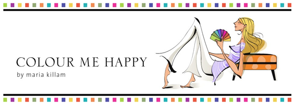
When I saw the new font she had chosen (with the addition of the row of colour on the top and bottom which was a wonderful and happy touch) I asked her why it was not centered? She said, “That would be like what people do with their furniture without a designer, they line it up all around the room, instead of arranging their furniture so that it creates a conversation area”. It reminded me of a statement Nate Berkus once made on Oprah, “It’s like your furniture is all under arrest!”.
I especially loved the way she left the ends of the header open, it looks great! Thank you Guylaine at Guylaine Rondeau Design and Katie Lane at Lemon Cherry for my beautiful and colourful header!
Related post:
Week of Publicity for Colour me Happy

I love both versions of your header. I'd like to have Katie at Lemon Cherry design a header for us — I know what I want it to look like, I just don't quite know how to describe it.
Did you notice how the Colour Me Happy text flows right into the bottom of your pant leg?? OK, that sounds weird, but do you get what I'm saying?! It carries your eye from across the text on the left into the image on the right 🙂
Kelly
I love your header, both the old and new. Though I think the summer clothing would work better as you're using the colour swatch as a fan, which wouldn't translate to a turtle-neck so well!
I love the way she relates interior design with graphic design – genius!
Beautifully talented, love the new header!
I actually have something like the header you suggested in mind for our blog. But Victoria is worried that it'll look like we're copying you. I told her we aren't copying you, we're being inspired by you!! 🙂
Kelly
Your blog looks hot!!!
Love your new header, it says who you are without lots of words, if that makes cents…I sure thats not the way to spell it but as my daughter would say whatever…
I adore Nate, arrested furniture, so funny..really good.
I love the picture with the animal print stool, books and bird, saved it.
Linda and I are going to the book fair again on friday…wish you could come with us! They have extended it so we are leaving work early (11:30) and going to get more design books…again wish you could come…move to Calgary, ok?
That would fix everything..hehe
Have a great weekend x Carol Ann
If there are any design books you want me to look for let me know by Thurs night…
I love the new header. And it drives me crazy when people line their walls with all the furniture!
The new header is perfect!Love her style!
* Looking GOOOOD, "ANY" way you "do" it!!!!!!
Annnd,I SOOO ADORE that first pic you have posted!!! (I guess we ALWAYS love pics that are in the style we prefer for ourselves!~ ADORE the clean, simple and uncluttered, along with classic colors/non-colors!… "Inspirational"!)~~~
MANY THANKS!
Linda in AZ *
Beautiful header for beautiful Maria. Great images of elegant interiors.
I noticed the color dots right away – what a great touch! Your header looks magnificent.
I already forgot what the older version looked like. Can you show us the before/after? I am a big lover of white space and the new header is nicely arranged. Love the illustration and color squares. I think the font is nice, but I would find an even happier, more feminine one to represent your personality and tie in with the yellow M next to your bio.
Hi Emily,
hmmmm. . . I don't know what a more feminine font would look like graphic design is not my area of expertise. She picked the font to go with the illustration, it matches the style of the large to small swoopy lines. . . makes sense to me 🙂
Maria
Rats, I wish you would have displayed the before and after of the new headers. I immediately noticed the color blocks which I think is a great addition. Anyhoo, I think it's a great header. I agree with the previous post, if you add a turtleneck, the fan deck wouldn't work so well. Love the Nate quote! As always a great post, Maria!
Maria, I love the newest header best, it's modern, reflects you and the business your in, simply cool!
And Nate the great… I've got some of his decorative items he used to make for Linen'n Things, a store selling house and home articles to the masses, but he made beautiful dark wooden candle sticks and bowls… got a lot from him. He is the classic American boy…
Your header is so great I just can't tell you how much I love it and how well it says who you are. Young! Hip! Clean! Restrained! Sophisticated! and it is obviously for a color consultant's blog.
You already know my thoughts on this! Happy hump day!!
I love the colour dots! I also like and decorate uncentered, love asymmetry. You are a doll and it suits you. I adore the images as well!
zo
The font is especially nice!! Looks great!
I love it! I definitely need a new header design and will be in contact with your people!
I truly like your new Header, and wudn't change a thing. Have you considered using it for a Business Card? -Brenda-
Love love love your new header!! And thanks for the shoutout in your "About" section- we wouldn't say it if it wasn't true..you are a true colour expert!!! I learn so much from you from each of your posts!
I love your header too, and have been over to Guylaine's blog to read about how she tweaked the font. Very interesting.
And I'm drooling over that last photo of the room with the blue accents. That is fantaastic.