Today I’m sharing a couple of before and after exteriors. The first is a charming character house transformed with an eDesign consultation from plain to fabulous. The second is a reader’s DIY before and after where she’s asking for help with some of the finishing details.
From blah to bold an exterior makeover
My eDesign client is over the moon with how his exterior turned out. And congratulations to him for making a bold leap into beautiful colour! Here’s the note he sent:
I know that I would love to see the results of my design input, so I wanted to share the results with you-it turned out amazing-THANK YOU!
Here is his sweet house before. It needed a little love.
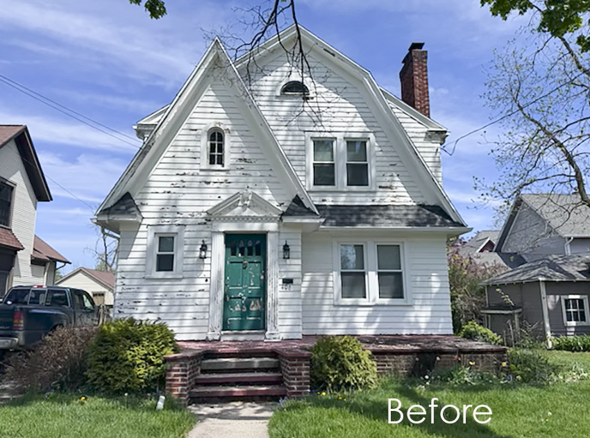
I never will understand why there are so many boring neutrals on charming homes in mature neighbourhoods like this. These are ideal for beautiful colour!
Fortunately, my client stated in his questionnaire that he wanted a wow factor. And that he was open to a wide range of colours.
If you haven’t yet read my post on embracing the limitations in your design projects, I highly recommend it. The first thing to analyze in any project is what are my constraints here? For exteriors, it’s often fixed elements like stone or brick. This brick foundation and steps on my client’s house are minimally limiting, but if he had brick running part way up the facade, that would be different. Another constraint for exterior colour is, what’s appropriate for my neighbourhood? And especially, what colours are the direct neighbour’s houses? You want something that looks both distinguished and connected.
But overall, for this exterior, the neighbour’s homes are grey and cream, which only means we will avoid anything too similar.
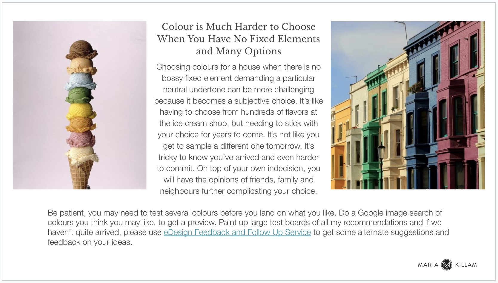
While having endless choice may seem like fun, it can make deciding much harder. I always include this slide in my exterior presentations where this is the case.
We gave him four colour combination options and here’s how it turned out!
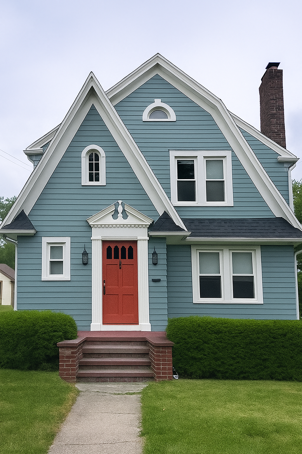
Body: SW Underseas | Trim: SW Pure White | Front Door: SW Peppery
Doesn’t it look incredible? One thing to notice right away is how the portico becomes a pretty focal point that was lost in the before.
If you need help landing on the perfect colour palette for your house, check out my eDesign packages here.
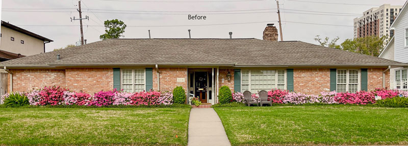
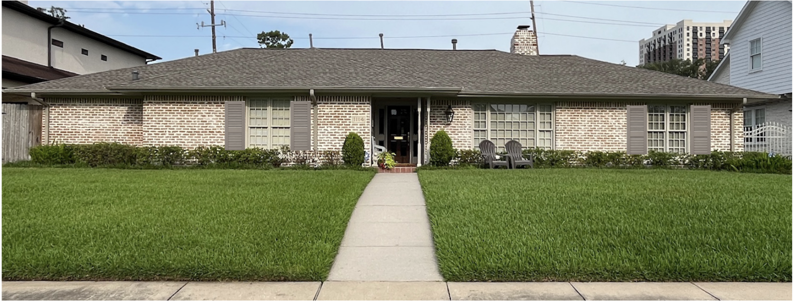
An almost finished exterior before and after
A reader sent me this note about her recent exterior project:
“Hi! Thank you for sending your email from an instagram message I sent.
Grout was filled in with a lighter color. No paint.
Love the results!I just had my azaleas fed and trimmed, so they are shorter now. But will grow up. And I did have 2 large old water oak trees I lost both in a storm last year. And two old, half dead and tired ligustrum trees on either side of the house. One per side.
But more importantly, I am torn on the shutters. Put them back or not? And I do not want a harsh contrasting color again. So something neutral? And I may put Pennsylvania Blue “stone like” tile on the front porch and replace the orange-ish pavers. Waiting on a bid. My roof is brown color and my house trim is a “fawn” beige neutral color. My front door is stained walnut color brown.
Any shutter suggestion would be so appreciated!”
 “Hi! Thank you for sending your email from an instagram message I sent.
Thanks for your question! Such a great transformation with the new white mortar!
Shutters can be tricky. I think you could go either way. If you do add them back, choose a soft warm neutral that relates to the roof. Only the two narrow windows will look right with shutters. I made a crude mock up to see what this would look like:
Not amazing yet right?
So what’s really missing here? 🧐
Put your answers in the comments and I’ll circle back to this next week!
If you have a question for my Ask Maria Column, email me photos here.
Working on an exterior project and want to get it right? Get my Exterior Masterclass here.
Related posts:
Shutters or Not: 10 Ways to Decide


Paint the front door a color. Add trees
You read my mind!
I feel like it needs more of the light creamy color, even if it’s just in the lawn furniture.
It needs color and some contrast .
And everything looks like it’s on one level .
Just a homeowner here, not a designer. Paint the brick, too orange, plus it clashes with all the pink in the azaleas. The home needs a little more landscaping besides all the azaleas although they are beautiful.
Replace those two spindly posts with something more in scale.
I would change the posts for something more substantial. Then paint the door a color and improve the landscaping – it needs height in front of the bare walls.
the first home is beautiful – made me say Wow!! What was the paint brand & color used on the front door?
Colors are listed under the photo. Paint is Sherwin Williams (SW)
Yes, the charming cottage home exterior makeover was a wow – Adorable! I love how you accented those charming features like the windows and the unique roof line by keeping the trim white while choosing the door color to closely tie in with the brick stoop, with the complementary main color. It would be a standout in any neighborhood.
If she is changing the pavers to a blue, then the door should be a different blue than the pavers–either lighter or much darker. The spindles should be one thicker, round piece of wood in another complementary blue, and the 2 Muskoka/Adirondack chairs should be a complementary turquoise or sky blue.
“Should” is a strong word. This is a suggestion.
Entryway too dark compared to “new” exterior- bulk up the spindle supports and lighten/brighten the door color.
Just my thoughts! (the exterior with suggested shutters and white grout looks good to me….)
I don’t have your eye for color and detail, Maria, but I think the ranch home needs a more welcoming entry. It would be more pleasing if the contrast brick at the stoop related to some other feature, cushions on the chairs, annuals at the base of the shrubs maybe, or the entry bench painted a happy high contrast color to bring attention to the front door. It sounds as if it is wood, and stained dark walnut, so it would be a shame to paint it, but it is not very visible with the entry so shaded.
Lack of front exterior symmetry!! Needs to be corrected either in a faux way or with landscaping.
Lack of symmetry in the front. Correct with landscaping and maybe faux closed shutters on front left.
I would not do any shutters.
There is nothing that says the front door is important. I think landscaping could help. I’d re-use the azaleas and spread them around the property strategically especially flanking the sidewalk. Do something that connects the house to the street. Right now it’s a big blank from the house to the street. Taller bushes in places would also help.
It’s hard to say without going back and forth to the picture but…….the front door came first to my mind. It needs to be a bright color and the spindles are too thin. I think the shutters would look good in off white with either the first brick or the after brick. Maybe too much pink in the flowers. Could balance out with other colors in other plants.
Gloria
The entry, front door are datk…looks visually list. Needs color to become welcoming and a fical piunt. Posts need to be, more substantial. Landscaping… add trees snd foundation shrubs with varying height that creates curve to soften the linear of the house. The color of brick with white grout looks great.
The first house… A++++.
Gloria
A few things stand out for me. The house looks too top heavy. It looks like the roof is too big and heavy and the house is being compressed to the ground. We need to see more of the house so that the eye does not notice the roof so much. The front door is non existent. It needs to be a focal point and needs colours.
By any chance can you share what the other color options given for the first house were?
Needs some contrast badly…
Some lovely flowering plants where the sidewalk meets the walkway to the house. Or maybe even flowers all the way to the house. Front door is hidden, difficult to see. So a brighter color along with the chairs, they just blend in.
Everything looks so flat and linear. In addition to a lighter, brighter front door color and some trees, I was thinking the landscaping could use some curves like you’ve done at your homes.
The ranch brick is orange so a shutter color that rich in color, such as Benjamin Moore’s pretty brown I think is called Syrup Brown, (I will check the name) is my suggestion for the shutters and front door. I think a new landscape plan is needed. I also like everyone’s suggestion of a larger porch post.
The paint is called Pancake Syrup by Benjamin Moore
Just landscaping and landscape lighting would elevate this gorgeous house.
Two beds on either side of the sidewalk closest to the street.
Deepening and curving the current azalea beds and adding low evergreen plants and various foliage for texture. And mixing the azaleas in with the new- if they can be moved.
Then two beds both sides of the sidewalk closest to the house or simply part of the deepening of the azalea beds.
Add a light post and some lantern style pathway lighting.
Trees planted in the yard and island bed(s) would be beautiful also.
To the left side of the home on the brick where a window may have added symmetry- a trellis in the same paint as the shutters coming off the house rather than just flat against it would be a nice addition. The owner obviously has a green thumb so a climbing rose would be nice with the azaleas.
Beautiful home regardless of changes!
I love your ideas, Lori!
Definitely some landscaping that adds height and a colorful door.
The first house is just WOW! Love the transformation; the colors used are gorgeous. I’d love to see what other options there were just for fun. I love what the homeowner has done with the brick house so far – such an improvement! In my non-professional opinion, landscaping is the key to take it to the next level. Others have offered some great suggestions. She could hire MaryAnne White! We have all seen what awesome things she’s done with your last 2 homes 🙂
The blue house is gorgeous! Love, love, love it! Very well done. Paint the front door in the second house.
I would nix the shutters completely. They really don’t go with the style of the house and leaving that one window without shutters looks strange. We have a ‘ranch’ bungalow cottage and are heavily debating removing the shutters when we reside it as we are using a vertical board and batten siding. All the front windows are varying sizes therefore the shutters are different sizes giving it a hodgepodge lodge look. I am leaning towards a thicker window frame to outline the windows, my husband feels shutters add to the ‘cottage’ look…
Anyway bungalow featured remove the shutters perhaps paint the window frames the taupe and..I’d find a feature for that blank brick wall to the left. Backdrop for a large stand alone or hanging sculpture or a trellis, shrubbery?
Could the posts be removed to open up the entry and make it lighter and more welcoming? Then some pots of flowers and a bright door? I agree with everyone else who has said it is lacking color and contrast.
The transformation of the first house is beautiful! You can now see the architectural details. Lovely.
This is the most astonishing before and after I’ve ever seen. I’m sure the homeowner is over the moon! Love it so much!
Gosh, I would have left the brick and shutters as is in the ranch home. Now it looks non-dimensional and colorless/not enough contrast. It needs some brightly colored pots with flowers near the front door, paint the Adirondack chairs to coordinate as well as the front door. Maybe change the trim color to be a little brighter to contrast with the brick and roof color.