A big reason (besides atmosphere) why people hire designers is because they have a hard time visualizing the end result.
What will that fabric look like on that sofa or is leather better? Read my opinion on leather here.
Will I like that colour all over my living room? Managing expectations is a very important part of our job!

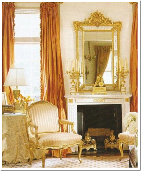
The length of drapery is something I’ve been focused on lately. After reading Joni’s post on Curtains, I decided (depending on the house) to start installing my drapery at floor length or even pooling if necessary (I confess I am a romantic!).
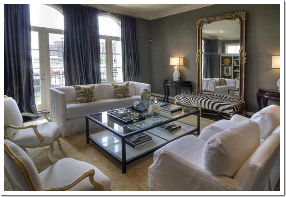
So right before Christmas I installed 60 yards of fully functioning striped, silk drapes, just touching the floor (like the above photo) in a living and dining room.
Then I received an email (from my clients) in the new year saying they didn’t like the fact that the drapes seemed to have too many ‘kinks’ in them (above and below) and were puffing out too much from the forced air vents.

I thought they were talking about the fact that silk has a natural ‘wrinkly’ look to them, just like linen!
As it turned out, they simply needed to be taken up by 3/4 of an inch with a chain added to the hem, otherwise it would take too much fussing and managing, which in the end–the lesson here is–if they are stationary, you can pool them or have them touching but if they need to be drawn nightly, they need to hang just off the floor (unless you are okay with the fussing that will be required)!

It’s also a good reminder that if you are installing silk or linen in a client’s home to let them know they will never look perfectly straight because of the nature of the fabric!
Yesterday, I received a hasty email from a client telling me that the colour I had chosen for her powder room was way too purple!! It was 2112-30
Well since I had picked it to coordinate with the upholstery fabric in her great room I was very concerned!! So I drove out immediately to take a look:
First of all, this is NOT I repeat NOT the way to test a colour.
This particular shade of gray definitely has a purple undertone but it is being tested (with one swipe of a paint brush no less) on a yellow, goldy beige colour. And what happens when you stick complementary colours together? Each one makes the other pop!!
I tried to assure my client that it would in no way look that purple once it was all painted in her powder room and that currently there was zero context for the colour but I might as well have been Charlie Brown’s teacher. . . (after all there it is, PURPLE and she can see it with her own eyes!).
However, I was completely responsible for the fact that I had not shown her how purple a gray it was in the first place, (because I did not have an oversized sample of it in my kit) and it wasn’t obvious just looking at it without comparing it to anything else.
I should have compared it to a greeny gray and a blue gray so that she could have made the decision seeing it in context!
So to fix it, we whipped out to the nearest Benjamin Moore store to tone down the purple (in the gallon) so that she was happy. Which is what we want, isn’t it?
Turns out the upholstery is not as purple as the colour and once it arrives and we decorate with some fun and fresh colours (including the existing yellow in her living room to bring in flow), it will be fabulous!
The adjoining great room, painted in Inukshuk (a taupe with a little pink in it), looked fabulous in her north facing room. She was happy that it looked brighter than she thought (because all colours get twice as bright once they hit the walls) and as a north facing room adds gray to a colour a little pink was needed to have the colour look beautiful!
So there it is, a lesson in the latest colour trend (in action) and I need to learn to articulate it better to my clients because what is obvious to me is not obvious to everyone unless it’s compared to something else!
A great reminder that managing client expectations starts at the beginning of every job all the way to the end, and makes all the difference between a good designer and a great designer!
The only way to choose the right colour every time is to combine my system of understanding undertones with the most indispensable colour tool available. You can purchase your own set of my curated large colour board collections here.
If you would like to transform the way you see colour, become a True Colour Expert.
Related posts:
What Everyone should know About Gray
White-on-Gray-on-White by Kelly Deck
If you are new to this blog, click here to see the Best of Colour Me Happy.
While you’re here, subscribe to this feed so you don’t miss out!


Wow – this is why I am not a designer – I would have a hard time dealing with the unglamorous side of design!
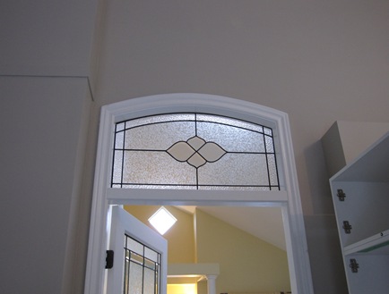
By the way – the first image with the beautiful coral silk curtains is by Gerrie Bremermann, and the picture with the coral curtains and the hallway – that's Lars Bolander. Number 1 and 3 on my top 10 list!
Guess what? My brother is moving to Vancouver!
So true! Good point that we must remember to cover all of the bases with clients.
…it's always good to wear a belt and suspenders so there's no surprises!
I really like the purple gray! Of course I also like the original gold on the wall. I would put purple and gold together and throw in some red and green and brown……and charcoal gray.
Ah, yes, Maria. Been there.
Sometimes I think figuring out what a client really wants is the hardest part of the job. I try to ask lots of questions and then repeat the question again in a different way. The most successful results seem to happen when we are both on the same page.
agree with you
Hi Maria,
I just discovered your blog and love it! Thanks for all the great info.
PS. We did meet once when you were in Calgary at the Lougheed House.
Cat
See, you are a great designer, because you immediately went to work to manage her expectations and produce a happy client. I can understand the panic of having purple on the walls, so I'm glad you found a way to tone it down to her satisfaction.
I've just recently discovered your blog and am enjoying it. Great lessons here….
Question. When you say that a color is twice as bright on the wall, what do you mean? Twice as bright as a small chip? I work off of large samples and the paint color seems pretty true to it.
Thanks so much for your insight. Love your work.
Hi Mary,
It's a good question, the colour is always true to the chip however as the colour goes on all the walls and the light hits it, it looks brighter, which is why a lot of people have trouble choosing yellows (for example) because they get screaming bright on the wall. it's also the reason why a pretty paint chip doesn't necessarily make a pretty wall colour.
If you are a designer using large chips you might not think about that because you're already using the right kind of muted colours to achieve the look and feel you want for your clients!
maria
Yet again, well said Maria!
I too am guilty of assuming the client knows just as much as me. Silly really because if they did they wouldn't need me! I usually do that with whites. Put one up and the client thinks it's too yellow and then put a yellowish one next to it and the client can see.
Curtains are another problem in themselves. Everyone assumes that the curtains will go in and the job will be done. I rarely have had a client who just loves the curtains the minute they are installed. There's so much to them and they cost a living fortune so it's a great concern when they don't LOVE them immediately. Usually a little tweaking and everyone is happy.
Great tips! As always, brilliant!
I prefer curtains to pool, touch, break, all of the above and think it is worth the extra fussing to have the look. But, I have yet to meet a client that agrees with that or feels the same way. After time they supposedly get a "memory" of where they should lay to make every one happy…..easier said than done/convinced. Shortening is an option, but lengthening….not so much (I forgot what the #s are of how many shortening of drapes my workroom does for this same issue you encountered, but it is a bunch)
It seems that clients panic moments happen more often than not, it boils down to trust and waiting for the room to be complete for them to see the whole vision. It's a long walk down a tightrope till they see the final vision that we can usually see easily and sometimes take for granted in our head. xo
Such great points from everyone!! A terrific discussion. As an artist it really applies to all color. the light direction from which the color of the light flows, comparing to others with different undertones!
Speaking of drapes… we are in the middle of selecting drapes for a patio and window wall. Any guidelines on color you can share? Should we try to match them to the neutral new couch, neutral mocha-ish wall? Try a contrasting color?
First thought is a light colored silk or linen for texture. Since we like the earth tones, we thought this might be a nice choice. Since it is a large slider and window wall we were concerned about a pattern being too busy. Grommet top perhaps?
Any help is appreciated.
Did you know that you are teaching each of us valuable lessons of learning to state the obvious and
the importance of spelling out the things we might take for granted. I always feel that each client deserves the education and the "handle with care" label. There is something to be said for service!
Your clients must value your tenacity as well as your patience. (and of course your color remedies!)
pve
I'm so glad you talked about the billowy curtains. I had silk dupioni curtains installed about a year ago and have been trying to find a way to deal with all the volume! They take up twice the space that I had imagined and I've been trying to 'train them ' to fall more neatly but no luck. Don't know why it never occurred to me to put a chain in the hem.
I admire the way you step back to see things from your client’s perspective, understand their concern and then find a solution; you don’t make them feel as if they are to blame for feeling the way they do. I like that about you.
And I like how you run through the Lessons Learned process at the end of a project by thinking about how to describe colour context to your clients in the future; I like that too.
Thank you for sharing – this is great advice!
Experiencing the same thing right now with a client. Not with paint, but fabrics…
Excellent post. Thank you! Yes – a skill that certainly does separate the good from the great.
Regarding the forced hot air billowing out the silk- I was afraid my linings on my silk drapes would dirty up for the same reason so I bought the magnetic register covers at one of the big box home improvement stores and cut them to fit the vents. Why builders place heating vents directly under the window edges is beyond me.
I think that trying to determine what the client really expects is the single most difficult portion of the job. Over the years, I've learned to over-explain everything to clients. It was a learning curve for me, because I've been interested in design since childhood and my family were d-i-yers, so I'm amazed when things that I consider basic, such as the difference between curtain lining and interlining have to be explained. However, most of my client horror stories boil down to the fact that I didn't make sure the client truly understood what was going to happen, so today, unless I know that the client is design savvy, I tend to go for overkill with samples, tear sheets, renderings etc. The only problem is that I do find a lot of design to be instinctive, so I have to balance explaining what I'm planning with a certain level of "trust me."
great reminder maria and servicing the client promptly is such a priority. often these lessons are learned from years of experience.
a story that came roaring back was early in my landscape design career with a client whom we realized was "picky" to the extreme.
come autumn we installed 500 tulips chosen from a color card. spring arrived and she called hysterical, they were the wrong shade of pink, "correct this immediately!" that was an instance of not being able to until the following autumn….sigh
debra
Oh wow, purple grey, hehehe, that has happened to me in my own home, I wish I had had a cool headed designer like you to talk me into it 🙂
Dear Anonymous,
It's hard to say which colour would be best not seeing your space. Because custom drapery is so expensive, sometimes people go really neutral so they can change their furniture down the road and not the drapery. Or it could certainly relate to the sofa as well.
I'm not sure this helps at all 🙂
Maria
Every great designer is a counselor and psycologist as well. We coach our clients as we go along. You are awesome Maria.
We need to talk about the pooling of silk drapes on the floor . . ohhh how decadent and romantic. The first picture would be my dream living room. That's it I want to redecorate with flowing, pooling fabric all over the place!
I definitely need to learn how to manage my clients' expectations!!! I work hard to share my vision and to explain the renovation and design process to my clients, but it's not always easy! I like what Developing Designs said: "It's a long walk down a tightrope till they see the final vision". So true!! Your other reader – Design Junkie – said that she's learned to over explain… I do some of that… but sometimes I find that I'm sharing too much information and getting my client confused!! Perhaps it's a balance ~ there's that tightrope again!! Okay… granted, my current project has been contractor-inducing HELL and so I've needed to hand-hold my client… the drama of the situation is making it difficult to manage her expectations. Ahhh… a conversation for over coffee one day, Maria!!! Speaking of which, we need to get together so that I can give you (finally!!) your gifty from DesignTies! I have a good excuse for the delay – and I've just hinted at it above 😉
I'll be in touch…
Victoria
I just found your blog and I THANK YOU. (enter singing angles here)
What a breath of fresh air. BECCA
Such great advice, Maria! I recently did an exterior color consultation and found out the hard way to give LOTS of disclaimers and managing the clients expectations regarding brush outs, renderings, large color chips and how even then there may be slight differences in the color and why that might be! It all worked out well but it was a valuable lesson for me.
A really valuable point, as always, Maria. I think a LOT of my frustration over my cork floor would have been avoided if the vendor had given me more information up front– lowered certain expectations, explained about some aspects of the installation and finishing, etc. It would have saved hours of my and their time, some of their money, and maintained a happier relationship. And I am currently dealing with the same issue from the other side, too– what people should or shouldn't expect from a portrait session with me– even when I think I have thought of absolutely everything to clarify beforehand, sometimes I miss something (e.g., if you want a disc of certain images to be mailed somewhere different, that's an additional charge). But since I didn't say so, in this case, I'm covering it.
Very good advise.
I love fabric to break 1 inch on the floor, that way it is managable in any given way, without the need to fuss over it. So far all my clients have been happy!
XX
Victoria
Such a good lesson here. I went thru the mill on paint for a bathroom with no window that I will post either tomorrow or Friday. The clients in the end were happy and it is an enormous improvement! And the curtain issue, yes, you are so very correct to point out these things since window treatments are big ticket items!
Good lesson! We learn every day new ways to deal with clients.
I just went through a similar color "issue" as yours with the gray that was too purple. My client and I had chosen Natural Wicker as an overall paint color which was going to be painted over a bright yellow. As soon as the first swipe went on it looked like pale lavender. We had chosen the color from a large chip and loved it, so I kept saying "trust me" until all the yellow was covered. It turned out beautiful but I have to admit I was questioning myself until it was finished! Thanks for the post!
you're so good maria!!
DEFINITELY need to constantly be reminded of this. (ESPECIALLY in regards to delivery dates—- eeek!! 🙂
xoxo,
lauren
I've only worked with an interior decorator a couple of times. The first time was horrible (to me). Everything in every room "flowed". There was mauve, blue and green everywhere you looked. It was just too much for me and I've sworn off others 'picking' what I like.
However, YOU are a breath of fresh air. I like your concept. We, as consumers, can't see it like you can and knowing when to 'hold someone's hand' can be crucial.
The other decorator I worked with (my fault as well as hers), she just couldn't commit to doing what she said she would do. Didn't return calls, had marital problems, etc. It just all seems to be 'too much' at the end of my day. So…I still need to remodel and decorate. Just bad experiences hold me back. 🙁
Inukshuk is an amazing colour!
I can imagine how difficult it must be to bridge the gap between the knowledge that you have and that is so familiar to you..and the understanding and perception of the client. Wow..I am so glad that is not my job. :o)
Teaching in layman's terms is the most difficult thing an expert can do..and the most critical. I think you did a great job because your heart is in pleasing your client.
I am working with an accountant who doesn't get that part at all. I end up in tears every time we meet. He's so confident that his expert advice is the right thing, but always takes offense at my queries of why? It's my money we are talking about after all! It feels as if he has no 'bedside' manner if you know what I mean. He's an expert and in the end, I can see he's right, but getting there is so frustrating because he hasn't learned how to communicate… to 'bridge' the professional gap. I think he has spent too much time in his office and not enough time with real people!
Great post as usual Maria. You always get me thinking… PS. Love the romantic style draperies!
xo
Donna