
Image source
This summer we have been talking about clean vs. dirty colours.
Now I want to talk about lighting.
And, I need images.
If you have a space in your home where the wall colour bothers you or it’s not the colour it was supposed to be, and you’re convinced it’s because of the lighting in your home, I want to hear from you.
This question from one of my lovely readers is also a clean and dirty issue, but her comment about the current shade of yellow in her living room is what prompted this post because I think it’s a common decorating problem that comes up often.
First, thanks so much for sending in your images and trusting me with your homes. We all have our own gifts and I am so happy that I get to share mine with so many of you!
Okay, here is today’s question:
I have enjoyed reading your blog for many years. I find your explanations of colors and their undertones to be clear and enlightening. Sending you pictures of my home is kind of like sending you pictures of me in my underwear. It takes courage and trust! 🙂This is my dilemma: My living room is painted Benjamin Moore Barley 199. It’s a pretty color most of the day, but in the afternoon it turns banana yellow!My adjacent kitchen is painted Manchester Tan, which I like. All my trim is painted Cloud White. When the door from the kitchen to the living room is open, I see the muddy Manchester Tan vs. the clean Barley; at least that’s how it looks to me. The color flow from one room to the next just doesn’t work.I would greatly appreciate any expert guidance you can give me!
Okay so obviously yellow is not the right colour for this room in the first place because it’s not found in the furniture. Your wall colour should pull your space together, which means it needs to relate, and other than the yellow sheers, there is no yellow in this living room.
And we can see that she loves cornflower blue because she’s added some accessories but that’s not enough blue to give the room a look and a feel.
And that’s what we all want right? We want our living rooms to feel like ‘It’s done’ so we can just enjoy them with our family and friends!
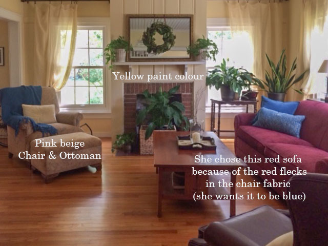
Here’s a close up of her pink beige chair and ottoman and also on the right you can see the transition between the green beige and the yellow.
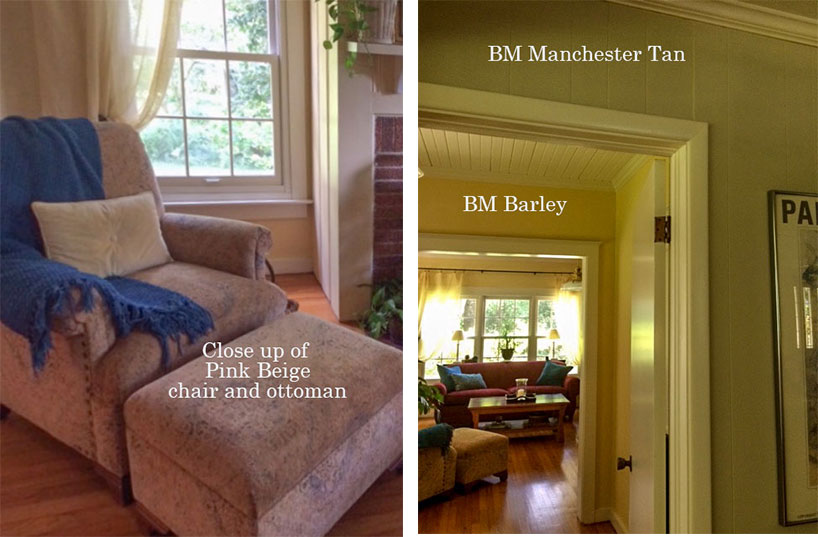
You can see in the transition photo that Manchester Tan looks dirty in comparison to the yellow walls in the next room, but Barley IS technically a more muted yellow. If you were to pull out your fan deck and start comparing yellows, there are many yellows that are way cleaner and brighter than Barley.
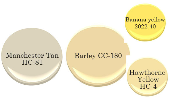
If you compare Manchester Tan and Barley you’ll see that they do work together if you were just looking at the paint chips.
If you have a fan deck handy, compare Hawthorne Yellow and you’ll see even more clearly that the yellow was getting cleaner and in actual fact, Benjamin Moore has a colour called Banana Yellow and you can see here that it’s a much more obvious example of a clean yellow vs. a dirty yellow.
However, before we talk any further about which paint colour is best, we need to make some decisions about how we are going to finish decorating this room.
Since the sofa is more expensive than the chair and ottoman, let’s move that to another room since I assume we don’t want to paint the room pink beige.
Painting it white or cream would also not help because we have colour in the adjoining rooms. If you suddenly paint one room white, it might start to look like it simply hasn’t been painted yet.
Okay, if you have a room like this that needs a refresh, look for an inspiration photo to help you.
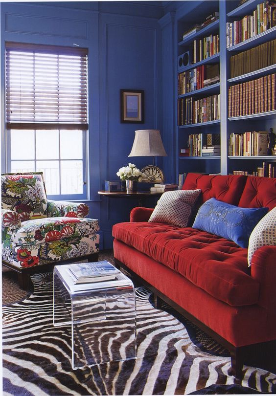
In this image below, the red sofa and blue rug are not heavily repeated in the decorating, and they are both really strong colours so you could treat the individual shades of blue and red like you’re colour blocking.
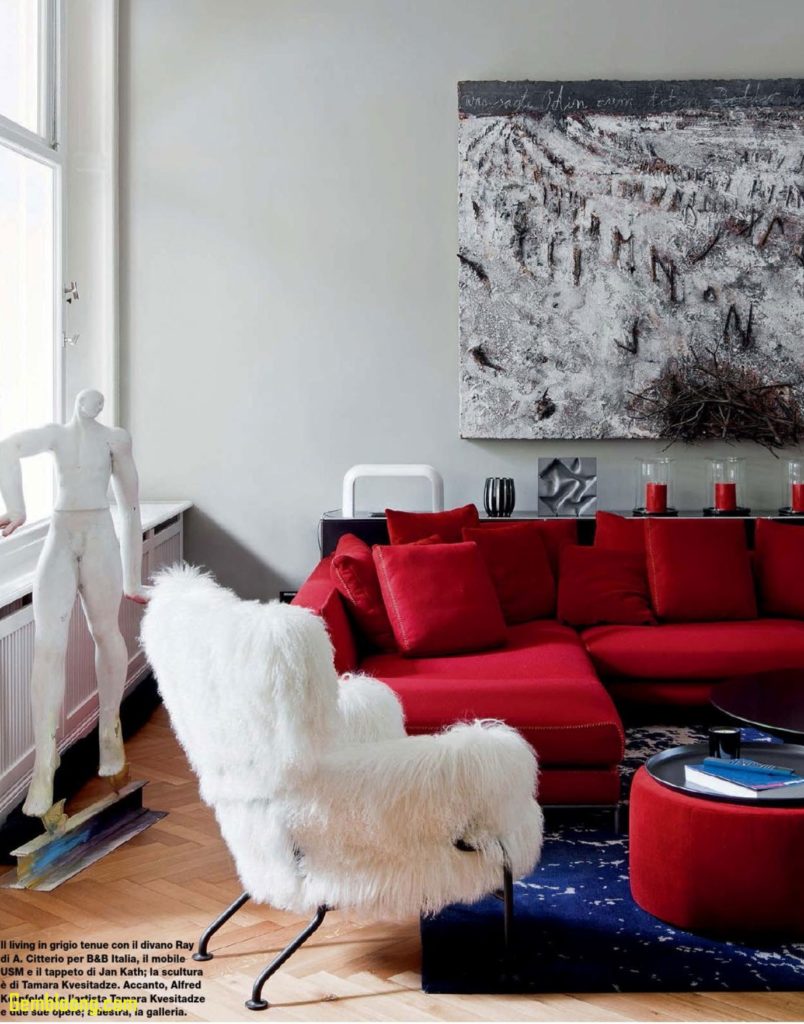
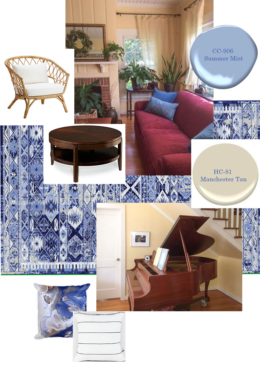
So I did the same in this room. Since she loves blue, I’m eliminating the chair and ottoman and introducing blue instead, but in a much stronger way.
I found a rug that’s mostly blue which is how we can get away with introducing it in this room with the red sofa even though there’s no red in the carpet.
We can then repeat the Manchester Tan from the kitchen (you’ll see it’s actually found in the rug) or paint the room blue. I would also paint the mantle the same colour around the fireplace.
I’ve also added throw pillows that introduce white which would make the sofa feel more fresh.
Here’s another inspiration photo with a red sofa and strong blue walls this time. I like the black and white zebra which looks amazing with strong dramatic colours.
As you can see, the main issue in the end, is not that the yellow goes TOO YELLOW at some times of the day, it’s simply that yellow is not the right colour for her room, and when it intensifies in the warm afternoon light, it’s even more obvious that it’s wrong.
Over to you, my lovelies. Do you have a room that seemed to change colour with the light and now it bothers you? I want to hear from you! Email me here with your images, taken in good natural light (wherever possible) and without flash.
If you’d like to transform the way you see colour, become a True Colour Expert® Register here.




Beautiful corrections. What do I do if the yellow I picked for exterior paint has turned my house the color of fireflies?
“Painting it white or cream would also not help because we have colour in the adjoining rooms. If you suddenly paint one room white, it might start to look like it simply hasn’t been painted yet.”
I wish that were not true! is it only true when there are ajoining rooms? Or it is true for the whole house, even with separation of rooms (either all the walls have to be white or none at all)? I feel like it might be even “truer”, the whiter you go (because primer is white). Does having pictures/photos on the walls medigate the problem, at least somewhat?
Genius!
Such great and practical solutions. I love the suggestions on the bold use of red and blue with this room !
Beautiful solutions!
Suggest painting out the fireplace in a fresh white that will work with a more clean yellow.
The red brick seems to be competing for attention – and may have influenced earlier efforts by trying work with it by using the pink beige chair and red sofa.
Hi! My favourite post by far in this topic series! Mind you, I have MANY favourites in the different topics you speak, just saying! I’ve followed your blog for years now.
This is SO comprehensive and addressing so many options to like and choose, even furniture ideas to replace, not just paint renovations, ooh! You’ve certainly been inspired by your travels, AND your growth here, expanding, you’re skills exponentially expanding.
I’m SO excited to see! Happy happy joy joy! I LOVE your vision and journey to watch. You go girl!
I have a funny one for you. My light bulb in my bathroom is SO wrong. It shows my skin at its worst, bringing out all kinds of pink! AND my lounge room has the afternoon sun that beats in so bad. Just thoughts. One day I might just DO the pix for you, if an exploration that tickles your fancy to get your mitts into, haha,
One more thing. SO surprised, you gave up your happy yellow colour here. I’m at a loss here, hehe!
Thought you’d fight for your yellow, and change everything else, around it! Hehe!
Well done, and love to you and your blog! All joy and sunshine! Xo.
I would love to see before and after pictures!
This really hits home.
I too have similar colours in my living room, but had not yet painted because I could not reconcile the wall colours.
Your client’s room is similar to mine with the fireplace at one end. I have no windows flanking the fireplace but to the right of the fireplace is the open doorway leading to the kitchen, with the main wall of the kitchen visible. Where your client’s couch sits I have a bay window and main traffic pattern into the kitchen. This is a 110 year old house and my neighbour’s dark forest green house is 8 feet away. The bay windows are topped with leaded glass in an emerald green, red, gold and white floral design. Because the houses are so close together light is challenging but we get direct west and south west light in the kitchen and window closest to the kitchen between 1:30 – 4:00 depending on the season.
Opposite the bay window is a gold/ orange knotty pine vertical wood plank wall with boards that are about 3 inches wide. The wood planks run all down that side of the living room and adjoining dining room, a total of 25 feet. Between the living room and dining room is a bulk head which I painted a dark maroon. I like it, but it serves more as a colour block to support the dark reds in the room. It could be changed. Like your client’s floor mine is 3 inch wide boards of fir, that has taken on that orange tone of old wood.
My couch is an ox-blood leather and sits against the wood wall because the access to the main hallway bisects the living room and dining room.
The draperies on the bay window are a silk-like horizontal stripe in Maroon, copper and a light greenish teal which are all woven with black to given the colours a muted look and each of these three inch stripes is separated by a quarter inch stripe of tobacco gold chenille. Currently I have a pink-beige recliner in the room but that is only there while we are renovating the bedroom/ office where it will reside. If it stays it could be recovered another colour. I have an antique love seat covered in a tobacco gold velvet with pillows and seat cushions in a fabric that is also woven with black to make the colours muted. The colours are maroon, navy, emerald green and gold with some black background. The pattern is vertical stripes with panels of leaf patterns between the stripes.
I thought of using a muted yellow tone paint because the fireplace wall already has a yellow tone finish. It is covered in gold grasscloth…which predates my twenty year ownership of this house and may be 30-40 years old so it is similar to the wood wall. Adjacent to that is the deep gold tone knotty pine board wall that would be a similar age to the grasscloth. I have lived with this grass cloth / knotty pine wall because changing it seems daunting and both were applied to original plaster walls that may be water damaged, but are certainly old and likely to be more damaged by removing them. Light is a challenge throughout the house as neighbouring houses are only eight feet away.
So, while I do not have the problem of massive light causing the paint colour to potentially turn a different colour, I do have the problem of trying to find two or more paint colours that work together in three different rooms, some light exposure and a large dark green wall as a view. The dining room has north light with a small exposure of western light with warm gold – cherry toned antique wooden furniture. The living room has western light and some south western light with that dark green wall, and the kitchen wall, visible from both of these rooms is the only wall on which I can have colour as the remainder of the kitchen is white cupboards and black counter tops. The only window in the kitchen also has a view of this dark green house next door.
I love yellow, and thought a muted yellow in the living room / dining room would work because we use the rooms mostly at night and it would give it a cozy feeling. ( Our main lights are ivory silk shaded sconces on either side of the fireplace which casts a further gold tone.
I’d like to paint the kitchen a lighter ( whiter) muted yellow tone with a darker muted yellow tone in the living room. I’ve had the kitchen wall a pale blue before which was too cold and depressing. I have had it similar to ‘goldenrod’ paper colour which was better, but a bit too saturated at some times of the day.
I suspect that because of the lack of strong light in this room, the wood, grasscloth and the green influence of the neighbour’s house that yellow IS the colour for this room. But I am perplexed how to find yellows that are muted enough for the living room which is in the middle of this trio of rooms, as well as a yellow tone that is not too strong for the better lit dining room and a lighter colour for the kitchen where the sun tracks across the white cupboards everyday when I am in the kitchen. The dark green of the house next door has a stronger influence than I see in my room, so I am uncertain where to find yellow tones that work for my kitchen, living room and dining room. Cream in the kitchen? Warm muted gold in the living room? How many yellows are too many yellows? Which work well with the influence of the gold/ orange tones of wood and grasscloth? Which yellows work with the dark forest green of the house next door that fills the windows we do have? Am I wrong about yellow in this room?
Pictures would help!
Fantastic post!!
Can you kindly recheck the rug link? Seems to be different then one pictured.
Hi Karen,
After I’d spent a few hours working on this post I realized that rug was only available in the wayfair.ca site and now, much to my chagrin, I can’t even find it there! Sorry about that! Maria
When the plan isn’t working change the plan, not the goal…I love that you revealed a paint problem as a room problem!
The red in the couch isn’t strong enough to stand next to the blue for my taste, would you specify a different shade or any other color sitting buying a couch slipcover?
* any other color if they were interested in buying a slipcover
a lot of people don’t realize that a slipcover costs the same as buying a new sofa. Once you pay for the fabric and the labour, it’s the same price (unless the sofa was really expensive in the first place). That’s why I didn’t suggest a slipcover. Thanks for your comment! Maria
I thought I had a lighting problem. Walls were BM Shelburne Buff, and I loved it. Then we put in low-e windows, and they cast a blue light. Suddenly my tan-gold turned a gross tan-green. It was also around that same time we tore up the carpet and put in hardwood floors. All of these years I blamed the windows. But now thanks to your blog, I’m wondering if it’s because of the floors (which are medium brown with red undertones). We FINALLY repainted a few months ago. BM Yorktown Green. And I’m back in love with my walls.
I love reds and blues together, but I think they work best when the red is either true or has some blue in it. Your solution would immensely improve the room—I hope she can implement it. And I agree with the person who suggested painting the brick. I look at a lot of houses online, and a natural brick surround almost always looks dull and dated.
Yes I agree painting the brick would be a good idea too! Maria
Brilliant! You always provide great, easy to obtain suggestions that really bring a room together quickly!
The color genius has struck again! After you explain your solutions, I always slap my forehead & say “Duh”. ?
could you have solved this room by adding muted yellow accessories, ie the room would have red couch, barley wall colour, and a rug with combo yellow undertone and red? (I realize this solution would still make the next room wall colour look dirty, so it would have other problems.)
Yes that would have worked too but I added blue because she wanted blue in the first place. Thanks for your comment! Maria
If we took your colour course besides learning undertones would we learn what to do with the colours so that we would know how to fix a room like the one you showed us on our own?
Thank you so much for your kind article and wonderful suggestions! I certainly love the blue you brought into the room, and it definitely looks more current and fresh. I’m sad about the rug not being available, but I will try to incorporate your ideas. Since you went into detail about the why of your decisions, it makes it easier to understand and, hopefully, follow. I envy your talent, but am so happy you share it with the rest of us!
Maria I like your comment it’s not always about the wall color but it is the furniture that is wrong. So many times when I go out on a color consultation the client only wants me to tell them what color to paint the walls. When you tell them that the furniture doesn’t go together they often are insulted because they just bought the furniture. It is hard to tell them that they need to move a chair or replace a new sofa. I like what you did with your room inspiration board. Maybe that is the way to show a client how to pull the room together without upsetting them. You so cleverly showed the reader what her room would look like when everything relates. Love these kind of posts!
I completely agree that for explanation purposes, ‘clean’ & ‘dirty’ accurately describe how to differentiate between the two color groups (and easily explain why mixing the two often looks discordant).
However, ‘dirty’ has a negative association. Most clients instantly bristle and get defensive at their home being referred to as such in any context, making a productive conversation unnecessarily difficult. Therefore, while I am thinking ‘dirty’ in my head, I use the term ‘muted’ while speaking with clients.
Thanks for all your awesome posts! You are very talented and I always appreciate your insight.
Our house is built in a J shape around a large, covered loggia. This means that most of the rooms have multiple light exposures. Also, we have canned LED lights in nearly every room, which provide a different color lighting than the hanging fixtures, lamps, and such. Everything in our home changes color throughout the day and evening! It all depends on time of day and which lights are turned on. Up until now, everything was painted white, with the exception of the kitchens and bathrooms that the builder inexplicably painted a very, very pale gray (looks very similar to BM Moonshine). I put off repainting because it just seemed so overwhelming, but now that I’ve started down this journey, I’m actually having lots of fun learning about colors and undertones and light exposures. It’s been fascinating to put poster-sized samples on the wall and watch the colors change throughout the day. The changes can be quite dramatic!