This post is written by Tricia Firmaniuk, my Director of eDesign:
In this post I’m picking up where Maria left off in her last post about what’s coming up in the trends and get a conversation going about black.
After several years now of “airy and beachy” many of us are looking for a bit of grounded sophistication.
The pendulum is swinging back to dark.
We’ve been seeing quite a lot of seductive deep and moody decor as a refreshing counterpoint to all those really bright white rooms (not that those are going anywhere anytime soon). And in particular a whole lot of black. It’s clear that nothing says classic sophistication more than a judicious hit of black.

But we’ve all seen really boring black too right? And just plain bad black like ill fitting polyester office slacks and lumpy, dumpy shoes and bags. Black easily begins to feel cheap, generic and uninspired.
And black in interiors can be even harder to get right. So where is the sweet spot? When is black sophisticated and when is it not?
A lot like white, which can also feel bland if it’s done badly, black needs to convey a sense of luxury to look good.
Similar to the way white can look unfinished and stark in a room that is not decorated and styled, black gets heavy and masculine really fast if it isn’t well thought out.
For many of us, the idea of a black sofa still brings back the 80s (below).
Although much sexier black sofas do exist, this is still not the best place to introduce a trendy hit of black into your room. Sofas are big and heavy looking to begin with, a black one can really drag a room down.
Another thing I’ve noticed is that many of us will tend to act like the black in our rooms is not even there. Like white again, black gets treated as a “non” colour and outright ignored. But as the brightest and darkest colours, respectively, in a room, neither white nor black should ever be ignored. They are colours, and they need to be addressed and repeated or they will stick out as wrong and out of place.
Most of us have at least one large bit of black in our main room, the flat screen. Screens command attention anyway, but if you have no other black in the room, it can look extra distracting.
And if your room consists of the generic black sofa above and an oversized flat screen and that’s it… well then I just don’t know what to say to you 😉 No, actually I do, call us, an intervention is required 😉 😉
If you have a prominent screen in your room, or even if you don’t, try introducing more black.
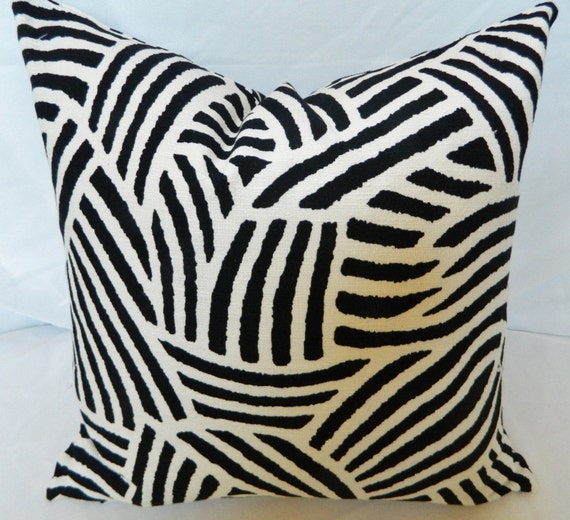
Black striped pillows and nice skinny black picture frames are a good place to start. And a black lamp in a sleek shape is a good idea too. Since black is heavy and graphic, tread lightly and think in terms of lighter, more linear black elements instead of a big, heavy swath (like a sofa or arm chair).
This is another beautiful example above. It looks like they’ve gone with a bold black or charcoal drape as well. Notice how the gallery frames don’t all look like they were bought from the same collection at Ikea? Luxury remember. Luxury often means going for a collected look. Matching black frames would create the opposite lumpy-generic-sofa effect 🙁
And some pillows in black and white can never hurt. I need a pair of these in Nate Berkus’ Tolo fabric stat.
It’s the same in the kitchen, there are lots of hidden in plain sight black bits on appliances. I’m not saying you can’t ignore them, I’m only saying they exist, and I find my eye tripping on appliances all the time because of all that black. So why not embrace it? It’s on trend after all.
While I think this kitchen below could use a bit more colour in general, it’s a good example of sprinkling around a bit of black to make the appliances feel at home.
I LOVE the styling in the image above. Just the right amount of black in an otherwise white kitchen with some warm woods and metals.
Black lighting, hardware and/or countertops are really good ways to introduce black, particularly if your appliances have black details. Just don’t go overboard, black looks better in the company of metals and wood.
I really think this is a better way to introduce black than to paint an entire bank of cabinets black, or to go all in with a completely black kitchen.
All those sexy, glamorous black kitchens we’ve been seeing lately look great for sipping cocktails and entertaining dinner guests, but they might be kind of a depressing setting for drinking your morning coffee don’t you think?
Also black just like the espresso kitchen of the 2000s needs LOTS of light in order to have it not feel like a dark hole in your house (Below).
However, if you do want to get your black cocoon fix, contained rooms like a bedroom, office, or bathroom are really good places to go all out and wrap the room in some dark drama. Take a look at this gorgeously moody and masculine study by designer Sean Anderson via Elle Decor (below).
Or this fabulous small bathroom below.
Turns out, black is a fantastic backdrop for art. If you look closely, many of the pieces above are inexpensive prints in cute frames but the black walls make them look so decadent.
And speaking of decadent, check out this powder room wrapped in black crocodile wallpaper. Pure luxury.
But an all black kitchen? Not for me thanks, not unless my entire lifestyle happened in the evening and wee hours, but I’m done with that kind of excitement these days 😉 And the cost of repainting a kitchen is much, much more than repainting a bathroom or office.
I do like this antique looking black island though with lots of brass and white below.
I really love the use of black in this room below. The black fireplace insert is acknowledged simply with a striking black lamp, sconces and some graphic chairs, but the overall look is still classic and balanced. I’m really into black lamp shades right now, they look so sophisticated.
This room (below) gets a lot of mileage out of a pair of lamps with black lamp shades and a few toss pillows with black patterns to tie in with the black front door and fireplace.
So that’s what I think, black done well is about luxury. And it’s easier to pull off in small doses to avoid things getting all heavy and depressing. But I also love the drama of really-well-done-all-black rooms, I guess if you have a large enough house to have some nice bright rooms as well.
What do you think? Are you drawn to the black trend? Have you tried to introduce it into your rooms? Is it hiding there already?
Thanks Tricia for this great post!
_____________________________________________________
Here’s what I want to add.
I have been on an extended long weekend in Victoria with my sister and her family and our first stop was The Empress Hotel.
A hotel that’s famous for serving British Tea.
A hotel that is over 100 years old.
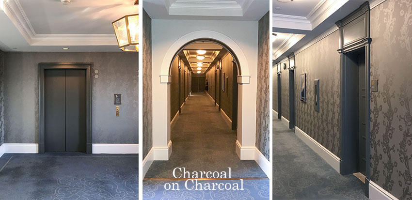
It had recently undergone a 60 million dollar renovation and it had been re-decorated from top to bottom in CHARCOAL.
These photos are of the guest room floor but the tea room and restaurants and guest rooms were also grey.
Ever noticed when you decorate with colour how much more timeless it is?
I say it over and over again in this blog, however, it seems to me that big hotel chains should have a designer in charge who understands colour.
This is a lot of money to spend on neutral that is already on its way out.
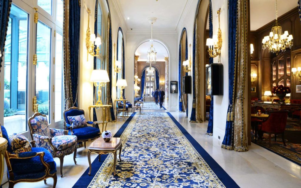
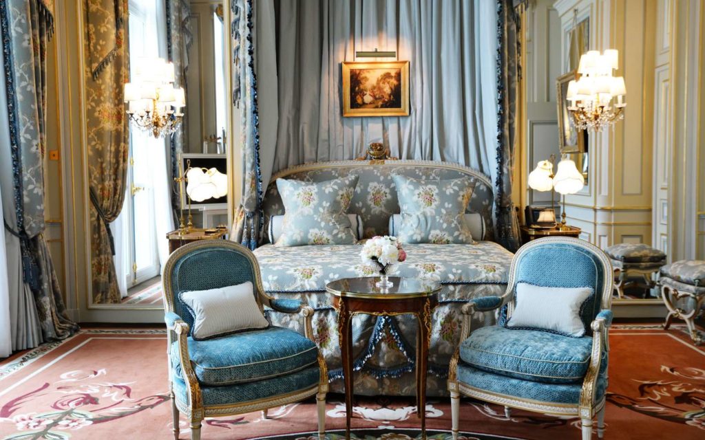
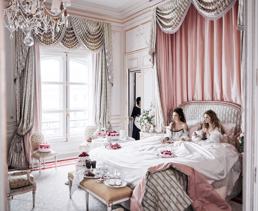
Conversely, the Ritz in Paris that recently went through a renovation that cost 440 million.
Let’s look at a few images shall we?
The lobby
A hotel as expensive as The Ritz should be replacing upholstery and fabric when it gets worn, not because the trends have changed.
You would not know in which era they did their restoration. You’ll find black, brown and grey in this hotel but none of these neutrals are overused.
When you have to change something because it’s obviously dated but it’s not dirty, old or worn out, that seems so wasteful to me.
And that’s what I’m trying to do in this blog every day. Save you from buying the wrong colour.
Then we left that hotel and came out to the Westin Bear Mountain, what did we find here?
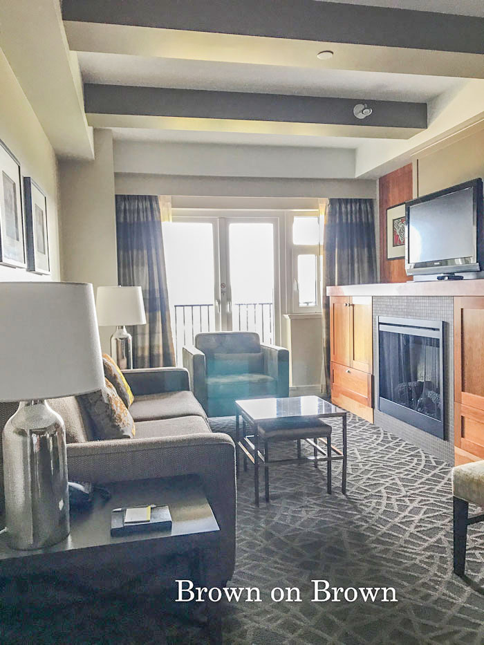
Brown on brown.
When was this hotel decorated? 2011. Two years after the grey trend had already arrived in the west coast.
There are so many designers who are completely unaware of where we are in any given trend cycle.
A lot of money is spent on the WRONG colour. Or because most people INCLUDING designers are just afraid of colour.
The lobby was entirely brown with some gold. It was like walking into a cave. This was the suite that connected our two brown rooms (above).
Terreeia and I travel a lot and I think it’s sad that I immediately know when a hotel has been built or redecorated by the OVERUSE of a trendy neutral.
A lot of designers say “My house is neutral because I am surrounded by colour all day, I need something calm and restful at home”.
But we’ve just seen the evidence in two expensive hotels that clearly, the designers choosing colour are afraid of colour, they don’t understand how to decorate with colour and they don’t realize where we are inside the trend cycle or that colour is a way more classic and timeless choice than the current trendy neutral.
So here are the guidelines to follow:
For hard finishes, choose white/cream over brown/grey or black.
For soft finishes, choose colour.
And you will be happy with your house (or hotel) for much longer than everyone else.
If you would like to learn how to choose the right neutral and discover how to decorate with colour, find a Specify Colour with Confidence Workshop near you this Fall here.
Elizabeth & Maria at the Beacon Hill Park in Victoria
Related posts:
Do’s and Dont’s for Decorating with Black Outside







![[CasaGiardino] ♛ A (Very) Blah Powder Room Transforms Into a Jewel Box - laurel home](https://i.pinimg.com/564x/17/90/59/1790597530838da3e62b207c246e185b.jpg)






We’re on the brink of buying a condo with a huge black leather wallpapered wall, barn doors with black leather, tall fireplace wall in black glass….I’m terrified!!!!
No… are you just kidding around or does such a place really exist?!
That sounds very expensive to change when you tire of such statement items.
However if you have the financial means to do so, then go for it.
If you weren’t joking; I beg you to post a link to a photo of it, please!
What a strange and sad thing to do to that grand old lady, The Empress. Did they gray the guest rooms and dining/bar areas as well?
EVERYTHING was grey on grey, including the tea room. Chairs scraping on cold marble floors. They had also painted out most of the 100 year old woodwork. So sad truly! Maria
The tea room!?! Heartbreaking. One of my fondest family memories, from about 7 or 8 years ago, was spending a rainy afternoon in the tea room with two of my adult nieces. The room was so elegant and perfect in its details and setting. I loathe when what’s in style (or, in this case, on its way out of style) becomes the main driver of a decorating scheme. I believe rooms, homes and locations tell us what they need, or at least where to start, if we pay attention. Just don’t believe The Empress’ Tea Room asked for gray on gray. 🙁
The back exterior store front is really lovely! It sort of reminds of a bit of black window casings that I think are so sharp (both interior and exterior).
It seems like in many of the other photos from this blog, pops of black are best when they are hardly noticeable.
I like the idea of black and while harlequin/checkerboard tile floors in theory but it seems like often they are made with less than attractive (likely cheap) tile and are in too small of a space, so that they don’t actually look all that good in real life.
I had a black and white kitchen floor in a rental built in the 40s where I lived about 4 months. I’d never ask anyone to install it unless they loved cleaning, never cooked or had live-in help. The white shows all the dark dirt, the black shows off the light dirt. Lucky for me at the time, I was flying all over for work, treated this one restaurant as my home and made friends with the staff because when I was home, I pretty much ate breakfast, lunch and dinner there with weekend brunch thrown in so I never cooked anything more than hardboiled eggs. One of the waiters even made sure he saw me off at the airport when we were both leaving for thanksgiving. Such a sweetheart.
Maria, it seems to me your brush stroke is too wide saying that, “But we’ve just seen the evidence in two expensive hotels that clearly, the designers choosing colour are afraid of colour, they don’t understand how to decorate with colour and they don’t realize where we are inside the trend cycle or that colour is a way more classic and timeless choice than the current trendy neutral”. You seem to not remember how difficult it is to work with owners who are the decision makers on what the design and color schemes will be. Every designer I know devours design trends and design minutia EVERYDAY. As designers we can educate our clients, but the final decision is not the designer’s. You describe a world that simple doesn’t exist where color scared designers have Carte Blanche to make dated choices. I find owners and many individuals are their own worst enemy when it comes to making choices and doing something different, beautiful and out of their comfort zone. That’s the problem, they are scared and hold the designer back. BTW, your guest writer was great.
Hi Karen, It’s true it is a challenge I agree but I have seen way too many hotels decorated in the current trendy neutral. Even the one I was just in, the kitchen was entirely brown but the backsplash was cream? I don’t think the ‘hotel owners’ would have objected to a cream countertop as well, but it was sadly brown too. . . Thanks for your comment! Maria
I love touches of black but dislike swaths of it, even when well done. After I read some years ago that every room should have a bit of black, I looked around my house and discovered that all my rooms do, in picture frames, lampshades, fireplace enclosure, and so on. A clock, black in an otherwise colorful rug. Not as intentional and sophisticated as your examples, but there.
I love, love, love how The Ritz is decorated. It’s beyond gorgeous. Next time I’m in Paris I’ll visit the lobby, since we could never afford a room there.
an otherwise colorful rug.
Yeach, that black hole / Goth kitchen…obviously spent money, but even almost 10 years in Manhattan with a black wardrobe, I think that would make me slit my wrists.
AND then, ruined every cabinet door by putting the knob too close to the corner. Ugh, so sad when that happens.
Maria,
I agree with you about the hotels, most of them seem to be at least a trend behind and don’t get me going about the dreaded undertones! 😉 Nothing seems to ever match. If that hotel had just used black and white instead of charcoal it would’ve looked timeless, in my opinion.
Do you think that amazing black bathroom with all of the art could be done in a bathroom without mirrors? I adore it!
Thanks for this decorating with black post!
See you in October!
CC
OOPS…I meant a bathroom without windows!
this was very helpful. I bought a house and am gutting it. A large fairly open ranch. White kitchen cabinets with an accent area of soft aqua-grey cabinets for a coffee bar. The walls are soft warm white. The trim matches the cabinets that are a brighter white. I was going to paint all the interior doors Agreeable Grey since it is more of a taupe than actual grey. But I was struggling with my light fixtures. I love the dark iron open lanterns I’m seeing because i felt like i needed some depth in the rooms. 19 ft ceilings in the kitchen/hearth. I did light cerused oak floors throughout with matching roof trusses in the hearth room/kitchen. And i like not having glass bc i don’t really want to have to clean it! So should I carry the black fixtures throughout? Or work in some of the aged metallics? Like that aged lighter gold color? Thinking of a black wide chandelier with delicate stems that spread out more in the family room infant of the light colored stone fireplace. So I am happy to hear that black is back!!! So here’s the question…in case you were wondering…I have an office with a large south facing window (front of house) that I would love to paint “black”. You will see this from the great room and as soon as you enter the home. It was the dining “room”. I widened the openings and raised them to 9 feet (all my interior doors are also now 9 feet). All this to say that there is one full back wall, a side wall with a very large window, and the other two walls are mostly open to the entry hall and great room. The ceiling in there is 9ft. So should I do it? Paint it “black”?
I love black.
My LEAST favorite pairings are with navy or sapphire blue, orange, peach, yellow or red.
It is lovely with lIme, white. plum. pink. periwinkle, or silver.
I had to chuckle about the generic black sofa & oversized flatscreen. That is a dream space for most guys. Lol
About 10 years ago I painted our guest bath black. I loved it! But the black was tempered with white beadboard wainscoting, white tiled floor, & white fixtures.
Black, like any other color, is great in moderation.
I love black! I do have to say I disagree about the comment on having a black sofa. Yes, those oversized leather or vinyls ones are ick! Mine, on the other hand, is a Victorian sofa with beautiful dark brown wood trim (NOT painted). It was given to me years ago and it was covered in pink velvet! 🙂 Several years ago I recovered it myself with my best friend. MY FIRST upholstery project! Yikes! And we covered it in black microfiber suede and I think it’s absolutely gorgeous! My living room walls are sage green – yes, I love sage green! And my rug is a dark red with a pattern on the borders. Has varying shades of sage green in the pattern. The woodwork and trim of the house is white. My house is an American Four-Square. My kitchen is dark red walls with white cabinets and black counters. It came that way and it stayed that way as I love red, white and black. But I don’t go overboard on the black. Thanks for the post on black! 🙂
Thank you for telling us that color is timeless. I would take the Ritz decor any day! I think I have enough black (or almost black) in my home with some iron table frames, soapstone fireplace surrounds, some black lampshades and of course the TV. I don’t think I could live with much more black than that.
Great Blog all just makes so much sense .
You can definitely overdo black .
But I like it as a accent with white .
You and Elizabeth look so much alike
Two pretty ladies !
Thank you
Yes the Empress remodel was disappointing last time I was in. The tea area wasn’t done yet. I don’t get hotel decor. It’s so rare to see it done well. . It’s like they purposely choose clashing undertones. I just stayed at the Fairmont Chateau in Whister this week, again underwhelmed. Our room had a newly redone bathroom I was told at check in. Large green beige tiles on the shower wall and the niche had finger glass mosaics in multi warm colours. It felt so dated. I had a hard time believing it was new. The give away was the style of the drain, matching tile to the floor tile that was just not quite right with the wall tile rather than metal. And the glaas door was was on rollers on the chrome track. The tile choices did not say current at all. Nice post Tricia.
I very much appreciate the tips on how to make the black TV and appliances fit into my light and bright new kitchen and living room. I was also thinking that my dark buffet does not fit in. Thank you for confirming that repeating color is a way to make it feel intentional and unify one’s space. Great post Tricia.
Maria — I do agree with you, but with a caveat. While the neutral hotels you showed were brown, charcoal, etc. and boring, the first room picture Tricia showed was neutral but beautiful. Neutral on neutral (and a little color maybe in the butterflies) with texture, i.e. done right, isn’t boring. Also, I would not want to stay in the second room from Vogue that you show here. Yes, it’s Vogue, so I guess it’s my bad taste (Vogue can’t be wrong…haha) and I’m not saying it shouldn’t be in the Ritz, but it’s a bit foofy for American tastes right now, wouldn’t you say? The lobby is dressed up, but it’s a bit more streamlined and up-to-date in my eyes.
Nice post, Tricia / Maria! Our large TV is something that has bothered me but I never really knew why until you explained it here. Also, since we’ll have a black fireplace now in our new-old home, I’ll look to incorporate some splashes of black throughout the family room to incorporate it. Thanks for these tips, they’re much appreciated!! ~ Miranda
After completing two colorful three-dimensional mosaic pieces, I installed them in my entry over a side board and on an off-white wall. Meh. Painted the wall flat black and added shiny black floral pins in a large harlequin pattern. Put the mosaics back up and WOW! Made all the difference in the world!
What color black did you use for the wall?
What a great post, ladies! I love black, too. I chose black doorknobs, hinges, and cabinet knobs throughout my new house. I also have black or iron lighting, excluding the master suite and dining room. Sadly, my area still has lots of shiny brass from the 90’s, and few people even know it’s dated! I’m done with bronze, too. And that crocodile wallpaper in that powder room?????? That is amazingly gorgeous! There should be a glass of champagne on the vanity to enjoy while using the toilet!!
P.S. That gray hotel???? So sad.
Black doorknobs/hinges/cabinet knobs and black iron light sounds lovely and sharp, and at least in the case of some of the hardware items, a bit unusual. It seems like metal finish colors come in and out of style more quickly than I might hope for – I sort of wonder if by using black, you might have escaped the trap that is trends in metal finishes!
That was fun! I love the Nate Berkus pillow, and the kitchen with the black and copper accents. Also that room from Travel and Leisure. The colors were heavenly…
Cindy
Well to me hits of black has always been classic. I have them in my own home and love them. Overdoing anything is not inspiring or beautiful to my eyes. I have been in houses and hotels that have used black wallpaper or paint to do usually a bathroom and even though they are very dramatic on a day to day basis I think they become depressing. Like most decor if a room doesn’t have some bright shades of color it just looks flat.
My husband and I were in that grand old lady the Empress a few years ago and just loved it! Although it was evident at that time it sure needed an overhaul but why did they have to do that to it? Just ugly. It was dark to begin with. So sad. I say keep it in the style it started out to be which was English and keep it’s charm. Use color, brass, and some black. Some places should never follow trends IMHO!
Great discussion ladies!
Very interesting post, thank you! I truly enjoyed reading it
It seems I’m already on trend, with very small accents and touches that I started introdicing here and there..partially, influence of great book by Celerie Kemble “Black and White and a Bit In Between” which I read several years ago..partially it’s me embracing my darker side and showing it to the world:) I was really hesitant of using black at home for many many years, even if it was just a tiny bit of black. In the past couple of years though I started being drawn to it more and more. My favorite blacks come from art of course. Then pottery, bedding, throws and throw pillows. I’m right in the midst of my exploration of black, white, and a bit in between:)
I love creams and browns with it too-very sophisticated. Reserved, understated, heartbreakingly gorgeous.If I was a different person, or even just owned several homes(lol)-I’d try such a room.
From the moment we decided to tackle a kitchen renovation, I envisioned black cabinets with natural oak floors. Our house is a 50’s ranch and our kitchen is located at the back middle. I compromised taking a wall out between what was the kitchen and living, to keep from adding on to the house. Big homes are just not my cup of tea. So, the open space will now be kitchen in back and dining at the front. There are two decent size windows on the back wall and typical ranch windows up front (this will be light from the north and south). I opted for no uppers on the back wall and only a couple on the side walls (my husband doesn’t think plates and glasses should be stored in pull out drawers…seriously) and pushed hard for a lot of lights. There will be 11 super low profile surface mount lights in the 15 x 13 kitchen space and 8 in the 15 x 12 dining space, all on dimmers, as well as under cabinet lights. I’m seriously struggling with paint color and countertop selections, but am currently leaning toward BM Gray Owl (already in the hallway and I love it), and Formica Neo Cloud counters (laminate for budget purposes). The sink is in the island, so I’m not too concerned about backsplash for the time being, but would eventually love all the kitchen area to have beveled subway tile. So, I have bought into black, but am definitely looking for a lightness or a brightness on the walls without going white. Thanks for the wonderful post and giving us the opportunity to comment 🙂
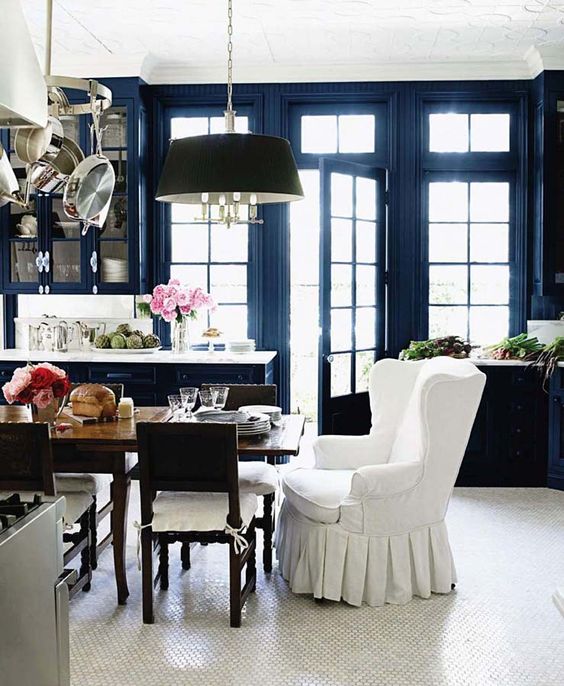
One of your photos showed the best way to do a black kitchen–inject a shot of navy blue into the space. Or, better yet, choose a dark navy blue instead of black. In design school, we learned about using navy instead of black in illustration class. It’s an awesome trick. Love your blog!
That’s good to know as my entry way is done in navy as so is my den. When I did them (about twelve years ago) I drove the staff at Benjamin Moore crazy tweaking the navy I chose until I got the correct colour as all I could see at the time was a ‘purple’. Didn’t know at the time why …. but thanks to Maria I now know the reason …. as ‘its all in the undertones’ …. ☺ . -Brenda-
Which blue did you pick?
Very informative post Tricia and Maria. Thank you ladies. Currently, I don’t have any black throughout my home however do have hits of various shades of navy. -Brenda-
P.S.: I wonder what the two women in the Vogue photograph are intensely looking at? It certainly seems to have them captivated …. °Û°
I walked in a small shop a couple of years ago and one wall was black with gold framed mirrors. Very stunning. That black kitchen would be a horrible place to work.
I’m in Toronto a lot for work and I understand your disappointment. A few years ago the Sheraton Centre was redone and I couldn’t figure out why they changed everything that was beautifully done navy and gray to shades of brown and taupe. I knew from you the trends were leaving brown and going gray. I just wanted to find the designer and say – “Are you crazy?”
On the other hand the redo of the King Edward Hotel rooms was beautifully executed to respect that age of the hotel but taking out the chintz and florals for a more classic look.
Maria, I have been receiving your emails/ blog posts for a few years now. However, after reading this post I will be unsubscribing. Kudos to the guest writer though, great post!
For an educator to state that designers: don’t understand how to decorate with colour and they don’t realize where we are inside the trend cycle or that colour is a way more classic and timeless choice than the current trendy neutral, is extremely myopic, subjectified and quite frankly a little offensive.
You go on to say: So here are the guidelines to follow: For hard finishes, choose white/cream over brown/grey or black. Far soft finishes, choose colour. Really?
Just because brown on brown and gray/ grey is not to ‘your’ taste, does not make it wrong or unappealing. And the only way for there to be any validity to your statement about the designer/s would be if you personally know the designer/s who did the work or all of the designers in the world. Do you?
Exactly which colors to use is up to the individual. In design, there are basic principles. However the rules, usually apply to color placement and harmony. Rules may be bent or broken after you’ve taken them to heart, that said, of course, there is no substitute for artistic instinct and experience and knowing when to bend or break them!
Most unsuccessful polychrome schemes fail because the colors used are too bright, and the contrast between adjacent colors is too great. One way to avoid this is to stick to colors that are grayed enough to create a restful effect; colors in a historical paint line for example, Curio Gray, Amber, Pewter Tankard, Crewel Tan, to name a few.
Let me also bring your attention to, The Influence of Color on Italianate Architecture. In 1842, landscape gardener, writer, nurseryman and nature-lover Andrew Jackson Downing published the book “Cottage Residences”. In this book, Downing a great number of details for creating a home that is in harmony with nature and is aesthetically pleasing to everyone who views it. He provides 6 color swatches that are in keeping with the ideals of the Picturesque movement, in which the subtle colors of nature are espoused as less discordant than the whites and greens, which seemed to have been prevalent.
The colors he espoused are neutral and include gray, brown, fawn and what he called “drab” — all the colors of natural materials such as sand, earth, clay, straw, slate and stone.
I could go on but will end here. Point made.
Hi Krista,
Thanks for your comment, and I am sorry to lose you as a subscriber, however, if you had seen as many hotels as I have that are ALWAYS decorated in the current trendy neutral, you might make the same statement as I did. I assume designers are hired to design hotels, however, they are ALWAYS, reliably decorated in the current trendy neutral from top to bottom, I might add. As I write this, I have just checked into a hotel that is currently being transformed from the 90s into the grey trend, from top to bottom. No colour, no black, no white, no cream. . .just grey woodwork and trim, grey carpet, grey walls and grey upholstery. I appreciate your thoughtful comment, you obviously know a lot about this subject and for that reason, I’m sorry to see you go. Warm regards, Maria
I’m not really a fan of either of the what I think are extremes in the hotel pics. Those colors chosen for the hotels do not seem particularly timeless and classic to my eye but I guess beauty is in the eye of the beholder. Perhaps I desperately need the color training! But also, my thought as observing and reading was that the Maria Killam team must despise Kelly Hoppen!! Her designs ooze classic and timeless in my eyes….
Thanks for your comment. The Maria Killam Team doesn’t despise anyone. There is room for everyone in the creative tent. What I try to save the world from is having to rip out their finishes every 10 years every time the trends change. Maria
Oh how sad to see those photos of the Empress. When we were there in 2013 I took hundreds of photos because it was so beautiful! Unfortunately I lost them when we were robbed and lost our computers AND backups at the same time. Well, we still have our memories. It was amazing.
What are you supposed to do if you do have black? And you can’t rip it out.