image source
The look of 2016 is White, Colourful, and Organic.
Here’s how I want you to read this forecast. Trend reports are generally about what’s NEW. It doesn’t mean that the trends I talked about in 2015 or 2014 are OLD. After all, trends in interior design cannot be in one year and out the next. No one could keep up and we’d all be broke trying to do that.
For example, we’ve been decorating with turquoise for 15 years. That’s why darker, richer blues including deep teals are all the rage because they are NEW. Does it mean that turquoise is out? Not in my opinion, it’s just not NEW to talk about turquoise.
After all, the definition of NEWS is NEW. What’s new? That’s what everyone is interested in reading about.
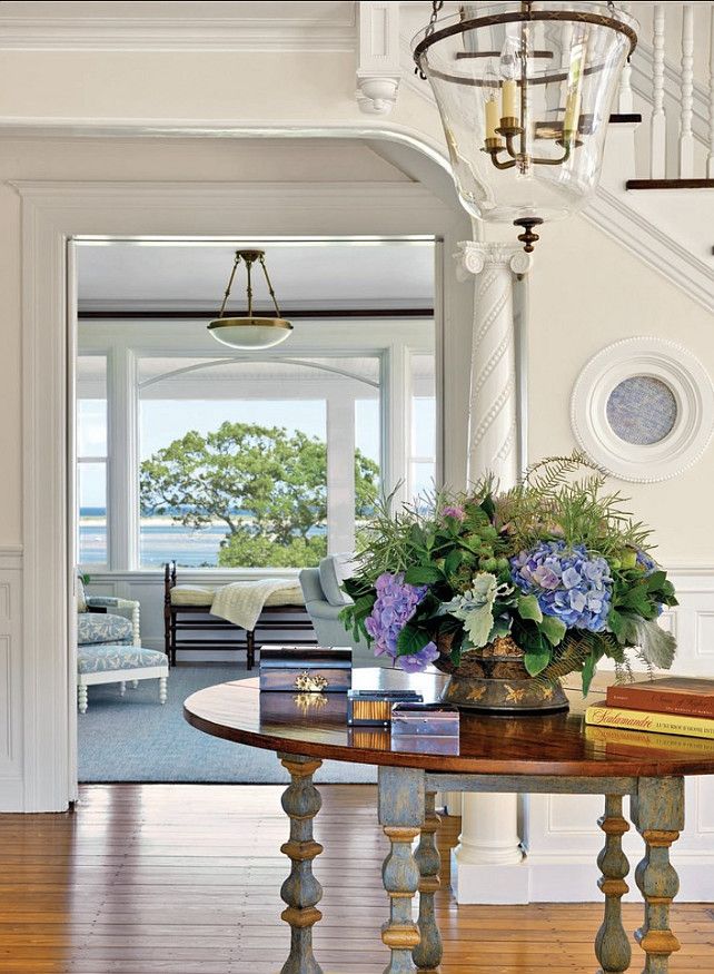
Simply white woodwork via Homebunch
White
Y’all keep sending me emails asking what I think of Benjamin Moore’s 2016 colour of the year, Simply White, so here’s what I think:
White is crisp, it goes with black, grey and bright colour. Unlike cream which belonged in the beige and brown trend.
I’ve been specifying lots of Simply White for 6 years now (which is how long the grey trend has been around on the West Coast).
In my system, Simply White is in the off-white category of the gradation of whites that start with blue whites, then move to true white, off-white, cream and then greige. I’ve outlined my entire system of choosing whites in my eBook White is Complicated; a Decorators Guide to Choosing the Right White
Gradation of whites from White is Complicated by Maria Killam
Sherwin Williams colour of the year for 2016 is 7008 Alabaster, which is also in the white category.
White is not suddenly a new trend, but instead of talking about grey (which is NOT news but still the trendy neutral of the decade) or black (which was at the top of my trend report last year) the industry has settled on white and made it new. For the moment anyway.
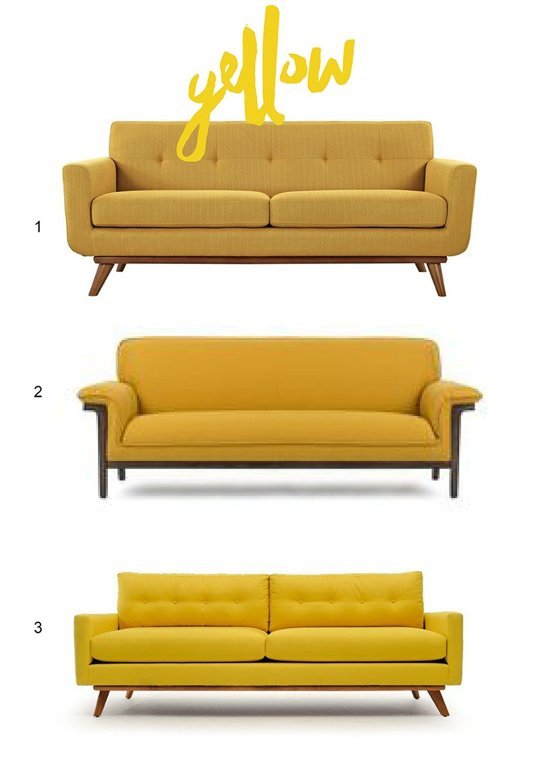
Maria Killam’s Yellow Sofa
Colourful Sofas
I’ve been specifying colourful sofas for years. I believe owning a sofa in a colour that you love will stand the test of time longer than the current trendy neutral.
I LOVE that what’s classic is now trendy.
Just like white kitchens and subway tile. Are they trendy right now? Yes for sure. But they are also classic and timeless.
Here’s a post I wrote a long time ago on how to choose the colour of your sofa.
Yellow
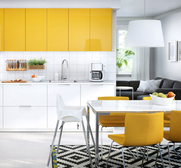
Yellow is finally getting trendier. When a big box store like IKEA has yellow as an option for cabinets and leather upholstered bar stools to coordinate, that’s when you know more people are warming up to this happy and optimistic shade.
Back in 2000 when I first started my career in colour, I specified yellow constantly. Then the brown trend arrived and NO ONE was interested in yellow anymore.
How about you? Can you see a space for it in your home?
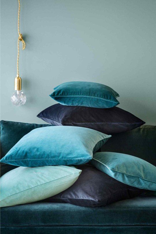
Jewel Tones
Navy and teal along with the deep yellow (above) all add up to these rich colours being hot, hot, hot.
via Sweet Things
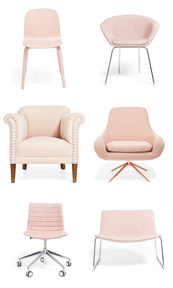
Pastels
Everything goes in terms of colour now but I talked about pastel pink being the colour of 2016 back in April when I wrote my trends report at High Point Market. And it’s also Pantone’s Colour of the year along with periwinkle blue.
Pink represents compassion, empathy and understanding. It relates to unconditional love – the giving and receiving of nurturing.
via Pinterest
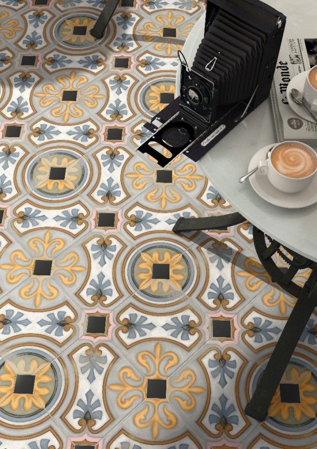
Colorful Patterned Encaustic Tiles
Careful how you incorporate all this colourful accent tile into your home. A good gauge of whether you should use it in your new renovation is ‘Will the entire room be so beautiful that it will get into a magazine or get pinned over and over?’ If the answer is yes, then go for it.
Too many people take the newest trend and try to add it to an old kitchen, bathroom or fireplace surround. That’s when it doesn’t look fabulous, it just looks, well bad.
Image source
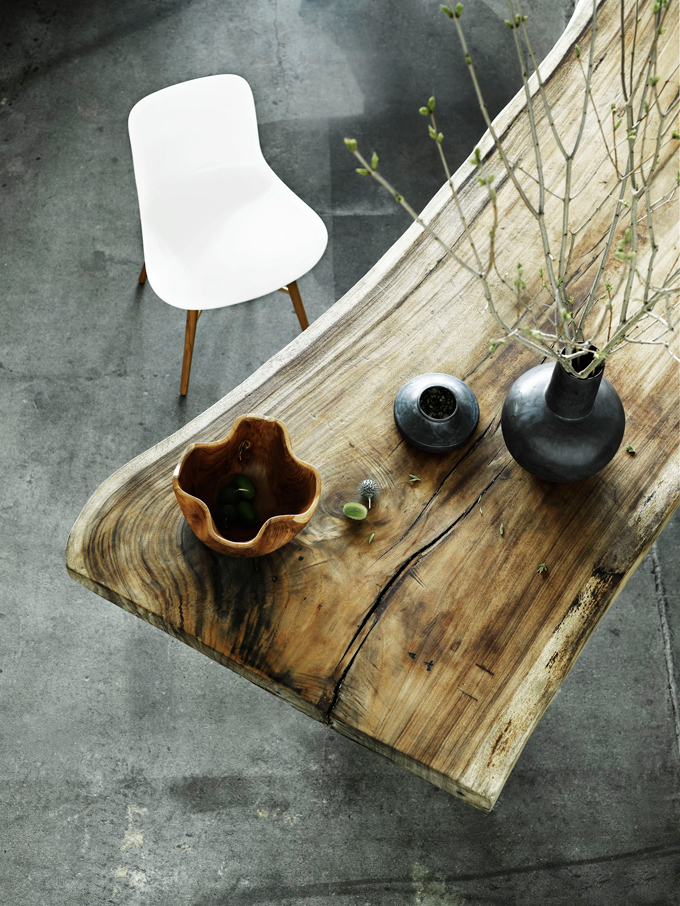
Organic and Textured
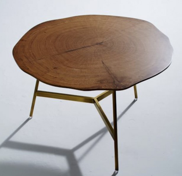
With grey being the trending neutral, the way to bring in warmth if you choose not to do it with colour is with natural fiber area rugs, baskets, warm wood tones in case goods and reclaimed wood furniture.
West Elm Coffee Table 30″ x 18″
Olive Green
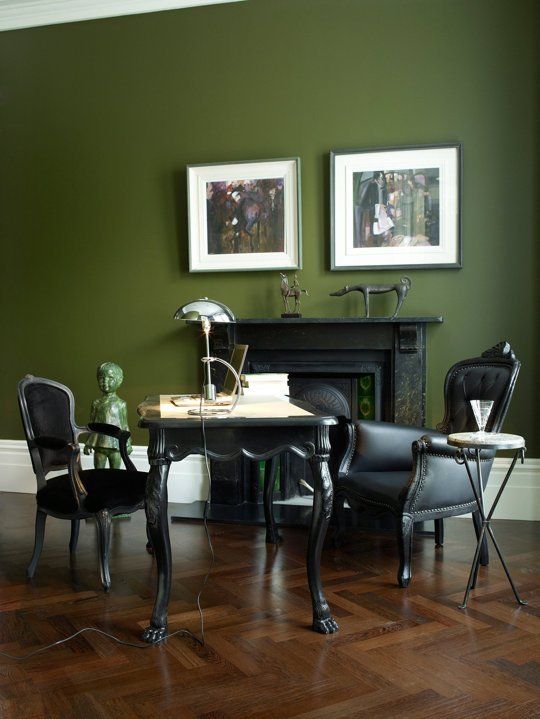
I also blogged about this colour being hot at High Point in April last year. It’s a colour this time around, not as greyed down as the sofa you had in the 90’s before the brown trend arrived.
Black hardware, tiles and kitchens are still on trend as well as oversize lighting, kitchens without uppers, and of course copper and gold on hardware and furniture, I mentioned them all in my 2014 and 2015 trends report (links found below).
Kate at Censational Girl recently posted that the buffalo check was having a moment. Traci Zeller posted about quartz crystals being a trend.
Anything else new that I missed? Which trend is your favourite?
If you would like your home to fill you with happiness every time you walk in, contact us! We would love to help you choose colours, select the right combination of hard finishes or create a plan to pull your room together. You can find our fabulous e-design consultation packages here.
Related posts:
Maria Killam’s Trend Forecast for 2014







I love everything..))
I might be less keen on yellow-that’s because we have tons of yellow in our current home, and we have these really grand ceilings so the first floor walls are very high..and they are yellow. The house is very light and bright, with huge windows, and yellow works really well(even though it kinda dies at night..it’s a very morning color), and I have some yellow furnishings and accents too(besides other colors ), and lovely vintage yellow lamp..but it feels like I’m ready to move away from yellow a bit, after six years of so much yellow. Next house will be totally different, and if I’ll go with yellow there it will be different yellow, something like caramel.
I’m also less keen on white-I love it, but I have this idea that it makes me look paler. LOL.
Love, love jewel tones. Mad about cement tiles. Couldn’t use them though in our new place renovation-they’re too slippery when wet, and I’m pretty clumsy person. But I adore them. I have a thing for tiles-that’s because I lived in Mediterranean for many years. Tiles, palms, and bougainvilleas..
I have colorful sofas now. My only regret they are leather. While I wish for velvet. On the other hand, leather makes for a relaxed mother and hostess))
PS Happy New Year!
Leather couch and velvet pillows is what I did.
Love the blue jewel tones for my pillows and have a black sofa and greige/white.
Yes I did that too! Velvet is just too dreamy
Yeah, and when I get kittens, not going to stress about the couch.
Maria, You always write thought provoking blogs! If you have been around long enough you see all trends come and go. I think in the long run it is what colors and styles a person is happy with that makes their home unique! I don’t pay much attention to trends. However as a designer it is always fun to see what trends are new!
Happy new year to you and your family.
“Anything else I missed…” . Maria, you did not miss a thing! Spot on post, my dear. xo
I love the overall clean and bright look that most of these colors convey, especially the teal/blue, yellows and white… 2016 is going to be a good year!
I’m noticing green a lot more. In clothes, floral patterns with muted green and yellow. And tv sets. A really interesting take on that is on this show Spotless. All walls of the main character’s home are dark, muddy green, with slightly lighter trim. It’s really interesting, and on trend with the dark, dramatic colors.
Happy New Year, Maria! Hope 2016 is your best year yet!
I love seeing pictures of rooms with white walls. I just don’t think I could live with it. It would feel too cold for me. It would never work in my home anyway. I don’t get enough light to pull it off.
I do better with a pastel color on my walls.
I love green, so Olive Green is my favourite of your trends. I am going to paint my laundry room and closet “Misted Fern.” My sofa is apple green! So I like the coloured sofa trend, too. And half my house is painted aqua, so I love the jewel tones that go with it in pillows, etc.
In the past I have been ‘a wallpaper junkie’ so colour and pattern has always been part of my décor whereas furnishings have been plain or muted but consisted of a lot of textures. That said; as I am renovating my entire home it is out with the old and in with new which will entail pretty well just the opposite. i.e.: Neutral background including fixed elements with more colours in furnishings and accessories. Oh regarding deep yellow and blue jewel tones ….. totally love them! -Brenda-
You have an excellent track record for forecasting trends, so I would expect this year’s report to be just as accurate. I appreciate the practical way your information is relayed, versus the often breathless, overhyped declarations from the big companies.
I haven’t seen the olive trend creeping in yet (though that could change!) but the whites, for sure. I’ve also been seeing jolts of really saturated “jade” as I might describe it – it’s like the early 60s turquoise that was almost green.
Very interesting article. We are painting inside and out this year, so I am sensitive to color. Our BM paint everywhere is a ‘wheat’ yellow, which I describe as aged ivory. We got the color by accident when our store forgot to squirt enough yellow into one of the buckets. We started with that bucket and got a shock when we opened the next one. Everyone asks for the name of the color, and I do love it. But – you knew it was coming 🙂 – I now want a lighter color outside. The house is stucco, and though it looks nice as is with its white window frames and burgundy awnings (not my choice, but made to match several Japanese maples), I think the color has ‘brightened’ and is now too yellow. I’d like to go whiter, change the awnings to black, and paint the front door and sidelights teal to blend with two small copper overhangs near the door that have finally developed a patina. The door and sidelights are just frames surrounding beveled glass panels. The window frames outside can’t be painted because they are aluminum clad. The windows are huge, but thankfully have no dividers. They look pretty white to me, but I’m sure they’ll clash with any white I choose for the house. I hate grey of any kind, and dislike the gothic look of dark browns and cement greys most of my neighbors have used. We also have one wall of stacked stone in front which has a lot of sandstone and peachy clay colors. Painting the house grey or cardboard color as it once was, tends to accentuate the grout of the stone instead of the beautiful blend of stone colors. Much as I think it a mistake to use a white in your beige tones, I think it is my only option. Any thoughts? Should I buck the newer brighter white trend or the despised grey and just use what works with my fixed elements? How does one decide to ignore the ‘new’? It is a 15 year decision because BM now has fabulous ‘rubberized’ paint for stucco that lasts forever. My New Year dilemma. Hope your New Year is all smooth sailing and happiness!
I am currently taking photos of my house so that I can do a phone consultation with you. I cannot wait!!!
Another great post,Maria- I have realized that there is no forever couch,upholstered chair, even cars,etc and you should buy what makes you happy to look at and sit on or drive, because by the time it is usually paid off, it is time to buy something new-
I love all of these, although the pink and olive green are my least favorite of them. What I especially love is that there ARE so many colors that are popular right now. It makes it easier to find them in stores, and it just makes me happy!
Trends affect me primarily because they determine availability. I like what I like and am glad when it’s popular because then I can buy what I like to fill in holes. We still have the emerald green velvet couch we bought in the early 90s–it now lives in our dining room and gives it a cozy and welcoming atmosphere. The walls are a pure yellow, painted in 2009. No plans to change because all the colors, furniture, art look wonderful against it. It’s a full spectrum color and looks rich at night, rather than faded. I make small changes to a room from time to time–like changing accessories or adding a new piece instead of getting a whole new wardrobe.
i just did this too – loved yours!
Thank you for publishing this! I am a colorful sofa fan myself – red. Ours is slipcovered in red on the blue side. I found in our bath that the color also pairs well with BM coventry grey.
Besides cabinets/casegoods/woodwork white has never been a color I desired. You need good lighting so it does not look dirty. In my opinion it is a bad option for families or those with pets.
I work in a furniture/home decor consignment shop. Besides neutrals what can you pair with olive and pink? A pair of pale pink chairs just hit the floor and the colorful pillows on it do not work. We recently had a distressed olive leather sofa with brass nailheads in which we settled on brown toned pillows. It would have been nice to add a color.
Purples and yellows! Here’s a pinterest link that will give you more ideas! https://www.pinterest.com/search/pins/?rs=ac&len=2&q=olive+green+sofa+living+room&term_meta%5B%5D=olive%7Cautocomplete%7C2&term_meta%5B%5D=green%7Cautocomplete%7C2&term_meta%5B%5D=sofa%7Cautocomplete%7C2&term_meta%5B%5D=living%7Cautocomplete%7C2&term_meta%5B%5D=room%7Cautocomplete%7C2
I’m all for colourful sofas but has anyone noticed how hard they are to find? Still seeing a sea of grays, browns and other neutrals in whatever furniture store I visit. Even when they offer swatches to choose your own fabric, they are blah. I think I’ll be slip-covering the old sofa instead.
Love these colours Maria, so glad Marsala has disappeared from the radar!
Not sure of your budget but Roger + Chris (rogerandchris.com) have BEAUTIFUL sofas in just about any color and/or fabric you desire. I am soo tempted to get a deep blue velvet chesterfield from there but not sure it would be the best choice with two messy teens in my house.
My fave here is the olive green. To me that’s a neutral, like blue is for others. I like tans, corals, yellows, golds with it. The right pink can work, and the right purple. And I’d dare to put those blue cushions above, with it. I have been in love with your yellow sofa since waiting for it to arrive with you through your blog. I love the raspberry curtains with it. For me, your home tours say choose colours you’ve and want to wake up to and smile. It is so refreshing.
I’ve owned and decorated enough homes now to see all these “trends” come full circle, lol. I did the olive green (actually 3 gradations from the same color card) in an open family/kitchen area back in 2001 and loved it. And had caramel going up the stairs, with a bold, bright yet deep blue in the living room. Next house? Went the gray and deep navy route with accents of yellow and red. Even had greige, before it even a word! (that was 2010). Used Alabaster almost two years ago in the bath on board and batten walls. Now it’s time for the next house and I’m loving whites and saturated blues, like teal. I’m still partial to gray, I’m going to go for more of the warmer grays. Maybe I should choose something totally “new” though since I’m too close to actual trends this time versus before?! 🙂
I am using Alabaster all of the time in kitchens right now. I have only had one client not ask for white walls, and we did Accessible Beige on the walls ceiling and trim. I think white walls are pretty, but I don’t have one in my home!