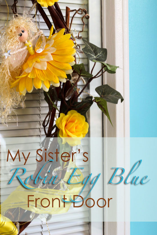
My sister Lea lives in the Eco Village just down the street from my house. She noticed her neighbours started painting their front doors so she called me and said “I want to paint my front door robin’s egg blue, can you help me pick the right one?”.
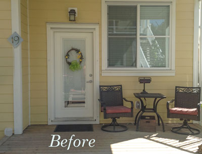
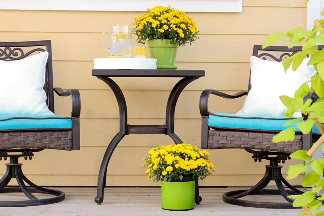
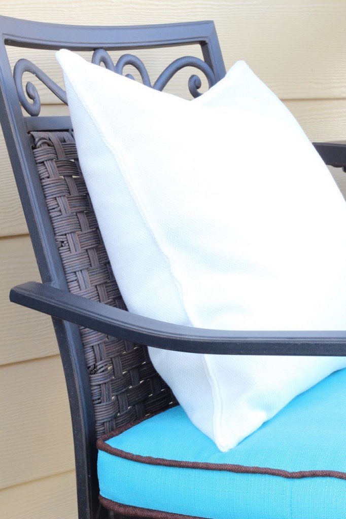
I said “Great idea! But what about your dull red cushions (below), they’ll have to go. Why don’t you find some new cushions first and then choose your front door colour”.
Okay, she said.
First she went on-line but as it’s the end of the outdoor season, she couldn’t find anything in the right colour.
So then she went to the fabric store and found some turquoise outdoor fabric.
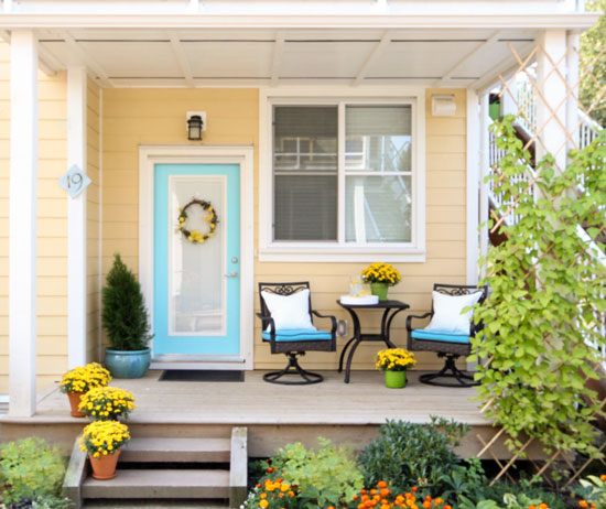
And then I chose her front door colour to match.
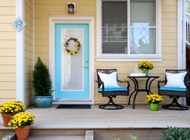
Front Door SW 6949 | Siding SW 6387
Lea was told that one yard of fabric would be enough, when she went back to get another yard (after I told her she needed 2 yards) it was gone, so she bought another yard of brown fabric. The bottom part of the seat cushion ended up brown along with the piping. It was a happy mistake because now they look even more custom.
Lea already had a turquoise pot, but the same tip applies to your house. If you don’t have seating anywhere near your front door, coordinate your front door colour to some colourful pots. In other words, buy the pot first. Then you can simply match your front door colour to the plant pots.
It’s hard to choose a random colour when it doesn’t relate to anything.
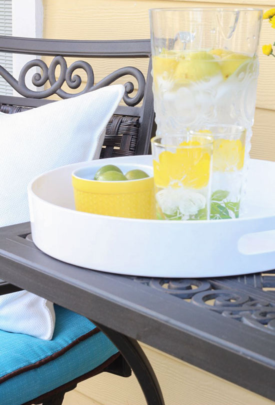
Some old vintage glasses I found when we were in Lunenburg last Fall.
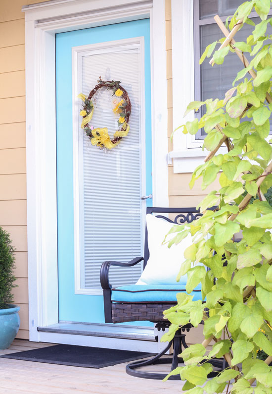
Lea changes up the colours on her wreath to match the seasons.
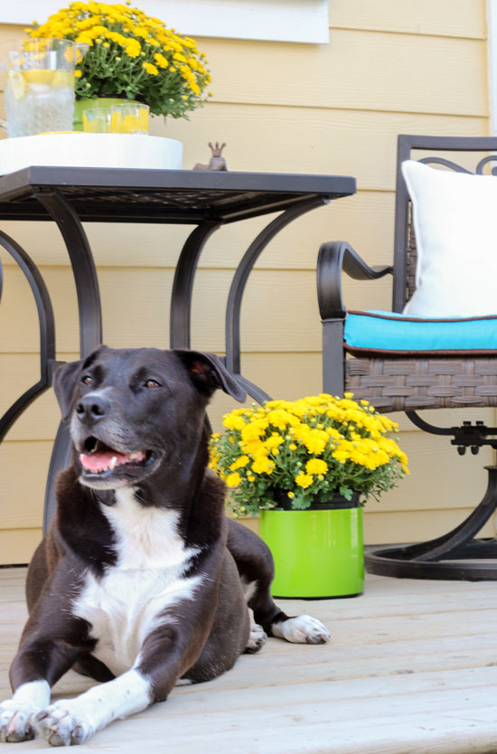
And here’s her beloved dog Babs.
It’s not too late to paint your front door this season! If you need help choosing a colour, you can purchase that colour solution here.
I’m so excited, I leave Saturday morning for the Withit Conference in Atlanta, then Wednesday I go to Montreal and then Sunday the 23rd we leave for Italy!! Hooray!
And there’s one more event I want to tell you about, my friend Deb Barret and Jackie Von Tobel are hosting a VIP High Point Market tour.
If you have never been to High Point and would love to get the insider scoop, this is the only way to visit the most exciting home furnishings trade show in North America. This tour is limited to 20 attendees with places reserved on a first come, first serve basis. We will take care of all of the planning, so you can concentrate on the show, buying and having a great time!
Pack your bags and join us October 16-21, 2015 for Soft Design Lab’s VIP #HPMKT Experience. Get your inspiration, information and insights from our Fall VIP #HPMKT tour. Here are five reasons why you should be on the tour:
Reason #1
High Point Market- it’s not only the best reason; it’s the most exciting home furnishings show on the continent! We’ll show you the ins and outs and give you VIP access and exclusive destinations that you can’t get on your own.
Reason #2
Design Inspiration- What can we say, High Point Market is the center of the design universe for a week in October and you can be at the center of it all.
Reason #3
VIP Access- It’s one thing to walk through showrooms during Market; it’s another to get the backstory, the brand vision, and the knowledge and skill sets to sell and design interiors. We can give you it all.
Reason #4
We’re your Personal Concierge- Soft Design Lab will take care of all of the planning, so you can concentrate on the show and on having a great time. All this and more for less than you would spend on your own!
Reason #5
It’s tax deductible!
Feeling inspired? If you need colour inspiration help choosing a front door colour, you can purchase it from my Exterior eDesign services here.
If you would like to transform the way you see colour, become a True Colour Expert.
Related posts:
Are you Waiting for your Paint Colour to Propose?
Canned Colour Combinations: Why They Don’t Work


I’m always so surprised how yellows don’t need to look very yellow at all on the little swatch to seem sooo yellow in a room or on siding. I had to take my paint deck out to see what SW 6387 is because these pictures look so similar to our yellow siding. I was shocked by the swatch, but sure enough- it’s very, very close! Thanks for sharing the door – looks great!
For all these years I’ve had it backwards and tried to accessorize AFTER selecting my paint. No wonder I never got it perfect.
Looks great! And I’m very impressed with your sister’s sewing skills.
I do front doors from a color that recurs through interior artwork. Never fails. Always a choice to work with exterior plus ties exterior to interior. Exterior pots I do as a whole, all are terra cotta or all galvanized or all lead….. Wonderful knowing different approaches. Now, please plenty of instagram from Italy. XOT
The patio cushions look great!!! The brown piping really pops against the blue.
Darlene
http://www.BundleMeBaby.etsy.com
Beautiful as usual, Maria! Enjoy your time in Italy!!!
I’m looking at the siding too. We were thinking SW Banana Cream for our house. Hmmmm, are we destined to be wearing sunglasses???
The house number sign would look great in the same turquoise colour!
I think what really makes this appealing is that the door is not solid. It adds just the right amount of color and will still look good in the winter when, presumably, the cushions are no longer outside.
Maria, The turquoise looks so clean and happy against her yellow house. Very inviting!
You are such a busy girl, Be sure to take plenty of vitamins to keep up your strength in order to see all of the wonderful sights in Italy. I certainly envy you. We want to see northern Italy so badly!
Have a great time.
Love the coordinating pillows and happy mistake story! Looks fabulous!
Can front and back doors be painted different colors to match pots or cushions or should they be the same
Usually the back door isn’t an accent colour but doesn’t mean you can’t do that at your house if it works. Love this idea!
The before and after is like night and day. It looks great! The contrast of the yellow flowers really makes it work.
WOW what a difference that color makes on the house
with the cushions and pot to match!!!. It really livens it up
and makes it look “stunning”………Amazing………and it proves
one of your principals that your always trying to teach us that the color must relate to something else in the area to look right…….and the proof is in the pictures! Really impressive what color can do. It makes me happy just to look at those pictures!