Hi everyone, I want to share a little tip about what your clients are really looking for (even though they might not even know it yet).
Occasionally I receive comments or emails like this:
“We aren’t ALL interested in introducing fresh into our homes, Maria!”
“Please don’t exclude those of us who still prefer warm, earthy colours.”
“Puh-leese, write some posts on what to do with all the orangey/yellow wood trim I deal with in my area!”
“My clients aren’t interested in gray.”
“You couldn’t pay me to use grays in my home. Ever.”
Even if it doesn’t look like it, these comments/questions all have one thing in common — they don’t yet understand the concept of “fresh.”
In my Specify Colour with Confidence™courses recently I’ve been talking with my students about the idea of fresh for their clients. It’s been such an important conversation I thought I’d share it with you.
And, even though I wrote about fresh in a previous post last February, I think I need to spend a little more time on it.
I CANNOT, I repeat, CANNOT remember the last time a reader or a client said:
“I loooooooove earth tones! Help me choose some earth tones, Maria.”
Just to be clear, I am not trying to sell you on the idea that you suddenly need to embrace gray and introduce it into your house from top to bottom. Actually, you don’t even need to have any in your house to create a feeling of fresh.
When I’m discussing finishes for a new build with one of my clients, the first thing we do is establish their foundation palette — will it be white (to go with grays) or will it be cream (to go with beiges)? And probably fully 30% of my clients prefer cream over white.
Anyway, back to fresh.
If you’re a designer and you can’t specify gray to save your soul, the reason is probably one of two things:
Small town {Italy}
1. The Parisian Gray Trend has not hit your town yet.
If you’re in the midwest, or you live in the country, away from a metropolitan area, this will be the case. Here on the west coast the gray trend arrived almost five years ago, but where I live (almost 1 1/2 hours from downtown Vancouver) most kitchens are still brown.
One of my sisters lives in the country near me and she’s looking for a new house. During her house-shopping jaunts, most of the kitchens she’s seen have wood-stained cabinets in some version of brown. In my experience that’s because most builders are men and their perception is that a wood-stained kitchen is more valuable than a white kitchen.
What these builders don’t understand is that it’s the wife who most often chooses the kitchen where she’ll spend most of her time. Not the wood-stained-loving man. It’s obvious by all the attention given by design magazines to white kitchens that this is a look women love and want.
Brown trend kitchens with wood-stained cabinets belong with all things cream, beige and earthy. They don’t belong with whites, grays and black.
And until the gray trend does hit your town, it’s harder to get excited or to help your clients get excited. It’s often not until we see a new trend with all its possibilities that we wake up to how to create the look for ourselves.
On the other side of this coin — for those of you who are right on top of the pulse of where colour trends are and are now starting to think gray is OUT, OUT, OUT, relax. Lighting manufacturers (for example) have only just starting making trendy lighting that goes with the gray trend, ergo all the gold and copper that’s suddenly right on trend and here to warm up gray.
Just two short years ago when I was looking for new lighting for my house, most of it was still oil-rubbed bronze. Residential colour trends can’t change that fast; manufacturers would go out of business if the trendy neutral of the decade officially changed every five years. Especially when it takes five years for most of the planet to catch on!
2. You still think gray is cold.
Your job as the designer/colour expert is to sell the right colour for your client’s home. I start Day 1 of my Specify Colour with Confidence™ True Colour Expert™ Academy talking about this.The right colour sometimes even trumps the colour a client thinks they need or want.
During Day 1 we talk about how to handle your client’s objections when they balk at the right colour you suggest. We talk about all kinds of colour myths, starting with the one that states that gray is cold. And not a single participant in my training walks out with the misconception that gray is cold by the time they complete the course.
In truth, gray can definitely be cold but it can also be warm.
If you choose all gray finishes for your renovation or new build, your house will for sure feel cold, certainly until you start decorating.
A client who calls you for a new colour scheme for their house right now — with everything they are seeing in magazines and online — whether they are consciously aware of this or not, they are looking to create a feeling of fresh.
And here’s what you need to get about that:
Irene’s incredibly lovely and sweet mom has a hunter green sofa, rose pink walls and carpeting, oak cabinets and furniture from the 80s. She LOVES her hunter green sofa. She has no idea that her living room should ever look any different. All her furniture is in good repair so it would never occur to her that she should even call her designer daughter over to help update her cosy home. Or, if she didn’t have a designer daughter, it wouldn’t occur to her to call a designer to change a single thing.
So, if you have a client who is paying you to update their home, it’s because they want something new.
So here’s the new. Get ready, because it’s called FRESH.
Here’s what introducing FRESH to your designer bag of tricks looks like:
Light, Pale Colours
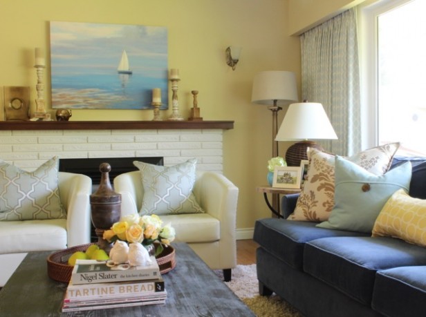
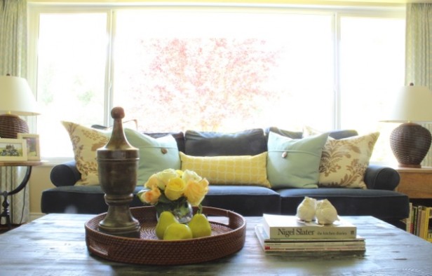
Recently, I helped my sister Anita with a makeover in her living room (above). Go here to see photos of her room before the makeover.
You’ll notice, when you look at her living room, THAT THERE ISN’T A SINGLE STITCH OF GRAY IN SIGHT. She even broke the cardinal rule of mixing pink-beige and yellow but miraculously, with some edited shopping and styling, we still made it work.
Introducing Cream or White
We made them work too.
Because they were cream.
Introducing cream or white to any interior through pillows, chairs, accessories and lamps will go a long way to adding a feeling of fresh to the space.
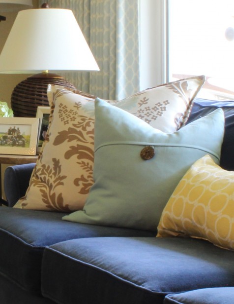
Notice that there’s just enough pink-beige in the larger-scale damask pillows (with cream) on her sofa as well as the candleholders on the mantle.
In addition, all her lamp shades are off-white. A lamp shade is, by the way, NOT the place to introduce colour or pattern.
Current Pattern
The large-scale damask on the creamy brown and blue pillow as well as the Moroccan pattern on her drapery are all new and current patterns.
All we need in here is a chevron pattern to make it really trendy. Have you noticed you can’t throw a stone these days without hitting something in a chevron pattern ; ) ; ). Hey, nothing wrong with chevron!
Here’s what I want you to learn. There is no gray or white or black in this interior and yet I would call this living room current, fresh and trendy. Trendy in the best possible sense of the word.
If you have a client who is paying you for a full service design or simply a consultation to give them ideas they can implement on their own, they are looking for F R E S H.
Will the pendulum swing back to dark and dramatic eventually?
Sure.
But right now, your clients are paying you for fresh and it’s up to you to deliver that.
And if you’re not a design professional, the same lesson applies to you! You might not have been aware that fresh was what you were looking for but how can it not be, when everywhere you look, that’s what you see?
If you’re not looking for a fresh look and feel, perhaps you’ve just finished a renovation or a new build and it’s earthy! So enjoy it and don’t worry about the trends. Trends, schmends.
I’m talking to those of you who have had the same living room for over 10 years. Maybe you’ve tried introducing new colours and it’s not working. This might be the reason.
Or not.
Maybe you’re someone like Irene’s Mom (or mine for that matter) who’s blissfully happy with what they have.
And that’s a good thing.
There’s more important things in the world to stress about than whether your home happens to be totally current or not.
Related posts:
10 Ways to Get a Fresh Look with a Black Sofa
How to Inject Fresh into Your Earth-Toned House
The Difference Between Fresh Greens and Yellow Greens
If you would like your home to fill you with happiness when you walk in the door, become a client. Online or In-person.
To get your exterior colours right, download my How to Choose Exterior Colours with Confidence webinar and get my go-to list of colours.
Download my eBook, How to Choose Paint Colours – It’s All in the Undertones to get my complete step-by-step system on how to get colour to do what you want.
To make sure the undertones in your home are right, get some large colour boards!
And, if you would like to learn how to choose colour with confidence, become a True Colour Expert ™







This is good food for thought! I’ve started to embrace the gray trend at last after seeing it mixed with lots of color enough times. Gray is one of my worst colors to wear, so I’ve been resistant. I would never ask for an earthy interior though – just a warm one – and greeny-grays are warm! We are shopping for a new sectional to replace our black leather bachelor loveseat & armchair (yay!). Our top picks are either a green-gray woven fabric or a cognac leather. Love the leather but I am feeling it will be the tipping point to earthy with our butterscotch sisal rug, cream curtains & bookshelves, yellow-beige walls, and cobalt blue and leaf green accents. However if I do get the gray sofa I will need to bring in a little more gray elsewhere so that there is something for it to relate to!
Julie, I have a cognac leather sofa with the lightest of grey/green walls but it is the white trim that keeps it fresh. To pull in the cognac colour I went with woven lamp shades of similar colour on either side then the rest of the accents I can change by season in pretty much any soft colour, like Maria did for Anita’s space above. The piece of art over my sofa has a hint on cognac as well. I have found this colour leather so easy to decorate around and it does warm up the space just enough.
Thanks Maria for another great post!
Hey Mairi,
I would love to see a picture of this room you described. We are thinking of a cognac sofa soon and I love greens! What was the paint color on your walls you referred to?
I have the same question as Sharon – it’d be great to know what color paint your walls are! I’m looking for a very pale grayish green (and a leather couch, too) and so far the pale sages I’ve found have been a little too yellow or beigey, or much more grey than green. Thanks!
@Sharon; Pete- I will post a picture very soon- we’ve just moved in recently. I tried and couldn’t find a grey that was close to the colour of ‘putty’ ie. a barely there warm greeny gray so I mixed it myself. (I know, Maria says don’t do this, but I love the DIY challenge :-)..A friend then had it computer matched at BM for her large kitchen with accurate results so I will get the correct formula from her first. Thanks for asking…
Thanks Mairi, much appreciated! It looks like I’ll probably be mixing a color myself, in spite of Maria’s words of wisdom. I’m looking for something more green than gray but your description of your color sounds really great. Definitely seems hard to find more existing options in that light gray-green range.
I’m not expert, so investigate this color yourself. But I just painted my interior BM Coastal Fog. It’s light green gray and I love it. I’m so incredibly happy with it.
I unfortunately wasn’t successful in posting my pictures on Flickr but I was able to closely match the BM colour “Halo” to the custom one I used and Coastal Fog is very close but 1/2 strength I would say.
Great post Maria
Thank god that I am not a designer as I would hate to work with a gray color palette- to me, it’s just so depressingly ‘au currant’, and artificial.
I just can’t ‘warm’ to it…Of course, I base my observation on what I glean from magazine articles and the internet, because I have not seen a single gray based interior in my friends’ homes..
Always appreciate your insights Maria! Love the photo of Italy too! I have just finished Maria’s three day course in Toronto and can tell you I learned a whole new way to look at colour and how it relates to other finishes in the space. Fresh is my new favorite expression when discussing decor with my clients ! Say Hi to Irene too!
Angela
I really enjoy reading your blog! You have so much knowledge to share! I especially love that you attached the link at the end about gratitude at the end of this post! When you love to look at pretty pictures of homes like I do, it’s very easy to lose perspective. What a great reminder. Thank you!
Trends schmends…HA. That’s why I believe a home filled with things you love will always be a home you’re happy to come home to.
Great post Maria. I was lucky enough to attend your course, so when recently I was hired to “update” a living room while keeping the old, beige sofa, I used these tricks. It came out fantastic. Before the update, my client said that she will change the sofa soon, after the update she mentioned that she might keep it for a while… 😉
I do love the new grays…..just haven’t been able to really incorporate it in my own home yet. Have used Ballet White which is grayish. Fabulous photo of Italy! Maria, a question for you or your readers: is BM Ivory White a white or is it cream? I’ve fallen in love with it, and I say it’s modern enough to use on walls with Cloud White trim, yet it is not cream. My friend says it’s cream and not modern. Who is correct?
Ivory white is cream , wheras cloud white is off white. You may want to lighten the trim to chantilly lace to provide more contrast. I wouldn’t worry about whether its modern because that also depends on your furnishings. It more a question of fresh versus earthy. Bottom line is ivory white will look fresh very on the walls.
Great info – yes “fresh” is what people want even if they don’t know it – and gray is a great neutral. Great job on your sister’s living room – it is fresh! Good luck on finding your “Louise from St. Louis” (that was Carrie Bradshaw’s assistant in the Sex in the City movie).
Hi Maria, I learned so much from your post. Love, love, love your blog. I’m a faithful reader even though I haven’t commented in quite awhile. As usual you are spot on with this post. I changed all the harvest gold and earth tones (I refer to that period as the Tuscan Tango) about 3 years ago and embraced the gray. It was very difficult to find decor back then to coordinate with the gray. It’s much easier now, but I’m still surprised when I walk through Home Depot and Lowes by all the earth tone area rugs, patio furniture, drapery, lampshades, and accessories. There must be people out there still buying it? Keep up the good work!
This is a great post. I live in a beach town in Southern California. People still ask for “earth tones” but I think they mean the colors of sea and sky and the plant material that grows here — which is dry green, purple, yellow chapparal and the blue/green of agave. “Earth tones” mean different things to different people — depends on the light and the climate and the style of architecture. It’s important to probe further. It’s important to listen between the words to hear what they really want. Sometimes, there’s just no hope, though, so it’s Chantilly Lace and a pretty face and I do my best. I do feel grey will be played out soon, to be replaced by “fresh” which is more livable and understandable by the consumer. Now if I could just get my daughter away from Revere Pewter…..btw, my go-to color is…BM Navajo White. Go figure. I fight it, but it works in so many spaces.
I currently have a client that is a bit tricky to work with. The wife loves the earthy tones (current home is very brown) while the husband wants something totally new (grey trend). While they do have white kitchen cabinets and black granite, they have gone back and forth with what they would like. After attending your Specify Colour with Confidence™ course, I actually used the word ‘Fresh’. It was then, and only then, that my clients started to be on the same page. When the husband saw that although you can still use ‘earthy’ tones (to make the wife happy), you can still get a ‘Fresh’ and updated look.
I can’t tell you how glad I am to have attended your course! It has made working with this couple extremely gratifying as they are so excited about their new ‘fresh’ changes (without a stitch of grey)! Thank you Maria.
You were right – KISS
Thanks Sue and everyone for all your comments! Maria
I just picked up a nice-looking pillow at a discount store…($8)…. And my friend thought I’d recovered my sofa…which the sun has faded in places from sage to yellowish…that yellowy/sage pillow ‘freshened up’ my sofa and my room! Temporarily.
Your the bomb . COM! XOXO Oh and PS I think I have totally realized my master bedroom wall are PINK BEIGE !! LOL TIME FOR SOME FRESH!!!
Haha thanks Chrissi 🙂 x Maria
Well I never would have thought that gray could be so beautiful, but I just painted my living room ‘Portland Gray’ because it complimented my art and the muted tones in my furniture. The best thing I ever did for myself was to attend your workshop Maria. Always look forward to reading your blog:)
As I’ve related previously…I have ALWAYS loved gray, have gray and…always will! It just “works” for me. franki
Loved your comment Maria, that grey can be warm! Ok, I must confess that I love pink! I use pink in my home (horrors of horrors it is on my walls as a strong undertone in the “white”). But I love it and most often my guests remark what a “warm” atmosphere it has created. And I love grey with pink. You can mostly find grey and pink together in clothing, so I have been freshening up my interior by incorporating grey in my decor…. the pillows, some accessories of combined greys, etc. and greens. It certainly has given my living room a “new look”!
I really liked the encouraging words at the end of your post Maria about Irene and your mother loving their rooms and happy to stay with them. We too often get so caught up in having to stay current we are unhappy people running in circles to do so instead of just loving what we have (IF it all fits together cohesively of course). Thanks for this good word.
If gray is on its way out what is next?
It’s not OUT. It’s here to STAY for the duration. Maria
Do you think that would also apply to grey/brown hardwood flooring? Here to stay as a classic colour?
Charcoal gray or any hardwood that’s more grey than brown would be trendy and not classic at all in my opinion. Maria
Perfect, thank you. P.S. This post is such a ‘happy’ read – good job!
This is one of your best posts. The white/cream decision is the most crucial as you say. Once you establish that then you can go warm or cool colors as long as they are the correct “dirtiness”! I think people who think grey is cold have not really looked at grey done properly in a room with color added. They are thinking prison grey with no color, which would of course be cold just as a beige room with no color would be dull as well. Keep up the good work.
Could you please please please tell us where you sourced the picture of Italy. I would like to buy a copy and frame it. Can’t stop looking at it. Thank you very much.
Hi Emilia,
Just click through the link and it’ll take you to where I found it. Looks like a touring site. Maria
Hi Maria, Congratulations on 6 years of amazing blogging. I love reading your blog, it has helped me keep in touch, remember and use what I learned in your Color Course – and that was awhile ago! Your course has such lasting power, I see color and design in a whole new way and that makes me happy!
I also really enjoy seeing pictures of your beautiful new home and life!
How do you incorporate leather into fresher colors? We have grey and a jeweled purple color in a room and want to add a leather chair. (it’s that or ultrasuede, which looks dumpy). The leather choices have me stumped. The white is so bright, it doesn’t work. Lots of brown. The only thing left is the orange color, which works with purple, but grey? How do you pick leather for the new fresh look?
Hi Liz, I’d need to see a photo in order to give you accurate advice. It’s a good question though! Perhaps your room could be in an Ask Maria post. email [email protected] a photo.
Great post Maria! What do you see trending for interior door handle/latch finishes… I am in the market to change my door latches out… So many builders are using the dark bronze finish… What was the trend at High Point???
Regards,
Ivy
What a great post! Love the way you write about color! Makes me want to repaint my entire house! LOL!
I LOVE gray, but I am trying to incorporate it into a new construction, and I am wanting to go for a Pottery Barn/West Elm look. Since I see Pottery Barn as warm and West Elm as more clean. I am having a hard time deciding on cream/white paint to go with both…… My island and vanities would be maybe a Chelsea gray or something similar that Sherwin Eilliams would have. I wish your whites book was out! I bought the understanding undertones one, but just don’t know how to combine the 2 styles! Maybe SW Shoji White? Any input would be appreciated. I’m supposed to pick out my colors today, I just cannot decide!
I like the idea of Shoji White for your walls but your trim would have to be Chantilly Lace or simply White. Both would go with charcoal countertops. Maria
Since I’m one of the people who you quoted about this subject, I will gladly own up to being from the Kansas City area, smack in the Midwest. However, the gray trend has been here for several years already. My comments are more about not expecting everybody to be into the same thing because it’s trendy. I have some clients who want grays, and I give them the best ones for their home. I may be cringing inside, but I go along with it. And yes, I “get” warm grays. I gladly spec them for exteriors. Many of my clients are happily living with houses full of earthy colored furnishings, and all they want is new paint colors. I spec what looks best with what they have. I don’t put my personal preferences above my clients. My gray comments are about how I feel about it, not what I do with clients. I have also had clients who are happy living with their 80’s colors, and I don’t interfere with that. I want people to be happy with their home, and feel good about it. I don’t agree that everyone really wants fresh colors, but they just don’t know it. My clients may say they don’t know what colors to choose, but when I show them examples of what works, they can tell the difference.
Hi Diane, I’m totally willing to be wrong about this and I appreciate your comment!
Thanks so much,
Maria
A couple years ago, I refreshed my home in preparation of selling. My color consultant helped me choose colors to work with the flooring and the new kitchen. Then the painters made a mistake and painted BM Stonington Gray throughout the downstairs. Imagine my surprise when I put the warmer colored upholstered pieces back in place and it looked wonderful! That gray made a beautiful backdrop for my warmer pieces and freshened up the whole space. I agree – it’s all about FRESH.