Whenever anyone asks me if I know of a great kitchen designer, I always refer them to Jan Romanuk. She designed my fabulous white kitchen last year and Quality Cabinets installed the cabinets. Not only is she a wonderful kitchen designer but she has been renovating high end homes for so long, there is nothing she doesn’t know about the process.
Jan is one of the most generous mentors I’ve ever known. It was Jan who taught me the distinction Yesterday vs. Today which saves many a client of mine from making huge mistakes while renovating or decorating their home.
Jan’s youngest daughter Tanya recently moved back from Australia and bought an apartment in West Vancouver. Needless to say it needed a renovation. Here is the beautiful result.
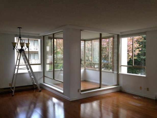
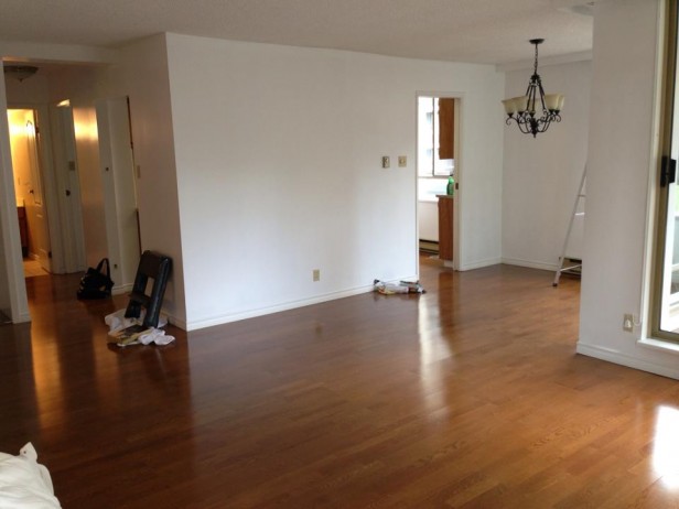
Before
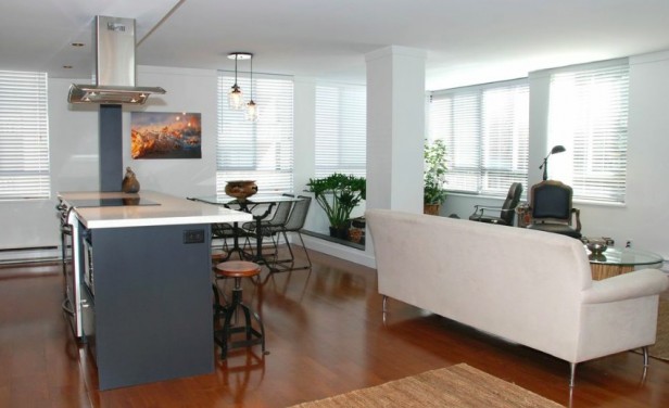
This was a sunroom which Jan immediately ripped out and turned into more square footage for Tanya’s apartment.
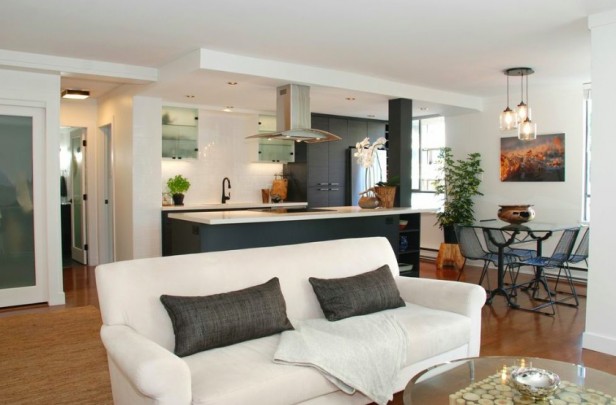
After
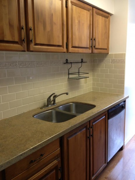
Before
This is a perfect example of combining yesterday and today. This stone countertop installed on top of 70’s cabinets. The backsplash tile, also very random and unrelated to both the cabinets and the concrete countertops.
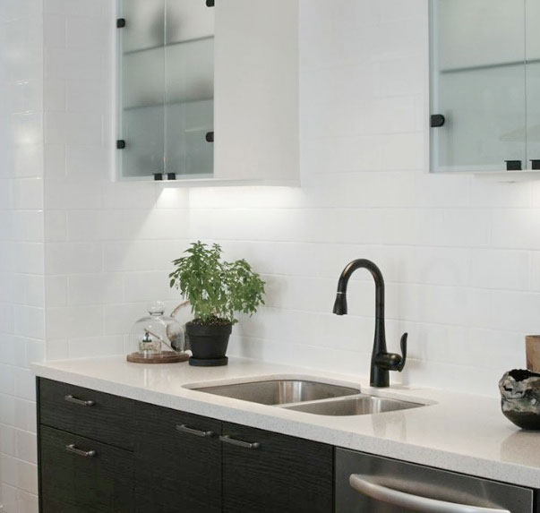
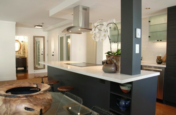
The kitchen countertops are Nougat Caesarstone. Jan installed a black faucet and had the hinges powder coated in black. Tanya wanted an Urban Industrial Chic look and feel so all the finishes were black, charcoal and white with no chrome in sight!
Before
Jan opened up the kitchen and designed charcoal cabinets using a laminate wood grain texture. The walls are painted OC-65 Chantilly Lace.
After
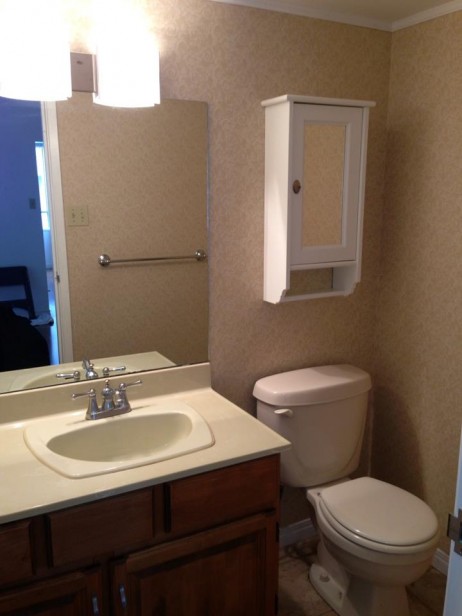
Here was the old bathroom.
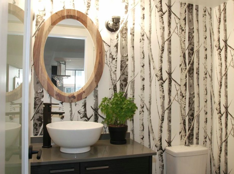
I love the birches wallpaper and the coordinating mirror from CB2. So pretty.
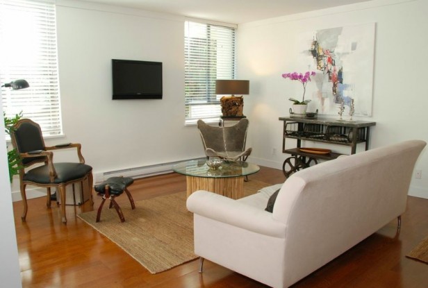
Jan was in a home decor shop on Salt Spring Island when she discovered the Butterfly chair in charcoal cowhide. The market cart is from the Antique Market. The coffee table base was found at Homesense and Jan had a custom piece of glass made for it.
The wooden bowl was Tanya’s from a trip to Fiji.
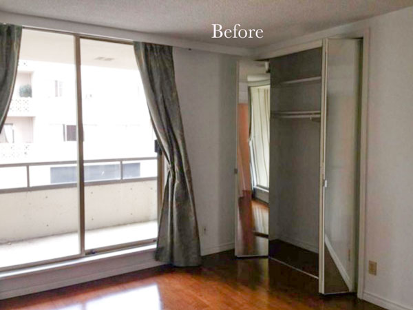
Before
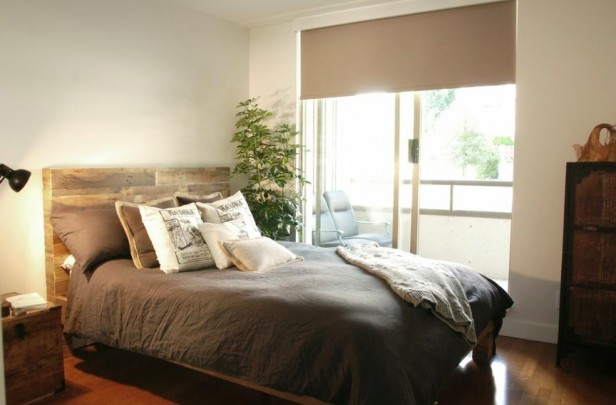
After
After
Tanya and Jan incorporated lots of texture and organic feeling elements into the apartment. Exactly how a monochromatic palette should look.
Thanks Jan & Tanya for sharing this renovation with my readers!
Susan Hargraves, Residential Stylist
It’s the first day of my True Colour Expert™ Training at the Van Duesen Gardens in Vancouver! We spend most of the day learning how to compare colour so that you can see which one is actually the right one and then by comparing, show a client that the colour you are selling them is correct.
If you would like to learn how to choose colour with confidence, become a True Colour Expert.
Related posts
Colour is Context
How to Mix Yesterday and Today in your Renovation
The Difference Between an Experienced Colourist and a Novice
If you would like your home to fill you with happiness every time you walk up to the front door, become a client. On-line or In-person.
Download my eBook, How to Choose Paint Colours – It’s All in the Undertones to get my complete step-by-step system on how to get colour to do what you want.
To make sure the undertones in your home are right, get some large samples!










Yowzers! Love the renovation! Clean but not cold. Beautiful.
Love the little bathroom with the birch wall paper and oval mirror. The monochromatic effect throughout is stellar!
Tanya is obviously one smart chick to have picked a mom who is such a talented designer! Lovely space.
What a beautiful renovation,Jan and Tanya worked great together,I love the countertop and backsplash, reminds me a lot of yours,pure genius with the black fixtures,her home will be totally unique! She will be so happy there!
Wowza! That is fantastic. I love the birch wallpaper…amazing how something so simple can make such an impact. The sun room was strange…a room in a room that looked like an aviary.
Remarkable updates and thrifty where needed! franki
Maria, I’m a loyal subscriber to your blog but in this ONE instance I would have to disagree with you on the accent tile issue. We renovated our NYC pre-war bathroom 6 years ago. In keeping with the tone of a pre-war, we replaced old, yellowed, crazed white subway tile with fresh new subway tile but added gorgeous frosted blue glass, white glass and black marble brick pattern mosaic tile as an inset border at both chair rail height and around the top of the subway tile. It fills us with delight every time we walk into the bathroom.
Love this. The one thing I would have loved to see is how she used that space that was the ‘sun room’! None of the pics actually showed that and I would have like to see it. Did it just get incorporated into the living room?
It is right there in the second photo, the first “after” picture. It is kinda bizarre, because the floor bar is still there–it seems like you have to step over the rise for that part of the room. Maybe they just haven’t gotten around to taking it out??
This extra room must be common in Vancouver apartments/condos. My cousin’s very expensive place in downtown has some sort of sunroom thing as well, even though the living space is very tiny.
I love how the bathroom cabinets coordinate with the kitchen, especially since you can see the bathroom from the kitchen. It’s modern and clean, but not cold at all. BEAUTIFUL!
Maria, generally I am not a fan of the industrial look, too cold for my taste. But this is spectacular. And the wallpaper in the bathroom is to die for. I am curious about the window covering over the slider in the bedroom. What is that? I find sliding glass doors the hardest thing to dress. Thanks
It was a sheerweave blind but installed the opposite way so it looked more finished.
Thank you Maria for a lovely post as usual. Thank you to Jan and Tanya for sharing their renovation process. Very beautiful, in fact, transformation is gorgeous. Very modern, clean and very chic! Now to enjoy.
I have not heard the term ‘residential stylist’ before. Does that mean that you don’t have a degree so can’t call yourself a ‘designer’. I really like that term and may use it in the future.
Great make-over, what talent…degree or not:)
Thank You Maria for the post on Tanya’s apartment, we had so much fun designing it together, listening to the clients need and wants has always been my focus in design so this was a unique opportunity to learn about my daughters design ideas
Thanks Maria for sharing a marvellous post, but even more for introducing us to Jan Romanuk who has now done two fabulous projects for us and is about to embark on a third – Jan is awesome!
I love the makeover. It is nice to see a well done reno in a modern style. Interesting that the floor color was maintained. Also, note the stainless dishwasher! It appears that the refrigerator is behind a panel- I’m surprised that they didn’t do the same with dw, but agree that stainless is next best.
Oh, I see that I’m wrong about the refrigerator- it’s stainless. Would be even better under a panel!
Super cool. It’s sleek but still very warm and inviting. I love that it is unique!
In response to the comment re the raised curb in former sunroom…yes, very common here in Vancouver area. This space is probably a enclosed balcony and as such, is actually owned by the building strata (much like the space in front of our homes owned by the city but we maintain and use). With permission, she could take out the doors etc but must be able to return it to original condition at their request. The curb may actually be part of the exterior building envelope and must stay.
Marie: Thanks for sharing this beautiful reno. I love it all, and I have primitive Country! Love the clean look of the contemporary style and find myself moving in that direction. i live in my own home now but soon will be in an Apartment in another part of the U.S. so seeing a reno in an apt. was encouraging to me! Beautifully done!
Ouch. I seem to be the only one who feels the space to be stark given the contrasts and quite cold, though I do like certain features. It’s clearly updated. There seems to be a little softness in the color on the bedroom walls, but the white in the kitchen/main area feels harsh. I’m still learning…I love everything about the bathroom except for the mirror everyone seems to love, lol. When I read that things need to relate, to me, the mirror seems out of place. Aside from the pattern, how does it relate to the rest of the bathroom? Is the pattern enough? I guess it goes with the headboard, but they’re not visually next to each other. With the kitchen, it’s seems all clean lines and very modern, but the living room seems all mismatches and again, doesn’t seem to relate except for the sofa and pillows. The small TV emphasizes the amount of empty wall space and lack of any softness about the windows. The floor seems incorporated in the main area but seems ignored in bathroom and bedroom compared to the key wooden pieces used. Was that intentional? I’m not intending to be critical, I’m just trying to understand why this style seems to work for everyone and why it’s not considered cold. What are the elements that define this as urban industrial chic?