This guest post is written by Tricia Firmaniuk, my talented virtual design assistant.
I’m always saying (and teaching) that the days of different colours in every room are over. Now, the current trend is one main neutral throughout with colour in rooms like the powder room, dining room and bedrooms, for example.
But until Tricia wrote this post talking about individual rooms vs the open concept homes which is how so many homes are built now, I hadn’t given that much thought to why this is such a big trend.
I love this thoughtful and bold post she wrote on decorating with colour, which as I briefly mentioned at the end of this post, is way more timeless than the current, trendy neutral.
My mission in life is to inspire you to create a classic and timeless home that you love as well as give you the confidence to use more colour.

When Terreeia was in Scottsdale a few weeks ago, she stayed at The Saguaro Hotel (above) because we are considering this town as a Fall location for one of my colour workshops.
When she was touring it, the sales manager mentioned that their chain of colourful hotels are the third most photographed hotels on Instagram.
Why?
Because human beings love colour, that’s why!
When you walk into one endless grey hotel after another, does it inspire you to prop your family up against the charcoal wall and take a picture?
Not unless there’s something really unusual about the decor that is worth posting on your social media pages right?!
So read on, and I hope you’re inspired to choose colour for your next home decor purchase!
___________________________________________
I can mark my heart’s switch of allegiance from big open modern spaces to cozy traditional houses to a specific day.
In my former career as a gallerina (and before Pinterest), I went into a lot of homes to help people select artwork. The majority of our clients, had newer homes with large modern open concept layouts.
At the time, I rented a big open studio with a wall of windows and high ceilings where I lived and painted, and I loved having the luxury of space. But after living there for awhile, I found that on a young artist’s budget, it was hard to create a colourful and cozy feel. The space was nice, but if sometimes felt like a big empty box.
One afternoon, I had a consultation for the gallery with an eccentric elderly lady in an older craftsman home that made a big impression.
Her house had a different wall colour in each room without looking like a circus. It was imaginative and bold but tasteful. It felt old world yet fresh in an intriguing way. The rooms were a comfortable scale for living and decorating.
The foyer and stairway were painted a sunny yellow with a gallery wall going all the way up. It led into a cozy sitting room with deep teal walls. Through one doorway off that room, the kitchen was wallpapered in a fun retro tomato red and white print and through another passage with a set of french doors, there was a glowing sunroom painted a fresh leafy green.
It was a modest home, but after all the big white, grey and beige boxes I had been in, this house was like a revelation.
The large painting I brought in for her to view over her sofa was whimsical and full of colour and tied things together beautifully (it was by the same artist as the one below). I went back to the gallery babbling about how I had just been in the very best house in town.
Bird Sanctuary 2 by Robert Wiseman, Peter Robertson Gallery
Before that day, my dream home was open and modern, but since that experience, my ideal has taken a complete about face. I still like open and modern homes, but if I had my choice, I would go with an older home with all the walls intact.
Older houses lend themselves better to colourful walls and you can create very different moods in each room. For someone like me who loves to play with decorating and colour, a historical house would be heaven.
I think that one of the practical reasons there seems to be so much fear of colour out there is that contemporary open concept floor plans make it almost impossible to transition paint colours well in the common areas. And I think this is a big reason why colourful walls have fallen somewhat out of favor. The vast majority of newer homes look much better with one easy going neutral wall colour flowing throughout the main areas.
It’s also a much bigger commitment and expense to paint a couple thousand square feet rather than just one room.
Add to that, then we buy most of our furnishings in safe neutrals, and you end up with an epidemic of really blah, colour-phobic homes.
So if you love colour, what’s the fix?
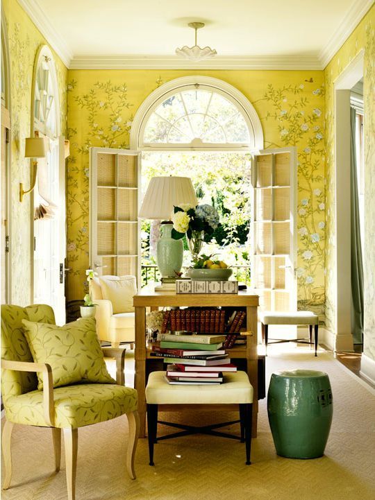
I’m always pining after boldly coloured rooms, and the best ones all have traditional architecture. But my house doesn’t look like this.
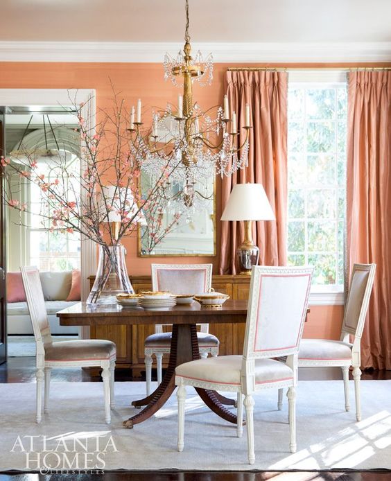
Suzanne Kasler via Atlanta Homes
Traditional floor plans with ample mouldings and clear separation between rooms meant you could transition between fairly bold wall colours easily.
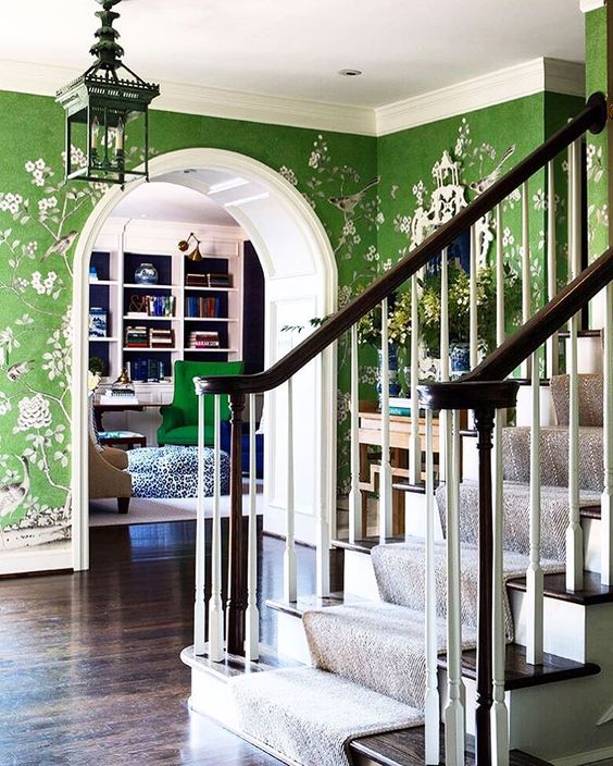
A beautiful green papered foyer could lead to a bright white room with a green accents like this below.
But just try adding a bold wallpaper like this to a newer home, if you’re lucky, maybe your dining room and hopefully your powder room or bedroom have enough separation to transition to wallpaper well. I’ve seen a lot of single walls papered to add some interest, some are more successful than others, but it’s really hard to pull off well.
Accent walls in general seem to be an attempt to mitigate the colourless situation many of us find ourselves in, but they usually feel a bit unfinished and jarring to me, less than ideal.
If you crave some colour, and you don’t have a traditional home with nice separation between rooms, you have to be bolder about decorating with it.
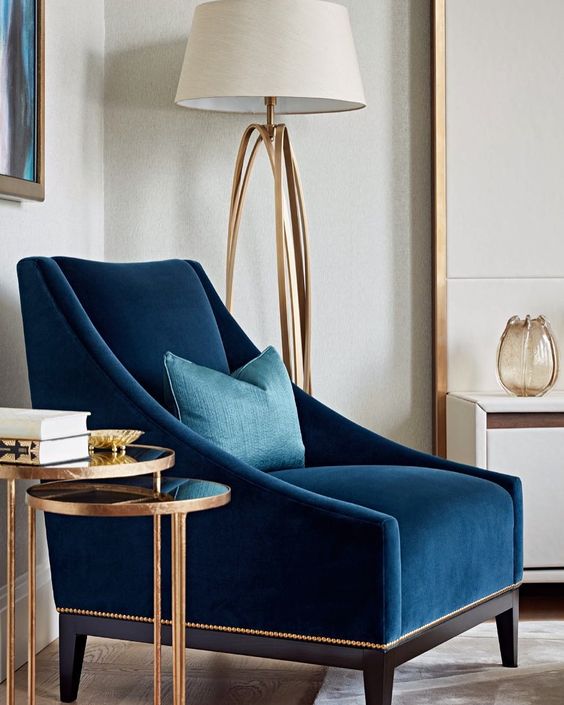
- Get Your Sofa in a Colour
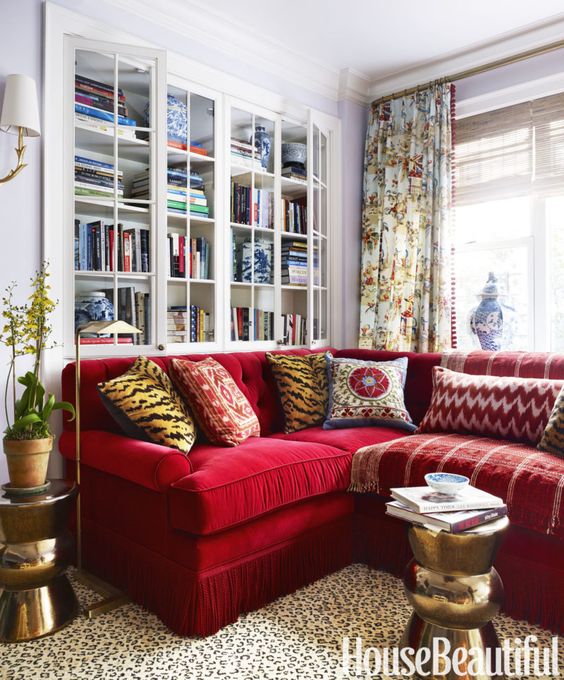
This is why a colourful sofa is such a great choice. If you have a large room with two story ceilings, you’re going to need some big hits of colour to keep it from looking bitty and getting lost. If you want colour but you purchase your largest upholstered piece in a safe neutral, you’ve just missed a major opportunity for colour.
You’ll never get tired of a sofa in your favorite colour.
2. Get a Bold Area Rug in a Colour You Love
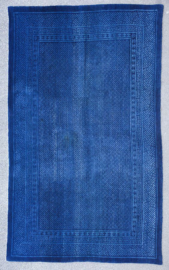
If you do have a neutral sofa, a colourful area rug is a great choice too. Something like this antique Chinese blue one (below) would begin to transform an otherwise neutral room.
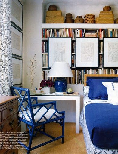
Then you could repeat the colour of the rug or sofa with lamps, artwork and accessories. It’s well done in this room below with a large hit of blue in the quilt, repeated in medium pieces like the lamp and chair, and smaller touches like the pattern in the bedding and drapes.
Even though the walls are neutral, this room gives the impression of bold colour.
It’s useful to consider every item you purchase for your home as an opportunity for colour. This is not to say that nothing should be neutral, but really consider if it would be better in a colour to create some interest in your room. If painting the walls a colour isn’t a practical option, you’ll need to bring it in with your furniture and decor.
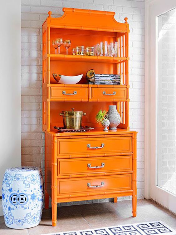
3. Paint a Piece of Furniture
Wood furniture pieces like armoires, consoles, dressers, end tables and display cabinets, chairs and even built ins are good opportunities for colour with a lick of paint.
4. Don’t Get Chairs that Aren’t Accents
Accent chairs exist for a good reason. A pair of brightly coloured chairs can make all the difference to an otherwise neutral arrangement. If you need colour, getting accent chairs in a drab, safe colour is just a waste.
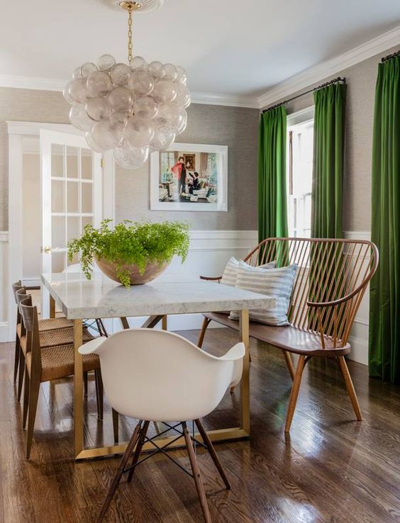
5. Dress Your Windows in Colour
I would never tire of these green drapes (below). This is a great way to go bold with colour in an otherwise neutral room. If you have a nice neutral setting, everything you add in for furnishing and decor has potential to bring in some happy colour.
6. Don’t Forget the Art
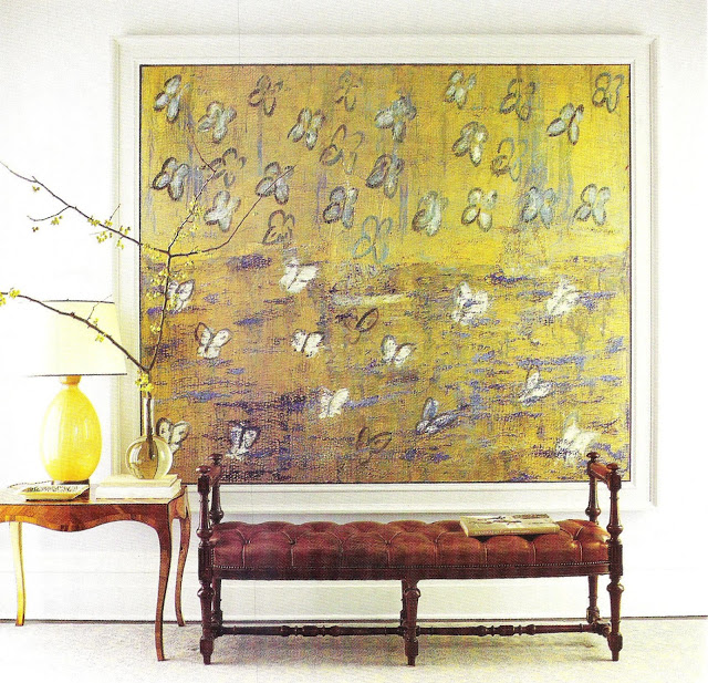
Too often art is just an afterthought. But you can use artwork as a large focal point or as a way to repeat your accent colour. A neutral space is a great place to display a colourful art collection. Here’s a post I wrote about finding affordable art if the real thing isn’t in your budget yet.
Painting by Hunt Slonem Interior by Steven Gambrel
So if you’re not sure where to begin, commit early on in the decorating process to a colour you’re consistently drawn to and take the plunge and purchase a couple of key items in that colour. Don’t shy away from the big items, you need some large doses. Then you can add in one or two coordinating accents and repeat them as well.
If you know you want to add colour to your home, but you’re not sure where to begin, you can get help with our Get Me Started eDesign consultation here.
_______________________________________
Thanks Tricia! Here was my class in LA this past week:
Los Angeles Specify Colour with Confidence Workshop
I had another amazing class here, last one of the five this season.
At dinner on Thursday night, one of my participants, a student in design school confided that she had spent the last three weeks working on a huge project, staying up late many nights and after two days in my class, she now needs to go home and change the whole thing!
Once you see undertones in the context of one of my live events, you can never unsee them ever again.
This is Nancy Sporsheim an interior designer all the way from Norway! She told us that the grey trend is completely over there and colour has arrived in a really big way!
I am honoured and amazed at how many people come from everywhere to attend my workshops!
Cheryl, Kelly and Jan
My design assistant Kelly Parkinson came with me this time as Terreeia was in Toronto. She did a great job at the back of the room with the help of our two volunteers. Past True Colour Experts, Cheryl Deagan and Jan Turcotte who kept everything running smoothly! Thanks so much again to both of you!
We will post Spring dates shortly.
Have a great week my lovelies!
Related posts:
Which Colour Sofa Should You Buy?
Ask Maria: What’s Next After the Grey Trend?
Ask Maria: How Do You Keep up with Current Trends?
SaveSave




Tricia,
Great post on adding color.
Oooooo, ooooooooo,oooooooo! I love color! I’m ready to go bold! Really good post. Loved the colorful hotel shot. (Interesting, the correlation between open concept and use of neutrals.)
Many condolences to Terreeia! Maria, I love this post. I consistently love Jonathan Adler’s designs (and yours) for this very reason. And when I think of my childhood, I always remember we had these fabulous orange velvet side chairs in the living room. Bold color just seems like such a commitment. Do you have any advice on how to overcome my phobia of commitment? Haha
Dee, one word: Trust. Trust the process. Trust yourself. Then just jump in and do it. Commit to one big bold piece you like – whether a sofa or drapes or wall paint or artwork for a wall. – just take a leap of faith (trust) and do it. After that first time, you’ll know you did the right thing and it will become a little easier next time. It will be worth it. As someone else already said, just do it!
Tricia, good post.
Terreeia (and Maria), my condolences. So sorry to hear about your sister.
Then add 2 other accent/decorative pieces to repeat the colour, making it deliberate and tying it in.
Thanks for the guest post! This is so timely. Long time ago in an apartment we did many of these suggestions and it was one of my best decorated spaces. After selling our last home (with your help in choosing neutrals for our first floor walls and fireplace) we moved into a 70’s somewhat contemporary place. We finally got the gray walls I wanted BUT I found that it is dark 🙁 Some walls are without windows and part of the space is due north. I am not interested in painting beige and the whites would not work in such a dark space. I adore red but it would be a bit much on open concept walls so I am adding it other ways. We added a red/black runner , sofa slipcover, dining seating. I want a red based lamp. Curtains cannot draw attention as the sofa under it cannot be centered nor pulled off the wall. Recently I have been drawn to colorful abstract or multi colored print rugs, art, pillows. Also mirrors and can you have a red lamp shade?. Mixing together is daunting. Maybe there is an older post that addresses mixing prints. I am having fun no matter what happens!
Great Post!
First, sincere condolences to T on the loss of her sister, losing a sibling is so painful.
Second, this is a great post. Just bought faux silk emerald green drapes for my living room. The color is stunning (and I’m not really a “green” person!). And, the price was fabulous since I got them on sale from Country Curtains as they are going out of business. Totally a happy camper! Now, what can I paint… !?!
Loved this post Tricia!
I thoroughly enjoyed and appreciated this post – informative and upbeat. Thank you!
I am choosing my sofa and fabric now. I wanted to go blue, but was afraid of committing to a color. I love the Bali blue velvet at Giannetti Home, and now I’m sure it would be timeless. I just visited their gorgeous new Santa Barbara store and got a swatch—wow, and perfect timing with this topic.
I completely get the open concept accent wall problem, which is why we painted the whole house in Maria’s specified colors. Neutrals are a great backdrop for artwork and I can’t wait to start framing our nature photography to hang with a beautiful blue sofa. Thank you.
I have always wondered why folks that have commitment issues with a colored piece of furniture can commit to some boring beige piece.
Great post! I live in a 1910s Craftsman type house; it is small and humble but so charming. I appreciate the defined spaces our house has, and I’m glad this is at least one problem I don’t have. Four doorways, two low windows and one radiator in the kitchen, though? Now that has some challenges. But I have three subtle colors in my downstairs and thick trimmed doorways to make the transition in color easy.
I have always erred on the side of clean bright colors. My personal motto is life too short for beige and brown. Every color you can imagine is found in our natural surroundings, in our backyard, along a country road, in the sea and sky, cute little birds, bouquets of flowers and glorious sunsets. Beige and gray, the colors of smoke, fog, mildew, dust and rot, a gloomy day, concrete sidewalks, and high rising impersonal buildings. I guess I associate colors with moods and feelings, and without hesitation I know which feeling I would rather surround myself with. The only reason I need neutrals is to give some relief to the colors, like the bark on a tree, the soil under my blooming flowers, billowy white clouds. Not saying everything needs to be a rainbow of colors, just that, there is no reason to be afraid of it. It’s already all around you. Embrace it.
Wonderful post, and so nice to read about the advantages of separate rooms! Open concept has never appealed to me, but in our small older house we needed to improve flow. Now we have two entrances to the kitchen, one from the hall and another 6 foot opening from the dining room, both with pocket doors. The living room is in the back of the house, entered through a 6 foot opening at the end of a long central hallway, with no doors. Near the front there is a 6 foot opening from the hallway into the dining room. We can entertain 25 or 30 people easily in the house alone, with great flow, and many more in warm weather when we have access to the back garden. There are lots of different places where people can settle in groups and talk to each other. It’s really the best of both worlds, distinctly separate rooms but an unconstricted feeling.
My condolences to Terreia on her loss.
The very best posts are the ones that make you think….and think. This post made me think! The lightbulb went on for me about lack of color on walls in an open concept house. I wanted to paint one room green but with the open floor plan and the rounded corners, there wasn’t a good way to transition the color.
I also love color but I decorate my house in about 85% neutrals. When I try to add more colors most of the time it seems inauthentic. After reading your post, I went and looked and my Pinterest boards. The “pins” that speak to me are usually some combination of black, white or cream, with wood and lots of green plants and colorful flowers. I love textures, plants, shine, contrast, natural and simple. The irony is while I truly love Maria’s blog but I am learning I’m a neutral girl! I wouldn’t describe my house as boring (it does sound that way ; ). If I do add color, it needs to feel authentic to my tastes and style—and that’s the tricky part for a “neutral” gal! Thank you always for the inspiration.
Terreeia, I am truly sorry for the loss of your sister. Be patient and kind with yourself in the grieving process.
I always love bold colors. I always wear strong colors. Nothing makes me happy going bold! Thanks for the inspiration 🙂
When I started reading this, I thought for a second that you were going to say that bold color isn’t possible in an open plan.
Thank goodness you didn’t go down that road. There are so many missed opportunities to bring color into open plans. Thank you for listing them!
Good post. It makes perfect sense to have the same or very similar colors or neutrals in an open floor plan. My house is like that on the first floor but upstairs, all of the rooms are separate. I have never felt that the gold guest room, green office and coral guest bath have clashed because all are the same muted values and in adjacent, but separate spaces.
My two rich red velvet sofas are over ten years old, and I still LOVE them! I am about to change the accents from green and turquoise to naturals, gold, and different textured whites, but I am not tired of the red!
Loved the photos. But when I try to PIN them, it won’t work.
Hmmm, what about Resale Value?? I’m sorry, but even with a traditional home with separate rooms, if you go crazy with color, now you need to find a buyer that is not overwhelmed or likes your choices. Or is willing to repaint the whole house! Just saw this at an open house of a nice home in a good neighborhood…sitting unsold. I think it was the mix of colors and flooring changing in every room. Of course, it was out of date, too…not a Maria home. But just something to think about.
I should have on expanded that…I think the best idea is to use a common neutral on the walls and hard finishes and do bold color with the furnishings and soft materials that will leave with you when you sell.