Major paint and colour brands have begun announcing their anticipated colour trends for 2025. As a colour expert, I find the annual Color of the Year (COTY) announcements fascinating, as they offer insight into upcoming design directions. And, it’s always a fun game to see if you agree with their predictions.
So let’s take a look, I’ve rounded up all the major brand paint colours here in one spot to give you an overview!
I’ve seen a few trends come and go, so here’s my take on the 2025 colours of the year.
But first, you might be wondering, just how useful is knowing the colour of the year?
Are colour of the year predictions worth following?
Obviously, paint companies are selling colour. And it’s the marketing team’s job to get us all excited about paint colours––so we buy more paint.
Here’s what you should know about COTY announcements. They are usually influenced by consumer decisions and product development across multiple industries, from fashion to interior design. And they can serve as indicators of upcoming design directions. BUT. . .
Here’s the thing, running out to try a new paint colour JUST BECAUSE it was named COTY makes no sense for two reasons:
- It’s a completely backwards to design a room by starting with a specific paint colour and decorating around it, even if you love the colour.
- The way to choose the perfect colour is to pull it directly from your decor. And the chances that any COTY is THAT specific colour you need from a piece of art, a pillow, or an area rug you’ve already decorated with are extremely low.
Have you ever painted your room a trending paint colour only to be disappointed? Let me know in the comments 💛
Stay tuned, and I’ll show you what to do instead, if you’re falling in love with one of these colours.
2025 Paint Colours of the Year
A few years back, I got to meet the lovely colour marketing crew for a major paint brand. And that’s when it really landed for me that they don’t know the right way to choose colour.
Paint companies often create elaborate marketing narratives around colours, rather than focusing on HOW to make the right colour choice. They artfully ignore it in favor of more marketable storytelling that aligns with their sales strategies.
And that’s why they are always making up fluffy stories to sell colour.
After all, a paint company doesn’t mind at all if you need to repaint your room a half a dozen times to get it right, do they?
And they certainly don’t want to send you back home again if they were to start asking questions like, “What colour is your sofa?” or “What colour is your duvet cover in your bedroom?” or “What colour is the stone on your house?”
But you, my friends, know better!
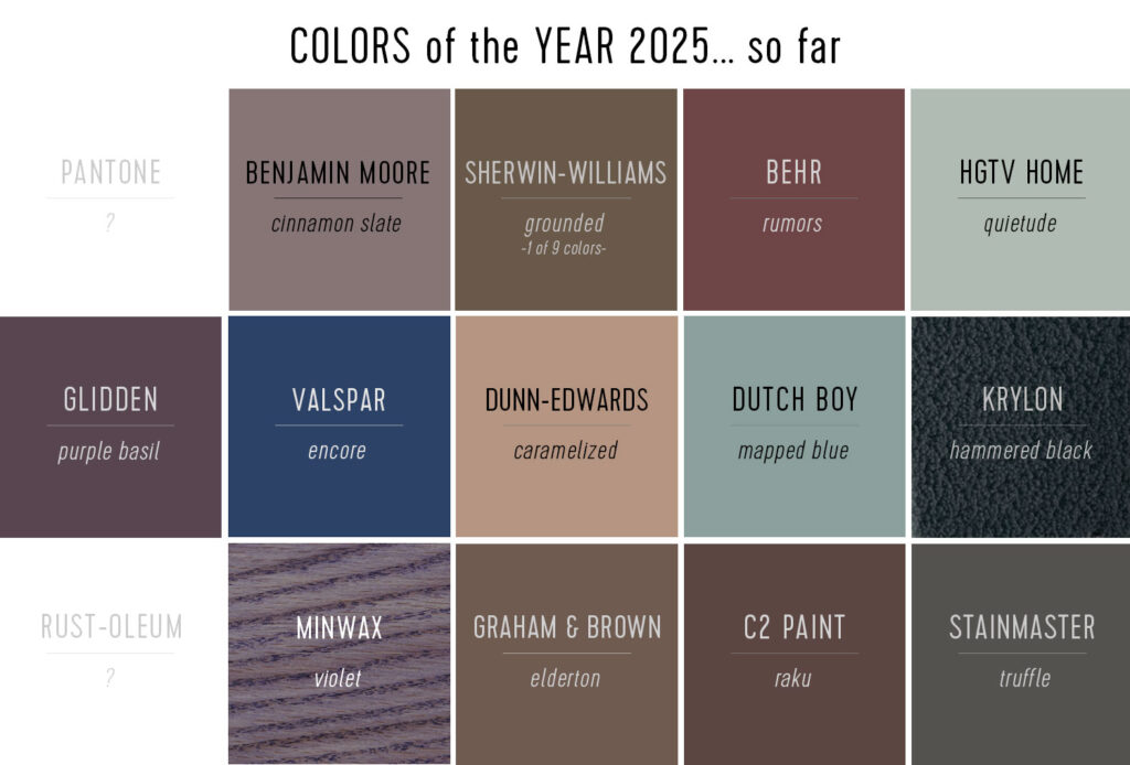
Here’s a roundup of the COTYs for 2025:
This illustration is from Young House Love. The HGTV colour on the top right, Quietude, is the Sherwin-Williams colour of the year.
And hmmmm…. can you see a colour TREND here?
Do you notice all the muted brown-leaning-plum purples and blueish blue greens?
The New Tuscan colour trend for 2025 and beyond
My crystal ball says that over the next few years we’ll land on a combination of brown and warm blues again as the colours everyone will be decorating with. Notice that fashion this fall is all about burgundy and brown, with lots of denim and blue.
And it feels familiar because we have been here before, haven’t we?
During the last major brown trend of the early 2000s, muted blue-green tones emerged as the dominant accent colour, particularly complementing the widespread use of brown furniture in home decor.
‘This color combination was particularly effective because of the natural color harmony between red-tinted browns and blue-greens, which function as complementary colors on the color wheel.
In the last brown trend, in the early 2000s, muted blues that leaned a bit green were the IT COLOUR accent for all the brown furniture people filled their homes with. Makes sense because of the natural colour harmony between complementary colours on the colour wheel––red-based browns and green-based blues.
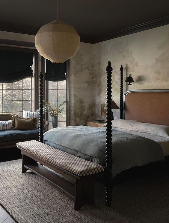
The emerging trend I’m seeing that incorporates rustic elements like wood and stone, more embellished details and warm colour palettes is what I’m calling the New Tuscan. It covers the new English Countryside look for kitchens and earthier palettes with muted greens, warm neutrals, browns and (yes) burgundy and plum.
And while muted blue greens perfectly balance deep brown, they are also lovely as the main show.
How to use the colour of the year in your home
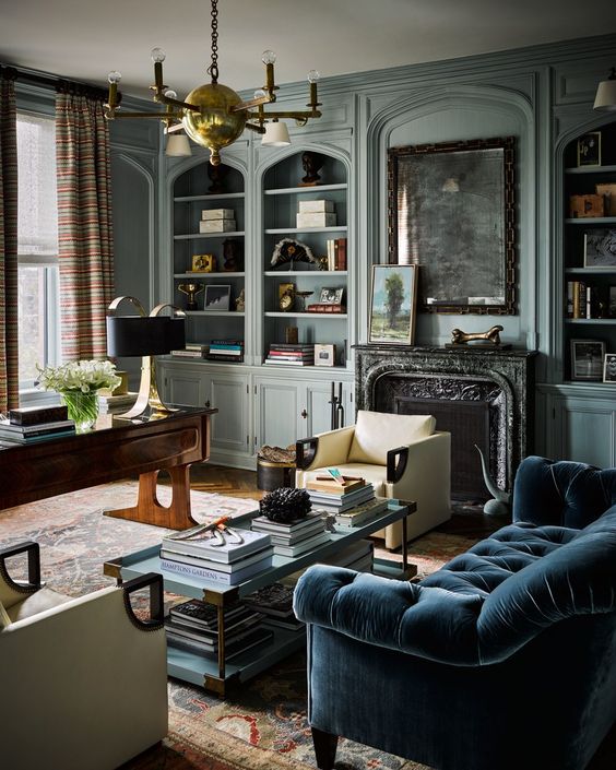
I recommend using the Colours of the Year as inspiration, if they appeal to you. In this sophisticated study above, I promise you that the combination of patterned fabric for the drapes and the pretty area rug were chosen first AND THEN the paint colour was chosen to coordinate.
They did not look at a paint chart and pick a specific blue green paint colour, or the colour of the year, to paint all that gorgeous millwork AND THEN start decorating.
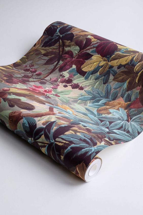
For instance, let’s say you wanted to try one of the plum-leaning colours of the year. You could look for a pattern for your room that has the same muted plums, blues and browns and use it as a jumping off point to decorate with this year’s colours.
I can imagine a pretty powder room in a wallpaper like this one below. Then, using your fan deck to match the colours, you could pull the perfect matching blue or plum for the woodwork. That’s how it’s done my lovelies –– and it’s part of the colour balancing method that I teach to homeowners and aspiring designers or design professionals.
Become a better decorator
Master the art of professional mood board creation with my comprehensive self-study course, How to Create Mood Boards. Access this valuable resource completely free when you become a Decorator member in the True Colour Insider Community. Join fellow colour enthusiasts and design professionals in our exclusive network, where you’ll gain insider knowledge and expert guidance to elevate your colour confidence.
So, what do you think of this year’s spotlighted colour releases? Are they colours you would decorate with? Maybe you have similar colours already in your house? Comment below!
Related Posts:
A Blue Kitchen Refresh Before & After





I wasn’t a fan of the dark shades and browns (except in wood) the last time, and I’m not a fan now. I’ll be happy to keep helping myself to green-blues, though! It’s always interesting to see how colour trends move through home decorating, fashion, and even car colours…and the warm-toned and deeper-toned trends are definitely back.
Wow. I’m old enough to remember the darker colors- the burgundy, brown, navy, etc. With white and cream and light beige now, those dark colors seem depressing. Many years ago, I also used to have wallpaper and prints which I do not like at all now as I get tired of them. With lighter solid colors, I can easily change the look of rooms with some added seasonal decor. Right now I’m removing the fall decor and getting out the holiday stuff. Such fun to be able to change the look of rooms so easily.
I really do think these heathery purple and brown colors look appealing when talented designers use them. But like Beth, I believe lighter solid colors are a lot easier to live in year after year and still feel classic! When I see these “moody” (LOL) rooms people are doing, I like them in pictures yet wonder how I’d see to do anything if it were my home. Even with six lamps on! Sure, a cozy snug room to read books in is great in the winter, and I guess I could even have a bedroom that was all murky dim and soothing, but it’s really not my first pick.
Funny story, though – the home we bought two years ago has this color on the walls! The spacious living/dining area is planked in deep mahogany-brown stained wood (not the orange cabin look). It’s a bit dark for me – hubby loves it of course – but the many windows and the cream-painted upper half of the vaulted room make it livable. It IS cozy in fall and winter. I painted the wall planks cream in the dim kitchen and it was vastly improved.
Inspiring story!
Yikes – def not a fan 🫣 That wallpaper feels very early 90s and even with the look(s) being ‘updated’, it feels dated-looking to me. While I still love my 2009 mocha brown sofa & ottoman, I find my light walls & accessories (with – yes, green/blue accents) keeps me happiest 🤓
I can’t wear earth tones / muted colours or burgundy so I guess it makes sense that they don’t appeal to me fm a decor perspective. I’m curious if these trends change or get ignored based on region, ie are we going to see these colours of the year in sunny beach homes …
I’m more of a fresh color person. I do follow a lady who decorates with muted colors. I think her taste is wonderful, even if it’s not for me. That forest and berry wallpaper is great though! There’s something fresher about it.
I’m so happy to see the return of colour to our homes I could dance!
I love watching English house hunting programmes such as Location, Location, Location and Escape to the Country. When I first started watching them a couple of decades ago one of the things I most loved was the diversity of styles and colours in the homes. But over the past decade it has felt as though every house was a carbon copy of the house before it – boring neutrals and little personality.
WELCOME BACK, COLOUR! I’VE MISSED YOU!
I am having a little laugh as these purple heather browns are the colors I chose for my 1930s house 10 years ago because I love them. I just painted my new modern unit white lilac which only solidified for me that I’m not a fan of living with light walls, but I’m selling and everyone here wants light and bright. Next home will definitely NOT be open plan. I love colour too much.
I love everything about this post!
I think it’s very dependent on each projects aesthetic goals.
But Thank You Maria…I’m sourcing much in the photos while trying to stay true to the timeless bones of your teaching!
In love with that wallpaper sample you posted, but not in love w/the colors of the year. Kind of Debbie Downers to me.
If I had that gorgeous wallpaper, I’d most likely only paper an accent wall and then choose a timeless light shade for the rest of the room.
Then when Ig et bored, all I have to do is change out the accent wall.
Most likely I would look for a removable peel and sick version of it, or use the liquid starch method for affixing to the wall to create that wallpaper into my own removable wallpaper.
Thankfully, I’ve always preferred to set trends rather than follow them. (i.e. teal and its variations have been my go-to color for almost 20 years)
–wait — that’s not possible – b/c I’m only 28 ! hahaha!
I do always wait for and love the colors of the year post.
Always interesting!
Thanks, as always, Maria!
I agree! Except, accent walls are definitly something that will date your home, have to agree with Maria on that…
You mentioned not choosing paint first but choosing the rug and other accessories first and pulling the paint color from them. I’ll never forget a post some years ago where you explained why and it’s always stuck with me. You said that it’s much harder to find a rug to go with the paint color than a paint color to go with the rug, as there are more paint colors to choose from. It sounds so obvious, but I had never thought of it that way before.
As for the 2025 colors, nope for me. My color scheme is happy, not moody!
So white or cream for a house putting up for sale? I’m leaning cream but don’t want to be beige.
I have always loved chocolate brown, plums, and muted colors.
I was happy to see the “style” part of the Tuscan trend go away (scrolls and acanthus leaves everywhere, ornate columns, etc) but not the earthy colors.
Fall is my season and I’ve always preferred warm off-whites and rich creams to stark whites.
I really did not like the gray trend. With the exception of pretty gray-inspired rooms I saw in magazines, every home I saw in real life looked depressing to me.
We spent a lot of time house hunting this past year and I was surprised to see how many new homes are still being built with gray LVP flooring, gray walls, black fixtures, etc….think prisons…lol
We ended up buying a ten-year old house with off-white kitchen cabinets and brown glass subway tiles. To me, it has character and it doesn’t look like everyone else’s house.
I think the pictures of the rooms above in this post look cozy and classy. 🙂
The Architectural Digest picture with the cream chair directly in front of the fireplace…move that chair!!! Would never take the advise of a decorator who blocks a lovely statement victorian fireplaces with a squat modern chair of the wrong proportions and destroys one of the true focus points of the room.
This is such a great article Maria. I’m going to share the link with my readers.
Thank you
Heddy