{via pinterest}
In the very beginning of my design career I was fortunate enough to have some great mentors. One was a very talented designer who probably couldn’t tell you about undertones but she had amazing spidey senses when it came to choosing colour.
As designers working in a paint store, our job was to book in-home appointments with customers who came into the store looking for help with colour. After the consultation, we would clip colour chips and glue them on a white board to create a colour chart for each of our clients.
Many people who move into a new house might renovate the kitchen first (as I did), then you’re left with dated bathrooms. My design mentor’s philosophy on choosing colours for dated bathrooms was to specify white or cream. The end.
This way her colour chart wouldn’t look like she was ignoring the flow of the house with what would look like a random colour that in no way related to anything else in the rest of the house.
Contrarily, my philosophy on choosing colours for dated bathrooms has always been to choose the colour that relates the best to the existing finishes to get that bathroom looking as fabulous as possible! If you have to ignore colour flow (in terms of the rest of the house that might be more updated) to achieve a better looking, dated bathroom, so be it.
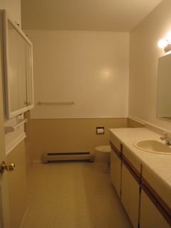
I have saved many renovation budgets just by choosing colours that made an ugly, dated, bathroom look so much better. Just take a look at one of my bathrooms on the day we took possession:
And now after a new colour and some styling:
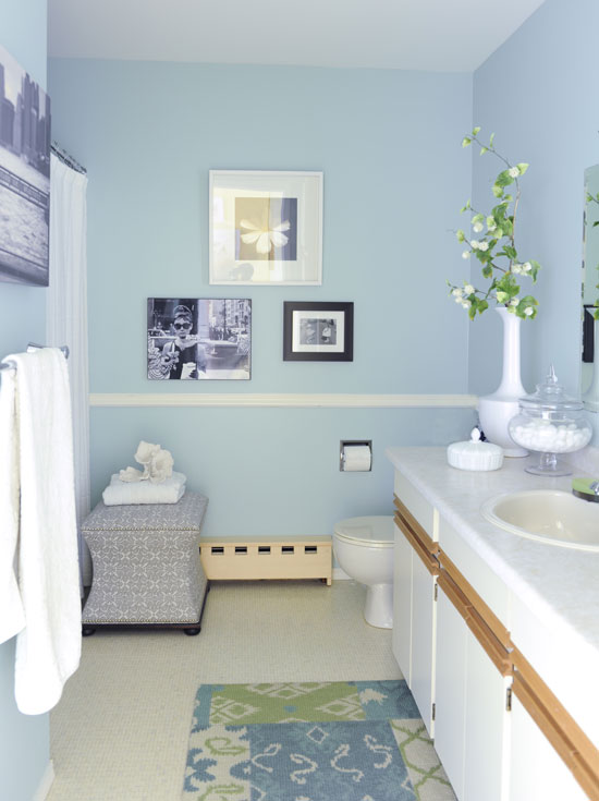
Colour & Styling by Maria Killam {P&L 25-27 Chanteuse}
Choosing white or cream is one way to do it but sometimes white or cream in a dated bathroom is the worst possible choice. Painting the walls cream in my bathroom (above) would not have been much of an improvement.
Is there more painting I could do here? Yes. However, since this bathroom is up for the next renovation, the rest of it doesn’t bother me right now.
So here’s when white or cream is the ONLY solution to a situation where you might be looking to update or achieve a fresher look and feel.
{via Centsational Girl}
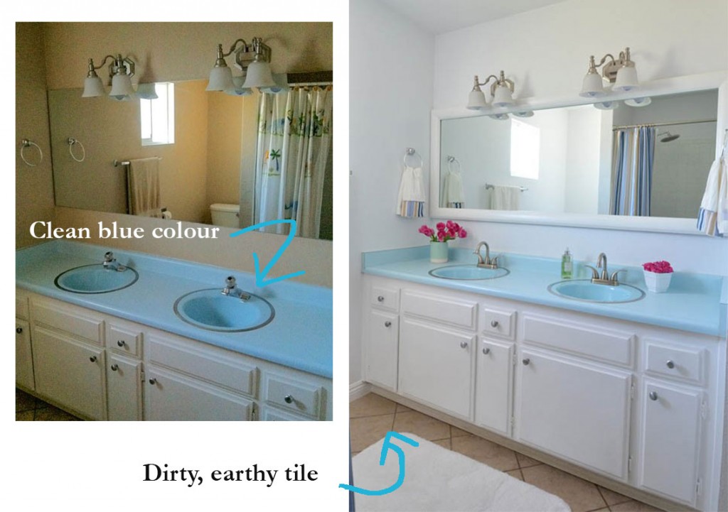
Kate from Centsational Girl posted this bathroom update this week with vintage blue countertops. Here you can see that the earthy tile was clearly installed (by a previous owner) without any consideration to whether the new tile would relate to the existing blue countertop.
The walls were painted a yellow or pink beige neutral (hard to tell which) and it left the bathroom looking like “New floor, old countertop”.
Until Kate’s specified white walls and a new shower curtain to transform the bathroom into a look that felt fresh and current.
Add a white bathroom matt to cover up the earthy tile and now we can just ignore it until the budget works to replace it.
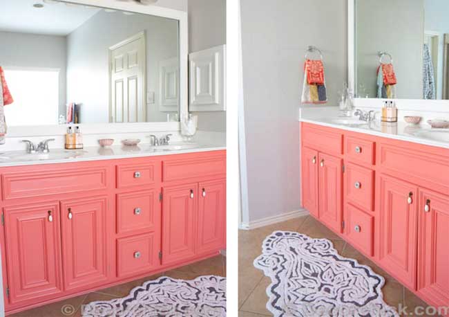
Same thing here with the coral vanity. But you must have the fabulous bath mats to cover up the pink beige tile here from Anthroplogie!
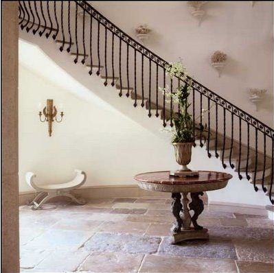
Here’s a very pretty entry filled with pink beige stone. With the cream walls, it looks like sand. If you had to choose a colour, you’d have to go with pink beige. My choice? Leave it cream.
This is NOT a solution for the average house on the block though. How many of us have an entry like this?
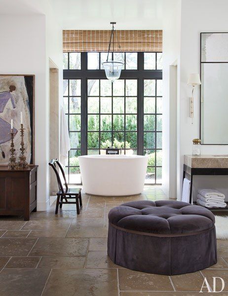
This bathroom has the same issue. Dark pinky/brown travertine tile and countertops but its here in Architecture Digest because of the windows and styling. The walls should be more cream so they don’t look as stark with the earthy floors, but it still made the magazine so my point is made.
Have any of you used this trick to ignore something dated that didn’t work? Fill me in below!
There are still spaces left in my Specify Colour with Confidence training here.
Here is a video testimonial from Leigh Ann Raines, from Chic by Design a talented (and so sweet) LA stager and interior designer:
[youtube_sc url=”https://youtu.be/sPnh1RcxKTI” rel=”0″]
Here’s the direct link to the video.
You’ll also receive my new bonus training on the step-by-step process I go through with clients during an on-line colour consultation.
Then you can stop making excuses about how every monitor is different and just start making more money consulting on-line. After conducting literally hundreds of consultations this way for the past few years, I have it down to a system that really works!
And best of all, the training and support doesn’t end with the 3-day course! You’ll be eligible to join my True Colour Experts™ Private Facebook page where daily, graduates post their design and colour dilemmas for feedback and advice!
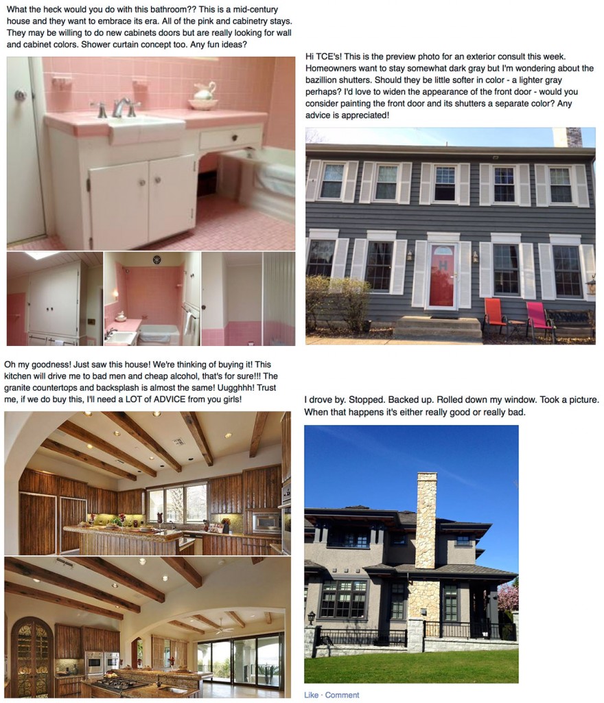
Here’s a sample of the kinds of posts that go up everyday:
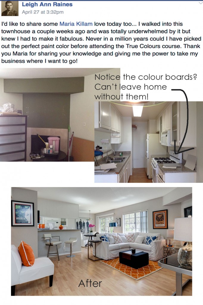
And Leigh Ann Raines whose video you just watched posted this great project the other day:
If you would like your home to fill you with happiness every time you walk in, contact us! We would love to help you choose colours, select the right combination of hard finishes or create a plan to pull your room together. You can find our fabulous e-design consultation packages here.


Maria, Love Love your bathroom!! Btw, what undertone is Leigh Ann’s wall color? Subtle Blue gray like Stonington Gray or green like Revere Pewter…can’t diagnose from photo??i am leaning towards blue gray.
As far as updating spaces like bathrooms, I totally TOTALLY AGREE THAT COLOR not white is usually the answer. My first floor bathroom has a lot of 80s square off white tile w/slightly warm pink UT in bath/shower and wainscot (I used to think they were white until I joined your blog and read White is Complicated! Lol) The counter top is a pink white faux marble solid surface which is why I first papered in a pink&white stripe. I have painted it several COLORS over last 26 years. Once I tried several whites w Aqua ceiling….I COULDNT FIND A WHITE THAT WORKED! No wonder since they were all too white or yellow whites as I recall. Maybe, BM Atrium White or Sand Dollar would’ve worked….PS: the walls are now beautiful PALADIAN BLUE with SW Dewey ceiling. I painted faux ceiling mouldings in White Dove& SW Waterscape. I love it…don’t notice pink counter at all now and tile just appears white. Previous BM White Sand walls had pink UT but not enough to go with counter and tiles looked dirtier somehow….AGREE, : medium saturated color can disguise unwelcome undertones of fixed finishes the best. And your idea that variations of Blue (and I think Aquas and green too)work best with pink UTs in carpet, tile, etc. is just GENIUS!
Hi Betsy,
Thanks for your question. The color I used is SW Agreeable Gray. This space has pink-beige tile around the fireplace and green-blue gray countertops (the bossiest element in the room). As I pulled some options from my color boards, Agreeable Gray was a clear winner and worked with every element, including the blue-gray carpet going up the stairs. It was my first time using this color, and I couldn’t have picked it out without seeing the large sample on the color board. My clients where thrilled with the result! So thankful for Maria’s wisdom, generosity to share beyond the class and connect us with our peers! Cheers to you both.
I did this in my master bath. I read your book and discovered Manchester tan which I used to freshen my home. I had lots of brown carpet, travertine tile, walls were mustard yellow and chocolate brown. I still have brown carpet and travertine tile, but with new paint the rooms have a totally different look. The Manchester tan looks like an ivory or cream in my home and plays well with all colors. I also found a beautiful picture to hang on the wall over the tub with beige, taupe, green and blue which brought color into the bathroom. Its a much happier room now.
great story, thanks so much for sharing it!!
Maria – as always, this is another excellent post. Your bathroom looks amazing!
Excellent post, as always. Your own bathroom transformation is amazing. Hope you had fun in High Point!
Great post, Maria. So smart. As usual!
Our home is a mid century ranch that we have added added a master suite to. The original master and teeny tiny bath is pink like above with pink tile including inside the shower and pink toilet. We updated the sink with a white pedestal but wanted to keep the retro feel so took the floor back to original terrazzo. We painted it Ballet Pink by Ben Moore because it is a perfect match to the piles and toilet and such a small space. It matches so well we caulked and paint the tiles where the old glass shaper doors had been installed. I used a white chenille shower curtain and high gloss white large mirror and pink and white braided rag rug. Feels clean, bright and so much bigger.
Maria, what would I do without you, your system, my large color boards and the private FB page for True Color Experts?!? Ooh, I don’t want to think about it…with an extremely busy schedule I don’t have time to follow many blogs but I read EVERY ONE of your posts. Thanks for all you add to my world.
Very Fun!!!!!!!
I have a home in Florida and see a lot of stone floors. Natural stone I have always put in a different category than a ceramic tile or vinyl floor. Why isn’t a stone floor in the “old jeans” category, like existing hardwood floors?
I have rarely seen it not have to be treated as a ‘colour’ instead of neutral. It’s certainly possible I guess, but the problem with that much pink stone is if you choose a colour that doesn’t clash with it like a green for example, it just looks like you chose the wrong colour. I’m willing to be wrong though!! love to see a photo where it just reads like jeans 🙂
Going with interior decorator on my team to my new home before we move in.
Choosing colors !!!
And placing furniture by room, not exact positions within their rooms.
Could do this myself, given time. Both my homes sold within 24hrs of listing. With packing, grieving leaving, and day job, I must speed the process.
New ceilings are 11′ high and scaffolding on wheels needed for entire house. Must be painted before moving in. At my age, want this to be the last total paint job, especially for the ceilings of original bead board + trim. 115 year old home.
Cannot wait to do my new garden, it’s all I think about !!!!
Aside from new home needing a deck, pole barn, chicken coop, conservatory, a new lane, clearing invasives from woodland, getting the pond pristine, and clearing views into dairy farm next door to see rolling Piedmont hills/forest, their lake, cows and meadows.
No wonder I’m getting help with colors inside. My brain is playing outside.
Did research on American farmhouse architecture ca. 1900, exteriors. White on white. Done. Easy.
Oddly, the front parlor consumes many thoughts. Northeastern light, windows on 2 walls. Want the room happy, brite. Anticipation is great.
Garden & Be Well, XO Tara
The first time a client asked me to help with wallpaper, he had just remodeled his bathroom (before he met me). It was a mixture of pink and green beige tiles, quite dark and murky. We spent hours looking at wallpaper books, and nothing looked right. He was getting exasperated as he realized that he had made a mess. I wanted so much to show that I could pull it all together, and finally, at the end of the afternoon, I found the perfect solution! The wallpaper was an odd pattern of muted greens and purples. Sounds weird, but was the ONLY thing that looked good with the tile. He and his sons were a bit skeptical, but once it was up, they all loved it. He became my fave client, and we’ve worked together for years.
Great post. I love the two bathroom makeovers up top. I’m especially drawn to the one with the blue counters with fuchsia flowers. Kinda like a mod riff on Greek island style with the floor tile.
I have a pink tile bathroom in my rental, which has 3 different types of pink tile plus some off white with beige and gold flecks mosaic type tile, and two different whites on the walls and ceiling.
I decided to go with greige, dirty purple, peach, dark brown and white accents to off-set all the pink…with a Moroccan-ish theme. Planning to paint the walls Edgecombe gray per Maria’s direction re painting rentals.
I think you can do quite a lot with a pink bathroom!
Ah, paint boards, they don’t always work either for me. I’m going bats. Have bought three sample cans and did the boards. Still can figure it out. Painted walls a bit for more inflormation to my eyes. Don’t like anything. Maybe just matching the trim, BM ivory white for the walls too? I do wish I could afford to rip tile out. Mine is forest green floor, weird gray tile shower.
I have bathrooms that have matching counter-top and floor tile…in a color (one bathroom is teal/purple, another is a much prettier seafoam color. If I painted a wall to match I always felt it would be TOO much that color…too overwhelming (woa with the teal or purple). Would this be a case of painting the bathrooms white to match the tub/sink?