


Have you ever wondered if a green house would blend too much into the landscape if you have lots of green around your house?
This homeowner was brave enough to go for it!
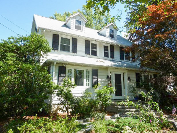
Before
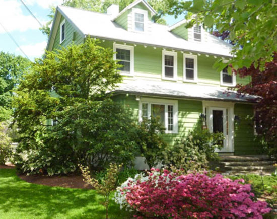
After: Body Colour, SW 6431 Trim: SW 6385

Green is the color of nature, fertility, life. Grass green is the most restful color. Green symbolizes self-respect and well being. Green is the color of balance. It also means learning, growth and harmony.
I love how seamlessly this house blends into the landscape.
What colour is your house?
Related posts:
Turquoise Beach House
Exterior in Grays: Before & After
How to Test Exterior Colour: 3 Steps to Get it Right
If you would like your exterior to fill you with happiness, become a client on-line or in-person.
Download my eBook, How to Choose Paint Colours – It’s All in the Undertones to get my complete step-by-step system on how to get colour to do what you want.
To make sure the undertones in your home are right, get some large samples!
If you would like to learn how to choose colour with confidence, become a True Colour Expert. Fall dates now open for registration.

CHARMING!
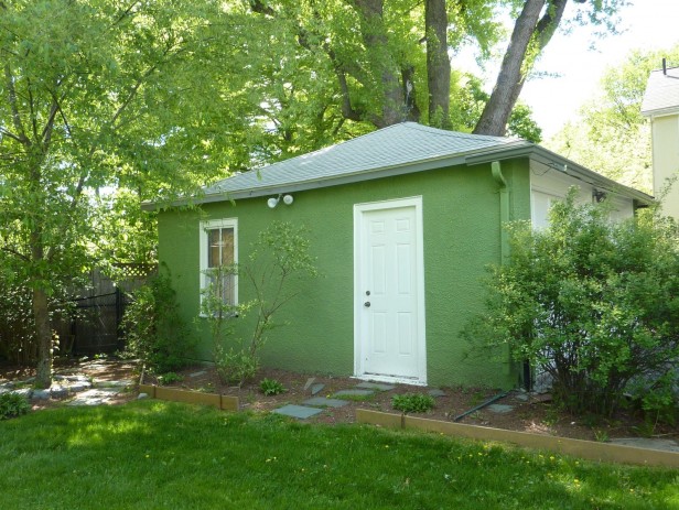
I love this! Our house is cream with green doors. I want to paint our shed green in the backyard. Right now it’s blue, and it doesn’t look like it goes with the house.
I myself like the white i would have probably gone with a red door and painted the windows a black. What happened to the storm shutters? Green is a safe colour in the environment that the house is in it can be hard to use other colorers due to all the reflected green. I also would have probably gone with one of the heritage greens just cause its so classic. Always nice to see the drastic difference colour can make to the outside of your house.
P.S. I think that house looks better without the shutters too. The color and removing the shutters made it look more inviting.
I would stain the lattice 1-2 tones darker of the house green.
Aside from the lattice being ‘cabinesque’ now, the house stops at its own corner.
After staining the lattice, the house will stop at the end of the lattice.
The boards used as edging in the garden? Same thing, stain them 1-2 tones darker than the house green.
Love this green you chose. I tell my clients their exterior colors should look ‘faded’ from the moment they are painted. Ridiculous to think, “The color will be better in a few years, once it fades.” Why was that thought ever acceptable?
Garden & Be Well, XO Tara
My current house is a pale, sort of celery green with white trim.My former house was a darker, sort of sage green with chocolate brown trim. The house before that was white with black trim. And our very first house was green with brown trim. Overall, green seems to be our color. Now mind you, I didn’t choose any of these colors but did like them…which is a good thing since all the houses had steel or vinyl siding which don’t require painting 🙂
I too like the pictured house in green! It was also quite pretty & classic in white with black shutters.
The house looks gorgeous in green. I love that it will look nice in winter too.
It’s funny… I would never had thought I would like a green house over a white one.. but this new green is gorgeous!!! The deep white trim around the windows sets the green off so nicely! Wonderful post!
I disagree, I don’t like the green at all. It looks more harsh to me. Kudos for removing the fake shutters!!!!
If they don’t function don’t fake it.
It depends on the effect you want and if you love this particular shade of green then you would be very happy with the result! I disagree about it blending into the environment though. I think it is more obvious because it can’t imitate that green of the foliage like it seems to be trying to. I would have greyed down the colour a little to complement the surrounds rather than trying to imitate nature, which is very hard to do.
Thanks for all you who love our green home pictured above. There are two trim colors: one the white/cream/white for the windows and the othe is a dark grey/green for the flat boards that follow the “v” along the roof and for the horizontal gutters. This dark green/grey line is used on both the home and the garage. It grounds the home (from the playfulness of the green) and is a nice accent to our light grey roof. The shutters were not fake; they were real shutters, but we removed them. We live in New England where there is no color for 6 months of the year, after the leaves drop in October until late April. The white home just added to the bareness of that long dark colorless stretch. It feels just great to be inside looking out and outside looking in. Thanks, Maria.
I love what you have done with the color and trim. I kind of miss those real shutters, though. Still, the overall look of woods-house-garage is cohesive and homey.
Love the look of this house, it looks great without the shutters. The green is perfect and I bet it will look lovely in the snowy winter. I hadn’t noticed the gray/
green fascia but it does really ground the house to the roof. Nice choice. Thanks for letting us see!
Love the green, very fresh!
My house is brick so trim is white with black shutters and a deep red front door. Maybe I’ll paint the new shed green, thanks for the idea!
Hi,
I love the green painted house. In England houses tend to be brick or stone so red or grey but occasionally houses are rendered and then usually painted white or cream but there are rendered houses painted the colour this house is and they look wonderful too.
I love green and once I have renovated my house most of my rooms will have a mainly green colour scheme.
I think green is a very under-rated colour, here in England the current fashion is for cream or beige walls and brown carpets, it is even hard to find carpets in any other colour than beige or brown.
I think this is the one and only time I vote for white. I avoid using green on exteriors when there is so many trees around. Perhaps a different, more subtle green would have been better?
For me the link isn’t working for “How to Test Exterior Colour: 3 Steps to Get it Right”
I love it! I think the landscaping looks better against the lighter green of the house – it has a more cottage feel to it. Although I usually don’t like painted houses, in this case I think the colour really works – especially if it’s in your B.C. climate where the green on the trees lasts a little longer than in more severe climates.
The green gives that home a cottage feel and it has more “story book” charm.
pve
I like the green…having lived in New England, our white house spent as much time blending in to the snow as is did blending into the trees. Plus, they have that beautiful huge purple maple in the front. Yay to the painted gutters! Now…I would like to see the home owners add pops of color and interest in the landscaping: statuary, pots, fountain, hooks, trellis, annuals, garden accents and maybe a few more shrubs with purple/burgandy leaves. Little spots of interest spread throughout.
Thank you. We are considering colorful window boxes on the side facing the north, to add interest to that face. (One step at a time!) As the photo is cropped, you cannot see the majority of the foliage. We have azaleas of all colors, yellow forsythias, two Japanese maple trees, numerous rhododendrums that will bloom in the next few weeks, a healthy dogwood, and so on. The Rose of Sharon in the back will bloom for months.
Sounds beautiful…I love gardens! Objects of interest are what transfor landscapes into gardens. Little spots of interest that make you smile along the path of life…or the path to the garbage cans! 🙂 I live in NC now and we have had annuals in pots since mid-April. I totally forgot that your last frost dates aren’t until the end of May. (Only do window boxes if you LOVE them. They can be dirty, hard to water and introduce ants and bugs a bit too close to the windows.) I really miss New England and having a house like yours! Thanks for sharing it with us.
Gorgeous! How I’d love to come home to this every day 🙂
I vote for the green team…. love the new colour, makes the home look welcoming and warm not sterile and cold. It would be lovely in the winter against the snow.
It looks surprisingly good! However, It also looks like the front yard had a makeover and this definitely adds to the ‘after’ shot. I guess if you love green and have good landscaping, go for it!
Interesting. Actually, it was the other way around. We have been steadily working on the foliage since we moved in, almost 8 years ago. We only painted our home within this last month, a few weeks after we discovered Maria’s website.
It takes a lot of courage to make such a bold move. Congratulations. The home just looks like New England, though the white with black was an even more traditional choice. My grandparent’s New England home was brown in the middle of a pine grove, which new owners promptly changed, but which to me always seemed so perfect for the setting.
I like the green too. Continuing the lattice work green is an excellent idea. I think when houses are painted warm colors like this your eye really notices the window treatments more than against white. It completes the look. My home is Western Reserve style so it’s white BUT with a green door haha.
I owe Maria in a big way! One thing I love about Maria’s style is that the expensive, big pieces or changes are neutral and ones I won’t “get tired of” in a couple of years. While the green is a change for the homeowner, I think neutral is a better choice for the long haul. I live in Virginia where Williamsburg colonial green might be seen, but it fades into the background more easily than the green in theses photos. In a previous 2 story brick house we owned about 30 years ago, I painted the beautiful white trim a gold color dental molding and all! In a few years…. Well, you can guess! I had to live with it because it was so much work to redo.
I love it, and I think green is nature’s neutral. So, it fits great in the environment.
Love the green! My house is a dark blue-grey with bright periwinkle blue trim. It looks good in the snow and great with summer color too.
I was just saying to my husband yesterday how beautiful our green house looks with our yard. The color is a soft green grey. My neighbor had a bright grass green color that was much better when it faded.
I love the green. I think bold or rich colours on houses make them look more solid, grounded and integrated with the landscape. That said, I strongly dislike white exteriors, fences etc. They seem to be from a (hopefully) bygone era of “overcoming” or conquering nature. Except in the snow, where they look bleak. They easly look dirty. Last year I painted my little white bungalow C2 Garbanzo, a lovely straw gold, trim and deck MS mushroom a deep driftwood grey (like the roof), and my door C2 Artichoke heart, a vintagey, greyed out deep cool green (also my interior cabinet colour). So much better. The sun doesn’t bounce off and burn my retina when I lounge on the deck anymore, and I can find my house in the snow drifts.
I love it! “Before” was a lovely traditional big white house in the trees, quite possibly like the ones on either side of it and the one across the street and others up and down the street. Now, how inviting! The “after” is another one of those images that’s going in my small but growing collections of places I’d love to spend a week with a bunch of good books and rooms I’d love to sit in for a cup of coffee or a glass of wine. I’m so glad Jane and family had the courage!
I love green, and all the good vibes about it. I usually agree with Maria, but, when I spec greens for exteriors, I go with grayish greens. I think “grass green” is too clear and bright. Maybe because I’m a gardener, I don’t want the house to compete with the landscape. I go for muted earthy colors that blend in rather than stand out.
Diane, Your comment is really interesting. A lot of this is contextual. Most of the homes in our neighborhood, city and extended area are either the white/black premise, or muted earthy colors and also grey (like cape cod grey). In that context, our green home adds some pizazz and spark but doesn’t seem out of place. I don’t know what a whole block of bright green homes would look like, but our closest neighbor’s home is soft yellow with soft blue shutters, and they have a huge old beech tree (much taller than our home) that shades the southern edge of property and we remark that between their home and ours, we have all the primary colors covered, and it creates a really nice balance.
I love it, too! Maybe a shade grayer, but this looks bright and happy in its environment. I was looking at the pictures, wondering if that would work in any way for my house. I doubt it,,,,in a neighborhood of close houses and not many large trees, it would look too far out of place. But this is refreshing. And I like the house with no shutters. I think with the green color, the facade would look too crowded and chopped-up with the shutters back on.
I love green. One day I took note of all the colours of homes in my neighbourhood and a surprising number of them were green, but a much more greyed down green is popular here.
One thing to keep in mind: green exterior paint is the worst colour for changing in the sun. In our last home across the country, we painted our brick house trim a dark green and it steadily changed to a blue-ish tone over a couple of years. That is when I researched it and found out about the pigments changing….I did not like the colour it changed to.
Maybe the pigments are better these days??? I would check about that before committing to green.
I am reacting here quickly, without really studying the house, but….what about painting OUT the white trim in a case like this?— I mean in the same color as the body. Could then the front door not take a more important role?
My house is yellow but I wish it was green — something as vibrant as Jane selected too. The pictured house is lovely and the green shows it off much more than white, plus the contrast allows the substantial white trim to shine. I’m assuming this house dates to the early 20th century. They don’t build many houses now with that many windows or the wide trim.
We replaced our charcoal gray asphalt shingles with a metal roof several years ago. The new roof is emphatically green, and highlights the different roof elevations (steep pitched main roof with shed dormer across the front).
I love shutters and I could easily see they were “real” (the shutter dogs showed in the before picture); my vote is to paint them deep green or a dark brown with a touch of red in it (and reinstall them). Either of those colors would be harmonious with the green walls.
I absolutely adore the green! I consider green in almost all tones/shades to be neutral, but one that is not boring as beige and grey often is.
My own brick home is now a very similar shade of green as this one. We went a couple of steps farther, and kicked it up a big with trim colors. The trim is a dark eggplant tone, and the windows are trimmed in a cranberry red. It complements the garden beautifully, and we get many positive comments from folks driving by. I even went so far as to paint the front fence and arbor the dark eggplant, which looks smashing with pale pink climbing roses.
I wish more people would climb out of the beige/grey rut they seem so firmly entrenched in.
Interesting that you ask about the possibility of painting out the white trim. My grandparent’s brown house had brown trim and gutters, white window sash and red doors on the house and the barn. In this case, I believe that the white trim works nicely because the gutters are not white.
I agree that most green houses look great w foliage…even one as bright as this. Good thinking that white houses are quite boring in winter….and in climates where there is no foliage for half the year…(mine incl) color is welcome. .Like interiors I think white only works well where there is great architecture and views….. Even then somewhat unimaginative. I would totally paint the front door a rich red color like BM country redwood….it would echo the color of the red maple perfectly and pop since its the complement to green rather than the black which disappears…trim should stay a creamy white. IMHO
Betsy, thanks for the heads up and your comments. Only want to mention that the front door is the dark grey/green of the edging. It’s the only place where you can get really close up to that color and see its richness.
Ours is BM Creekside Green and we love it; it works really well with all the greenery around it.
I love the green. Great job!
I also love green, exterior, interior. Two points: 1). people almost always look great in photos with a backdrop of green plants; 2). dining rooms with green walls are NOT a good backdrop for photos…and think how many family pictures are taken in that room.
I realize that this doesn’t bear relevance for decorating…except the elusive pursuit of good family pics takes place within the homes e decorate.