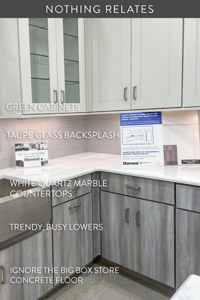
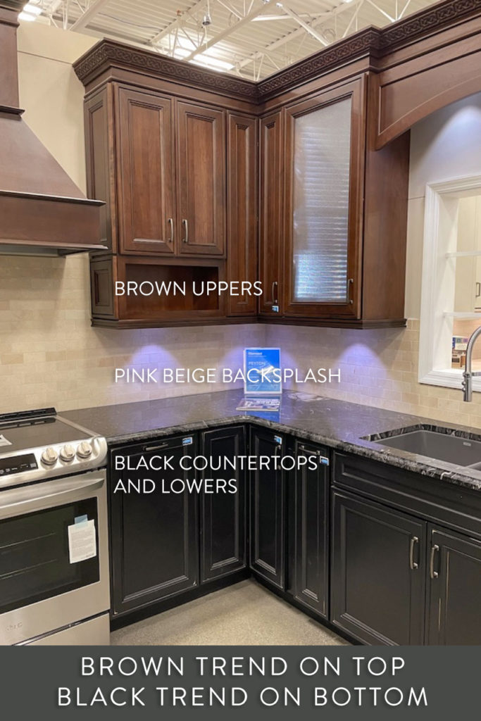
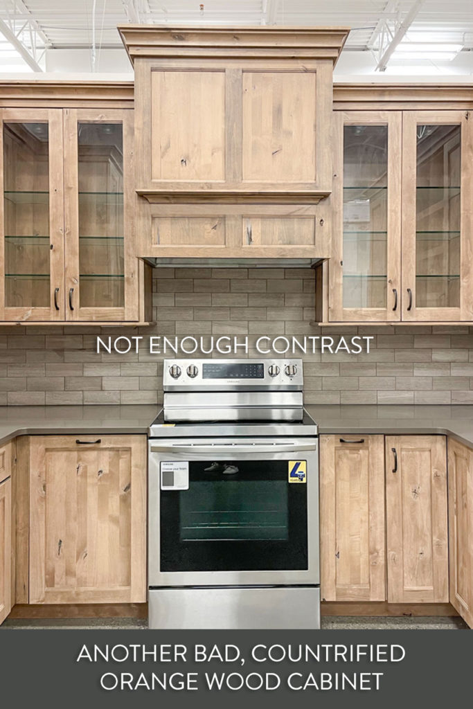
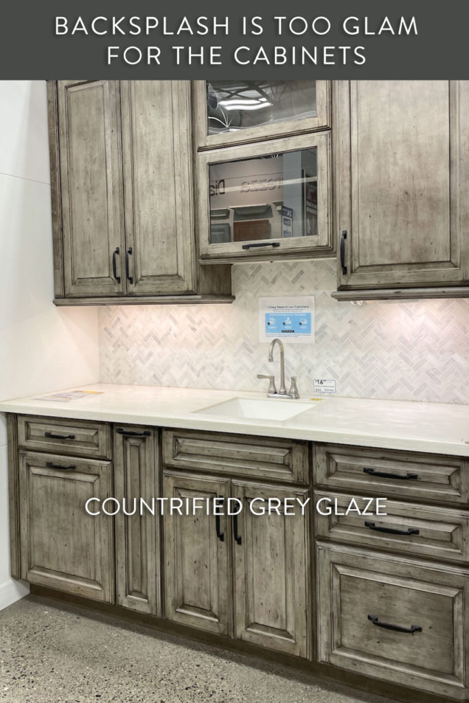
Every time I walk into the kitchen department of a big box store, I cringe at the horrible kitchen displays. They are always and without fail a mish-mash of undertones and colours, uppers and lowers all different and well, generally a hot mess.
Recently, after snapping a few photos, I wondered if what they’re actually trying to do, is what I did at the very beginning of my design career.
I posted an ad in a local real estate magazine and it had three images. One teeny tiny little image said ‘colour consultations’ with a random doorway where you could see two colours at once. The next one was a bad before and a really dark after (before photoshop), also miniature, the third one was a photo of a styled fireplace that said ‘decorating’. They were all dark, way too small and frankly looked very bad all grouped together.
My idea was to show variety, “I can decorate in any style” which is a common novice decorator mistake, but looking at those images, a potential client would end up wondering, “What? So strange to see all three rooms in the same house (even though of course they were not in the same house)?”
So I’m wondering if these big box stores (to give them the benefit of the doubt) are simply trying to use up their display space to show as much variety of cabinets and finishes that they have available?
Regardless, it does not work AT ALL.
So here’s what they are NOT saying:
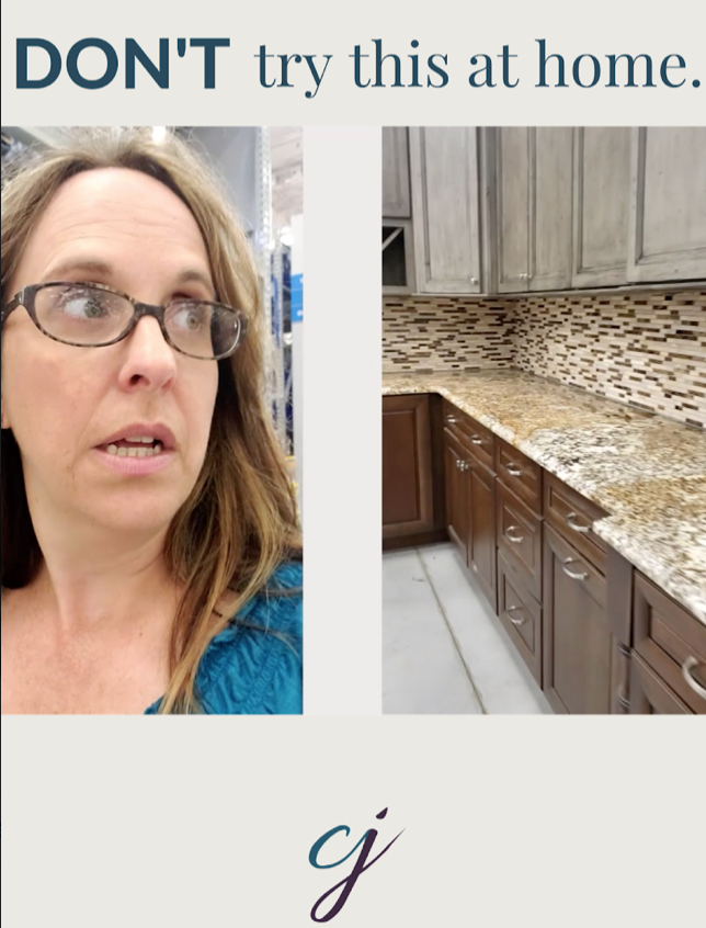
Under no circumstances, should you use these as inspiration for your home
While we’re here, can I just say the glazed cabinet is OUT? It was definitely trending during the brown trend but as you can see, the above two looks basically belong in a cabin in the woods. And nothing wrong with that, if that’s the look you’re after, however, notice how both the countertops and backsplashes killed the look of these cabinets.
Why is it important to know the trends? So you can recognize what’s timeless and classic instead
I sincerely hope that the kitchen designers at these stores are not putting together these kinds of “interesting” combinations full of “variety” for their clients. But even if they are not, I worry that people are copying these displays in their homes. Especially now that so many people ARE renovating because they’ve been staring at their homes too long!
Regardless, I’d like to save you from such a mistake as I’ve seen too many creative DIY kitchens like this in homes everywhere.
It could also be that this display of variety is intended to speak to the DIY homeowner looking for something “unique”, and if they are not aware of the trends the way a designer or design enthusiast is, it seems inevitable they will end up with something busy, mismatched and trendy. And invest lots of money in a new kitchen with no longevity at all.
But as I am not the design police, people will do what they want and like. We’ve seen before how well that turns out. Therefore, I can’t help but feel the urge to intervene, because it hurts my heart to see people end up unhappy with a once in a lifetime renovation, whether it’s right away after it’s installed, or only a few short years later.
Read more: How to be Smart in a World filled with Dumb Colour Advice
Here’s the wisdom of experience I would like to share with every homeowner that walks into a big box store to design their kitchen:
Boring now equals timeless later
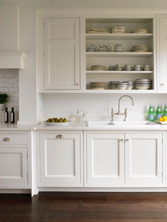
Your kitchen will have much more longevity in a smooth, natural light wood tone, solid white or cream on the cabinets with a simple white or cream backsplash. The cliche less is more really does apply.
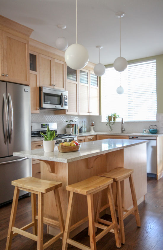
This simply (not super fancy) kitchen I designed for my sister Lea, six years ago still looks timeless because the finishes are boring.
Read more: My Sister’s New Kitchen; Surprise! It’s not white or Subway Tile
It would be interesting to see the big box stores displaying more timeless combinations instead of amazingly adept examples of exactly what not to do.
Read more: First Rule of Design; Boring Now Equals Timeless Later
My good friend Claire Jefford, a designer and True Colour Expert in Burlington, Ontario, also has two videos devoted to this very subject of bad kitchens in big box stores:
Remember my advice is best read BEFORE you make all these mistakes. If you’ve already made them, know that you are NOT alone, these are beginner mistakes that everyone makes before they know better.
If you’d like help with your renovation or new build, add your name to the waitlist here. Once or twice a month we open them up for a few hours until we are sold out again.
If you’d like to learn how to choose colours for your exteriors, buy my Masterclass for Exterior Colour Selection here.
Related posts:
Warning; Rant Alert on the Tackiest Advice Ever!
Danger: Free Advice will Sabotage Your Expensive Renovation



 Claire Jefford










Maria, a guy picked those out. If a woman suggested the materials, the manager over rode her. Then a guy installed it without checking and they said “oh too late!”
I’m in a showroom right now where the guys who own it asked the rep what sells the most and then installed it. They asked me to come help them improve their showroom.
Your sister’s kitchen is lovely. I’m curious what wood and stain it is as many light woods become much more yellow, or worse, orange, a few years after install but it looks like hers has not.
Maria,
I am a past client of both of your exterior and interior packages. I am slowly implimenting what you suggested and loving the changes (paint colors of room, classification of home (that helps me shop wisely), tips and tricks for my sellections of your limited suggestions (need that)! I discussed all of the changes with my husband and heard out his likes and dislike of only one item. That left me with less of your good choices (voila, decision made, yeah). I liken this to the parenting of a child that can’t decide what to wear in the morning, so mommy puts out (only) two outfits to choose from.
I am so glad to have to piece of mind that what I am getting will all work together! It left me with so much less to have to do and decide. I concentrate on other things like the yard and the budget; to know when the next thing can be improved or added. My living room lamp and front door are now on their way. ; ) That is the fun part!
Thank you so much, Stacy G.
PS I love your heather had in the video! Do tell… ; )
*hat
I bought a kitchen from a big box store and it will finally be delivered in 2 weeks. I went in armed with advice from your blog about classic and timeless finishes and did not let the salesperson sway me from my decisions. I chose white cabinets with black pearl granite. I then bought your white is complicated ebook and after absorbing the information I bought your how to choose paint colors ebook. I can’t afford design services but I’m confident in my choices after reading both ebooks at least twice. The only thing I wish you would’ve elaborated more on are black and white kitchens, especially when you have an open floor plan with kitchen, dining and living room all in one space. When I got to the question and answer section of one of the books where someone asked what neutral would you paint the walls with a black and white kitchen? and you replied none, that it needs a pop of color, but if you need a neutral, choose one of the grays, I panicked! I can’t paint the entire open floor plan space chantilly white (my cabinet and trim color) because I have espresso brown furniture and it would be too stark. Also, the rest of the north facing rooms in my house don’t pass the light test so white is out. I’d love for you to do a post on open floor plans and the havoc they create when choosing paint colors and furniture. Moving on, after going through the grays you suggested Im choosing a blue green gray (either silver pointe or Fleur de sel) to match one of the colors in a rug I just purchased. I highly suggest to anyone who can’t afford design services to at least think about investing in both of Maria’s books. They helped me so much!
Thank you Maria! When we see these things put together by “professionals” who also offer “design services “(!!!) we know WHY there are so many horrible kitchens and bathrooms out there- it’s sad, and horrifying!!
Thank you for sharing your wonderful advice with the world!! Now that our eyes are open,and we are AWARE-we can steer away from bad advice!
You have saved me from having a kitchen with pencil tile as a backsplash because the designer insisted that subway tile with my white cabinets would be “too plain” and fired me as a client-because we could not make decisions and agree together!! I ended up finding you through this process and gave a lovely kitchen-white cabinets, white subway tile(following your lead-I went all over the place to tile stores-fir the “right” white ta match the cabinets-needed to be special order(of course!) but was WORTH IT!! Without you-I would not have persevered!!
Also-black counter-top! With no 4 inch backsplash!! Was a fight with the countertop experts!! Thanks to you-I stood firm!! I have a kitchen that is so pretty and can be changed with cute accessories and is classic and timeless!!
Oh! I also did a “Maria-advice” bathroom!!
It’s simple – placing random items that may or may not relate is easy. Creating something simple and beautiful is freaking hard!!! Making a harmoniously simple palette is a masterpiece that takes an enormous amount of time and energy to get right – and not compromising on things that are just “ok”. Design is a bit like writing – stripping it down and getting it right takes time and skill. As Mark Twain said: “I apologize for such a long letter – I didn’t have time to write a short one.”
Unfortunately, many of these places don’t actually hire designers. They hire someone for their store, then they are “trained” for kitchen design. This isn’t just limited to the big box stores. I currently work for a cabinet & countertop company that sells high end cabinetry, but they have no passion for design and no motivation to learn or keep up with any trends. It’s VERY frustrating to say the least. Trying to pitch new display ideas has been painful, and eventually they get the final say on selections – which always results in something similar looking to these nasty big box displays, despite my vision of the original design. They too have paired things I would never put together in hopes to show a little of everything. It’s a very uninspiring place to be.
I worked for a relatively mid size large consumer lumber company’s corporate office when the kitchen displays were first put in the stores. We did not have designers, we had buyers who chose the products and marketers who worked with them. There was x amount of space allotted to kitchen design, and the idea was to cram things in. Same with windows and door displays. I’ve noticed more of a pull back from the lumber yards, it is expensive to designate that space with the large variety of items and local designers and cabinet companies have been very competitive.
We also bought 20/20 and trained people as you noted, and a lot of them came from current employees who were interested in doing that. In the end, there is one person I know that is still working in design, and he is busy all the time. Design is fairly subjective and the customer sometimes has it set in their minds what they want. I have been drafting/designing houses for years, and money is generally the most important decision. I usually propose at least one if not 2 ideas in addition to what they desire, and have found a high success rate of them going with something they never thought of.
I took a kitchen design class (it is not my forte’, but I am interested, of course I like to cook and bake) years ago at the kitchen and bath show in Chicago. I sat next to a couple of store designers, who it was obvious had never worked with a pencil or sketched, just step and repeat plugging into a computer program the pieces in a somewhat learned procedure. The instructor, (who had written an article in JCL), gave us tracing paper and a marker and told us to quickly sketch up a few kitchen idea alternatives from one he gave us. I dug in, my co attendees, sat unsure for a while. He was making the point, if you can sketch, you are much more likely to think, but if you rely on a computer program to show a final single fancy design, you may be wasting a lot of time. He suggested having a few of these rough sketches on hand to pull out when you are meeting. It does work, people, if nothing else, know you are thinking about them.
That squiggly sink has been out for a while–15 years or so, I think. I truly hope no one would install it as their main sink, which goes to your point about not doing what you see in a big box store. I think it would be so sexy in an entertaining scenario–ice-filled, with champagne and oysters, or just drinks, for example.
I love that your first all white classic kitchen photo has what looks like a 4″ backsplash! So out, right? But that kitchen is so classic it doesn’t matter.
So true! It’s a shame most people look at these displays and think it’s an option on how to design their own kitchen. That’s why we exist. HAHA! Cheers for sharing my IGTV videos xxoo