


I am doing a talk about trends in a couple weeks so I thought I’d start by conducting a poll with all of you, my favourite peeps! So here’s what I need to know.
From the designers reading this, what would you say are the (minimum) top 5 paint colours (numbers and paint co.) you are specifying right now?
And from all the rest of my lovely, creative readers, which colours are you painting your homes right now? If you don’t have specific numbers, just say something like: “I just painted my daughters room robin’s egg blue, or my dining room brown”. Or if you are about to paint, tell me what you’ve chosen!
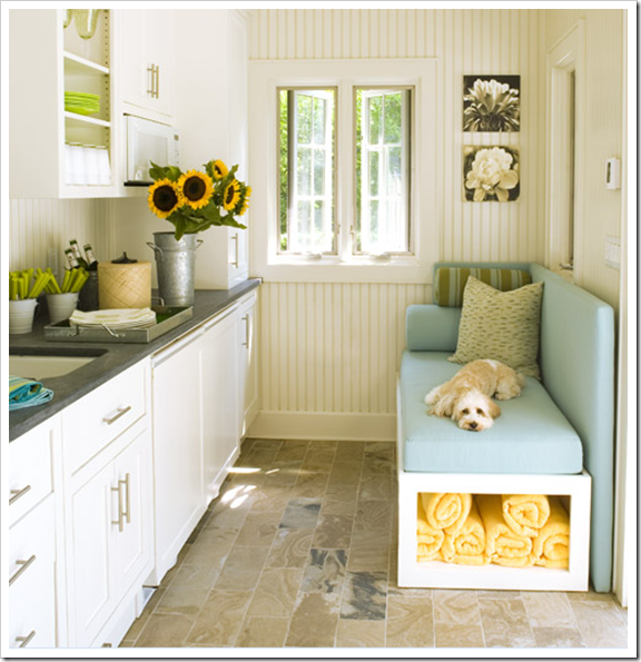
This little darling (above) also wants to know 🙂 House of Turquoise
Oh, and one more thing—this is very important, which city/region are you from? It’s always interesting to know if some colours are more popular in the East vs. the West for example.
I can’t wait to hear what you have to say, I’ll write a follow up post so that everyone else can read what they are as well!
Thanks so much!
If you would like your home to fill you with happiness every time you walk in, contact us! We would love to help you choose colours, select the right combination of hard finishes or create a plan to pull your room together. You can find our fabulous e-design consultation packages here.
Related posts:
The Combination of Surprise is What’s Next in Colour
Fresh and Fruity Colour Trends for 2010
New to this Blog? Click here ; Subscribe to my Monthly Newsletter; Become a True Colour Expert
While you’re here, subscribe to this feed so you don’t miss out!

OOOHH how fun is this little post. SMILE
I am digging Silver Sage from Restoration Hardware. I am in love with Grey right now.
SLC, UT
West SIDE 🙂
OK – this is really current – as in days away from completion (Atlanta, GA):
Kitchen:
Cabinets: Ben Moore Navajo White
Trim: Ben Moore Marscapone
Walls: Porter Paints Gold Buff (at 50%)
Entry:
Wall: Porter Paints Belgian Waffle
Wainscoting: Porter Paints Gold Buff
Trim: Ben Moore Marscapone
Next Up (3-6 months):
Bedroom – a gentle, fresh green – Laura Ashley Apple Slice or Spring Glow (maybe)
I live in a coastal, south Georgia island where everyone seems to be in love with aqua, blue and shades of robins egg. I see very little grey that the rest of the country loves. But, I bet that will change!
It's funny you should ask this question about what colour we are painting our rooms. I just finished my post on what colours we are choosing for my sons room. He wants a nice blue but as he put it not a wishy washy whitey blue!
He's only ten but the boy has taste and knows what he wants!
Main floor: BM ashwood
trim/kitchen cabinets: BM marscapone
sons room: BM Grey wisp
daughters room: BM Peacock blue
I also forgot to add we now live on the west coast (Vancouver Island) five minutes from the ocean! We moved from Southern Ontario…very big change in climate !
Email from Reader (I thought it would be easier to keep them all in these comments)
We just repainted the entire house, in Los Angeles. Here's the colors we chose (all Behr):
Living Room: Boston Fern
Dining Room and Kitchen: Shaded Spruce
Office: Sequoia Grove
Master Bedroom: Pepper Spice
Master Bath: Caribbean Green
Bath: Dried Palm
Clearly, we LOVE color and aren't shy about boldness in our home. It helps that we are both artists.
Can't wait to hear what the color trends are here and elsewhere!
Love this post! can't wait to see what others say. Here are a few of my favorties.
– Sherwin Williams Amazing Gray (a perfect warm gray)
– Coos Bay by Pratt & Lambert *A-M-A-G-I-N-G color, a beachy green color with just a touch of gray so that it doesn't look like a nursery color.
– I like the trim color Pearl tint by pratt and lambert when paired with the Coos Bay.
– BM Revere Pewter
– trim: SW Accessible Beige 30%darker
I have some pics w/paint colors on my blog:
http://designbebe.blogspot.com/
I just painted my den Sherwin Williams Hopsack and the rest of the house is Benjamin Moore Linen White. The guy in the SW store told me that right now Latte is one of their biggest sellers.
I'm in Jacksonville, Fl.
Oh this is fun! I'm just beginning as a decorator and haven't specified many colours yet, but have just done a couple of rooms in our home (have to get my decorator on somehow!).
Guest Room:
Walls BM Silver Marlin
Trim BM Snowball White
Master:
Walls PPG Ostrich Feather
Trim BM Snowball White
Love ALL of them!
Oops – forgot to add – I'm in Ottawa, Canada.
Fun post! All paints are Benjamin Moore – I live in Southern Ontario
Entry, front hall, stairs, 2nd floor hall: Munroe Bisque
Living/dining room: Lennox Tan
Powder room: Sandy Hook Grey
Great room: Hazy Skies
Main Bath: Grant Beige
Guest Bedroom: Thunder
Master Bedroom: Herbes de Province
Master Bath: Grant Beige
We went golden beiges with a green undertone when we first built, now I'm leaning to greige, neutral grey (no blue or pink undertones) and green/grey
Great post! I can't wait to see what everyone is using!
I just painted my office Benjamin Moore Waterfall…love it!
Hi!
Nashville, TN
Porter:
Greens:
Photo Gray 411-4
Woolen Vest 412-4
Prairie Dust 413-4
Saddle Soap 413-5
Browns:
Earthy Ochre 315-5
Spiced Vinegar 314-4
Jute 314-5
Pony Tail 315-4
Blues:
Tempered Steel 508-4
Just about everything in their new Neutrals palette is amazing.
Sherwin Williams:
All the colors in the Essentials palette – Love
Intellectual Gray SW7045
Anonymous SW7046
Adaptive Shade SW7053 (awesome)
Network Gray SW7073
Chatroom SW6171
Portobello SW6102
Svelte Sage SW6164
And Latte is a great neutral answer to builder beige.
Love your blog!
Julia
Hi Maria…Can I just tell you that I want to paint it just like that room!! I'm from Texas. Frankly, my friends are all using earth tones. I mean the 'stylish' ones. Ha! Tans, dusty green, chocolate brown, dusty orange.
I'm just ready for a change…I want to lighten up but maybe because I've been out of date so long that I'm behind everyone else's trends.
The creams and egg shell blue and the bright yellow really appeal to me.
I forgot to mention, I'm in Minnesota!
Still obsessed with gray over here in Maryland. Kitchen is bm winter solstice, living room is one shade lighter bm silvery moon. Also loving the way it looks with bm hale navy in the adjoining room (foyer).
we're building next year, so right now i'm obsessing over colors! the base of the entire house will be benjamin moore's simply white – most walls, woodwork, etc. however, my studio will likely be a soft aqua, the kitchen island will be army green, and the bedrooms will incorporate navy, coral, and kelly green (which i am TOTALLY digging right now). i do love a mousy gray and a buttery yellow … i consider both a neutral. (location: i'm in minneapolis, minnesota.)
Midwest here. For the bedroom, Benjamin Moore Annapolis Grey. I "hear" that one of the big colors in the decorating arena is still Lambswool, but I am going with more of a grey…Restoration Hardware's Graphite is next up on my brush.
In my professional life I specify a lot of Devine Almond, in my personal life I am all about the varying shades of turquoise!
We are about 65% through our reno.
I chose the following:
Cabinets & Trim: BM Cloud White
10'x 4' Kitchen Island: BM Brookside Moss (oh YES I did!)
Walls: BM Grey Mist
I am so excited for a light and bright house. I was so tired of dark. Taking out a wall helped.
I am in Calgary, Alberta. My designer has been an amazing help in this entire process.
Colors that seem to sell here are Benjamin Moore Lenox Tan and Sherwin Williams Latte. Here are the colors in my home, which are Benjamin Moore:
Main Living: Lenox Tan
Mud Room: Shaker Beige
Master Bedroom: Misted Green
Master Bathroom: Gray Cashmere
Kids Bathroom: Dill Pickle
Boys Bedroom: Middlebury Brown
Girl's Bedroom: Aqua (custom)
Karen
Sioux Falls, SD
Dear Maria, you always make us think.
Did a big job in Beigewood 1007 BM & Bleeker beige HC -80 with cheddar cheese orange and some terracotta Carlsbad Canyon 076 & greys a couple months back love it!
Just specified Paris Rain 1501 a couple of apricots including Pineapple orange 158
Another spec wedgewood gray HC 146 northhampton putty HC 89 crowne point sand HC 90 white heron OC 57 Herbal Escape 1487
Pale moon oc.158 Gilford green HC116 Hc 117 Hancock green.
a recent job
B.J. Silver Sage 506
Sea Reflections 1664
Hale Navy HC 154
Ashland Slate 1608
2108-50 silver fox
528 folk art
193 dijon
2119-50 nickel
831 stratford blue
Lots of greys blues some oranges yellows greens and beige tones.
I want to specify pink but no one is biting.
Sorry Maria forgot to say Northern CA.
Here is WA Australia, Black and Charcoal or any dark colour.
Paint colour numbers over here are called different names than for you guys so its easier to tell you the colours than the numbers.
In the Dulux colours
RAKU- PURPLE BLACK
DOMINO- BLACK
CAPSICUM RED- EARTHY RED
WARM NUETRAL- PINK TAUPE
PLOUGHED EARTH- DEEP TAUPE BALCK
ANTIQUE WHITE USA – PURE WHITE
OCEAN – DEEP NAVY.
Generally any greys, taupes, whites and blacks with splashes of blue
Very interesting to see how we decorate across the world and how we follow fashion trends. We are always a fashion season behind so generally it is the same for our interior decor in Australia. We try to keep up but it takes a while to embed in peoples psyche….
I work at a paint and wallcovering company based in Minneapolis and our best selling color is called 3AM Latte, also last year's winner.
I was surprised, considering how much play gray got last year.
Paint line, Hirshfield's (our own, mfg. in Minneapolis)
Toronto – dark, North-facing library Benjamin Moore's Danse du Soleil. Looking for the right shade of turquoise for entrance foyer. Exterior trim: gray but with a bit more brown than a lot of the blue-grays that have been favoured in Toronto trim's the past few years.
My home in the desert was all contractor white and I painted the dining room & a powder room Sherwin Williams Hopsack and I just LOVE it. I am a very warm loving person and most of my NW home is in yellows all forms, do you think that is because of our grey weather….yellow makes me feel warm and fuzzy.
Great post to engage your readers Maria, I love your blog and learn so much.
Nice post!
I'm really liking grey right now. Combined with white or lilac or yellow.
My favorite is the one that Martha Stewart painted her kitchen cabinets in her famous house.
Sorry, I don't know the code, although I'd love to find out, so if anyone knows…
From Greece with love!
I'm in the middle of a main floor reno, with a new kitchen. The kitchen, at the back of the house, is BM Revere Pewter. The living room, front of the house, is BM Edgecomb gray. And the dining room, in between, is…..BM amorous (AF-600). I wanted a hit of purple, was thinking a cushion, but ended up with a whole room! Love them all.
What an adorable shot!
Have a lovely weekend Maria ~~
xoxo Laura
Love this post!! It's great to see what everyone has in their houses.
Main house will be BM Kangaroo AF-145
5yr old daughters Rm- Sherwin Williams Lite Lavender SW-6554
2yr old daughters rm- Sherwin Williams Anemone SW-6567
The rest of my house is the builders color still- Color Wheel Knott.
I forgot my location – Tampa, FL.
My favorite color in my house right now is Ralph Lauren's River Rock – Prairie Fire. I have it as an accent wall in the kitchen, underneath the chair rail in the dining room, and carried into the living room as an accent wall. I love the texture and it's such a pretty mossy shade of green.
VA Bch, VA
hi Maria,
I just painted my NJ cape cod house exterior in these BM colors:
Field – Hillside Green
Shutters – Shady Lane
Door – Burnt Caramel
Trim – Mountain Peak White
Porch ceiling – Palladian Blue
These were picked after consultation with you several months ago… I LOVE IT! Will forward pics soon.
Hi Maria! I've just moved and with in the reno have done a whole-house paint with BM Manchester Tan in Ulti-Matte. This color is a chameleon-changing from a linen beige in daylight to grey in shadow, then revealing its green undertones in incandescent light. I did 2' x 2' samples of a number of BM colors (thanks for that advice!) but it still didn't get the full complexity of the undertones in this one. The trim is done in a custom BM satin finish matched to my blinds. It looks white against the Manchester Tan but is almost a mushroom. I've found that greyed blue-greens and not too red orange look great with both.
Oh—I'm in the Pittsburgh, PA region.
Well, I just finished painting our dining room Ashwood (Behr) with Linen White for the trim and below the chair rail. It looks beautiful! I am in the process of repainting the whole downstairs and here is what I *think* my final selection is (all Behr):
living room: Honey Butter. Linen White trim
kitchen: Butternut Wood, Cracked Wheat, and Linen White cabinets and trim
foyer: will be the same as the kitchen
…we are in Richmond, VA
I am NOT a decorator. I have been reading your blog to learn how to choose colors for my home, which is badly in need of fixing up – "contractor beige" flat walls with textured white ceilings throughout. I'm going for fresh and clean but needed to match the bathroom fixtures – the sink is yellow beige, counter is pinky beige, tub and toilet are greeny beige.
So far have painted the master bath in BM Muskoka trail on ceiling and walls, Dove White trim and doors. Gaspe blue on the vanity and wall cabinet with a nice shower curtain with oranges, blues and sage and beige in it. Looks fabulous. Muskoka trail was the best color I could find to work for the bathroom, and doing the vanity in blue seems to work well to detract from the beige war going on.
Master bedroom is Dove white on trim and doors, white mini blinds to match, Muskoka trail on ceiling and walls are BM 633 "Appalachian trail".
My plans for the living area and kitchen are to do the lower kitchen cabs in BM wild orchid, upper cabs in white to match the trim, walls will be BM 187 "Goldfinch", which is a good match to the counter top I have picked out. (Two surfaces in the kitchen should be the same color…. right?) Golden oak hardwood floors throughout.
I have just painted my powder room a R. Lauren color called Key Largo in flat – it is a coral – then I ordered a huge and a medium size stencil (damask patterns) from Royal Design in S. Diego – and did the stencils first in B. Moore 1313 and then came back on top in 1303 very lightly – these two pinks were in semi gloss so the damask catches the light! I think it is fabulous! Got a new light fixture and changed the hand towels.
Suzanne on St. Simons
I have finally finished painting most of the rooms in my house Quiet Moments by BM. #1563
It looks different in every room due to the differnt amount of light each room gets. But I love it. It almost works as a nuetral color for me because I swear every accent color looks good with it.
I live in a suburb of Chicago.
Mary, i’m looking into quiet moments/beach glass. What are the different hues it has in different rooms? I love the color but my bathroom has a lot of tan/beige tile and floor with cream trim and a lot of natural light. Sampled Mount saint anne in there and too dark worriend the others will be too light. Any help is appreciated! Thanks!
When we lived in Seattle five years ago, 50% of my neighbors had the SW color Blonde in their house. I guess we needed a little sunshine there! The best think about this color is it looked different in each house, depending on the type of light.
My current house in Boston is mostly Restoration hardware Latte, RH chocolate in guest bath, dining room is BM parchment, another room is Saddle (maybe Benj Moore?)
I'm not a designer, just a fan of good interiors. I live in West Texas. I think greige (greyish beige) is in and what I would paint my interiors if I could.
I am getting ready to paint my entire house Martin Seymour's Linen Weave cut in half. Everthing from the ceiling, crown moulding, walls, and base boards will be that color. I know it sounds boring, but this color changes with its surroundings. I am in Houston, TX
I love reading what everyone's using! Here's what I've done (in Boston):
Bedrooms: BM Grant Beige, Palladian Blue
Kitchen: BM Raccoon Hollow (with Dove White cabinets)
Bath: Martha Stewart (old) Araucana Blue
Office: MS (old) Seedling Green
Planning for Hall: MS Bamboo Mat or BM Straw
Client's MBR: BM Seapearl, Stone House, a persimmon or a navy blue
Also, love all BM HC colors.
Just had a minor kitchen fire in NE FL. Rather than replace all the cabinets, painting the cabinets something like Benjamin Moore Rainforest Dew 2146-50 (a bit lighter/greener…can't find the card!) and walls will be Amazon Soil 2115-30 (That one I remember!). Didn't want a pure white on the cabinets – shows dirt too much! And I have green ash paneling in the adjacent FR. That will be painted someday, just not immediately.
In my entry, I have a big painting, and the entry flows thru the LR, Ofc, and DR. DR is already Sherwin-Williams Restful SW 6458. So, based from the painting, I am going to start in the LR with Raindrop SW 6485, then into the ofc with Waterscape SW 6470. That should flow into my DR. I may select a golden color for the entry and hall, but later; again, coming from the painting. Right now, that is Glidden Coral Cliche 00YY 61/121.
BM LInen White
Donald Kaufman 17 (Barn Red)
Pratt Lambert Algerian
Devine Ale
BM Dry Sage
For the living room we went Benjamin Moore's Golden Delicious for the walls and Cypress Grove for the ceiling. Its amazing- bright and sunny during the day, dramatic and warm at night.
We are building a home (Cleveland, OH) and only get 3 colors and even this seems to be a hard task for me to complete.
We have to use ICI Paints. I am thinking
Mansard Stone for the dining room
Zeppelin for the kitchen
Desert Sand for the entire rest of the house. The man wanted to do the entire house beige to which I just about freaked out. I would love to paint the master a blue color as well but just can't decide!
My bedroom is painted Gentle Tide (Glidden) with BM Linen White trim. The ceiling is Cool Cucumber (Glidden). I totally copied this off the younghouselove blog after drooling over it forever. And it is beautiful! So soothing, relaxing, uplifting.
My living room is BM Powell Buff. I love the yellow it has in it. So cozy at night with the lamps.
The kitchen is a work in progress. Cabs are currently white, and I'm seriously considering doing the bottom cabs French Grey (Glidden).
Forgot to mention I'm in the Southern U.S.
I live on one of the Gulf Islands (BC) and we've just finished painting our house.
We used:
Living area, kitchen, dining, bedroom: BM Stone Hearth
Away rm/office: BM Wythe Blue
Powder room: BM Rainforest Dew
Bedroom/laundry: BM Pale Avocado
Bedroom/baths: BM Palladian Blue
…And my absolute favourite is Palladian Blue!
Atlanta:
Son's room BM Patriot Blue walls w/white trim
Living room SW french roast with a glaze w/white trim
Trying to decide upon master bedroom colors: SW Latte or chopsticks or BM alpaca or shaker beige or standby linen white. Will do cove ceiling over bed a metallic or venetian plaster and switch out ceiling fan for chandy
exterior shutters just painted SW raisin
Oh how fun! I'm currently painting my kitchen. All the paints I'm using are Benjamin moore. Cabinets are Sea Isle. ( There's way too much green coming in from outside to paint them white:) And trim is Chantilly white. My daughter's room is Spring Iris- trim the same.We're from right outside Seattle
Hi Maria!
I'm a (part time) designer in California.
For clients that are stuck in 2003 (and I can not for the life of me convince that 'gray is the new beige') I spec out BM Lenox Tan and Shaker Beige.
I am redoing a townhouse on the beach in Santa Cruz, Ca. and we are doing all of the upstairs in BM Stonington Gray, which is my current go to wall color!
What a fun post! I can't wait to see the list that you compile.
My favorite paint color is BM Early Morning Mist (1528). It's the lightest greige. I love it b/c it's fresh and clean. I have it in my DR, but plan to paint the rest of the common areas in the house with it. Cheers! xoxo
oops! I'm in Washington DC.
I must be in a blue/grey phase with my clients. I am in Cleveland, Ohio
Sherwin Williams #6204 Sea Salt
Sherwin Williams #6211 Rainwashed
Behr #720E-2 Lt. French Gray
Ben Moore Sail Cloth
Martha Stewart Ballet Slipper
I hope you publish your findings. I would be very curious to see the trends and the diff between areas.
We just painted most of our house in Glidden Cappuccino White. The bedroom is Tropical Surf. We are getting ready to sell, so we wanted a light, neutral color.
And I'm in Greensboro, NC. Sorry!
Los Angeles: Dunn Edwards Cameo is my favorite creamy neutral. I have done 5 house in this color in 2009 & 2010.
I just painted a beach condo in San Diego Aqua: Pratt & Lambert Sea Crystal. Master bedroom used Cameo on the walls and Sea Crystal on the ceiling with white moldings, looked fabulous.
Grey is also big now just completed a kitchen in Grey.
Living/dining/kitchen, all of which flow into each other and are undergoing a cosmetic renovation, I am painting Sherwin Williams Ambitious Amber – even the ceiling! Trim and doors are the ESZ white semigloss from True Value.
Oh, and I'm in Maryland.
Hi Maria, I just painted my beach cottage bedroom MS Phlox MSL175.
Exactly what I was going for (pale french lavender gray) with brite white trim!
Cape Cod, MA
Hi Maria
Love your blog! I live in west Michigan and just downsized to a condo with a 4 season room overlooking a pond. Main living area is painted BM Linen White with white trim. Our bedroom is BM Wedgewood Blue with white trim…very "spa" like. Looking forward to seeing the tabulation of results!
Warm Regards
Marsha
Hi Maria,
I just painted my husband's office Restoration Hardware's "Slate", the entry and adjacent hallways (we have a one story with two long hallways) SW "Macadamia", dining room and piano room Frazee's "Plantation Beige", and my bedroom and bath (and kids bath and laundry room) are now SW "Maison Blance" – they look great with my brick floors and french doors. I'm trying to decide if I want to carry the macadamia into the kitchen/family room or leave it the old Behr color "ginger root".
Plantation beige is a funny color – I originally had it in a bath and laundry, but with no natural light it looked to gold. In the rooms with lots of windows it looks so much lighter and happier.
I live in North San Diego county in the city of Carlsbad.
Thanks for your inspiration!
Mellissa Summers
Hi Maria,
I'm from Mississauga, Ontario and have just finished painting my living room Puritan Grey (Benjamin Moore) and am finishing up my dining room in Great Plains (again Benjamin Moore). this will tie the two together with all my existing furnishings.
Jan Townley
I just painted my bedrooms the following:
Porter Paint – Steele Gray
Porter Paint – Frosty (I think that's the name)
I'm picking out paint this weekend for my living room/dining rooms and I'm leaning towards a sandy beige because i have dark wood trim. I'll accent with pops of robins egg blue and possibly burnt orange.
Oh shoot…forgot to tell you that I live in Indiana…so Midwest!
I live in Victoria, B.C. and I'm planning on painting my rooms the following colours:
Living Room – A green somewhere between olive and khaki
Kitchen/Dining Room/Library – A colour I call Dijon mustard cream sauce
Powder Room – A dark greyish blue to match a beautiful crystal I have
Master Bedroom – The palest blush pink
Second Bedroom – Pale terracotta
Upstairs Sitting Room – A very dark bronze, almost black
Upstairs Hallway – Benjamin Moore's Dill Pickle
Master Bathroom and Main Bathroom – White, white and more white
I just painted my bathroom a light, light pink: Martha Stewart's 'pink sea salt' and if I had an office or den to paint, I would do it in an off-black
now for Spain and Italy the color number one in decoration for the interior walls of the House, is the white shell egg.
Hi Maria,
I'm in the panhandle of Florida. So far we've painted
Master Bedroom: Rock Oyster (martha stewart) very pale gray/blue
Dining Room: Palladium Blue (BM)a greeny blue
Family Room/Foyer: Pale Wheat (Behr)
Trim: Valspar white
Kitchen cabinets are what I'm trying to decide on. I don't think they can be bright white with the granite I have.
Maria, as you know I am in the Kansas city area.
A deep Prussian blue on stairway and den. Will be doing silver accents along the stairway. The den has creams/browns as accents and art with pops of fushias.
Powder room in a rich buttery yellow
Master bath in Periwinkle/ a deep shade/ white and yellow accents.
Terracotta behind Living room bookshelves and over mantle as accent.
Other rooms and hallways are in a Creamy/ rich beige tone.
Karena
Art by Karena
living room- s-w navajo white
dining room – s-w ivoire
kitchen – s-w misty
cabinets – s-w inkwell
bedroom – s-w gratifying green
front door – rustoleum paris green
forgot to add – i am in pittsburgh, pa!
Just finished painting our house:
all from Sherwin-williams
body- 7066 gray matters
trim- 7063 nebulous white
front door- SW 6503 bosporus
napa, california
Painted my bedroom a gorgeous blue, Tradewind by Sherwin Williams. Mesa, Arizona
I'm in Minnesota and just painted a basement room a light bluish gray.
Hi, I am from the SE corner of New Mexico, USA.
Kitchen: cabinets:BM Grey Owl
walls; BM Moonlight White
trim: BM Simply White
Powder Room: walls: BM Grand Teton White
ceiling: BM Green Tint
Family Room: P&L Lamswool
Thinking about using Green Tint in master bedroom.
I love the way BM Moonlight white is so versatile. I use flat except for the trim which is semigloss or satin.
Love your blog.
We are in the midwest and we just painted our home these colours (all BM):
Trim: Simply white
Study: Hot apple Spice
Powder room/guest room: Silver fox
Kitchen/master bath/playroom: Gray Wisp
Foyer/Halls/Family room/dining room: Natural Cream
Master: Kingsport Gray
kid's room: Lenox Tan
Laundry: Dill pickle
Basement: Grant Beige
Great question! We live on a sea island near Charleston and just finished a main floor redo. With lots of windows it takes a strong color to achieve something that doesn't wash out. Light colors never seemed to hold the rooms together.
2 story living room, dining and entry – SW Perfect Greige
Master – Restoration Hdwe Slate
Kitchen & Morning Room – SW Great Blue Heron
About to paint condo in historic district:
Walls – SW Naturel 7542
Cabinets – either SW Fenland 7544 or Pier 7545
Marty
Phoenix,Arizona……
Here in the Southwest it is all about a good neutral. I use this pallette in both commercial and residential projects.
Dunn Edwards
Salt Box DE6141
Floating Feather DE6142
Almond Latte DE6143**(This is the one I use the most by far)
I'm in Northern California. Hubby and I painted the kitchen cabinets SW Biscuit and absolutely love it. The walls are SW Halcyon Green but I'm not loving it….too green. I was aiming for something more aqua or turquoise. I guess the "green" in the name should have been my first clue, huh?
Wow, what a fun post. Here are some of my favorites from over the years:
yellow: BM Hawthorne Yellow
grey/green/blue: BM gray cashmere
blue: BM Ocean Air
grey: BM Pale Oak or Revere Pewter
green: BM Georgian green or maidenhair fern
taupe: BM Grant beige
cream: BM Linen white
hot pink: BM Razzle Dazzle
soft pink :BM Blanched Coral
brown: BM Alexandria Beige or Bittersweet chocolate
I am in Tennessee!!
Hi Maria,
This is an interesting thought. I'd have to say that my colours right now are white with bright splashes of colour. Our master bedroom is all white with an accented wall of sky-baby blue. Sorry I can't give you the exact paint number or details. It doesn't work that way in Italy. It's quite chaotic here when you buy anything.
We're in the midst of renovating our computer room and it will be white with an black accented wall using chalkboard paint (crossing my fingers on this one).
Originally, I'm from Vancouver too. So, I hope that helps.
p.s. beautiful kitchen photo. Great blog!
Rambles with Reese
What a fun survey!! or experiment! I am currently not painting any rooms…but have been getting ideas for my office and our gest room… The guest room is most likely going to be a pale pale pink…with a touch of brown and turquoise for accent… as for my office..no clue! it is so interesting to read everyone's comments and where they are from..
I am in a suburb of Cleveland, OH
After a year of renovations, I finally found a perfect color that goes with everything: SW6155 Rice Grain.
In the kitchen:
walls HC-173 edgecomb gray
upper cabinets AF-35 vapor
lower cabinets HC-105 rockport gray
Oh, and I'm in Minnesota.
In Colorado, we just used Benjamin Moore's Enchanted Forest and Harvest time. In Texas — on an island — we used blues and greens.
Recent – as in finished within the past few months:
Hallway: pure white. It picks up reflections from the other rooms as the light changes, so it's always looking like some other color.
Office and master bedroom: Ceiling is pale slightly grey blue (Behr 570A?).
Walls are pale lilac Behr 630A, Amethyst Cream (changes hue from grey to blue to pink to purple with changes in light, which we consider an asset)
Living room: Walls are very pale peach. So is ceiling
Behr 280A -2 (Apple Crunch)
Ceiling is 280A-1
Baths and laundry room: FreshAire "True North" FA016, color matched in Behr.
It's a clay/taupe off white that happens to go with the tile in all three rooms.
Why Behr? It and Glidden are the only two paints that don't give me a blinding headache while they dry.
ADDING: Phoenix AZ
The light clear tints, and I can see them all in the sky, go really well with the modern house and intense natural lighting.
It also makes a good background for the art.
Next house (New Mexico) will start with a pale yellow/cream (on the yellow or peach, not the green side) on the walls. There's a native grass that dries that color over there. Accents will be in the mineral color range. I'm going to pick some rocks I like and color match them.
I'm up in the NW GA mtns in Cartersvill, so my colors may be 10 years behind what is new and hip. That seems to be the case with other things, like dentistry and smoking…
I've got:
Behr Blue Fox 540E-3 in my Mstr B&B
Behr Arabian Sands 280E-2 in halls/baths
Behr Burnt Almond 280F-4 in the kitchen/living room
Behr Beluga 770F-7 in accent stripes of kitchen
Behr Grape Leaves 400D-6 in daylight
And stripes of Grape Leaves and Blue Fox in a guest bedroom.
My inspiration was this CD of Tuscan dinner music- it had bright green, deep blue, purple, orange and reds. So I've used these colors to create a Tuscan theme in this NW GA house.
Just did our MB in BM Paladian Blue, my son's room in BM Powell Buff and our guest bedroom in BM WIlmington Tan.
From the Eastern Shore of Maryland
We're in the process of working on a cottage in the country (Calamuchita Valley in central Argentina) and once the roof is repaired we'll be doing a LOT of painting! I'm going with light greens and blues, the colors of water, since we're the equivalent of a city block distance from the river. I'm SOOOOOO glad we have Sherwin Williams here so I can get good quality paint. One color I'm looking forward to using is "Rainwashed".
This is a great post Maria, my favorites lately have all been grey's:
BM – Revere Pewter
BM – Escarpment
BM – Overcoat
And I am from Vancouver 🙂
Nancy
Perhaps one of your only readers in Mississippi 🙂
I've just moved here from Nashville. The locals are very into warm colors – tans, golds and browns are big. I've been in half a dozen of my new friends' homes and every one of them has had tan/gold walls with red decor. Something akin to SW Blonde or SW Macadamia is the default builder's beige here.
Not a hint of the gray trend anywhere except in my living room that's painted Farrow & Ball London Stone 🙂
LR and foyer: BM Marscapone (still have the paint in my hair)
Door and windows: Ralph Lauren Turret stairs
In sunny (read: HOT) Florida
I am not a decorator, but a homemaker with a passion for decorating. We have a show here in Canada called "City Line" and it's a daily show about fashion, food, decorating & gardening. They always show the latest in colours and trends and quite often I get inspiration from this show, as well as Canada's Style at Home and Canadian House & Home. I just painted my family room BM's Mont Saint Anne, which looks grey on the paint chip card, but takes on a soft blue tone on the wall. It looks great with white trim and silver accents. I just did my daughter's room in BM "Whisper of Gray" which is soft lavendar with gray undertones. I am really happy with how both rooms turned out. We make our home in Edmonton, Alberta, Canada.
Email from Reader:
I just painted my living room deep sea blue/teal, my dining room
violet/aubergine and my kitchen slightly darker than Tiffany blue. All
these gorgeous colors can be seen from each room and it works great! I
love color !
I plan to read all the comments and compare colors. Great idea for a post. I am in the planning stages of a completely new space and am looking at the following colors although placement is still up for discussion.
Raspberry Pudding 110B-7 Behr
Cranbrook 110B-6 Behr
Lewiville Green 494 Ben Moore
Frozen Pond ul220-15 Behr
Deepest Aqua GLB24 Glidden
Cocoon MS195 Martha Stewart.
As an artist, I'm crazy about color and not afraid to use it in my decor. Plan to paint several pieces of furniture to give them new life in my new space.
I'm following previous commentors and giving my location in a separate post. I live in St. Louis, Missouri. Tricia
I've been wanting to participate on this as this topic is dearest and closest to my heart ;). I even had to grab my BM paint fan deck so I could check what some have mentioned.
Our builder used ICI Antique Linen as the general colour of our home and we are planning to repaint all the bathrooms starting with our ensuite and our son's. We will be painting them with either BM Balboa Mist or BM Collingwood.
I'm from Ottawa btw.
As usual, it's always fun checking out your blog, Maria.
Kanata Dweller
I just helped a client with color for her home. She is moving from a 2 bedroom to a 4 bedroom home.
All of the colors range from Clinton Brown, Pismo Dunes, Driftwood, Polar Blue, Kendall Gray to Barely Beige. Everything reminds me a New England Beach.
Brown, Beige, Blue and Calming.
I can give you the BM numbers, but you probably already know them by heart.
pve
How fun!! I love to know what other people are painting with. I am about to paint the walls in my kitchen. I'd love to do the cabinets as well but alas, they have to wait.
Right now, the cabinets are off-white but I want to paint them a true white. I want the walls blue, perhaps Waterfall (BM) or Rainwashed (SW). I usually prefer BM but really like Rainwashed. I live in Austin, TX.
Huge thanks to you, Maria!!
Per our phone consultation, your recommendation is nothing short of genius. The Wickham Grey is beautiful beyond my imagination; ethereal. The other pick, Shale, is also brilliant; it's quite dissimilar to any of the typical neutrals and very chameleon, which I love.
The consultation was money very well spent. To anyone thinking about it, do schedule a Maria Killam consultation! You will not be disappointed!
My husband and I just bought our house last September. The exterior was white with awful faded blue trim and all the interior walls were white. The kitchen had the horrible 80s oak cabinets, but at least the previous owner had put in some granite counter tops.
Kitchen: cabinets- White, walls- Ralph Lauren- Cobblestone, and a white subway tile backsplash.
Living Room: walls- Ralph Lauren- Cairo Brown
Office: walls- Behr- Hazy Skies
Dining room: walls- Ralph Lauren- cobblestone
Exterior- sides- Behr- Riviera Beach, trim- White, door- Martha Stewart Barn Red.
Bedroom: The walls were already gray, so we added some espresso colored furniture with brushed nickel hardware, plum drapes and deep brown and plum bedding.
I'm still unsure of trim colors, but after doing some reading here, I have some ideas!
Christine- Texas
well, colour is always colour and it really depends on project to project and client to client, BUT i'm completely hooked on Royal Blue and Gold. The Golden Age is back to our lives.
Maria, you're doing an AMAZING job with this blog. AMAZING!!!
Oh, forgot to mention, I'm a portuguese girl living in London (not in Buckingham Palace, though :))
Email from Reader:
Maria – Here's some feedback for your paint color research (my career was as a market research analyst so I know how hard it can be to get good info).
Recently painted:
Guest bedroom – Behr Blue Opal PWN-27
Guest bathroom – Benjamin Moore Golden Straw 2150-50
Master bedroom and office – Sherwin Williams Paper Lantern SW1360
Living room – Sherwin Williams Decor White SW1361
Dining room – Martin Senour Linen 57-7(WW)
To be painted soon:
Utility room – either Valspar Balance 2004-10C or Behr Cinnamon Cake W-F-220
Region:
U.S – Mid- Atlantic (Pennsylvania)
As we have many overcast days here, lighter colors keep the house from being too gloomy. Except for the blue, these all provide a neutral warm, sunny background which works well with almost all colors. This home was built in 1965 by my first husband with two huge Ohio limestone fireplaces (a real guy thing) which have predominately golden tones. Color choices were not made based on current trends but were chosen to blend well with the fireplaces and red oak hardwood floors. So far, we love all the colors.
Thanks for writing such a great blog. Hope you are enjoying your new home. Diann
I'm in the Midwest (Madison WI) and recently painted my remodeled front porch and front entry:
Walls: BM Grasslands 502
Ceiling: BM Guacamole 2144-10
Trim: BM Pink Damask OC-72
My living room, which both rooms enter into is:
Walls: BM Burnt Peanut 2081-10
Trim : BM Pink Damask OC-72 (semi gloss)
Ceiling: BM Pink Damask (flat)
Just painted the exterior too:
Walls: BM Eucalyptus Leaf 2144-20 (it's stucco)
Trim: creamy-yellow (don't know the # — close to BM Milkyway OC-110)
Trim around window frames: matches marvin windows wineberry (close to BM 2080-10 raspberry truffle)
I work with clients selling flooring & window products in Honolulu. I sell to alot of military customers, both my home and showroom have been painted BM Pearl Harbour it's golden color looks perfect with woodtones.
Oh,this is a fun way to include readers directly in post..
I want to decorate my apartment in gray-green-duck egg blue…
I love those colours,and how they look together. And also lots of white.
I live in Herceg Novi,a small mediteranean town on the shores of Adriatic sea. In general,people around me hardly accept changes,everybody loves dark wood furniture,and peachy wall colours-yuck!
I would love to implement some new styling around me
I recently did my bedroom in Sidewalk Gray (Benjamin Moore) which is a cool, lavendery gray, added crisp white trim and a duck egg blue ceiling. The cool grey walls and the happy sky-toned ceiling, with matching ducks egg blue silk drapes makes people swoon. They love it!
I'm not painting (my landlord doesn't allow it), but my boyfriend (Chicago suburbs) has a warm brown in his living room and he's going to paint his bathroom soon. Debating between bright purple and bright orange.
Benny Moore Atmosphere cut 30% for a gorgeous light filled great room.
What a great post! Just like all of your others…
I cover North America for PPG Pittsburgh & Porter Paints and our most popular colors are
Pony Tail
Golden Ecru
Sand Fossil
Spiced Vinegar
Smoky Slate
Olive Sprig
Toffee Crunch
Belgian Waffle
Copper Beech
Gray Frost
Phoenix Fossil
There's more but I don't want to hijack your blog : )
We just launched a BRAND NEW color palette that is comprised of the top 100 colors (based on fabrics, countertops, flooring, etc) as told to us by designers all over the US and Canada. We call it our Atmospheric Collection – if you'd like a color card just send me your info and I'll have it shipped to you.
Thanks Maria – I'm still trying to schedule time to attend one of your color seminars!
Ruthanne
We are in Michigan.
Bathrooms – gray-green beige on walls, grayed navy cabinets, white trim
Master bedroom – clean clear greenish blue, white trim
living area – yellow, actually more of a gold on walls, kitchen cabinets a medium purple. White trim. Living room has green, blue and purple accents in furnishings, rag rugs, mission style furniture.
Ripped out all carpet and installed golden oak flooring (peel and stick vinyl!)
The whole home had golden oak trim and doors, now all painted white.
Email from Reader:
I’m from Pittsburgh, Pennsylvania and am a National Color & Design Consultant for PPG – along with owning a high-end Residential Interior Design Co.
I breath color and live every day thinking of how to empower individuals to apply color in the simplest most dramatic form – A COAT OF PAINT!
Empowerment happens to be my inspirational word of the year!
Some of my fav’s:
PPG Pittsburgh Paints/ Pumpkin Bar ( always in a satin finish ), Horseradish ( in my eyes, the number one trim color selection), Morocco Sand is my second fav for trim color both in a semi-gloss finish.
Black Magic is an extreme color that I love to specify! It makes you WIN! There simply isn’t a more dramatic, ‘listen to me’ color!
My fav in our PPG trends is Sea Sprite – this particular color is so soothing to apply to absolutely any space within your home and/or office!
Tryi it and let me know of your thoughts!
Thank You once again for allowing me to view my fav. Paint selections!
Karolyn
Just revisiting the comments and it looks like my first one didn't post. (Second one made it – I'm in Minnesota.)
About to paint the living room is Behr – White Clay
Just painted the bathroom Sherwin Williams – Mountain Air. Would've liked to go darker with Languid Blue, Rain, or Quietude, but we may be renting out in the near future. I'm keeping those in mind for our new house, though. At any rate, they are all greyish blues.
I'm an Aussie. I have just done my bedroom in Lake Placid, which is a deep peacock blue, my living room in Whimsy half, which is a light blue, and my kitchen in… Carribean I think it's called? It's a deep butter yellow. You can see them all here http://www.flickr.com/photos/craftastrophies/sets/72157623120796395/
All in a dulux base but not all the colours are dulux. I also have the paint to paint my hallway and teeny bathroom in 'skyway quarter' (some of the colours can be seen here http://www.bunnings.com.au/learn-how-to-DIY_online-diy-tools_dulux-colour-wall.aspx?utm_source=google&utm_medium=cpc&utm_term=paint%20colours&utm_campaign=Bunnings%20Paints) and my laundry in a much lighter but still buttery yellow. And I am trying to find the perfect granny smith green that is springy but not TOO acid for my study/craft room.
Dying to paint the kitchen cabinets white but have to wait until it warms up so the primer will dry. And all the doors and fittings need to be painted white as well. Hmmm, maybe I'll manage that this weekend…
Oh, and the white I used is called 'peplum', and it's a bright white as I used it for EVERYTHING – doors, windows, skirtings, cupboards – and it had to transition through yellows and cool blues and deep blues. It looks fresh and clean (the off whites I tried looked dirty next to the blues) but not too chilly.
Hope it isn't too late to add my colors. I just finished my house and did kitchen in bm graytint, family room in pebble beach, hallways and master bedroom in horizon, dining room and office baolboa mist.
Inspired by Mother's Day, I decided that Hot Pink would be a happy color in my dining room. Benjamin Moore 1349, Pink Corsage. I have a very traditional colonial house in McLean, Virginia so it is unexpected, but just what I needed this year I turned 50! It is fabulous with dark woods and silver candleabras. Now I just need to paint the living room. That 90's red will give way to a green/grey, I think!
We're doing a two bath reno at our very traditional church – dark oak, 80's jewel burgundy, green, blue. We're slowly moving in a muted sage green/merlot direction because we can't re-do 5,000 sq ft all at once. It's a challenge to find "new" colors that will meld w/old. We're on the north shore area above Chicago. We're going "way out there" with wallpaper – funny chirping birds that we adore.
Just finished stripping wallpaper in two bathrooms. Upstairs in kids bath I painted Benjamin Moore Feather Gray. It was scary to paint but get it all painted it looks great. The Master bath is in Ben Moore Creamy White. This color was called Spring In Aspen on someone's blog. The guy at the Ben Moore store said the paint was renamed Creamy White. It is a beautiful creamy egg nog color. They should have kept the old name.
Repainting the painting job we did Tuesday (today is Thurs.)….
As another poster mentioned – we got a baby-room color. Ooops. Changing it out for Restoration Hardware's Eucalyptus. Ultra white trim…black, flat (iron'esque) switch plates and window fixtures.
Southern coastal Virginia.
Well I love grey & my clients do too. I think it is because we all want our homes to reflect our more natural environmentally sustainable lifestyle with natural timbers, stone, fabrics, natural leather etc. I think some strong colours can look "polluted" or "synthetic" and rather out of tune with our honest and back to basic style we crave. Personally, I think any of the colours you can glean from a pebble beach would work – this would allow inclusion of violets, pinks, greys all sorts of colours. Also as pure grey is the only colour that does not give you an after image ie it is perfectly balanced and harmonious, its not surprising we all like to be around it……but I love sulphurous yellow too, especially with grey!
I’m curious here; why do trends in colors matter to people so much? I personally couldn’t care less about trends; I pick the colors that make me happy. All the houses on my street are painted a boring gray or light green; I painted mine a beautiful blue-green called Seaglass that I matched from a futon cover at the Benjamin Moore store. Some of the neighbors thought it would be too bright, but when it was finished, most of them told me they loved it. It’s very dark and gray in the winter here on the Oregon Coast, and we need color! And as for the interior colors, I decorate my house in the colors that I wear; aquas, greens and soft yellows.
I am not afraid to go bold…unfortunately I cannot tell you the names because I painted my house about 6 years ago!!! But I can describe — my living room is a mustard color. The enterance way / hallway are just a shade lighter than the bright mustard, my kitchen is an earthy green with brown undertones, my bedroom is mango madness (yes I remember the name since I painted it only about 2-3 years ago!!!) by…hmm I believe it was SW, my sons’ room went from blue jeans by BM to a beige on top and brown with green undertones on the bottom (and a white crown molding seperating the two colors halfway, the office is a brick red by behr, the laundry room is a silver-blue, and my bathroom, which we will be re-painting this week…will be either valspar’s cinnamon cake or terra cotta trail. I bought the sample of desert carnation (also by valpar) and it is just too darn light.
I just looove EARTH TONES 🙂
Ok, I painted my kitchen 7 years ago…
Grape Leaves Behr 400D-6
I painted my kitchen upper cabinets last year
Heirloom White Rust-oleum
I will be painting my living room in the next month
SW Accessible Beige 7036
My long hallway
SW Watery 6478 Semi-gloss
Haven’t decided on the beadboard ceiling or trim color, for it would need to be the same in hallway and living room.
The doors (7 in hallway) are currently
SW Lt. French Gray
oops, live in NW Ohio
This is the first home I have painted. My spouse was in the Coast Guard for 27 years and were always moving therefore everything had to stay white…I currently live in Pensacola, Florida and loving my colors! I love your web-site Maria!
Dining room Sherman Williams Ivoire
Den /TV room SW Uncertain Gray
Kitchen& Living room SW Grassland
Hallways SW Ancient Marble
Two Bedrooms SW Svelte Sage
Bedroom Sea Salt SW
Guest Bath Benjamin Moore Horizon
Master Bath BM Moonshine
SW iron ore, exterior stained glass door with sidelights, trim SW nebulous.