BM 145 Honeybell
The best part of arriving at a tropical destination is how the air smells the minute you walk off the plane. I think you can begin to see why I loved this resort so much when I stayed here around 10 years ago (my last beach vacation).
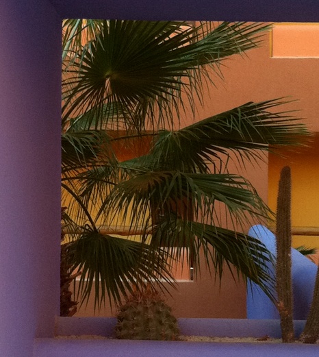
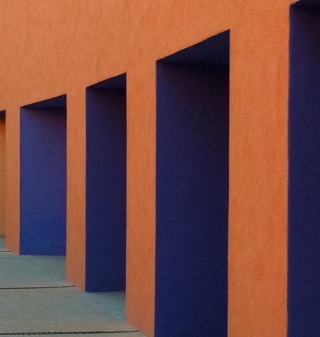
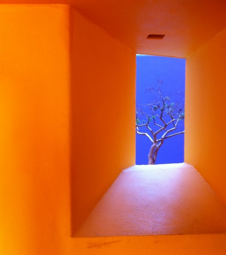
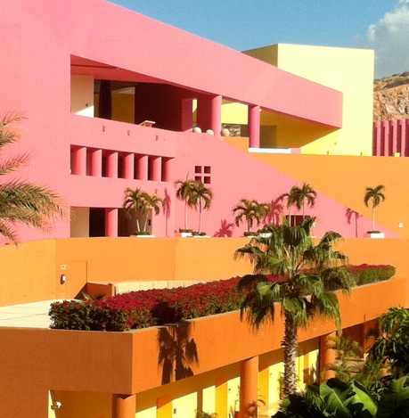
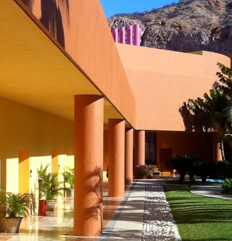
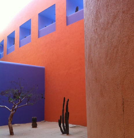
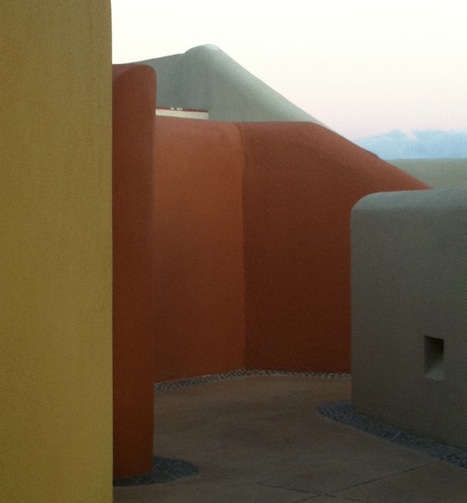
Famed architect, Javier Sordo Madeleno, created the lines, curves and colour of this resort and it is truly stunning.
Almost nine years ago when the brown trend arrived in Vancouver I watched as every one fell in love with it and started to decorate their entire homes in it. Because I was in the colour business, I was not impressed. In fact the only brown home decor items I bought at the time was a custom, velvet bedskirt and two shams. The shams are now gone and just the bedskirt remains, in the guest room.
Lately, as I drive by commercial buildings in Vancouver that lack any architectural detail, no moldings for example or casings around the windows and see that they have been painted a dull, dark and lifeless gray it makes me feel depressed.
In fact I have decided that I like the gray trend even less than the brown trend because at least brown is warm. As gray only lives in the company of colour, it is dead and lifeless on an exterior without any other colour–not even white woodwork to break it up. Residential is different as usually there is a lot more detail to paint something else other than gray.
Were you all in love? Re-tweeting and liking it on facebook? NO.
The posts that I write that are filled with beautiful and colourful photos are the ones you love (the numbers don’t lie). We can love a sophisticated gray room but only when there’s lots of white or cream or the addition of colour to bring it to life.
So here is my tip of the day. Painting an exterior dark gray will announce that, “This house/building was painted in 2015.” (Lighter grays are less trendy.) It’s why anyone that hires me for a consult gets that advice from me first. It’s the same with brown. If you drive by a brown exterior, you know it was pretty much painted prior to when the gray trend started.
Above photos by Maria Killam
These walls would not nearly as interesting to photograph if they were all the same greeny gray as the wall on the right.

Have a great week my lovelies!
xoxo Maria
Download my eBook, It’s All in the Undertones. If you have a computer, you can download my book!
If you would like your home to fill you with happiness every time you walk in, contact me.
To make sure the undertones in your home are right, get some large samples!
If you would like to learn to how choose the right colours for your home or for your clients, become a True Colour Expert.
Related posts:
The problem with an All Gray Room






Yes, yes , yes…. So glad you said you prefer brown to grey….. I find grey sad and uninspiring, while at least as you said, brown is warm,
These pics are fabulous and totally compliment the gorgeous landscape. Hope the interior/ hotel rooms are as lovely! … enjoy!
nice post and very nice sunny perfect color combinations…i like BM 145 Honeybell Benjamin Moore color…..
Have fun soaking up your vitamin D.
DF
🙂
Hi, Maria
You look like your having a lot of fun. Those color reminds me of Aruba, where I’m from, where it’s always sunny and colorful. I wish I was there, but instead i’m stuck in NYC with cold and grey weather.
The color and the architecture of the hotel reminds me of the Mexican architect Luis Barragan, where he also used color and lines to create interest. Maybe Javier Soldo Madeleno was influenced by Luis or apprenticed with him at some point.
Hmm. I get what you are saying about brown and gray in exterior choices. But I don’t think it can be a blanket statement about trend, etc. I think one has to consider the region they live in. Brown and gray are timeless in New England for example. I don’t think the same rules apply for color trends in exteriors like they do in interiors. Although I totally agree about gray commercial buildings! What’s up with making your exterior depressing? Especially a retailer? Just some thoughts. Have a great day Maria! Alwsys love thought provoking posts. 🙂
Great color combos -what pop!
Enjoy the soft warm breezes for those of us left behind in the Northern climes.
A very peppy post. Can tell you are on vacation! LOVE the hotel colors.
I think I agree with Carole above – in the east here gray and brown have been exterior design staples for years and I don’t see them going away. When visiting the west, I do see more colour and love it – but your west coast colours don’t translate as well back east.
The resort looks amazing – the use of colour is terrific. Have a great week soaking up the rays and the colour.
What a pretty place, enjoy your vacation !
Gorgeous photos – have fun soaking up the sun and the great visuals you are surrounded with.
Great photos. Enjoy your vacation! And I’m a little sad about the dissing of grey. And wonder if the grey and white mottled brick I chose for my home in 2002 (and still LOVE!) will mark it as 2015. It is a lighter gray, so maybe I’m safe.
Also (sorry to be so oppositional today), though I love the colors in the Los Cabos photos and have many similarly colored interior and exterior photos in my files, I have never lived anywhere or had any room to decorate where these schemes would fit in. Nor do I see many (any?) buildings these colors in NYC or Staten Island where I live. They look fabulous in your photos, but they have very particular applications.
In conclusion, I LOVE the colors. And I LOVE my grey. Am I schizophrenic?
Hi Beryl,
When I talk about the current ‘trendy’ neutral’ I am always speaking towards those that choose it for EVERYTHING in their home. I currently have pale gray walls because it’s a perfect backdrop to my sunflower yellow sofa but it would be dismal if it was a charcoal sofa as well, etc, etc.
And my overall ‘dissing’ of gray was towards commercial buildings with zero architectural detail. No one is inspired by stucco clad buildings in varying shades of gray.
Thanks for your comment so that I could clear this up with everyone!
Maria
Surrounded by beauty and color. You are in heaven! Enjoy every minute of it! Can’t believe you are blogging on vacation!
My entire condo is painted in BM Revere Pewter. It’s a warm brown-gray. I’m not a brown person, neither am I a gray person. This has the right amount of brown and gray. It seems to blend in every color scheme and light exposure.
Looks like a cheerful place to stay! Enjoy your vacation!
I see that Cabo got some rain over night! Now you’ll get to see the desert turn green – it’s an amazing sight because it happens so suddenly.
LUV the Cabo colors and glad to see u enjoying yourself. I luv gray but it is soooooo hard to find the perfect color. The undertones drive me nuts!
Wow, you look hot! Who can sit in that pose and look that good! I am so happy with your comments about gray. I totally agree! I would much prefer a beautiful, warm brown or a true beige! Rock on and have a great holiday!
The midwest is already grey and dreary, so thanks for the uplifting, colorful post. Your photos are always so terrific! What camera do you use?
Have a great week relaxing!
Maria, I’m happy for you, you work so hard and deserve a vacation in a warm, colorful place!!! – I’ve always been a brown person – I’m a Virgo, an earth sign. No trend will change that. However, I’m in the process of lightening up my home, but you couldn’t pay me to paint anything gray! I’m leaning toward warm vanilla and caramel colors since that’s what I find cozy and cheerful. They seem classic to me.
I think you need me sitting on the chaise beside you!
The colours are wonderful. Thanks for posting all the brilliant, sunshiney photos. I’m with you on grey. Don’t even like it in houses here where we have plenty of it outside. It sucks all the colour out and feels so cold. Blech.There’s enough grey here already, thanks very much 🙂
Maria, i am sooo there with you!! After spending a good portion of my adult life in so. FL we moved to North Carolina. Though I have learned to appreciate the rich gem & earth tones in these mountains, I will always miss the luscious Florida colors! They’re just so alive and, yes, happy…..
Do I detect a “secret” desire on your part to move to the tropics??? GO FOR IT.
Sympatheticly, Paula.
no offense, please maria, but your headline should be ITS, not IT’s.
I fully agree – gray needs a partner to make it look right. Personally, I love gray and always, always have. It partners well with so many colors, can be toned up or darkened depending on what you partner it with, so I find it terribly flexible. However, I’m a little bummed that everyone wants gray now, because in a few years when gray is “out” I think I’ll have to defend it in my own home!
Now those are some colors! So bright and happy! Love it!!
I agree about your thoughts on grey. Unless grey has some striking color next to it – such as fuschia, tangerine or aqua, it looks very cold and unappealing to me.
Well, I remain a gray fan but definitely not a cold gray with not color added. Since I live in Texas and it’s warmer here and with the building boom the last ten or fifteen years of old world homes in our area with nothing but browns and browns and more browns, I needed a breath of fresh air. So gray works for me to give me the coolness I need. But still, not without colors added for interest. But since you live in a colder climate, Maria, I would suspect that I would also not want to see the cold, lifeless grays in a cold climate as it would feel depressing like the warm browns feel smothering to me here in Texas.
Loving your travelog with all the color! It definitely makes a happy difference, n’est pa?
Maria, I LOVE these colors! I just love color..period. Your explanation of when to avoid grey on exterior buildings makes a lot of sense to me.
It’s great to see you having fun! I had a mental picture of you holed up in an office with blinky lights on your computer mesmerizing you.(Glad that ebook is finished!) LOL!
Love,
Donna
OMG. I need to go to that resort. I am going to add it to my List of Things to Do. Are those photos just burned in to your memory ? All the colors of handmade Mexican tile … but BIG.
Regardng grey : do you think you would like it or tolerate it more in a sunny location ?
I’m picturing the older residential neighborhoods in London. There is a lot of grey but there is also a lot of architectural detail and variation. Plus the doors are often a very bright color. I always liked the white houses better though.
Thank you for all the hard work you do on your blog.
~ Christgie