After I just posted that turquoise (not teal from the 80’s) is Pantone’s colour for 2010 I received my latest issue of House & Home Magazine and there on the cover was turquoise and yellow (Pantone’s colour for 2009).

Victoria Webster is the homeowner that had the vision for this colourful and fabulous house—the bright colours and eclectic furniture nods to early-20th century decorator Dorothy Draper and the current style-setter Kelly Wearstler’s revival of Hollywood Regency.

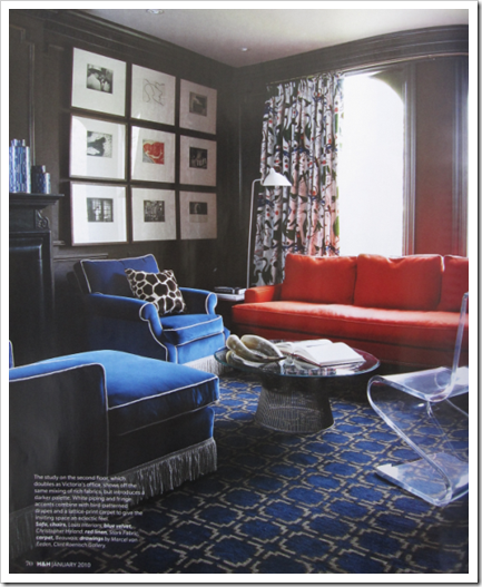
Here’s the entry with the stair runner from Paris and black lacquered wainscoting and molding.
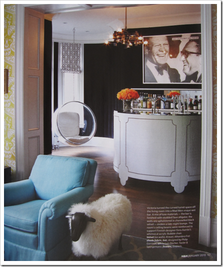
The bar is finished with studded faux alligator and the walls are upholstered in channeled black velvet. The ceiling beams were reinforced to support Finnish designer Ero Aarnio’s acrylic bubble chair.

I love the mandarin orange dining room walls. Did you know it takes 12 coats of paint and 2 coats of glaze to achieve this kind of sheen? Wow!
Here a similar orange is repeated in the sofa.
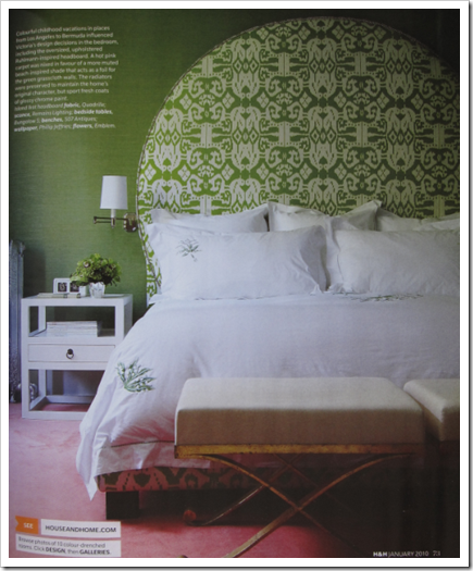
The hot pink carpet was nixed in favour of a more muted beach-inspired shade that acts as a foil for the green grasscloth walls. The radiators were preserved to maintain the home’s original character, but sport fresh coats of glossy chrome paint.
House & Home had a long list of ‘What’s Hot Now’ but here are the highlights:
Living Room
1. Striped rug
2. Painted plank flooring
3. Warm metal accents (brass is in again but it’s muted)
4. Velvet Upholstery
5. Oversized art
Bathroom
1. Freestanding tub
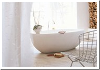
2. Concrete floors
Kitchen
1. Open shelving
2. Pump-style faucet
3. Lab inspired furniture
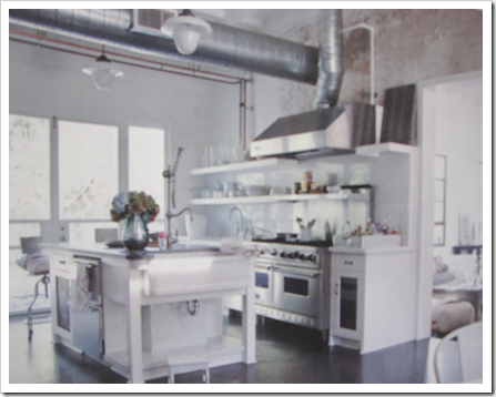 4. White Cabinetry
Bedroom
1. Four-poster bed
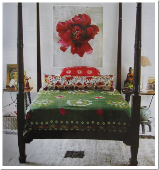
2. Saturated textiles
3. Embroidery
4. Curated collections
Which trends will you be embracing?
If you would like to transform the way you see colour, become a True Colour Expert.
Related posts:
Danger Zone: The First 24 Hours After you take Possession of your New Home
Signature Look or your Clients Look? Which one Works the Best?
5 Steps to a Kitchen you will Love
While you’re here, subscribe to this feed so you don’t miss out!


That place above is stunning! OH…
And I always have to smile about the trend news…kinda funny… I know, it serious to many! But I try not to be too influenced by all that.
It gets to us anyway by colors and patterns and styles showing up in trendy stores. Seems to me certain trends are coming back faster and faster!
I am still recovering from the Eighties…
MY personal trend forecast:
Neo-Victorian!
PS: Love that four poster bed, I just posted on it, its from Kathryn Ireland. So gypsy!
XX
V.
I am starting with oversized art but totally agree with rest of your list.
.. and that place is amazing.
X
V
well we have the oversize art and open shelving(in the kitchen)but I must admit the rest of the trends do not thrill me…do not like white kitchens at all (for me) we had a four poster bed that we gave to my daughter last year, we were over it…to many hip bruises lol
I think a lot of those trends have been around for a few years, haven't they? I try not to be trendy in my home, because what's trendy will ultimately become untrendy… I do love H.Regency though!! And I love the house that was featured too! Too rich colors for my liking (I tend to lean towards a Scandinavian interpretation of Hollywood Regency with lighter color schemes), but definitely eye candy!
I do have a striped rug, velvet uphiolstery, oversized art, freestanding tub and white cabinetry (which is horrid though)… Sounds like a trend junkie, huh??
As a designer, I embrace all styles and this style really appeals to my young 20 something clients who have design funds and must live in trend land. They don't want to be attached to things so trends work for them as a form of detached living. Lots of color and styles mixed together creating a design fusion.
There's great design out there for everyone's taste and what we can't find we create! That's what so great about interior design getting to know different types of design styles through clients, so fun.
The only thing constant is change change change and common sense of course! Fun post of course!
Bette
I must admit that big 'ol round headboard made me smile !
I tend to gravitate to vintage/antique pieces. They never go out of style. If I do something trendy it's with accesories. I like the mix of old & new. Plus when the trend is over, it's not a big investment to replace it.
Love the big green headboard. The side-lamps look a little small next to it.
Love the gray sofa and round headboard, very dramatic. But what's with all of the Lalanne sheep popping up everywhere? I'm not sure I dig those, but everything else looks fun.
I love all the photos – gorgeous! I am completely embracing the turquoise in 2010 – I also love painted plank flooring, concrete floors and free standing tubs. And – you can never go wrong with white cabinetry – it's always gorgeous!
I am drwan to a curated collection approach. I believe that the things you have and display in your home should tell a story about you and your history. I think that curated collections have more soul than pretty knick knacks you just picked out at your local stores.
I am alsow drawn to large art. I either choose a single piece of large art for a space or I hang multiple pieces together so they give a unified impression of a single, large art installation. These multiple pieces usually relate to each other around a theme. It can be the subject matter, the technique, a color, etc.
I inherited white cabinets in my kitchen but I probably would have chosen them anyway.
Oversize art for sure. Colorful textiles, maybe a striped rug for the living room!
oh no!!! i feel like my house is trendy now!!! 🙁 hahahahah
but i love this home you showed… she even looks perfect in it!!!
xoxoxo
Maria,
Sorry for my lack of comments on your blog! But for me it is busy this time of the year! But you know that I love your blog and your interesting posts!
This post iw again stunning! I love that orange coloured dining room! And I was reading the trends you summed here with cincentration! Thank you for sharing these ! Maybe we will notice the trends in the blogs next year!
A big hug,
Greet
Oh I will embrace velvet upholstery and drapes and embroidery definitely.
I love this house, why didnt I get my copy of H&H yet? I dont even know the trends yet 🙂 Ashley got hers last Friday and everyday I check the mail… maybe tomorrow.
If I had a big grand house… I wonder…
Thanks so much for the inspiration. Turquoise is a fav of mine always…I also love just even saying the word torquoise and how the word just rolls off your tongue. When my son took French immersion he pronounced it and still does so it sounds even more special. Something like Tur-kwaas.
Susan
I definitely love the trends of a free standing tub, painted floor planks and over sized art. Thank you for this post.
http://girlwhimsy.blogspot.com
I love this post for several reasons:
1. you mention Dorothy Draper, who I love as well as Carleton Varney who took her firm over..LOVE THEM!!!
2. Those colors are just great! Turquoise is fantastic. And that clean birght yellow is a great color to pair with lots of others, I think!
3. I love seeing bright usage of color and texture- fresh, young, revamped retro looks! I would rather end up a little over the top, than BORING with my decorating- any day of the week! If I hate something after a little while…just repaint, and change it up again! I do not want to play it SAFE! Risks are fun!
Great post!
Scrumptious, whimsical and brilliant colours but when all is said and done the thing that will stay with me is the sheep.
You take care.
I just met with my decorator, and we had discussed pitting that color orange on the back of the shelves in 2 different bookcases. Do you know if it always takes such a high number of coats to make it pop like that? What's your experience?
First the good; I like the idea of white washed or painted plank floors, and also warm metals.
But for me personally, the rest of the trends are dissapointing, and as some have pointed out, not exactly new ideas. I don't think you mentioned H&H trying to push the wallpaper on the ceiling trend. I think this is a little silly as well. And the Victoria Webster's room, while daring, seems to be too full of trends that looking back on it in a couple of years, I think it will look dated and forced. Just my two cents worth.
Hi Photographer,
There is a depth to that kind of look that can only be achieved through multiple coats. As long as you know that's what it might potentially take, you can have the patience to start. Since you are doing it on bookshelves it may not be as noticeable (with multiple layers) as it might be on a wall so it might take less before you are happy with the effect!
Show us photos when it's done, sounds amazing!
Maria
Wow, someone just sent me to this site and I am so flattered to be up here – never knew there were so many people as obsessed with colour as I am – more used to being told I am crazy for my choices!
I was wary they were using our place for a 'trends' issue as I consider our home more 70s than trendy. Plus we have had it for a couple of years now. But it is Happy and more than anything reflects the personalities of its occupants.
As for the book case, the 12 coats of paint for lacquer is mostly so that the walls can be hand sanded in between each coat (lucky painters!) to get the walls really smooth. If you don't want a 'wet look' a couple coats would be fine, or you could talk to your painter about putting a coat of varnish on top, that is a cheaper alternative – Lynda Reeves did that in her first apartment actually. The colour is Benjamin Moore's Electric Orange btw.
Thanks again for all the nice comments, you made my snowy day!
I loooooove this house!!! Thank you so much for featuring it. You've inspired me to buy subscriptions to Canada's Style at Home and Canadian House and Home. I can't find them on the newsstands here in Charlotte, but now I'll get them in my mailbox. Yippee!!
You had me at the black wainscoting! Beautiful Canadian style once again! Hope you are well and enjoying the holidays!
xo Lisa