As a new decorator, many years ago, a client once asked if I could find two chairs that would work with the twenty year old ancient, lumpy, gray leather sofa (sitting in their rarely used living room).
Back then I said YES.
Today, I would say no. It doesn’t matter that you have rarely sat on that sofa from the 70’s or 80’s. It’s dated (this is a general statement, obviously there are classics from every era, I’m not saying it all needs to go, but I’m trying to make a point here 🙂 and unless I find some chairs from that era, your new chairs will look like today and that sofa will still look like yesterday.
When a client informs me that they would like to keep their white lacquered kitchen [from the 80’s) with black granite countertops (with rounded edges—from the 80’s), rip out the 12 x 12 gray tile flooring and install brown hardwood with a black and brown mosaic backsplash? My job is to paint the picture —in advance—before they do all of this and hate the kitchen. Why? Because adding brown to this mix will not hide your cabinets. You will still have an 80’s kitchen.
I was once in a clients home [for a colour consultation] who had a navy blue sofa, a black area rug with coloured squares in burgandy, gray-green, butterscotch and blue greens. She told me she wanted to paint her walls brown and also asked my opinion about adding a chocolate brown ottoman to the mix as well.
I said not a good idea.
Why? Because she wasn’t changing anything else in the room. The carpet was new and already had 5 colours in it that did not relate to the navy blue sofa. Introducing brown at this point would have added a 7th colour to the room that did not relate to anything existing in the space.
So, unless the client was willing to change something, the wall colour needed to relate to a colour already in the space for the colour to do what it’s supposed to do, which is; pull the space together.
Just this week I was hired by a kitchen cabinet manufacturer to style some kitchens to be photographed for their new website (photos coming soon). They showed me images of five kitchens they wanted to shoot.
One of them had stark white cabinets (they should have been cream, see my post on selecting whites here) with brown granite countertops and a brown subway tile backsplash. I said “that one already looks 90’s so I wouldn’t shoot it”. Luckily I had a smart client, he went along with my advice.
During the shoot, my client suggested an angle that would have included dining room furniture that was dated. Again, I advised him not to do it. I know I immediately flip the page every time I see an advertisement selling hardwood flooring or carpeting, with poorly styled or dated furniture so I’m sure other people do as well. That [poor styling] immediately makes the image look like it’s from an old magazine.
Just before you think I’m one of ‘those designers’ that has to start with everything new. On the contrary; what I am saying is, instead of installing a mosaic backsplash into your older kitchen, use simple subway tile instead (for example). Still an updated and fresh look but something that will not draw as much attention as a ‘bling bling’ backsplash that belongs in a newer kitchen.
So before you introduce the newest, trendiest colour or tile somewhere in your house, make sure it works with your existing space. The best homes are not trendy at all, but look like they have been lovingly collected over time into a space that speaks to you, your family and your lifestyle.
To get your colours right, download my eBook, It’s All in the Undertones.
If you would like your home to fill you with happiness every time you walk in, contact me.
To make sure the undertones in your home are right, get some large samples!
If you would like to learn to how choose the right colours for your home or for your clients, become a True Colour Expert.
Related posts:
Hiring a Designer; Luxury or Necessity
Bobbie Burgers; In Full Bloom inside House & Home Magazine
Warning; You are the Colours in your Home
Three ways to beat the High Cost of buying the Wrong Paint Colour













As a home owner if you know what to do, do it yourself, when in doubt call a professional,tell them what you want and follow their advice. Money well spent.
As a designer, listen to your clients and help them to clear the path to mistakes. Money well earned. Great post, Maria!
Great post!! I totally agree about the best homes having a collection of things thru the years.
bottom line: if you hire an expert in something, listen to their expertise. be open and coachable. otherwise it’s a waste of everyone’s time and money.
i twice fired clients because they had no ability to understand that.
Great words of advice and so true. I'm new to the field, but this already ringing true. I have a new client that wants to re-do her great room for a younger, fresher look. Well she doesn't want to get of the carpet, curtains, artwork. Ummm hello…I can help you update it, but with the colors she going on in those main items it's not really going to make a difference and she says that she hates the room as it is now! Ah.
Thanks for the great post. I swear I need to print out all your posts and keep them as a design bible in my office.
Can't stop telling you that I love the new header!
As a designer you're teaching people/clients how to "listen" with their eyes, "hear" your voice and act with their trust. We will not steer them wrong. We want for them what they can't yet "see".
Great points Maria!
Bette
Great words of wisdom. My favorite response to a client is…"Hmmm, I think we can do better."
great advice. your clients are very lucky to have you there to steer them in the right direction. after all, your instincts and experience are great and that is why they trust you!
Maria, you know that subject gets me going, don't you?
🙂 Well, I am working as we speak and the changes made to the plans by the clients without my input made me cringe.
They are not willing to trust enough for all kinds of reasons, but I feel in this case (they are in their
8o's) I'll do my best under the circumstances. They are happy with their decisions, well, I am ok with that.
I will think about the implications
of trust…and walk away another time.
So true, I just this evening spent over a 1/2 a hour trying to get my client to listen to why she had to have black tables…there are already 5 stains in the room…1 more than the day I saw her last week, I had a great idea worked out for her fireplace mess and she did a new stain color before I had time to see her, I could have screamed!…Now there are 3 different red stains (one is the floor!, 1 blond stain and 1 walnut stain…if you are going to get someone to help you… Listen to the advise or do not ask us to spend hours working out what to do and then don't listen….sorry I am so pissed this past week and this evening was a waste of my time…I'm not bitter, ok not much!!! OK I feel better. thanks for listening to this meltdown…Linda helped me with Tuesdays meltdown…it has been the week from hell, I think I will print out this blog and post it at work on the coffee tables….just kidding but I would love to!
Your blog is so great…Maria
xxCarol Ann
so true. clients are dumb. this is another brilliant post from you!! thanks for liking the pic of my guy and me. oh i am almost done with my guest post!! i just need to add pics and some sass and i'm done.
I always pre-empt it with "you are paying me for my professional advice…so what I really think is…" most appreciate the honesty.
See you tomorrow!
This is so true, Maria.
We are not doing any of our clients a favor by just going along with what they think they want. In the end, neither the client nor the designer are going to be happy with the result.
Great post!
xo
Brooke
A wonderful post, Maria – I always enjoy hearing how you handle difficult situations with such tact!
I'm going to take issue with the "clients are dumb" comment that was posted above. That's an absurd overgeneralization, not to mention, just plain rude. Although some clients may be "inexperienced" when it comes to redecorating, that's a far cry from "dumb".
It's funny how certain looks become dated so quickly. Kitchens seem to go out of date faster than many things. In Dallas, during our condo building boom several years ago, everyone put in granite counter tops and stainless steel appliances. It sort of defined the look of that period of boom building. Now everyone is sick of it because it's everywhere.
you have no idea !! How refreshing is that post. the "NO" make you feel guilty all the time! ..I work in the Arab world the most weird-deco-environment-ever-invented-by-humans. Plus the most-weird-dealing-with-others-attitudes-issues. The non-losing-face-thing, is one of the biggest obstacle for any normal western professional person. So we end up saying YES for everything and everybody's happy ! now the standard of what is beautiful and tasteful is non a nonsense.
We better do the right thing instead of doing things right.
I discover that pretty late .
Great advice Maria. I have to admit, I really do have a tough time with telling clients "no" but I am getting better with it— and also saying "no" to certain jobs in general when the gut talks to me… but I could still be firmer.
Need to get some more confidence!!!
thanks for the advice!
xoxo,
lauren
Here is my take on the subject:
To me 'The Key to any successful relationship' is: listening, consideration & compromise. When applied in the world of business, it has been my experience, this formula often distinguishes the Professional from the Novice.
Great post Maria! You made some very valid points. -Brenda-
Wonderful post! I hired a designer once to help me update my living room, and (knowing me) I pretty much had chosen everything and wanted a second opinion. She was so agreeable about everything – and she did make some excellent suggestions – but she should have told me to go ahead and replace my dated 80s sofa (it might even be a 70s sofa), because even recovered with a nice fabric, it is outdated. The coffee table I liked, and she agreed to – is too big scale for the room – I asked her if it was too big, and she said no – but it is! Next time I hire a designer I am going to state from the very beginning that I do not have an eye for scale and I would like the designer to be the ultimate authority on decisions.
By the way, I found your kitchen examples to be interesting. You have said in past posts that the cabinets tell the date of the kitchens more than anything. What defines a kitchen of the 00s? I would have thought white cabinets and a honed black granite countertop would not look dated (I have seen lots of kitchens like this – including the ever so famous Something's Gotta Give kitchen) – but you did say white laquer, which might be a different thing entirely.
Informed honesty is what clients need (speaking from the client side of things).
My favorite line: “No, I would not do that and here’s the reason why. . .”
Thanks for a great post.
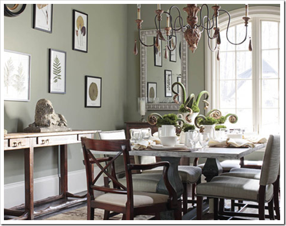
Good words Girl! I want that chandelier in the last photo!
Have fun at your dinner to night and your gardens are lovely!
Blessings…
I love Angela's suggestion of "I think we can do better". What a wonderful way to steer a client towards your ideas, without necessarily bashing them over the head with the unfortunate aspects of their own plans.
As a would-be client (no, I haven't got the money so maybe you won't care about my views anyway), can I just mention to some who commented above that sentiments like "clients are dumb" and "I had to fire clients…" are probably not the most helpful path towards a cohesive partnership?
We, your potential clients, read these blogs too, and although we may not be able to see the big picture and end result, we're the ones writing the check and living with the results. Not everyone has the awesome talents of the design crowd, and the process of spending huge amounts of cash on something we have to live with for the next 10 years is enough to make us seriously afraid. I mean that – it's really scary! I would suggest, your task is to help us see the strength of your suggestions, not sneer at our taste.
Maria, thanks, very thought-provoking post.
I would be classified as a 'dumb' client . . . I can't buy anything without calling you first. It's sad. I have no problem admitting I love paisly and know that it's wrong wrong wrong. Because of you I can look like I have really good taste.
Dear Things that Inspire,
There is a particular 'white flat lacquered' contemporary designed cabinet that was a big 90's look (it is very dated looking now) in addition to a raised panel with rounded corners cabinet door as well that is old.
The look of 00 for the first 3-4 years before brown trend hit big time was an orangy/ginger coloured shaker style cabinet that I saw in consultations over and over again, and then everything turned brown.
Clients are definitely not dumb. Designers (like me) are so happy to be doing what we love to do in someone's house I don't ever walk around thinking that.
However, I still stand by a comment left on one of my prior posts. 'Hire a professional for everything you can't do professionally yourself.'
Such a great post. Thanks!
Great post! I think that the most interesting part of working on a home is working with the people who are going to (or already do) live there. I value the lessons I learn (sometimes the hard way) about people through designing for them. I would love to have a better handle on how to work with clients and really listen to what they want and many times be able to read between the lines of what they say they want and what they really want. This post really addresses that and shows how well you have mastered that great talent. Your the best!
Waah. You have so much wisdom, and color is so important to me….I want you to come do MY house in Montana.
This was a great post.
Even I, inexperienced though I am, could tell that 7-color living room w/blue sofa was not going to work.
Great post. It rang true on so many levels. In my opinion the client/professional relationship is based on trust. Trust that the professional will understand you, your needs and create a wonderful space that is designed for the individual you/family.
It sometimes takes awhile to get used to being firm and guiding the client without offending them in what they have or think would work. Once this relationship is understood, it's usually smooth sailing and no "firing" has to happen.
I totally agree with you.
The expertise and experience of interior designers, and their imagination, are somewhere up there compared to an amateur home owner whose wish list is based on what he has seen. And what he covets. Which can be disastrous when mixed and matched into a room or a home for that matter.
I am speaking from experience, too. Ha Ha.
Very interesting topic to discuss. Mostly it's a budget problem – either you have money for changing the cabinets to 2009 look or you'll have to choose the color appropriate for the old cabinets 🙂
Thank you, thank you, thank you!
As the owner of a new design firm, that whole post will be posted in our office!
Sakinah
http://www.sajinteriors.blogspot.com
So, so, true! Sometimes if it's that much of a struggle, it's better to look at it in a new way. I hate it when I get wed to one and only way when changing things up would be more successful.