When the cabinet manufacturer saw the photos from this kitchen I styled, they hired me to style all the kitchens (and some built-ins) for their new website. They were interested in the high end look of this kitchen website which they emailed me to review.
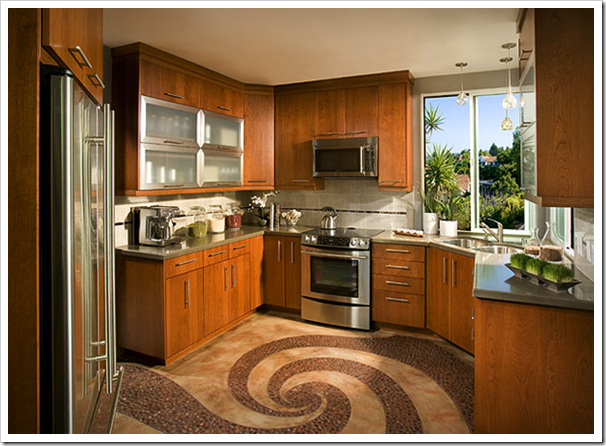
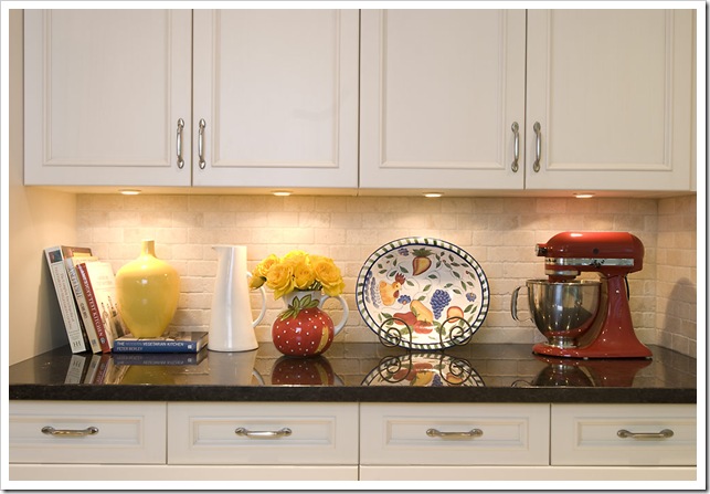
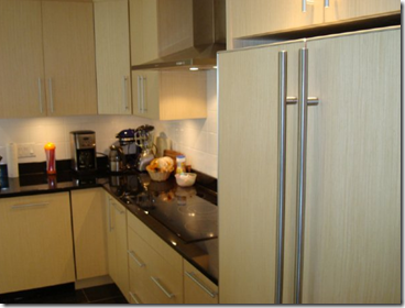
My first stop for most of the accessories I needed was Fluff. They have a warehouse full of everything you need (furniture, lighting, accessories) to stage any space. There I picked everything I thought was appropriate based on the photos I had been sent (which is all I had to go by as it was a last minute decision for the client). The first kitchen had cream cabinets and the only colour inspiration in the space was the red Kitchenaid mixer (below):


 Fluff Rentals
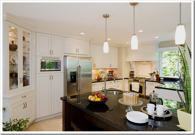
When I chose the items I needed for this kitchen, the photos did not include the china cabinet you see now on the left (above). When the first images were downloaded into the photographers computer I realized the left side of the kitchen looked like it was floating because there was so much dark on the bottom right of the photograph; so I ran around this clients home to find every red urn and accessory she had and luckily, she had more, so we were able to visually pull the cabinet into the photo and create balance.
 Styled by Maria Killam
2. Pick a theme for the food; ie. breakfast, wine & cheese, coffee.
Remember how I’ve said in the past that it’s hard to style a kitchen so it doesn’t look contrived? In this kitchen I chose a coffee and cake theme but, I have seen everything from carrots to wine and cheese and coffee all on the same island because whoever was styling it was thinking only of colour instead of choosing a theme; very important!
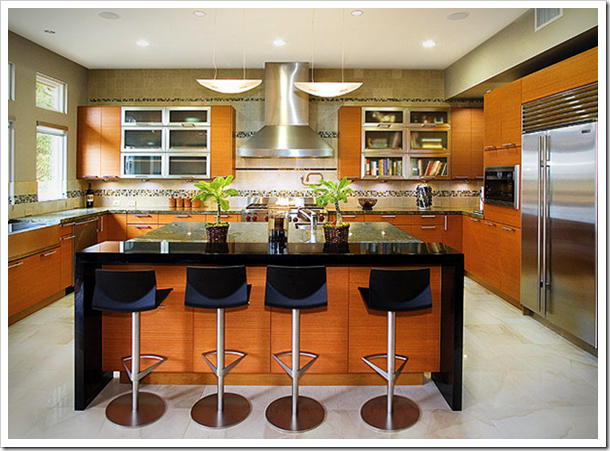
The next kitchen was contemporary and I didn’t have any colour inspiration (from the photos besides the cabinet) so I selected a wine & cheese theme and brought in white dishes and a branch for a splash of green and drama:
 Before

 Before
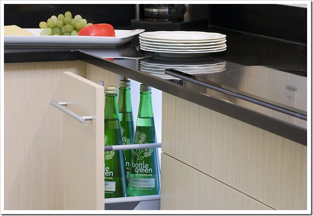

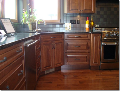
The next kitchen we styled was quite dark so I chose an orange and yellow colour scheme to add some colour and pop!
 Before
See the pendant lights in the kitchen (above) when I chose the yellow and orange colour scheme I didn’t consciously pick it based on the colour, it was only when I saw the finished images that I noticed that the colours I chose matched the lights. Whew, I love it when that happens 🙂
I don’t have the full kitchen shot here so I’ll just show the one you already saw in yesterday’s post but here you have the before photos (above) anyway:
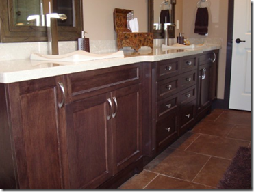
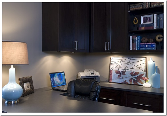
In this home they had installed cabinets in the office and bathrooms as well, so here are the before and after’s:
 Before
 Fluff
Fluff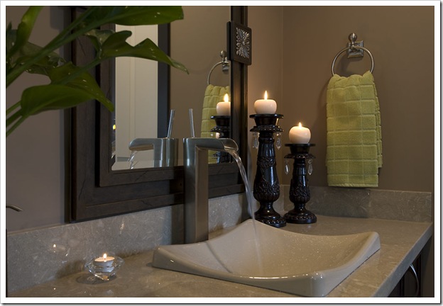 Styled by Maria Killam
 Before
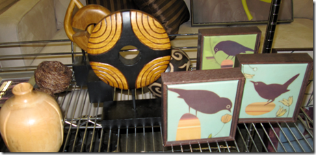
 Styled by Maria Killam
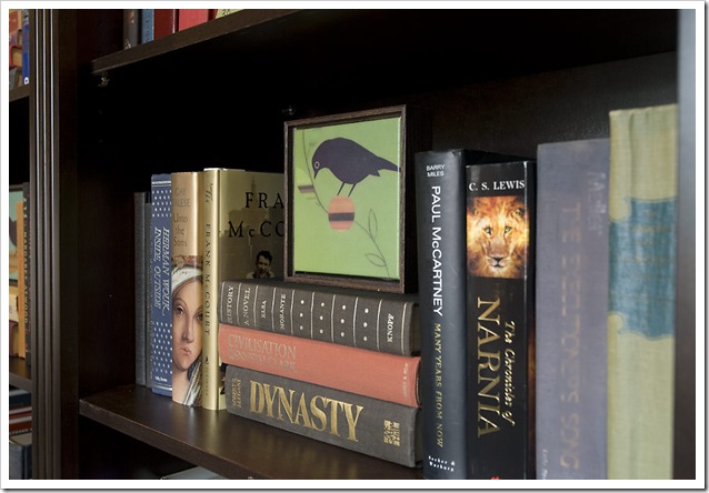 Styled by Maria Killam
 Before

Styling Kitchens
Styling for Photo Shoots
Staging: Two Day Transformation
White Kitchen Cabinets


I love it. I understand the need to stage a presentation for the customer…the photography, the buyer, etc. And, color coordinated libraries are lovely…and entirely useless for a bibliophile! I suspect I will do the same when my time comes to sell the house, but until then, alphabetical within subject for me!
Wish you had been in my kitchen to day! My house was being photographed for a design /shelter magazine and i had styled most rooms and gardens…except…the kitchen. it looked so bare and ignored. It could have used your loving touch.
oh! That was fun! Disneyworld kinda fun! I want to be you when I grow up… Loved it!
Thanks for the tutorial. I learned so much! Many of your ideas will definitely be incorporated into my home.
Jane (Artfully Graced)
wow that fluff place looks awesome. I dont think we have a place like that here. You did an awesome job with the kitchens.
Dear rj,
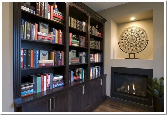
You are absolutely right! The client immediately (so nice of her to do it for me) put the bookshelf back to the way it was after we were finished!
Only good for show!
Maria
Haha … My first thought on the bookshelf before reading your caption was “I wish this was color coordinated so it looks less cluttery” 🙂
Beautiful work, Maria! I especially love the bookcase restyling. Just a bit of rearrangement and what a difference it makes!
Fantastic post. What a great tutorial. I wonder if we have something like Fluff over here, might have to do a little investigating.
I was happy to see a book by Frank McCourt there in the photo. Fabulous author, he just died and it's a loss to the world.
If I ever write a book, I'll get you to pick out the jacket cover so that it will coordinate with the latest interior design trends 🙂
Thanks Maria, for another fabulous post. I'm a bit of a visual girl and tend to read my blogs by the photos but I read every last word and was absolutely fascinated. You make it sound so easy but I know it's not. I'll be filing this post away for future reference.
when i move into my dream home and finally have my “dream library”, i’ll have you come and make it look pretty like this! with all the beautiful design books i have… i know it’ll be fun!
(and as long as my design books are together, and my business books together, and so on… i really don’t care about the alphabetical order! i can find any book any time!)
Wow, I love learning how you tackle these jobs and your thinking process while its actually going on. I love your insight. Great post!
it's al about the fluff!
So glad the bookcase (my favorite part) was allowed to be organic rather than color blocked. As it is, it is a usable work of art.
Great Post, Maria!
One thing I can't believe is that the client didn't want to keep the bookcase the way you designed it. Oh what a bad move, I loved what you did to it. Wonderful!
Joy
Greetings, Maria. I am a newbie to your blog and somewhat new to blogging (about 2 months). I was responding in kind to a comment left to me by Annie of get-me-outta-here. She mentioned you and here I am. I have enjoyed my visit here very much and have added you to my blogroll so that I can follow your posts.
Tina
wow, i never knew how much went into creating beautiful interior shots. Thanks for the glimpse into this seldom-showcased world, and for sharing with us your process. Completely intriguing.
Okay now you have hit a new realm of teaching! Wow. You make it seem so logical and simple. I have the confidence to try it myself!
Terreeia
Love the lemon & orange juice vignette! Great ideas on decor settings!
Maria,
As a designer I know how important "staging" is…But when I became an Editor of a design magazine. I realized – how little I knew when you are viewing through the lens of a camera. Nice reminder to us all & great job!
Ahhh… the magic of styling. Thank you for this post! As an interior designer with set decorating/photo styling experience it is often difficult to get clients to BELIEVE me when I tell then how important it is to tend to the details. On my luckiest jobs, I am hired to do the styling in addition to the design. But, I can't tell you how many times I've been in a nicely designed space that just looks unfinished because it hasn't been properly styled. Magazine photos don't style themselves! Thanks for shedding some light.
Great work and tips here, thank you.
Lovely work Maria and great information. Great tips and a reminder of how important the "after" shots are. I would love to have a store like Fluff available!
A store like Fluff? I'd like to BE Fluff! How great would THAT be? I've been getting ready to redo my kitchen (currently early 50s) and I'm convinced the color for cabinets is white, white, white!
Also, I borrowed a picture from your blog and posted it on MY blog as a link in my "favorite blog" section. Is that ok with you?
Thanks!
~jane ~
Yet another super-informative post!! I love how you displayed the books on the bookshelves both horizontally and vertically. I REALLY need to re-do my bookcase!!
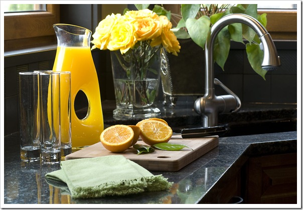
You really put a lot of thought into every little detail in all the kitchens that you styled. And Anna is a great photographer — I love her idea to put the light in the drawer with the bottles. That's a great shot!!
Kelly
Once again a great post with lots of info and valuable tips. You've done a great job.
marcie
looks beautiful!! so important to "stage" for one event- great thinking!!! you make it all easy.
great one.
xoxo
Maria,
That was great. For those of us who design it's a great refresher course. For those to don't realize "How'd she do that" is a great lesson in how-to-do. Always fun stuff!
Bette
Hi! I'm new to blogging and have just "discovered" you! I have to say that it's a bit of fate that you would be talking kitchens!! I love all of the white kitchens that are around today. I'm redoing my kitchen and living way down on the border with Mexico, houses are Spanish/Mediterranean. Stucco and tile. The interiors feel very spanish with reds,golds, and greens. A white kitchen would just look terrible. I'm at a loss, what do those of us with these types of homes do?? I'm not asking for specific design advice really, just frustrated with trying to do a kitchen that doesn't look dated, but doesn't look glaringly out of place!!
Anyway, I love your blog, I've actually read nearly all of it now! 🙂
I'll be back!
Dear Sedona,
How about cabinets in a yellowy creamy colour! Then you still have the timeless feel of 'white' cabinets! I agree stark white in that style would be very bad!!
Thanks for your comment!
Maria
The light in the drawer was a great idea, really successful! (those elderberry drinks are yummy too…)
And I loved the office staging too.
Thanks for letting us know about Fluff, I didn't even know they existed.
I'm a little late on the commenting . . . I have noticed the crappy unmatching food in styled kitchens. Thank you for noticing and keeping the theme together. The ladyfinger cake looks delicious.
Maria… I just read an old post of yours about the effect of natural light on colour. So… does that mean that if a room (hypothetically – uh huh… yeah… right… hypothetically) has a northeast exposure, that yellow is not a good colour for that room?
So much to read – so few hours in the day.
~jane~
Dear Thunder-Moon,
It means you can't go with a pale yellow, or something that looks like creamy beige, that's what tends to go green, it must be something like BM Dijon!
Maria
Maria, I was just reading your white kitchen post and you showed a picture of a kitchen you show painted with Benjamin Moore's OC-92 Mannequin Cream, is this what you wer thinking? I like the creamy color, maybe with a dark glaze rubbed in the crevices? Thanks for commenting on my blog! My new cameras on the way, so I'll be posting lots of pictures soon. Also, I emailed you about cost for advice on outside paint colors for our house in Houston. Not sure if you've recieved it? Thanks so much!
Fantastic post, thanks so much for sharing all Maria! The cabinetry looks wonderful and it is clearly the star of every shot. You have a wonderful sense of color and proportion, I imagine your client was thrilled!
Boy, you are good! What a great job you did. love the green bathroom – loved the running water!!!!
Just a super fantastic job Maria, I have also noticed, as Joni did,the water running…nice touch. Great staging and great images.
Really a wonderful post – great tips – love the backlighting on the open drawer. Of course your eye, is fantastic for all themes and colours
v
Wow, I kind of stumbled onto your blog, and I love it! You do such a wonderful job, and I've often wondered how staged homes and photos look so great. It was really great to see the step-by-step brought to life by an expert! Thanks so much for sharing!
These are fabulous! I especially love how you did the bookcase…this was truly inspired. I'm 99.9% sure those bird pieces are the work of Amy Ruppel, and artist I greatly admire:
http://www.amyruppel.com/
Maria, This a phenomenal post! I'm trying to get an idea of how decorating really is done and this went miles towards helping me understand the principles involved.
I also had a long talk with my friend, Laurie, who (the one who didn't get the idea of A-Z filing, but is an amazing decorator. She's the only person I actually know nearby who can help…and she 'owes' me on all the sewing I do for her. :o)
I had this sense that one of my biggest mistakes is too many little things versus a few big things. Between that, and the whole house being unified either in theme or color scheme, I really have a lot to work on.
I am spending the whole evening…just reading your older posts and trying to pick up some of the barebones 'principles' involved in decorating.
Thanks for this super post!
Hi Maria..I feel so funny coming back and leaving yet another comment..but I sure do love this post! I need to feature this one! I've finally gotten the livingroom completely re-done with our new look and the new carpet and some antique rustic lamps..lots of brown, cream and navy. This will be a great post to show what inspired me! This the best how to I've seen so far on your blog..such great before and after photos.
OMG that is great! I love your work! Guess I am not as up-to-date as your usual subscribers! I swear I have fallen in love with your blog… Breathtaking writing! You're an outstanding and talented person, keep up the individuality 🙂