This client spent months knowing there was something wrong with the colour in her kitchen/great room, and as soon as I pointed it out, she saw it and now she is happy.
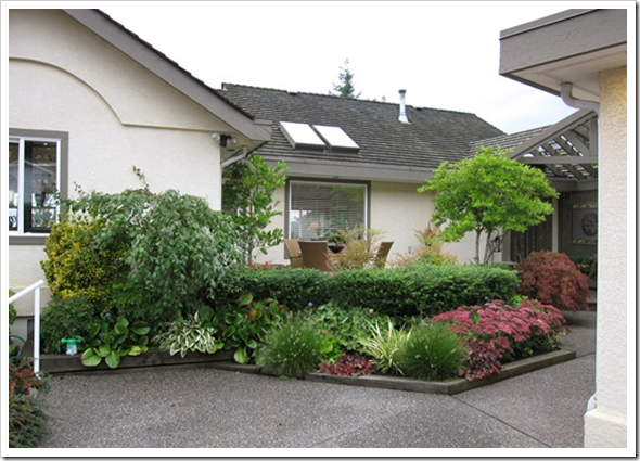
And I want everyone to walk into their home and be filled with happiness because you KNOW that your colour is right. This is the entry [above] to her home with the fall colours of her landscaping!
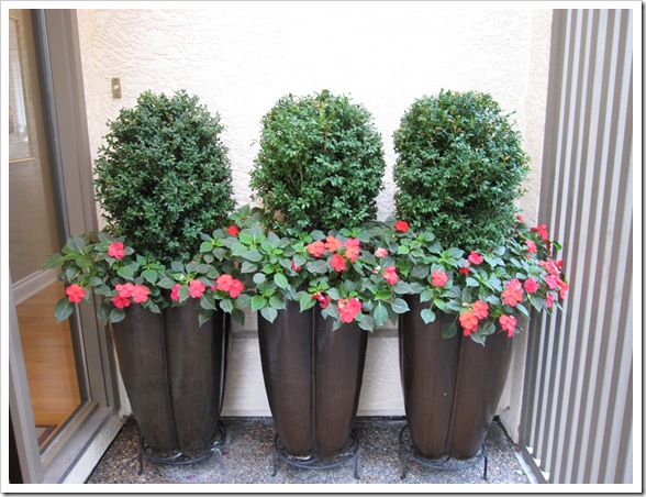
This house is in West Vancouver and has the most stunning view, I wish I could have shown it to you. Here are her gorgeous flower pots right outside the front door!
We started the consult in the actual living room–as is usually the case. This is generally the room that sets the tone and the flow for the entire house, we usually spend the most time here because sometimes accent colours need to be chosen and many times (certainly if the room is empty) we need to do some space planning. Can’t buy furniture until you know which pieces and where to put it.
Some people go for years without living room furniture because they don’t want to make a mistake. And what do people do when they don’t know and don’t want to make a mistake? Same as me, nothing.
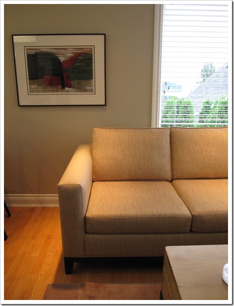
Anyways, this living room did not require my help, I loved the way the toss cushions tied in the artwork! The entire house was painted Bleeker Beige HC-80. She was re-painting a few rooms so I was there to make sure that if we were leaving this colour anywhere it’s because it was the right one.
After running through a few options, it became clear that she did have the right colour in her living room, entry, and hallways. This photo [above] was taken by my client towards the end of the day so it’s darker in the room, but you can still see that the colour works nicely with her sofa in addition to the fact that her fireplace tile was also a greeny beige which tied in with the colour there as well.
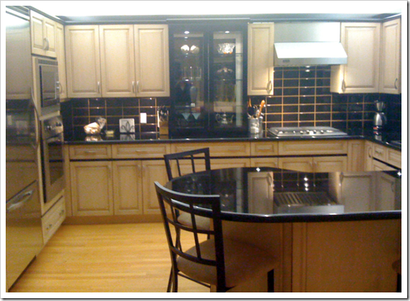
Here is her kitchen. This was also taken at night so it’s [the colour] not as obvious as it would have been otherwise (when I was there during the day there was work being done nearby so the counters were dusty, etc).
Here is the great room attached to the kitchen. My client had bought this beautiful sectional, and the fabric which was a tweed; close up looked yellowy brown but overall the read of the fabric dictated that the wall colour have a pink [red] undertone. You can easily see in the above photo that the beige on the walls (still the Bleeker Beige) was too green. The solution?
On the screen it certainly doesn’t look right and I wish I had a photo of the large sample sitting on the sofa but you’ll have to trust me that it was perfect. And such a happy coincidence that this same colour tied in with the kitchen cabinets.
That’s how I chose the correct undertone, by placing one large sample after another on top of the sofa until we arrived at the one that worked with both the sofa and the kitchen cabinets.
Currently, the green undertone simply made the cabinets look pinker than they needed to. Red and green are complementary colours so green next to pink makes it look even pinker.
Pink beige is not always bad by the way (anyone reading this blog knows it’s not my favourite colour) mocha colours are warm and a lot of people love them. It’s all context with colour and in this house, it was the perfect colour to tie everything together.
Related posts:
What Everyone should know About Beige
The Difference between an experienced Colourist and a Novice
The only time to use a Personal Colour Viewer
5 Designer secrets that will Make or Break your Paint Colours
Should you pay for a room to be re-painted if you Chose the Colour?





Wow looks great! I especially love the color in the great room 🙂
i hate beige
I remember going through this when I was picking a beige for my downstairs powder room. I had just stripped off an all-over, colorful wallpaper. I did not want a beige with a pink undertone and I did not want a beige with a yellow undertone {have had both and hate both}. I finally found one that had that "mocha" touch to it, and I was happy.
Love your clients entry landscaping, and I love the accent colors in your client's living room {that copper color is a favorite of mine}.
Oops ~ that should say "an all-over floral".
I had a similar experience in my own home with white. In the kitchen and dining areas, the white I used is great. Lots of light makes the room bright and the paint is just warm enough to keep it from being too stark. In the living room, however, where there isn't much light at all, the same white read cold and chalky and almost grey. It bothered me for a long time til I found a new white that's quite a bit darker and warmer than the first. Now the living room, entry and hallway are painted the new white and they look great! The thing is though, you can't tell that I've used two different whites to get the same look throughout the house.
Great lessons, Maria! Thanks as always!
I love the wall art with the gold pillows. Super cute :=)
it's amazing how many undertones a "neutral" color can have. Switching out the greenish beige for the more pinky one was so right on the mark. pinky beige cabinets drive me nuts, so i always appreciate alternate solutions to toning them down.
i'd love to know who painted your client's painting in the living room- just beautiful!
My husband just did a flip house and learned this in a painful ($) way -he picked a color from a tiny swatch and the beige once on the walls turned into really ugly fleshy color. It looked horrible in the house, I made him re-paint it a different shade. It made a huge difference and I think helped it to sell faster…
Wow….I see what you mean. I live to far for a consult 😉 and don't have the money anyways!! But My home does need some tweeks when it comes to colors. I have been amazed how different a room can appear at different times of the day….the lighting affects the wall color which is very frustrating for someone with no knowledge. You can think you have the right color and then when evening comes it is UGH!
I love reading each and every one of your posts! I feel that I learn so much and can;t wait to get into a new house where I can start applying your wisdom.
Oh, how I wish you lived in Atlanta! I would hire you in a heartbeat.
I love how the pillows work with the painting so beautifully – I am sure the painting was the inspiration for the room, which is a wonderful thing.
Maria,
Great consultation thanks for taking us along. People need information, knowledge is self-empowering and a real confidence builder. What better place to feel empowered and confident and safe than in your own home.
Bette
I learn so much here Maria!!!! I bet the client was thrilled!!! Loving her artwork & pillows too!!
big hug and I'm 27 – I guess there is a little old lady living inside me somewhere hahahaha 😉
xoxo
But you didn't explain how to pick the right beige? Are you saying there are pink beiges and green beiges and you are not supposed to mix the two but match the undertone to your furniture and other room elements?
I often find your posts are rather unclear. You go off in so many directions and never make clear what you're trying to say. Maybe shorter, more concise posts would help?
Wish you could come to see me in Melbourne and get my house sorted!
I think beige is one of the most difficult colors to get right.
Yes, there is beige, and then there is "beige" lol
BTW, your followers are huge, your site has grown so much lately, you must be thrilled… I've started a new blog (for the long term) as opposed to my house build blog which finishes when my house does!!! I'll be stealing some of your great posts (with links back to you of course!!!), hope you don't mind! Thanks for your comments to date Maria
Hi Anonymous,
Thanks for your comment. That's actually why I said 'call me' because it takes years of specifying colour to be able to nail the undertone the first time.
My client's first guess on her kitchen cabinets was that the undertone was yellow (because they don't scream pink she didn't see it until I showed her with my colour samples, then it was obvious but not until then)
If you read my post "What Everyone Should know about Beige" it will outline the different undertones of beige (which I should have included in the related posts).
Basically when it comes to beige's in a room, they all need to work together and be the same undertone. If they don't that's when beige is boring and looks bad.
And I appreciate your feedback!
Maria
Hi Maria,
I am just now completing a client's creamy/beige master suite, and I have to say, I was sweating it all the way through because of the entire undertone thing. Many sleepless nights I would wake, distraught it would end up pink! It is because of your blog I was able to make the right choices. The architect, builder and lighting consultant came through yesterday and loved it all and commented that I nailed the colors perfectly. Such a relief!
Much thanks,
Angela
PS, please do an online class!
Maria,
By reading the post of that anonymous person, I would say that I know for you it is one of the most difficult jobs there are, to explain what a colour looks like and certainly beige is not that easy to determine.
Sometimes when I talk about beige to my clients, than they have a totaly other colour in mind than I have. Than they ask me :" Do you mean taupe colour or a more brown colour, or…."
I do think that everyone has a "different eye" for colours!
But I know that I have learned to see colours by watching them again and again!
Maria, I love the image of the living room! The colours of the painting and these from the sofa and the cushions are interacting very well!
A great post Maria!
Have a nice weekend,
Greet
We are linked across the miles by a common thread — beige! I was just working at a client's home whose cabinets were golden, flooring pinky beige, tile blue. They had just painted the entire house white (which should be against the law in a home for sale) except the bathrooms where I advised them to remove the wallpaper and paint beige.
They trusted me to choose the paint color and I used dozens and dozens of 8×11 samples being amazed at how easily beige is transformed into a ugly tone!
I was sweating it as it went on the walls. But hooray – it looks fabulous. Your posts are top notch and such fun!
I love the art and toss pillows. It is so true, beige is not an easy color to pic for the layman. It takes expertise and an "eye". There are too many options, undertones, overtones, lighting, and many other factors! Great post
Gorgeous post!
xoxox,
CC
P.S. I found the majority of the images in that post on nymag.com/fashion…
Maria~
I totally get the red next to green makes each more vibrant…so my question is when it comes to make up/foundation and one has pinkish skin why do the cosmetic experts recommend a green foundation?
Monica Kelly
[email protected]
This may not be about beige – BUT. On the subject of everything must relate or it won't make sense. re. understones.
Got home after being away this weekend and Aron put a new light and fan in the kitchen. It's beuatiful but now the spanking new light just makes the rest of my really old dated kitchen with the Oak cabinets look even worse. I'm missing the grungy old light fixture. The dusty/dirty undertones matched the dated oak cainets.
Question about applying green foundation over pink,
My guess (and I'm not an expert on make-up) is that the green neutralizes the pinkiness on the skin but it is also applied ON TOP of the pink. Just like if you apply green on top of pink paint the pink is gone.
If anyone else has a better answer, feel free to enlighten us 🙂
Hi Anonymous, here's an answer about your foundation question from Imogent Lamport, an image consultant in Australia, http://www.bespokeimage.com.au
Green is a camouflage/concealer not a foundation. It's used underneath
foundation to even out red/pink skin (as green is the complement of red on
the colour wheel it neutralises the redness of the skin). It's great over
rosacea or broken capillaries.
You may also come across yellow concealer (for purplish under eye bags),
orange concealer (for bluish under eye bags) and purple concealer (for
sallow skin).
These coloured concealers are all called corrective tones and are applied
very lightly under a liquid or cream foundation as they neutralise the
colour you want to conceal. Be careful with the green, you don't want to
end up looking like Kermit the frog.
Hope this helps!!
Maria
thanks for even showcasing a home with beige walls. Shelter mags and blogs alike tend to feature homes with gray walls or white-toned walls, and beige gets overlooked. I love grays and whites but in my home I love the warmth of beiges. 90% of my house is painted Spice Gold (one shade up from Stone House). It's sometimes hard to work with because I get so little inspiration elsewhere and I'm (clearly) not a designer so it's been all trial and error. But SO cozy.
What a great blog, so helpful! What color beige would you recommend to go with a brownish burgundy leather sofa? Do I need to go with the pinky beige, or can I go with something else. I have been thinking about the following beiges, bleeker, shaker, and grant. I am worried about my walls looking too pink in a room with lots of windows. Any color recommendations in the ben moore classic deck would be so helpful! Thank you for the wonderful site!
I just bought your e-book and found it very enlightening. It answered my question about why the grey walls in my bathroom make the pink-beige tiles look so drab. But my question is – should I paint my walls a pink- beige as well? Will a “dirty” pink beige color make my lovely tile look better?
Probably if you have a lot of tile in there, a colour that relates to it might be better in the end. Nothing really wrong with gray and pink though, unless you have a few different tones in the pinky tile none of which are grey, then the grey wouldn’t work. It’s hard to say without seeing it. Maria
Maria, can you help with my confusion. Are you saying that the sofa in the great room has a yellow undertone (you say that it is a yellow brown)? You then say that the green beige of “bleeker beige” is not good with this yellow brown sofa. You feel that a pink beige of “stone house” would be better. I thought that pink beige and yellow beige are only two undertones that definitely do not go together. Can you please clarify? Thanks much.
The sofa in the great room is pink which is why I suggested a pink beige to go with it instead of the current green beige that in no way relates to it. Hope this helps, Maria
OK, thanks, I think what you are saying then is the the undertone of the paint color we choose for our walls must (as much as possible) be same undertone as is in the fixed and non fixed elments in the room. Is this correct?
Somewhere along the way I picked up the mistaken assumption that green undertones could be applied near pink undertones without creating too much of a disaster – but never to mix the pink and yellow undertones.
Thank you very much for your knowledge and info.
Thanks
Hello Maria,
Thank you for hosting such an informative site. I have just painted Shaker Beige in my diningroom and could see the pink immediately. I stopped at one coat and decided to search online to see what other people had to say about the pink and found your site.
I’m wondering if having another can of Shaker mixed with a little less red would make it appear less pink. If so, how much red should be reduced?
I’ve tried all three colours on the HC 79 colour strip but they appear too green and cold in my house. I have laminate flooring with red undertones which I assume is why the green is really pulled out as well as the pink in the Shaker.
I would not start adjusting Shaker Beige, it’s obviously not the right colour, I would choose a colour based on your furniture, not your laminate floors. Maria
I ended up getting another can of shaker beige mixed, this time with 25% less of the red tone. The colour is not much different, but the pink undertone is no longer there. It works much better in the space.
I have just used BM Smokey Taupe (983) in the living room/dining room with BM Stone Hearth (984) trim. The large chips looked good with the new neutral fabrics, but now look pink on the walls – especially at night. Will accessories help?
Too bad I read your book after I selected the paint!
Usually those colours only look pink if there is too much green gray in the room. It’s hard for me to say without seeing the room. Maria
What a lovely home! The LR and kitchen are both elegant and inviting. Now she has a perfect great room, too. Lucky client! The photos really make your case. Well-done, Maria. Having just decorated my LR (like a demented elf,) I can barely see the walls for the tree! That’s a good thing, in my case! ;( ps..wd love to visit Vancouver..looks wonderful!
Hi, can anyone give me some advice on what colour to paint my living room? I have a beige carpet, with a beige marble fireplace, a black leather sofa , half way down my walls is a white pvc dado rail and I have beige and black patterned curtains, with white ceiling / coving / doors – please help
Well it’s hard to say since I can’t see which beige it is, but BM Manchester Tan is a good, versatile green beige that I would recommend. Maria
I understand the same undertone concept….could I use a color on the opposite side of the color wheel…. In other words, couch has green undertone, but I want to use a brown with a orange undertone to paint behind the couch, Will that work??
I’m so enchanted with your website. Your explanations and photo examples make perfect sense. My husband has always thought me crazy when picking paint colors…I would paint boards and rank them on a spreadsheet regarding how the color appeared morning, mid day and evening and even on on which wall. The result was a slightly different shade in the rooms with existing carpet vs tile. During the process, almost everyone responded the same way. They thought the colors were so similar, ‘why go to so much trouble, just use the same color throughout the house’. I went to so much trouble because I believe it’s important as well as incredibly worth it in the end, to use color appropriately. Getting color right affects your mood, your health, and whether you are comfortable in your own home. When it came time to sell, our house sold in the first day for more than our asking price (we had 3 offers). The buyer shared that the color influenced her decision because she felt it indicated how well we cared for the home. After reading your articles, I realize now that what I was instinctually trying to do at an amateur level is what you illustrate so well at an expert level. I don’t feel crazy anymore! But oh, Maria, you would have saved me so much time and anguish!
What beige would work with oak pickeled cabinets that look pinkish I want a beige that will take the pink out
More pink otherwise it will look like ‘green walls, pink cabinets, blue grey walls, pink cabinet’. Try SW Patience. Or just go with Charcoal walls, that’ll kill the pink because the contrast will be so high they will start looking just plain beige.
Maria
I have a problem with beiges. I have tried a lot of beiges. They are turning yellow, gray, and pink. I tried Kilam beige and it was too dark. I tried bone white, Navaho white, Muslim, Manhattan Tan, Natural linen. I have a great room that doesn’t get a lot of natural light. I have chocolate couch and beige carpet. I need a neutral that is light. Furniture and trim is oak wood. Also I tried natural ground, and Divine white. I could use some suggestions in a beige that isn’t too dark with no yellow, gray, pink understones. Pam
Hi Maria,
I am building a new home and have been a Maria’s fan( having purchased your ebook for outside colours:) for some time now..am wondering where I would start with paint colour internally when I won’t be purchasing new large items of furniture( couch,dining table,bed)until we move in..I will be sticking to your ‘white kitchen with subway tile’ advice-THANK YOU…unfortunately as an Australian we don’t have the BM and SW colour choices here and also are only allowed two colour choices for walls throughout the whole house – a bit of a nightmare with so little choice with builders in this country!!..rant over..?