This post is about an eDesign consultation! I was so thrilled to receive ‘after ‘ photos of this project because this house is so pretty!
Here’s what my client shared in her questionnaire:
We just moved in and are planning to be here for 20+ years. We love that the only other owners designed and built this house in 1959 and had an obvious love for this house.
We love that much of the mid century deign is still here, the fretwork, pendant lights, and completely original bathroom with original tiles and fixtures.
I don’t love my kitchen because it looks like it does not belong in a mid century modern home. I’m replacing the black appliances with stainless, looking to change the sink and faucet. Don’t like the tile floor but it will have to stay for awhile. Also most of the trim is painted various shades of orange.
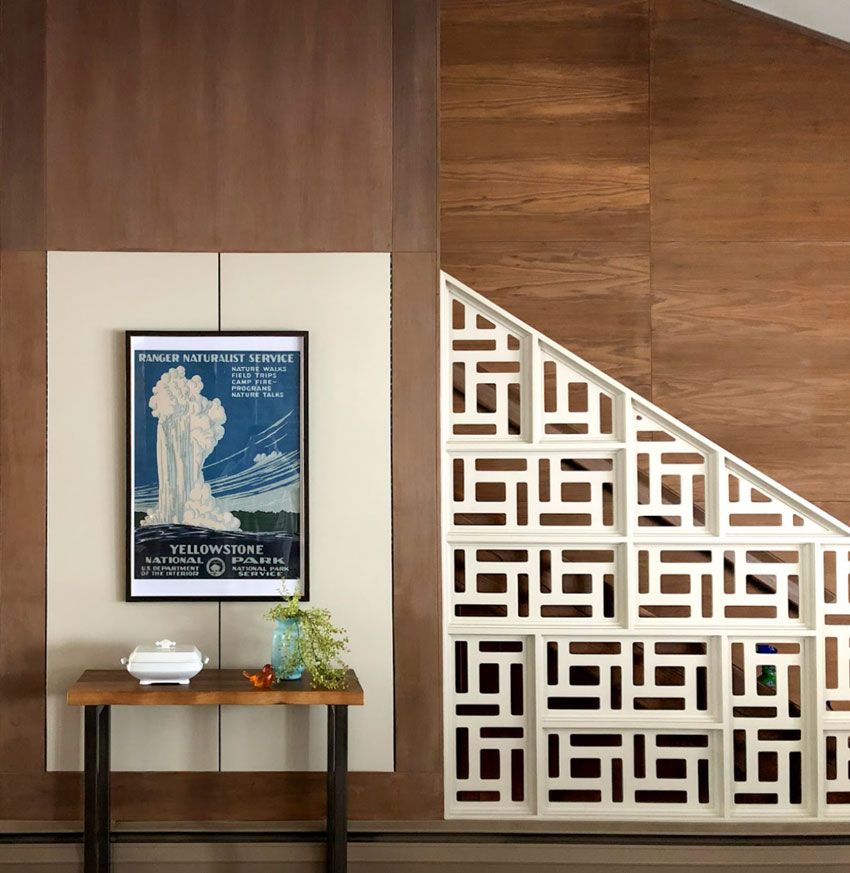
Here is her lovely entrance with the original pendants lights and fretwork:
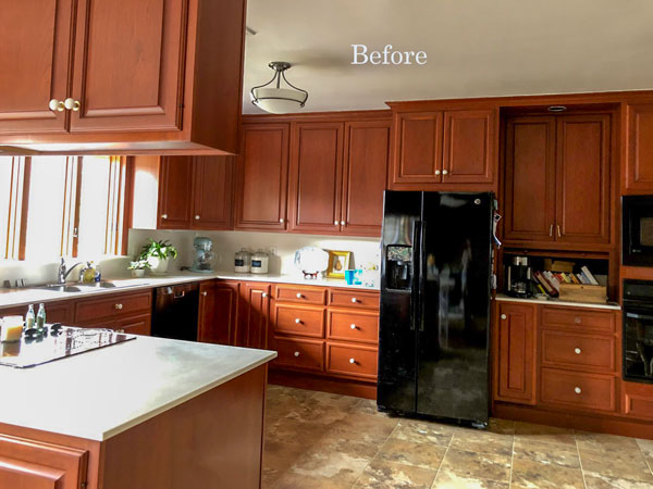
Here are some before pics
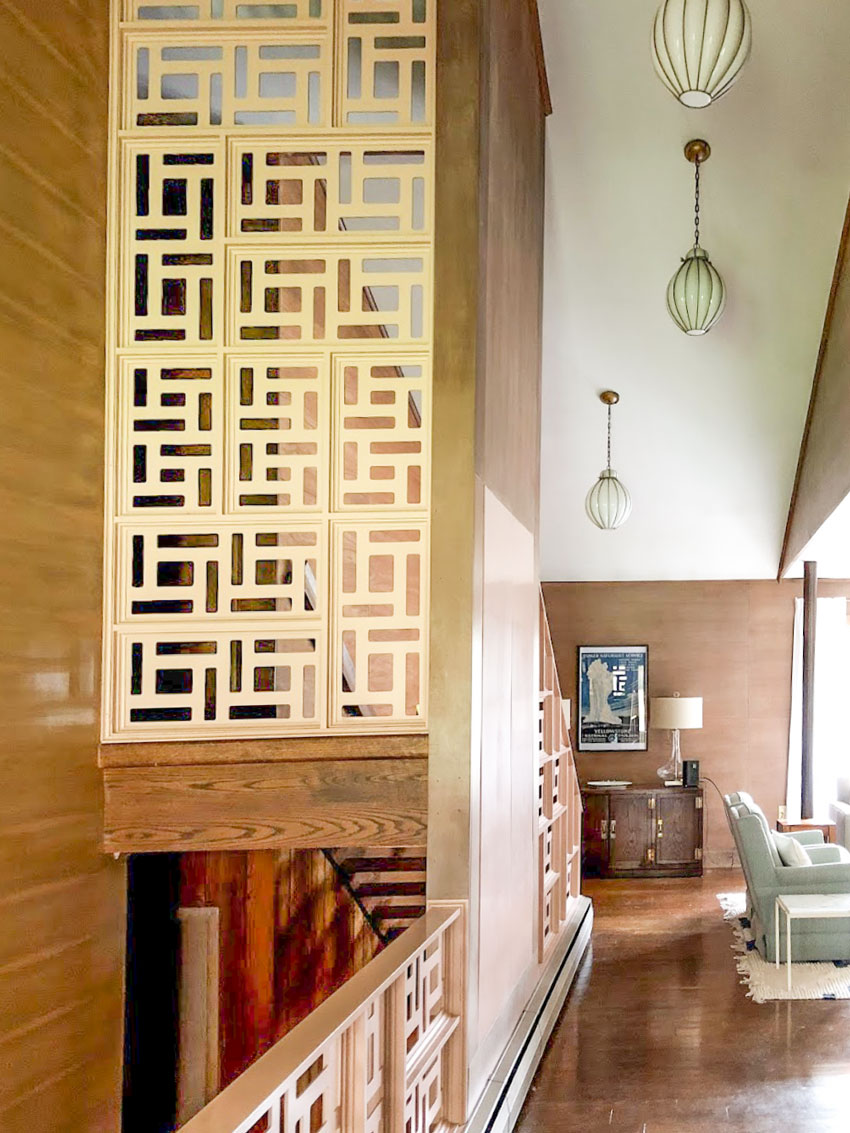
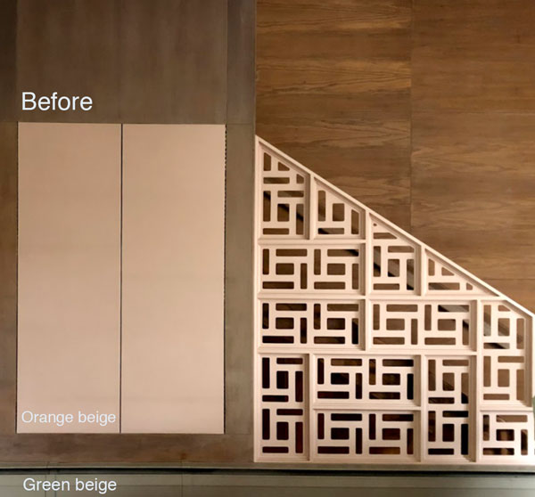
You can really see how pinky/orange the fretwork is in this before photo (above).
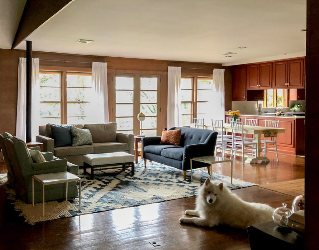
Living room with original wood panelling that’s staying, freshened up with white drapes. You can see the cherry kitchen from this open plan (above).
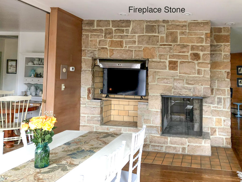
Here’s the pink/orange/green grey undertone stone fireplace:
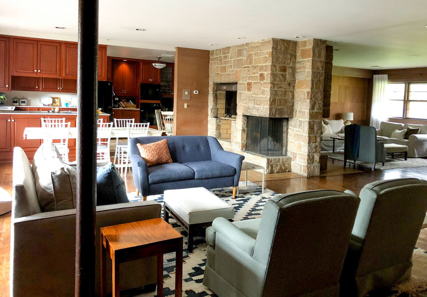
Original fireplace which is staying. Another view of the open plan interior:
I chose a navy blue (BM Newburyport Blue) from her living room decor and suggested she paint her chairs the same colour to create flow in the kitchen.
Here’s the cherry kitchen:
You can see that the cabinets have a nice classic raised panel style and are nicely designed to go all the way to the ceiling without an awkward gap between the uppers and the cabinets a common issue I talked about here.
Here’s an example of what my eDesign Slides look like
In order to make her kitchen look more current and relate better to her house, all she needed was a new colour for her cabinets, the little bit of drywall in the kitchen and her decorative fretwork and these are the two options I gave her:
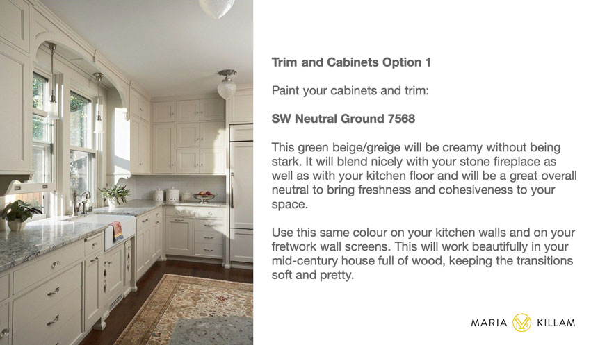
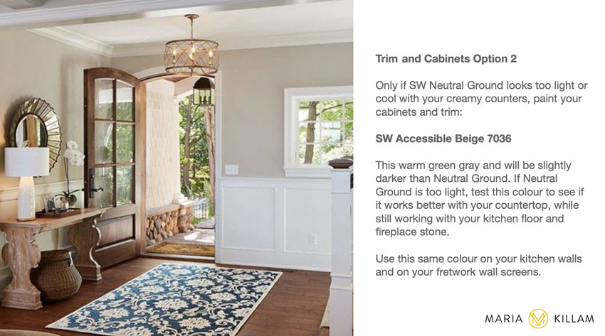
How to Test Paint Colours
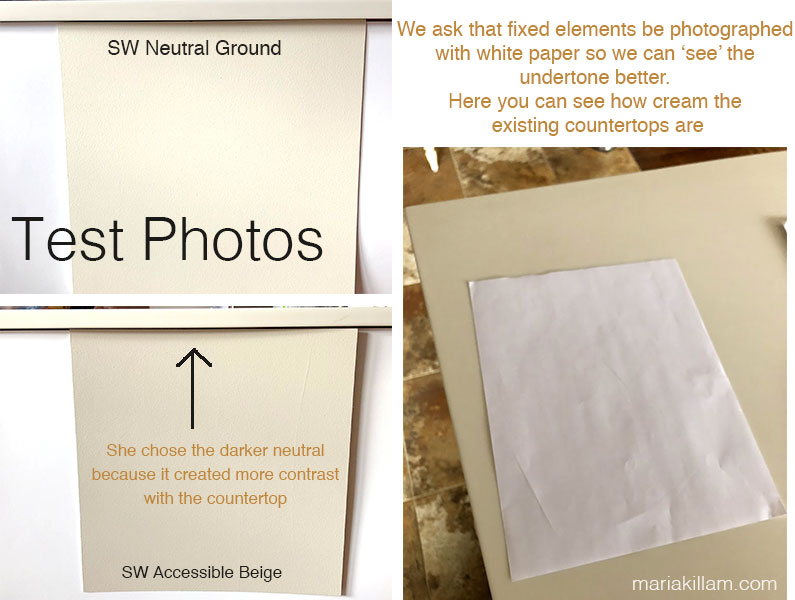
These are the test photos (below) she sent with both colours looking good with the existing tile floor.
Notice that the paint colour test boards are shown with white paper behind so that the colours are isolated (so we don’t make the mistake of comparing them to the old colours). Had these test boards been propped up directly against the cherry cabinets (that will be painted), it would have been harder to accurately see how they were relating to the floor (that stays). The deep reddish tones of the cherry cabinets would have inaccurately influenced the look of the colours being tested.
The paint colours are also in the same position in relation to the floor that they would be once kitchen is painted. Laying the paint colours flat on the floor DOES NOT give you an accurate read.
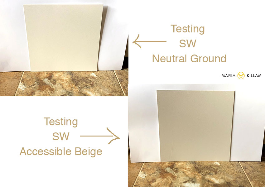
You can see that both these neutrals work well with her existing tile floor (above).
She also sent these photos, correctly testing the potential cabinet colours with the countertop. This helped us determine that Accessible Beige was the right choice because it provided more contrast with her cream countertops.
Here’s what her kitchen looked like before:
Before
Here’s the lovely after:
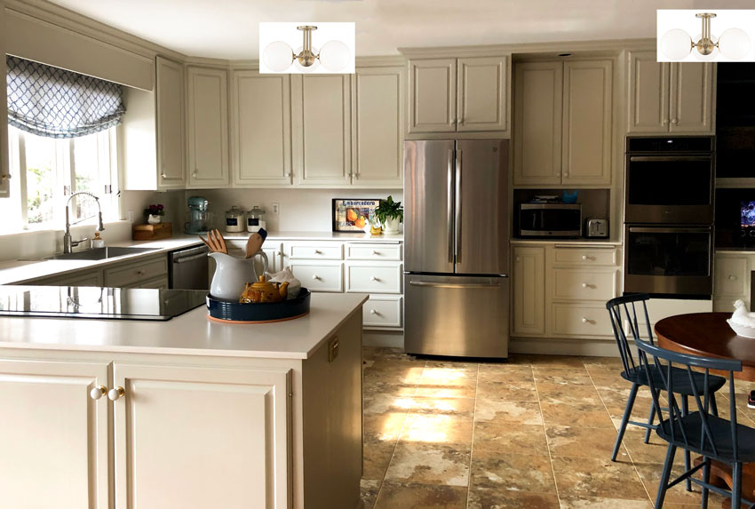
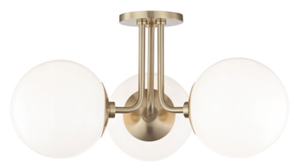
After | I am including these surface mounts as a suggestion for new lighting.
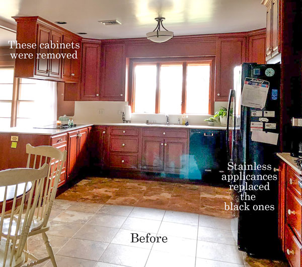
Other side of the kitchen before (above)
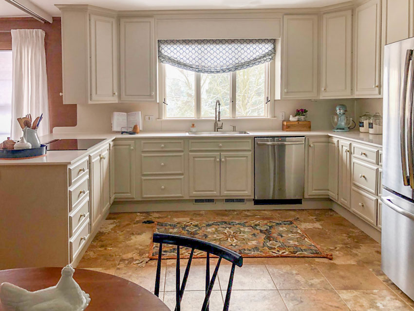
She also repeated the navy in the throw rug, accessories and roman shade (above). | After
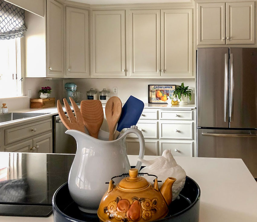
After | Notice the vignette in the right corner of her kitchen. Something you’d see from across the room!
Here is another view of her pinky/orange fretwork in the staircase (below). You can also see how green her radiators are in comparison:
And here’s the new paint colour and some lovely styling by my client:
After
Learn how to do eDesign consultations
If you’re facing a home renovation or new build project, know that every finish, paint colour and piece of furniture you choose for your space is a colour decision first.
So the wisest thing is to learn how to choose colour effectively. Since most expensive mistakes are colour mistakes.
In my new Create Your Dream Home edition of my colour training, you’ll learn how to use my system to make all your selections. And I’ve tailored the content to show you what you need to consider to create a clear vision and direction for your project that makes sense for you and your specific house for a timeless look you’ll never need to renovate!
Get my advice for your specific project with an eDesign consultation
For help with any decorating project that has you going in circles, you can find our eDesign consultations here.
ps. I’ve had my fabulous wordsmith Irene Hill and my artist/Senior Colour Designer Tricia Firmaniuk here at the house in Palm Desert all week! We are finalizing the details of my colour wheel and working on updates to my first ebook! Very productive!

Irene Hill, Maria Killam, Tricia Firmaniuk
Related Posts
Take the Burden Off with Customized Exterior eDesign Services
A Nature Inspired Modernist Exterior; Before & After
Ask Maria: Will my Cherry Kitchen work with a Cognac Leather Sofa?


Question: what kind of countertop and what color countertop? I like the light colored cabinets with the light colored countertop, and I’m wondering how to do that and successfully get them to coordinate.
It’s a deep creamy corion countertop and that’s why we gave her two colours to test and we chose the one that created a little more contrast with the countertop! It’s all in the undertones 🙂 Maria
Maria
OM goodness the before and after .
Night and day .
Those colors just soften and totally changed the look and feel of that kitchen .
And the rest of the house .
Love the changes
Amazing !!!
SUCH a nice transformation.
Amazing! Just beautiful.
I love the fretwork color – and I wonder who had the patience to do such a good job on the paint!
I love how the cabinets look new – not like painted wood.
Nice!
Oh, I LOVE that darker neutral with all the earthy wood and stone in this Mid Century house. Thank goodness no one ever got rid of the fantastic fretwork railings – they just sing in their new color!
So much better. I’m assuming the stove is the black glass on the counter top. What does she use for a exhaust fan?
I’m guessing since she removed the uppers nothing. Which is the choice I would have made as well to freshen up the kitchen! Maria
i would assume that the stainless, steel strip behind her cooktop is the fan. It rises out of her countertop and disappears back into the counterfor a clean look. A big stainless steel fan hung above would look out of place in a mid century design, plus block the sight line.
I love the new colour of her cabinets and fretwork. It’s warm and fits the style of her home where a white kitchen would have been far too stark. Proof that edesign does work. ?
Wow, just wow!!!
How lucky is the homeowner to have such a large, welcoming kitchen. It looks so functional, especially with no island in the middle. And the colour you chose is just right…I would be very happy cooking in that kitchen. I hope the homeowners enjoy it.
Just noticed the gorgeous dog…goes perfectly with the new cabinet colour!
Beautiful. So nice that the integrity of the home could be retained but freshened up tremendously.
I would love it SO much if you would consider putting together a Colour Confidence workshop for non professionals. I want to learn for my own personal use, but have no interest in the business aspects that are of course, such a big part of your 3 day program. I can imagine you are so in demand and maybe an intensive 1 day course wouldn’t be worth your while. Rats!
I couldn’t agree more – I would LOVE a modified version of the course for non professionals, as we don’t need the business aspects, we just want to have the confidence to choose the right colours to create a beautiful home for ourselves and our families! The e-books are great, but there’s nothing like hands-on personal training!
There are so many homeowners who attend my course and easily save thousands and thousands of dollars with what they learn. Day 3 is just as valuable for them as the other 2 days because they learn how to shop online. How important styling is to the overall look and feel. How easy is it to spend $2500 in the wrong colour? People do it ALL DAY and ALL NIGHT. Thanks for your comment, hope that helps! Maria
What a transformation the new colour and removal of the uppers has made to her kitchen. Also the new colour of the fretwork and the wall next to it, plus a bit of styling by her. She must be so happy with her new look kitchen, etc. Great work!
Maria I have a question
The
New lights that were picked look really white compared to the rest of the kitchen .
Is that white going to be repeated some place else ??
I’m just curious
Hi Nancy, well it’s a light. That should be white when it’s on otherwise the room would be dark. I don’t think it’s necessary to repeat the ‘white’ shade of the light.
Good question though!
Maria
What a timely post. I was re-reading your whites e-book the other day and when I got to this topic it was as if I was reading it for the first time. Lovely to have a new real life example just when it’s been on the tip of mind. Thanks.
Well that worked out beautifully, didn’t it! The kitchen looks wonderful and using it through the house manages to freshen this 50’s home in a way that doesn’t obliterate it strong mid mod feel.
What an amazing difference — from tired and dated to fresh and pretty! I love it!
Love the colours. The kitchen looks fabulous and I love the fretwork and the original pendant lights too. Excellent colour choices.
This is just beautiful! Perfect color choices and works so nicely with her lovely house.
Question: Would you use a flat or satin finish on the cabinets and fretwork?
I would use the most durable paint, check with your paint store or better yet get them professionally sprayed! Maria
This was an excellent blog! Thank you!
This was an excellent blog! I have so many my client’s kitchens that look like this.
Thank you!
Thank you for sharing the process and outcome of an design. Which package was this? I would like to see an example like this of each edesign package that you offer? It would be extremely helpful in my purchasing one.
This was a beautiful outcome!
She bought our bundle of 2-3 paint colours which is right here: https://mariakillam.com/product/colour-bundle/
I woud like one for every single package we sell as well but good ‘after’ photos when I’m not there are harder to get!
Thanks for your comment! Maria
❤️❤️❤️ the colors and transformation!
Wow. Fabulous!
I was shocked yesterday to see an article where the walls were Decorators White. I’ve seen so many houses painted all white but, I had no idea that it was almost the whitest white that could be found.
Boy! Was I naive!!!
Maria thank you for sharing how you do your edesign work and photos of what you suggest! Everything turned out perfectly! I love the paint on the kitchen cabinets and how it transformed a not so wonderful kitchen into a show stopper, I see that she took your advice and painted or bought blue kitchen chairs. I am sure she is totally thrilled. I have shied away from doing edesign because I am afraid that I am reading colors wrong from just a picture. I like to be hands on and am so anal that I check color 10 different ways. I am always afraid that the painters color matched the paint that I suggested and the color would be off but with your distinguishing eyes you just nailed it! I may have to try it even though I can’t physically see the end result. Great job!
Absolutely love the choice of paint color for this mid-century kitchen (cherry cabinets). It looks like a completely different home! Showed it to my husband and he was wowed too! What an inspiration….
Fantastic Before and after on such a beautifully unique house! Great learning tool to really see the choices and outcomes . Would either of the colors have worked it she wanted it overall lighter and did she use the same Accessible Beige voice f for the fretwork?
Yes she could have painted the kitchen cream to relate to her countertop. Yes the fretwork is the same colour. Thanks for your comment. Maria
Great transformation i’m speechless.
I love that she kept a mid century house in character
Maria,
I wonder how to find a True Color Expert in my area? I’ve googled it but no dice. Do you have a register of some kind? Of course I don’t want to take business from you, but it would be nice to have an idea if anyone in my metro area has ever attended one of your training seminars.
And BTW, what a great job with this amazing house (as usual)!
Hi Maria,
That was very nice of your client to send you “after” pictures. She must have known we were all hungry for them.
I bet the house looks better now then when it was originally built.
Hello,
I’m revisiting this post after reading the post on All Grey Home in 2011 and All Black in 2019 dated today 2/15/19.
I usually am a fan of white/cream/beige kitchens but this one doesn’t appeal to me. It may be my computer monitor but there is a weird undertone at work here, at least to me. Maybe a touch of pea-soup green? I have been in many mid-Century homes from the late 1960s to today and I never saw one with a kitchen like this; Southern California is full of them from the building boom after WWII through the 1970s and maybe even later. What I mostly saw were kitchens looking exactly like the “before” photos. Maybe this is why I’ve never been a fan of that era. I’m glad the home owners like this but I just don’t get it. What am I missing?
What you’re missing is that the colour was chosen to coordinate with the tuscan floors which in no way belong in a mid-century modern kitchen as a few commenters have pointed out, but definitely make it easier to live with until that reno happens. Hope that helps, Maria
Been following you for at lest 5 years and this is my favorite post so far!
I like the color chosen for the cherry cabinets. My personal preference is towards the cherry cabinets. The kitchen with cherry wood cabinets is far more inviting to me. It’s a room I would enjoy spending time in with family and friends
Wow! What an amazing transformation. I’m impressed with how you worked with the floor so that it doesn’t look dated but acceptable. It doesn’t bother me, and usually this tile looks so dated to me, that I think it must be ripped out. Bravo!