Are you tired of looking at a bathroom filled with tuscan brown elements? Here are 5 ways to update your bathroom for a fresher look. Hint: it has a lot to do with adding more white or cream.
My lovely client Deborah hired me to help her choose fresher colours and finishes for her bathroom and kitchen renovation, as well as help decorate her house. I’ll share more soon, but I’m starting with the reveal of her fresh and light powder room, shown here:
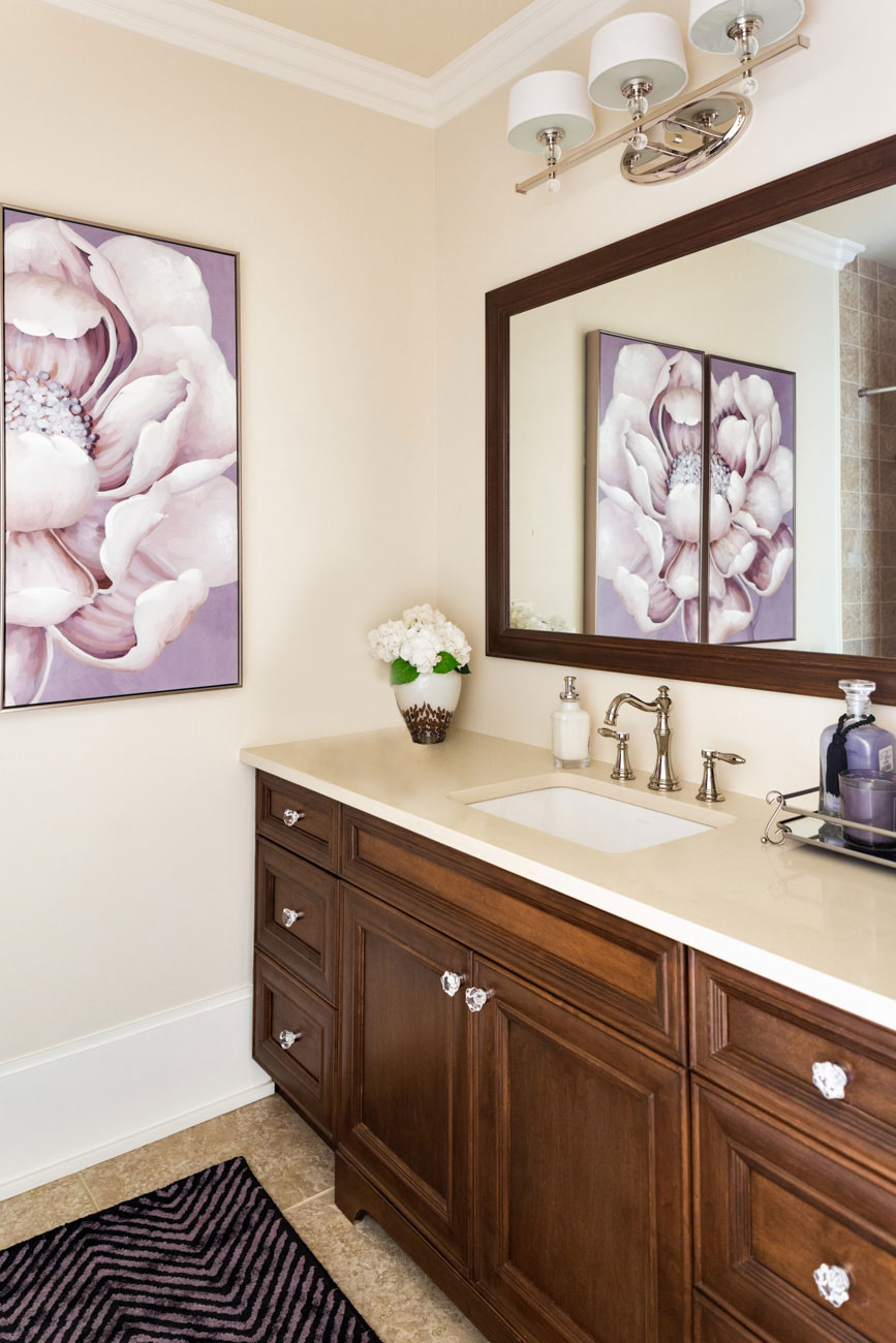
After (Photography by Barry Calhoun)
How to update a Tuscan brown bathroom.
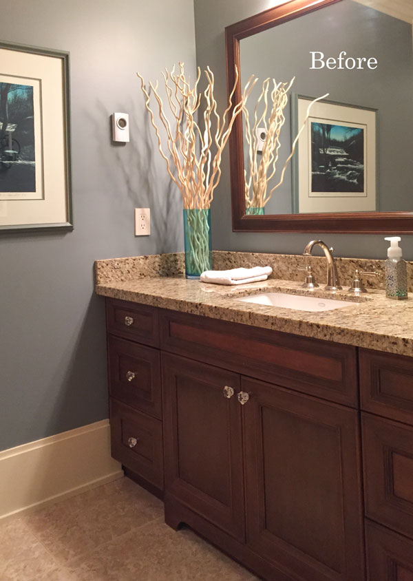
Her existing bathroom was the typical installation from the Tuscan brown trend (below). You know the type… yellow/gold granite with a gold/tan patterned floor tile to coordinate.
In this case, it’s not that the colour of the floor tile really clashed, but it was a lot of pattern and Deborah wanted a cleaner, fresher look and feel.
Her vanity was a pretty medium brown so it stayed. A wood stained vanity adds contrast and is still neutral, which also works in a strictly white or cream bathroom. Here are 5 ways we updated her brown bathroom.
1. Update the countertop.
Since the vanity was the first thing you see when entering this room, and it’s constantly in view when walking back and forth in the hallway, the biggest bang for the buck, in this case, would be replacing the countertop with a solid colour.
Caesarstone Buttermilk was the perfect new countertop colour. It is a very pale creamy colour with a warm yellow undertone to relate to the cabinets and floor tiles.
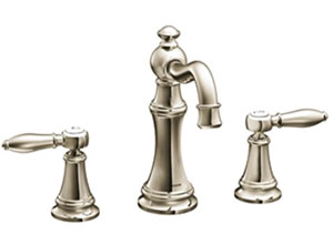
2. Replace the faucet.
Notice that this faucet ends where the mirror starts. That’s one way to help you decide how tall your faucet should be in your bathroom. Check out my pinterest board for more faucet ideas.
3. Add an area rug that covers up most of the tile floor.
If you don’t love the tile in your powder room, toss the regular sized bathroom mat and instead find an area rug that coordinates with the art or accent colour in your bathroom.
Eggplant Rug Ideas: Similar | Similar | Simliar
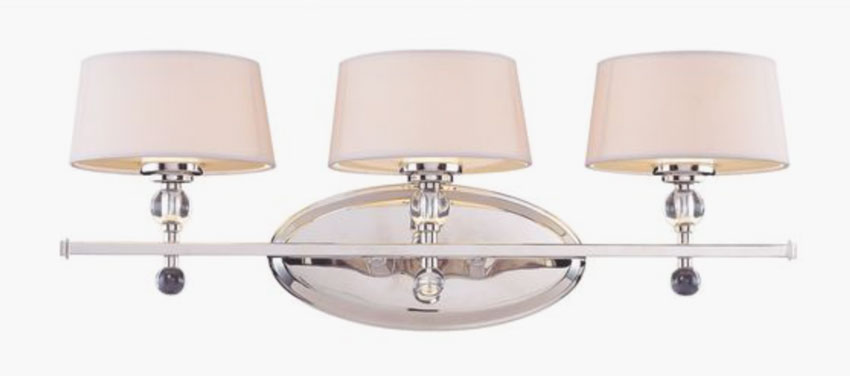
4. Replace the light fixture.
In a bathroom, I prefer sconces on either side of the mirror. But if you are already wired for a bar light, get one with shades. Shades help filter the light so it’s a prettier, softer light. Full disclosure: I’m kinda obsessed with lighting.
Vanity Light: Source | Similar | Similar
5. Introduce a new paint colour.
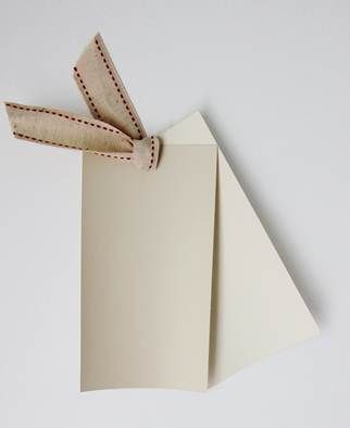
Surprise! A new paint colour is a great way to freshen things up. I chose Benjamin Moore OC-6 Feather Down (a green beige complex cream), which is one shade lighter than Benjamin Moore HC-81 Manchester Tan (also a green beige, shown below). Both are very versatile paint colours if you need to freshen up a tuscan brown colour scheme.
>> READ MORE: How to update an earthy kitchen.
And, here is the after photo again:

After
One last detail… Notice the absence of the 4″ quartz surround on the countertop. It looks much cleaner without it and is not really necessary in a less-used space like a powder room.
Related posts:
The Single Worst Mistake to Make During your Bathroom Renovation
It’s a Charcoal Tile Intervention, Don’t Miss This One
How to Make Earthy Tile Look Expensive






Great post showing how a few tweaks can make a big difference (if they are the RIGHT tweaks!)
Thanks for continuing to post interesting and informative content!!
I’m partial to Cavaliers and the figurine is adorable!
I love these posts from your client work, with analysis. One question: I was initially expecting to see a bronze fixture in that brown and gold bathroom, but it was silver. So why did it need to be replaced? I prefer the new one–just wondering.
She wanted to update her faucet and the polished silver felt fresher than a bronze faucet and it relates to the new light fixture we chose! Thanks for your comment! Maria
Lovely Update to this bathroom. Maria, what I love about your blog and advise is that it always offers the solution to the problem.
As much as I love looking at inspirational designer books and rooms styled by well known designers, they mostly never reveal their methodology on how or why they do what they do. You consistently tell us how to fix the problem and make things beautiful. Thank you.
Sharon, I agree with you. Knowing the why and how something is done makes a big difference and that is what I also like about Maria’s posts.
Hi Maria,
We’re driving home from South Dakota. It was a nice treat to see this post in my email this morning.
Once again…beautiful update to the powder room. The first word that comes to mind is “calming”.
The room looks very calming & softer with the new palette.
The lack of the 4” backsplash was the first thing I noticed. I think if your stone fabricator does a good job with cutting the countertop, the 4” strip isn’t necessary. And I’ve been seeing 2” strips in the kitchens designed by deVOL kitchens in England. Very clean looking.
Your client’s baseboards are awesome! Nice & tall.
Great post – so nice to see real life rooms and transformations!
Feather down looks wonderful in the space and I am curious if you are specifying light/greige colors even in spaces that don’t get a lot of natural light, like this powder room, given the current trends toward light and bright. I’ve read posts from a few years ago about not using such light colors unless the space has adequate natural light and am curious when it is ok to use a lighter color versus when it would not work.
That’s a good question, in this case I was focused on choosing a colour that would work with the tile. . . the art came later. . . possibly the powder room could have been a shade of purple had we found the art before the room was painted 🙂 the ‘light colour in a dark room’ post would apply to bigger spaces that are simply dim. . . not awesome with white walls or a greige which in a room without a lot of lighting or natural lighting would quickly start looking like apartment beige! Thanks for your comment! Maria
Love the floral art on the wall.The soft, cool pink keeps the bathroom from looking beige. Did you actually replace the light fixture, or is it the same one?
We did replace the light fixture, the old one had to be on to take the picture so we wouldn’t have been able to see it in the before pic. Thanks for your comment! Maria
Very close to what I did in our hall bathroom..(the only place we didn’t fully gut)
After spending years in Mediterrannean, I’m not a great fan of Tuscan look since I’m not really sure how Tuskan it is..:) and obviously reads more fake in some homes more than others, depending on geographcal location, etc
A real rug helped a lot..
It’s hand knotted and withstands enormous amount of abuse..Survived a major leak already(should have gutted the damn bathroom already lol since there was the only old plumbing piece in the whole house-old drain..another couple grands right there)
We changed the vanity since the old one was very cheap insignificant thing-y anyway, installed for resale…sold it on Craigslist..bought another one on Craigslist that fit better..))
Planned for sconces but in the end they looked awkward because space was too narrow, so had to give up on the idea, get another mirrr, different vanity lights. Oh well.
I also dislike sidesplashes..
Nice job! Love the crystal knobs
How wonderful this updated powder room is! It looks so rich with the new colours. You have a gift and I thank you for sharing it with us. I noticed the figurine and it is adorable. I am a bird person and try to inject bird figurines in my decor.
Great post as usual, Maria. Very comforting of you to write posts such as this for those of us who can’t or don’t want to do gut renos for every projects and very refreshing that we just refresh and still be happy. And, as usual, super extra little tips – always teaching us (lamp shades for the bar lights if that’s what you have, nixing the 4” surround, a larger rug to distract from less than ideal flooring that can’t be changed).
With Mary-Illinois, I’m digging the deVol kitchens with their 2” strip and other variations that make for a beautiful simplicity and a very clean look (granted they do fewer upper cabinets and that doesn’t quite work for everybody but there are ways to accommodate). So nice here not to see all the overly busy backsplashes that compete with the overly busy granite and all the other overly busy touches such as trim and molding that even so many designers put in their kitchens.
I Love my readers, thank you all for your comments on this post! They always add something more than what was already there. Maria
Thank you Maria. Amazing how well just paint and the right art transforms the room.
Love the transformation! So fresh and pretty. I enjoyed seeing you and your Atlanta group yesterday. Have fun in Boston!
Like the original faucet better but otherwise love it. Been thinking of adding that light fixture forever so nice to see it in context in a room.
Changing that countertop made such a difference. Plain is pretty!
Like the lightness the new counter creates….but I must say I am shocked to see people tossing out the granite countertops
already! I definately would not have done that but I understand the never ending quest to stay current will drive people to do
some pretty drastic things. Just seems so wasteful to me. A new rug and some contemporary art and accessories would
have been enough in this case. So many wall colours would work with this. Baffling.
I just came across this blog and thread. When we were viewing homes for sale in late 2020, I would chuckle whenever our real estate agent would comment on the granite in some of the houses we saw as ‘out of style’. As if a natural stone from the earth is ever out of style! It’s all about trends and I’m proud to say I do not follow trends! The granite in our home is a combination of different hues of brown, a little charcoal gray, a bisque color and pink/peach/terracotta. It’s beautiful granite and we would never think of replacing it.
Wow! What an improvement with just a few changes, especially the paint and countertop. Can’t see the original light fixture, but the new one is lovely. Great space!
Was it easy to get the granite countertop off without damaging the cabinet? I would love to make that change in my powder.
Gorgeous sensible refresh.
Maria,
My heart skipped a beat when I saw your refreshed powder room. Is it possible that Manchester Tan is coming back in style? All of the trim in our 20 year old, historic looking home was painted Manchester Tan by the builder. For most of the 15 years that we have lived here, we’ve wanted whiter trim. We are DIYers, but this task feels too daunting. The trim is fine with darker colors, but we want to lighten up! After stripping dark and dated wallpaper in our powder room a year ago, the walls are still primed white! I would love to hear your thoughts on our dilemma. You are the Color Goddess!
It’s really hard to say without photos, perhaps paint the walls Manchester Tan too as long as it works with your decor. I wouldn’t say manchester tan as a trim colour would ever be considered ‘in style’, because it’s not considered a trim colour, however as long as it works with your decor then it doesn’t matter what’s on-trend or not. If you need more help, you can purchase just a paint colour consult on our eDesign page! thanks for your comment! Maria
This is beautiful, and timely. Could you share the trim color? I love the Feather Down wall color.
The trim colour is SW snowbound. Maria
Great advice. Such a big difference in this bathroom with just changing paint, removing the dated fixture and lightening up the countertop. Loved this article.
Very beautiful. Thank you for the tip about Feather Down looking good with “Tuscan” finishes. I think it is finally the perfect match to my kitchen subway tile, and I have medium brown cabinets, as you know.
Inspiring post!!. We also have “heavy” Med/Tuscan travertine throughout our home, with heavy golden beige/yellow beige undertones. I love both Manchester Tan and Feather Down. Do you think either are too green beige with more gold beige undertone fixed elements? We have an open floor plan, so using 1 color is the most realistic way to go. It’s hard for me to tell with the sampilize sample since the walls are so gold, BM Deer Path/Sandy Brown.
Those two colours work the best with a tuscan house! Maria