Last week Claudia Ricciardone posted this happy news on our private True Colour Experts Facebook page:
I’ve got some exciting news to share and I can honestly say this would have never happened without Maria Killam‘s course. I just had my work published in Luxe Lifestyle Magazine! Here’s the link to read the article and my bio is in the contributor’s section.
The print edition will be out mid-October. It was Maria’s training that gave me the confidence to build my design business. It was also her class that introduced me to my design BFF’s, True Colour Experts Maxine Breedlove from San Angelo, Texas (who wrote the article),and Cate Holcombe Raleigh from North Carolina. I am forever grateful to Maria’s class and to the friends I made during her workshop. Thanks, Maria!!!!
To date, since I started leading this workshop in 2010, I have taught my System for Specifying Colour® to over 1000 design professionals, and colour enthusiasts. Whenever I encounter someone who has attended my course, they talk about how much more confidence they have now! It makes me so happy to hear all their stories!
Here’s Claudia’s and the tour of her beautiful home:
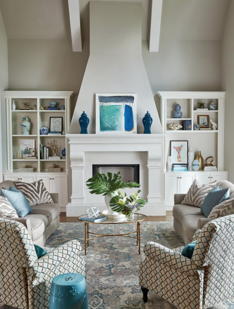
Main Interior Color: BM Revere Pewter
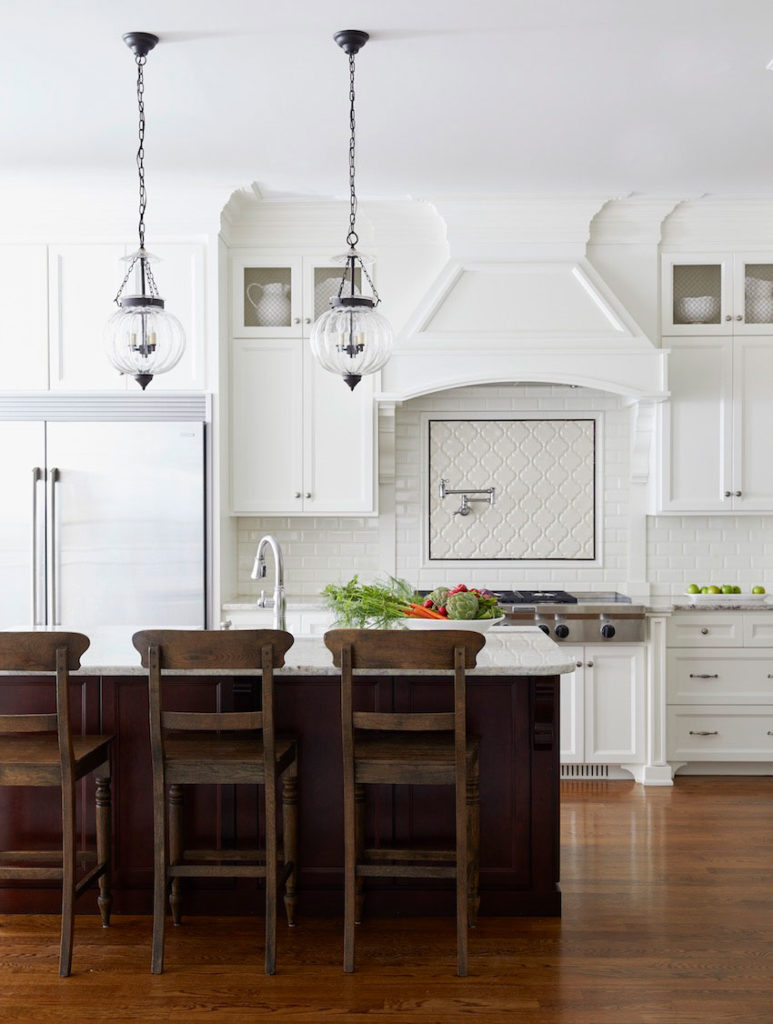
Melon Pendants | Kitchen cabinet color: BM White Dove
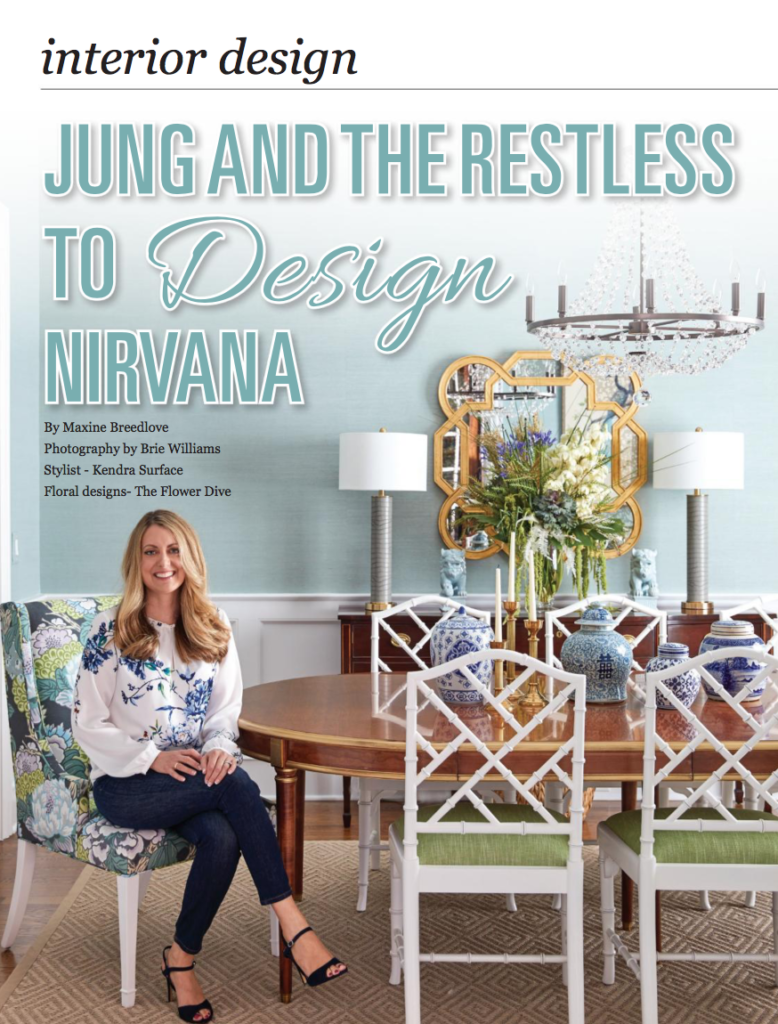
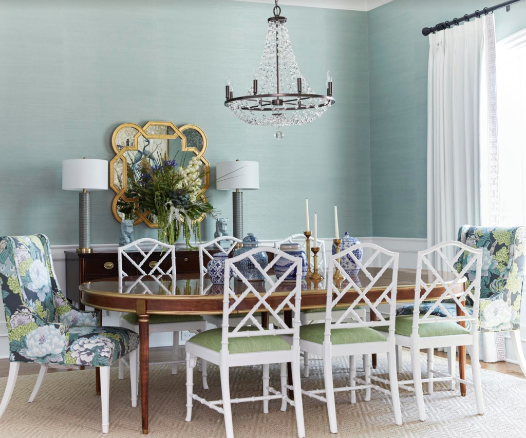
Dining room wallpapered in Thibaut Fine Sisal in Seamist. Custom Wainscotting and chairs are in BM Decorator’s White.
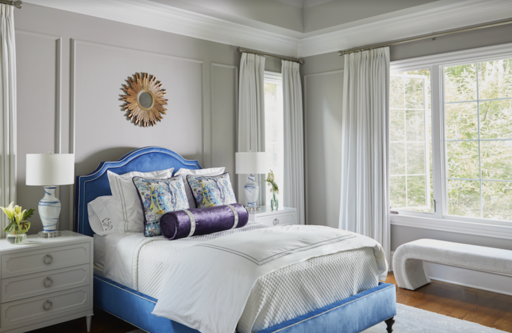
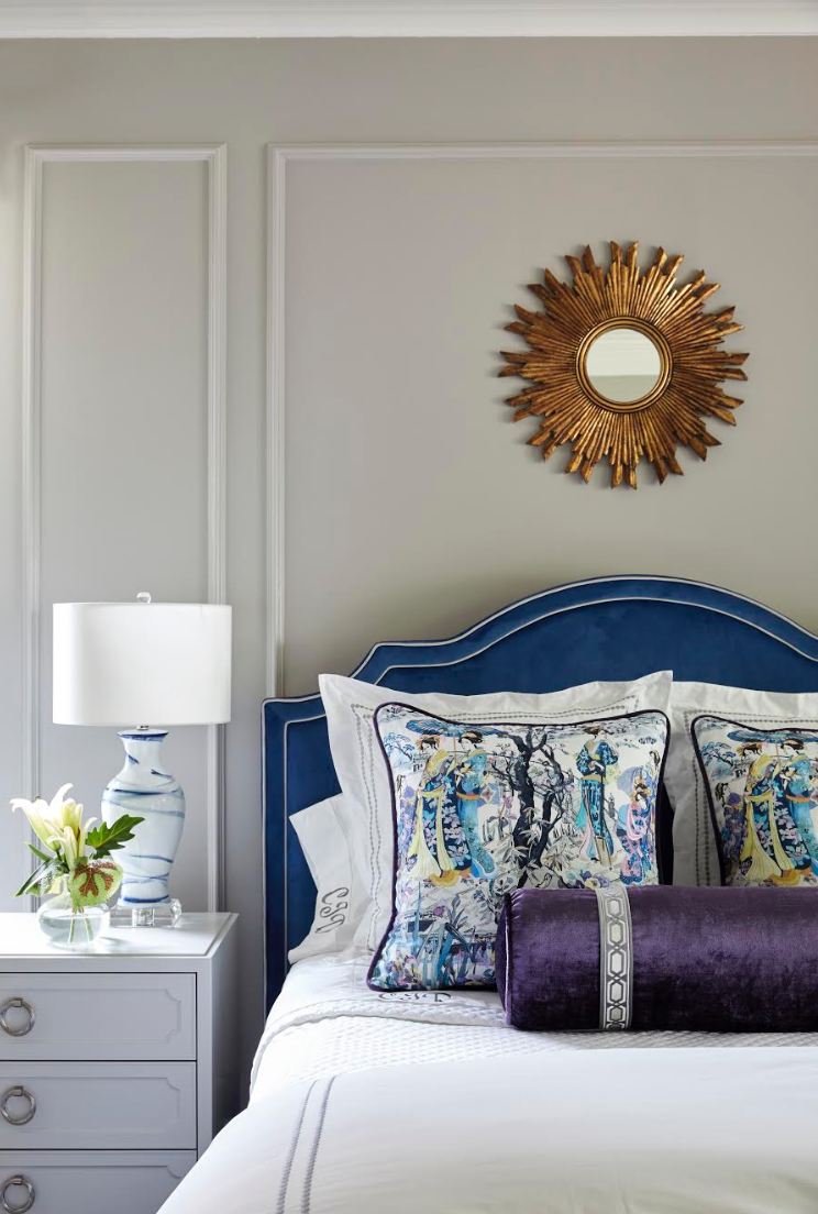
Master bedroom wall color: BM Gray Huskie
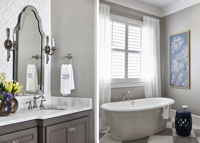
Love her classic and timeless bathroom finishes. Then it’s so much easier to change the colours when the time comes!
Master bath: BM Gray Huskie | Photography by Brie Williams
I attended Maria’s “True Colour Expert Training in April of 2016. I am a residential designer who has always had an affinity for working with color. However, there were times when a color’s undertone didn’t quite work and I couldn’t figure out why? There had to be a method to more accurately choose colors. When I found Maria’s course, I knew it was what I needed to take my design business to the next level.
Maria is an engaging and knowledgeable teacher. I like that she is no-nonsense and direct but also warm and personable. Her course opened my eyes to the world of undertones and helped me to accurately determine appropriate color selections. The large color boards are key to selecting interior and exterior colors with confidence. I’m not exaggerating when I say that the boards work like magic. You can almost immediately see what will work and what won’t once you use the boards and understand Maria’s system.One of the most valuable benefits of taking her course is the access you get to her private True Color Expert Facebook group. I’ve made so many great connections and the group has been exceedingly helpful when I’ve had design questions.Maria’s course has been one of the best investments I’ve made in my business.



Beautiful home. Well done!
Thank you, Amy! I appreciate the kind words. 🙂
Congratulations, and a compliment to Maria of course, too! Gorgeous. I wish the dining room was paint so I could know what Ben Moore color it would be if it was paint. ; ) (I’ll pull out chips/samples to find a match. Just lazy.)
Thank you, Beth! It’s really hard to recreate the lovely sheen and depth of the sisal wallcovering in paint but if I find a match, I will let you know. Benjamin Moore’s Century pain has great depth of color. You may find something there.
It’s a very small collection, so no, but it’s okay – I have all of their large chips and a ton of large painted samples – including Maria’s sets, which saved me from even more painting! I’m mostly retired but will post what seems close, though every computer/screen shows color differently. Again, congrats and enjoy the acclaim!
I have the same reaction to the dining room walls. What paint would be the color of that wall paper? It is just what I need for my master bath. Maria, can you give an equivalent paint color with your magic computer?
Without a large sample, I can’t tell, plus we’re dealing with both wall paper and a shiny computer screen. I might swatch Ben Moore’s glass slipper 1632. My painted and large paper sample are both missing. There are others like pale smoke or wales gray I’ll look at, though they may be greener. And you know how blues always look bluer on the wall, so may need to go with a green-blue-gray. It’s just a starting point. I know – let’s go visit her house to see. Ha!
I’m going to look at a couple grays, but also Woodlawn Blue in the Historic collection.
Absolutely beautiful, well co-ordinated and executed. The colour Grey Huskie is obviously a U.S. colour. Can you tell me what would be its equal in our Canadian fan deck?
Thank you, Patricia!
Do you have AC colors? If so, Ozark Shadows, AC-26.
The work is stunning, and Maria is to be commended as well.
Is there any possibility of finding out the make of the chandelier in the dining room? I have been looking everywhere for at least two years for one that meets my criteria and this one is a definite 10!
Hi Linda, Thank you so much! The chandelier is by Crystorama. Cheers, Claudia
Hi Cynthia, Thank you! The chandelier is from Crysorama ?
Maria,
In the process of designing our retirement home, I met with a lighting expert who educated me about kelvins with respect to LED lighting for recessed lights. (Since recessed lighting is popular where we are building, we need to incorporate it into our house for resale purposes.) I can choose lighting that ranges from yellow/orange to white to blue. How do I select the appropriate light, and how do I coordinate this with my paint color choices?
Linda, I built a home two years ago and have done numerous renovations for clients since then. My electrician uses Sylvania 2700K for recessed lighting. They produce the perfect light; not too yellow, not too blue. I see so many people with the wrong bulbs. The blue/white ones are the worst!
Amen to this! My husband once got excited about a great deal on LED bulbs thinking he could surprise me with them to help finish making our home more energy efficient. They were are SO BLUE. Our 11ft long, narrow hallway immediately began to look like something from a movie about an old asylum where patients are mistreated. We took them right out and have resigned ourselves to many years of one lamp in a super dark corner of his office having clinical blue light. After that we looked up the Kelvin ratings for the bulbs we like best in various rooms (they aren’t all the same because of varying natural light situations) and we are very strict about sticking to it. 🙂
Congratulations! Beautifully done!
Thank you, Karine! I appreciate it! 🙂 Claudia
Such beautiful work Claudia! Well done!
Thank you, Claire! XOXO, Claudia
It’s such a beautiful house! Can you please share the source of the living room rug?
Hi Mary, thank you! Although many of the items I used are only available through the trade, I actually bought that rug retail years ago through La-Z-Boy! ?
My living room is painted Revere Pewter and I also love the rug and would like to know more info. The entire living room is perfection!
Thank you, Sandra! We really enjoy the living room, especially our young daughter who thinks the sofas are trampolines. 🙂 I actually picked up the rug a few years ago at La-Z-Boy. 🙂 Claudia
She has my favorite colors in her living room, but every single room is absolutely gorgeous. Oh, and she has my favorite white in her kitchen, BM White Dove, which looks divine. I love it when white cabinetry is mixed with wood- it brings so much beauty into the space.
Thank you, Mary! Your kind words made my day! XOXO, Claudia
I love the living room the best, especially the artwork over the fireplace and the rug. Where did she get them and the other blue and teal accents?
Hi Laura, thank you! I painted the painting above the fireplace ? I am so happy you like it! The rug was purchased retail a few years ago from La-Z-Boy.
PS Laura
The teal urns on either side of the painting are from Furniture Land South. The rest of the items I have collected over the years. XOXO, Claudia
So beautiful!! I think my favourite is the bathroom, but that is what my eye is drawn to these days as I will be undertaking a bathroom renovation in the next few months. The whole house is pretty and timeless as well as comfortable and personalized. I love it!!!
Hi Brenda, Thank you so much! I did try to achieve a personalized and comfortable feel to our home and am happy you picked that up. Thanks, Claudia
Congratulations Claudia! I enjoyed all the photos, and the dining room is my favorite. I love the colors in that room, and I am always a sucker for Chinese Chippendale chairs ❤️
Hi Ellen, Thank you! I appreciate the kind words! Claudia
Love so much about this design and got some inspiration for a few areas of my house. Specific things I love:
Island & Bar stools – Just exactly what I need
Bookcase arrangement by fireplace – very visually interesting. I am not a symmetrical person so I always need ideas to arrange things
Bedroom – I love to decorate with gray but always struggle for a pop of color to give personality. Love the bed.
Hi Cindy,
Thank you so much! 🙂 The bar stools are from Restoration Hardware. I’m glad that my designs have given you some inspiration. It means a lot to me. Claudia
Beautifully done and compliments to you both! The living room is my favourite although all are gorgeous. I love the colours and especially the area rug…where did you get that?
Thanks, Susan! You made my day! The rug was purchased a few years ago at La-Z-Boy. 🙂 Claudia
Beautiful rooms. Just gorgeous. Congratulations Claudia Ricciardone!
I’d thought Maria’s talent was for designing colourful and classic interiors–it is–but her chief talent is infusing her students with knowledge and confidence. She is truly inspirational in the most practical and down-to-earth way.
Hi Alana, Thank you! I appreciate it. I agree with your assessment of Maria. She is an inspiration!
Congratulations Claudia Ricciardone for a job well done and to the whole team that helped get your work published! Your home is beautiful and tranquil. I love all of the soft colors plus the accents! The living room is stunning! Maria has taught us well and is such an asset to our industry. She has given meaning to color mixing. I am so grateful for her teaching!
Hi Lucy, Thank you! Yes, I am grateful for Maria’s teaching, as well as for people like you who have added value to our TCE group. Your kind words made my day! Claudia
Lovely home. She’s got some great pattern mixing. Love the chinoiserie pillows in the bedroom and the print on the dining room chairs. Thanks for sharing!
Hi Donna, Thank you! I especially appreciate the comment on pattern mixing. 🙂 Have a wonderful day! Claudia
Beautiful. This is definitely an example of “Color Me HAPPY”.
Hi Penny, Thank you! Yes, the colors do make me happy. Maria did a great job teaching us to be bold with color. Claudia
Claudia, your home is beautiful! It has a very elegant “feel” to it.
Thank you, Mary! I appreciate your kind words! Cheers, Claudia
Congratulations to both Claudia and Maria!
Thanks, Gina! Claudia
Claudia, your house is gorgeous. I have looked at thousands of photos of rooms for inspiration, and yours are the first to truly inspire me. Can you tell me the manufacturer and name of the fabrics you used on your dining room arm chairs, and also for the cushions on the remaining dining room chairs. I just love those colors!
Hi Linda, thanks so much for your high words of praise! It made my day! Both fabrics are from Thibaut. The floral in Honshu in Grey and the green one is Bailey in Grass. Claudia
Claudia Beautiful hardwood floors. Please share type of wood and stain. Thank you