Click on image for sources
The speaker on our first morning was Michael Shamassian, president and owner of Shmaze Industries. His presentation was very inspiring. He talked about how his passion for colour began at 19 when he started painting cars for a living while attending college at the same time.
Fast forward, he is now in the business of coatings. Sunglasses, cell phones, laptops, even medical equipment.
When Diane Von Ferstenberg wanted her image on a cell phone her assistant told him ‘Just to warn you, she’ll throw it across the room if she doesn’t like it [the sample]’. When the sample did show up in her offices they said it was the first one she had not actually vaulted away from her.
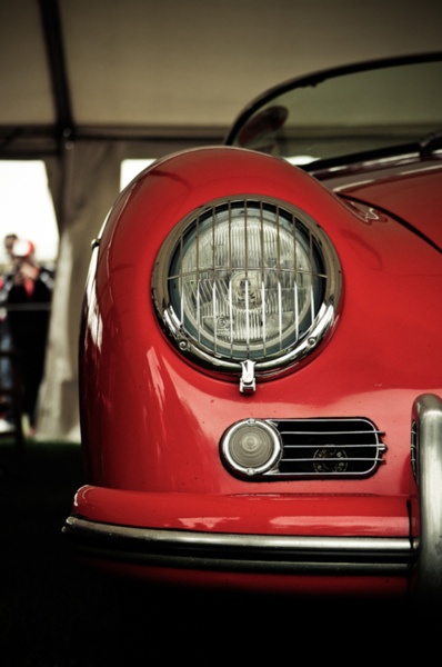
Mike said he worked with one company on a stunning red for a product (some machine, I didn’t get what it was) that dentists would buy. They said because of that red, sales went up 60-70%.
He said choosing colour takes guts but can do amazing things for your business when you get it right.
Mike said designers will create this amazing palette of colours and in the end–and it happens all the time–the colour choices that make the cut are black, white and silver. When he asks the executives why? They respond “Because it’s safe”.
And of course, if you’ve been reading my blog, you’ll know the current trendy neutral is in actual fact not safe at all.
So what are the forecasted colours for 2015? I can’t tell you the exact shades, you have to be a member for that, but here’s the recap:
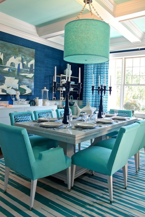
Turquoise is still a big colour going forward. Remember when I spoke to the Director of Design for Maxwell fabrics just a few weeks ago? She said, it’s almost becoming a staple colour, it’s so popular.
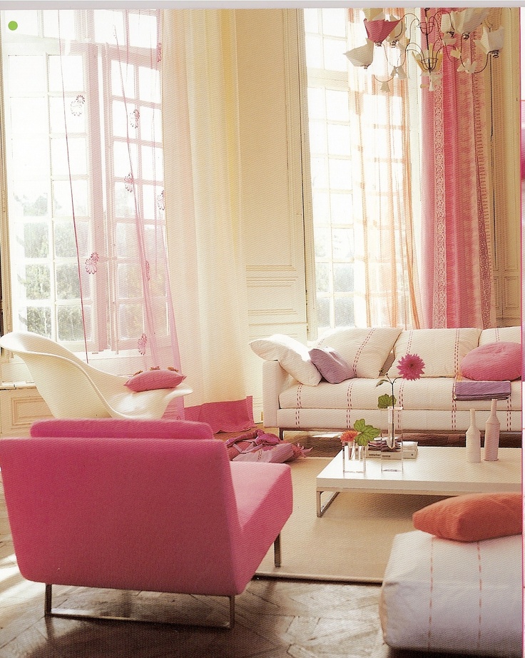
Muted soft, pearlized pinks are also on trend. Gold is so pretty with pink.
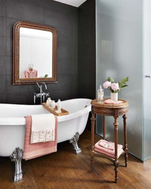
Black is of course on the palette but it’s chalky.
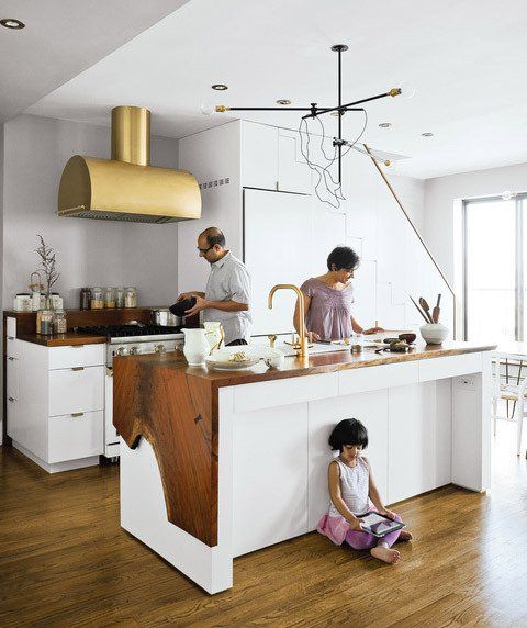
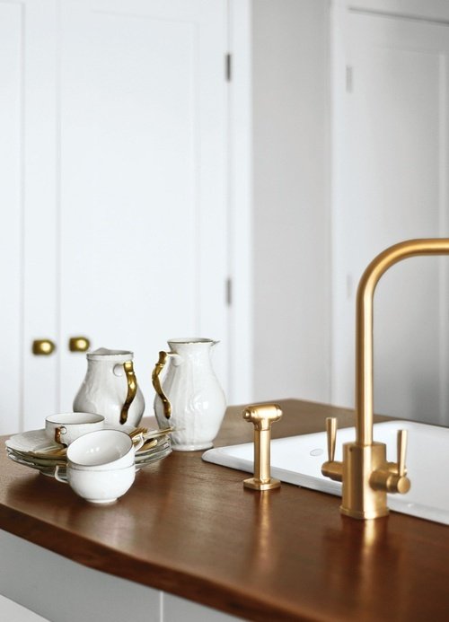
And gold is back. Brushed gold of course, not the shiny stuff from the 80’s. This is not news in the world of design but it sure takes a long time to stick even when it does arrive on the scene.
I recently had a client call me to say she had sourced unlacquered brass, drapery rods from New York. She wondered if I had a supplier here in Vancouver she could buy them from.
I assured her that such a current, trendy item could not be found in Vancouver. One of the biggest hardware suppliers in Vancouver didn’t even start carrying oil-rubbed bronze drapery rods until the trend was pretty much at the end of the 10 year cycle.
It’s why when I hear anyone say the grey trend is over I can’t help but smile. I’m sorry, I can’t help it, it takes so long for manufacturers of, let’s start with lighting (for example) to move from one major colour trend to another, there’s no way after 4 years, it’s suddenly over.
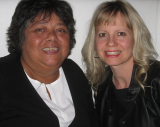
Terreeia and I at dinner last night in Palm Desert. (My bangs I cut myself, a little SHORT?)
Which colour/s are your favourite?
Related posts:
Just Blink Twice and It’ll be Black
Colour Trends are Important: Yay or Nay
Danger: How you Know You’ve Fallen for a Trend
If you would like to learn how to choose colour with confidence, become a True Colour Expert.


Favorite colors: pink all the way to red, blue all the way to aqua.
Such a cute picture!
It is such a timely problem; knowing what is ‘back’ and when the trends hit the market–and then the mass consumer. My clients, in Southeastern US, are still stuck on earth tones and oil rubbed bronze, for the most part. It is difficult to guide them towards current trends. Personally, I love aquas and blue/green with pops of crimson accents.
I have been telling friends for at least a year that gold was coming back and they said “on no never” and I’m seeing it more and more. I one of those that reads alot of decorating blogs, and never makes a decision on anything. I have added some turquois and navy colors but I’m stuck. I feel if I chose what trending in 20l5 maybe by then I should find more things in that color. The Life of indicision isn’t fun! I do get the bestLi information on almost everything from Maria. Love her work!!!!
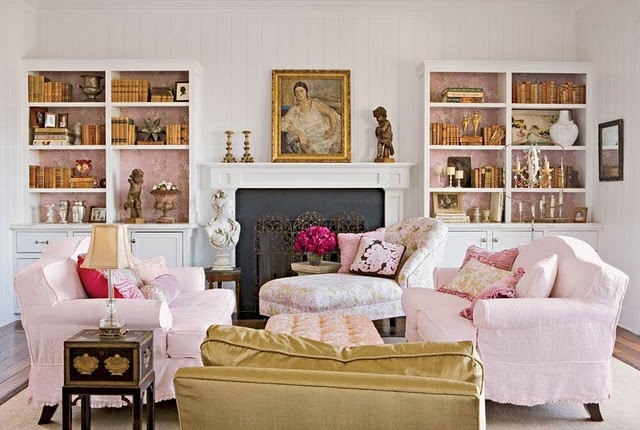
I really love that pearlised pink. It’s so soft and feminine. Very pretty. It’s going into my bedroom.
The brushed gold is the most surprising to me. I’m not sure how I feel about it but when it takes off I’ll remember that I saw it here first.
Loving the tones in the first pink room.
Ditto. They’re actually not too far off from the raspberry & Philadelphia Cream I currently have in my house!
I actually like the projections for 2015. We’ll see what happens!
I think Turquoise will be a wonderful color and I guess it will go beautifully with the current grey trend too. Now I wonder what the next trend in kitchens would be. Here in India, we are seeing more of white kitchens now, catching up.
Lovely colours 🙂
What will the gold trend change about the color of kitchen appliances? No more stainless steel if gold is on the way?
I started doing brushed gold here and there in my home 2-3 years ago. (a curtain rod, a glass and metal coffee table I painted, and some accent decorative pieces). I love it . Not sure if it will replace chrome faucets for me though.
I never got into the oil rubbed bronze look OR brushed nickel.
How do you feel about mixing metals Maria? Especially with some form of “brushed gold” in a room?
( I am still loving some grays, but I am adding ink blues, some other shades of blues, small doses of some form of chartreuse? (not sure what to call it)and believe it or not, some soft pink.)
Mary in Ohio.
Thanks Maria for including my shot of Mabley Handler’s fabulous turquoise dining room from the 2012 Hampton Designer Showhouse.
Stunning!
Stunning!
Maria, isn’t the west coast trend delay so frustrating? I’m in Seattle, and I guess you could say I have more like New York taste in that I follow a lot of early trendsetter/design blogs (including yours) that inform my opinions. Then I can’t get some of the better products!
You should see how irked I get when I’m looking at upholstery sample books to try to match the green I want. I’ve been going for either emerald or a much darker version that’s close to that 80s forest but with more blue than brown in it, to try to match a specific shade. Every upholstery book is full of “sage” greens, or their darker olivey counterparts from the pre-brown trend. There’s no blue-based green or saturated kelly green in sight!
Those brass rods sound amazing. Call me in ten years when they make it to Seattle and I’m totally over them, haha. 🙂
What no colours from the family of purple? I guess it is back to the drawing board for me.
With that said, turquoise yes, pink(s) not so much. (The dreaded pink undertones ….. yuk! ☺)
Brushed brass, yay and finally! So warm and IMHO a perfect contrast yet co-ordinate for gray.
-Brenda-
P.S: Have fun in the sun Maria and catch some rays for me. Very overcast and cold, cold, cold here today.
I am a long time lover of pink, so I’m always happy when it is “in.”
Love that chalky black! Always loved brass…hate the pale pink…too namby pamby and feminine for me and I’m female! My husband can’t even see pink! He’s red/green colorblind, so any colors in those families don’t register. Loves shiny gold/brass, blue and yellow (my least fave color
My favorite color…blue it has been since as far back as I can remember. 2 years ago we painted our living room Benjamin Moore 806 A Breath of Fresh Air. I still love it!
Is there any way of “brushing” shiny brass fittings to make them look like brushed gold without having to replace them all?
I know some people have successfully used rub n buff to change silver and gold fixtures, tables. I haven’t used it myself but i would!
Jessica, what is rub n buff? Whose product is this? Sounds just what I need to change some of fixtures in my house!!!
I would love to do this! So all of my builder-grade cheezy gold fixutres would suddenlty become chic!
You hit a nerve with me on the brushed gold. I’ve been looking for exactly that as curtain rods to dress up my dining room for months. Not shiny 80s brass, not actual gold, but something that has a vaguely aged, tarnished look.
It’s more pattern than color, but I also am seeing lots more tortoiseshell in home design. I love it.
What a lovely couple! Terreeia seems like a warm and honest person. By the way that shade of turquoise is my favorite, most soothing colour. I really love it combined with grays and greens and yellows! (way before the gray trend, of course).
Greetings 🙂
Pink with gold, or mint with gold!! I’m so happy we can all indulge in fresh powdery pastels. It’s the perfect antidote to the ennui from all those earthy neutrals.
For me, my heart’s still with green and my inspiration is my treasured “aspens in fall” painting and the gorgeous views of grass and trees outside my windows outlned dramatically, I think, by the dark window frames. It’s the immediate view you have when you step into my foyer and my I really do smile everytime I walk in. My only problem with trends is that if green and the vibrant yellow of the treetops (a la Maria’s couch) are not “in”, I have a difficult time finding accessories. By the way, Maria, just spotted that gorgeous yellow couch of yours last night while flipping pages in “Small Room Decorating” Country Almanac (Spring 2014). Turned over to pages 10-11, looking at pics only, and immediately thought “Wow, that looks just like Maria’s couch”, then looked closer and thought “Wow, those are Maria’s paintaings” and then, with my nose to the page, read and realized “Wow, this is Color Rules courtesy of Maria Killam and this IS Maria’s couch and paintaings and rooms”. What FUN and DELIGHT!
I agree that green is my favorite. It never “goes out”, as it’s always in nature.
🙂
We bought a great, TURQUOISE swivel rocker this year, so am happy to hear about that color. But I’m not too happy about my blue master bedroom, so maybe now’s the time to repaint to PINK! BTW, I read at the Pantone website once that the universally-flattering colors are eggplant, mellow rose pink, Indian Teal and True Red (per The Color Answer Book by Eiseman). Thanks, Maria.
Oh, I saw that (or a similar) article at Real Simple. Here’s a link if anyone wants a visual with pics:
http://www.realsimple.com/beauty-fashion/clothing/wardrobe-basics/4-universally-flattering-clothing-colors-10000001584157/index.html
So I guess we just need to take some wet metal sand paper to all the gold doorknobs/fixtures in our 1990’s houses and make them “brushed”, thereby saving a lot of money in replacing them. 🙂
the pink and cream room just makes me swoon. very dreamy and luxurious.
you’re one very busy lady now a days. I have to share the beautiful rooms you posted on my fb page.
Glad to hear that turquoise is becoming a staple color. Not sure I can wrap my head around gold’s return yet. I’m sure once I see it everywhere it will grow on me.
Your bangs look great, I never would have noticed. I’m growing mine out after a year of having them, because I can’t for the life of me figure out how to cut them effectively myself!!
Maria –
Maria – I’m thinking of doing some remodeling – time to replace appliances and faucets, light fixtures….but if you have a tailored country theme – bordering on mission …. what colours for these key items does one go with? That’s a lot of money to unload to find out you are outdated by the time you finish doing it.
Metro NY has been seeing unlaquered brass for about 1-2 years. Circa lighting has almost no polished brass lighting. That being said, we ‘ve had mostly negative response to the finish as it looks dirty (as if a film of grease has been applied) though the no maintenance factor is appreciated. We’ve had an increase in PVD’d finished polished brass again as it looks crisp, clean and stays shiny – no maintenance & classic at the same time plus it warms up the cooler grey tones. Makes for happy clients. Thanks for the sneak peek into the future.
I’ve cut my bangs too short too, a number of times haha!
Gold is too much “in your face”. The above kitchen photo is a prime example of that. I saw the gold range hood and nothing else until I made a point of going back to the photo a second time to look for other elements; the wood counter is beautiful but I hadn’t seen it at first glance.
Gold takes over a room in whatever form it is. Here are a few examples…A chandelier with gold hardware will attract the eye and one will notice the hardware before noticing the chandelier whereas in the case of brushed nickel/chrome, the actual chandelier will be seen first as it should be.
In a bathroom, gold faucets will be noticed first at the expense of either the tiles or counter.
With art, the frame is seen before the art itself. I have noticed this time and time again after visiting numerous art galleries.
In my (humble haha!) opinion, gold is the opposite of subtle and should be used with restraint.
I’m all for the use of mixing silver and gold when gold is used on one or two accent pieces.
What do you think Maria?
I forgot to mention that the only time gold does not take over is when there is a lot of yellow in the room.
I never thought of it that way before, interesting point. Maria
I am loving the way the pink tames the gold in the image you provided above.
Kelley, If you block out the gold chair/loveseat in the front of the photo you’ll notice all the gold in the back of the room more readily. I think the goldi(ish) fabric is what helps balance the room.
I posted my comment above because I lived with real antique gold accessories for 3 decades and got so frustrated from trying to tone it down. I experimented a lot and that’s how I eventually discovered that yellow was the best colour to take some of the attention away from the gold.
Hi Renee, I agree with you and appreciate your experience with gold. Gold + yellow and gold + pink are definitely different schemes with different effects. You do notice the gold with the pink. To me personally there is a happy tension there that brings both colors into balance. The pink really softens the gold, and the gold toughens up the pink and gives it some edge. I found myself liking that image and going back to look at it again. To me, the scheme seems fresh and surprisingly lovely – which is really saying something because I’m usually allergic to that sort of pink. As gold makes its way back into the mainstream, it will be fun to see the ways it is used successfully this time around. Thanks for the interesting discussion!
Those bright brass and chrome fixtures can be changed over to brushed gold, oiled bronze, etc., colours from Modern Masters metallic paints. First prime with high adhesion primer (Stix by Insl-x is great) and then painting on the metallic. If it’s a high use fixture, top coat with Modern Masters polyurethane. Many of the Benjamin Moore retailers carry these products.
Personally, I am waiting for camel and cream to come back in trend especially for cars. I want a cream exterior and camel interior. I hate the dull black and grey interiors.
Glad that all my gold and brass are coming back into style. Knew that it was just a matter of time.
I’m personally not a fan of gold tones, brushed or shiny. I think you should choose what makes you smile.
My kitchen is stainless and shiny black granite (had to compromise w/hubby) but we’re not planning on selling and it still makes me smile. I think it helps that it’s “neutral” enough to add a trendy color if we want (except the gold). It’ll be fun incorporating some chalky black accessories.
I love the dark teal with the turquoise dining room. I already hav those colors in separate rooms, now to combine them…
I’m in the brass corner, too. It’s almost like wearing gold jewelry (my personal fav) I just lean towards warmer colors. Brass and smokey black…yup! franki
Turquoise is great, but you won’t see me decorating a main living area with pink.
Favorite colors are natural greens, ocean blues and soft yellows. And whites of course:)
As far as metals go, I’ve always loved the warmer and darker ones, don’t think that will ever change.
Maria, yes your bangs are a little short, but you still look adorable. Next time they need a trim, take 1/8″ sections, twirl them, and cut off the desired length. This way they’ll look like they’ve grown along with the rest of your haircut, not chopped straight across. I always need my bangs trimmed before it’s time to go for a full haircut, and this works perfectly for me.