The reason I’m calling them ‘designer yellows’ is because [usually] the first thing a designer will do if they are helping you with a yellow is tone down (or muddy) the yellow you have chosen.
 Credit
Yellow gets twice as bright as the tiny 2 x 2 square paint chip once it intensifies all over the walls so a yellow that looks pretty on the paint chip will most often be the wrong yellow and will not give you the effect you are looking for. It will just sit there, on the wall, screaming at you!
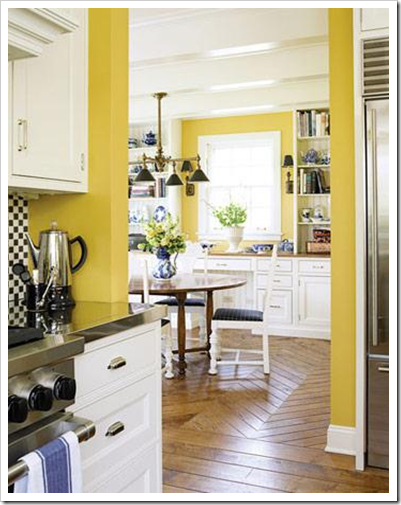
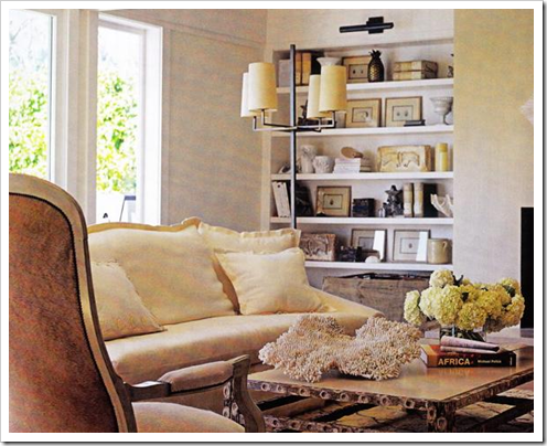
The colour in this kitchen (above) is likely (BM) Dijon or Chestertown Buff.
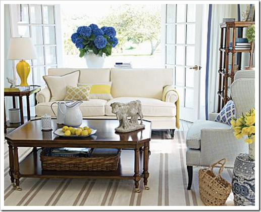
This is a beautifully decorated room but this yellow (above) would be much too bright for most people and only works here because the periwinkle blue sofa matches the ‘clean’ factor. Also there’s a lot of white in this room as well. Imagine broadloom in any colour with this yellow, it would end up looking dirty with this wall colour.
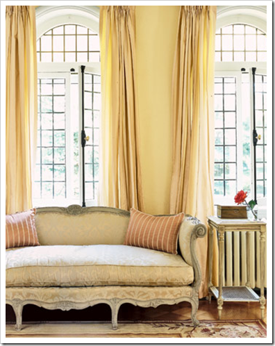
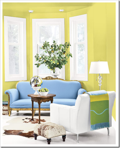
One of my favourite yellows is 2154-50 Straw, it looks like butter, similar to this one (above). I also love Rich Cream 2153-60 (accent wall below), it’s softer and lighter. Careful that you don’t put it in a North facing (or too dark) room, yellow if it’s too pale will go green. Testing is always very important.
Generally the rule of thumb with yellow is it should be more orange than green. Most people don’t like greeny yellows although they do look good with a colour scheme that includes purple, hot pink, emerald greens and cobalt blues!
 Happy Easter my Lovelies!
Need help choosing the right neutral or colour? My How to Choose Paint Colours: It’s all in the Undertones ebook takes the hundreds of choices down to 9 neutral undertones along with list of all my other go-to best grays, broken down into 3 undertones, green, blue and purple. The beige undertones of pink, yellow, green, gold, orange and taupe along with the best greens and blues.
My bonus book of colours is worth the price of the ebook alone but you will also get my system of understanding undertones so you can stop making mistakes when sourcing tile, carpet, countertops, etc.
If you would like to transform the way you see colour, become a True Colour Expert.
Related posts:
Why is it so hard to choose yellow?
Three Different Shades of yellow
If you are new to this blog, click here to see the Best of Colour Me Happy
While you’re here, subscribe to this feed so you don’t miss out!


Great lesson Maria! | love Straw too and I have had Standish White in my family room for awhile and love it. It's a soft butter yellow which doesn't scream yellow. As you said, it's all about the light.
Dearest Maria, just now I had a moment to read all about your moving and the implications with it! I cross my fingers that you both will find a dream to rent!
I know it is exciting and aggrevating at the same time!
Do you have a lot of local readers? Perhaps you find something this way, they must love you as a tennant…
Love also the happy yellow post, I am going to paint my living room Farrow and Ball's Orangery. It is not a yellow but close. And so warm! The kitchen above is so pretty!
Happy Easter to you all!
I am still a bit sad, that I missed you in the city last time you came!
XX
Victoria
I love yellow! My kitchen and den are currently painted Behr's Whisper Yellow. Beautiful!!!
I'm in love with the butter yellow. So warm and comfortable.
thank you so much! you are so knowledgeable about color. so sorry you have to move.
as I go "hippity hopping" out of here, have a great Easter.
Oh Maria, I love that kitchen. Mine is BM Concord Ivory and that pic is really making me want to paint my cabinets white. Happy Easter !
Great post on yellow. It can be a hard colour to call depending on ,as you say, the lighting. I'll often go for a less intense version so that it works as a neutral.
Adoring the room with the white sofa and the yellow accents.
cheers
Susan
My kitchen used to be Hawthorne Yellow and then I needed something more, and it is bright Green, but I often look back at photos and feel that yellow is easy!
Yellow like the sun is cheery and always adds warmth.
I personally love a greeny yellow.
I dyed my eggs today, some pretty yellow, pink, orange, blue, green and purple.
Happy Easter-
pve
Koving yellows right now!! Beautiful images!!
Karena Art by Karena
Loving that is or maybe craving!
Karena
I actually prefer the yellow-greens over creams for wall color if choosing color for my own home, but can appreciate the straw and cream in someone else's home…
I LOVE the current trend of fresh, sunny yellow fabrics in gray rooms.
My Aunt has Harvester (SW) in her family room and it's gorgeous! Are you familiar with that color?
As always, great advice, you are brilliant. Love the kitchen you have posted (have used Dijon in a previous house and loved it). . Happy Easter. xo
We have a very, very long hall, it is 6' wide and quite dark. We thought white but there was not enough light so we painted it bright, strong yellow! It is an amazing colour but I suppose some people could find it a bit much. I will post a photo tonight of the hall if you are interested in looking. Enjoyed my visit.
I love that buttery yellow picture you show, Maria. I do like the "muddied" yellows better myself.
Also, you didn't mention it here, but the yellow in Vancouver tones differently in a home in, say, Phoenix, due to the differences in natural light and surroundings. Be careful of falling in love with a picture in a magazine (unless, of course, you have someone like Maria to help you!) 😉
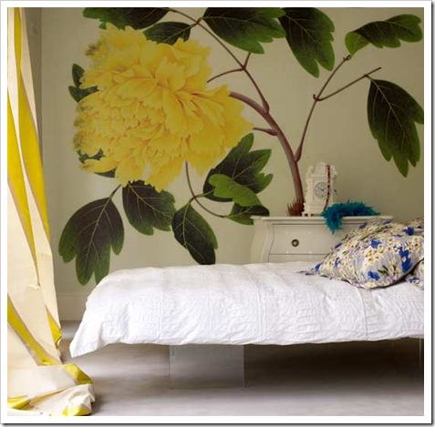
You are so kind to share your expertise and colours!! I love the yellow peony mural! The butter yellows are for sure my favourites. About 8 years ago I painted my home yellow and it took about 6 paint samples on my walls before I could chose one. Now I'm really tired of it, but I'm noticing that it's coming back into style.
Hi Kelly,
Thanks for your comment, this is why I talk so much about testing colour properly (as painful as it is) because the same yellow will look different in 2 houses even in the same city!
Maria
Yellow is definitely a hard one–I'm trying to get it right in my powder room now.
Happy Easter!
Happy easter !
"…this is why I talk so much about testing colour properly (as painful as it is) because the same yellow will look different in 2 houses even in the same city!"
Maria, isn't that the truth? Experience: not always fun the first time… *grin*
Thanks for this really useful information. Happy Easter!
Great advice about yellow! It really can cheer you up if done right.
Yellow is my favorite color-and it's also the most likely one that my clients mess up on when left on their own. Even with my help, it's a process to match the right yellow with their individual lighting situation. Such a fickle color but so wonderful if people take the time to gray it down and test, test, test.
Love love love yellow. The curtains in the "straw" photo above make me want to sing at the top of my lungs. I have a north-facing library with lots of mahogany and a relatively small window. The room is painted "Danse du Soleil" and it makes me unreasonably happy.
Buttery yellow . . buttery soft suede . . . creamy delicious butter. Anything is just better with a dollop of butter! (don't ask how I turn a decorating comment into a food related comment )
Hi Maria,
I have used rich cream with success…but my favorite of all time is Hepplewhite Ivory HC36 for a true buttery yellow. I use it in model homes for that universal appeal. HC36 has followed me from house to house ( I am a houseaholic) and I never tire of it! Folks always asking about and admiring this color. Have you tried it? Looks like nothing on the sample–but always delivers.