I recently came across some advice by an interior designer. She said outright that we won’t regret giving into our creative impulses when designing our homes. That we should choose tile and fixtures that are as trendy as our toss cushions, and that we shouldn’t worry about our fixtures being forever.
This is the fluffiest, dumbest advice I think I’ve ever read.
I talk to clients every single day who are upset either because they got carried away with too-creative finishes, or because they got the wrong advice from a professional and it’s way too late because everything is installed.
Other times, my clients can’t wait to rip out a previous homeowner’s burst of creativity in the house they’ve just moved into.
I don’t normally get this cranky, but this kind of advice — written for the novice who is already confused by all the unrealistic, ugly, and EXPENSIVE finishes they are seeing out there-is unnecessary and misleading.
The definition of fluffy advice? Frivolous words that fill up a page and help no one.
Don’t get me wrong. It’s not that I don’t love well done, trendy spaces. It’s just that I recognize a trend for what it is: something with a short life.
How do I know this?
All you have to do is look at the house you just moved into (unless it’s brand new and filled with trendy finishes that you might find acceptable), and ask yourself: Do I love the previous homeowner’s trendy choices that are now so, so dated?
No.
That’s the first clue that although you love it now, you might regret it later.
So here are some images that you’ll never find on this blog in a regular blog post unless I’m warning you to avoid them.
So enjoy. . . and then keep it timeless, and break out the subway tile.
Just sayin’.
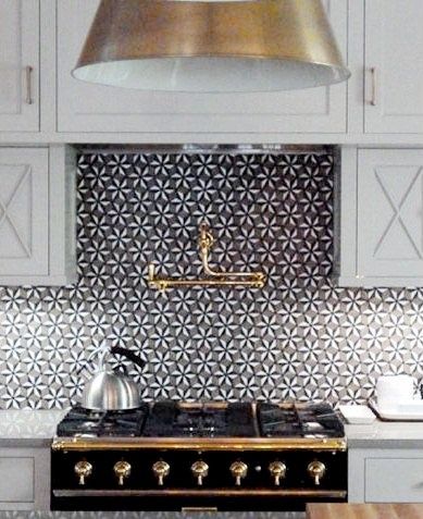
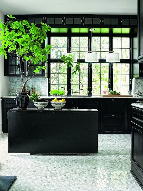
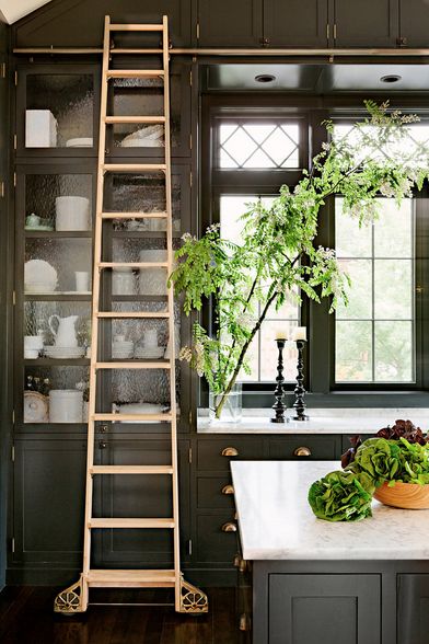
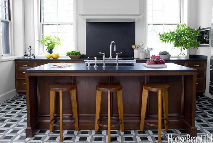
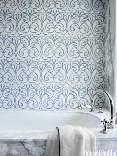
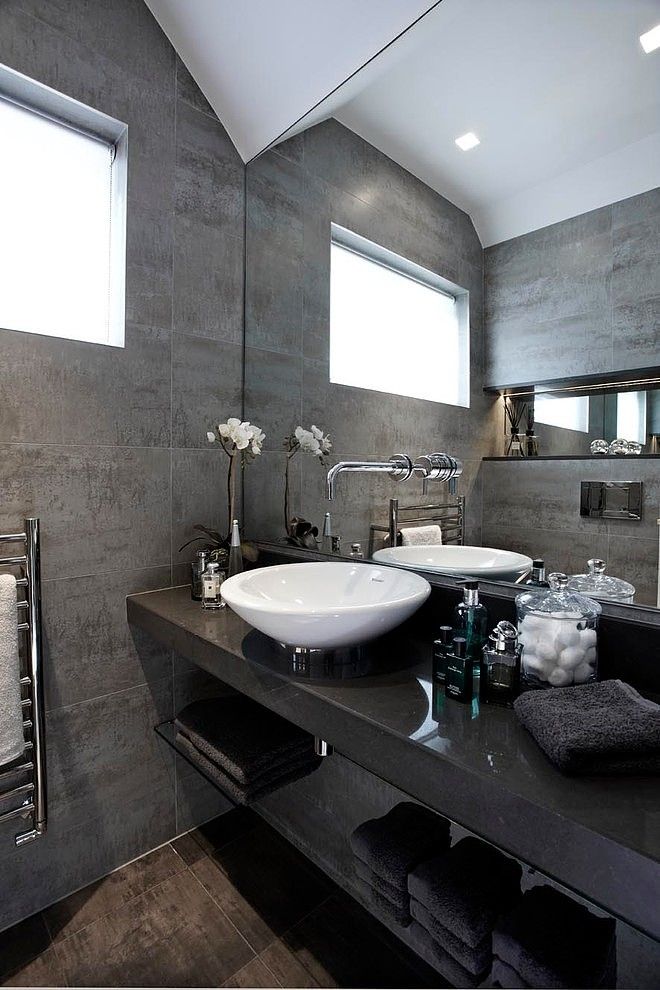
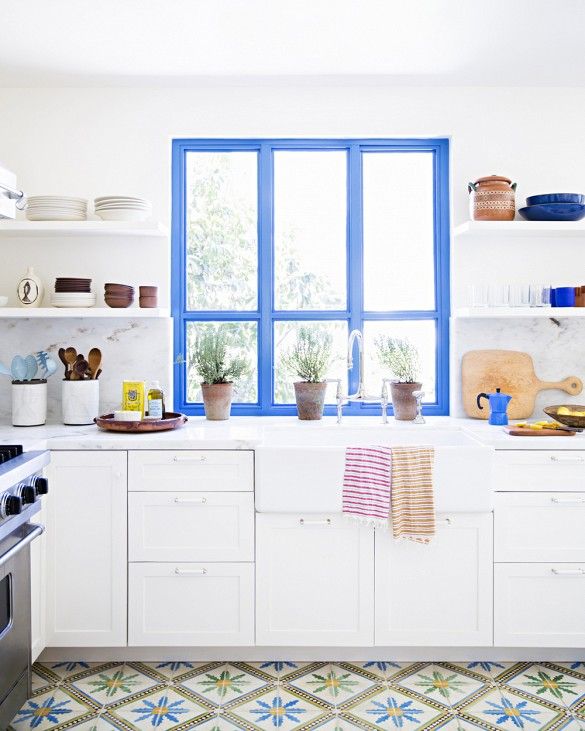
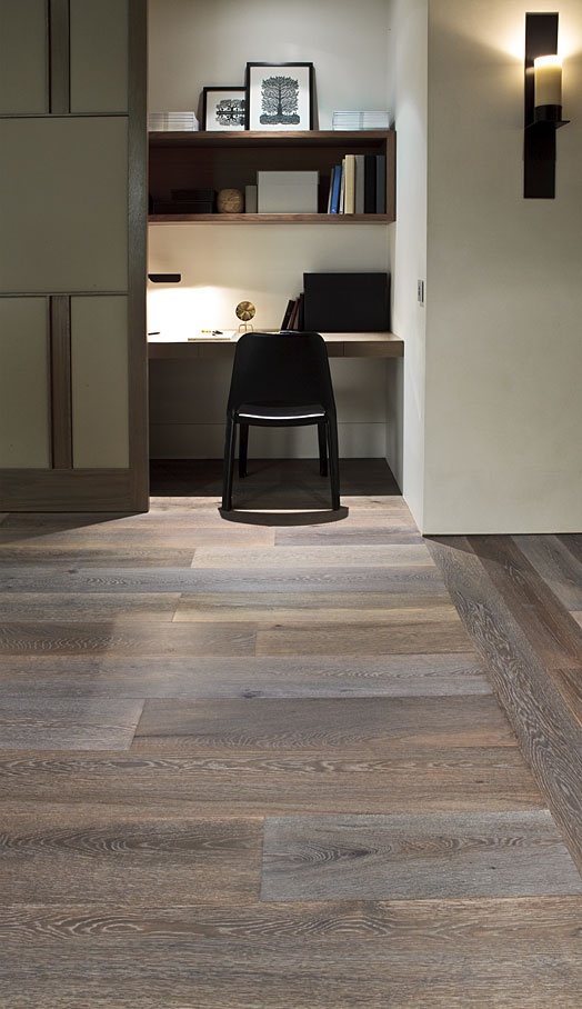
One of my amazing True Colour Experts™ just shared a story recently of a consultation she had with a couple who were building their forever house. They kept showing her one grey hardwood floor sample after another, and finally she said:
“You are building your forever house. You can’t have any grey in your floor, period.”
It’s hard to stick to this when you’re loving it right now, but trust me. I’ve been there. Just like most of us are not buying brown sofas or painting our houses brown right now, we were doing exactly that just a short five years ago.
So enjoy the trendy images, but keep the trendy purchases to removable items in your home.
And remember, this is advice for those who have not made these mistakes yet. If you already have, just style the room.
So many decor-related mistakes can be saved with some creative styling.
Check out my Styling Interiors board for inspiration.
I love my readers, and I want you to feel inspired, not depressed, after you’ve read one of my ‘warning’ posts. Seriously, though, with that kind of advice floating around, it had to be said.
Have a wonderful week everyone! xoxo Maria
Related posts:
Ask Maria: What’s Next After Subway Tile?
The New Timeless Hardwood Floor
Grey is OUT! (Maybe) The Colour Trends is In











Love your posts and blog Maria! Question: Why is the third picture down trendy? Other than the counter top being used for the 4 inch backsplash, I thought neutral grayish cabinets and white counters were classic?
Grey cabinets are part of the grey trend, just like espresso cabinets was the brown trend.
Good to know as I am really loving the BM Fieldstone Gray cabinets with antiqued brass knobs I found on Pinterest. I dont want to hate my kitchen within 5 years. Now to convince my husband that painting the existing hideous oak wood stained cabinets is not “ruining” them 😉
Great article. I really appreciate your ‘what not to do’ posts. They are supremely valuable.
I agree with you – 100%! I’m going on the 5th year in my home and I’m so thankful that I didn’t go trendy on my finishes! When I stained my hardwoods the super dark color seemed to be all the rage! And gray…well, gray everything!
I only used “trendy” on things that I could easily change myself, such as wall paint, chair bottoms, shower curtains, etc. It has worked out really well!
(I was directed to your blog by Brooke Gianetti when I asked her for advice on a white cabinet color. I went with BM Chantilly Lace after reading your blog posts! It’s perfect! The paint store man described it as “white – but with a little bit of sunshine!”)
We just painted our guest room Chantilly Lace – love it so much!
Thank you for having the courage to say the fact that, not all pretty photos are timeless design. If people have the money to change their tile all the time, but I don’t know too many people like that.
Thank you for your seasoned advice that help us all have more beautiful homes.
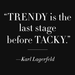
Well said, Maria! Great article. The quote “Trendy is the last stage before Tacky.” made me laugh. Those words are so wise, but there are millions of people out there who have more money than sense or taste. And they will get taken to the trendy and tacky cleaners every time.
let’s assume these pics are in homes of very wealthy people who can change these
strong finishes anytime…
doesn’t make the choices any less distracting…tho
You are absolutely Right! An Interior Designer should be the right focus lens for the clients for the fixed materials and give directions for accessories. The good designer should ask the clients the right questions and answer them with a timeless approach. Love all your posts, the dos and don’ts!
Whenever I feel pulled toward an expensive “trend” in a fixture or permanent finish, all I have to do is head to the library to look at decorating magazines from the 1990s or earlier. Ugly, ugly, ugly….just as so many of our trendy choices today will seem 10 years from now.
Of course the manufacturers encourage us to install the trendiest items, and pay shelter magazines to feature them editorially. If we all installed timeless fixtures, we wouldn’t need to buy replacements for a long, long time. And that’s not good for business.
Maria, while I generally agree with you about the advisability of keeping major design elements timeless, I’m afraid I simply can’t agree about grey, including grey floors.
For one thing, wood floors can easily be refinished or painted if someone tires of them, but there are also few colors in the entire history of interiors and architecture (or fashion) that are more ubiquitous and timeless. Or chic, for that matter. Grey is such a fabulous chameleon.
Think weathered old coastal buildings. Think buildings built of redwood, cedar, teak, all of which are chosen in no small part *because* of the beautiful silvery grey that they weather to. Japanese soaking tubs. Soft, heathered grey wool. Silvery chiffon scarves. Gunmetal taffeta and lace cocktail dresses. Silvery grey hair on people who are aging beautifully. Silver itself, especially the beautiful patina of well-loved old flatware and serving pieces. It’s also the color of stainless steel as well as concrete, either of which can read contemporary or classic, depending on how they are implemented. It’s even in nature, in some of the most beautiful grayish greens and silvers of some plants.
Peruse World of Interiors.
Finally, look up Axel Vervoordt. And Mary Douglas Drysdale.
Then please send me that client who wants the grey floors! I can easily do a beautifully timeless design that incorporates them – *or* something all-out trendy, or anything in between. OMG, my head is exploding with ways to do something simply stunning and utterly timeless in a number of different styles!
Because, among other things, there are many different definitions of “timeless”, and people with very different preferences can and will live *very* happily forever with exceedingly different concepts of what that means.
Don’t try to shove someone who adores midcentury Modern design, Art Deco, Japanese design, or a high tech industrial look into classic English, early American, or French design, for example, including those color schemes. Those are simply not the sole definitions of “classic”, “timeless”, or “forever.”
Nothing can substitute for a talented, thoughtful, and creative interior designer’s deep understanding of the history of interiors, architecture, and art, accompanied by deep probing and listening to elicit from the client what would speak of “forever” – to them.
It really is not just about color, and there is no one-size-fits-all. And to tell a client who is showing so much consistency of preference that she can’t have it – wow. The idea just blows my mind.
Sure, definitely skip the black kitchens, and wide swaths of wild geometric tile designs in tough-to-replace areas like bathrooms, and work on talking clients out of those, but holy cow, the range of options with grey, including on floors, just require a creative, perceptive designer who isn’t all rule-bound in her approach, always insisting on X color or material and avoiding Y or anything *but* X.
Yes, I’m with you on some of this….
I think it’s silly to say you can’t have “any grey” in the floors. There are lots of shades of grey in wood flooring that have been around for years & years! Long before the brown phase.
Mostly I agree with Maria, but I think it’s ridiculous to say no grey in wood floors. (and mine are espresso, so I don’t say this for myself!)
Amen!
The bathroom pictured from House Beautiful with the gray and white marble (my guess) need only a new wall paper or paint to be timeless. What a wonderful wall paper to use if it is to ones liking. The changes that can be made to this room are numerous with none requiring major remodeling.
If you look closely, you will see that what you are referring to is actually mosaic tile, not wallpaper! (At least it looks that way to me–I can just make out the tiny grout joints. Try enlarging your screen view and you might be able to tell better.) And I am sure that they were quite expensive to purchase as well as install! Wallpaper above a tub might have a tendency to peel off from the steam. However, tile that looks like wallpaper is probably going to be as trendy as the wallpaper that it is mimicking, but much harder to remove!
That House Beautiful bathroom is: Danse Azul Artistic Tile
Gorgeous now! And trendy in a heartbeat! Maria
I guess what Maria refers to as timeless is you can’t tell when something is installed. Examples that you brought up like art deco or mid-century modern will date the place, not necessary in a negative sense but more like an era/period. I do think that some trends when done right (and not overdosed) will look good way beyond its shelf life. But again, not everyone enjoys living in art deco, mid century modern or even baroque styled homes.
Hi. I agree with everything you’ve written. Where can I did your design firm online and get in touch with you?
I agree with you. How boring would it be if we all had “timeless” white kitchens with carrera marble and mid-tone wood floors? I personally think marble is so done to death that it has now become trendy. I also agree that some people will tire of patterns easily, but on the other hand, some people won’t. I see beautiful timeless styles often, in modern homes for example, or craftsman, or mid-century. I personally love textured tiles and I’ve loved them for 15 years and I believe I’ll love them forever, but I tire of patterns. I also have bright color everywhere, but it is my choice to keep that in furnishings and paint which can be changed more easily. But that said, everything dates and wears anyway in 20 years. I think the best bet is to go with what you love, not with what’s trendy.
The main thing though that I’ve learned from reading this blog over the years is whatever your style, keep things simple. I see so many rooms even on Houzz and Pinterest that are just awful with too many ideas crammed into one space that usually don’t even match. Whatever style/pattern/color you choose, stick to one cool thing at a time and not 3 or 4. I may be using a “trendy” white wave tile in my master bath, but the rest is calm with a very limited palette, and no mosaics or borders or accent pieces. Those are the things that always seems to not match and to date the most.
Kudos to you, Maria!
Even if someone is wealthy enough to change out trendy fixtures every 10 years, there is a cost to the environment. We all pay that one.
Well said Maria!
great advice Maria . we see the results of this every day in our home staging business. we stage over 500 properties every year and most we must style around their trendy choices from which ever decade the house was purchased in. when possible, we do a little reno, however as someone stated above, it is not always in the budget to do so.
Maria, I love you but I can’t agree with no gray floors. That being said, I just finished a lovely kitchen —- with matte white subs for the backsplash!
Love this post Maria! I’ve been reading your blog for a couple of years or more, and I’m so happy that I found you! We renovated our house last year, and I now have an all white kitchen with white subway tile. In fact, I’m getting ready to write a post about the tile. One of my contractors wanted me to put in some trendy tile, and couldn’t understand why I wanted plain white subway tile. Which isn’t the norm here in our town. After the white tile was installed, he said he understood why I chose it. He said you can add whatever color you want in the kitchen accessories, your not stuck with one color choice. Exactly!! We also went with medium brown hardwood floors (on your advice), and we love them!
Don’t you just love it when contractors try to act like designers?
Well said Maria …. and Karl … ☺. That said, IMHO one should not dismiss the psychological factor that as a species we all have a desire to fit in or to put it more plainly ‘be on trend’ or ‘follow the crowd’ so to speak and it is what the marketing industry zeros in on. i.e.: A need for a (decorative) backsplash yet many working islands don’t have any. A figure type that shouldn’t be wearing skinny leg pants; yet their closet is full of them. -Brenda-
I am absolutely with you on the timeless thing. Even paint, which people will tell you is “so easy to change,” is not always easy to change. What if the homeowner is elderly and can’t do the painting on their own? It’s not cheap to hire a painting contractor to change it. Having said that, I think we should also be mindful of the waste of ripping out pefectly good fixtures and finishes even when wealthy enough to do so. Also, having jsut had wood floors laid, I don’t think I’d agree that refinishing wood floors is “easy.” Doing anything with the floor requires alot of packing up and emptying rooms and so on–plus it does cost money.
One final point, though…. Not that many things are really timeless. There will always be some elements that date a room. Even as long as it’s been around, subway tile has been very trendy the last few years. While it may not ever seem as ugly as trendier tiles, it may indeed look somewhat dated in a few years (when I’m betting the style mavens tell us it’s awful and “dated”). I say have what you love in your house. Just make sure that it’s something you really love–not just what the magazines tell you you should love!
Also, I think that if your finishes go with the style of your house, you can go a little bit trendier. That is to say, in a mid-century modern ranch, the mid-century mod finishes are appropriate. In a colonial, they’ll look out of place, even though they’re very trendy right now.
If you’ve always loved brown, don’t replace it with gray because that’s “in.” And don’t avoid using it because brown is “out.” If you love it, you love it, and you will probably still be happy with it in 15 years, provided you’ve used good principles of design.
Great post,Val -you nailed it!
Agree! -Brenda-
Love your input!
Very well said!
“Not that many things are really timeless”. Good point. The trick is trying to figure what is timeless. What may be timeless and always look great in an Arts&Craft style bungalow will not look right in a mid-century. I do think subway tile is a safe bet (of course only if you really like it). Maria has made the distinction in the past about timeless elements being on trend, or not, but always remaining classic. However, everything wears, fades, and sometimes you just simply tire of it. I dont want to design my house with the idea in mind “Oh, I will just love this until I’m dead”…LOL
It’s so easy to get sucked in to a trend. Especially when you see it in every store that sells finishes. And every magazine.
I’m just glad I found you before I started changing out the builder grade finishes in my home.
Photos 3, 4, and 7 are gorgeous and don’t belong in a post on design don’ts.
If it were up to you, our country would be a homogeneous mass of white homes with black shutters, medium wood floors, white subway tile and white cabinets. How boring.
I’m renovating a kitchen and putting in quartersawn oak (gasp! Stained wood!) with brass accents (so trendy!) soapstone (not white!) and a shaped tile backsplash (not neutral!)
Haha, if more people read these kinds of posts, there would be way less unnecessary renovating going on in the world.
PS. I think what your’e doing is timeless. Black is my second choice for a countertop after white. I don’t hear grey in your flooring description so it sounds like your’e right on in your choices 🙂
I would have loved a quick comment on each image to point out what you find wrong. SOME of the images are beautiful and timeless in their own way and could be “updated” fairly easily down the road. Remember there was a time where people didn’t want a white kitchen…let alone subway tile, and worse when it had contrasting grout! I’m really interested in some of your replies to these comments. Thanks
You can get cranky all you want if it’s that productive!
Reminders never hurt.
This was a great post, Maria. Can you help me fully understand all the trendy issues with your last photo?
Thanks.
Grey floors are the same as brown floors, they belong to the current trend. If someone reads this post and installs pale floors with a light grey wash instead of charcoal I will consider my job done here.
This post is for the person who is looking for ‘the answer’ and is about to make all the common mistakes that a novice makes. Not for every design savvy consumer which a lot of you are!
Grain of salt. A little trend not A LOT goes a long way to getting a classic house.
I totally agree about the stupidity of trendiness, but mostly because it’s so wasteful and environmentally irresponsible. Are we so focussed on our selves and satisfying our whims and are we so flush with money that we don’t think about the larger costs to the environment? I know many of us do think about preserving and maintaining rather than disposing and wasting…good for you Maria for encouraging a earth-saving attitude.
Many people think they need to have fancy stuff going on in their kitchen or it will be boring. I remind my clients that kitchens are full of STUFF that covers up most of the back splash anyway. Having a trendy back splash makes it too busy.
Designer advice that really bugs me: when they say to paint your home to match the colors in your clothing, or a piece of artwork. What if those colors have no relation to the house? What about the undertones of the fixed elements?
Thanks Diane for moving this conversation forward!
Exactly right! x Maria
Here is a good illustration of your point, Diane: a customer once came in to pick out backsplash tile for a home she was about to put on the market (I used to work in the tile/flooring and décor dept. of a big box store). She had picked out a very busy colorful mosaic tile and showed me a photo of her “inspiration” fabric which was very colorful. I asked, “Is this your curtain fabric?” She answered, “NO, it is my realtor’s coat. She told me to pick out a mosaic tile with these colors in it!” I am NOT making this up! I showed her the white subway tiles we had that were about $12 LESS a square foot than the mosaic tile and had a little discussion (quoting Maria’s sage advice) with her. (Don’t know what she eventually went with, but she did put the mosaic tile back!)
LOL. Great funny story.
I love this post! I think if you have an eccentric personality with an eccentric historical/custom home, you can (and should) have all of the eccentric (or trendy) features/fixtures you desire (or can afford).
However, for the rest of us — either through job relocation, monetary contraints/priorities or life’s little realities — Maria’s advice is priceless!
I have been reading her posts for more than 4 years and I have such clarity when it comes to updating my home (or helping others).
The biggest bonus of having timeless features it that you can refresh and evolve your decor at will (or season). And THAT includes having fun with trends at very little cost and inconvenience!
(One last thing: Having had half a house of hardwood floors refinished I will say it is NOT an easy or inexpensive undertaking. The ENTIRE house is distrupted removing EVERY single item in the area being refinished. You must also live someplace else during the sanding and then the four-five days of stain/poly/cure. And the cleaning…wow. It is not just the walls and surfaces but the dust in your heating and cooling system. We just had hardwood flooring installed in the second half of the house and chose prefinished flooring rather than ever go through that again.)
Agree about refinishing hardwoods. We had new floors laid in a kitchen remodel and extension, which meant that the floors in the rest of the house had to be refinished. The only thing that mitigated the terrible disruption was our choice of a European hard oil finish, Rubio Monocoat, which could be done one room at a time. So kitchen floor first, then dining room, then hall and new living room. The only time we had to be out of the house entirely was the three days when the hall was refinished and curing, since every room connects to it. It’s been almost two years and we still haven’t geared ourselves up for redoing the bedroom floors. Just finding places to put all the furniture is a huge problem. Once the bedrooms are finished, however, we will never have to do this again–a hard oil-finished floor never needs sanding. It also cleans like a dream. Why everyone isn’t jumping on the bandwagon and using hard oil finishes is beyond me.
Kay, I jumped on the Monocoat bandwagon. I had to plead with my floor guy I really wanted him to experiment on the beautiful quartersawn oak floor he just laid for me. I love my floors!
I am on the fence about much the advice because we are in our forever home. If the person who buys it from our estate doesn’t like what I did, they are free to change it. Decorating for resale is just not in my DNA.
good post. i agree with most of it. i work with clients each day with color issues, and it’s great fun to work with the adventurous ones, who want on-trend finishes. it’s also very, VERY interesting and instructive to work with (usually) older, wealthy clients who don’t give a darn about trends. they simply want the best (as they define it). for these clients, i concentrate on undertones, lighting, proportion — the fundamentals. people bring themselves to their homes (second homes, boats, churches, offices, cottages). i guide them toward the right answer. but they have the final say, of course. that’s the job. “timeless” isn’t always the right answer, by the way.
I agree that timeless isn’t always the right answer, but usually a good designer will know in the moment when to ignore that advice.
My advice is for the person who is not a designer and needs ‘rules’ to get it even close to the realm of timeless.
Great comment thanks!
Great post Maria, as always. love reading it, it’s a wealth of info and also love hearing everyone’s thoughts and what they have experienced. All good lessons and advice.
Oh,one of the best posts from Maria, thank you.
Classy is always going to be classy no matter what even after 100 years.
Surroundings designed in a classy order will make you calm, happy and free, no disturbance in your everyday life.
Hoechstetter Interiors is right on…
While I always respect your advice and do agree with you on this one that, unless you enjoy and can afford to redo your rooms when you tire of something, a trend is better left to the small stuff. However, I will say that the photos you chose to illustrate this idea do not seem all that trendy to me, just difference in tastes. Subway tile is wonderful but also a bit of a trend as it used to be and we recently re-discovered it as the new “it” product. So, unless you are worried about re-sale, I say enjoy those crazy tile patterns in your home knowing that, at some point you will grow weary of it. But, again, it is your home and you need to fill it with what makes you happy.
Hi Diane,
I wrote a post about subway tile being trendy or timeless, you can read it here: https://mariakillam.com/subwaytile/
It’s trendy right now just like white kitchens, however it also happens to be a ‘timeless’ element. That’s why they are in every movie and TV show set while the trendy bathrooms are rarely found in them unless there’s a specific reason or they are trying to show a particular era like Mad Men.
Just sayin’. Thanks for your comment!
Maria
Great post loved all the information.
Really loved the comment you made about the gray washed floors. Instead of a Charcoal floor.
I have white Oak medium wire brushed wood floor ( oil finish ) with a light gray wash over it .
It really doesn’t read gray it reads aged and I love it.
Thanks for a very interesting post .
To me timeless means simple, classic and neutral. I made the mistake of being trendy in my last house thinking it would be my retirement home. Well life happened and we had to move. What buyers objected to the most were all the brass bathroom faucets and brass everything, after 15 years the bronze finish was trending.
As I build my 5th home I will have soft neutrals – with 6 bathrooms and 2 powder rooms I won’t have all white bathrooms as I’m afraid it will have an institutional look. Best advice I got from Maria – watch the accent tile, it will date a bathroom or kitchen, don’t I know it! Got tired of one bathroom 5 years after install. But my simple cream travertine tile master bathroom was timeless and liked by potential buyers.
Amen Sister!!!!
Oh my gosh, my Sister, you got it right!
The two times I consulted a designer, they had the philosophy ascribed in your email. I look back to their suggestions and I cringe. I cannot believe I fell for it.
I love timeless design which is why I was drawn to you. Thank you for standing up and showing up with great advice.
Maria, Always love your posts and this one sure stirred up a lot of response. It shows that everyone has their own ideas about trendy. Some of the nicest homes that I have been in are “traditional” and timeless. A lot of the top designers have combined the traditional look with a little whimsy and have made it look beautiful!
That is where a knowledgeable designer can combine trends to make it look timeless.
Great discussion.
Ever think how much STUFF goes into a landfill from our careless redecorating? Do we really NEED to trash our world because we think we must chase every trend? Thank you for your words, Maria!
LOL I’ve never understood “trendy.” Why would I care what everyone else is doing? Why would I want my home to look like my neighbor’s or the latest magazine? I think of the neutral hard surfaces in my home as a blank canvas for furniture and accessories. I have a lot of color in my home, and it is what *I* love, not what I am told I “should” love by manufacturers who want my money. If I ever decide it’s time for a change, it’s easy and relatively inexpensive.
I love your blog, Maria. It has helped me to tweak my neutrals and be brave about color, but I’m afraid you’ll never get me to like subway tile. 🙁 I understand why it works, but trendy or timeless, it leaves me cold, literally. White paint makes me happy. 🙂
Another one of those reaction-provoking posts, Maria, and funny that even though you specify who the post is geared to, so many readers and other designers get so snippy.
I think the issue of the “grey floors” illustrates how much we get caught up in trends whether we think we are or not. I don’t remember that much focus on grey floors when the grey trend started, but now, especially with all the wood-look porcelain tile out there, some lovely and some not weathered grey floors are everywhere. But they are just not right for every home. A la Irene Hill’s wonderful post on “Your House Is the Boss of Your Project”, when I briefly thought about greyish brown wood-look tile, my little sorta Spanish-bungalow home with it’s large dark-framed sliders and mullioned windows shaded always by eaves, it’s yellow beige walls, it’s vaulted ceiling and it’s one arch screamed at me “no, No, NO!!!!” Much as I love the floors in the pictures, I listened. Thank goodness I’ve had you to learn from, Maria. I couldn’t pay you enough for that education.
My story is not about fixed elements like tile and granite, but over the years I have learned that trends do indeed affect us all, often unknowingly. When I bought 2 rooms full of cherry Queen Anne furniture (expensive and good quality) in 1993 I thought I was set for life. After all, the style had been around since the mid 1700’s, wasn’t that a good sign of safe, classic and timeless? And, it was on trend at that time, everyone I knew was buying it and all our homes looked like the early 1990’s Ethan Allen catalog. But then alas, came Pottery Barn and like companies, and our cherry Queen Anne furniture started to look dark, dated, way too formal, and something more like our mothers or grandmothers would have. Just this month I sold the dining room furniture. After learning it was a hard sell, no one wanted it, consignment stores weren’t even that interested because it is too common and takes up too much space in their shops. On Craigslist there are many similar sets. Finally I ended up selling it outright (for a song) to a used furniture store. I felt a bit sad because the quality was so good, but I wasn’t sad it was gone from my home. It no longer felt like the rest of my home, because I too, was affected by current trends and went lighter, brighter and way more casual, and wish I’d done it sooner. But guess what I told my kids (who really disliked the furniture): I said, 20-30 years from now you’ll be saying to each other, “remember that beautiful cherry Queen Anne furniture mom and dad used to have? We sooo wish we had it now!” That’s the way the decorating world works, for better or worse.
I think you’re right..it takes about forty or fifty years for something that was loved, to come back. Now I feel I’ve made a circle in my tastes and came back to my Grandma’s style, that shaped home of my childhood-mid century modern furniture, clean lines, but nothing too futuristic.. I didn’t know the name of the style back then, or many years after..)) I found it out several years ago, when looking for the furniture and not liking this, not liking that…Now my late Grandma would’ve liked my house. I also love flowers like she did, and art, and pottery. It definitely shaped my tastes, not right away, first you explore, you take some distance..and then it hits you, you’re ready to inherit some of the things back again. Here’s a bit sad quote that I’ve stumbled upon recently: “The largest trends in home design are driven by the dead: that’s right, generations pass away and their possessions go into estate sales which feed the antique markets which feed the high-end design trade which feed the reproduction market and trickle down from there.”
PS I just wanted to join everybody in saying that’s a thought provoking post, and one great discussion here.
That is an interesting perspective! It sounds like you are confident in your style and your grandma would be proud. I do like antiques and vintage, and have a fair amount of “junk” like that to throw in the mix. I think a mix is the way to go!
Ditto on fine antique china..
I have lived in boring beige or white apartments most of my life, with brown or beige tile in the bathrooms that strive to please everyone, and really please no one.
I think there are a couple of things one ought to consider before installing difficult-to-change finishes:
1) Does it fit the style of my home? I do think it is OK to mix styles, but it has to be done with care to work, or be in an isolated space, like a powder room or basement rec. room/man cave.
2) How long do I plan or hope to live here?
3) Is the current material good quality and perhaps just needs a good scrub and some tweaking to work?
As a lover of old houses, one thing I admire is the chutzpa they had to just go for it–stained glass? Sure the more ornate the better! Colorful mid-century bathrooms? Hey, you only see it for a half hour or less at a time, so why not? Ornate molding? Gingerbread? Over-the-top light fixtures? Bring it on.
Did it always work? Maybe not, but now we look at them and say, “Look at that craftsmanship, look at that detail–why would anyone tear that out?”
They tore it out because it went out of style 20 or more years after it was built, just about the time it was starting to weather, and slathered it in white paint to make it look cleaner and more modern. That has been going on since the 1930s.
It takes 40-50 years to appreciate a past age’s aesthetic, and no matter how hard we try, it is almost impossible to not escape influence from what is in at the moment.
Just witness all those “authentic” restorations from the 70s and 80s–one can almost always tell because they are a little “off” from the original. It is almost like those old movies that are set a hundred years ago, but have the women in contemporary makeup and sort of old fashioned hairstyles. Add 20 or more years, and it stands out like a sore thumb.
So I say, celebrate what is unique in your old house! Don’t blandize it in an attempt to make it more sellable. Consult an expert in the period of the house’s construction and subsequent remodels for a tasteful update. That pink bathroom may just grow on you, and is becoming retro cool again.
Carefully consider expensive changes. Make the most of what your house is with the décor before wiping the slate clean.
Maria, I found your website AFTER I picked all the finishes in our home! I remember three years ago being tempted to buy grey washed wood floors! They were so new, so different! I hadn’t seen anything like them. My husband usually lets me pick everything out without a fuss, but he made a fuss about those floors! Luckily I listened to him! We have beautiful medium wood floors that look aged. I know I will love them for years to come! My neighbor picked the grey washed wood floors. Every time I go over to her house I’m reminded to thank my husband for talking me out of them. It’s not that they look bad, they are just really trendy! Maria, I just had my brown leather couch delivered to my house a week ago! So yes, people are still buying brown couches! I can’t think of anything more timeless than the couch I picked out by shape and color! I LOVE it! The things I have around it make it current too. By the way, I painted my walls the shoji white you have in your kitchen. Is that color part of the grey trend? The seem more creamy and warm than the current grey trend wall color.
It’s not like a can of paint can fix it
A brave article showing these images, as a design blogger myself, I talk about what you should and shouldn’t do but not always brave enough to illustrate the point as you have done. I think for those that want to create a home that is timeless, showing images such as this is important to be clear about how something might look trendy today but how are you going to feel about it 10 years down the track like those Avocado bathroom suites that were so popular in the 80’s.
I see lots of makeover programs on TV, especially where some of the contestants are using highly patterned tiles which might look great on the day but I am sure that whoever purchases the property at the end will tire of them after a few years. The same goes with colour trends.
I say, if you want pattern and colour, use cushions, they are a decorators secret tool.
We so often hear the mantra, “If it feels right to you, then go ahead and do it”. You’ve perfectly pointed out as to why this is not logical thinking. In fact, if we find ourselves questioning potential mistakes in any area of life, we should seek wiser (emphasis on wiser) counsel or at least delay until we’ve thought long and hard about a decision.
Can I just tell you that I appreciate your advice and use it whenever I can in my home. Recently we had to choose a floor. I know what you say about wood being the most timeless. I let that be my guide even though there were other floor options I was really drawn to. Since we live in Tucson AZ, wood is not practical because it’s just too dry here and wood doesn’t do well. We installed a very realistic looking wood tile. Not cheap but very beautiful. We get so many compliments. Thank you for steering me the right way and helping me love my house and my choices. I truly appreciate you sharing your talents.
Interesting and passionate comments. I have enjoyed them all.
Additionally, will add:
Kudos to you, Maria, for your posts, and also for you always classy, helpful, and spot-on replies!
I think timelessness is much more about the quality of material than the colour. I like clean contemporary lines but also appreciate old grandeur though I wouldn’t choose to have it in my own home as a rule. A beautiful floor is a beautiful floor regardless of whether it’s beige, brown or grey. I’ve seen stunning kitchens in white, maple, brown – I’ve also seen terrible kitchens in the same colours. The vanity with the vessel sink you’ve shown above may be a bit dark and the floor isn’t quite right with the tile, but the design is simple and timeless. It IS trendy, but I think we have to be careful not to dismiss good designs because of that that. Something may be trendy, but that doesn’t mean it’s not evolutionary.
Personally, I will never have subway tile in my house, as I hate it. It is timeless but it’s also reminiscent of public bathrooms and dingy public places and that’s not something I want in my house. All those grout lines aren’t terribly practical either. I will never have another white kitchen either, as it just felt functional, and not particularly welcoming.
Yes..I thought along the same lines..timeless is beautiful. Now what is perceived as beautiful changes a bit between times and cultures of course, but I feel that certain inner meaning stays the same. And I guess it IS quality, or should I put it this way-the soul and the skill somebody put in his creation. It is probably what we admire, even if we can’t/don’t feel the need reproduce it in our everyday lives anymore. The skill and the soul of another person peeking at us.
Personal connotations also play a huge role, of course, in what we tend to like or not. My husband abhors subway tile, precisely of how it reminds him of public restrooms. That’s how public restrooms looked like in Europe. (I’m also from Europe, but I’m somehow OK with subway tiles:) But I have hard time with slate, because in my mind it represents mausoleums and graveyards. Or: I know that black and yellow can be really chick together, but I got very frightened in a black and yellow space one time when I was a kid-I try not to pair them until this very day.
Overall, it’s very interesting subject, and I feel that hundreds of essays wouldn’t be enough to cover it. But I do love this discussion.
PS sorry for all the typos..((
Maria, on the subject of Subway Tile and for those who find it ‘boring’ … ☺ … they may find the following of interest as it proves, not only is it timeless but it is very versa..TILE to work with. Web search: Ann McCulloch How Do You Like Your Subway Tile. -Brenda-
P.S: I have also seen it for use in a shower stall where it has been stacked in rows that I would describe as an upside down, mirror image L and it looked amazing.
Sorry, that should have read: Ann McCulloch Studio
-Brenda-
Call me tacky, I’d take the second kitchen in a heartbeat.
I’d take the second and the third…))
I remember that second kitchen from a magazine(can’t recall the name of that magazine right now)..it’s a part of a really beautiful house. AS far as I remember the article in question, the homeowners love to build/remodel houses They build a house, they live there for several years, and move to a next one. This is their third house that ends up being featured in the press. Obviously, the bones of the houses are so great, and the amount of light is amazing, so you can do things you wouldn’t be able to do in space with less advantages. Also, these people obviously have style(I remember other rooms too), and lots and lots of money, which, I imagine, kinda helps)) I’m in the middle of remodel right now, and you would think our strict budget would boost my creativity..but no, it does not))
I don’t think Maria’s saying that kitchen is tacky – I think she’s saying it’s not timeless. In 4 years, will you look at that kitchen and say “ugh, I’m so over black.”
I like it too – – but I would never do that because I don’t have endless funds to undo it. Sounds like that homeowner might – so go for it!
We just repainted our kitchen cabinets white (original 50s cabinets) from a dingy yellow/white. We debated doing them gray – same color as the walls – but then I realized I really don’t LIKE gray cabinets in photos and I’d never get sick of white. We also tore out corian blue speckle counters from the 90s and replaced them with carrerra marble. Best decision we could have made.
Hey Maria,
YES! We bought the 1984 house that “has never been updated”, complete with solid brass HUGE swan fixtures in all the bathrooms. We have plans to “de-trend” the entire home, but for now we are coping and laughing/cringing when we see them.
“living with swans” in Texas 🙂
I don’t think any elements are truly timeless. If you don’t update your permanent finishes they start to look dated after a decade. Also if you love mosaic tile go ahead and use it. I’ve seen the most gorgeous tile floors in old Italian homes. They were installed a hundred + years ago and are still spectacular today. If you want gray wood floors don’t install brown floors just because you think they are timeless. When I remodeled my first kitchen 25 years ago, everyone warned me about diminishing the potential resale value of my home by installing a white kitchen. A couple years later the first white kitchen trend started, which was quickly replaced by cherry cabinets and then again white kitchens. Trends come and go. Choose what you love and you’ll be happier in the long run.
I actually can’t leave this comment as one of the last comments on this post because “Choose what you love” advice, is just as misleading as the advice the designer in this post wrote.
I talk to people every day who did CHOOSE WHAT THEY LOVE as a matter of fact and now HATE THEIR HOUSE. Or they bought someone else’s CHOSE-WHAT-THEY-LOVE-house and it’s just ugly.
Yes there are all kinds of exceptions to my ‘classic and timeless’ guidelines but those exceptions are best made by someone who is either being guided by a good designer or is someone who has the design ‘gene’ to begin with.
Doing what you love is also advice that will get you nowhere in the decision making department. Hitting a blog post where a decorator or designer is saying “Buy what you love’, will definitely keep you clicking until you do find a designer with an opinion that resonates with you.
If someone who knows nothing about design or who does not have a creative eye buys ‘everything they love’ that will most of the time end up being a pile of expensive mistakes because nothing works together.
If someone doesn’t like my advice, they can keep clicking, no harm done. But I receive many emails daily by grateful readers who followed my advice in the face of disagreement from their contractor or husband but stuck to their guns because they had someplace to stand:
Classic and Timeless.
And no matter what anyone says there are fundamental principles that define a classic and timeless house that are mentioned many times in this blog.
Big name designers in magazines often say things like “BUY WHAT YOU LOVE AND I’LL FIND A PLACE FOR IT:”, but how many guest rooms does any given house have?
Because that’s where it ends up.
There are some good points here, Maria. So mant people tend to forget about the long term. It’s always best to stick to trendy throw pillows and small decor items that can easily and affordably be replaced!
Ask why you respond to the trend or the image at hand. Over time the answers will tell you which elements of what are a crush, and which are a marriage.
I have a crush on the black kitchen shots. I respond to them because of the visible structure, the height, and the drama of contrast. Painting my kitchen black will not magically give it those bones, and I don’t like black that much for its own sake. That’s a crush.
I could happily buy that curlicued bathroom tile. It’s white and blue, and has curling, twining patterns. I own and enjoy many possessions that feature one or both of those, bought over many years. That tile doesn’t have any disliked-by-me elements either. I love that tile for itself, not for its temporary popularity. That’s a marriage.
That’s such a cool way to put it.
Beth B., with respect, I think the problem with your rooms full of cherry Queen Anne-style furniture was not that it was dated, but that there was too much of the exact same thing in one place.
Too much of *any* single style and/or color will look boring and quickly dated, no matter how good the quality, and no matter how classic (or modern) the style is.
The eye needs some variety, which means mixing things up more, both styles and finishes, with things that *coordinate* well, but aren’t all matchy-matchy.
To do that well, of course, does take some good design sense, but if you keep in mind things like finish undertones, furniture scale, and the general lines (curved vs angular, for example), that will take you a long way.
HTH!
Wendy
The thing is, what most people think is “timeless” is often just a trend too. Like white subway tile kitchens. Ten years ago, almost no one had them outside of Europe; now they’re everywhere. In five years they’re going to look really dated.
I’m old enough to remember that back in the 80s, everyone thought the Laura Ashley/English country look was timeless.
Amen sister!
I read all of your posts and follow many other decorating blogs. I know grey is on trend. I see it everywhere myself. That being said I love the way my home FEELS with Powell buff on the walls. The yellow makes it seem so warm and cheerful and I need that in northwest Ohio. I read your post about beige and shrugged my shoulders. I have grey in other ways but not on my walls. Thank you for all you do but this is one trend I will sit out.