While the obsession with the modern farmhouse continues, I’d love to know what style of new home you are building (or planning to build in the future)? And, here’s my advice on which new build details can fall totally flat in your design if you aren’t careful.
Your Modern Farmhouse home will make more money. Is this TRUE?
Recently, I read this article that reported, homes that boasted the “modern farmhouse” style, typically sold for 10.3 percent more than expected.
Since the majority of new build colour specifications we’re doing are definitely either modern farmhouse or specifying some shade of white to PAINT the existing stone or brick to move in that direction, I wondered how true this is for you?
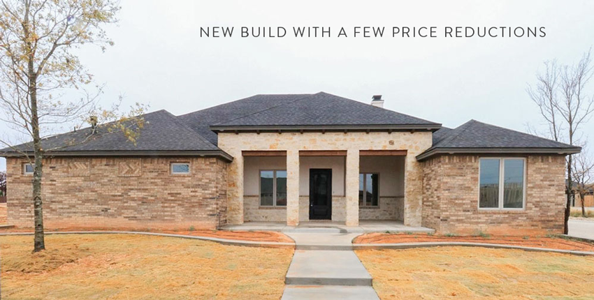
Browsing real estate sites led me to this new build (below). It was built in March 2020 and has had several price reductions (hmm, I wonder why).
Bad pink beige brick with stone combination, black roof on a brown house, and windows that make no sense with a blank, mostly windowless wall on the left side.
This is definitely a house that CANNOT skimp on landscaping which will make a huge difference.
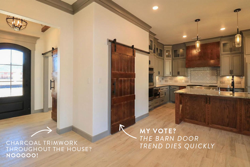
I was quite horrified to see all the charcoal millwork and trim throughout this home. Charcoal trim with grey carpets in the bedrooms, so sad to see this in a brand new SPEC home.
The Barn Door Trend
And the barn door trend. Can it just die NOW please?
Do you know how many barn doors I’ve seen on hotel bathrooms now that this trend is here? And if you’ve never lived with one, you wouldn’t know that you have zero noise or odour control with this type of door.
Someone had to say it.
Do it because it’s a decorative way to close a door, but NOT if you want to muffle any sound or keep kitchen or bathroom odours INSIDE those rooms.
Think about it, a door that is simply floating on top of an opening isn’t that functional.
The classic flooring colour is the ONLY redeemable design feature of this unfortunate new build design.
Should you design a hood fan accent?
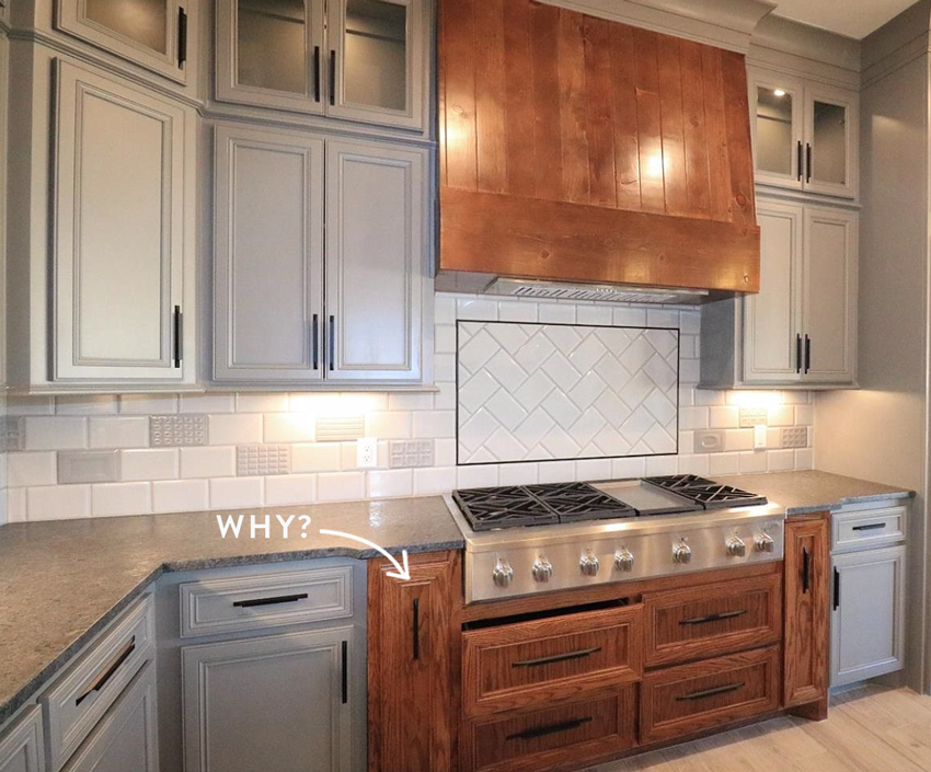
And while we are here, let’s talk about the hood fan as-an-accent moment that is going strong.
The hood fan can be an accent if it’s truly fabulous.
Otherwise, I would leave it the same colour as the rest of the kitchen.
Here, it could have worked, repeated in the four drawers underneath the range, but this look died as soon as the pullouts were included in the wood stained colour scheme.
Read more: Classic & Timeless Hood Fans
And I would like some votes on how many people would install this ‘interesting’ backsplash in their kitchen. You might think you’re bored of a basic subway tile backsplash?
But, while YOUR backsplash tile is simple, timeless and beautiful… This kitchen above is what your neighbour (who does not read my blog) is likely doing. 😩
White or Black Farmhouse Trend
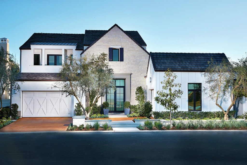
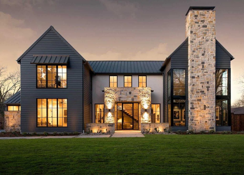
Besides the white farmhouse, the black one is also going strong. Stone is often added to try to make each house with identical white or black paint look different in the neighbourhood.
I do appreciate the BALANCE of the stone installation (shown above), AND that this stone has darker pieces in it that relate to the exterior colour. Also, this stone is obviously pink beige as well but because the siding colour is so dark, it just looks warm instead of like the wrong stone was chosen.
Notice also that most of this style of home has been strategically photographed at dusk. When the sun is setting and orange light is reflecting into the windows (the eyes of the home). These windows would otherwise be black holes without this photography.
Over to you my lovelies? I would love to hear from you if you are building or if you know someone who is building, is everyone building a modern farmhouse these days? If not, which style of home are you building?
If you’d like to learn how to choose the right colours for your exterior, get my Exterior Masterclass here.
Related posts:
How Soon will my Farmhouse Kitchen Design look dated?









We built our white modern farmhouse 20 years ago, first time I’ve ever been ahead of a trend, ha ha.
The long windowless brick wall might be a garage you enter from the side or back.
It reminds me of my beloved, dearly missed ranch style in Houston. Our house looked huge (it wasn’t small!) because you drove around back to enter the garage, which butted up to dining room/kitchen side. So there was a DR window that broke up the expanse of brick..
That garage became a playroom and is still remembered fondly by my sons and their friends. Then our house was kind of large! But w/o a garage..🤷♀️
I’ve looked at 2 ATROCIOUS townhomes lately.
One was still filled w ALL the dead owner’s things (included carpeting covered in dog urine) and had been empty for over a year.
It was disturbingly gross. The other had been flipped by Paul Bunyan, apparently.
Lots of random wood farmhouse beams and hideous vinyl wood planking, not the nice kind, throughout the entire house. I could barely keep a straight face.
Good Lord…there are some really ugly expensive homes on the market in HouTX!
Paul Bunyan… HAHAHA!!! You made my day!
We built our farmhouse too over 20 years ago. We’ve had many random people ringing our doorbell to ask who the builder was. My husband and I custom designed it and I general contracted the home. People were attracted to farmhouse style way before the trend and I believe many will still love the style after it falls out of favor on hgtv.
Looks like another contractor gone wild … apparently no professional guidance – maybe using leftover materials from another job.. and money costs money every day the project is unsold…
Sad to see high hopes dashed … everyone loses – the builder & the potential happy homeowner…
We purchased a home in August and the previous owner was definitely into modern farmhouse. White kitchen, rustic (laminate tile) flooring, gray walls (SW mindful gray) and they had updated all the trim and doors in the house to be white. Since moving in, we have painted kids bedrooms (kids don’t want gray walls), changed the kitchen hardware to black, and installed subway tile in the kitchen. I don’t have a trendy style, or if I do, I haven’t found a name for it. I take bits and pieces from all the styles and do what works best for my space.
If I were to build a house, my husband and I have always been huge fans of the rustic log cabin style, or since moving to the PNW and seeing the style here, I do love the PNW contemporary style (big windows, wood beams, wood floors in natural regional woods, etc).
I am a real estate agent in the US. I look at a lot of homes in our area which is growing by giant leaps and bounds. There are a lot of homes that are being built with the modern white farmhouse look. They look really fresh and clean at this time. In our area any home for sale sells for more than what it is worth right now not just white modern farmhouse. Resale value is yet to be seen since we are not too far into the trend. The black exterior does not do well in our area because of the fading and chalking of the exterior paint that will happen quickly under our hot summer suns. I haven’t seen any black exteriors and don’t see it as catching on here. As for the home with the charcoal and wood stain in the kitchen, I have to say that is just about one of the ugliest combinations I have seen ever. I just can’t imagine anyone looking at that and saying, “I must have this, it is so pretty”. It looks like someone didn’t know what they were doing or had leftovers they wanted to get rid of. What a mess in my opinion and I am not a color expert but I hopefully can see what looks somewhat appealing. Homes that are tasteful and have a come in and sit down look are what sells.
We are in the process of a new build. While we love the new Modern Farmhouse trend, we chose not to do it because we feel it could be too trendy and date itself in 10 years or so. Instead we went with a more classic farmhouse with horizontal clapboard siding. We’re painting it white, but also doing white windows and including some gray stone, dark trim and dark roof. We’ve loved this color combo way before it became popular in recent years. Our house is a single story….because we’re 60 and tired of taking the stairs, lol. Our home will be on 4 acres in Temecula, CA with a backyard of rolling vineyard views, so it works with the country life feel.
That colour combo sounds really nice Marilyn!
I know modern farmhouse is trending but it’s certainly not everyone’s style. I’m seeing them all over Pinterest, Instagram and blogs. With the white oak flooring, stark white walls and light wood cabinets the home will fall flat if not decorated properly. I’m seeing them in new builds in my area. And please, enough of shiplap!
I’m in St. Louis….just saw my first new build modern farmhouse (although I’m sure there are others!). It’s white painted brick and siding. I took a double-take! It was so stark in a suburban subdivision! Fortunately, it’s tucked in a cul-de-sac in the back. A bold choice; I won’t be choosing it.
There’s a lot of that stark white trend going on in our area, and not just “farmhouse.” We are entering a very ugly period, not sure why these high end builders think people want this stuff. But apparently people are desperate to get into homes.
Well I have a real modern farm house – on an actual farm that has livestock and black horses. Yes it’s black (forgive me but it matches my out ponies / out buildings!) but it has white windows and lighter stone accents with many mature trees in a large yard. The 70×220 adjacent barn is stone painted sided tin with white windows / doors and black roof/ accents as are all the small run in barns that dot the landscape. The fencing / gates are also white, black and stone.
Having white paint inside a real farmhouse would never survive – operational farms are messy and so are this bunch of farmers.
We are the only black / white/ stone yard in the area – all the rest are pinky beige or blue or green or red (traditional farm yard colours)
I knew better than to do black metal siding and black windows to avoid the black hole look thanks to this blog and Maria’s books. Whew.
I hope I never have to sell and can stay here for as long as my health allows (there is no pinky beige or charcoal trim in this farm house – I promise!)
Susan, your farm sounds picturesque, but you know what Maria is thinking….. you need to add some cognac ponies to warm up all the black and white. 😜 No really it sounds gorgeous and I love your on point post as always Maria.
Too funny! love it.
That is a very good idea!
I’d love to see you do a photoshop fix of the exterior shot of the bad pink brick and stone house with a black roof. Your “fixes” are inspirational!
I have to agree with you about the charcoal millwork trim.
Maybe I am a bit tainted as a realtor, but farmhouse will be dated and black windows for SURE will be dated. I’m old enough to remember the black and dark bronze window trend of the early 80’s and let me tell you, that by the early 90’s, homes with those windows were as bad as homes with pink, avocado or harvest gold sinks and toilets. Folks would look at those homes and immediately calculate what is was going to cost to replace the perfectly functioning black dual pane windows.
You say it over and over again, Maria that trends will tire and classics are what some folks consider boring. As realtors (and I am sure designers) we can walk in a house and tell you exactly when a home was built, remodeled or updated based on the finishing’s. Sometimes in the long haul boring is not so bad.
IMHO, interior finishes that stand the test of time and hold their value best are those that are insync with their exterior style (think, Spanish or Mediterranean with more rustic finishes, cape cod or colonial with traditional or mid century with sparse clean lines). Maybe there will be enough of the modern Farmhouse influence for it to create its own architectural style for it to create its own new category where black windows will be a requirement, but only time will tell.
Totally Agree! Continuity and flow are important design principles. It makes me crazy when I see a lovely home exterior and the the interior has been renovated (usually) in a conflicting style. Updating is good, but I believe it is important to work with what you have. Not dissimilar to pulling together a personal wardrobe where you’ll get the most flattering outcome when you dress for your body type, age, etc.
There is an apartment condo building in my neighbourhood that has a beautiful classic Georgian exterior – however the developer (who fancies themselves as interior decorators and refuses to hire a professional home stager) has outfitted the suites with various mash-ups of Jungle Glam, Hollywood-Art Deco, you name it, and are wondering why their properties aren’t selling!
I am scouring the internet for blogs with decor inspiration that is NOT “modern farmhouse.” It is so trendy and not what I want. Reminds me of all the other decor trends I have lived through…all fake – US colonial, French country, French provincial, Tuscan, Mediterranean, shabby chic, English cottage, coastal, et al. (any suggestions for blogs?)
I love the advice to spend money only on small purchases within a trend. Keep big ticket permanent finishes classic and timeless. Thank you. PS that poor house is SO ugly. I don’t think it will sell unless they hire Maria to fix it up.
Of course Maria’s amazing blog, and Laurelberninteriors.com. Beautifully classic interiors! And much needed humor too!
Lauren’s suggestions and Cote de Texas. She has a number of beautiful posts and one on classic and timeless houses. Also check out Maria’s pinterest boards.
Maria – how sad that new build what exactly is it ?
Is it suppose to be a farmhouse ,
It looks like a fixer upper outside ???
We are doing a farmhouse I sent you pictures as I didn’t know how to attach to this e-mail .
It just said home to me at this time in my life’s journey
Spending so much time at home .
I’ve been doing contemporary so this is a big change for me .
No barn doors .
White windows inside .
My last home had black interior windows.’
Found after a while for me that they became to heavy looking .
Plus window treatments was a lot harder to have looking right .’
I will have some black
Accents but really trending light on the black .
Only using in areas that can be easily changed out .
That is for my own taste as I’ve found black to be a heavy contender when I decorate .
We all have our own comfort zones .
Thanks Maria great blog as always
We are planning to build in about 8-10 years and our house will be based on a mid-century modern style. We plan to use stone as an accent on the exterior and the body of the house will likely be a light neutral. Our love for mid-century modern predates the current revival trend and we have a pretty extensive collection of vintage MCM pieces. So it makes sense. However, it won’t be a time-capsule home either, it will have a natural and coastal feel to it… and yes, it will be on the coast 😜 (I’m a fellow designer, so I know what I’m doing lol!)
We need to paint our current home and are planning to paint it a deep Smokey blue with white trim and a light aqua door, metal roof. The style of the exterior is a typical colonial style ranch with concrete blocks that are shaped like clapboard siding. So, the general idea is to create a bungalow look with the paint, materials, and landscaping. I think the color scheme will work well and it will definitely stand out in the sea of white and gray houses that line the streets of our neighborhood.
My house was originally built in 1914 as a true farmhouse on a farm (we are now within the city limits and the farmlands are my neighbors’ homes). The house is white sided with black trim, which is typical for farmhouses in the Midwest (unless you were really wild and crazy like my great-grandparents and went with dark green trim.) The main floor has oak flooring which we liberated from a linoleum prison, while other rooms have maple/fir floors and trim. We had to completely gut the 2nd floor where the trim is now all white. The kitchen cabinets are all painted white and have been for 21 years. We do NOT have an apron sink or sliding barn doors anywhere and I would use gray paint only if a gun was held to my head. I expect this house will be just fine whenever we sell it because it has remained true to what it is and what it was meant to be, a simple farmhouse for a family.
Nothing like authenticity! I’m projecting myself into the future, and embracing the fact that I have a suburban version of turn-of-THIS-century Contemporary Texas Limestone+horizontal siding Casual Colonial Farmhouse on the outside (very pretty lines from front and back), and an interesting variety of interior spaces that are the hallmark of a builder that sadly went out of business, and known to be unique to our community. A blend of contemporary and traditional elements with some surprises. I tried for YEARS to peg the style and figure out a cohesive design theme based on the style, but finally decided to call it what it is. There is no tradition associated with this style that would allow “Texas Farmhouse” decor to look appropriate here, but I’m having fun dealing with a pinky-peachy-grey-beige tile floor and orange-tinted red birch cabinets, mantel and banister…..
I live in a small suburban town that sees quite a number of older houses being torn down for new construction. The current wave seems to be white houses with black windows. I call them Dalmatian Houses. Nothing against black windows, my almost 100 year old Tudor house has them, but the newer ones are tinted more and they just look like black spots on a white home. The first house in this post seems to be trying to add some interest with the blocking of the structure and not having the garage be the very first thing that catches the eye, by having the section on the right appear larger and perhaps a bit forward of the garage. Nicely done. The light colored brick in the center helps to soften what could have been a Dalmatian home . The soulless, black hole contemporary windows need character to flow with the front door and garage doors. Hmmm, wonder what the next rend will be once the dalmation farmhouse has run its course?
Can you explain why painted tirmwork other than white is a “no no”?
Great post! That new build with the price reductions clearly doesn’t have any cohesion. I get the feeling the designer (if there was one) was trying to blend styles, which is why I would put the architecture of this home in the Contemporary category. It CAN be done, it’s done al the time, but this house was not done well. Fortunately, that can be fixed with paint. Speaking of paint and the Modern Farm House style, the bones of many home styles through the decades actually lend themselves quite well to an exterior color scheme of black and white. Good examples of homes that can be very pleasing painted white with black elements are Colonial, Neoclassical, Cape Cod, Tiny House, Contemporary and even Ranch if done well. Colonial Revival, Tudor Revival, Mediterranean, Prairie (think Frank Lloyd Wright), Shingle and brick row Townhouses all can have significant earthy warm color elements of brick, stucco, and shingles depending on style. It takes a bit of coordinating magic to make black and white look natural and pleasing on these style homes. It usually involves going with a complex cream or a brown/black to make a cohesive paint family that matches the architecture. Craftsman Bungalow, Queen Anne, and Victorian are distinct styles that usually require more than two colors (and much more than black and white) to really make the architecture come alive. Just painting any home black and white to put it on the market can backfire significantly if not done well. I’ve seen some dreadful examples of this in my town. If I could post pictures, I would show you!
I still like the McMansion articles that explain the difference between “mansion” and McMansion. It explains exteriors and why things work and do not work.
https://mcmansionhell.com/post/149284377161/mansionvsmcmansion
My two cents: farmhouses belong on farms and barn doors belong in barns! And those kitschy farmhouse signs need to go too…the ones that say “farm fresh eggs” or even better… “farmhouse”. Ugh!!!
Took the words right out of my mouth, Katy!
Let me add to the pesky signs list: “Eat, Pray, Love”, “Blessed”, “Thankful”, “Live, Laugh, Love”….etc, etc. Things like that have a very short “use by” date. If one wants to be reminded daily of things that ought to go without saying, then why not hang them in a closet?
Exactly!!!
Our current home is modern farmhouse and we’re selling to move. I’m so over it at this point. I’ve always been drawn to classic traditional and that is what we’re doing in our new home. I’ll add some trends in things like light fixtures or pillows that can be easily changed and updated, but for the big stuff I am going all in with classic timeless choices. I do not want to hate that black and white encaustic tile in 3 years (like I do now) so I am going with subway tile. Where I once loved shiplap and barn doors, I now realize that jumping on a design trend is a very expensive hobby that needs to be redone every 5 years if you want to stay current. That new loud marble everyone is chattering about will be over before it started and imagine the investment in that kind of hard fixture and trying to live with it for 20 years.
We are in the process of building a Contemporary English Tudor. It is white stucco with Black Sable windows, I would call a very dark blue grey.
Not a fan of Modern Farmhouse, unless you live on a farm.
We are building an ADU and according to the HOA and city rules, the design must match our existing house which is sort of a non-descript, Southern California “spanish” (pinkish-white body with a gray tile roof). I am hoping to go more old California style and maybe bring my current house along.
We are in the planning stages of a new build. I want classic and boring. The home that we just sold is a home we custom built, and did many expensive, slightly trendy things. We added reclaimed wood (actual reclaimed wood from an old textile mill in South Carolina), Knotty Alder cabinets that we had painted and glazed, Knotty Alder solid wood doors, etc. (NO barn doors, I hate the things!) People still gasp when they walk in the front door because the house has character and charm and is only 7 years old. All that being said, I’ve always loved traditional interiors and have found myself craving the classic. As an Interior Designer, I am learning the importance of stressing to my clients that classic is better and in the long haul they will be grateful for my advice. Thank you, Maria, for teaching me so much!!
I live in Nova Scotia and 90% of the new builds have this style! Agree that it immediately dates a home. The black is not going to wear well, we saw many a newly installed exterior door and garage door with nasty scratches already!
We are in the middle of a new build, but this style isn’t “allowed” in our earth toned neighborhood.
We went for a taupe exterior, with a dark grey roof as there is a lot of roof on the house with white doors, windows and trim. Going to pull in the black to be “trendy” with exterior lighting, door handles and outdoor accessories.
Ok let’s be honest. The house is dreadful starting from the exterior. Now where did this farmhouse concept come from? If I wanted a farmhouse it would be on a farm. They really don’t fit in urban areas. I am seeing farmhouse kitchens, farmhouse sitting rooms, farmhouse bathrooms. I am staying with you Maria timeless and classic.
The modern farmhouse trend hasn’t made it to Victoria yet, at least in the neighbourhoods I’ve travelled through. Most of the new builds here are either modern or west coast modern, neither of which turns my crank. If I were to build a new home it would be in a traditional French style.
I live in the mountains where the prevailing styles are small cabins, grand lodges, craftsman, and farmhouse. If I were building, I’d be building a CLASSIC farmhouse with a large or wrap-around porch. As much as I like the white exteriors of many classic farmhouses, I’d paint it a color and the interior would be a riot of colors.
We are beginning to get some modern farmhouses too, but that’s not where my heart is. Once in a while you see a genuine old farmhouse and they’re so charming in a way modern farmhouse style never is.
One interesting thing is that the cabin/lodges are starting to have more variation. Some people leave the natural wood walls on the exteriors/interiors and some are painting them with wonderful results.
A farmhouse tear-down/rebuild in my neighborhood sat on the market 14 months. The price was cut multiple times and the last listing is $80k less than the first. Why? It is in a neighborhood of elegant Queen Anne and Georgian homes built between the late-19th and mid-20th centuries. It sticks out like a sore, trendy thumb.
We just finished building a European Traditional style home – all stone & off white stucco. Stone consists of shades of browns and grays – no red, orange, or gold. Doors are stained dark walnut. Random width medium oak stained floors. All tile and backsplashes are neutral and classic. Kitchen has brushed gold hardware, off white cabinets with navy blue hutches, a walnut island and Taj Mahal Quartzite. Love Traditional & Classic Design along with splashes of color. Love following your Blog & have learned quite a lot from you!
Hi Maria, we are a few months away from finishing our new build. I’m so relieved I found your blog to guide me through it!
The style we are building is, I think, called new traditional. It’s a bit European, with tall double windows and little Juliette balconies. I’ve used your principles as much as possible, thank you! Anthea x
IMO: I think that REGIONAL needs to come into this debate. The Southwest has its own style icons as does the PNW as does Cape Cod, etc. Farmhouse = homey to some folks. Taken as accents it is fine, but stick to regional basics for resale.
Or at the very least consider using regional/local colours on your newer style of house. I live in a city full of 100 year old houses very close together (so you never see a home on it’s own, it’s always in context with its neighbours). There are a lot of tear downs happening and I think a modern style can work beautifully, as long as the exterior colours are thoughtful! Black and grey looks terrible. Mid tone neutrals that blend with the existing old brick homes and mature trees look so much better.
After fourteen years of following Maria’s blog, the many decisions a new build required did not seem too overwhelming. Thank you, Maria for generously sharing your thoughts!
In December we completed our home located on forested acreage. It is a one story with a 7:12 roof pitch, two large front gables, nine-foot ceilings and six-foot windows. I think it leans away from ranch style and approaches modern farmhouse, and I also think it has a farmhouse vibe as practicality and economy were high priority in the finishes. White was my first choice for the exterior, but timing and budget requirements necessitated certainty of one-coat coverage, so we went with blue (SW Foggy Day). The trim is SW Simplicity Beige which looks almost white but matches the tan window frames, the roof is black, there is an aggregate concrete front porch and sidewalk, and no stone or brick work. Literally everyone says they love the blue color and it blends so well into our site!
Also to consider, especially if house is in fields or forest, is that many insects are attracted to light colors and even now in the wintertime I see them on the trim but not the body of our house.
We are planning on a all new build home. I am very torn about which architectural style to go with. I love Spanish, Mid-Century Modern and Ranch style homes. None will work because of various factors. Among them:
-I don’t want the home to stand out like a sore thumb. Spanish would be a sore thumb.
-Lot frontage is 50 feet and we are limited to 42 feet of building front. I hope this makes sense. This rules out the Ranch and MCM style as they tend to be, what I call, low slung and wide.
-While I also like farmhouse style, it would not fit in with the neighborhood or location (suburb of LA, CA). Not a farm/farmhouse in sight.
I want the house to stand out but also blend in (or, perhaps more accurately, coordinate) with the neighborhood.
I have loved the black windows and white exterior combo for more than 10 years. It is very frustrating to see used to death. There have been 10 new build and remodels in my immediate neighborhood (not where we are building) and 7 are the black/white combo and only 3 were done tastefully. The others are a bit of an eyesore.
PAppel, Look at Prairie Style. Similar to MCM with long horizontal lines, but there’s a lot of two stories. That’s what I’m doing.
My husband actually grew up on a farm. He has no interest in moving into a “Farmhouse.” And he says that what is currently called “Farmhouse” style is nothing like what a REAL farmhouse looks like!
We are building a new home in the South. We love classic old Southern architecture, and we are building a classic Georgian-style house. It has a brick skirt (“Williamsburg” red and beige brick). To change things up a little, the body of the house will be painted beige, with “dirty” blue shutters and white trim. I figure that if we ever decide to go more traditional, we can have the body of the house painted white, and the shutters painted black.
I’m not:) If I were, I would not wish to build a modern farmhouse. However, my husband and I are re-siding (painted cedar), replacing windows (Marvin, exterior color Stone White) and re-doing our front porch and entry; we want to embrace the colonial part of our 1960s garrison colonial. The house is white and we’d like to stay with this color, but which white?)
Our very common problem is confusion about which white to choose for a house with predominantly eastern exposure (we angle a little south too) in cold, dreary, Minnesota? So much of what we see looks dingy or yellow.
I’ve thought about doing a consultation with you – would you give advice about timeless, style appropriate colors for the body of the house, shutters and entry?
I am in the early stages of building a custom home in eastern Idaho with a wide-open view of the Grand Teton Mountains and a curvy canyon river. The predominant style in the community is rustic craftsman in cedar and dark browns.
I am straying away from that look and building more of a modern craftsman exterior with kind of sage green siding, pearl grey stone, dark green/greyish trim and a dark brown/grey colored roof. The windows and front door will be black as white windows just don’t seem earthy and substantial enough for this part of the country.
The interior will be a neutral colored, mountain modern/mountain chic vibe with a mix of rustic and contemporary. As with many homes here, the view through the very tall and expansive windows will be the focal point.
Framing will start in about 1 month and I still have some time for changes to the exterior colors and interior design.
.
I was searching your blogs for something to validate what I had in mind for the flooring choice and this very timely blog was perfect. Maria, your articles have been beyond helpful and I have learned so much. I can’t thank you enough for sharing your expertise !!!
I love a classic black and white farmhouse in the country! But to put all of these “modern farmhouses” in suburbia just doesn’t seem right.
Every house that is currently being flipped or renovated in my cute little town (NYC suburbs) is aiming for “modern farmhouse,” and they all make me so sad. We have mostly turn of the century classic homes, both small and large, that are so colorful and charming. All of the horizontal white clapboard and black windows look so out of place and are already outdated. (We also have people painting their houses very dark grey en masse, but that’s another topic.) The house I moved into in 2019 has windows painted black and white (ugh), I guess in an attempt to jump on the trend. The attic had been renovated with three black windows, but fortunately those aren’t too obvious . The windows are definitely on my to do list; I want to restore the original charm of our 1910 cottage.
That being said, my last house was a contemporary ranch with faded cedar siding that I stained black. It was completely isolated, and blended into its surroundings beautifully. I always had an obsession with the black barns I saw everywhere in Pennsylvania growing up, so that was my influence. I never regretted it.
We are building a coach house in a historical district so, I have avoided the white farmhouse trend because it would scream, “I was designed in 2020.” I had to work diligently to discourage my architect from specifying black windows. Fortunately, my awesome builder could see the wisdom in my request (no black holes for our new build – ha ha!)
Seriously, your Exteriors Course helped me at every turn. Our new build should be complete in May!
We’re building a timber frame home on 270 acres at the end of a dead end road. Definitely not on trend – lots of wood – hickory ceiling through most of the main level, 10”x 10” pine timber structure throughout, some cedar, walnut and barn wood walls (sourced from the farm outbuildings), stained cabinets, wood floors. Some barn doors – haha! None in important rooms though – the pantry, son’s closet, my closet, my husbands office (that will only be closed to hide the mess when we have company)- they just made sense for the style of the house and where they are located in the home. Exterior has cedar timbers (again 10”x10”), way more windows than I’ll ever want to or can wash. Black roof, wood trim, red siding and stone. Definitely not modern farmhouse. More like my husbands dream come true.
We are in the process of building a modern farmhouse, for our family of 7, on 174 acres in northern NJ. My mom has taken your live color class and I have learned a lot from her throughout the years! I am learning so much from your blog and exterior course online! I’m so thankful that I am learning these design and color concepts now before we make a mistake! Thank you Maria!!
We built our home about a 1 1/2 ago and I love everything about it! I designed it and my husband did alot of the work also hiring subs. I call it Coastal but it really is transitional with a coastal styling. I wanted it to be classical in color and finishes so even though we designers like all types of materials I kept it simple and spent the money where needed.
My best advise to people is to take the time needed to study your plans, select items you’ll like 10 years from now and always have someone on site to check that the project is going the way you want it so many i talk to didn’t understand their floorplans or the wrong color or countertop was installed because they weren’t there. Hire someone if you need help- those site checks can be invaluable!
The first house we purchased, 39 years ago was a simple, small ranch, white siding with black shutters. The knotty pine kitchen cabinets and trim with oak floors made it feel too dark, rustic for me. I painted the cabinets and trim creamy white but left some pine wainscoting and white walls. I loved the creamy white and brighter white together. I used black hardware and the only other color was in my pillows, art work, plants which was enough for a small place. My next house was on a horse farm and was farm style stained the color of tree bark. Putty colored kitchen cabinets, white subway tile with a stained island, medium hardwood floors and white walls became my go to design. I am on my 5th house and all have been the same: some shade of white kitchen cabinets with a stained island, medium wood floors and white walls and trim, black accents. I like things simple, clean lined with little decor or color except some art, plants, pillows which I change periodically when I tire of the color. All had subway tile too. I only had one change when I fell for the dark floors, trendy tile backsplash in our 3rd house. I was immediately sorry and went back to my signature look. I guess I’m part of the trend but I’ve been here for almost 40 years.
So much depends on where you live. Often, very often in fact, the home images you post have absolutely no counterparts here on Cape Cod MA or many other MA and New England towns. In my opinion it’s not really possible to take these images in this post and make them “farmhouse” with paint. They will never read farmhouse with that architecture and it looks like some kind of bad mistake to try. Here cedar shingles and clapboard are the norm, so modern farmhouse barely needs a tweak. It has always been that way. It’s other locales who embraced this as a trend. But it starts with the architecture.
We moved into our new build a month ago today. Your company helped us with an interior design package. Then we got an exterior package to help us decide on stone and brick colors, thinking in brown tones, even though we weren’t sure how it would relate to the interior you suggested. I was familiar with your interiors from internet—but not exteriors. My husband and I were shocked by your suggestions, the one which we did end up using(almost to our own surprise) was SW Agreeable Grey Hardey Board siding with SW Snowbound trim, SW Peppercorn door and gray-black shingles. It is what I think you would call modern farmhouse.
I have thanked my husband repeatedly for hiring your company. We are extremely pleased, and everyone who sees our home says it is beautiful. The custom shade couple today, for example, said they are in many large, expensive homes, but most are beige and blah. They went on and on about how beautiful our home is. We told them we are thankful for you, Maria.
I plan to send pictures one of these days. Thank you, thank you, thank you!
Sincerely, Cynthia Halbgewachs
The farmhouse trend hasn’t made it up to northern Wisconsin much. My favorite coffee shop ditched its mismatched funky furniture for farmhouse style in grey-blue, put shiplap on one wall (early 1900s house, no shiplap here, just plaster) painted the walls white and changed accessories. It just looks blah and washed out now.
But worse, a lovely old Queen Anne Stick Style house that needed some TLC got completely stripped. First the inside was opened up and painted mostly white and the windows were replaced. Most of the ones on the second floor were shortened and an odd elongated octagon that looked like an 80’s reject was installed in the kitchen, right next to the front porch. Then it was sold and they stripped everything off of the exterior, even the cool gable ornaments, the fancy cut shingles, the recessed panels under the bay window, the totally unique lacey porch posts, spandrel and railings and all the window casings and window hoods. They sided it with very wide siding with an 8″ exposure rather than 4″, put in cable railings and posts, and skimpy mitered window casings painted black. It looks OK, but almost like a new house rather than one built in the 1880s. At least Joanna wouldn’t have gone that far.
I’m in Silicon Valley. I would say about 50% of the new homes/major updates in my area are modern (mid century or 2021 modern), about 25% are modern farmhouse, and 25% traditional. Of those homes about 50% are white while 50% are dark. Of new kitchens, about 50% are white while 50% are modern wood finishes.
I was considering this look some years ago as a means to update our house when it’s time to sell, but I would not use it now, as it will be overdone and dated by the time we’re ready to go. It doesn’t help that my husband hates this look. I’m trying to spot some other look that would suit our front-facing gables. One house of this design style in our area has steep gables and sits well above the road so it looks as though it’s about to rocket off the hilltop. Add to that the fact that the white-painted brick brings sanitarium-style sterility to mind for my husband, and I guess we’ll keep searching.
If I was building I would do Cape Dutch Revival. Light neutral interior with lots of texture with green accents.
In Australia the modern look is very different from farmhouse. The houses have flat roofs and look like various boxes piled on one another.
We are smitten with Tuscan style and are hoping to build in this style this year. We are in a housing boom and getting builders is nigh impossible.
The predominant colour of exteriors is still grey.
We want our house to be Tuscan with a modern twist. Do you have any thoughts on exterior colour choices.
Regards Robyn
So you in Australia didn’t go through decades of Tuscan already? Here in the USA I am sick to death of it and hope to never see another one! Although to be honest I walk around Tuscany wanting to put a fresh coat of paint on everything. So I’m not even a fan of the real thing let alone the immitations.
I’m doing a modern prairie, mid-century on the inside. I tried to avoid stone but I’m in the mountains and everyone uses stone, and the house faces south so the sun is wicked and paint/stain doesn’t last. So I’m trying desperately to come up with a long, linear stone that looks mid-century and doesn’t date the house to 2021.
I’m building a Modern Industrial home using recycled steel beams from our demolition projects. We are using blackened Shou Sugi Ban and oxidized corten panels for the exterior. It’s a bit steampunk and I know it’s not the trendy farmhouse. It’s definitely unique and while it’s not 100% my style, I am embracing it since it’s a labour of love for my engineer spouse. I’m painfully aware it’s not the trend nor the traditional.
We are building a Nantucket style gabled roof beach front home with Boothbay Blue Hardie shingles, Charcoal Roof, Old South Brick for chimney and foundation, and lots of white accents, including heavy window trim, trellis, brackets and flower boxes. Thinking of using either a dark tealish navy blue or very light greenish blue for Bahama Shutters. Our neighbor just built a beachfront home in the modern farmhouse style with gabled roof – black windows & roof, Old South Brick for chimney and foundation, white shingles & board & batten with dark navy Bahama shutters. Both houses have the dark and light contrast, and I think both are beautiful!
With warmer tones emerging, I see Prairie Modern or California Casual or Luxe Lodge (whatever name sticks, right?) as the next step. It will slowly move from white, to cream, to beige (or all layered, like the best outfits). Not exactly stark white, beachy blues, or stone & wood everywhere, but more neutral and earthy with natural and nature elements – still calming and quiet with texture (and whatever toned-down muted color palette you like-green, rust, grey, gold but in a tonal way with more layers repeated in the color family of your choice) on top of the existing white as an easy transition away from grey and farmhouse. Just my opinion and also what I would love to see-ha, wishful thinking.
If I ever build, I would like to build a modern cabin with lots of natural wood (but some drywall too), a big screen porch, and a big fireplace.
Long time reader chiming in for the first time. I actually like some modern farmhouses in some places. I’m no fan of the cheesy chicken wire decor, no actual farm wife would let that in the house, and barn doors are also really easy to overdo. But I do like architecture overall, particularly the ones that aren’t all white. Here in the upper south, the old houses crumbling in the country are the ‘I’ house style, and for our climate, the shape provides good natural light indoors and a good compromise between summer shade and ventilation and winter heat needs. I see a lot of the same shapes showing up on modern farmhouses. I think that the starkness and black windows will soon pass, and I’m hopeful they will branch out into a bit more variety and color, but overall, I think it’s an improvement on the giant dark begabled lumps of McMansions we’ve been seeing for years, or at least has a more fixable set of flaws. In our own case, we’ve been considering building and if we do it will likely be some sort of modern farm/ mountain house. DH leans toward lodge or modern styles, I love the more classic, historically rooted looks, so it’s where our styles can find common ground- classic rooflines, deep overhangs, tall windows, and plenty of porch for me, unfussy, rustic stone and wood, concrete and glass for him. For our kids, a durable, non- precious house is sensible, and hopefully simplicity will help keep costs down a bit too.
Maria! I agree that the barn door trend has HAS to die! I just bought a renovated house and the hallway bathroom has a barn door that does NOTHING for the noise. Yikes. My question is—is there anything that can be done to make a barn door more appealing? My hallway is too small and my bathroom layout too narrow to install a real door. I’d love to install a real pocket door, but I know those are pretty pricey.
I love how this blog minces NO words. Right up my alley (on which there are no farmhouses, because it’s an alley, not a country road.) If it’s a farm, it can have a farmhouse on it- preferably built in the 1800s. Whatever it is, it has to make sense, otherwise it’s just risible. Gimme a stately Georgian in its rightful place, or a classic Sears home any day. All these years in, a pristine Sears Lexington still makes the heart skip a beat.
Oh, and- barn doors are already dead, because unlike pocket doors, which have an actual purpose, barn doors have always been just pointless affectation (“to add some interest!” Yay for ‘interest’ /s…)
We are at the planning stages of our new build and we will be doing a Modern Tudor style house. Our area is a lake/mountain town known for Neo-Norman and Tudor style architecture, and the HOA is quite strict about having steep roof pitches, so the Modern Tudor style just made a lot of sense. I think it’s important for the house style to fit the area you live in – I love Modern Farmhouse style in rural areas but it looks a bit odd in urban and suburban areas. We are aiming to do a lot of different exterior sidings for a custom look – white Limewash brick as an accent, with some black or timber board and batten and black vinyl siding on the sides, with black windows and timber accents. Maria I know you say that black windows are not a great idea but I really have my heart set on them! Any advice on how to avoid that black box look from the outside?
We are building a Georgian home in the woods of Tahoe. It is red brick, copper, with plaster and cement balustrades. Shutters a metal. All out buildings are made of stone, brick, metal. In the inside we are using pops of green, grey, cream white, bronze. Kitchen is creamy white and sage w/wood accents. Lots of molding. NO barn doors. It is a risk to build this. But homes in the woods burn. And cement, brick, cement plus a massive sprinkler system is the only way to live in 2021 in California. We chose this style because a brick farmhouse does not fit our vibe. I blame the husband having lived in NYC in his youth for this one vs the Californian in me.
Hi Maria, can you explain a little more by what you mean about the backsplash? Is it the herringbone pattern over the range that doesn’t look good or the pops of grey, or both? Thanks!