


Everytime I don’t take a ‘before’ picture and then I finish decorating the room and it looks this cute I regret it! I am working on decorating a town house for the owner of reVISION Custom Home Renovations (pictures to follow, we are still waiting for some furniture to arrive). I did finish the powder room the other day so I thought I’d show you how it turned out!
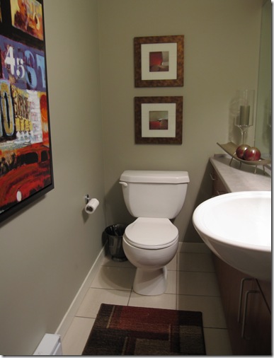
He’s renting the place so we left the colour as is–it really made the room look beige-on-beige though–see how the colour doesn’t quite work with the countertop (it’s got more purple in it and the wall colour is more green), so I decided the only way to take the attention away from the colour not being perfect (and to make up for the fact that we were not painting it a strong colour)was to add a punch of colour with the art and accessories!
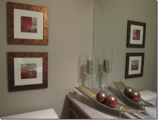

The colour was not from Benjamin Moore (and that’s the only deck I had with me) but it was very close to cc-490 Smoky Taupe, except a bit more green. By the way one of my colleagues at Benjamin Moore used to say “If all else fails and you don’t know what to do, use Smoky Taupe it always looks good”, and it is a colour I specify a lot (not for that reason, I use it if I know it’s going to work, but in general it is a good go-to colour), it’s a nice warm gray/taupe that looks great in contemporary spaces.
Isn’t it cute now? I especially loved the little boat and coloured balls I found from Pier 1.
Have a great weekend everyone!
Related posts:
Bachelor Pad (media room before & after)
Staging: Two Day Transformation

Love it. I love that you worked with what you had and still made it look FAB!
I love seeing examples of your work!
Hope you have a great weekend!
Hi Maria!!
I know exactly what you mean! I have kicked myself a bunch of times for not taking before” shots!!
Nice outcome! I will imagine the before:):):)!!
love, kelee
Kelee,
Just imagine BORING AND BLAH 🙂 and you’ll have it in your head!
xo
Maria
You did a great job! I like the bronze-y frames on the pictures, they really add a nice detail and good contrast to the walls!
Keep that camera in your purse!
Have a super weekend!
blessings….
i would like to poop there. its that wonderful!
NICE!
🙂 Victoria
I think the hits of red in the room are perfect 🙂 The accessories and artwork really do help to mask the fact that the wall & counter colours don't quite work together. In fact, I didn't even notice till you pointed it out!!
Kelly
As Kelly when I first looked at the picture I saw the bold colours and a calming taupe on the walls. Only a few seconds after I saw the contrast between counter, walls, floor.
Of course majority of people will never see the difference. Weird that I am redoing a powder room (done previously by an Interior Designer…the same???) with exactly the same colours/mistakes and the owner never saw the problem!
Very cute. Powder rooms are my favorite to decorate!
I really enjoy your blog and its very informational as well!! Thanks and hope you’ll become a subscriber to my blog as well! I’m new on here and want to learn as much as I can about design and connect with lots of people just like me! Thanks 😀
Powder rooms are the jewels in the home jewelry box.
They can be designed with lots of fun stuff because guests use them while visiting and they’re an art piece to us on a regular basis. Nice photographs.
Bette
what a nice result! how do you feel about changing toilet seat in such a situation?
Really nice. Thanks for the paint color tip, too!
Luv this!
Beautiful powder room, Maria. Love the punch of red!
Love it!
The space is great, Maria. Yep, the little boat and coloured balls are perfect for the “pork chop” portion of the counter, but it’s the large vibrant print on the left wall that I’m crazy about! FAB!
Victoria @ DesignTies
I just looked again and saw that the counter doesn’t have a pork chop… it’s actually a great cabinet/counter combo. Sorry!
V
Hi Design Ties,
It’s not a port chop but still has the feel of one (it’s still in a spot that is not accessible as a countertop)
I did think it was a creative way to fit a full size sink into a small space!
Lynne, I’m not sure what you mean by ‘changing the toilet seat’. To something other than white that already matches the toilet?
Thanks for commenting!
Maria
we all have a go to color…mine is Shaker Beige