


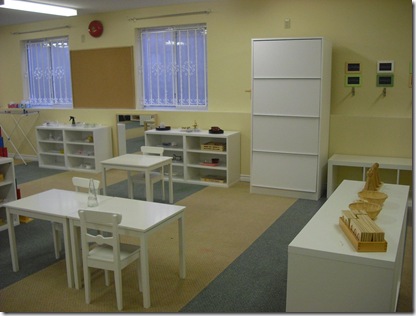
One of my past students at Vancouver Community College, Nour Enayeh recently completed a decorating project with a Montessori school. This is the ‘after photo’ (the before is the second one). She said that the Montessori program believes that kids should not have a bunch of primary colours to distract them from their activities, so the room definitely has a calmer feeling, than the normal appearance of a kindergarten classroom.
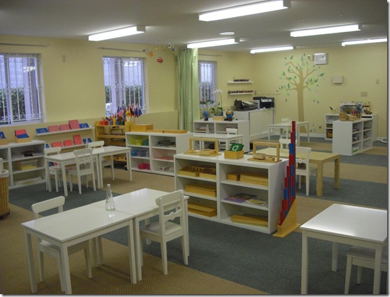

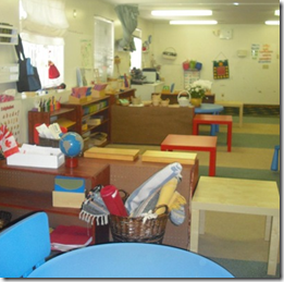
The client wanted to change the carpets as they were dirty (not that we can see that here in the photos) but it was not in the budget. However she did pick a new colour for them (HC-33) above, and Nour said that after it was painted everyone was asking if they had installed new carpet.

I was once called out to pick colours for the hallways of 2 very large apartment buildings. The strata was very unhappy with the existing gray carpeting in the halls because (in their opinion) it looked dirty from the time it was installed (2 years previously) and they were discussing replacing it. I saw the problem immediately and it was that the colour [on the walls] was way too clean. It was a very pale and clean yellow, OC-114 called Lemon Ice.

I explained that the way to correct this was to choose a ‘muddier yellow’ and I selected 2153-50, Desert Tan. You can see the difference between these colours was huge, and it was quite the transformation because now the gray carpet looked like the right carpet and colour for the space instead of pre-maturely dirty, which is what they thought. That is the power of colour!


Nour also put on her decorative painter hat and painted the tree as well, she used HC-34 Wilmington Tan for the tree trunk.
 After
AfterGreat job Nour, thanks for sharing these with us!
Related Post:
Clean vs. Dirty Colours

This room is so cute. And the new paint makes it look fresh and new!
amazing!!! it looks so clean and fresh. don’t let the kiddies back in the room they’ll mess it up!!! just fill it up with cats and cat trees it would look better! thanks for likin gmy cat tree post!
xoxo your bff
Great idea for kids’ playrooms!
Betsy
Painting does sooo much for a room! Who knew it would make the carpet look better too!
Blessings to you Maria. Have a good week!
Children almost always have a sunny disposition so matching that with color is the perfect blend.
When we’re smiling the whole world smiles upon us.
Bette
Good job, lovely!
It looks great, very calm, I like the Montessori philosophy, two of my children went there, they are oriented on nature, basic toys, mixed age groups and very nourishing!
She did a wonderful job there!
Great work without mega sums of cost. I am always impressed when the old is reused in a new and exciting way.
Paint is the turning point in a room. You are a grand teacher!
Fascinating!
What a great project! I just found your blog via Things that Inspire and have spent a bit of time searching around!! Great job! I love your ideas and I will be back!!
xx-Gina
Lovely room. Great advice as always. Love the story about making the hallway carpet work by changing the paint color!
thanks for the comment! hope you’ve become a follower and i loved the plates too 😀 would make a much more pleasant meal than just plain white plates.
Hi Maria, I am missing something here…was the carpet painted? and how? or as in the building you mentioned just the walls colour was changed and the carpet looked fresh? I am puzzled.
Clever, clever! It seems so obvious in retrospect, but it’s a style-for-less tactic that I never would’ve thought of!
Brillante Home Decor,
What made the carpet look new was the colour on the walls that now matched it perfectly (I’m sure also made the gray look much better as well). I would guess by the photo that the colour on the walls could have had more orange in it but my student did say it was because of the flash.
A pale, washed out (too clean) colour on the walls can very often make furniture or carpeting look dirty which was the point of my post
I think the space looks great! My son attended Montessori through elementary school and, as far as I’m concerned, really benefitted because of it! I would have loved to bring him to an environment like this one.
Something I think also helps the carpet in this space is the way Nour set up the work/play stations AND kept them in one colour… doing so emphasizes in a positive way the striped panels of carpeting.
Victoria @ DesignTies
I’m such a lunatic about color, I repainted two rooms three times. Wish I would have just hired the right color person, instead of the Home Depot paint mixer who moonlights as a painter. Also made mistake of painting before doing countertops and color clashed. Swatches are important!
Oooops, Thanks Maria…I did not read it well but it makes sense now and it is a great tip to remember. I am learning every day something new with your posts!
Ciao.
I am honored to have my first project posted on your blog Maria. I have to say that I learned a lot from you ,whether at school or from your blog, you made me realize that I love colours, you are my role model and simply an awsome teacher.
Nour
The color change is amazing…Love that she changed all the furniture to white, fresh and clean…
Love the use of trees in the space – very bright and cheery. The “leaf” rug is great too.
Another great lesson in colour! Man you are giving away all your secrets.
I did not know that the Montessori program believes that kids should not have a bunch of primary colours to distract them from their activities. I am the same way in my office. If I had a child in school I would be sure and send them to Montessori.
Hi Maria!
I’ve been peeking around your blog…..lots of great information here and I really enjoyed myself.
Blessings,
Spencer
interesting…Can you explain what undertones in the wall colour in the Montessori school made this the ideal match for the undertones in the Montessori school carpet, or the clean versus dirty idea between the two colours (new wall colour and carpet)?
I have a large family room that is dark with dark furniture. The wall to wall carpet is medium beige with a fairly short pile. Do you recommend area rugs over carpet? I need some color to anchor this room, but every time I try an area rug over carpet it shifts or buckles. I am budgeting for hardwood but it will be awhile before I can afford it.
Hi Katherine,
I say do whatever brings some life and a new colour palette to the room. It'll shift but oh well, at least you'll have something more exciting to look at!
Maria